The Chanel logo stands as one of the most recognized symbols in luxury fashion. Two interlocking C’s facing opposite directions. Simple. Timeless. Worth billions in brand equity.
This emblem represents over a century of haute couture heritage, positioning itself at the peak of logo design principles in the fashion industry. The current version dates back to 1925, attributed to Coco Chanel herself.
Founded in 1910, the House of Chanel has maintained remarkable consistency with its visual identity. Unlike many luxury brands that chase trends, this mark has seen minimal changes across its existence. Maybe two or three subtle refinements at most.
What Is the Chanel Logo?
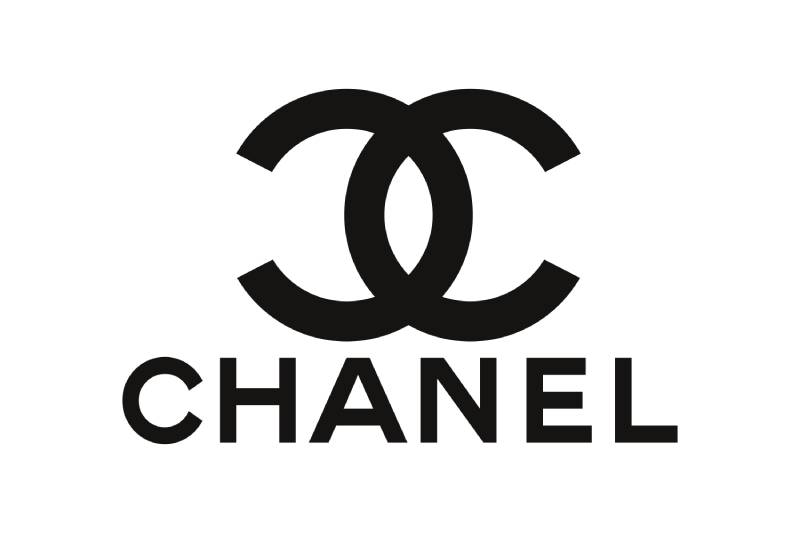
The Chanel logo features two opposing interlocked letter C’s, officially introduced in 1925 by founder Gabrielle “Coco” Chanel. It symbolizes the founder’s initials while representing elegance, luxury, and timeless French fashion craftsmanship.
Design Type: Monogram/Combination Mark
Primary Elements: Two mirrored C letters interlocking at their backs, creating a vertically symmetrical design with a stacked wordmark
Official Introduction Date: 1925
Designer: Gabrielle “Coco” Chanel (attributed)
Trademark Status: Registered trademark globally, aggressively protected against counterfeiting
Color Palette: Primary black (#000000), Secondary white (#FFFFFF)
Usage Context: Products, boutique signage, packaging design, advertising campaigns, digital platforms, runway presentations
How Has the Chanel Logo Evolved Over Time?
The Chanel logo has remained largely unchanged since 1925. This is remarkable in an industry obsessed with reinvention.
Most modifications involved subtle proportion adjustments and optimizing the design for different media formats.
The core interlocking C structure has never been altered.
Original Chanel Logo (1925-Present)
Years Active: 1925 to present day
Design Description: Two back-to-back interlocking C’s with clean lines and perfect symmetry. The letters share a vertical axis and overlap at their open ends.
Color Scheme: Black on white, or white on black depending on application
Designer: Coco Chanel (widely attributed, though some historians debate this)
Context: Introduced during the Art Deco movement, which celebrated geometric forms and streamlined aesthetics. The design captured that era’s spirit perfectly.
Key Characteristics: The logo predates Coco’s perfume bottles and became the seal of authenticity for all Chanel products.
Cultural Significance: It established the template for luxury fashion monograms that countless brands would later imitate.
Minor Refinements (1980s-2000s)
Years Active: Ongoing adjustments
Design Description: Line weight optimizations for print design and digital applications. The proportions became slightly more refined.
Color Scheme: Remained black and white
Context: Karl Lagerfeld’s creative direction brought renewed global attention to the brand. The logo needed to work across new media channels.
Key Changes: Cleaner edges for screen reproduction. Nothing structural.
What Do the Design Elements of the Chanel Logo Mean?

The interlocking C’s represent Coco Chanel’s initials, but there’s more going on here.
The mirrored arrangement suggests duality and balance. Some interpret it as the merging of opposing forces.
The geometric precision reflects the founder’s philosophy of functional elegance.
Why Did Chanel Choose These Specific Colors?
Black was Coco Chanel’s signature. She revolutionized fashion by making it chic rather than morbid.
Understanding color psychology explains this choice. Black communicates sophistication, power, and timelessness.
White provides maximum contrast and versatility.
This pairing appears across black logos in the luxury sector for good reason. It never dates itself.
Black: Hex #000000, symbolizes elegance, mystery, exclusivity
White: Hex #FFFFFF, represents purity, simplicity, premium quality
What Typography Style Is Used in the Chanel Logo?
The wordmark uses a custom typeface based on classic serif font structures with some modifications.
The letterforms are elegant but readable. High typography standards throughout.
The font weight stays consistent, avoiding anything too thin or too heavy.
This approach supports legibility at any scale while maintaining luxury associations.
What Are the Hidden Meanings in the Chanel Logo?
Some see references to the Aubazine Abbey’s stained glass windows, where Coco spent her childhood. The interlocking curves resemble patterns found there.
Others point to the horseshoe shape created by the overlapping sections. This might symbolize good fortune.
The psychology of shapes suggests curved forms create feelings of comfort and femininity.
Coco herself never publicly explained the design’s deeper meaning. She preferred mystery.
How Does the Chanel Logo Compare to Competitor Logos?

Among luxury fashion houses, Chanel’s mark stands out through sheer restraint. Most competitors have complicated their identities over time.
The Louis Vuitton logo uses overlapping initials too, but adds a monogram pattern. More ornate, more busy.
Prada’s logo relies on a wordmark with heraldic elements. Traditional but less distinctive.
The Balenciaga logo went through a recent simplification that actually moved it closer to Chanel’s minimalist design philosophy.
Chanel got there first. Everyone else followed.
What Are the Technical Specifications of the Chanel Logo?

Official Color Codes:
Primary Color (Black): Hex #000000, RGB (0, 0, 0), CMYK (0, 0, 0, 100)
Secondary Color (White): Hex #FFFFFF, RGB (255, 255, 255), CMYK (0, 0, 0, 0)
Dimensions and Proportions:
The interlocking C’s follow near-golden ratio proportions. The aspect ratio sits close to 1:1 for the symbol alone.
Minimum size requirements ensure the overlap remains visible. Typically no smaller than 10mm in print.
Clear space equals the height of one C letter on all sides.
What Cultural Impact Has the Chanel Logo Had?

The interlocking C’s became shorthand for luxury itself. Counterfeiters made billions copying it. That’s a strange form of flattery.
The logo appears in hip-hop lyrics, street art, and fashion commentary worldwide.
It influenced how every luxury brand thinks about visual hierarchy and recognition.
Museums have exhibited it as a design artifact. It transcended commerce to become cultural property.
How Does the Chanel Logo Fit Into the Overall Brand Identity?
The logo anchors everything Chanel produces. From No. 5 perfume to haute couture, the double C’s signal authenticity.
It works alongside specific brand guidelines covering photography style, store design, and advertising tone.
The camellia flower and quilted patterns support the primary mark without competing.
Together, these elements create an identity system that feels unified across every touchpoint. Boutiques in Tokyo look like boutiques in Paris.
How Should the Chanel Logo Be Used?
Official Usage Guidelines:
Never rotate or distort the interlocking C’s. Never add shadows, gradients, or effects.
Maintain minimum clear space. Black on white or white on black only.
Don’t separate the symbol from the wordmark in formal applications.
Accessing Official Assets:
Chanel provides logo files only to authorized partners and press contacts. The brand controls distribution tightly.
Licensing Information:
No general licensing available. Chanel does not permit third-party use under any circumstances.
Trademark Protection:
The logo holds trademark registration in virtually every country. Chanel’s legal team pursues infringement cases aggressively, including against small sellers and online counterfeiters. They don’t mess around.
FAQ on The Chanel Logo
Who Designed the Chanel Logo?
The interlocking C design is attributed to Gabrielle “Coco” Chanel herself around 1925.
No design agency was involved. She created the monogram personally to represent her initials.
Some historians question this origin, but Chanel maintains the founder designed it.
What Do the Two C’s in the Chanel Logo Stand For?
The double C logo represents Coco Chanel’s initials. Simple as that.
The mirrored arrangement creates visual balance while spelling out her name twice.
This French fashion mark became synonymous with haute couture worldwide.
When Was the Chanel Logo First Used?
The logo first appeared in 1925 on Chanel No. 5 perfume bottles.
The House of Chanel had already operated since 1910. But the iconic symbol came fifteen years later.
It quickly became the brand’s primary visual identity element.
Has the Chanel Logo Ever Changed?
The core design has remained virtually identical since 1925. Almost a century unchanged.
Minor refinements adjusted line weights for modern web design and digital platforms.
The luxury brand identity benefits from this remarkable consistency.
Why Is the Chanel Logo So Expensive to Counterfeit?
Chanel aggressively protects its trademark registration globally. Legal teams pursue counterfeiters relentlessly.
The simple geometry actually makes fakes easier to spot. Proportions must be exact.
Authentic products use specific materials that counterfeiters struggle to replicate.
What Colors Are Used in the Official Chanel Logo?
The official color palette uses only black and white. No exceptions.
This monochrome color approach reinforces timeless elegance.
Gold sometimes appears on hardware, but never in the logo itself.
Is the Chanel Logo Inspired by Aubazine Abbey?
Possibly. Coco Chanel grew up at Aubazine Abbey in France.
The stained glass windows there feature similar interlocking geometric patterns. The resemblance is striking.
Chanel never confirmed this connection publicly. The mystery remains part of the Gabrielle Chanel legacy.
Can I Use the Chanel Logo for Personal Projects?
No. The Chanel symbol carries strict trademark protection.
Using it without permission violates intellectual property law. Even for personal or non-commercial purposes.
The Paris fashion house does not license its brand symbol to third parties under any circumstances.
What Makes the Chanel Logo a Good Design?
The interlocking C’s demonstrate perfect alignment and geometric precision.
It works at any size. Recognizable from across a room or on a tiny button.
The design follows core graphic design principles that ensure lasting relevance.
Where Can I Find the Official Chanel Logo Files?
Chanel does not provide public access to official logo files.
Only authorized partners and press contacts receive approved vector graphics directly from the company.
Downloading logos from unofficial sources risks trademark infringement issues.
Conclusion
The Chanel logo proves that restraint beats complexity every time. Nearly a century later, the interlocking C’s remain a timeless brand symbol that competitors still try to match.
Coco Chanel understood something fundamental about brand recognition. She knew that white space and geometric unity would outlast trends.
The designer trademark she created reflects her philosophy. Elegance through simplicity. Confidence without noise.
This fashion house emblem shaped how luxury brands approach visual identity systems. It set the standard that defines the industry today.

Renowned for his expertise in logo design and visual branding, Bogdan has developed a multitude of logos for various clients.
His skills extend to creating posters, vector illustrations, business cards, and brochures. Additionally, Bogdan's UI kits were featured on marketplaces like Visual Hierarchy and UI8.
He also wrote in the past years on sites like Design Your Way, WebDesignerDepot, WPDean, Designmodo, Speckyboy, Slider Revolution, and more.
- Jujutsu Kaisen Font Generator - 12 October 2026
- The Windsurf Logo History, Colors, Font, And Meaning - 10 October 2026
- How to Remove Background From Product Photos (No Photoshop) - 10 October 2026

Bogdan Sandu is a seasoned designer who has been designing websites since 2008. Renowned for his expertise in logo design and visual branding, Bogdan has developed a multitude of logos for various clients. His skills extend to creating posters, vector illustrations, business cards, and brochures. Additionally, Bogdan's UI kits were featured on marketplaces like Visual Hierarchy and UI8. He also wrote in the past years on sites like Design Your Way, WebDesignerDepot, WPDean, Designmodo, Speckyboy, Slider Revolution, and more.
You Might Also Like