


The Louis Vuitton logo stands as one of the most recognized symbols in luxury fashion. It represents more than a brand. It signals status, craftsmanship, and over 160 years of French heritage.
Within the broader context of luxury branding, few marks carry as much weight. The interlocking LV monogram has influenced how high-end brands approach their visual identity. It set the template that countless fashion houses still follow today.
The current version traces back to 1896, created by Georges Vuitton (the founder’s son). The brand itself launched in 1854. Over the decades, the logo has seen refinements, but its core structure remains remarkably consistent. That kind of staying power is rare.
What Is the Louis Vuitton Logo?
The Louis Vuitton logo features the interlocking initials “L” and “V” surrounded by a geometric pattern of quatrefoils and flowers. Georges Vuitton designed it in 1896 to combat counterfeiting. The monogram represents Parisian elegance and the brand’s trunk-making origins.
Design Type: Combination mark (monogram with decorative pattern)
Primary Elements:
- Interlocking L and V letters
- Four-pointed star (or diamond with concave sides)
- Four-petaled flower motif
- Circle with inset quatrefoil
Official Introduction Date: 1896
Designer: Georges Vuitton
Trademark Status: Registered globally. Louis Vuitton actively pursues counterfeiters and protects its intellectual property through extensive legal action.
Color Palette:
- Brown (Toile Monogram): The signature canvas shade
- Tan/Beige: Background on classic products
- Black and White: Used in formal applications
Usage Context: Leather goods, ready-to-wear clothing, accessories, packaging design, storefronts, digital platforms, and advertising campaigns.
How Has the Louis Vuitton Logo Evolved Over Time?
The Louis Vuitton logo has remained surprisingly stable since 1896. Unlike many brands that undergo dramatic redesigns, LV refined rather than reinvented.
Minor adjustments addressed printing technologies and digital needs. The core monogram pattern never changed.
Original Trunk Designs (1854-1896)
Years Active: 1854-1896
Design Description: Before the monogram existed, Louis Vuitton used striped patterns on trunks. The Rayee pattern featured beige and brown stripes. Later came the Damier (checkerboard) pattern in 1888.
Color Scheme: Brown, beige, red accents
Designer: Louis Vuitton himself
Context: These patterns aimed to distinguish genuine Vuitton trunks from competitors. Counterfeiting was already a problem in the 1880s.
Cultural Significance: Established Vuitton as a luxury trunk maker for European aristocracy and wealthy travelers.
The Monogram Canvas (1896-Present)
Years Active: 1896 to current day
Design Description: The interlocking LV initials with Japanese-inspired floral and geometric motifs. The pattern uses repetition to create a cohesive, instantly recognizable surface.
Color Scheme: Brown monogram on tan canvas
Designer: Georges Vuitton
Context: Created partly as an anti-counterfeiting measure and as a tribute to Louis Vuitton, who died in 1892.
Key Changes from Previous: Introduced figurative symbols instead of geometric stripes. Added the founder’s initials directly.
Cultural Significance: Became the template for luxury branding. The “all-over” monogram print influenced fashion for over a century.
Modern Refinements (2000s-Present)
Years Active: 2000s onward
Design Description: The monogram pattern remains, but LV introduced variations. Multicolor versions. Collaborations with artists like Takashi Murakami added new colorways.
The standalone LV initials (without the full pattern) gained prominence for cleaner applications.
Key Changes: Simplified wordmark for digital use. Higher contrast versions for small screens.
What Do the Design Elements of the Louis Vuitton Logo Mean?

Every element in the LV monogram carries purpose. The interlocking letters honor founder Louis Vuitton.
The surrounding motifs blend European and Asian influences. They create a pattern that’s decorative yet functional as an anti-counterfeit measure.
Why Did Louis Vuitton Choose These Specific Colors?
Brown (Primary):
- Hex: Varies by product, commonly #6B4423
- Symbolic meaning: Earthiness, reliability, timelessness
- Psychological impact: Conveys warmth and tradition
- Brand connection: References leather and natural materials
Brown grounds the brand in heritage. It says “established” without trying too hard.
Many brown logos aim for similar associations with dependability and classic taste.
Gold (Accent):
- Symbolic meaning: Luxury, prestige, excellence
- Psychological impact: Triggers associations with wealth
- Usage: Hardware, embossing, special editions
The pairing of brown and gold works because it balances warmth with aspiration. Like many gold logos, LV uses metallic accents sparingly for maximum effect.
What Typography Style Is Used in the Louis Vuitton Logo?
The LV initials use a custom serif font style. The letters feature elegant, slightly flared terminals.
The serifs add a traditional, formal quality. They reference 19th-century French printing traditions.
For the full wordmark “Louis Vuitton,” the brand uses a clean, high-contrast serif. It’s legible at various sizes while maintaining sophistication.
The typography hasn’t changed drastically. Subtle weight adjustments keep it modern without losing heritage.
What Are the Hidden Meanings in the Louis Vuitton Logo?
The floral motifs draw from Japanese family crests (mon). Georges Vuitton was reportedly inspired by the Japonisme movement popular in late 19th-century Paris.
Some design historians see Art Nouveau influences in the curved elements.
The four-pointed stars and quatrefoils may reference compass points. This would connect to the brand’s travel and exploration heritage.
Georges Vuitton never publicly explained every choice. That mystery adds to the logo’s allure.
How Does the Louis Vuitton Logo Compare to Competitor Logos?
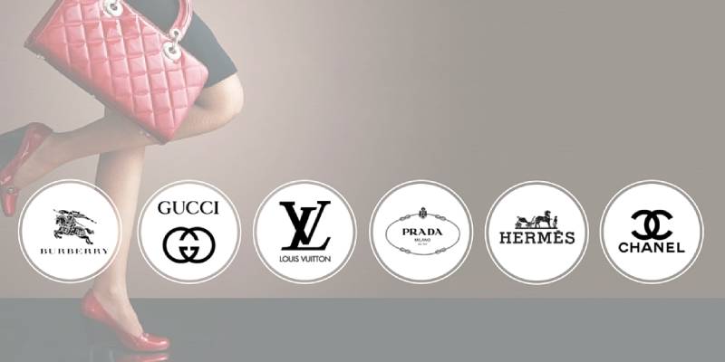
Among luxury fashion houses, LV takes a maximalist approach. The monogram pattern covers entire products.
Competitors often go simpler. But LV proves that more can work when executed well.
Versus Chanel logo: Chanel uses interlocking C’s, but sparingly. The Chanel mark appears as a single emblem rather than an all-over pattern. Both rely on founder initials. Different applications.
Versus Prada logo: Prada favors a clean wordmark with minimal decoration. It reads as more understated. LV reads as more expressive.
Versus Balenciaga logo: Balenciaga shifted to stark, sans-serif typography. It aims for a different audience. LV maintains its ornate heritage.
What sets LV apart is commitment. The monogram isn’t just a logo. It’s a texture, a material, almost a product itself.
What Are the Technical Specifications of the Louis Vuitton Logo?
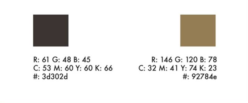
Official Color Codes (Primary Brown):
- Hex: #6B4423 (approximate, varies by application)
- RGB: (107, 68, 35)
- CMYK: (0, 36, 67, 58)
- Pantone: Custom matched
Monogram Pattern Dimensions:
- The LV initials sit within a repeating grid
- Flower and star motifs maintain consistent spacing
- Pattern tiles seamlessly in all directions
Clear Space Requirements: When using the standalone LV mark, minimum clear space equals the height of the “L” on all sides.
Minimum Size: The full monogram pattern requires larger applications to remain legible. The standalone LV mark works at smaller sizes.
For digital use, vector graphics versions ensure crisp reproduction across screen sizes.
What Cultural Impact Has the Louis Vuitton Logo Had?
The LV monogram changed how fashion brands think about branding. Before LV, logos marked products. After LV, logos became the product.
The all-over print approach inspired countless imitators. Gucci, Fendi, Dior, and others developed their own monogram patterns.
In hip-hop culture, LV became a status symbol by the 1980s and 1990s. Artists referenced the brand in lyrics and wore it prominently.
The logo also sparked debates about conspicuous consumption. Is visible branding tacky or aspirational? LV sits at the center of that conversation.
How Does the Louis Vuitton Logo Fit Into the Overall Brand Identity?
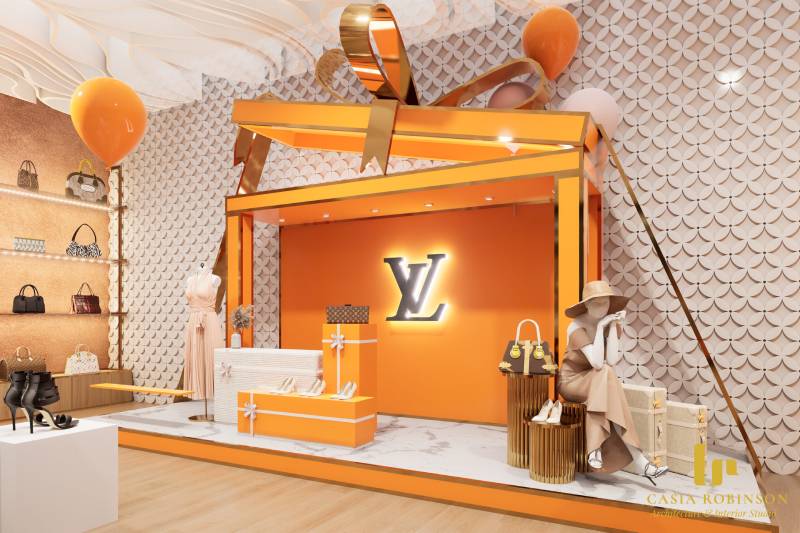
The logo anchors everything. Store interiors, ad campaigns, product design, and even staff uniforms reference the monogram pattern or the LV initials.
Their brand guidelines treat the monogram as sacred. Placement, spacing, and color reproduction follow strict rules.
The logo connects to adjacent brand elements: the Damier pattern, the signature brown boxes, the brass hardware. Together, they form a cohesive system.
You could argue Louis Vuitton wrote the playbook on integrated luxury branding. The logo isn’t separate from the product. It IS the product, in many ways.
How Should the Louis Vuitton Logo Be Used?
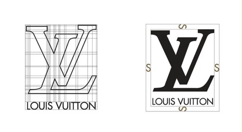
Official Usage Guidelines:
- Never alter the proportions of the LV initials
- Maintain minimum clear space around the mark
- Use only approved color combinations
- Never place the logo on busy backgrounds that reduce legibility
Where to Access Official Logos: Louis Vuitton provides assets to authorized partners only. The brand does not offer public logo downloads.
Licensing Information: The LV monogram cannot be used commercially without explicit permission. The brand licenses its marks for specific collaborations only (e.g., artist partnerships, limited editions).
Trademark Protection: Louis Vuitton is notoriously aggressive about enforcement. They pursue counterfeiters worldwide and have won numerous high-profile cases. Using the logo without authorization risks legal action.
For legitimate business inquiries, contact Louis Vuitton’s corporate licensing division directly.
FAQ on The Louis Vuitton Logo
What Does the Louis Vuitton Logo Look Like?
The LV monogram features interlocking L and V initials. Surrounding them are quatrefoils, four-pointed stars, and flower motifs.
This pattern repeats across the signature monogram canvas. It’s instantly recognizable on handbags, luggage, and leather goods worldwide.
Who Designed the Louis Vuitton Logo?
Georges Vuitton created the monogram in 1896. He was the son of founder Louis Vuitton.
Georges designed it partly to honor his late father. The other reason? Fighting counterfeiters who copied Vuitton trunk designs.
When Was the Louis Vuitton Logo Created?
The monogram pattern debuted in 1896. The French fashion brand itself started in 1854 when Louis Vuitton opened his trunk-making shop in Paris.
That’s over 125 years of the same basic logo design. Pretty remarkable staying power.
What Do the LV Initials Stand For?
Simple. They represent Louis Vuitton, the founder’s name. He established the luxury brand in Paris, France.
The interlocking design makes them work as a unified symbol rather than just two separate letters.
Why Is the Louis Vuitton Logo So Valuable?
Brand recognition drives value. The LV symbol signals premium quality, French craftsmanship, and status.
LVMH (the parent company) protects this brand identity fiercely. Decades of consistent marketing built trust with consumers seeking luxury fashion products.
Is the Louis Vuitton Monogram Trademarked?
Yes. Louis Vuitton Malletier holds registered trademarks globally. They pursue counterfeit goods aggressively.
The company spends millions on intellectual property protection each year. Unauthorized use of the trademark design triggers legal action.
What Are the Official Louis Vuitton Logo Colors?
The classic combination uses brown on tan. This appears on the original Toile Monogram canvas.
Black and white versions exist for formal applications. Special editions have featured multicolor variations through designer collaborations.
How Can You Tell if a Louis Vuitton Logo Is Authentic?
Check pattern alignment. Genuine products show precise, consistent spacing. The LV initials should never appear cut off awkwardly at seams.
Stitching quality matters too. Authentication services can verify brand originality for valuable pieces.
What Font Does Louis Vuitton Use?
The wordmark uses a custom typeface with classic design elements. It features high-contrast strokes and refined serifs.
The style reflects 19th-century French printing traditions. It reads as elegant and timeless across all brand materials.
What Is the Damier Pattern?
The Damier is a checkerboard pattern Louis Vuitton introduced in 1888. It predates the monogram by eight years.
Still used today, it offers a more subtle alternative. Some buyers prefer it over the bolder LV monogram print.
Conclusion
The Louis Vuitton logo remains a masterclass in luxury brand identity. Few symbols carry this much weight in the fashion industry.
Georges Vuitton created something that transcended its original purpose. What started as counterfeit protection became a global status symbol.
The monogram pattern, the interlocking LV initials, the heritage dating back to 1854. These elements work together as a complete visual system.
LVMH continues protecting this trademark aggressively. And for good reason. In the luxury market, brand recognition equals everything.
The logo doesn’t just identify products. It defines what premium fashion means to millions worldwide.

Renowned for his expertise in logo design and visual branding, Bogdan has developed a multitude of logos for various clients.
His skills extend to creating posters, vector illustrations, business cards, and brochures. Additionally, Bogdan's UI kits were featured on marketplaces like Visual Hierarchy and UI8.
He also wrote in the past years on sites like Design Your Way, WebDesignerDepot, WPDean, Designmodo, Speckyboy, Slider Revolution, and more.
- Jujutsu Kaisen Font Generator - 12 October 2026
- The Windsurf Logo History, Colors, Font, And Meaning - 10 October 2026
- How to Remove Background From Product Photos (No Photoshop) - 10 October 2026

Bogdan Sandu is a seasoned designer who has been designing websites since 2008. Renowned for his expertise in logo design and visual branding, Bogdan has developed a multitude of logos for various clients. His skills extend to creating posters, vector illustrations, business cards, and brochures. Additionally, Bogdan's UI kits were featured on marketplaces like Visual Hierarchy and UI8. He also wrote in the past years on sites like Design Your Way, WebDesignerDepot, WPDean, Designmodo, Speckyboy, Slider Revolution, and more.
You Might Also Like


