While most brands chase bright colors for attention, some of the world’s most recognizable companies built their empires on brown logos. From UPS’s iconic chocolate shields to Louis Vuitton’s luxury leather tones, these earthy brands prove that warm, natural colors can dominate markets just as effectively as flashy alternatives.
Brown branding cuts through visual noise by projecting authenticity, reliability, and premium quality. The color psychology of brown triggers trust associations while connecting brands to natural materials and craftsmanship heritage.
This analysis examines 15 major brands that leverage brown as their primary color identity. You’ll discover how companies like Hershey’s, Timberland, and Nespresso use chocolate browns, earth tones, and natural color palettes to build consumer loyalty across diverse industries.
From luxury fashion to mass-market confectionery, these brown logo strategies reveal why earthy color schemes often outperform brighter alternatives in building lasting brand recognition and emotional connections with target audiences.
Brown Logos
| Brand Entity | Industry Attribute | Brown Shade Value | Brand Positioning Context |
|---|---|---|---|
| UPS | Logistics & Shipping | Dark Chocolate Brown (#351C15) | Reliability, trust, earth-to-earth delivery |
| Louis Vuitton | Luxury Fashion | Rich Leather Brown (#4A2C2A) | Heritage craftsmanship, premium leather goods |
| Hershey’s | Confectionery | Milk Chocolate Brown (#7B3F00) | Classic American chocolate, comfort sweetness |
| Nespresso | Coffee Systems | Espresso Brown (#3C2415) | Premium coffee culture, sophisticated brewing |
| M&M’s (Brown) | Candy Manufacturing | Cocoa Brown (#8B4513) | Fun chocolate character, playful confection |
| Timberland | Outdoor Footwear | Wheat Brown (#D2B48C) | Rugged outdoor durability, work boot heritage |
| Godiva | Premium Chocolates | Golden Brown (#B8860B) | Belgian luxury, artisanal chocolate craftsmanship |
| Carhartt | Workwear | Carhartt Brown (#704214) | Blue-collar strength, worksite durability |
| Tootsie Roll | Candy Production | Toffee Brown (#A0522D) | Nostalgic candy, childhood memories |
| Cracker Barrel | Restaurant Chain | Rustic Brown (#8B4513) | Country comfort, homestyle dining |
| Whole Foods (Legacy) | Organic Grocery | Earth Brown (#8B4513) | Natural products, organic lifestyle |
| A&W Root Beer | Beverage Brand | Root Beer Brown (#A0522D) | Classic American soda, vintage appeal |
UPS

UPS transformed the shipping industry by embracing dark chocolate brown branding as their signature identity. The logistics giant chose this unconventional color palette to project reliability and hide dirt on their fleet vehicles.
Logo Design Elements
The current UPS shield features:
- Dark chocolate brown paired with golden yellow accents
- Logo uses custom UPS Sans typography creating clean lines with pointed edges
- Shield shape employs visual hierarchy through contrast
- Brown backgrounds with yellow lettering for maximum visibility
Brand Context & Values
- Founded: 1907 as American Messenger Company
- Serves global logistics markets targeting business customers requiring reliable package delivery
- Brown became UPS identity after Charles Soderstrom suggested dark brown paint to hide dirt on delivery trucks
- Targets both residential and commercial sectors
Psychological Impact & Differentiation
Brown triggers trust associations and reliability perceptions among consumers:
- Color psychology of brown suggests stability, dependability, earthiness
- UPS built their “What can brown do for you?” campaign around these psychological connections
- Warm brown creates comfort while projecting strength through premium chocolate associations
- Differentiates from competitors using blue or red for trust and urgency messaging
Visual Applications
Comprehensive implementation:
- UPS brown appears across digital platforms, print materials, vehicle fleets consistently
- Logo design scales from massive truck graphics to mobile app icons
- Shield maintains visibility on various backgrounds through high-contrast yellow elements
Industry Relevance
- Logistics companies typically use blue or red for trust and urgency messaging
- UPS differentiated through brown’s unique positioning in shipping markets
- Earthy color choice stands apart from competitors while connecting to practical, dependable service values
Louis Vuitton

Louis Vuitton’s iconic monogram incorporates rich brown elements through their signature Damier Canvas and brown leather goods. The luxury house uses brown variations alongside gold to create premium positioning in fashion markets.
Logo Design Elements
The luxury identity features:
- Interlocked LV monogram appears in chocolate brown variations across product lines
- Georges Vuitton created the monogram in 1896 using Roman serif inspiration with elongated serifs
- Brown Damier pattern features checkered designs with beige-brown backgrounds
- Gold LV lettering creates emphasis through tonal variation
Brand Context & Values
- Established: 1854
- Targets luxury fashion consumers seeking heritage craftsmanship
- Serves high-net-worth individuals through exclusive retail experiences and limited-edition collections
- Brown leather goods represent Louis Vuitton’s trunk-making origins
- Connects to premium materials and traditional craftsmanship values
Psychological Impact & Differentiation
Brown leather evokes luxury, heritage, and timeless elegance:
- Warm earth tones suggest authenticity and craftsmanship quality among affluent consumers
- Creates emotional connections to premium materials while projecting exclusivity
- Rich chocolate associations support luxury positioning
- Differentiates from competitors avoiding brown in favor of black or gold presentation
Visual Applications
Luxury-focused presence:
- Brown appears across handbags, luggage, leather accessories consistently
- Monogram scales from small jewelry details to large travel trunks maintaining brand recognition
- Digital applications use brown backgrounds to frame product photography effectively
Industry Relevance
- Luxury fashion brands often avoid brown in favor of black or gold presentation
- Louis Vuitton’s brown positioning connects to leather craftsmanship heritage
- Natural color reinforces authenticity messages where synthetic materials dominate lower-tier offerings
Hershey’s
Hershey’s built their visual identity around chocolate brown coloring that directly represents their core product. The confectionery giant uses rich brown shades to create instant product recognition and appetite appeal.
Logo Design Elements
The chocolate brand identity features:
- Current wordmark features chocolate brown lettering on white backgrounds
- Bold sans-serif fonts with condensed letterforms creating strong shelf presence
- Gradient brown ranges from dark chocolate (#381216) to lighter milk chocolate variations
- Different product lines use corresponding brown variations
Brand Context & Values
- Founded: 1894 by Milton Hershey
- Dominates American chocolate markets targeting mass-market consumers
- Accessible pricing and widespread distribution in grocery and convenience channels
- Brown chocolate associations support positioning as America’s chocolate authority
- Serves multiple generations with consistent brand recognition
Psychological Impact & Differentiation
Chocolate brown triggers appetite responses and comfort associations:
- Warm color psychology connects to happiness, indulgence, nostalgic childhood memories
- Creates immediate product identification while suggesting rich flavor and quality ingredients
- Visual cues support appetite appeal and brand recognition
- Differentiates through product-truth messaging versus more colorful candy brands
Visual Applications
Product-focused implementation:
- Brown appears across wrapper designs, point-of-sale materials, digital advertising consistently
- Color maintains appetite appeal across packaging formats from individual bars to family-size products
- Chocolate brown backgrounds frame product photography while supporting brand recognition
Industry Relevance
- Confectionery brands commonly use bright colors for attention
- Hershey’s authentic brown positioning differentiates through product-truth messaging
- Natural chocolate color reinforces quality perceptions where artificial ingredients face consumer scrutiny
Timberland

Timberland built their brand identity around wheat brown leather and natural earth tones reflecting outdoor durability and craftsmanship heritage. The footwear company uses brown strategically to suggest rugged authenticity.
Logo Design Elements
The outdoor heritage identity features:
- Iconic tree logo appears in brown variations supporting outdoor positioning
- Sturdy serif fonts with brown lettering creating masculine, outdoorsy brand personality
- Wheat brown coloring matches their signature boot leather
- Consistent brand recognition across product categories
Brand Context & Values
- Founded: 1952
- Targets outdoor enthusiasts and urban fashion consumers seeking authentic workwear styling
- Serves multiple demographics through outdoor gear and lifestyle fashion positioning
- Brown leather connections support heritage messaging while projecting durability
- Craftsmanship quality values emphasized through natural materials
Psychological Impact & Differentiation
Earth brown tones suggest outdoors, reliability, and masculine strength:
- Natural color creates adventure associations while projecting authentic materials and construction
- Brown connects Timberland to nature experiences and rugged lifestyle aspirations
- Warm earth associations support outdoor authenticity messaging
- Differentiates through heritage and authenticity while competing in outdoor lifestyle markets
Visual Applications
Outdoor-focused presence:
- Brown dominates product design, retail environments, marketing materials consistently
- Color supports outdoor authenticity across digital platforms while maintaining masculine brand positioning
- Natural brown backgrounds frame product photography effectively while reinforcing heritage craftsmanship
Industry Relevance
- Footwear brands often use black or bright colors for athletic performance messaging
- Timberland’s brown positioning differentiates through heritage and authenticity
- Natural leather color reinforces quality perceptions where synthetic materials dominate lower-price alternatives
Carhartt

Carhartt built their workwear brand around brown duck canvas and natural earth tones suggesting durability and blue-collar authenticity. The company uses brown to project honest work values.
Logo Design Elements
The workwear authenticity identity features:
- Carhartt logo appears in brown variations supporting workwear positioning
- Sturdy, industrial typography creating masculine, utilitarian brand personality
- Canvas brown coloring matches their signature work jacket materials
- Authentic workwear associations through natural material representation
Brand Context & Values
- Founded: 1889
- Targets blue-collar workers and outdoor enthusiasts seeking durable work clothing
- Serves industrial and fashion markets through authentic workwear positioning
- Brown canvas connections support heritage messaging while projecting durability
- Honest work values emphasized through natural material choice
Psychological Impact & Differentiation
Work brown tones suggest reliability, durability, and masculine strength:
- Natural color creates authenticity associations while projecting practical functionality
- Brown connects Carhartt to honest work environments and rugged lifestyle values
- Earth-based color psychology supports utilitarian brand positioning
- Differentiates through workwear heritage while competing in lifestyle fashion markets
Visual Applications
Workwear-focused presence:
- Brown dominates product design, retail displays, marketing materials consistently
- Color supports workwear authenticity across fashion markets while maintaining utilitarian brand positioning
- Natural brown backgrounds reinforce heritage craftsmanship messaging while creating masculine brand personality
Industry Relevance
- Apparel brands often use bright colors for fashion appeal
- Carhartt’s brown authenticity strategy differentiates through workwear heritage
- Natural canvas color reinforces quality and durability perceptions among consumers seeking authentic work clothing
Godiva
Godiva leverages deep chocolate brown throughout their premium confectionery branding to suggest Belgian heritage and artisanal quality. The luxury chocolate brand uses rich brown coloring for sophisticated market positioning.
Logo Design Elements
The luxury chocolate identity features:
- Godiva wordmark appears in elegant bronze and brown variations supporting premium chocolate associations
- Refined script fonts create luxurious brand personality through sophisticated letterforms
- Deep chocolate browns range from milk to dark chocolate variations reflecting product diversity
- Brand unity maintained while showcasing product range
Brand Context & Values
- Established: Belgium in 1926
- Targets affluent consumers seeking premium chocolate gifts and personal indulgence
- Serves luxury markets through exclusive retail and gifting occasions
- Brown chocolate associations support positioning as Belgian chocolate authority
- European craftsmanship heritage projected through sophisticated color choice
Psychological Impact & Differentiation
Luxury chocolate brown suggests indulgence, sophistication, and premium quality:
- Rich color creates desire while projecting exclusivity and artisanal craftsmanship among affluent consumers
- Brown elements support gift-giving positioning through elegant, sophisticated color associations
- Premium quality messaging enhanced through natural chocolate representation
- Reinforces Belgian chocolate authenticity while differentiating from mass-market confectionery brands
Visual Applications
Luxury-focused implementation:
- Brown appears across packaging, boutique interiors, advertising materials consistently
- Color supports luxury positioning across digital platforms while maintaining premium brand perception
- Rich brown packaging creates shelf differentiation while suggesting product quality and gift-worthiness
Industry Relevance
- Premium chocolate brands compete through packaging elegance and heritage messaging
- Godiva’s sophisticated brown strategy reinforces Belgian chocolate authenticity
- Natural chocolate color supports premium pricing through quality associations in competitive luxury markets
A&W Root Beer
A&W Root Beer maintains rich brown coloring throughout their beverage branding to suggest classic root beer flavor and American heritage positioning in competitive soft drink markets.
Logo Design Elements
The classic American beverage identity features:
- A&W logo features brown lettering and root beer imagery creating direct flavor associations
- Vintage-inspired typography supporting classic American beverage positioning
- Root beer brown coloring creates immediate flavor recognition while maintaining heritage brand authenticity
- Product packaging maintains consistent brown presence across formats
Brand Context & Values
- Founded: 1919
- Targets consumers seeking classic American beverage experiences and nostalgic flavor profiles
- Serves fountain drink and bottled markets through heritage positioning
- Brown root beer associations support traditional beverage authority
- Connects to classic American drive-in experiences and cultural heritage
Psychological Impact & Differentiation
Classic brown suggests tradition, authentic flavor, and nostalgic experiences:
- Rich color creates memory associations while projecting genuine taste authenticity among beverage consumers
- Brown connects A&W to traditional American beverage culture through warm, familiar color psychology
- Heritage positioning supported through natural beverage color representation
- Differentiates through tradition while maintaining root beer authenticity
Visual Applications
Heritage beverage presence:
- Brown dominates packaging design, fountain equipment, restaurant signage consistently
- Color maintains beverage recognition while supporting heritage brand messaging across retail channels
- Traditional brown elements create consistent brand experience from bottled products to restaurant environments
Industry Relevance
- Soft drink brands typically use bright colors for energy and refreshment messaging
- A&W’s brown heritage strategy differentiates through tradition while maintaining root beer authenticity
- Natural beverage color reinforces flavor expectations and heritage positioning in competitive soft drink markets
Cracker Barrel
Cracker Barrel incorporates rustic brown elements throughout their restaurant and retail branding to suggest comfort food authenticity and American heritage values.
Logo Design Elements
The comfort food identity features:
- Cracker Barrel logo features brown barrel imagery supporting rustic restaurant positioning
- Traditional serif typography creating homestyle comfort associations
- Warm brown coloring appears across signage and interior design elements
- Consistent rustic brand personality through natural material representation
Brand Context & Values
- Founded: 1969
- Targets families and travelers seeking comfort food experiences
- Serves highway and suburban markets through restaurant and retail combination formats
- Brown rustic elements support old-fashioned positioning while projecting authentic American comfort food values
- Heritage messaging emphasized through traditional color choices
Psychological Impact & Differentiation
Rustic brown suggests home comfort, tradition, and authentic cooking:
- Warm earth tone creates familiarity while projecting honest food preparation among target consumers
- Brown connects Cracker Barrel to rural American values and comfort food authenticity
- Natural color associations support heritage positioning
- Differentiates through heritage positioning while competing in family dining markets
Visual Applications
Comfort-focused presence:
- Brown appears across restaurant interiors, signage, merchandise consistently
- Color supports comfort food positioning while maintaining rustic brand authenticity across multiple locations
- Traditional brown elements create consistent brand experience from exterior signage to interior dining environments
Industry Relevance
- Restaurant chains often use red or orange for appetite stimulation
- Cracker Barrel’s brown comfort strategy differentiates through heritage positioning
- Natural rustic color reinforces authenticity perceptions where consumers seek genuine comfort food experiences
Tootsie Roll
Tootsie Roll maintains chocolate brown consistency across their confectionery branding to create immediate product recognition and chocolate authenticity. The candy company uses brown for nostalgic market positioning.
Logo Design Elements
The nostalgic candy identity features:
- Tootsie Roll wordmark features brown lettering creating direct chocolate associations
- Playful display fonts supporting candy personality while maintaining product recognition
- Chocolate brown wrapper design creates shelf recognition while suggesting candy flavor
- Authentic color representation supporting immediate product identification
Brand Context & Values
- Founded: 1896
- Targets mass-market consumers across multiple generations seeking familiar candy experiences
- Serves convenience and grocery channels through nostalgic positioning
- Brown chocolate associations support traditional candy authority while connecting to childhood memory messaging
- Heritage brand emphasizing consistency and familiarity
Psychological Impact & Differentiation
Nostalgic chocolate brown suggests comfort, familiarity, and sweet indulgence:
- Warm color creates memory associations while projecting authentic candy flavor among consumers
- Brown elements support heritage positioning through traditional chocolate color psychology
- Comfort associations enhanced through consistent brand presentation across generations
- Differentiates through tradition while maintaining chocolate authenticity associations
Visual Applications
Heritage candy presence:
- Brown appears across wrapper design, point-of-sale materials, advertising consistently
- Color maintains candy recognition while supporting nostalgic brand messaging across retail environments
- Traditional brown packaging creates shelf differentiation through heritage positioning in competitive candy markets
Industry Relevance
- Modern candy brands emphasize bright colors and innovation messaging
- Tootsie Roll’s consistent brown strategy differentiates through tradition
- Natural chocolate color supports heritage positioning where consumers seek familiar, trusted candy experiences
M&M’s Brown Character
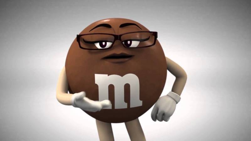
M&M’s transformed their brown candy into a distinctive brand character, creating personality-driven marketing around chocolate brown identity. The Mars Wrigley brand uses brown strategically for product recognition and character development.
Logo Design Elements
The character-focused candy identity features:
- Brown M&M character features classic M logo in white lettering against brown candy shell backgrounds
- Circular design maintains brand consistency across all color variations
- Chocolate brown coloring creates immediate candy identification while supporting character personality traits
- Color associations support character development and brand recognition
Brand Context & Values
- Mars introduced M&M’s in 1941
- Targets mass-market consumers through colorful candy positioning serving all age demographics
- Various retail channels and seasonal product extensions supported by character marketing
- Brown M&M character represents chocolate authenticity while participating in ensemble character marketing
- Multi-generational appeal through consistent character development
Psychological Impact & Differentiation
Brown M&M personality suggests reliability, sweetness, and approachability:
- Warm chocolate color creates comfort associations while supporting candy indulgence messaging among consumers
- Character-based marketing transforms brown from basic color into personality-driven brand asset
- Emotional connections developed through character storytelling and personality traits
- Differentiates through personality development while maintaining chocolate product associations
Visual Applications
Character-driven presence:
- Brown appears across packaging, advertising, digital content as character element
- Color maintains candy recognition while supporting character storytelling across multiple media formats
- Brown character design translates effectively from small package graphics to large advertising displays
Industry Relevance
- Candy brands typically emphasize bright colors for attention and energy
- M&M’s brown character strategy differentiates through personality development
- Natural chocolate color provides authenticity where artificial ingredients face increasing consumer resistance
Nespresso
Nespresso incorporates brown elements to reinforce premium coffee positioning and espresso authenticity. The Nestlé subsidiary uses brown alongside black and gold to create sophisticated luxury messaging.
Logo Design Elements
The premium coffee identity features:
- Distinctive “N” monogram occasionally appears in coffee brown variations complementing primary black wordmark
- Art Deco-inspired typeface custom-developed by Zecraft design bureau
- Brown capsule colors and coffee-themed imagery support technical precision of espresso preparation
- Natural color associations enhance premium positioning through authentic coffee representation
Brand Context & Values
- Launched: 1986
- Targets affluent consumers seeking convenient premium espresso experiences
- Serves high-income households through exclusive club membership and boutique retail locations
- Coffee brown elements reinforce positioning as espresso authority while distinguishing from mass-market instant coffee brands
- Luxury positioning supported through selective color application
Psychological Impact & Differentiation
Coffee brown suggests sophistication, morning rituals, and premium quality:
- Warm earth tone creates comfort while projecting expertise and authenticity among target consumers
- Brown elements support luxury positioning by connecting to rich espresso crema and premium coffee bean origins
- Natural associations enhance premium coffee experience messaging
- Reinforces premium positioning while connecting to coffee’s natural origins
Visual Applications
Premium coffee presence:
- Brown appears in capsule packaging, boutique interiors, marketing materials selectively
- Color supports coffee authenticity messaging across digital platforms while maintaining brand consistency
- Rich brown tones enhance product photography by creating appetite appeal for coffee experiences
Industry Relevance
- Coffee brands often use black or red for energy and boldness messaging
- Nespresso’s selective brown usage reinforces premium positioning
- Sophisticated brown application differentiates from mass-market coffee brands using brighter colors for shelf impact
FAQ on Brown Logos
Why do companies choose brown for their logos?
Brown triggers trust and reliability associations while connecting brands to natural materials. Companies like UPS and Timberland use earth tones to project authenticity and craftsmanship heritage.
The warm color psychology creates comfort while differentiating from competitors using brighter alternatives.
What industries commonly use brown logos?
Food and beverage brands dominate brown branding strategies. Chocolate companies like Hershey’s and Godiva use natural chocolate browns for product authenticity.
Coffee brands, outdoor companies, and luxury leather goods also leverage earthy color schemes for premium positioning.
How does brown affect consumer perception?
Brown evokes dependability, quality, and natural authenticity among consumers. The warm earth tone suggests honest craftsmanship while projecting masculine strength.
Luxury brands use rich chocolate variations to create premium associations and heritage messaging across target audiences.
Which famous brands use brown as their primary color?
UPS built their identity around chocolate brown shields and delivery trucks. Louis Vuitton incorporates brown through Damier Canvas and leather goods.
Hershey’s chocolate brown creates immediate product recognition.
Can brown logos work for modern digital brands?
Brown translates effectively across digital platforms when balanced with contemporary design elements. Nespresso combines brown with black for sophisticated coffee positioning.
The key involves pairing earth tones with modern typography and clean layouts for digital compatibility.
What psychological associations does brown create?
Chocolate brown suggests indulgence, comfort, and premium quality. Earth brown connects to outdoor experiences and environmental consciousness.
The natural color creates nostalgic associations while projecting stability, reliability, and authentic material quality across consumer segments.
How do brown logos perform in competitive markets?
Brown differentiates brands in crowded markets where competitors use bright colors. UPS stands apart from blue logistics competitors through distinctive brown positioning.
The natural color creates memorable recognition while building emotional connections through warm, approachable brand personality.
What design elements work best with brown logos?
Gold and cream accents complement brown bases effectively. Serif fonts enhance heritage messaging while clean sans-serif typography creates modern appeal.
Natural textures and organic shapes reinforce authenticity while contrast ensures readability across applications.
Should startups consider brown for their logos?
Startups benefit from brown differentiation in tech-dominated industries using blue and green. The color suggests reliability and quality craftsmanship.
However, brown may appear conservative for innovation-focused brands seeking energy and growth associations through brighter alternatives.
What are common mistakes with brown logo design?
Avoiding insufficient contrast creates readability problems across backgrounds. Brown requires careful color palette planning for digital visibility.
Many brands use muddy brown shades instead of rich chocolate variations, reducing premium perception and brand appeal.
Conclusion
Brown logos demonstrate that unconventional color choices can build powerful brand empires across diverse industries. These companies prove that earthy branding strategies often outperform flashier alternatives in creating lasting consumer connections.
The success of chocolate brown identities, rustic color schemes, and organic logo designs reveals important trends in color theory applications. From UPS’s logistics dominance to Hershey’s confectionery authority, brown creates distinctive market positioning through authentic material associations.
Coffee brown elements, natural texture logos, and earth-inspired graphics continue gaining relevance among environmentally conscious consumers. Modern brands increasingly recognize that warm color palettes can project premium quality while building trust through familiar, comfortable associations.
Whether targeting luxury markets like Louis Vuitton or mass audiences like M&M’s, successful brown branding requires careful attention to saturation, contrast ratios, and complementary accent colors.
These case studies prove that thoughtful brown logo implementation creates memorable brand experiences that transcend typical color psychology expectations across global markets.

Renowned for his expertise in logo design and visual branding, Bogdan has developed a multitude of logos for various clients.
His skills extend to creating posters, vector illustrations, business cards, and brochures. Additionally, Bogdan's UI kits were featured on marketplaces like Visual Hierarchy and UI8.
He also wrote in the past years on sites like Design Your Way, WebDesignerDepot, WPDean, Designmodo, Speckyboy, Slider Revolution, and more.
- Minecraft Font Generator - 8 October 2026
- How Top Meta Ad Creative Is Designed for E-commerce Brands - 8 October 2026
- How photo recovery software works and when to use it - 7 October 2026

Bogdan Sandu is a seasoned designer who has been designing websites since 2008. Renowned for his expertise in logo design and visual branding, Bogdan has developed a multitude of logos for various clients. His skills extend to creating posters, vector illustrations, business cards, and brochures. Additionally, Bogdan's UI kits were featured on marketplaces like Visual Hierarchy and UI8. He also wrote in the past years on sites like Design Your Way, WebDesignerDepot, WPDean, Designmodo, Speckyboy, Slider Revolution, and more.
You Might Also Like