


The fundamentals
What are tech company logos?
Tech company logos are the visual brand marks software, hardware, and internet companies use to identify themselves across screens, apps, and packaging. They function as compact identity systems built to survive shrinking down to a 16-pixel browser tab.
Renderforest found the logo is the single most recognizable brand identifier, ahead of visual style and signature colour.
The screen-first difference
Most tech logos strip away detail that a print-era corporate mark could keep. A bank crest can afford filigree. An app icon on a crowded home screen cannot.
That pressure explains why so many brands flattened their identities after roughly 2013, when mobile became the primary surface people saw them on.
Wix data shows 75% of consumers associate a logo with a specific company or product, which is the whole point of a brand mark existing.
Simplicity also pays off. Stanford Graduate School of Business research found simple, uncluttered logos are more memorable, and DesignBuddy notes a confusing mark can trigger a 29% decline in brand recognition.
Apple is the cleanest example. One monochrome silhouette, no wordmark, and it still reads instantly on a phone, a laptop lid, or a store wall.
What are the main types of tech company logos?
There are 5 main types of tech company logos: wordmarks, lettermarks, pictorial marks, abstract marks, and combination marks. Most tech identities fall into one of these buckets, though the lines blur once a symbol and a wordmark start travelling together.
| Type | What it is | Tech examples |
|---|---|---|
| Wordmark | Full company name styled | Google, Sony, Canon |
| Lettermark | Initials or monogram | IBM, HP, LG |
| Pictorial | Recognizable object | Apple, old Twitter bird |
| Abstract | Non-literal symbol | Nvidia eye, Airbnb Bélo |
| Combination | Symbol plus text | Microsoft, Slack |
Wordmark and lettermark logos
Wordmarks spell out the whole name. They work when the name is short and worth reinforcing, which is why Google leans entirely on its custom letterforms.
Lettermarks compress a long name into initials. IBM, HP, and LG all shortened themselves into monograms people now recognize faster than the full words behind them. Paul Rand designed the IBM lettermark, and its striped 8-bar version still anchors one of the most cited corporate identities in design history.
Symbol and abstract logos
A pictorial mark shows something real. Apple shows an apple. Abstract marks skip the literal object and build meaning from shape alone, like the Nvidia eye or Airbnb’s Bélo.
Why tech loves abstract: a symbol with no fixed meaning can stretch across products, sub-brands, and years of pivots without feeling wrong.
Combination logos
Combination marks pair a symbol with a wordmark so each can work alone or together. Microsoft’s four-pane window sits beside its name, and Slack does the same with its hashtag-style octothorpe. The symbol handles the app icon, the full lockup handles the billboard.
Why do most tech logos use sans-serif typography?
Most tech logos use sans-serif fonts because they stay legible at tiny sizes, render cleanly on screens, and read as modern rather than traditional. Serifs get muddy at 16 pixels. Clean geometric letterforms hold their shape.
The mid-2010s convergence
A wave of tech brands dropped their quirkier fonts for smooth, rounded sans-serifs within a few years of each other. Google, Airbnb, Spotify, and Pinterest all made the switch.
Google’s 2015 rebrand swapped its serif wordmark for the geometric Product Sans, a move built specifically for legibility across devices.
Custom typefaces built in-house
Big tech increasingly commissions its own fonts instead of licensing existing ones.
- Netflix Sans: built with foundry Dalton Maag, it moved Netflix off Gotham and saved the company millions a year in licensing fees, per its brand design lead.
- Airbnb Cereal: an 18-month project with the same foundry, launched May 2018, designed to feel friendly yet professional across every market.
- Google Sans and San Francisco (Apple): proprietary families no competitor can license, which keeps each brand typographically distinct.
The custom typeface trend solved a real problem. During the mid-2010s, brands piling onto Circular, Proxima Nova, and Avenir started looking identical.
The sameness problem
Owning a font is now a differentiation strategy. When everyone licenses the same well-drawn geometric sans, distinctiveness evaporates. IBM Plex and Airbnb Cereal let those brands keep a distinct voice while competitors blurred together.
What do colours mean in tech company logos?
Blue dominates tech logos because it signals trust, stability, and reliability, the exact traits software and internet companies want customers to feel. A ResearchGate study of the top 500 global brands found roughly half include blue and a third use it as the theme colour.
Trust is the driver. A 2026 YouGov index of 31,000 consumers across 27 countries found blue rated most trusted for the ninth year running, with 58% of respondents favouring blue-dominant brands.
Facebook, Twitter, IBM, Intel, and Dell all lean blue. That is not an accident.
Multi-colour logos
Some tech brands go the opposite direction and use several colours to signal range and playfulness. Google uses four primary colours that hint at a company doing many things at once, while Microsoft, eBay, and Slack read as versatile rather than single-purpose.
A consistent colour palette still lifts recognition by up to 80%, per widely cited Nielsen-sourced branding data, so even playful logos lock their colours down tight.
Monochrome and gradient
Black and grayscale marks read as premium and confident. Apple, Uber, and X all run monochrome.
Then there is the gradient revival. Instagram’s 2016 rebrand traded its skeuomorphic camera for a flat gradient, and Firefox followed with a fiery multi-stop blend. Adobe surveyed 1,000 US consumers and found blue ranks as both the top trust colour and the most likely to trigger impulse purchases.
What hidden meanings are built into famous tech logos?
Several famous tech logos hide a second meaning inside the mark: the Amazon arrow, the Apple byte pun, the FedEx arrow, and the LG face. These details reward a second look and quietly reinforce what the brand wants to say.
- Amazon: the arrow runs from the “a” to the “z,” meaning the store sells everything, and it doubles as a smile.
- Apple: the bite gives the fruit scale so it reads as an apple, not a cherry, with a long-rumoured “byte” pun baked in.
- FedEx: the negative space between the “E” and “X” forms an arrow signalling precision and forward motion, per CNBC.
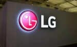
- LG: the letters compose a stylized winking face, part of a friendlier consumer-electronics identity.
Cisco’s logo abstracts the Golden Gate Bridge, a nod to its San Francisco roots and, loosely, to connection. The full backstory behind Apple’s mark sits in our look at why there is a bite in the Apple logo, and it is a decent reminder that negative space does a lot of quiet work in logo design.
How have big tech logos changed over time?
Big tech logos have moved steadily from detailed, skeuomorphic designs toward flat, simplified marks built for small screens and fast recognition. The pattern repeats across nearly every major brand.
Huddle Creative notes FedEx’s flat, modernized refresh contributed to a 20% sales increase, evidence that simplification is not just aesthetic.
From skeuomorphism to flat design
Skeuomorphism mimicked real-world objects with shadows, gradients, and texture. Flat design threw all of that out. Apple went from rainbow stripes in 1977 to monochrome in 1998 to fully flat, while Instagram kept a glossy 3D camera until 2016, then switched to a flat gradient glyph.
The evolution of logos across tech tracks this exact arc, mostly driven by mobile displays where texture just turns to mush. By 2025, an estimated 70% of new logos are expected to follow minimalist principles, according to Linearity’s trend data.
Rebrands that worked and ones that backfired
Not every change lands. StudyFinds reports 53% of major brands that changed their logos initially faced backlash from loyal customers.
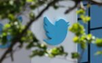
Instagram kept the recognizable camera element and added a gradient, boosting awareness while modernizing. Twitter’s 2023 switch to X threw away one of the most recognized birds in tech, betting enormous existing equity on a hard reset.
SurveyMonkey found 42% of consumers see a brand with a modernized logo as more trustworthy than its previous version, so the upside is real when a rebrand respects what people already loved.
What makes a tech logo effective?
An effective tech logo scales cleanly, works in a single colour, stays memorable within seconds, and looks distinct from competitors. Miss any one of these and the mark starts failing somewhere in the real world.
- Scalable: it has to hold up from a billboard down to a 16px favicon without losing its shape.
- Single-colour safe: if it dies in black-and-white, it will die in an embossed box or a grayscale app state.
- Memorable fast: Crowdspring notes it takes just 7 seconds to form a brand impression, though 5 to 7 exposures before a logo actually sticks.
- Distinct: the whole point is separation from the brand next to it in a crowded app drawer.
Timelessness beats trend-chasing. StudyFinds found brands moving from intricate to simplified marks saw a 21% rise in positive perception, and simpler marks age slower.
Slack’s earlier hashtag logo famously used eleven colours that broke when rotated or resized, and the cleaner redesign fixed exactly these scalability failures. Good logo design principles would have caught that on day one.
Which tech company logos are the most recognized?
The most recognized tech company logos belong to Apple, Google, Microsoft, Amazon, and Meta, the same brands that dominate global brand-value rankings year after year.
Kantar’s BrandZ 2024 report put Apple past a $1 trillion brand valuation, the first brand ever to cross that line, with Google, Microsoft, and Amazon rounding out the top four.
| Brand | Logo type | Standout trait |
|---|---|---|
| Apple | Pictorial | One silhouette, no wordmark |
| Wordmark | Four-colour custom letters | |
| Microsoft | Combination | Four-pane window + name |
| Amazon | Wordmark | a-to-z smile arrow |
| Meta | Abstract | Infinity loop symbol |
The recognition tier
These five marks share one thing: they survive at any size, in any context. Apple’s monochrome fruit needs no name attached, and Amazon’s smile-arrow wordmark works as a full logo or a standalone app glyph. Brand Finance noted Apple grew brand value 74% in a single year while keeping the exact same mark.
Newer entrants building identity
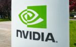
The AI wave produced a fresh batch of tech logos still settling into recognition. Nvidia’s stylized eye symbol jumped alongside a 178% brand-value surge in Kantar’s 2024 data, the fastest riser that year.
Both the OpenAI logo and the Anthropic logo lean on abstract, geometric marks: OpenAI uses a spiralling hexagonal knot, while Anthropic centres on a simple, almost typographic starburst. ChatGPT entered Kantar’s 2026 Top 100 as the highest new entry.
How are tech company logos designed and created?
Tech company logos are created either by in-house design teams or external branding agencies, built as vector files so they scale infinitely without quality loss. The path depends almost entirely on budget and stage.
Netflix, Airbnb, and Google run internal design groups, often partnering with a foundry for custom type work. Pentagram, Wolff Olins, Landor, and Siegel+Gale handle the big strategic rebrands for funded and enterprise clients.
The tools behind the work
Vector software is the standard, because a logo has to redraw cleanly at every size. Adobe Illustrator is the long-running default for vector graphics and precise curve control, while Figma is now widely used for collaborative logo and interface work. Files ship as SVG so the same mark renders sharp on a watch face and a billboard.
What it costs
Price swings wildly by who does the work. A freelance logo runs roughly $500 to $5,000, per Splash Creative. Agency identity systems land at $8,000 to $20,000 for the logo component inside a broader $15,000 to $40,000 engagement.
DesignRush pegs global enterprise brand packages with multiple touchpoints at $100,000 to $250,000+, the tier where Pentagram-level firms operate. Enterprise rebrands run $30,000 to $100,000-plus even at the entry of that band, per AgencyPro.
Are tech company logos protected by trademark?
Tech company logos are protected as registered trademarks, which stop competitors from using a confusingly similar mark on similar products or services. Copyright covers a logo automatically, but only against exact copying. Trademark is what actually guards brand recognition.
The Rapacke Law Group notes design marks make up 36% of all USPTO trademark applications, and a logo needs its own filing separate from the brand name.
Why you cannot reuse these marks
Registering a logo with the USPTO or EUIPO locks in exclusive rights within its class. The owner can sue infringers, use the ® symbol, and claim nationwide protection, which is why you cannot slap the Apple silhouette or a near-copy on your own product without inviting a lawsuit. LegalZoom notes filing a mark in black and white gives broader protection, since it covers the logo in any colour you later use.
Registration reality
Getting a mark through is not automatic. Nearly 57% of applications receive an Office Action, per Rapacke, which is why most filers use an attorney. USPTO filing fees start at $350 per class, and a single-class registration with professional help commonly runs $1,250 to $3,000. Federal registration also opens international protection through the Madrid Protocol across 130-plus countries.
Fair use limits
Trademark does not block everything. Editorial, educational, and commentary uses of a logo are generally allowed: showing the Google logo in an article about Google is fine. Using it to imply endorsement, or on merchandise that competes with the brand, is not. The line is consumer confusion.