

The Tencent Logo History, Colors, Font, and Meaning
Imagine unraveling the DNA of a digital giant, thread by digital thread. That’s the essence of the Tencent logo—a symbol representing China’s tech prowess, a visual handshake from an empire invisible in the airwaves yet omnipresent in the digital realm.
This isn’t just about splashes of color or clever design; it’s about the heartbeat of an Asian multinational conglomerate.
Whether you’ve exchanged pleasantries on WeChat or lost yourself in the immersive universes of Tencent Games, that logo signifies a portal to alternate realities fashioned by bytes and business savvy.
Here, grasp the strategic interplay between corporate identity and user interface icons.
We’ll delve deep into the evolution of visual branding elements—how the Tencent symbols have morphed to embody a narrative of agility and innovation.
By the curtain’s fall, you’ll be enlightened on the art of molding an icon that breathes life into the ethereal body of a brand.
From the significance of color schemes to the whispers of intellectual property rights, unravel the layers that make a logo legendary.
The Meaning Behind the Tencent Logo
![]()
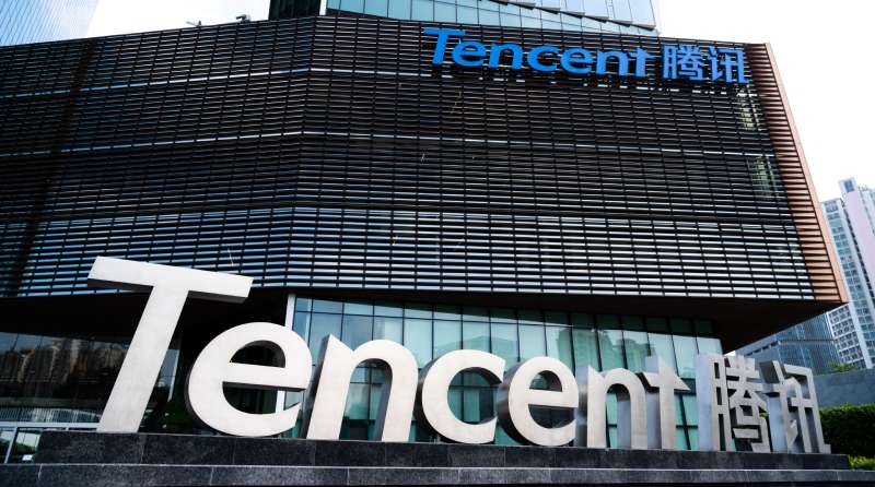
The Tencent logo epitomizes the company’s commitment to innovation, protection, and a professional ethos. Despite being a powerhouse in China, Tencent’s global aspirations are evident in its English main logo.
A significant arm of Tencent, Tencent Games (part of Tencent Interactive Entertainment Group), stands tall as the world’s premier gaming company, based on its expansive investments.
Its latest brand identity captures the essence of “Spark More,” visually represented by a luminous, fiery spark. This refreshed branding accentuates the joy of online gaming, the connections it nurtures, and the passion and inspiration it fuels.
The History of the Tencent Logo
![]()
Now, let’s take a step back in time. A trip to when Tencent was a budding tech startup. Let’s walk through the evolution of its logo and how it has kept up with the times.
From Humble Beginnings
In the early days of Tencent, their logo was rather simple. It consisted of just the company’s name in bold, block letters. No frills, no distractions, just their name, out there in the world.
This simplicity reflected their initial mission – to create straightforward, effective technology solutions.
Adoption of the Penguin
The penguin was introduced in the logo in 2001. It was not just a design choice, but also a strategic move.
The year marked Tencent’s entry into the social networking space with QQ, and the introduction of the friendly, approachable penguin was a way to appeal to a broad audience. It was an attempt to personify the company’s commitment to building communities.
The Colors of the Tencent Logo
Color can evoke feelings, associations, and responses. The Tencent logo uses a tastefully simple color palette to get its message across.
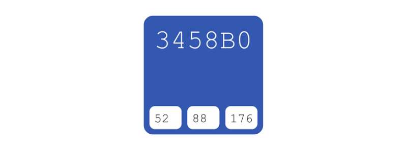
Power of Blue
The primary color in the Tencent logo is blue, a color often associated with trust, dependability, and stability. Tencent wants to project itself as a reliable and trustworthy technology company, and the color blue helps to visually communicate this to the audience.
Touch of Red
The small, red scarf around the penguin’s neck adds a pop of color. Red signifies passion, energy, and action. This little touch of red represents Tencent’s relentless pursuit of innovation and its commitment to taking bold, passionate steps in the tech industry.
The Font Used in the Tencent Logo
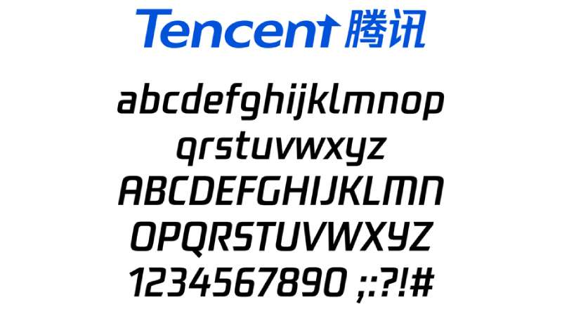
Fonts have their own language and can silently communicate a brand’s personality. The font used in the Tencent logo has a tale to tell.
The Story of Simplicity
The font used in Tencent’s logo is simple and unassuming. It has clean lines and sharp edges, reflecting the company’s straightforward approach to problem-solving and innovation. It’s a visual hint that they provide clear, effective technology solutions.
The Logo’s Role in Tencent’s Brand Identity
The Tencent logo does more than just identify the company. It plays a crucial role in building and maintaining Tencent’s brand identity.
A Promise of Trust
Every time users see the logo, they see a symbol of trust. The logo embodies Tencent’s promise to provide reliable and trustworthy tech services. It’s a visual pledge of commitment to their users.
A Bridge to Users
The logo serves as a bridge between Tencent and its users. It’s more than a symbol—it’s a tool of communication.
It resonates with the users, makes them feel a part of the Tencent community, and fosters a sense of belonging. It’s a friendly penguin inviting users to be a part of their virtual colony.
The Influence of the Logo
Tencent’s logo is not just a mere design, but an influencer. It subtly affects the way people perceive the brand and engage with it.
An Instigator of Trust
The carefully chosen colors and the simple yet expressive penguin symbol in the Tencent logo instigate a sense of trust among the users. It reassures them that they are in good hands, creating a positive image of the brand.
A Catalyst for Engagement
The friendly and familiar penguin makes users feel comfortable and welcomed, leading to increased user engagement. It’s not just a logo—it’s Tencent’s friendly face to the world. It’s a catalyst that stirs up interaction and engagement on their platform.
The Global Recognition of the Tencent Logo
Tencent’s logo is not just known in its home country, China, but it has marked its presence globally. Let’s take a look at how it achieved this.
An Icon of Innovation
Tencent’s reputation as an innovative tech company has turned its logo into an icon of innovation. The sight of the penguin logo is enough to evoke thoughts of advanced tech solutions and cutting-edge innovation in the minds of tech enthusiasts around the globe.
A Universal Symbol
Although the logo is rooted in Chinese culture, its meaning is universal. The values it represents—community, patience, trust—are universally recognized and appreciated. This universality has played a vital role in gaining global recognition for the Tencent logo.
There you have it—a deep dive into the world of Tencent’s logo. It’s a tale of strategic design decisions and a constant evolution to keep up with the changing times.
The Tencent logo is more than just a logo—it’s a visual story that speaks of the company’s journey, its values, and its commitment to its users.
FAQ On The Tencent Logo
What’s the Story Behind the Tencent Logo?
Picture this: a globe, signifying boundless reach, and typography that’s neat yet dynamic. Tencent’s logo echoes its corporate identity: an emblem of interconnectivity.
The simplicity hides deep roots in the company’s philosophy—a seamless digital ecosystem mirroring our world.
Is the Penguin in Tencent’s Logo Symbolic?
Absolutely. That little penguin, swinging a scarf, isn’t just adorably iconic; it humanizes the brand. It’s reflective of Tencent’s popular messaging service, QQ, suggesting a friendly, approachable vibe.
Ingenious, isn’t it? Injecting personality into a multimedia conglomerate—not just a cold, faceless entity.
How Has the Tencent Logo Evolved Over Time?
It’s about subtlety. Tencent’s insignia hasn’t done backflips across the years. The evolution is in the finesse—the crispness of font, the depth of color. It mirrors the transformative journey from a modest start-up to a gaming company titan of global acclaim.
What Do the Colors in the Tencent Logo Mean?
Dive into blue, deep as an ocean, symbolizing depth, stability, tech-savvy sophistication. It’s their canvas of trust and reliability. Red, though less prominent, is about passion and action.
The Tencent colors are a masterstroke in visual storytelling—graphical design in logos is no play of chance.
How Often Has Tencent Redesigned Its Logo?
Guess what? Not so often. Tencent strikes as a steady ship, choosing to revamp its visual identity just once in a significant way since its inception. It’s a testament to their original design’s foresight, resonating with users and lasting longer than most in the volatile tech arena.
Why Does Tencent Use a Globe in Its Logo?
Think global. Tencent’s emblem, cradling the globe, isn’t shy about its aspirations. It’s a nod to the company’s ambitions beyond its Shenzhen headquarters—a tech empire that embraces innovation sans borders.
The globe isn’t just geography; it’s a philosophy, a silent manifesto of a digital conqueror.
How Does the Tencent Logo Impact Brand Recognition?
Imagine you’re scrolling—a sea of logos, yet one beckons. Tencent’s logo is the whisper you can’t ignore. It’s more than an icon; it’s a fingerprint, unique in the crowd, boosting brand recognition, etching itself in memory. It’s the silent ambassador of the whole shabang.
What Are the Intellectual Property Rights Around the Tencent Logo?
This one’s heavyweight—laws and paperwork. Tencent’s insignia is trademarked, securing it in intellectual property rights jargon. It’s locking treasure in a vault.
Whether it’s for online advertising or user interface icons, this is Tencent waving the ‘do-not-touch’ sign—legally speaking, of course.
How Does the Tencent Logo Reflect Its Business Diversification?
Look at it: simple, yet covering more ground than you could trek. A visual metaphor for Tencent’s dive into uncharted sectors—digital marketing, AI, entertainment.
It holds its own, standing tall amid varying contexts. It’s a logo that’s dynamic—think chameleon, shifting hues across a corporate branding landscape.
What Is the Global Perception of the Tencent Logo?
On a global stage, think of Tencent’s logo as a handshake, where East meets West. It’s familiarity mixed with curiosity.
A Chinese technology company flagbearer, the logo’s cradled globe rings in international ears, unveiling brand equity that sneaks up, unannounced but not unnoticed, on the world market.
Conclusion
Twirling to the closing notes here, it’s clear—the Tencent logo isn’t just a splash of blue and a globe. It’s the banner for an Asian corporate powerhouse, whispering epic tales of pixels and possibilities, thrusting into territories as vast as gaming and intimate as messaging threads.
Let’s be real, this emblem is like an old friend in the digital sprawl, familiar yet cloaked in business acumen. It dances between the tug of tradition and the pulse of innovation, a multimedia conglomerate’s face that has calmly sailed through the tsunami of tech brand revolutions.
If anything, this journey through Tencent’s visual saga lays down one truth: logos, like legends, are crafted, not born. They grow into their aura, one colour choice and typeface tweak at a time, building brand recognition in silent, steady strikes. Carry this with you: every pixel holds power, every curve carries a conversation. The Tencent logo—it’s a story, it’s a strategy, unspoken yet understood.
If you liked this article about the Tencent logo, you should check out this article about the Lenovo logo.
There are also similar articles discussing the Dropbox logo, the Alphabet logo, the Panasonic logo, and the Huawei logo.
And let’s not forget about articles on the Qualcomm logo, the Fujitsu logo, the Baidu logo, and the Booking logo.
Bogdan Sandu, a seasoned designer with 15 years of diverse experience, has been designing websites since 2008.
Renowned for his expertise in logo design and visual branding, Bogdan has developed a multitude of logos for various clients.
His skills extend to creating posters, vector illustrations, business cards, and brochures. Additionally, Bogdan's UI kits were featured on marketplaces like Visual Hierarchy and UI8.
Latest posts by Bogdan Sandu (see all)
- The Red Stripe Logo History, Colors, Font, And Meaning - 9 May 2024
- Tie the Knot: Romantic Wedding Color Palettes - 9 May 2024
- Game Show Typography: What Font Does Jeopardy Use? - 9 May 2024