The Dropbox Logo History, Colors, Font, and Meaning

Imagine this: You’re scrolling past a sea of icons, hunting for that one digital lifeline to store your world of bytes and bits. Then you spot it—the Dropbox logo, a beacon of connectivity.
This symbol? It’s not just a splash of blue and white. It weaves a story of cloud storage and digital asset management, speaking volumes without uttering a word.
As a visual identifier for Dropbox, Inc., it transcends its simplistic design, becoming synonymous with file synchronization and effortless file sharing.
Here’s the scoop: I’ll unpack the layers behind this ubiquitous cloud storage icon.
From its conception by co-founders Drew Houston and Arash Ferdowsi to its symbolic representation as a sync folder emblem, the Dropbox logo carries with it a reputation built on user-friendly design and the promise of digital collaboration within the Software as a Service or SaaS realm.
By article’s end, expect clarity. You’ll have a newfound appreciation for how this icon impacts branding elements, user experience, and the core values of simplicity and efficiency in design.
Stay tuned. The story of the visual identity of Dropbox and its evolution is just as riveting as it is enlightening.
The Meaning Behind the Dropbox Logo
![]()
Oh, the Dropbox logo. You know the one. That simple box, seemingly hovering on the brink of the impossible, balancing delicately on one corner.
There’s something about it, right? Makes you feel connected, grounded, but still light, almost ethereal. Let’s dive in and see why that is.
A Portal to Possibilities
Ever thought about it? This logo isn’t just a box, it’s a portal. Yes, you heard me right, a portal. You know, like those things in sci-fi movies that teleport you to different worlds.
This box is your gateway to countless files, folders, memories, and opportunities. It’s a symbol of what the cloud can offer, the freedom to access and share your stuff anywhere, anytime.
The Unity and Balance
The balance! That’s right, balance. It’s not just for yoga, my friends. See how that box sits perfectly on its corner? That’s Dropbox telling you that it can handle your digital load, no sweat.
But it’s more than just balance, it’s unity. The four sides coming together, representing how Dropbox brings people and their stuff together.
The History of the Dropbox Logo
![]()
Now, we’re going back in time, to where it all began.
The Evolution
This logo has been on quite the journey. It started as a simple, literal box, open at the top. This was way back in the early days of Dropbox, around 2007 when they were first getting started.
As Dropbox grew and expanded, so did its logo. By 2013, it had morphed into the abstract, balanced design we know today.
A Symbol of Progress
But why the change? Well, the answer’s quite interesting. Dropbox wasn’t just storing files anymore. They were connecting people, sparking collaborations, and enabling creativity. They needed a logo to reflect that, to show their progress, their evolution.
The Colors of the Dropbox Logo
![]()
Enough history. Let’s talk colors. The logo may look simple with its blue on white, but let’s break it down.
The Power of Blue
The color blue is deeply symbolic, filled with meaning. It represents trust, loyalty, wisdom, confidence, and truth. It’s like a visual hug, reassuring users that their stuff is safe and secure with Dropbox.
The White Space
Then, there’s the white. It’s clean, it’s fresh, it’s uncluttered. Just like the user experience Dropbox strives to provide.
The Font Used in the Dropbox Logo
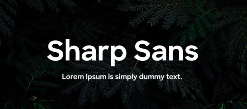
Let’s shift gears a bit and talk about fonts. What’s in a font, you ask? Oh, so much!
Simplicity and Legibility
The Dropbox logo utilizes a custom typeface, named Sharp Sans. It’s clean, it’s simple, it’s easily readable, just like the brand itself. Its rounded shapes complement the boxy icon, creating visual harmony.
The Space Around the Dropbox Logo
Alright, onto our bonus section. It’s not just about the logo itself, it’s also about the space around it. Let’s see why.
A Breathing Space
Dropbox’s logo is always surrounded by generous white space. This is intentional. It gives the logo room to breathe, helps it stand out, and ensures that nothing else distracts from it.
Creating Focus
The white space also draws your eye directly to the logo. It creates focus, pulling you in and making the logo the center of attention. Quite the clever design trick, isn’t it?
The Logo Adaptability
We live in a world that changes at breakneck speed, right? And your brand needs to keep up. That’s why adaptability is key.
A Universal Language

The Dropbox logo is as flexible as they come. It’s got this universal appeal. Be it on a mobile app, a desktop site, or a massive billboard in the heart of a bustling city, it fits right in.
Ready for Anything
The logo, with its simple design and stark contrast, can stand against any background, any platform. It is designed to adapt, to transform, and to blend seamlessly wherever it is placed.
The Psychology of the Dropbox Logo
Did you ever think about why this logo appeals to you? There’s a lot more to it than you might realize. Let’s find out.
Engaging the Senses
First off, there’s the aspect of sensory design. The simple, clean look and the calming blue color engage your senses, providing a visually appealing and comforting experience.
Triggering Emotions
Moreover, the logo also works on a psychological level. It’s designed to trigger positive emotions and associations, such as trust, reliability, and creativity.
Whew! That was quite a journey, wasn’t it? From meanings to colors to the psychology, the Dropbox logo is a design marvel packed with nuances.
It’s more than just a logo, it’s a symbol, an experience, a story. And what a fascinating story it is!
FAQ On The Dropbox Logo
Who designed the Dropbox logo?
Pulled straight from the design world’s lore, the original Dropbox logo was crafted by Jon Ying, a buddy of co-founder Drew Houston.
Their teamwork mirrored the seamless sync users feel when sharing files. Gone through iterations, yes, but its soul remains, echoing Dropbox, Inc.‘s ethos of connectivity.
What does the Dropbox logo represent?
Here’s the gist: A box, but not just any—this box is open, inviting. It symbolizes an ever-ready home for your digital keepsakes. Beyond cloud storage, it signifies a safe haven, almost whispering, “Drop your stuff here; we’ll keep it cozy and synced. Trust.”
Has the Dropbox logo ever changed?
Oh, has it ever. It shifted gears, keen to stay relevant in the swiftly changing digital terrain. Gone are the days of the thick, chunky emblem.
Now, it’s all sleek lines, typifying Dropbox’s brand image evolution—a nod to modernity and a future of streamlined digital asset management.
Why does the Dropbox logo mostly use blue?
Blue’s the wingman of trust and calm in the color psychology scene. Dropbox swears by it to radiate reliability—crucial vibes when we’re talking file synchronization and personal data. It’s no random choice; it’s deliberate, signaling a serene spot in the cloud chaos.
How often has the Dropbox logo been updated?
The tales of updates aren’t bard-song-frequent, but pivotal they’ve been. Twice it’s morphed significantly—a testament to Dropbox’s visual identity staying dynamic, mirroring how the platform itself evolves.
First, subtle. Then, clear-cut in 2017. Reflecting user experience paradigms in digital collaboration spaces.
Is the Dropbox logo trademarked?
You bet. It’s not only an icon, it’s legal muscle, too. Wrapped up in intellectual property law, Dropbox ensures their sync folder emblem is under lock and key. It’s business, after all. They wouldn’t let their symbolic branding elements float around unguarded, would they?
Can I use the Dropbox logo on my website?
Now that’s flirting with a grey area. Dropbox does have a brand guidelines page. If it’s for promoting shared files or as an integration point, sure, but always check the do’s and don’ts first.
They’re particular about their brand identity representation to maintain that visual consistency.
What message does the Dropbox logo convey to its users?
Think of it as Dropbox making a promise: “Your content is safe, accessible, ready to be shared or synced, wherever you go.”
It’s an oath emblazoned in blue, reassuring every user of the tool’s user-friendly design and unwavering dedication to smooth digital asset management.
Is the Dropbox logo considered effective in its design?
In the design circles? It’s a definite ‘yes.’ Minimalist, sure, but packing a punch. It’s memorable. It’s versatile. And in the app-laden world at our fingertips, it holds its ground—distinctly Dropbox yet universally understood as a go-to for file sharing and online storage.
What’s the future for the Dropbox logo?
Only the design gods know for sure. But buzz is, it’s likely to keep its core while adapting. Expect it to stay current with design trends, nodding to users’ growing needs in the SaaS industry, without losing grip on that recognized visual communication it’s known for.
Conclusion
So, here we are, closing the lid on this exploration of the Dropbox logo. It’s more than an icon; it’s a digital pillar—a compact capsule of ideas embodied in blue. Now, stow away these takeaways:
- Dropbox, it’s not just gear in the cloud storage machine.
- This simple box stands as a symbol of digital asset management done right.
- An online storage solution that whispers, “Keep calm, I’ve got your back.”
As trends trot ahead, and platforms adapt, this emblem’s bound to morph, yet its essence? Rock solid. It’s stitched into the fabric of file synchronization, of seamless sharing and digital collaboration—a sync folder emblem for the modern web navigator.
What started as a dive into the aesthetics of a corporate logo became a journey through brand identity, evolution, and a promise of peace in the digital whirlwind.
Take a minute, the next time that blue box pops up. It’s got depth—a whole story, tucked right inside.
If you liked this article about the Dropbox logo, you should check out this article about the Lenovo logo.
There are also similar articles discussing the Alphabet logo, the Panasonic logo, the Huawei logo, and the Qualcomm logo.
And let’s not forget about articles on the Fujitsu logo, the Baidu logo, the Tencent logo, and the Booking logo.
Bogdan Sandu, a seasoned designer with 15 years of diverse experience, has been designing websites since 2008.
Renowned for his expertise in logo design and visual branding, Bogdan has developed a multitude of logos for various clients.
His skills extend to creating posters, vector illustrations, business cards, and brochures. Additionally, Bogdan's UI kits were featured on marketplaces like Visual Hierarchy and UI8.
Latest posts by Bogdan Sandu (see all)