A mouthwash brand invented a medical condition, then sold the only cure. Listerine ads pulled that off in 1921, and the halitosis campaign still shapes how oral care gets advertised.
The archive runs from Lambert Pharmacal magazine spreads to Kenvue’s New Year’s Eve broadcast takeovers. Multiple agencies, dozens of markets, one repeating structure.
This page covers the campaigns with names, years and agencies attached, plus the design decisions behind them:
- Flagship print and TV campaigns from 1921 to today
- Layout, typography and palette analysis of the print work
- Taglines, agencies and strategic shifts by decade
By the end you will know why the bottle sits bottom right, small, and why that placement kept working for a century.
Listerine advertising spans 105 years of consumer campaigns, from the 1921 halitosis print ads to the “Fresh Start Feeling” blitz that opened 2025. The work runs on one repeating device: name a social risk, then sell the rinse that removes it.
This page covers the campaigns by name, with the agency, year and market behind each, plus the layout, type and color decisions that make the ads read fast on a magazine page.
Listerine Advertising at a Glance
Listerine has advertised directly to consumers since 1921, working with Lambert & Feasley, J. Walter Thompson, BBDO and FCB. Its best-known campaigns are the halitosis series, “The Taste You Hate, Twice a Day” and “Bring Out the Bold.” The visual signature combines amber liquid, clinical white space and a heavy logotype.
| Attribute | Value |
|---|---|
| First major campaign | Halitosis series, 1921, Lambert Pharmacal Company |
| Lead agencies | Lambert & Feasley (1920s), J. Walter Thompson (2015-2019), BBDO and FCB (Kenvue era), WPP (from December 2025) |
| Best-known taglines | “Often a bridesmaid, but never a bride”; “The taste you hate, twice a day”; “Kills germs that cause bad breath” |
| Primary media | Magazine print, radio, network TV, OOH, digital, in-game |
| Primary markets | United States, United Kingdom, Brazil, India, China, APAC |
| Landmark ruling | FTC corrective advertising order, 1975, upheld on appeal 1977 |
| Visual signature | Amber liquid, blue-green mint palette, white clinical ground, bottle as hero |
| Recurring copy device | Fear appeal plus social testimonial |
Which Listerine Ad Campaigns Are the Most Famous?
Six campaigns define Listerine advertising: the halitosis series (1921), the cure-all claims (1927-1975), “The Taste You Hate, Twice a Day” (1970), “Feel Every Smile” (2015), “Bring Out the Bold” (2016) and “Fresh Start Feeling” (2024).
The Halitosis Campaign (1921-1930s)
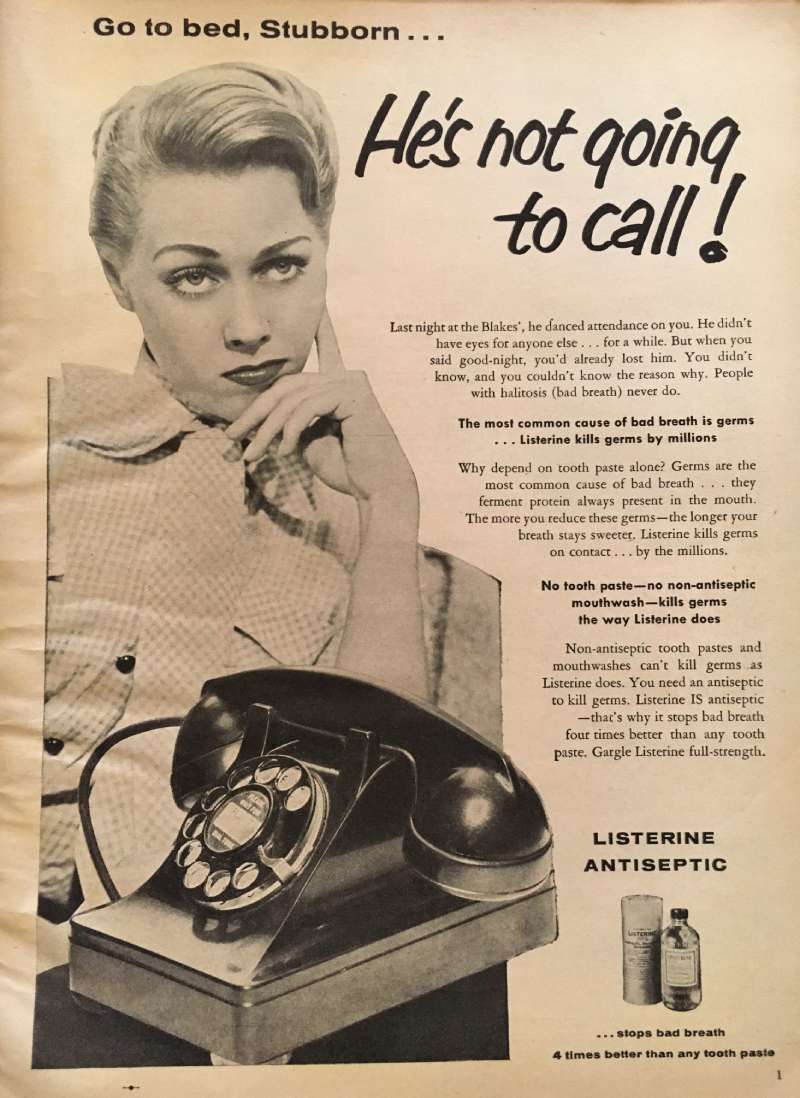
The halitosis campaign ran in American magazines from 1921, written by copywriters Milton Feasley and Gordon Seagrove for Lambert Pharmacal. Gerard Lambert paired the Latin “halitus” with the suffix “osis” and turned bad breath into a named condition. The recurring line: “Often a bridesmaid, but never a bride.”
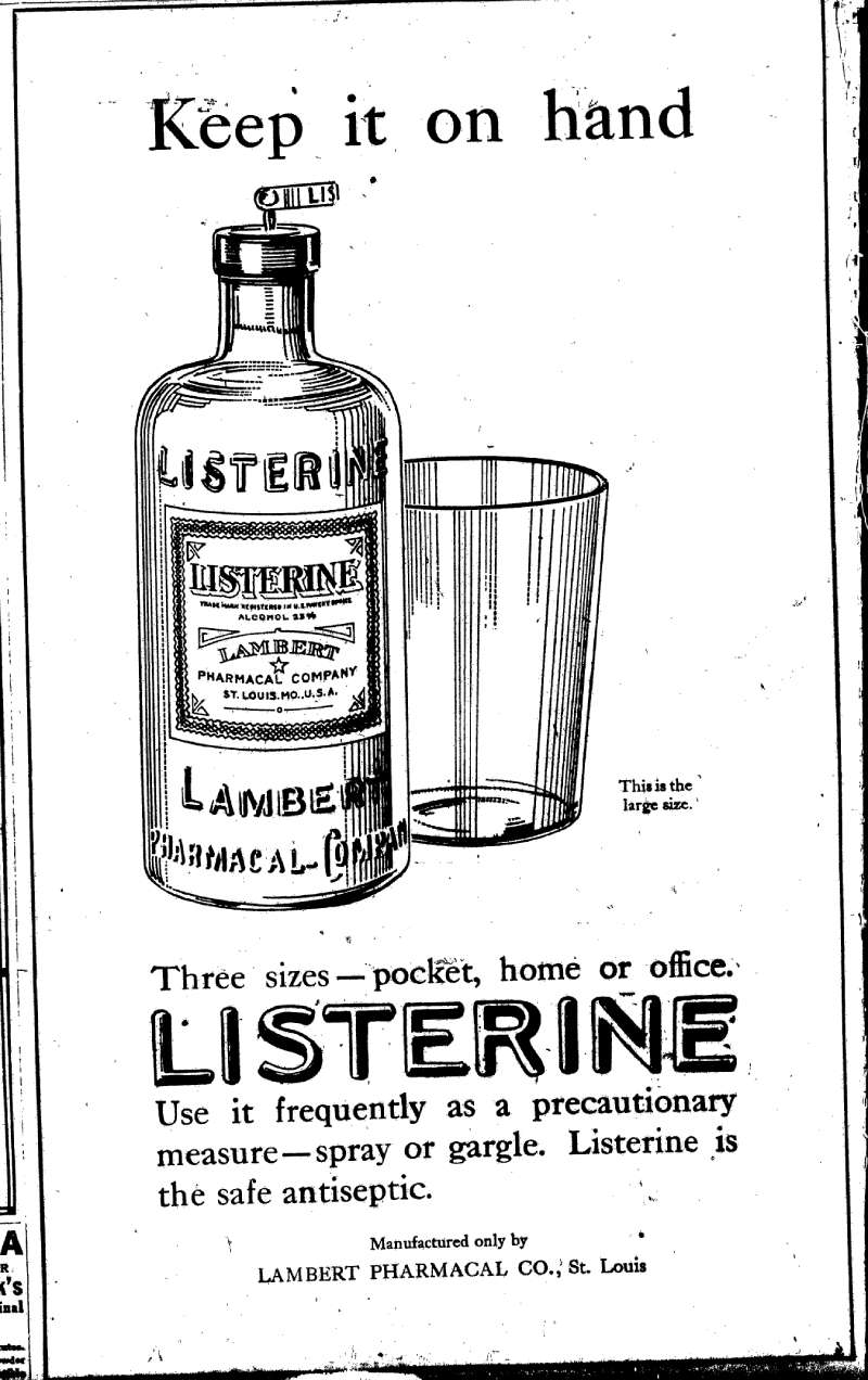
Layout was a single photographic or illustrated vignette, a serif display headline running full measure, and four to six inches of body copy set in a narrow column. The bottle appeared small, bottom right. The face of the rejected woman carried the whole ad.
Lambert Pharmacal’s revenues climbed from $115,000 to more than $8 million in seven years, and by the late 1920s Listerine was the third-largest print advertiser in the United States.
The Cure-All Claims and the FTC Order (1927-1978)
What the ads promised:
- Dandruff: scalp application ads ran from the 1930s into the 1950s
- Colds and sore throats: gargle-before-you-catch-it copy, running from 1921
- Aftershave, astringent, deodorant: added between 1921 and 1929
- Cigarettes: a Listerine-branded pack, launched 1927
The FTC filed its complaint in 1972 and ordered corrective advertising in 1975. Warner-Lambert had to spend roughly $10 million, about one year of budget, on ads carrying the line that Listerine will not help prevent colds or sore throats.
The Taste You Hate, Twice a Day (1970-1983)

A weakness reframed as proof.
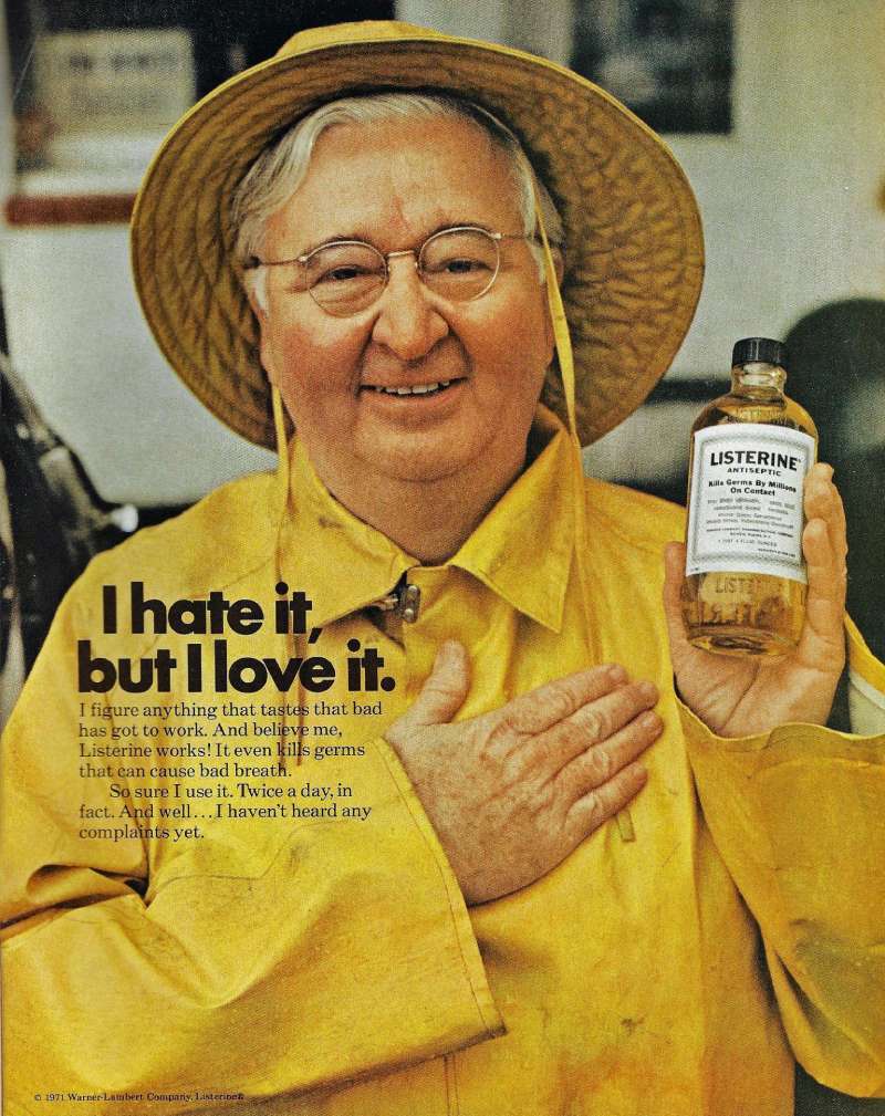
Agencies promoted Listerine in 1970 with “The taste you hate, twice a day,” selling the sting as evidence the antiseptic worked. By 1983 the halitosis language had given way to “Listerine fights plaque,” a shift toward dental claims rather than social ones.
Scope used the opening. Procter & Gamble’s ads implied that a medicinal taste leaves a medicinal smell, which reframed Listerine’s own boast as a liability.
Feel Every Smile and the Smile Detector (2015)
J. Walter Thompson London built the Listerine Smile Detector app to launch Advanced White mouthwash in the United Kingdom, Ireland, Germany, the Netherlands and South Africa. The app reads a smile at up to 5 metres and answers with a beep or a vibration.
Oscar-nominated director Lucy Walker shot the supporting film “Feel Every Smile” through Pulse Films, featuring four blind participants. Creatives Will Helm and Will Brookwell built the campaign around a single claim about the power of a smile.
The Royal National Institute of Blind People endorsed the app, and D&AD ran the work as a social good case study.
Bring Out the Bold (2016-2019)

Johnson & Johnson launched “Bring Out the Bold” on 4 April 2016 across more than 80 countries, built by J. Walter Thompson from a survey of 6,000 people in six Asian markets. The positioning: Listerine users take more risks than non-users.
Execution ran wide. Commercials, pre-roll, out of home, radio and print, plus a Union Square sampling stage in New York with Biz Markie that drew more than 10,500 participants.
Gramercy Park Studios produced the animated inserts for the 2016 spots on a four-color palette, keeping the infographic sequences readable against the live action.
Listerine Print Ads From Latin America and Asia
Regional work carries the sharpest art direction in the brand’s recent archive.
| Campaign | Agency | Market | Year |
|---|---|---|---|
| Western, Box, Baseball | BBDO Chile | Chile | 2014 |
| Breathcalypse | Wunderman Thompson Brazil | Brazil | 2022 |
| Listerine Your Routine | Blink Digital | India | 2023 |
Breathcalypse put bad breath inside an open-world game as green smoke, with vending machines stocking the product in the virtual city of Complexo.
How Do Listerine Print Ads Work Visually?
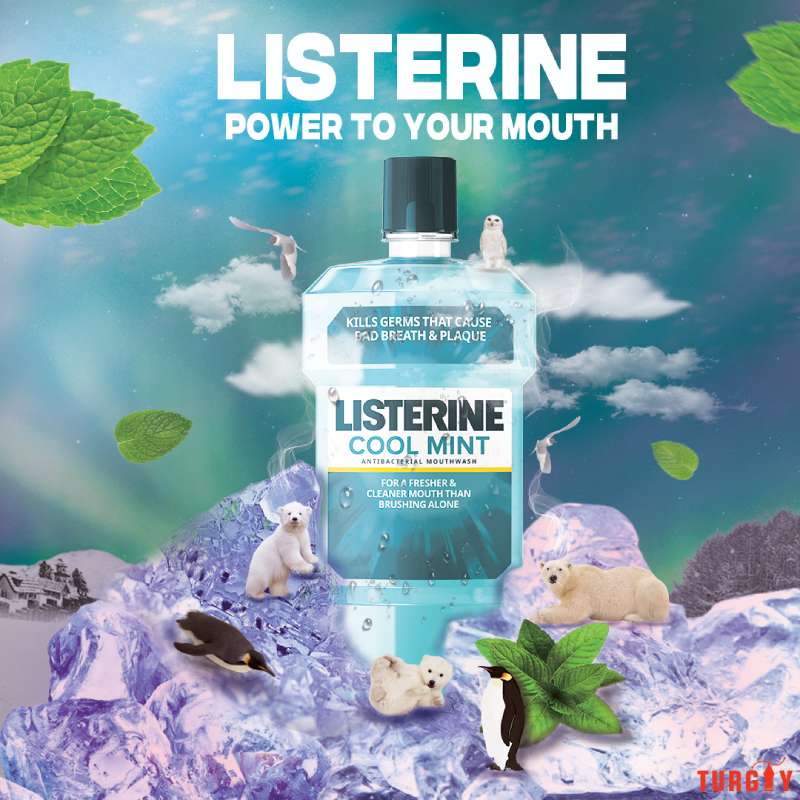
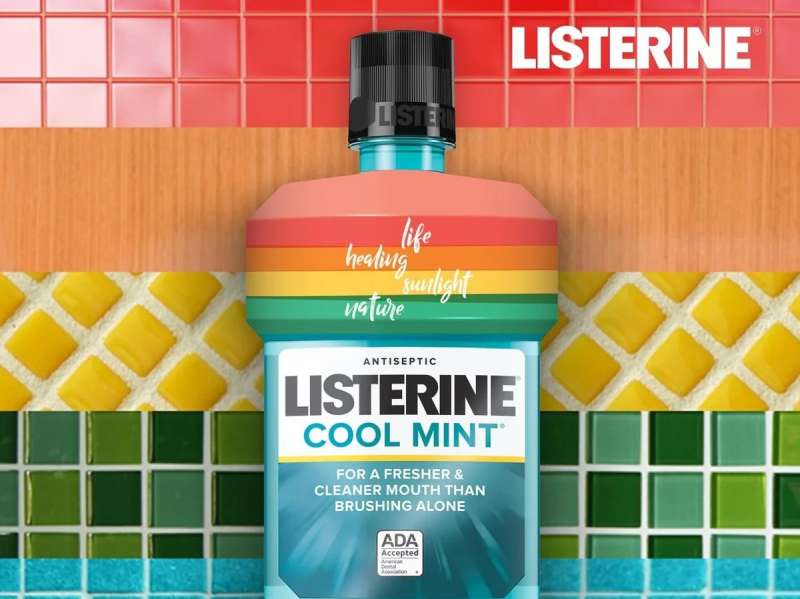
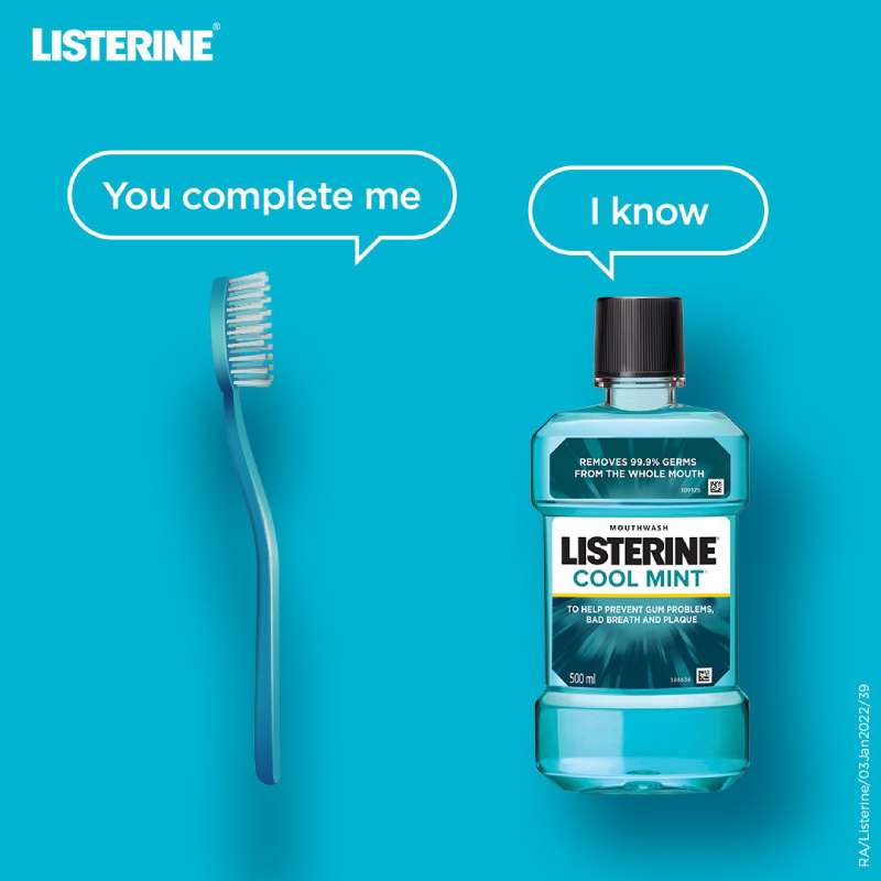
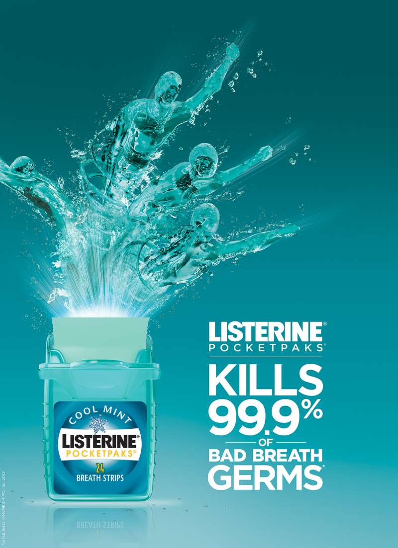
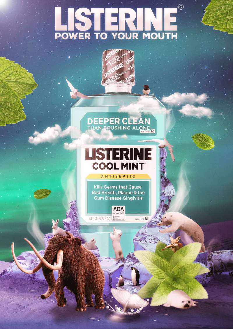
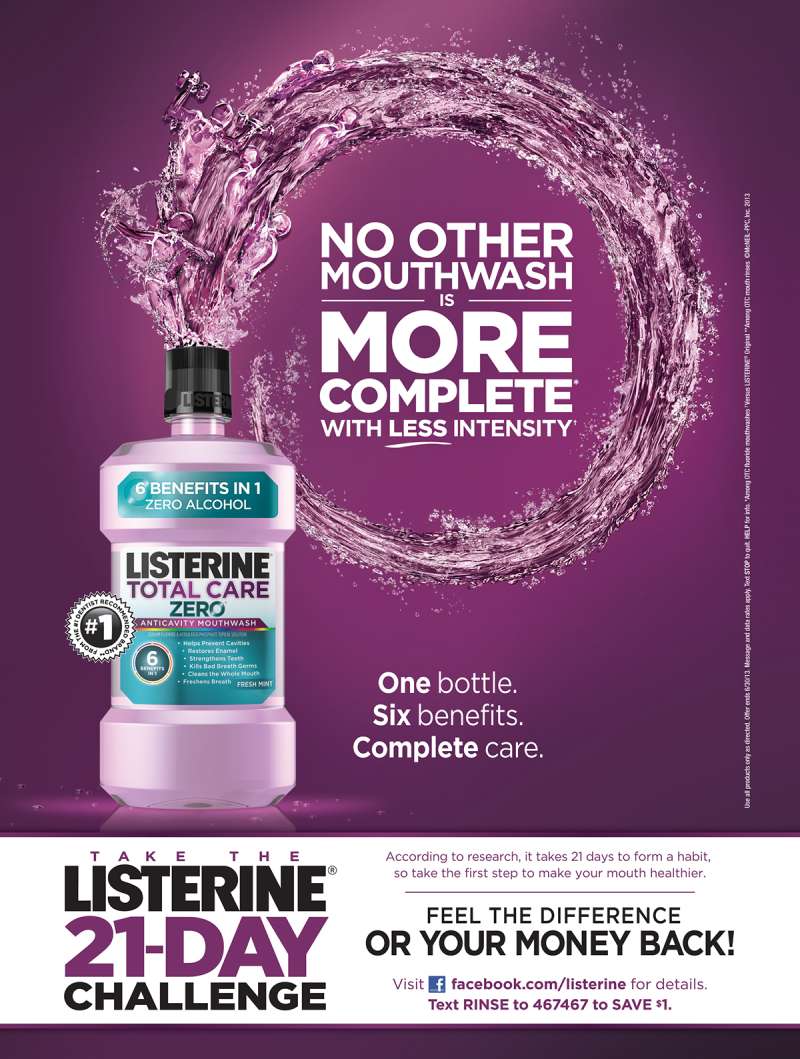
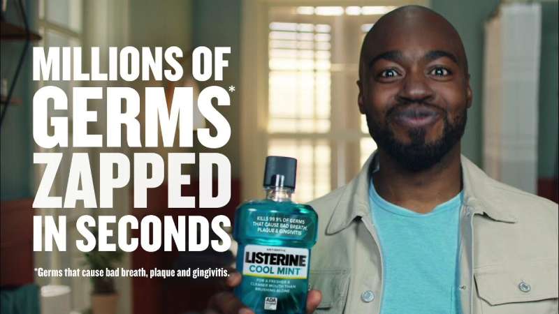
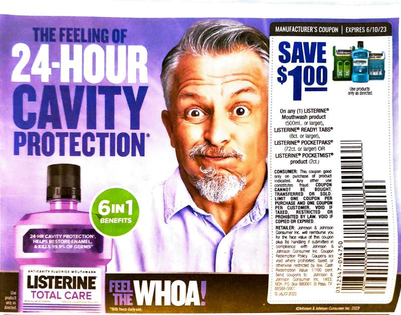
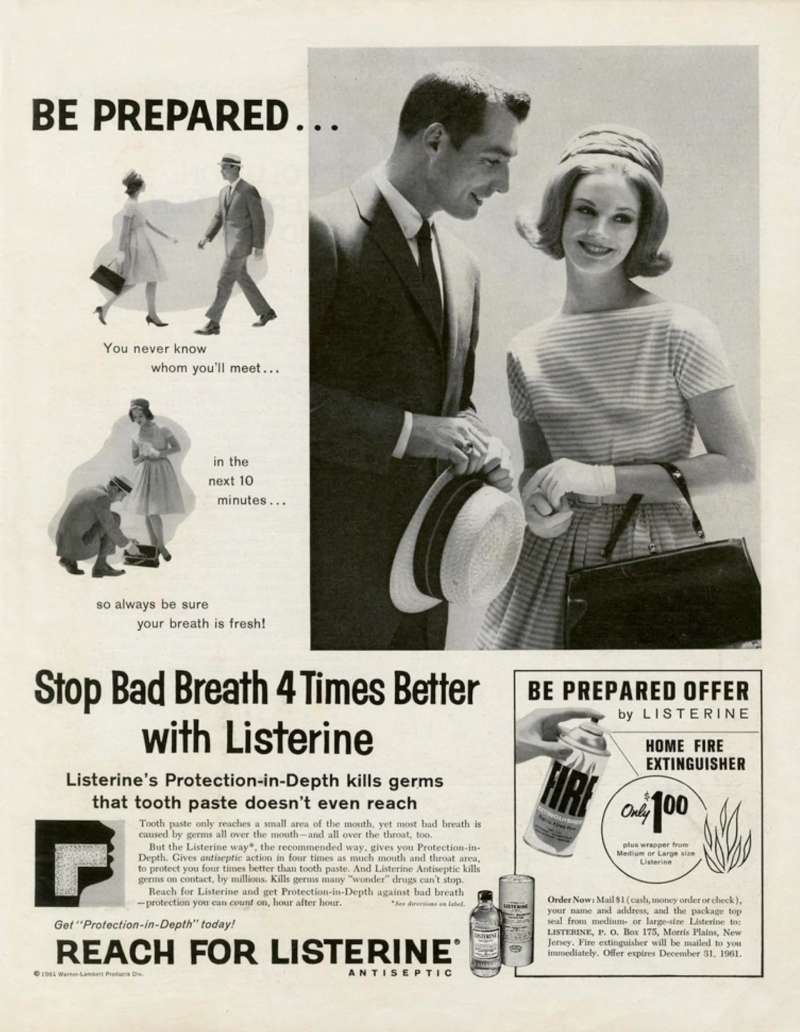
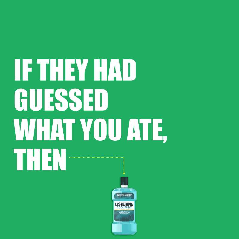
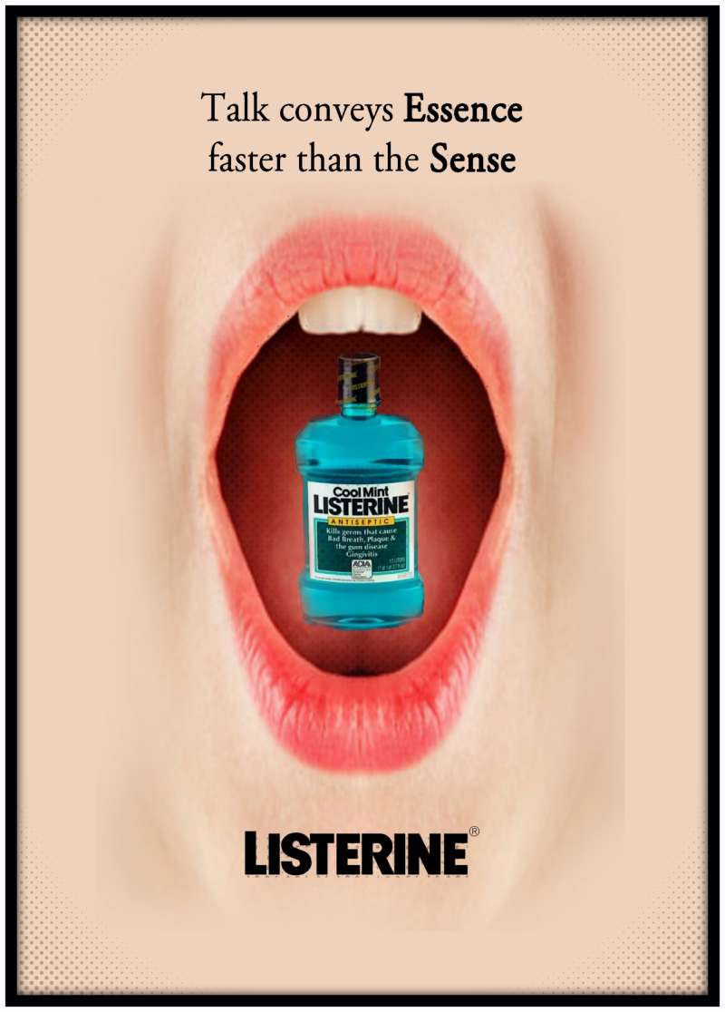
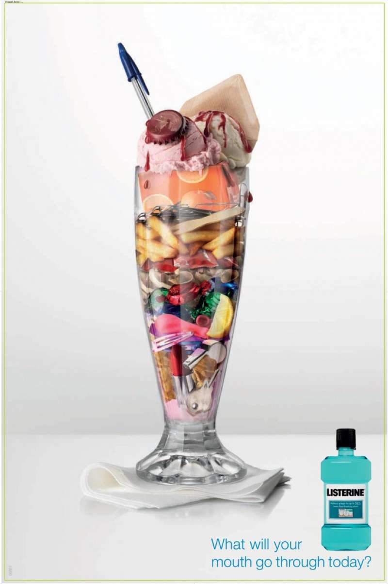
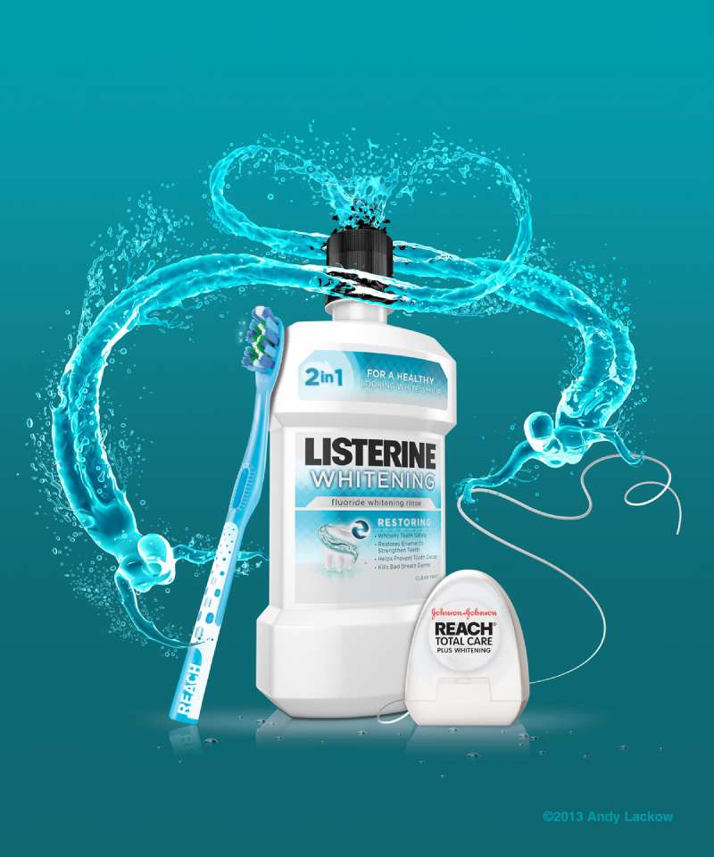
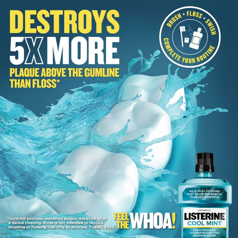
Listerine print ads use a three-part structure: a human face or mouth as the focal image, a short accusatory headline, and the bottle placed low and small. Color does the identification work, since the amber and blue-green fills are recognizable before any word is read.
The visual hierarchy almost never puts the product first. Face, headline, copy, bottle. That order held from 1921 through the 2016 global work.
The 1920s layouts filled the page. Body copy ran long, images were tightly cropped, and margins were thin, which matched magazine conventions of the period.
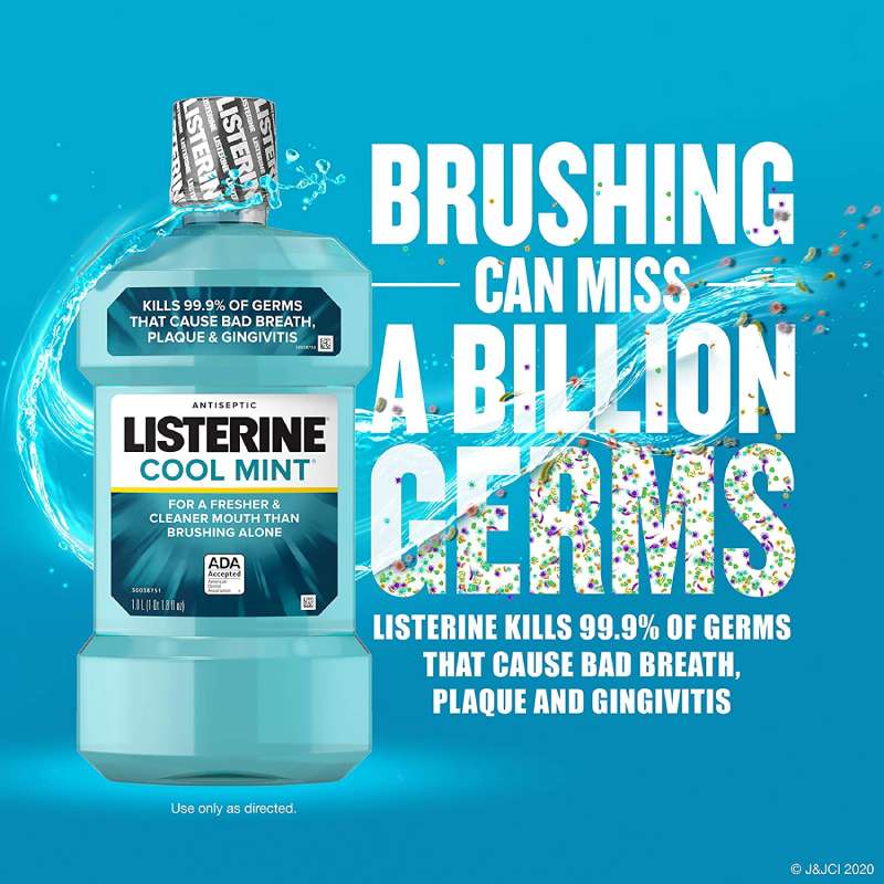
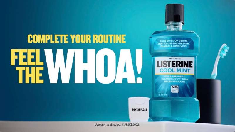
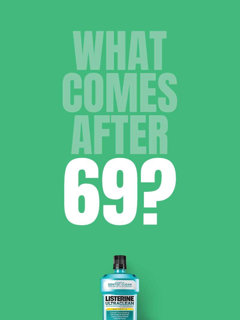
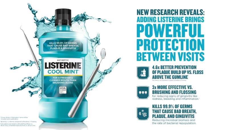
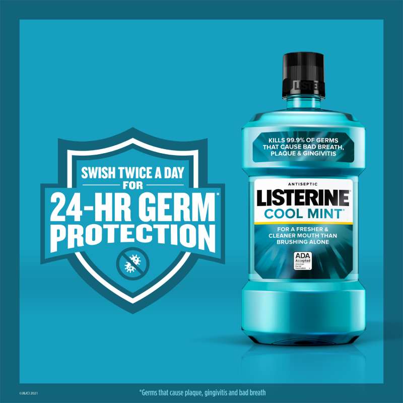
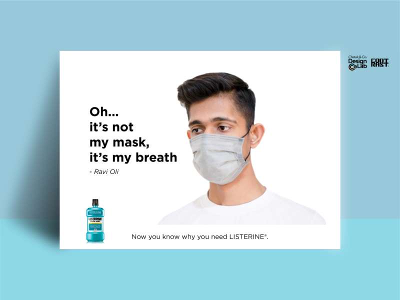
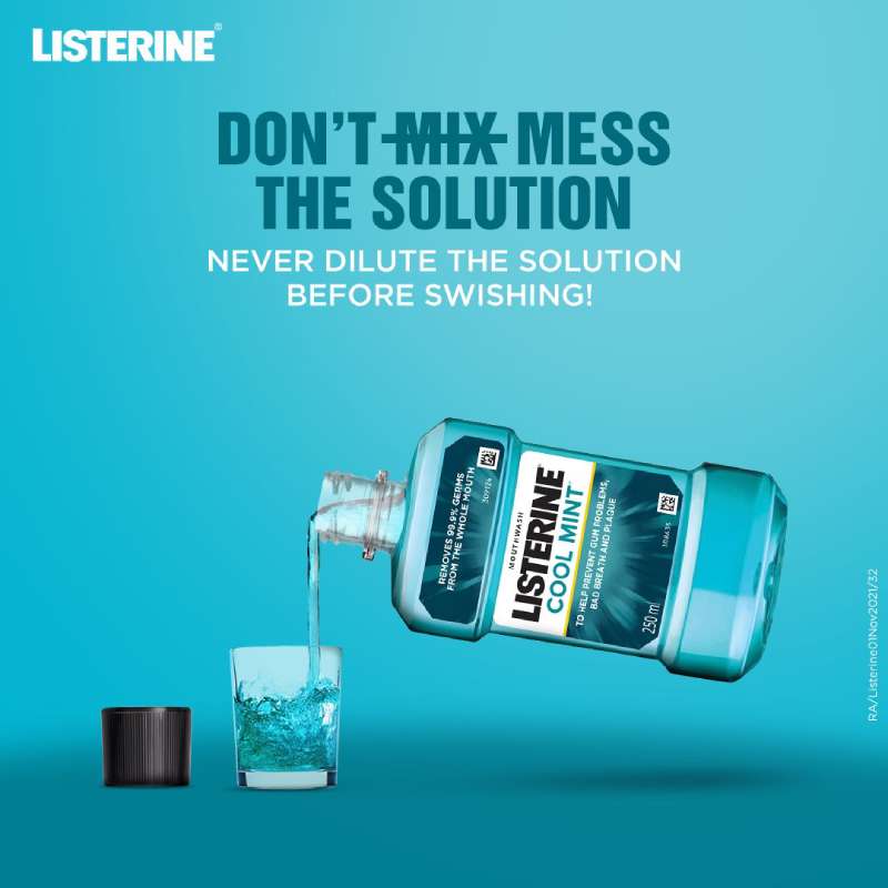
Post-2000 layouts inverted that. The product sits on flat white ground, headlines drop to five or six words, and generous white space does the framing that illustration used to do.
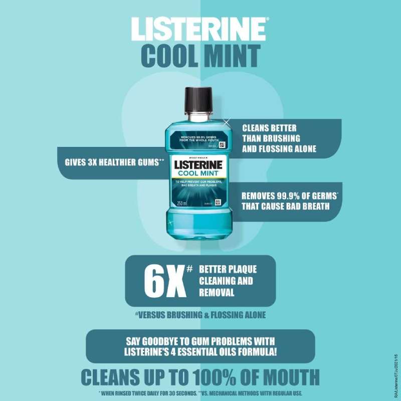
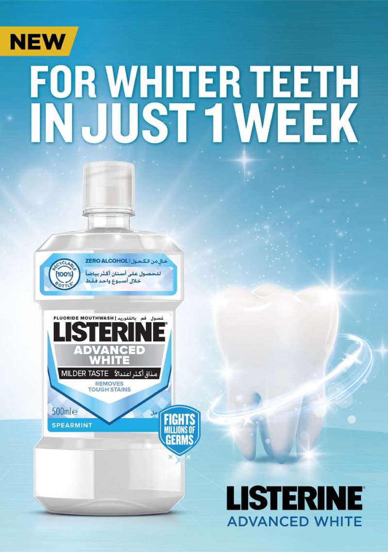
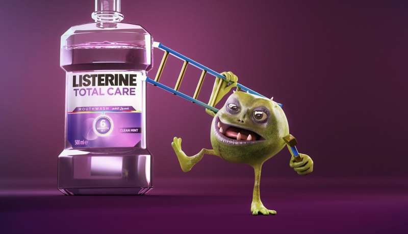
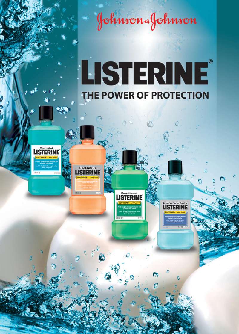
The color palette is narrow by design. Original amber, Cool Mint blue-green, Freshburst spearmint, each mapped to a variant so shelf recognition and page recognition match.
Typography across the modern work stays at one or two weights, with the tagline set below the optical center and the wordmark locked to the bottle rather than floating free. High contrast between the liquid and the white ground handles the rest.
The bottle itself does heavy lifting. Listerine’s packaging design gives the ads a fixed silhouette, which is why so many regional executions can drop the logo to thumbnail size and still read.
How Do Listerine TV Commercials Differ From Its Print Ads?
Listerine TV commercials sell duration and sensation, while print sells consequence. Spots show the 30-second rinse, the sting, the reaction. Print shows the social outcome of skipping it. The two formats split the message rather than repeat it.
Feel Every Smile (2015, JWT London, dir. Lucy Walker). A documentary-style film with four blind participants describing what smiles mean to them, then using the Smile Detector app. No product demonstration until the final frames.
Bring Out the Bold (2016, J. Walter Thompson). A 30-second spot showing what a confident smile unlocks, from a VIP party to a date with a stranger, cut with animated inserts explaining stain lifting and stain prevention.
Fresh Start Feeling (2024-2025, Kenvue). A New Year’s Eve takeover of CNN’s live broadcast with Anderson Cooper and Andy Cohen, plus a Listerine countdown clock and digital fireworks on the NASDAQ and Midtown Financial buildings.
The animated sequences matter here. Motion graphics carry the clinical claims that print handles with a footnote, which frees the live action to run on storytelling alone.
How Has Listerine Advertising Evolved Since 1921?
Listerine advertising has moved through four strategic positions in 105 years: social fear (1921), medical cure-all (1927), sensory proof (1970) and clinical oral health (1990). Each shift changed the art direction before it changed the copy.
| Decade | Strategic shift | Representative work |
|---|---|---|
| 1920s | Invent the condition | Halitosis series, “Often a bridesmaid” |
| 1930s-1950s | Extend to every ailment | Dandruff and cold-prevention ads |
| 1970s | Sell the sting as proof | “The taste you hate, twice a day” |
| 1990s-2000s | Clinical claims and ADA acceptance | “Kills germs that cause bad breath” |
| 2015-2025 | Lifestyle and confidence | Bring Out the Bold, Fresh Start Feeling |
The 1930s work borrowed Art Deco illustration conventions, with stylized figures and geometric borders. Anyone browsing vintage ads from the period will recognize the treatment across dozens of unrelated brands.
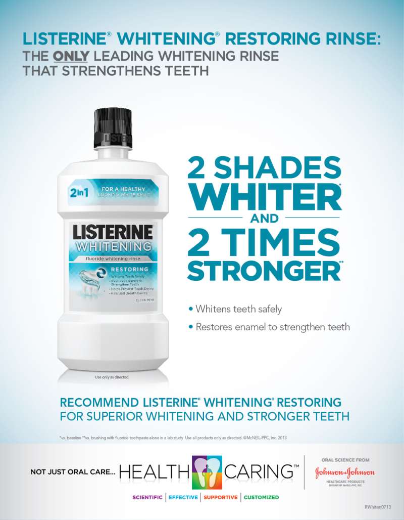
The typographic break came later. From the 1990s the brand moved to sans-serif headline setting and a flatter, more minimalist page, matching the pharmacy-aisle look the category adopted.
The 2011 Total Care Zero Alcohol line was renamed Total Care Alcohol-Free for the 2025 campaign, a naming change Kenvue framed as a new brand identity aligned with current consumer priorities.
Which Agencies Created Listerine Advertising?
Five agency relationships built the Listerine advertising archive. Lambert & Feasley created the halitosis campaign in 1921. J. Walter Thompson created “Bring Out the Bold” in 2016. BBDO Chile created the Western print series in 2014. Wunderman Thompson Brazil created Breathcalypse in 2022.
| Agency | Work | Years |
|---|---|---|
| Lambert & Feasley | Halitosis print series | 1921-1930s |
| J. Walter Thompson | Feel Every Smile, Bring Out the Bold | 2015-2019 |
| BBDO / FCB | Kenvue-era creative across brands | 2023-2025 |
| WPP | Global creative and production | From December 2025 |
Ownership changed hands four times, and each transfer reset the roster. Lambert Pharmacal merged into Warner-Lambert in 1955, Pfizer acquired the brand in 2000, Johnson & Johnson took it in December 2006, and Kenvue inherited it at the 2023 spin-off.
Kenvue ran a global media and creative review from October 2025 and appointed WPP for creative and production, Publicis for media, covering an estimated $1.35 billion in annual global media spend, according to COMvergence.
What Can Designers Learn From Listerine Ads?
Listerine ads teach five transferable techniques: name the problem before naming the product, hold the palette to two colors, keep the bottle silhouette fixed across every market, place the tagline below the optical center, and let the human face carry the emotional load.
- Name the condition, not the benefit. “Halitosis” outperformed “fresh breath” because a named problem needs a named fix.
- Lock the palette to two colors plus white. Amber and blue-green have identified the brand for decades without a logo present.
- Set the headline at one weight. A single weight forces the typographic hierarchy into size and position rather than into decoration.
- Put the face above the product. The reader identifies with a person, then accepts the bottle as the answer.
- Test the palette against the claim. Clinical blue reads as medical, warm amber reads as strong, and color psychology decides which one the ad needs before the copy is written.
- Pick display type that survives compression. Regional adaptations shrink headlines hard, so fonts built for advertising hold up where delicate faces collapse.
Worth remembering: the 1920s ads worked because the copy was long, and the 2016 ads worked because the copy was short. The variable was the medium, not the rule.
How Do Listerine Ads Compare to Colgate Ads?
Listerine ads sell the removal of a defect. Colgate ads sell the smile itself. Listerine anchors on germ counts and product intensity, while Colgate’s Smile Strong platform, built by WPP’s Red Fuse team, runs on documentary portraits and social inclusion.
| Dimension | Listerine | Colgate |
|---|---|---|
| Core promise | Kills 99.9% of germs | Smile freely, smile strong |
| Lead visual | Bottle and liquid color | Human face, full frame |
| Copy device | Clinical proof | Personal testimony |
| Recent platform | Wash Your Mouth (2025) | Free Your Smile (2023) |
Colgate commissioned a Pureprofile study of more than 4,000 people across eight Asia-Pacific markets in 2023 and found that 94% wanted to smile more freely, then built the creative from that number. Listerine ran the same play in 2016 with its 6,000-person survey, but pointed the finding at behavior rather than self-image.
The difference shows up in the art direction. Browse a set of Colgate ads and the face fills the frame. Browse Listerine and the bottle does.
Scope and Crest sit in the same rivalry from the other direction. The Procter & Gamble ads for Scope attacked Listerine’s medicinal taste directly, turning the “taste you hate” boast into an argument against the brand that made it.
What Makes Listerine Advertising Work?
One mechanism, applied for 105 years: define a condition the reader did not know they had, then own the fix.
The creative changes shape, from long-copy magazine spreads to facial recognition apps and in-game vending machines, but the underlying brand positioning has not moved. Every execution names a gap between how you are and how you want to be seen, then puts an amber bottle in it.
The design lesson sits underneath that. Consistent color, a fixed bottle silhouette and one repeated number let the brand rebuild its advertising design from scratch every decade without losing recognition.
Strip the campaign names away and the structure is identical in 1921 and 2026. Problem, proof, product.
Listerine Ads Examples


FAQ on Listerine Ads
Who wrote the original halitosis ad copy?
Copywriters Milton Feasley and Gordon Seagrove wrote the halitosis series for Lambert Pharmacal in the early 1920s. Printers’ Ink credited Feasley in 1926 with changing daily habits, putting the morning rinse alongside the morning shave.
What was the first Listerine consumer slogan?
Before 1921, Listerine advertising spoke to dentists about killing germs in the mouth. The consumer line that broke through was “Often a bridesmaid, but never a bride,” running in magazine spreads through the mid-1920s.
Did Listerine really advertise cigarettes?
Yes. Lambert Pharmaceutical launched Listerine Cigarettes in 1927 and advertised them for a short period. The brand extension sat alongside toothpaste, which performed far better and stayed in the portfolio.
Why did Listerine ads promise a dandruff cure?
Gerard Lambert kept adding uses to sustain advertising momentum. Between 1921 and 1929 the copy covered aftershave, astringent, deodorant, colds and sore throats. Scalp application ads ran from the 1930s into the 1950s.
What is the current Listerine tagline?
“Kills germs that cause bad breath” remains the product-level claim across packaging and print. The 2025 campaign platform is “Wash Your Mouth,” extended in 2026 as “Wash Your Mouth, Your Way” around a range of intensities.
Why do Listerine bottles change color across ads?
Color codes the variant. Amber signals Original, blue-green signals Cool Mint, spearmint green signals Freshburst. The system lets an ad drop the wordmark to thumbnail size and still identify the product on sight.
Which markets run the most Listerine advertising?
The United States, United Kingdom, Brazil, India and China carry the heaviest campaign activity. Euromonitor put Listerine at a 29.9% share of the Chinese oral care segment in 2022, where mouthwash penetration sits near 15%.
Does Listerine advertise to dentists separately?
Yes. Listerine Professional runs its own channel for hygienists and dentists, built on gingivitis and plaque data rather than fresh breath. Kenvue launched the Clinical Solutions line at the ADA’s SmileCon in October 2023.
Why did Listerine rename Zero Alcohol to Alcohol-Free?
Total Care Zero Alcohol launched in 2011 and became Total Care Alcohol-Free for the 2025 campaign. Kenvue framed the change as a brand identity update matching current consumer priorities in oral care.
Can designers reuse vintage Listerine print ads?
Duke University’s AdAccess database publishes historical advertisements for study and research, with its own terms of use. The Listerine trademark stays active, so commercial reuse of the marks needs clearance separate from the image rights.
Conclusion
Listerine ads work as a case study in doing one thing for a century. The antiseptic mouthwash changed formula, owner and agency, while the fear appeal underneath the copy barely moved.
Warner-Lambert absorbed an FTC ruling in 1975 and kept advertising. J. Walter Thompson rebuilt the brand around confidence in 2016.
Neither shift broke recognition.
For designers, the takeaway is disciplined restraint. Two colors, one bottle silhouette, a headline short enough to survive translation into a dozen markets.
Pull up a 1925 magazine spread and a Cool Mint spot from last year, side by side. Different craft, identical architecture.
Steal the structure, not the tone. The tone belongs to 1925.

Renowned for his expertise in logo design and visual branding, Bogdan has developed a multitude of logos for various clients.
His skills extend to creating posters, vector illustrations, business cards, and brochures. Additionally, Bogdan's UI kits were featured on marketplaces like Visual Hierarchy and UI8.
He also wrote in the past years on sites like Design Your Way, WebDesignerDepot, WPDean, Designmodo, Speckyboy, Slider Revolution, and more.
- Canva vs PowerPoint: Which Is Better for Presentations? - 22 September 2026
- How to Install Fonts on Mac (Step-by-Step Guide) - 20 September 2026
- From Mockup to Code: How AI-Augmented Development Speeds Up the Design Handoff - 19 September 2026

Bogdan Sandu is a seasoned designer who has been designing websites since 2008. Renowned for his expertise in logo design and visual branding, Bogdan has developed a multitude of logos for various clients. His skills extend to creating posters, vector illustrations, business cards, and brochures. Additionally, Bogdan's UI kits were featured on marketplaces like Visual Hierarchy and UI8. He also wrote in the past years on sites like Design Your Way, WebDesignerDepot, WPDean, Designmodo, Speckyboy, Slider Revolution, and more.
You Might Also Like