A caveman straps a package to a pterodactyl, the pterodactyl gets eaten, and the caveman loses his job. That spot ran during Super Bowl XL, and it is one of the most watched FedEx ads ever made.
The brand has used the same move since 1978. Sell an invisible service by making the failure funny, then let a two-colour wordmark close the argument.
What follows covers the campaigns worth studying, from Ally & Gargano’s fast-talking man to DDB Brasil’s wordless print work.
You will find:
- The agency, year and market behind each campaign
- Layout, palette and typography analysis of the print work
- Why the TV commercials behave nothing like the posters
FedEx advertising spans 53 years, 4 lead agencies and 9 documented taglines, from the 1978 debut of “When it absolutely, positively has to be there overnight” to BBDO New York’s “The New Power Move” in 2025. The work runs on deadpan comedy and literal visual metaphor, delivered through television, print, out-of-home and sponsorship.
This page covers the campaigns grouped by era, with the agency, year and market behind each one, plus the layout, palette and typography decisions that hold the whole thing together.
FedEx Advertising at a Glance
FedEx has advertised since 1973, working primarily with Ally & Gargano and BBDO New York. Its best-known campaigns are “Fast Talking Man,” “Stick” and DDB Brasil’s “Neighbors” print series. The visual signature combines purple and orange, a custom sans-serif wordmark, and an arrow hidden in negative space.
| Attribute | Value |
|---|---|
| First major campaign | “Fast Talking Man” (1981), Ally & Gargano |
| Lead agencies | Ally & Gargano (1973-1987), BBDO New York (1990s-present), DDB Brasil (2009-2010) |
| Best-known taglines | “When it absolutely, positively has to be there overnight” (1978), “The World On Time” (2001), “Relax, it’s FedEx” (2004) |
| Primary media | Network TV, Super Bowl, business print, OOH, digital |
| Visual signature | Purple and orange, Univers/Futura hybrid wordmark, high-key product photography |
| Scale behind the spend | $87.7 billion revenue in 2024, operations in 220+ countries |
Interbrand valued the FedEx brand at $8.17 billion in 2022, placing it 79th on Best Global Brands.
Which FedEx Ad Campaigns Are the Most Famous?
Six FedEx campaigns carry most of the brand’s creative reputation: “Fast Talking Man” (1981), “Desert Island” (2003), “Stick” (2006), the Global Access print series (2008), DDB Brasil’s “Neighbors” (2010) and “The New Power Move” (2025). Every one of them sells speed through a joke rather than a spec sheet.
Fast Talking Man (1981-1983)

“Fast Talking Man” ran on US network television from autumn 1981, created by Ally & Gargano and directed by Joe Sedelmaier. The spot casts John Moschitta Jr. as an executive who conducts an entire workday at roughly 400 words per minute.
Sedelmaier shot it in April 1981 and the agency held the spot until football season. Moschitta held a Guinness record at 586 words per minute and slowed down so viewers could follow him.
Ad Age named Ally & Gargano its Agency of the Year in 1982.
Desert Island (2003)

Spot: “Desert Island,” Super Bowl XXXVII, BBDO New York, with Tom Hanks reprising Chuck Noland from Cast Away.
Device: the payoff inverts the film. Noland finally delivers the package, asks what was inside, and hears a list of survival gear he could have used for four years.
Ad Age recorded it at No. 11 on the USA Today Ad Meter, one place outside the top ten, though it scored better in the InterMedia Advertising Group survey.
Stick (2006)

“Stick” aired February 5, 2006 during Super Bowl XL for BBDO New York. A caveman straps a stick to a pterodactyl, the pterodactyl gets eaten by a tyrannosaurus, and he is fired for not using a courier that will not exist for several million years.
Production credits worth knowing:
- Chief creative officers David Lubars and Bill Bruce
- Art director Jonathan Mackler, copywriter Jim Le Maitre
- Directed by Traktor, shot over three days in December 2005 near Lone Pine, California
TIME later listed it among the best Super Bowl ads ever made.
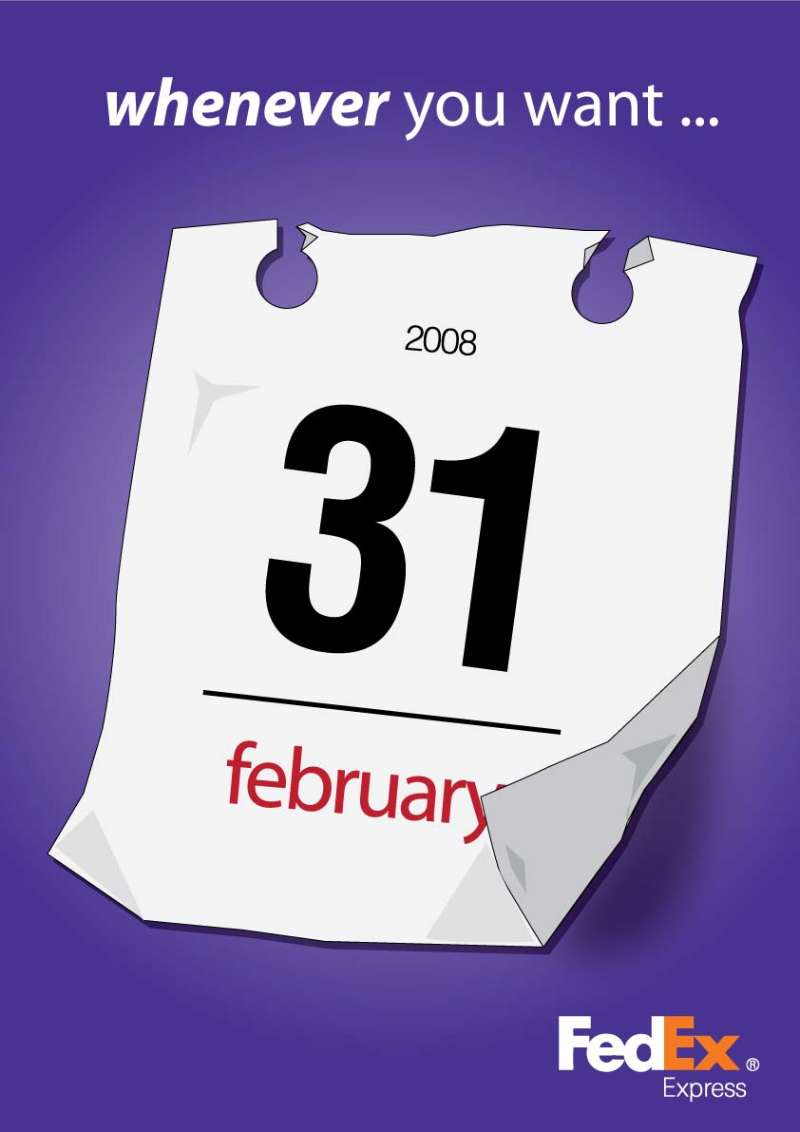
Global Access Print Series (2008)

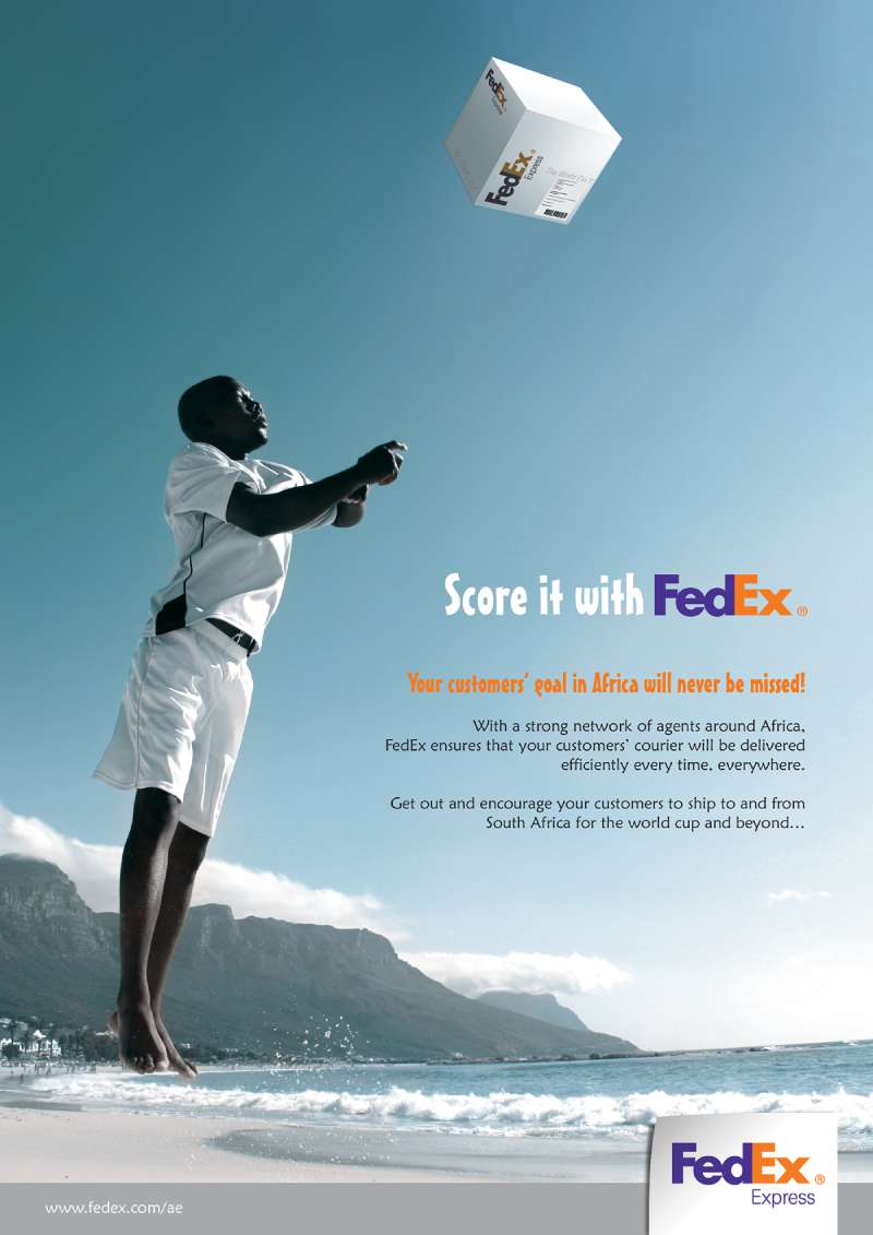
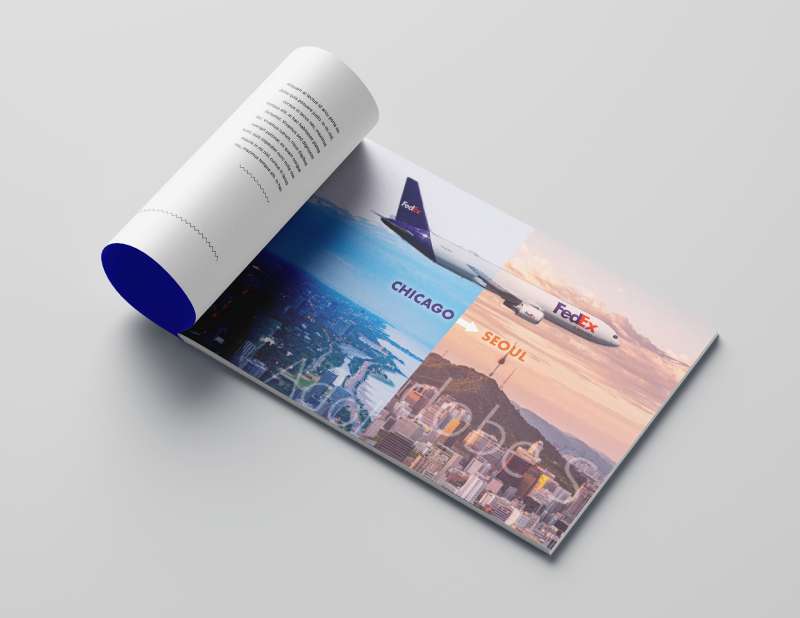
BBDO produced four print and online executions in multiple languages, breaking in November 2008 across the UK, France, Germany and India before rolling into Brazil, China, Japan, Mexico and Taiwan.
Theme: access, success and growth, shot as behind-the-scenes glimpses of the network rather than hero packages.
Digital extension: built by Atmosphere, BBDO North America’s digital shop.
Neighbors (2010)
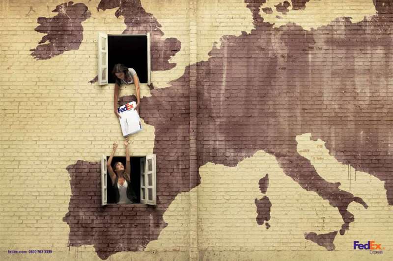
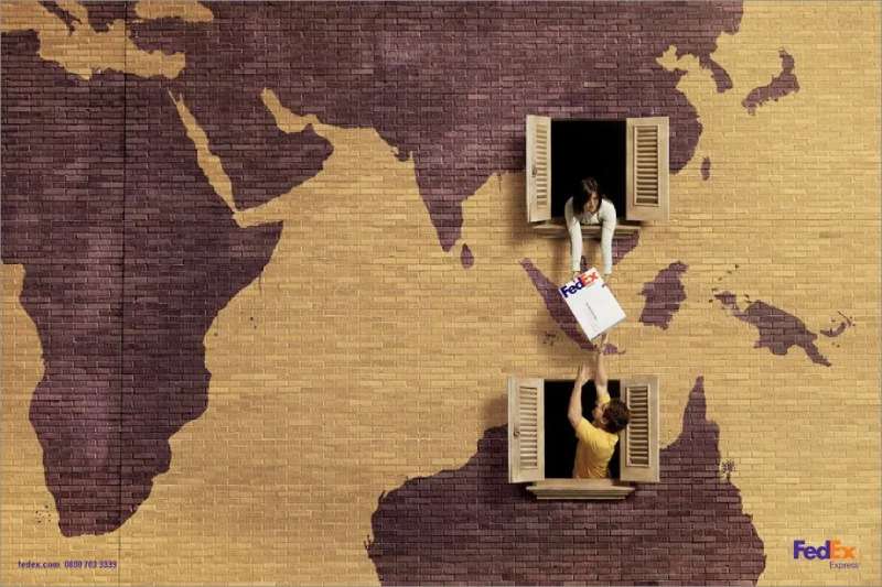
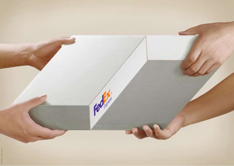
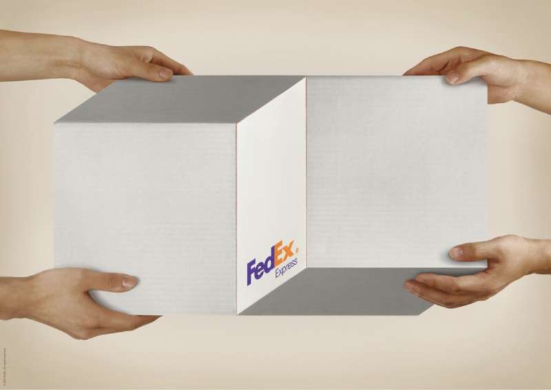
DDB Brasil released three print executions in April 2010: USA-Brazil, London-Spain and China-Australia. A hand passes a package from one window to the next, and the wall between the windows carries a weathered map of the continents.
Credits: creative directors Rodrigo Almeida, Renata Florio and Sergio Valente, art director Max Geraldo, copywriter Aricio Fortes, photographer Manolo Moran.
Communication Arts exhibited the series. The copy load is close to zero, which is the point.
The New Power Move (2025-present)

FedEx went back to comedy in September 2025.
BBDO New York built the platform around dead office rituals (the flashy watch, the deliberate late arrival, the unbroken eye contact) and swapped them for smart logistics as the real flex. SMUGGLER’s Bjorn Ruhmann directed.
The spots launched inside NFL broadcasts and moved to digital and social. Executive creative director Dan Oliva framed it as moving FedEx into an intelligent future while keeping the comedic personality it has always had.
How Do FedEx Print Ads Work Visually?
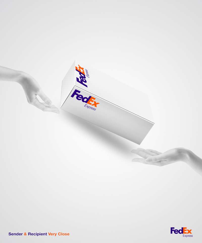
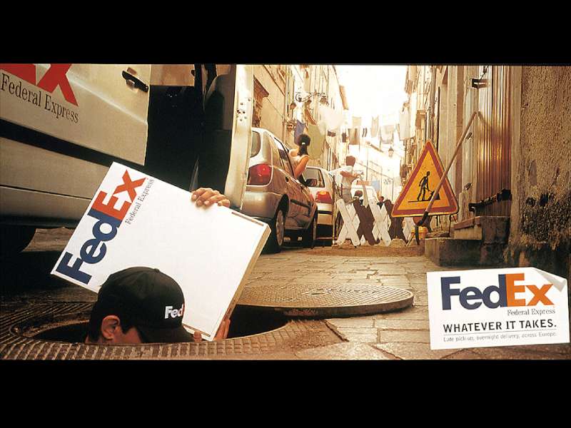
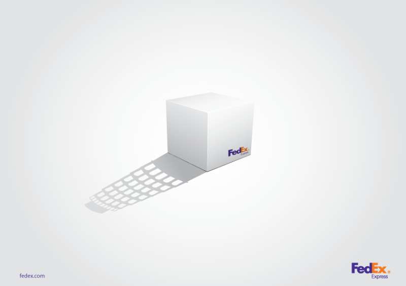
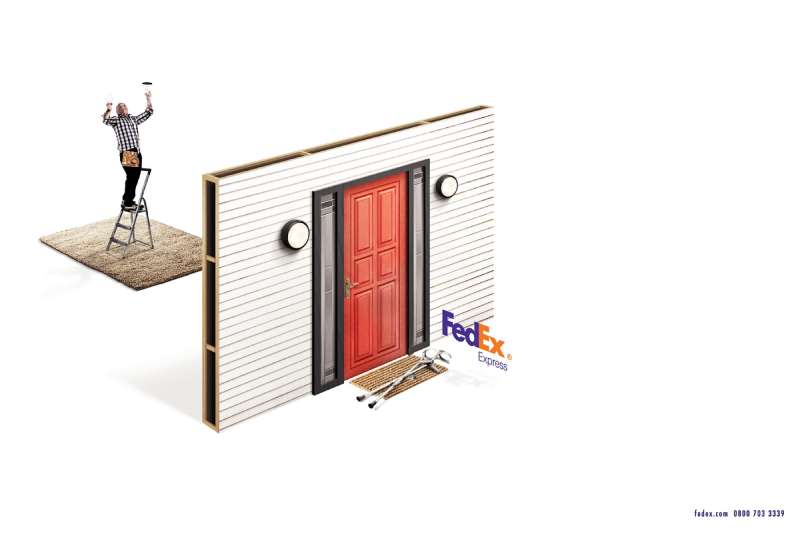
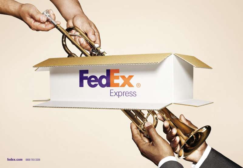
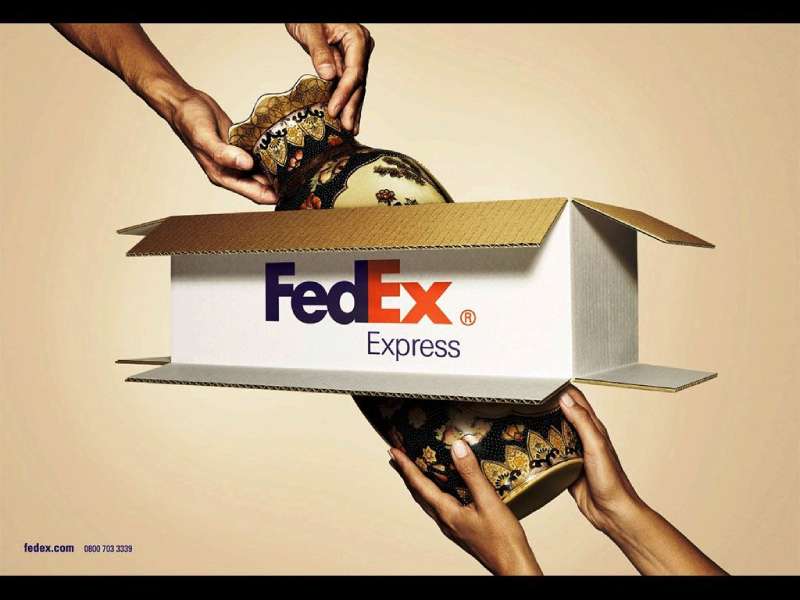
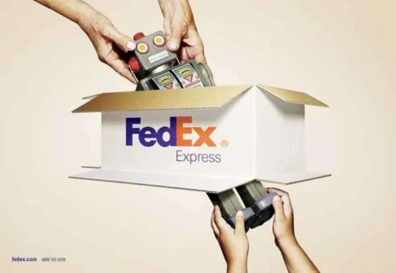
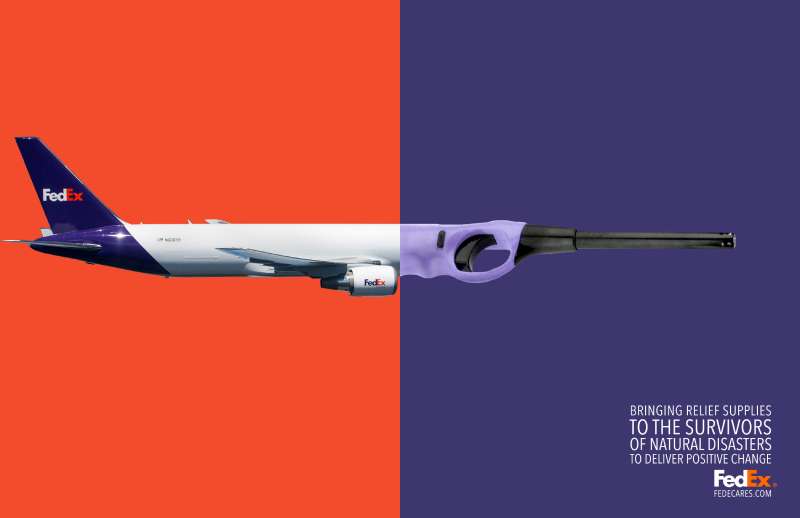
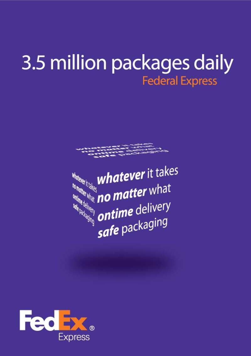
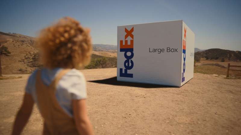
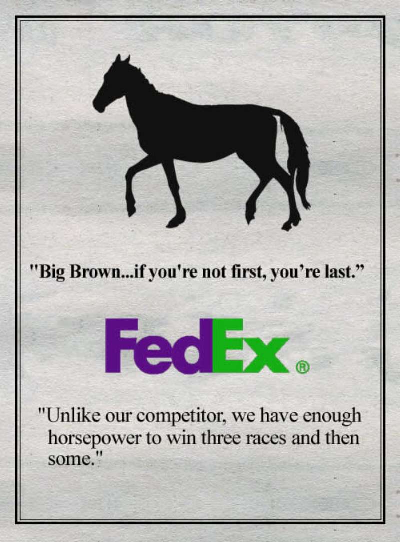
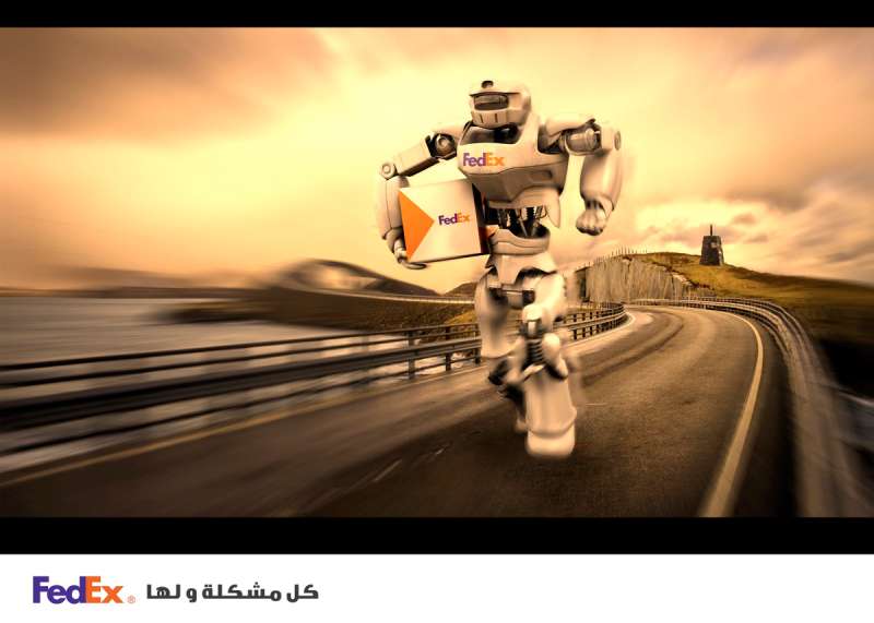
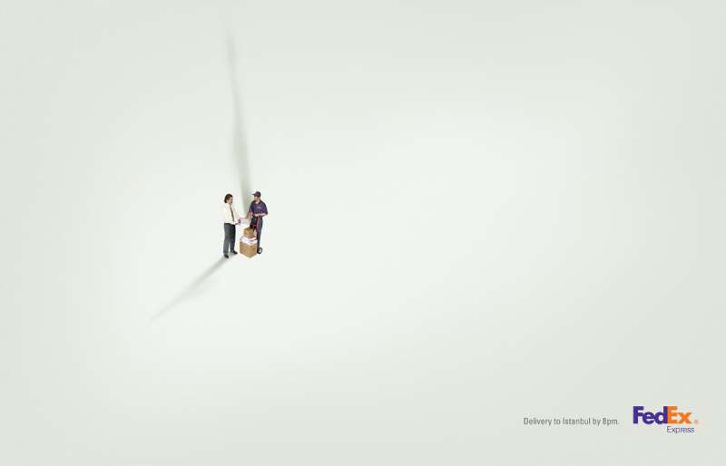
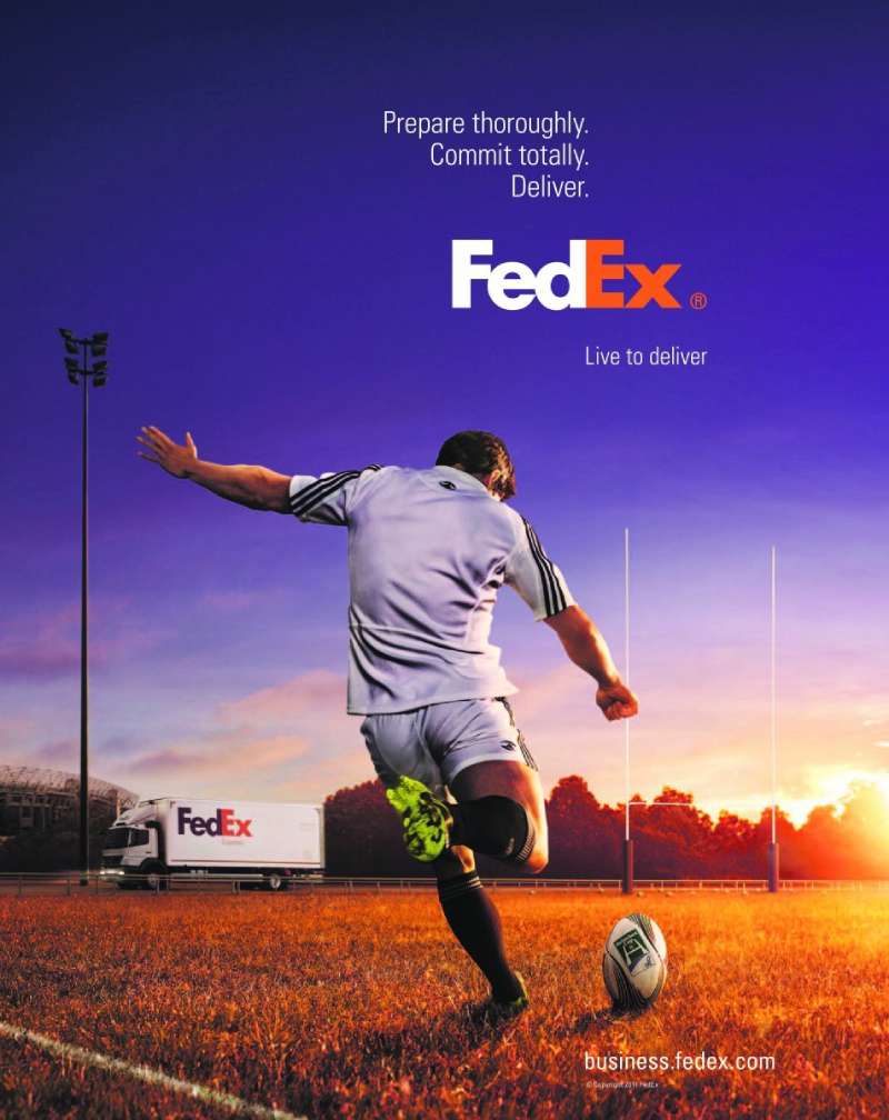
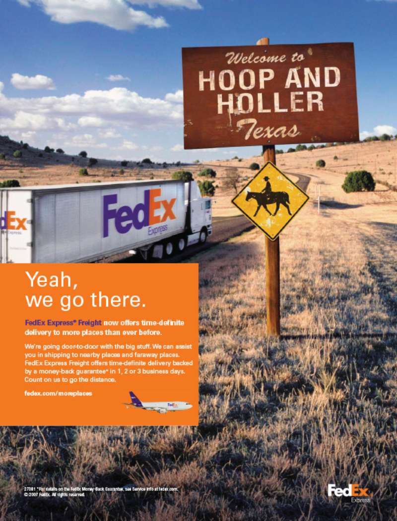
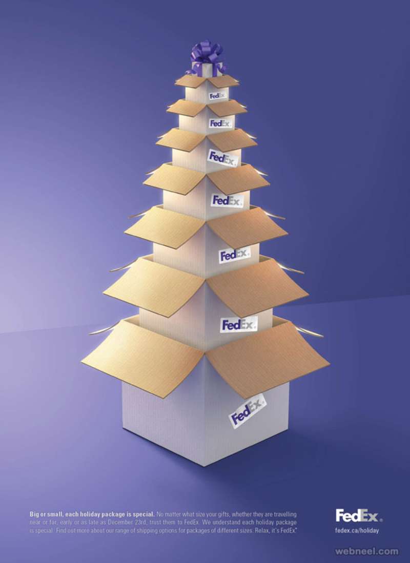
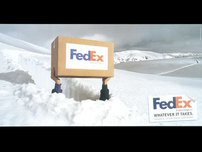
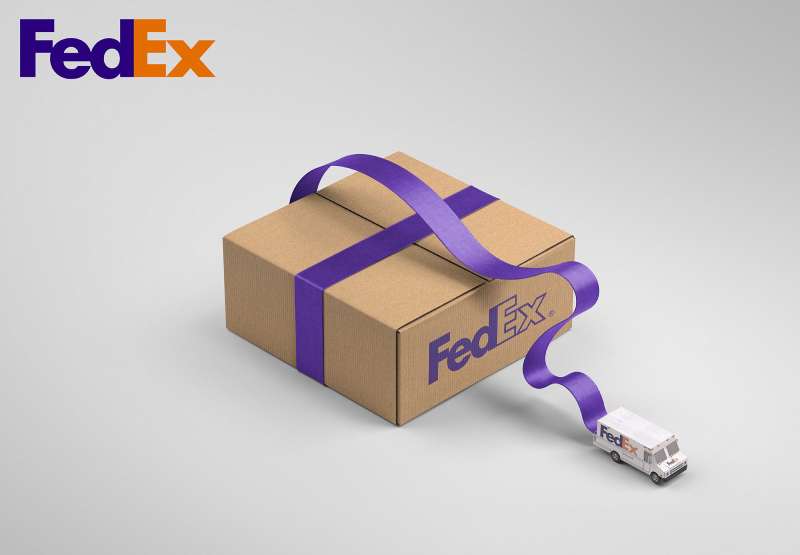
FedEx print ads reduce the frame to one object, one action and one logo. The layouts run high image-to-text ratios, often above 90 percent, with the copy block dropped small at the base and the wordmark anchored bottom-right. Photography stays literal. Metaphor does the persuading.
The palette is disciplined. Purple carries the corporate mark, orange handles the accent, and the surrounding image usually sits in desaturated earth tones so the logo reads as the brightest thing on the page. That gap between a muted field and a saturated mark is straightforward contrast doing structural work.
Typography almost never competes. The FedEx wordmark is a custom sans-serif built from Univers 67 Bold Condensed and Futura Bold, and most executions let it be the only typographic event in the layout.
The arrow between the E and the x is the reason the mark survives at any size. It exists because of kerning, not illustration, which is why the FedEx logo still gets taught as the reference case for negative space in logo design.
Recurring layout rules across the print work:
- Single focal object, centred or on a strong diagonal
- Generous white space around the subject, no competing texture
- Logo lockup at 5-8 percent of frame width
- No headline in roughly half the international executions
Purple reads as stability and orange as speed, which is a textbook application of color psychology to a service that sells both at once.
How Do FedEx TV Commercials Differ From Its Print Ads?
FedEx television trades the silent visual metaphor for dialogue and comic timing. Print states the promise in one frame. TV builds a small workplace disaster across 30 seconds and lands the brand in the final 3. The print work is authored by art directors. The TV work is authored by copywriters and directors.
“Fast Talking Man” (1981, Ally & Gargano, dir. Joe Sedelmaier). One locked-off office set, one performer, no visual effects. The joke is entirely auditory, which is the opposite of every print execution FedEx has ever run.
“Stick” (2006, BBDO New York, dir. Traktor). Desert location, CG dinosaurs, subtitled caveman grunts. The payoff arrives after the tagline, which is unusual and part of why it stuck.
“Moving Forward” (2021, BBDO New York). The film runs in reverse, tracing pandemic-era vaccine delivery back through the network. First execution of the “Where now meets next” positioning, and the rare FedEx spot with no punchline.
“The New Power Move” (2025, BBDO New York, dir. Bjorn Ruhmann). Office satire shot flat and bright, with the humour carried by performance rather than production scale.
Television is where FedEx does storytelling. Print is where it does proof.
How Has FedEx Advertising Evolved Since 1973?
FedEx advertising has moved through 5 strategic phases: speed as spectacle (1978-1987), customer reassurance (1987-2000), comic absurdism (2001-2008), global network scale (2008-2020) and intelligent logistics (2021-present). The tagline changes track the shift precisely.
| Era | Strategic shift | Representative work |
|---|---|---|
| 1978-1987 | Sell overnight speed as a new category | “Fast Talking Man,” Ally & Gargano |
| 1987-2000 | Reassurance and reliability | “Our Most Important Package is Yours,” “Be Absolutely Sure” |
| 2001-2008 | Absurdist comedy on the biggest US stage | “Desert Island,” “Stick,” BBDO New York |
| 2008-2020 | Global network and B2B access | Global Access print, “Neighbors,” DDB Brasil |
| 2021-present | Data, routing and supply chain intelligence | “Moving Forward,” “The New Power Move” |
The 1994 rebranding sits at the centre of that timeline. Landor Associates found that people already said “FedEx a package” regardless of carrier, and the company adopted the nickname on June 23, 1994.
Federal Express launched operations in 1973 from Memphis with 14 aircraft and 389 employees. Every later campaign is a variation on the same promise made in that first year.
Which Agencies Created FedEx Advertising?
Four organisations account for almost all recognised FedEx advertising: Ally & Gargano, BBDO New York, DDB Brasil and Landor Associates. Ally & Gargano built the voice, BBDO extended it for more than three decades, DDB Brasil supplied the print peak, and Landor supplied the mark everything else sits on.
| Agency | Relationship | Signature output |
|---|---|---|
| Ally & Gargano | Began working with Federal Express in 1973 | “Fast Talking Man,” the overnight tagline |
| BBDO New York | Agency of record since the early 1990s | “Stick,” “Desert Island,” “The New Power Move” |
| DDB Brasil | Regional print, 2009-2010 | “Neighbors,” “Vase” |
| Landor Associates | Identity assignment, 1994 | The FedEx wordmark and arrow |
Lindon Leader designed the FedEx wordmark in 1994 as senior design director in Landor’s San Francisco office. He worked through more than 200 variations before the arrow appeared, and the logo has since collected over 40 design awards, which is why he turns up on most lists of famous graphic designers.
Joe Sedelmaier directed “Fast Talking Man” for Ally & Gargano and went on to direct close to 1,000 commercials, including Wendy’s “Where’s the Beef?”. He died in May 2026 at 92.
What Can Designers Learn From FedEx Ads?
FedEx work rewards restraint. The campaigns that lasted did fewer things per frame than the campaigns that did not, and the brand’s most copied asset is a piece of letter spacing nobody was asked to notice.
- Build the idea into the letterforms before adding a symbol beside them
- Limit the palette to two brand colours and let the photograph handle everything else
- Drop the copy block below the optical centre so the object owns the top two thirds
- Write the joke before you art-direct it, because FedEx TV survives on timing, not production value
- Keep the logo small and let placement do the emphasis work
The DDB Brasil executions prove the last point hardest. Three images, no headline, and the reader still reaches the conclusion unassisted, which is what separates minimalist design from empty layout.
None of this transfers automatically. A brand without 50 years of category ownership cannot run a wordless page and expect recognition, and plenty of advertising design fails by copying the restraint without the equity underneath it.
How Do FedEx Ads Compare to UPS and DHL Ads?
UPS and FedEx sell the same service and argue it in opposite registers. UPS built “What can Brown do for you?” on a single ownable colour and a whiteboard-drawing spokesman, which made the brand feel procedural and reassuring. FedEx went for jokes with a body count.
DHL runs a third route entirely: yellow-and-red fields, heavy typographic headlines, and aggressive comparative work that names competitors outright. FedEx has never needed that, because it holds the verb.
The nearest structural comparison is not another courier. It is the B2B service brands that also sell an invisible product through visual metaphor, which is why Mastercard ads, American Express ads and IBM ads all share the same problem FedEx solved with an arrow.
What Makes FedEx Advertising Work?
FedEx sells a service nobody sees. The package leaves, the package arrives, and the interesting part happens out of frame.
Every campaign that landed solved that problem the same way, by giving the audience a concrete object and a small piece of comedy or geography to attach the promise to. A stick. A window. A man talking too fast.
The visual system holds because it refuses to grow. Two colours, one wordmark, one arrow nobody points at.
Fifty-three years of work, four agencies, nine taglines, and the through-line never changed: state the promise, prove it once, get out of the frame.
FedEx Ads Examples




FAQ on Fedex Ads
What is the most famous FedEx ad?
“Stick” (2006) gets cited more than any other. A caveman fails to deliver by pterodactyl and loses his job for it. BBDO New York wrote it, Traktor directed, and TIME later ranked it among the best Super Bowl commercials.
Who was the fast-talking guy in the FedEx commercial?
John Moschitta Jr. He held a Guinness record at 586 words per minute and slowed to roughly 400 for the 1981 spot so viewers could still follow him. Joe Sedelmaier directed.
What is the FedEx slogan?
“The World On Time” has run since 2001. Earlier lines include “When it absolutely, positively has to be there overnight” from 1978, “Relax, it’s FedEx” from 2004, and “We Understand” from 2009.
Why is there an arrow in the FedEx logo?
Lindon Leader found it while adjusting letter spacing at Landor Associates in 1994. The arrow sits in the gap between the E and the x, which is why the mark still gets taught alongside basic logo design principles.
Was the Cast Away FedEx commercial real?
Yes. BBDO New York produced “Desert Island” for the 2003 Super Bowl, with Tom Hanks reprising Chuck Noland. Ad Age recorded it at No. 11 on the USA Today Ad Meter, one spot outside the top ten.
Who directed the FedEx caveman commercial?
Production company Traktor shot it over three days in December 2005 in the California desert near Lone Pine. David Lubars and Bill Bruce were chief creative officers at BBDO New York on the account.
Does FedEx still run print ads?
Yes, at lower volume than before. MediaRadar logged FedEx magazine placements as recently as 2026. The heavy print design era ran roughly 2008 to 2012 across BBDO and DDB Brasil.
How do FedEx print ads differ from rival courier advertising?
FedEx print carries almost no headline. One object, one action, one logo. UPS and DHL both lean harder on typographic headlines and spokesperson devices, which raises the copy load on every page.
Have FedEx ads won awards?
The wordmark alone has collected over 40 design awards plus a Rolling Stone top-eight placement in 2003. Ally & Gargano took Ad Age Agency of the Year in 1982, largely on the Federal Express work.
What is the newest FedEx ad campaign?
“The New Power Move,” launched September 2025 by BBDO New York and directed by Bjorn Ruhmann through SMUGGLER. The spots mock stale office rituals and position smart logistics as the real competitive edge.
Conclusion
Five decades of FedEx ads come down to one discipline: refusing to add. Purple and orange, a single wordmark, one idea per frame.
BBDO New York has held that line since the early 1990s. Lindon Leader’s 1994 arrow gave the work a mark that reads on a 747 fuselage and a business card without changing.
The takeaway for anyone building a logistics or B2B identity is not the deadpan humour. Plenty of couriers have tried absurdist comedy and landed nowhere.
It is the element count.
Pull three of these executions into a mood board and tally what sits on each page. Most stop below five components, and that restraint is what carries “The World On Time” across 220 countries.

Renowned for his expertise in logo design and visual branding, Bogdan has developed a multitude of logos for various clients.
His skills extend to creating posters, vector illustrations, business cards, and brochures. Additionally, Bogdan's UI kits were featured on marketplaces like Visual Hierarchy and UI8.
He also wrote in the past years on sites like Design Your Way, WebDesignerDepot, WPDean, Designmodo, Speckyboy, Slider Revolution, and more.
- The Windsurf Logo History, Colors, Font, And Meaning - 10 October 2026
- How to Remove Background From Product Photos (No Photoshop) - 10 October 2026
- How Designers can Build a Stronger Online Creative Identity - 9 October 2026

Bogdan Sandu is a seasoned designer who has been designing websites since 2008. Renowned for his expertise in logo design and visual branding, Bogdan has developed a multitude of logos for various clients. His skills extend to creating posters, vector illustrations, business cards, and brochures. Additionally, Bogdan's UI kits were featured on marketplaces like Visual Hierarchy and UI8. He also wrote in the past years on sites like Design Your Way, WebDesignerDepot, WPDean, Designmodo, Speckyboy, Slider Revolution, and more.
You Might Also Like