Canon ads have run on national television since 1976, longer than most camera brands have existed.
Fifty years, seven lead agencies and eight flagship campaigns, from the AE-1 blitz with John Newcombe to Created Different in 2025.
The work runs on one device: prove the camera by showing what the camera saw.
This page covers:
- Every major campaign by name, with its agency, year and market
- The layout, type and colour rules behind the print work
- How the TV commercials differ from the printed page
- What art directors can lift from the system
Expect specifics. Agency credits, taglines, view counts, award names.
Canon Advertising at a Glance
Canon has advertised on national television since 1976 and works today with VCCP London, Dentsu Creative and Memac Ogilvy.
Its best-known campaigns are Image Is Everything, Come and See, See Impossible and Live for the Story. The visual signature combines the red wordmark, a flat black or white field, and one product hero shot.
| Attribute | Value |
|---|---|
| First major campaign | Canon AE-1 television blitz, 1976 |
| Lead agencies | Grey New York, JWT London, VCCP London, Leo Burnett Sydney, Dentsu Creative |
| Best-known taglines | Image Is Everything (1989), Come and See (2014), See Impossible (2014), Live for the Story (2017), Delighting You Always (Asia) |
| Primary media | Print, TV, cinema, DOOH, retail, YouTube |
| Awards | Adfest Gold and Bronze for The Lab: Decoy (2016) |
| Visual signature | Red custom wordmark on white or black, single hero object, minimal copy block |
Canon has held the No. 1 share of the global interchangeable-lens digital camera market for 23 consecutive years, from 2003 through 2025, according to Canon Inc.
Which Canon Ad Campaigns Are the Most Famous?
Seven campaigns define Canon advertising: the AE-1 television blitz (1976), Image Is Everything (1989), Come and See (2014), See Impossible (2014), The Lab (2015), Live for the Story (2017) and Created Different (2025).
Four of them ran across more than 15 markets at once.
| Campaign | Years | Agency | Market |
|---|---|---|---|
| AE-1 launch | 1976-1984 | In-house and US network buy | US, Japan |
| Image Is Everything | 1989-1990 | US network TV | US |
| Come and See | 2014-2016 | JWT London | EMEA |
| See Impossible | 2014-2018 | Grey New York | US |
| Live for the Story | 2017-2019 | VCCP and PHD London | 19 European markets |
Canon AE-1 (1976-1984)

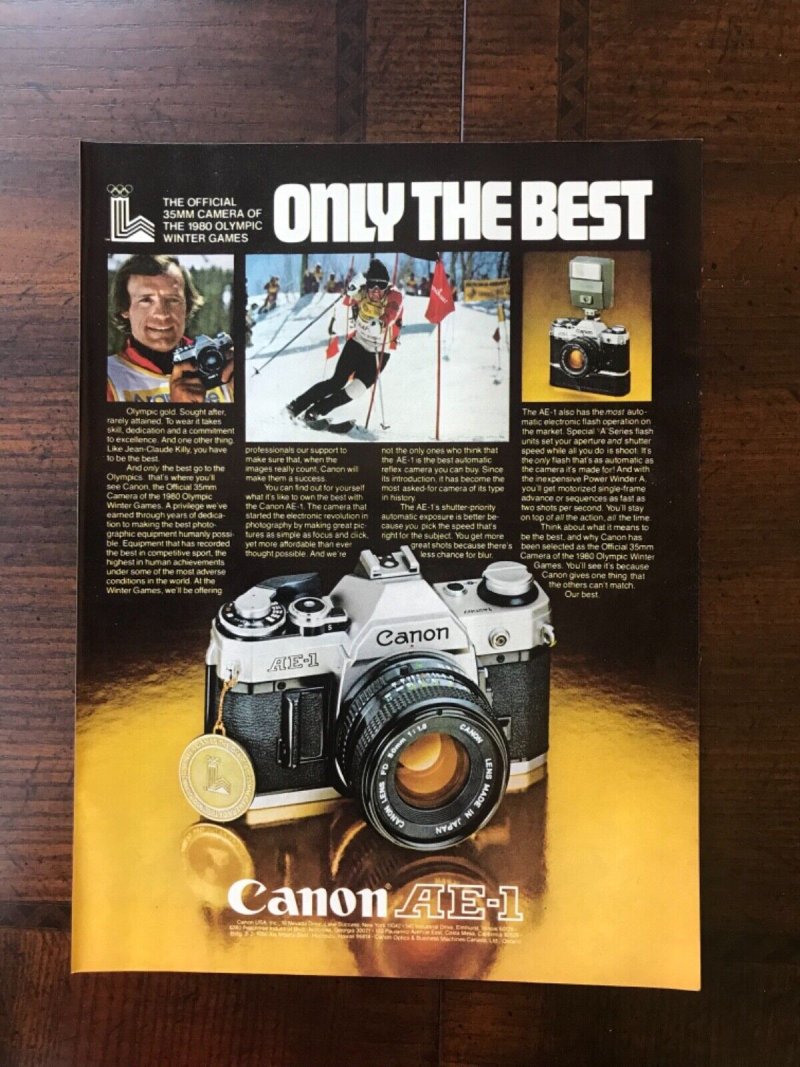
The campaign that invented camera advertising as mass media. Canon put the AE-1 on US national television with tennis player John Newcombe, the first Japanese camera maker to do so.
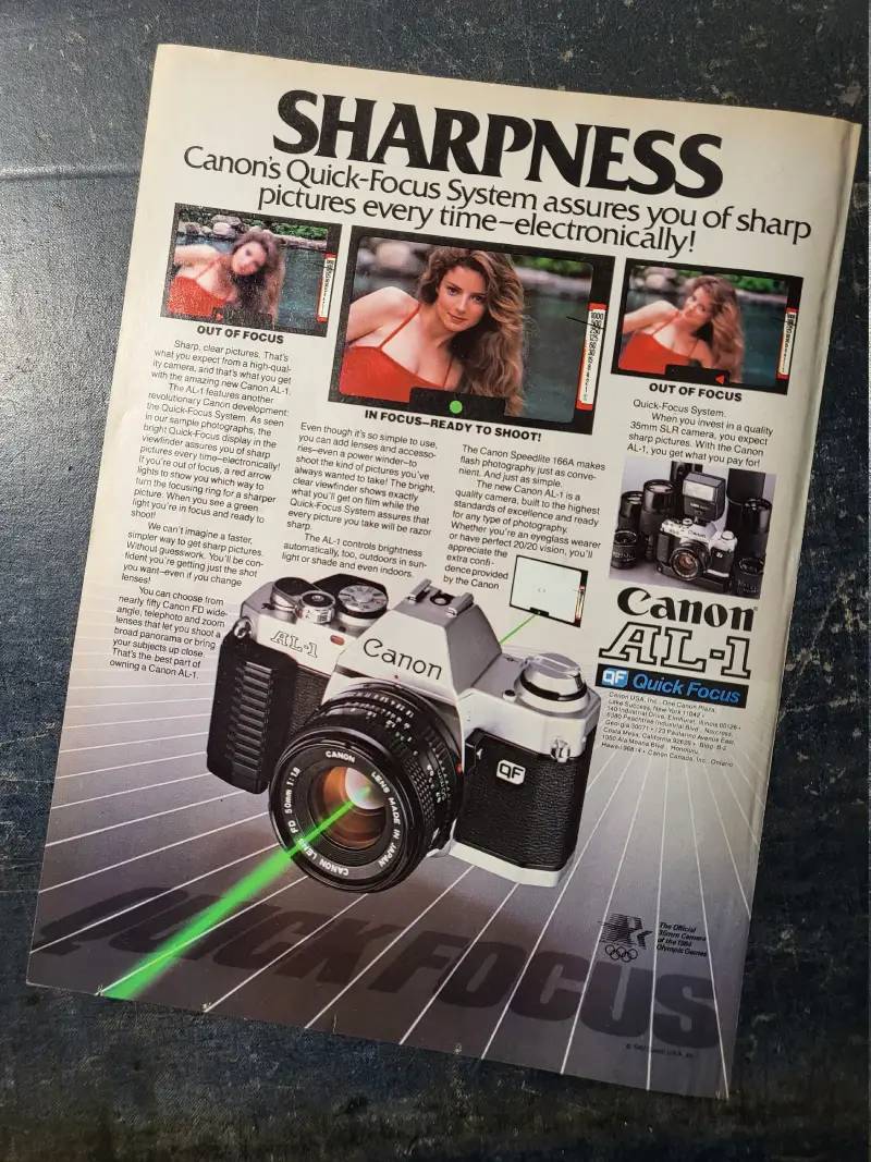
The print executions ran a full-bleed action photograph above a short body copy block, with the camera sitting bottom right at roughly a quarter of the page.
- Slogan: “So advanced, it’s simple”
- Launch price: $250, around 40 percent below rival SLRs
- Result: over 1 million units sold, unprecedented for the SLR category
Image Is Everything (1989-1990)

Shot in the Nevada desert in 1989 for the Canon EOS Rebel, the spot has Andre Agassi step out of a white Lamborghini, lower his sunglasses and deliver three words.
The line outlived the product. Agassi wrote in his autobiography that the slogan became synonymous with him overnight, and sportswriters treated it as his personal philosophy rather than a camera ad.
Art direction here is pure late-80s excess: hard desert light, saturated primaries, no grid, all emphasis loaded onto the talent instead of the product. Canon has never repeated the approach.
Come and See (2014-2016)

JWT London built Canon Europe’s largest brand campaign to date around two films directed by Jonathan Glazer, both shot on Canon bodies and unveiled at photokina in September 2014.
Film one: a Calcio Storico match in Florence, medieval costume, competitors wrestling for the ball.
Film two: a herd of deer walking residential streets near Epping Forest while the humans sleep.
The three-year platform invited users to submit their own frames to a content hub, which made the campaign a rolling archive rather than a fixed flight.
Canon See Impossible (2014-2018)

Grey New York led brand strategy, creative, promotions and PR on the US Masterbrand effort announced 7 October 2014, adding a new tagline and a 3D expanding-box device to the logo lockup.
The signature print piece, produced with Taylor James, showed an EOS 5D Mark III exploded into its component parts, with four callouts tying components to cinema, medical imaging, publishing and optometry.
It was the first time Canon had taken a camera apart in public. The layout depends on generous white space around the floating parts, which is what stops the diagram reading as a service manual.
The Lab (2015)

Leo Burnett Sydney made six photography experiments for Canon Australia under the line “shifting creative thinking behind the lens”.
The first film, Decoy, invited six photographers to shoot one man named Michael. Each was given a different false backstory: self-made millionaire, ex-inmate, commercial fisherman, psychic, recovering alcoholic, and a man who saved a life.
Six portraits, six different people. The film passed 2.2 million YouTube views inside six days, per Campaign Brief, and took Adfest Gold for Best Use of Non-Fiction Film.
Live for the Story (2017-2019)

VCCP and PHD London launched Canon’s European repositioning on 17 May 2017 across 19 markets, aimed squarely at 16 to 35 year olds who had written the brand off as their dad’s camera.
The hero spot, Boundaries, follows one character from boyhood to adulthood. Huge lighting rigs were switched on manually in sync with the actors, so scenes snap from black to lit like a flash firing.
The camera barely appears. That is the point, and it is the clearest example of storytelling replacing product demonstration in Canon’s work.
365 Days of Summer, the Instagram activation fronted by Zoe Kravitz, drew 67,000 hashtag uses, 16,606 entries and 70,000 new followers over 10 weeks (VCCP).
Created Different (2025)
VCCP’s content studio Girl and Bear made this pan-European platform to reposition Canon for hybrid creators who shoot stills and video in the same session.
Three creators carry the launch film: pogoist Henry Cabelus, former Olympic swimmer turned TikTok dancer Kristina Makushenko, and makeup illusionist Mimi Choi.
Ingrid Masachs, EMEA marketing director at Canon EMEA, framed it as putting the brand at the centre of creator culture rather than adjacent to it.
Canon Regional Print Ads From India and Brazil
Regional Canon work carries the sharpest copywriting, mostly because local agencies get to be funny.
Canon India ran Some Things Are Best Left to Canon (2023) and Big Smile with Canon (2022), both anchored to the Asian corporate line Delighting You Always.
Dentsu Creative Brazil released The Gaze Changes Everything in November 2024 under the concept “without the click, there is no prompt”, using the work of Tina Modotti, Lewis Hine and Benjamin Abrahao Botto to argue the human eye still outranks the AI prompt.
Memac Ogilvy and INGO Hamburg produced a Father’s Day print set in June 2024 for South Africa, Turkey and the UAE.
How Do Canon Print Ads Work Visually?
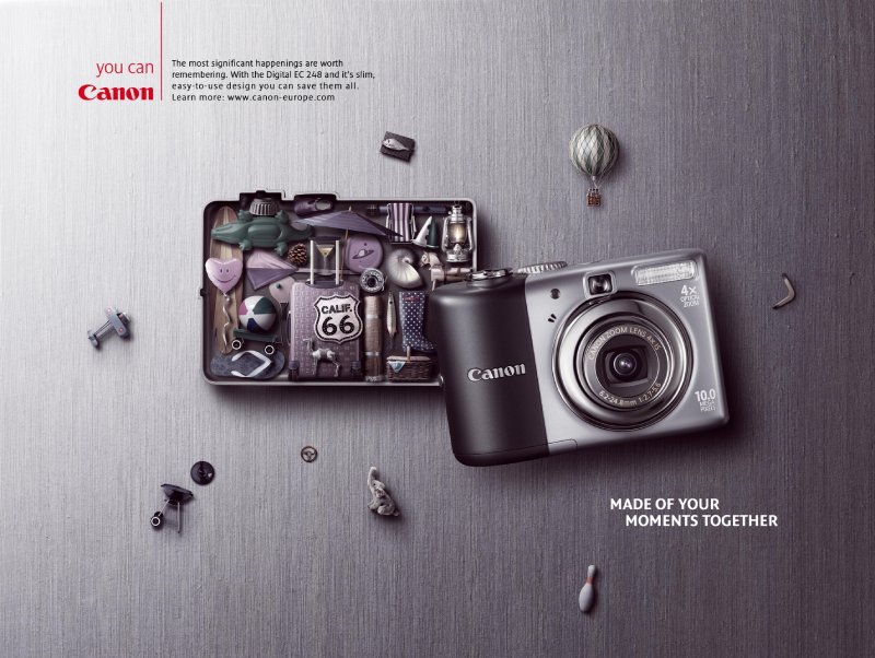
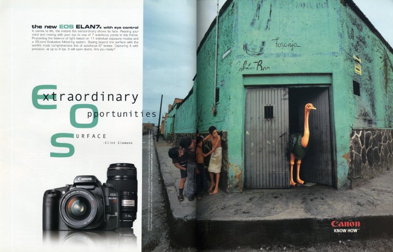
Canon print ads follow a three-element system: one dominant photographic frame, one red wordmark at fixed size, one short copy block. Colour stays restricted. The product appears at small scale or not at all, and the frame does the persuading.
The red wordmark and where it sits
The Canon logotype is a custom wordmark finalised in 1955 and adopted in red in 1956, with a hooked terminal on the C that no off-the-shelf typeface reproduces.
Placement rule across almost every execution: bottom right, small, never competing with the image.
That restraint is why the red reads as a signature instead of a shout. Red carries energy and urgency in color psychology, and Canon spends it once per page.
Image-to-text ratio
Most Canon consumer print runs somewhere between 70 and 85 percent image area.
Copy lives in a single left-aligned block, usually below the optical centre, set in a clean corporate sans-serif font that changes by region and agency.
The photograph is the argument. Everything else is caption.
Composition and hierarchy
Order of attention: image, headline, product, wordmark.
Canon layouts rarely fight this sequence, which is why the work survives being shrunk to a phone screen. Strong visual hierarchy costs nothing and rescues a lot of average photography.
The See Impossible exploded-camera piece breaks the pattern by making the product itself the focal point, floating components on a near-empty field.
Typography
Canon does not run a signature display face across markets. The wordmark carries the identity, and body type is deliberately neutral.
Headlines sit at one weight, one size, no italics. Tight kerning on the tagline is the only typographic flourish you will find in the European work.
Compare that to camera rivals who set specs in three weights across a five-column grid. Canon’s typography is closer to a museum wall label.
How Do Canon TV Commercials Differ From Its Print Ads?
Canon TV work sells the moment. Canon print sells the frame. Television spots since 2014 hide the camera almost entirely and build 60-second narratives, while print keeps the product visible and the copy under 20 words.
Come and See: Calcio Storico (2014)
Directed by Jonathan Glazer for JWT London. Sixty seconds of medieval-costumed players wrestling for a ball in a Florence square, shot entirely on Canon bodies, with no product shot until the endframe.
Live for the Story: Boundaries (2017)
VCCP London, 60 seconds, EMEA. A boy grows into a young man through bike rides, piano, fully clothed swimming. Practical lighting rigs fire in sequence with his movement so the frame flashes on and off.
The Lab: Decoy (2015)
Leo Burnett Sydney, roughly three minutes, YouTube-first. Six photographers, one subject, six fabricated backstories, then the reveal when all six prints hang on the same wall.
Long-form branded content, not a commercial. It cleared 2.3 million views in its first week.
Created Different (2025)
VCCP and Girl and Bear. High-energy cuts between three creators working in different disciplines, built for vertical crops and pre-roll as much as for broadcast.
How Has Canon Advertising Evolved Since 1976?
Canon advertising has moved through 4 strategic phases: product demonstration (1976-1988), celebrity endorsement (1989-2000), brand storytelling (2014-2019) and creator partnership (2020-2025). Each shift followed a change in who was buying cameras.
| Decade | Strategic shift | Representative campaign |
|---|---|---|
| 1970s | Camera advertising moves to national TV | AE-1 with John Newcombe |
| 1980s-90s | Athlete endorsement and lifestyle positioning | Image Is Everything, EOS Rebel |
| 2000s | Corporate slogan and product-led print | Delighting You Always, PIXMA line |
| 2010s | Brand storytelling against the smartphone | Come and See, See Impossible, Live for the Story |
| 2020s | Creator partnership and AI counter-positioning | Created Different, The Gaze Changes Everything |
The 2014 pivot was defensive. Smartphone cameras had taken the casual market, so Canon stopped arguing about specs and started arguing about intent.
Anyone hunting vintage ads from the AE-1 and A-1 era will notice how much body copy those pages carried. Six paragraphs of exposure theory was normal in 1978.
Which Agencies Created Canon Advertising?
Five agencies have owned significant Canon accounts since 2014: JWT London, Grey New York, Leo Burnett Sydney, VCCP London and Dentsu Creative. VCCP won integrated duties in a 2016 review, replacing six incumbents including JWT London.
| Agency | Campaign | Year |
|---|---|---|
| JWT London | Come and See | 2014 |
| Grey New York | Canon See Impossible | 2014 |
| Leo Burnett Sydney | The Lab | 2015 |
| VCCP London | Live for the Story, Created Different | 2017, 2025 |
| Dentsu Creative Brazil | The Gaze Changes Everything | 2024 |
Jonathan Glazer directed both Come and See films for JWT London in 2014. Taylor James produced the exploded-camera print and digital work for Grey on See Impossible in 2015.
VCCP pitched against Grey’s Possible and took the account in January 2017. PHD handled media on Live for the Story alongside VCCP’s creative.
Memac Ogilvy and INGO Hamburg produced Canon’s 2024 Father’s Day print for three EMEA markets, with art director Nicolas Lopez credited at Memac Ogilvy.
What Can Designers Learn From Canon Ads?
Canon’s work rewards five specific habits. All of them are transferable to any product where the output matters more than the object.
- Give the photograph 70 percent of the page and let the copy behave like a caption
- Lock the logo to one position and one size, then never negotiate it again
- Spend your one saturated colour on the wordmark, not the background
- Cut the product from the frame when the result is more persuasive than the tool
- Set headline and tagline at a single weight, and fix the spacing rather than adding a second face
- Test the layout at thumbnail size before approving it at A3
The last one matters more every year. A layout with weak contrast collapses on a 6-inch screen, and most of Canon’s paid reach now lands there.
Minimalist design is doing a lot of quiet work in the Canon system, though it is minimalism by subtraction rather than by style. Nothing is ornamental because nothing extra was added.
How Do Canon Ads Compare to Sony and LG Ads?
Canon and Sony split the camera category on tone. Sony’s imaging advertising leans technical, foregrounding sensor performance, autofocus benchmarks and frame rates, with product renders dominating the page. Canon has spent the last decade doing the opposite, hiding the body and arguing about what you did with it.
The gap shows most clearly in print. A Sony Alpha spread will name the sensor. A Canon spread will show a herd of deer on a suburban street and put the wordmark bottom right.
Fujifilm sits closer to Canon emotionally but sells nostalgia and film simulation instead of story. Nikon runs somewhere between the two, historically heavier on the professional endorsement.
On the printer side, Canon’s PIXMA advertising competes directly with HP on price-per-page messaging, which is a completely different creative problem from selling a lens.
For the wider consumer-electronics comparison, look at how Sony ads handle product-led layout, how LG ads use colour blocking, and how HP ads approach the print category Canon shares with them.
What Makes Canon Advertising Work?
The system holds because two things never move: the red wordmark and the rule that the photograph argues the case.
Everything else has changed at least twice since 1976. Athletes gave way to unknown subjects, spec copy gave way to three-word taglines, and the product itself gradually left the frame.
What stayed is a layout discipline most brands abandon under pressure. One image, one line, one mark, bottom right.
That consistency is why a 1978 magazine page and a 2025 pre-roll frame read as the same visual identity despite sharing almost no creative DNA.
For designers, the takeaway is unglamorous. Pick the two elements you will never negotiate, then let everything else move with the decade.
Canon Ads Examples



FAQ on Canon Ads
What is the most famous Canon ad?
The Image Is Everything spot from 1989. Andre Agassi steps out of a white Lamborghini, lowers his sunglasses and delivers the line for the EOS Rebel. The phrase followed him for the rest of his career.
What is Canon’s advertising slogan?
Canon runs different lines by region. Delighting You Always is the corporate slogan across Asia, See Impossible ran in the US from 2014, and Live for the Story covered Europe from 2017.
Who directed the Come and See commercials?
Jonathan Glazer, working with JWT London in 2014. He shot two films: a Calcio Storico match in Florence and a herd of deer walking residential streets near Epping Forest. Both were captured on Canon bodies.
When did Canon start advertising on television?
1976, with the AE-1 launch. Canon became the first Japanese camera maker to buy US national network time, using tennis and golf players to argue that automatic exposure made anyone look competent.
Why was the Image Is Everything ad controversial?
Fans read the three words as Agassi’s personal philosophy rather than camera copy. He wrote in his autobiography that sportswriters treated the line as his religion and predicted it would be his epitaph.
Did the AE-1 campaign actually sell cameras?
Yes. The AE-1 passed one million units, unprecedented for an SLR at the time. Priced at $250, roughly 40 percent under rivals, it turned a technical product into a mass-market purchase.
Have Canon ads won awards?
The Lab: Decoy took Adfest Gold for Best Use of Non-Fiction Film and Adfest Bronze for Best Internet Film. Canon’s award record sits well below its market share, which is unusual for a category leader.
Are Canon ads shot on Canon cameras?
The brand films are. Both Come and See spots were shot on Canon bodies, and Canon has used third-party work as proof too, including a 2011 Doritos commercial filmed entirely on a 7D.
How does Canon reach younger buyers?
Through creators rather than campaigns. Emma Chamberlain, Zoe Kravitz and the three creators in Created Different all came with existing audiences, which shifted Canon’s brand narrative from equipment to output.
Do Canon ads differ by region?
Substantially. India runs humour, Brazil argues photography against AI prompts, Europe runs long-form storytelling, and the US ran corporate rebranding. Only the red wordmark placement stays fixed across all four.
Conclusion
Fifty years of Canon ads come down to a single working method: hand the frame to the photograph and keep the product out of its way.
That method survived the shift from magazine spreads to YouTube pre-roll without a rewrite.
The campaign roster proves it. Grey New York exploded a 5D Mark III across a print page, Leo Burnett Sydney turned six portraits into a lesson on perspective, and VCCP built a 60-second commercial that barely showed a camera.
Different agencies, different decades, same restraint.
What designers can take from the archive is not a style. It is a set of fixed decisions about logo placement, palette limits and copy length that stopped being debated somewhere around 1976.
Consistency did the heavy lifting.

Renowned for his expertise in logo design and visual branding, Bogdan has developed a multitude of logos for various clients.
His skills extend to creating posters, vector illustrations, business cards, and brochures. Additionally, Bogdan's UI kits were featured on marketplaces like Visual Hierarchy and UI8.
He also wrote in the past years on sites like Design Your Way, WebDesignerDepot, WPDean, Designmodo, Speckyboy, Slider Revolution, and more.
- The Windsurf Logo History, Colors, Font, And Meaning - 10 October 2026
- How to Remove Background From Product Photos (No Photoshop) - 10 October 2026
- How Designers can Build a Stronger Online Creative Identity - 9 October 2026

Bogdan Sandu is a seasoned designer who has been designing websites since 2008. Renowned for his expertise in logo design and visual branding, Bogdan has developed a multitude of logos for various clients. His skills extend to creating posters, vector illustrations, business cards, and brochures. Additionally, Bogdan's UI kits were featured on marketplaces like Visual Hierarchy and UI8. He also wrote in the past years on sites like Design Your Way, WebDesignerDepot, WPDean, Designmodo, Speckyboy, Slider Revolution, and more.
You Might Also Like