Two hundred and fifty thousand rubber balls rolling down a San Francisco hill sold more televisions than any spec sheet ever did. Sony ads have worked that way for decades: build the demonstration for real, film it, name the product last.
This page collects the campaigns worth studying, with the year, agency and market attached to each.
- Bravia “Balls”, “Paint” and “Play-Doh” by Fallon London
- PlayStation “Double Life” by TBWALondon
- PS5 “Play Has No Limits” by adam&eveDDB
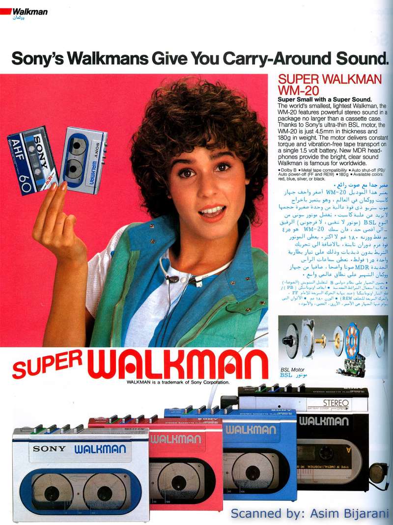
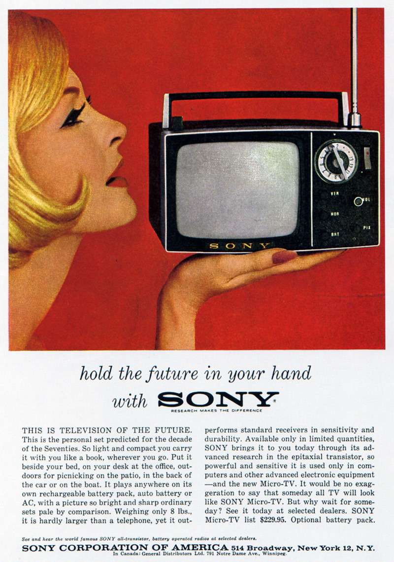
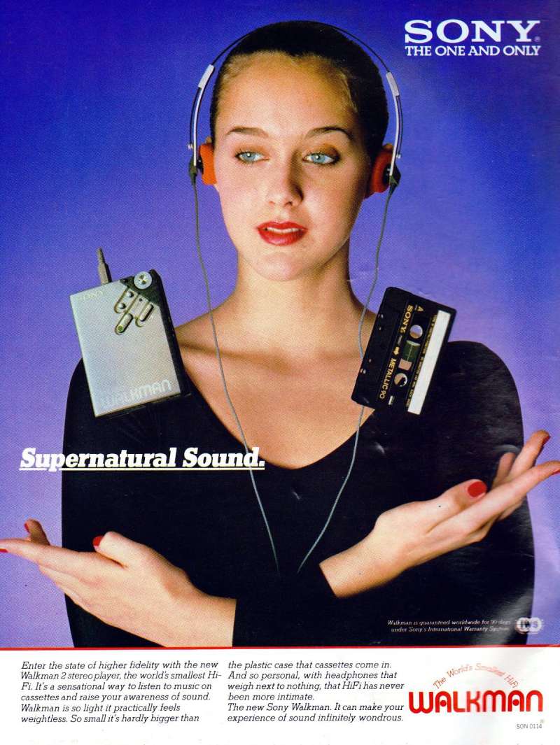
- Walkman and Trinitron print advertising
You also get the part most ad galleries skip: the composition, palette and typography choices behind the work, and what a designer can take from them.
Sony advertising covers 7 decades, 5 lead agencies and 8 flagship campaigns, from the 1955 TR-55 transistor radio press ads to the PS5 “Play Has No Limits” film released on 12 November 2024. The work runs on one repeated device: a physical spectacle shot in camera, with colour carrying the product claim.
This page covers the campaigns by name, each with its agency, year and market, plus the layout, palette and typography decisions behind them.
Sony Advertising at a Glance
Sony has advertised since 1955, working mainly with Fallon London, TBWALondon and adam&eveDDB. Its best-known campaigns are Bravia “Balls”, Bravia “Paint” and PlayStation “Double Life”. The visual signature combines saturated colour against grey streets, in-camera effects and a small logo lockup.
| Attribute | Value |
|---|---|
| First major campaign | TR-55 transistor radio press ads, Japan, 1955 |
| Lead agencies | Fallon London (2002-2009), TBWALondon (1990s-2000s), adam&eveDDB (2020-present), Dentsu (Japan) |
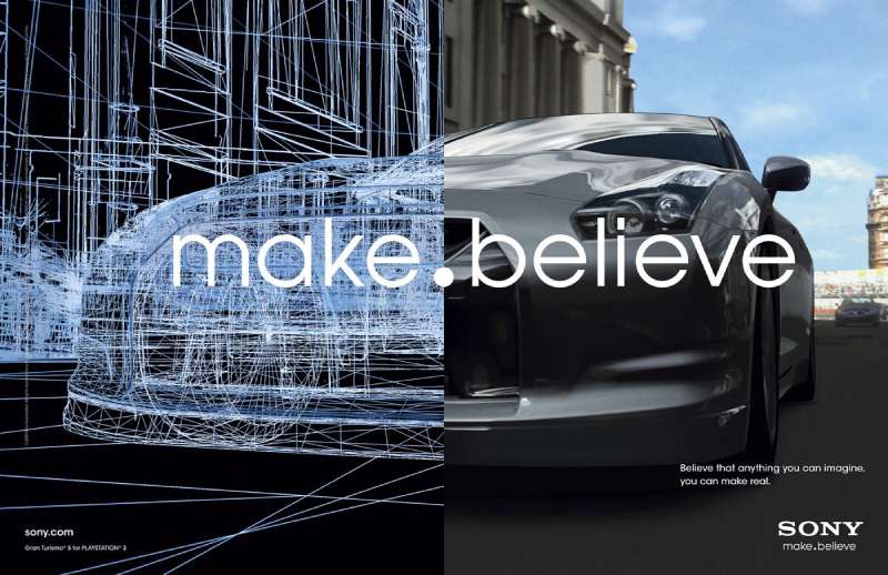
| Best-known taglines | “It’s a Sony” (1981-2005), “like.no.other” (2005-2009), “make.believe” (2009-2013), “BE MOVED” (2013-2021), “Play Has No Limits” (2020-) |
| Primary media | TV, cinema, print, out-of-home, online film |
| Awards | Cannes Gold Lion 2006 (“Balls”), Annecy advertising film award 2008 (“Play-Doh”), D&AD Pencil 1999 (“Double Life”) |
| Visual signature | Restricted background, one saturated colour event, SST type, logo at minimum size |
Statista ranked Sony Group as the top Japanese advertiser at 260 billion yen in annual spend as of August 2021.
Which Sony Ad Campaigns Are the Most Famous?
Five campaigns define Sony advertising: Bravia “Balls” (2005), Bravia “Paint” (2006), Bravia “Play-Doh” (2007), PlayStation “Double Life” (1999) and PS5 “Play Has No Limits” (2020 and 2024). Four came from London agencies. Three used no CGI at all.
Bravia “Balls” (2005)

Fallon London created “Balls” for the Bravia LCD launch, directed by Nicolai Fuglsig through MJZ. Juan Cabral wrote and art directed it. The spot sends 250,000 rubber balls down Filbert and Leavenworth in San Francisco, cut to “Heartbeats” by Jose Gonzalez.
The colour palette does the selling. Grey asphalt, grey Victorian housing, grey fog, then every hue in the spectrum moving at speed. No product shot until the last four seconds, where the endline “Colour like no other” sits alone on black.
Campaign named it Campaign of the Year in 2006. It took a Gold Lion at Cannes that June, and PetaPixel reports the shoot broke $74,000 of windows across four days of filming.
Bravia “Paint” (2006)

Location: Queens Court, a condemned 23-storey tower in Toryglen, Glasgow.
Director: Jonathan Glazer, through Academy Films, with Dan Landin shooting.
Material: 70,000 litres of water-soluble paint fired by pyrotechnics, per the BBC.
Budget: around GBP 2 million for the campaign.
The composition inverts “Balls” completely. Colour moves upward and outward from a static grey block instead of downward through a street, and Rossini’s “The Thieving Magpie” replaces the acoustic guitar. Sony launched it in the half-time break of a Champions League match on 17 October 2006.
Bravia “Play-Doh” (2007)

The third “Colour like no other” film moved to New York and traded live action for stop motion. Frank Budgen directed through Gorgeous Enterprises, with animation by Passion Pictures.
- 200 modelling clay rabbits, from 10cm to 10m tall
- 40 animators, 3 weeks of shooting, 2.5 tonnes of clay
- 100,000 stills to build a 60-second cut (Campaign)
- Soundtrack: “She’s Like a Rainbow”, The Rolling Stones
Annecy gave it the advertising film award in 2008. The purple plasticine wave rolling through Manhattan remains the most technically difficult sequence Budgen said he ever attempted.
PlayStation “Double Life” (1999)

TBWALondon built the most awarded campaign of 1999/2000 without a single frame of gameplay, according to The Drum.
Nineteen ordinary people talk to camera about their second lives as generals and pilots. James Sinclair wrote it, Ed Morris art directed, Trevor Beattie ran creative, Frank Budgen directed. Faure’s Requiem plays underneath.
The whole spot is an exercise in storytelling through design: hard side light, real faces, no set dressing, and the product name held back until the final card. D&AD awarded it a Pencil that year.
PS5 “Play Has No Limits” (2020 and 2024)

adam&eveDDB launched the platform on 20 August 2020 and returned to it in November 2024 with a live-action film directed by Frederic Planchon through Academy Films.
A city turns into a controller. Pedestrian buttons carry the PlayStation shapes, traffic lights flip to triangle, circle, cross and square, bins become hoops.
Campaign US credits Gaby Grant and Jane Barker as the creatives, with EssenceMediacom on media. The four-symbol system does the branding work here, not the wordmark.
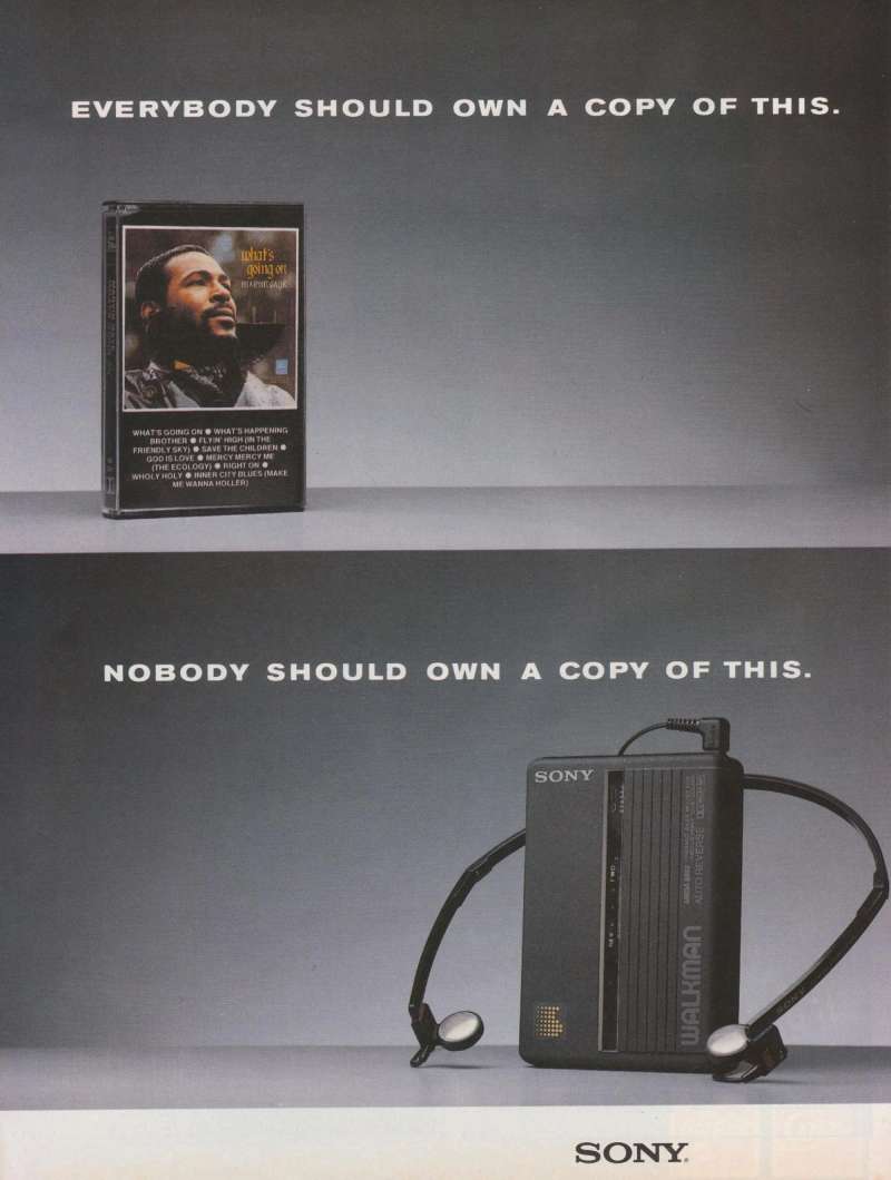
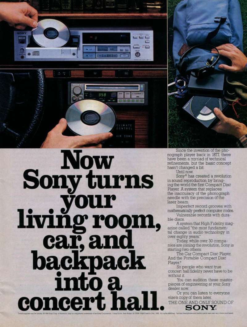
Sony Walkman and Trinitron Print Ads From the 1970s and 1980s

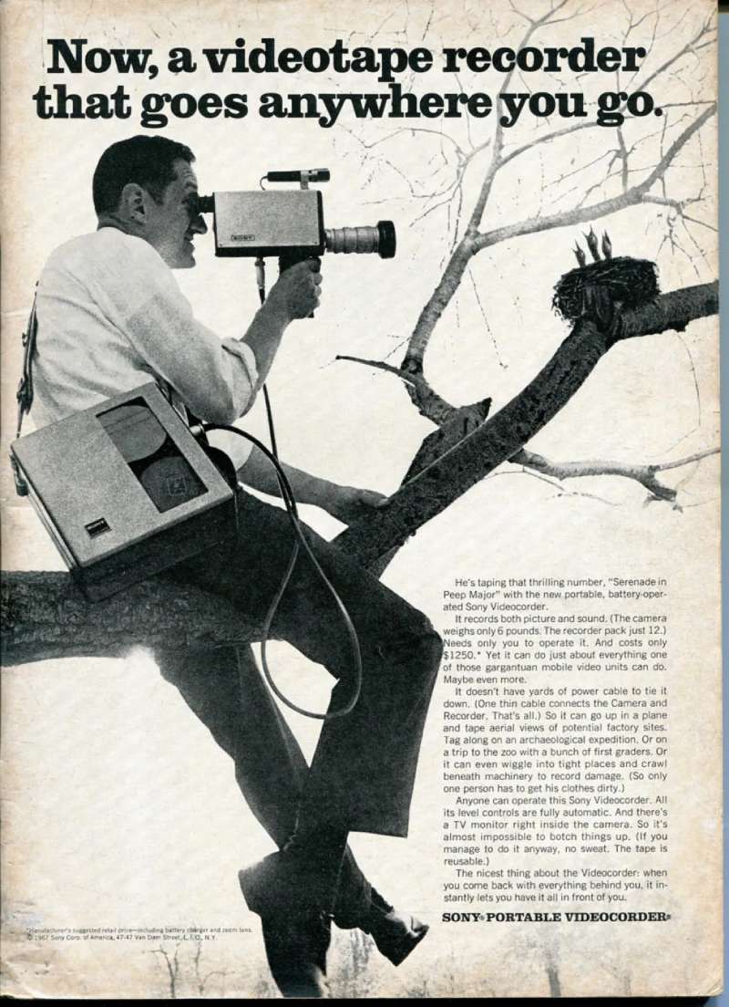
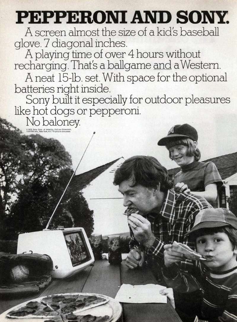
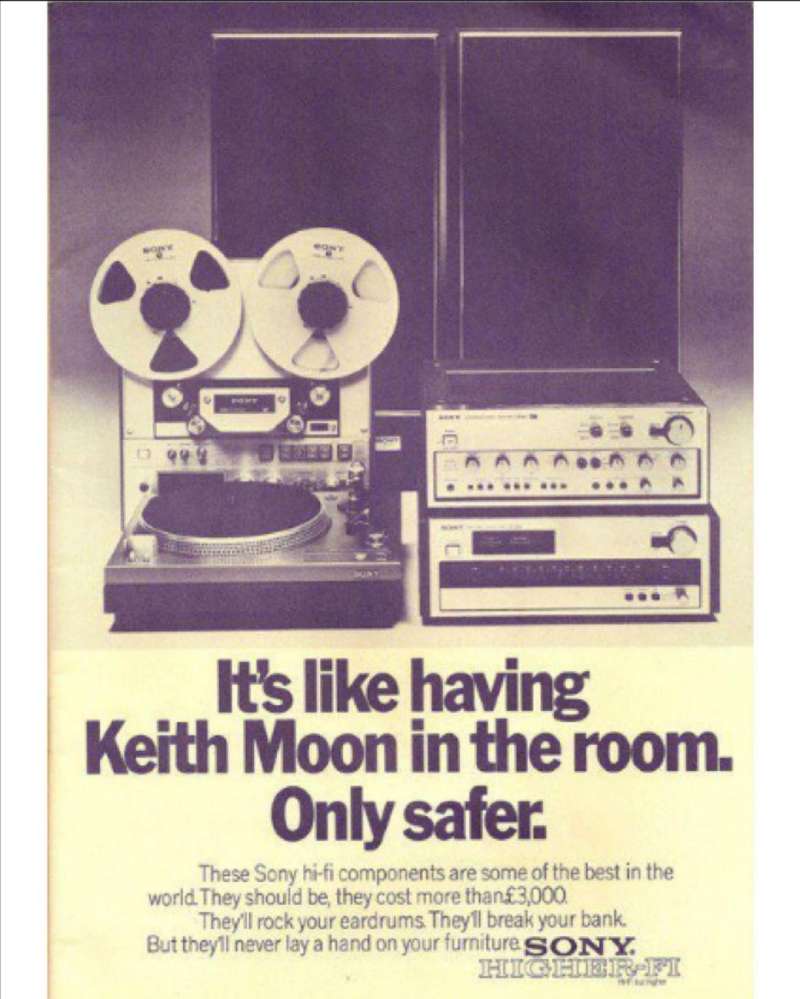
Sony’s print design era ran on product photography and long body copy, the opposite of the Bravia work.
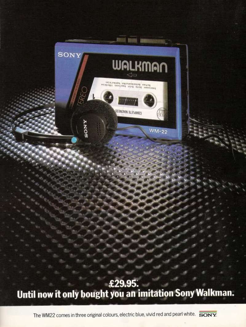
The 1979 TPS-L2 launch ads put the silver and blue player at actual size against white, with the price set in small type. Trinitron press ads used the same formula with a screen instead.
Sony sold roughly 220 million cassette Walkman units before production ended in 2010, and 385 million across all Walkman formats by 2009. These vintage ads are worth studying for one reason: they show a brand explaining a category nobody had a name for yet.
How Do Sony Print Ads Work Visually?
Sony print ads use a single-object composition on a neutral field, one saturated colour accent, and body copy set small in a humanist sans. The logo sits at minimum legible size, usually bottom right. Copy-to-image ratio stays under 20 percent on brand work.
The Bravia print run came out of the film shoots directly. Photographer Peter Funch rigged separate cameras in San Francisco to capture stills for the press campaign while Fuglsig shot the commercial, so the poster and the TV spot share one frame language.
Palette
Two colours plus black is the working rule. Everything that is not the colour event gets desaturated toward grey, which pushes contrast to its maximum without touching the tonal range of the photograph.
Layout
Sony layouts follow strict grid systems with generous margins. The product sits near the optical centre, the endline drops below it, and the white space around both is left empty rather than filled with feature callouts.
Type
Since 2013 the brand runs on SST, a humanist sans-serif font built by Monotype with Sony’s Creative Center. Akira Kobayashi led the design, modelling it between Frutiger and Helvetica.
Monotype reports SST supports 93 languages, and Hatched London counted over 23,000 drawn glyphs across the family. Owning the typeface also removed Sony’s ongoing font licensing costs on its previous corporate face.
How Do Sony TV Commercials Differ From Its Print Ads?
Sony TV commercials run 60 to 150 seconds, hold the product back until the final card, and use licensed music as the emotional carrier. Print ads show the product immediately. Film ads show the effect of the product and name it last.
Bravia “Balls” (2005, Fallon London, dir. Nicolai Fuglsig). A two-and-a-half-minute cut aired first, on Sky Sports 1 before Manchester United versus Chelsea on 6 November 2005. Sony bought the entire break.
Bravia “Paint” (2006, Fallon London, dir. Jonathan Glazer). Seventy seconds of paint detonations on a Glasgow tower, with a clown walking through the aftermath. The full film went online the morning before it aired.
PlayStation “Double Life” (1999, TBWALondon, dir. Frank Budgen). Sixty seconds of talking heads, zero gameplay footage, one line of endline copy.
Creativepool reports over a million people watched “Balls” online before its TV debut, and that Bravia demand outran supply to the point where Sony opened a new factory.
How Has Sony Advertising Evolved Since 1955?
Sony advertising has passed through 4 strategic phases: product explanation (1955-1978), lifestyle ownership (1979-1998), brand spectacle (1999-2009) and platform branding (2010-present). The taglines mark each shift precisely.
| Decade | Strategic shift | Representative work |
|---|---|---|
| 1950s-60s | Explain the new category | TR-55 and TR-6 radio press ads, “Sony Boy” character |
| 1970s-80s | Own the product silhouette | Walkman TPS-L2 and Trinitron print, “It’s a Sony” from 1981 |
| 1990s | Sell the feeling, not the spec | PlayStation “Double Life,” TBWALondon, 1999 |
| 2000s | Physical spectacle as proof | Bravia “Balls,” “Paint,” “Play-Doh,” “like.no.other” |
| 2010s-20s | One system across all divisions | “make.believe,” “BE MOVED,” “Play Has No Limits” |
The 2009 shift matters most. Sony announced “make.believe” at IFA in September 2009 as the first message covering electronics, games, music and film together, and budgeted USD 100 million behind it in 2010 with Peyton Manning and Justin Timberlake fronting the 3D push.
That decision set up the current brand guidelines, where one typeface and one lockup serve every division from Alpha cameras to PlayStation.
Which Agencies Created Sony Advertising?
Fallon London created the Bravia campaign for Sony Europe between 2005 and 2009. TBWALondon created PlayStation advertising for Sony Computer Entertainment Europe through the 1990s. adam&eveDDB has created PlayStation global brand work since 2020.
| Agency or studio | Work | Years |
|---|---|---|
| Fallon London | Bravia “Balls,” “Paint,” “Play-Doh,” “Foam” | 2002-2009 |
| TBWALondon | PlayStation “Double Life” | 1999 |
| adam&eveDDB | PS5 “Play Has No Limits” | 2020-2024 |
| Dentsu Tokyo | Bravia work in Japan | 2013 |
| Monotype | SST corporate typeface | 2006-2013 |
Directors: Nicolai Fuglsig shot “Balls” through MJZ. Jonathan Glazer shot “Paint” through Academy Films. Frank Budgen shot both “Double Life” and “Play-Doh” through Gorgeous Enterprises. Simon Ratigan shot “Foam” in Miami in 2008.
Post houses: The Mill handled “Balls”, Moving Picture Company handled “Paint”, Passion Pictures animated “Play-Doh”.
Juan Cabral wrote and art directed all three Bravia films under executive creative director Richard Flintham, which explains why the trilogy holds together as one visual argument.
What Can Designers Learn From Sony Ads?
Six rules come out of the Sony body of work, and they transfer to advertising design in any category.
- Desaturate everything that is not the message, then let one colour event carry the whole frame
- Hold the logo until the last beat and set it at minimum legible size
- Build visual hierarchy from scale contrast, not from adding weights and rules
- Set the endline in the brand typeface at one weight, and give it its own frame
- Shoot the demonstration for real when the product claim is about accuracy
- Keep the copy block short enough that kerning at display size stays under control
The last one sounds like a technicality. It is the reason “Colour like no other” works as a lockup and most tech endlines do not: four words, one weight, no descender collisions.
Sony’s approach also argues against feature-listing. Minimalist design here is a strategic choice, not a stylistic one, because the category was flooded with resolution numbers nobody could compare.
How Do Sony Ads Compare to LG Ads?
Sony and LG sell the same product to the same buyer, and their advertising splits on one decision: proof versus promise.
Sony builds the demonstration physically and films it. LG builds the demonstration on the screen itself, running high-contrast studio imagery through OLED panels to make black depth the hero. Both work. Sony’s method costs more and produces work that survives outside the ad break, which is why “Balls” still circulates 20 years later.
The typography splits too. Sony runs one humanist sans across every market, while LG ads lean harder on product-line lettering that changes per campaign.
Compare the same axis in Canon ads, where the image is always a photograph the product supposedly took, and in IBM ads, where the argument is carried by type and diagram rather than spectacle.
What Makes Sony Advertising Work?
One rule runs through 7 decades of it: pick a single claim, then prove it physically instead of describing it.
Colour gets proved by 250,000 balls. Escapism gets proved by 19 faces talking to camera. The product arrives last, small, and set in one weight.
That discipline is why the work survives outside its media buy. Repetition of one device across three films built a recognisable system, and emphasis on one element per frame kept each execution readable at any size.
Copy the restraint, not the budget. The design principles underneath cost nothing.
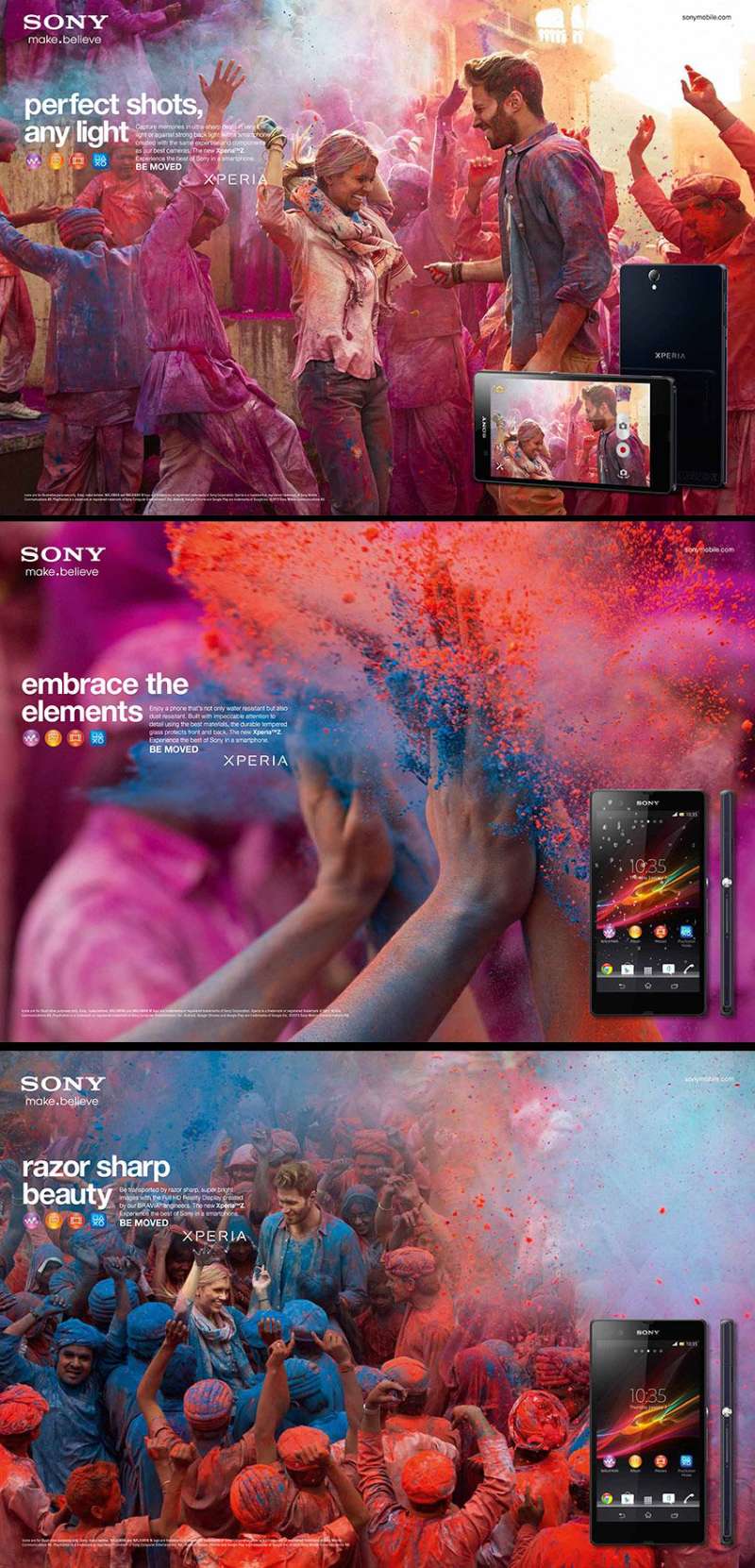
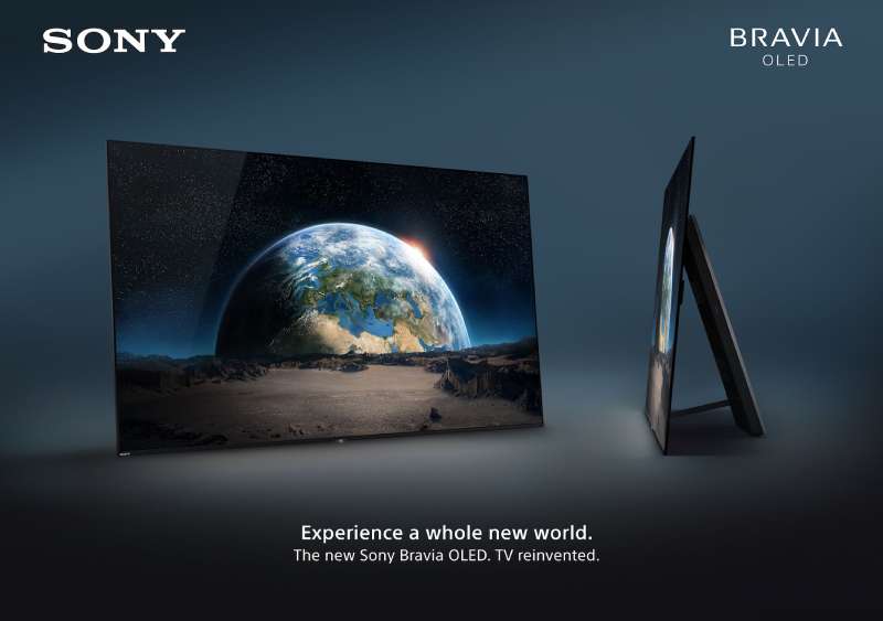
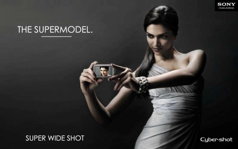
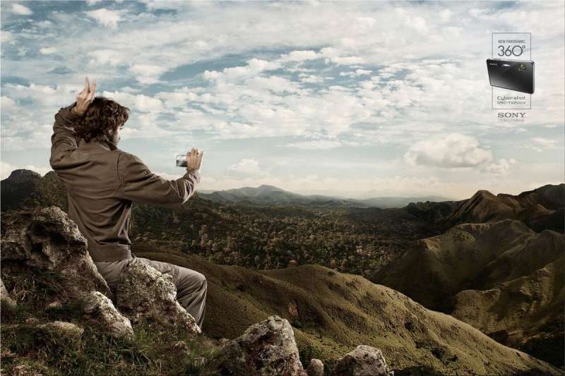
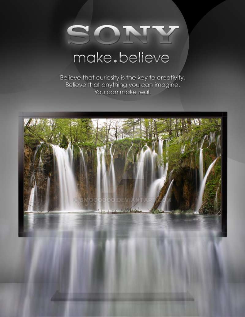
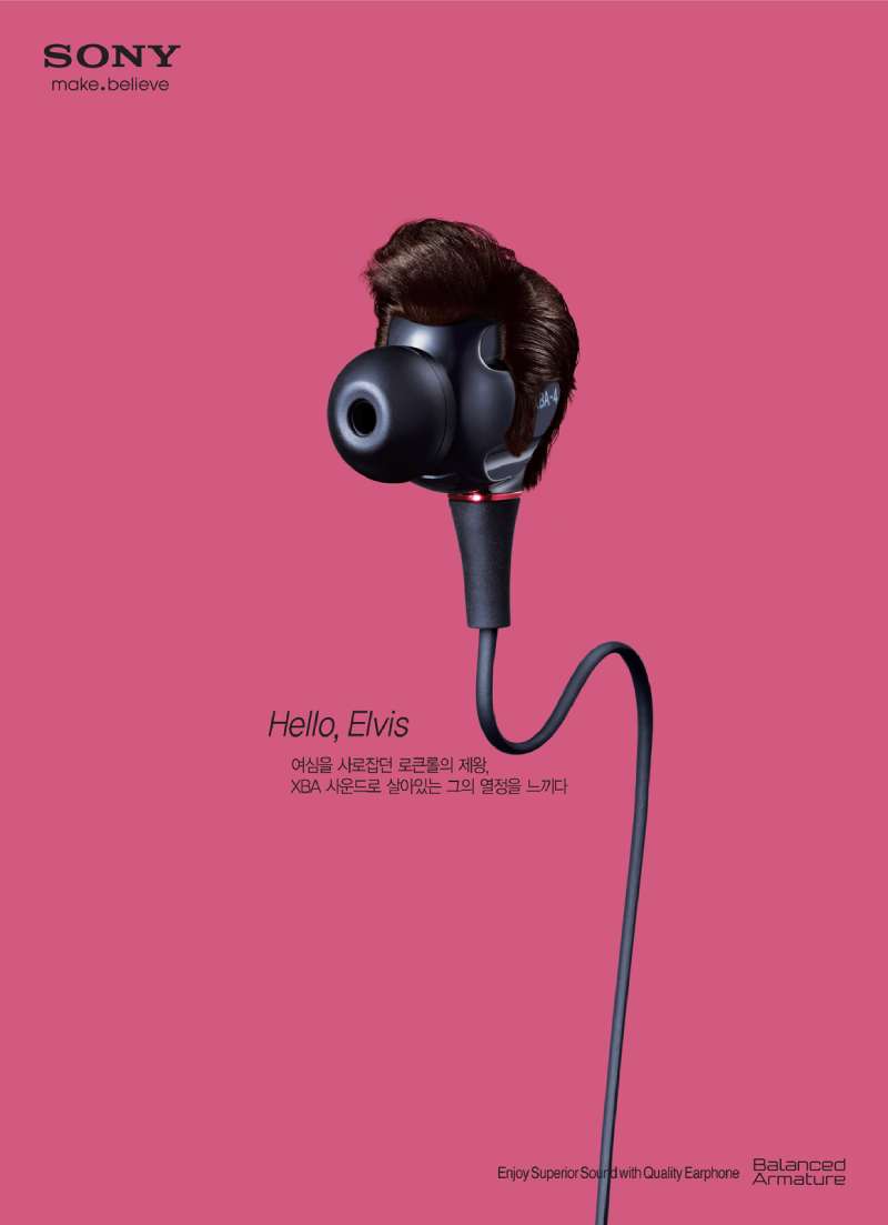
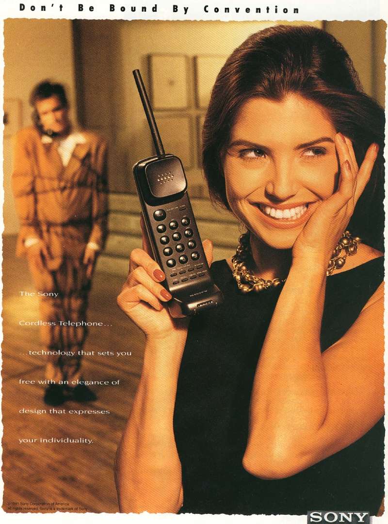
Sony Ads Examples
.


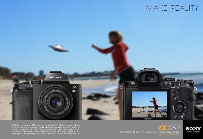
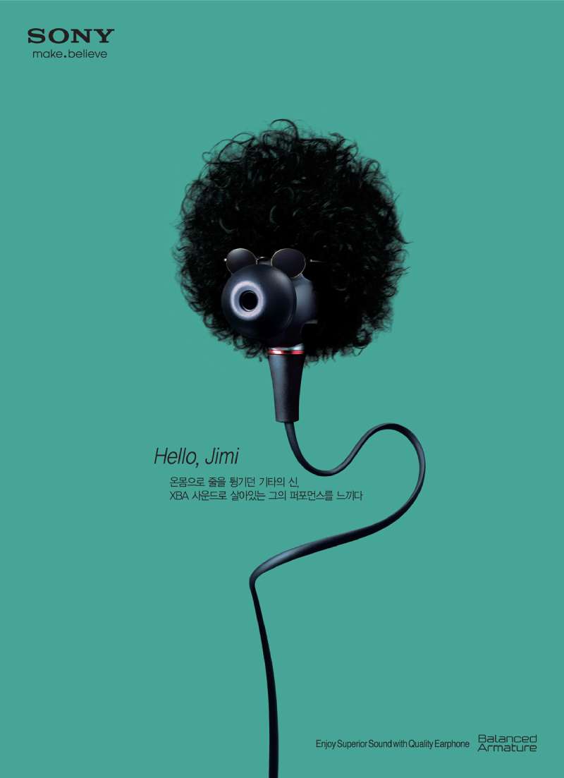
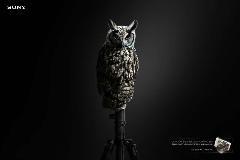
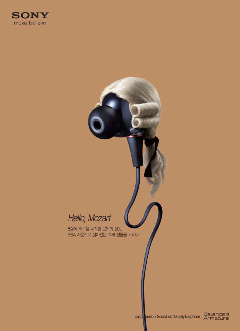
FAQ on Sony Ads
What is the most famous Sony ad?
Bravia “Balls”, released in October 2005. Fallon London sent 250,000 rubber balls down a San Francisco hill to prove one claim about colour, and the film still circulates twenty years later.
Who created the Sony Bravia campaign?
Fallon London built “Colour like no other” for Sony Europe. Juan Cabral wrote and art directed the three main films under executive creative director Richard Flintham, with OMD on media.
When did the Sony bouncing balls advert first air?
6 November 2005, on Sky Sports 1 before Manchester United played Chelsea. Sony bought the whole commercial break and ran the full two-and-a-half-minute cut rather than a trimmed 30-second version.
Where was the Sony Bravia paint ad filmed?
Toryglen in Glasgow, on a condemned 23-storey tower block called Queens Court. Jonathan Glazer directed, and the crew fired 70,000 litres of water-soluble paint using pyrotechnics.
How many balls were used in the Sony Bravia advert?
250,000, sourced by calling funfairs and dealers across America. Crews closed Filbert and Leavenworth, covered the drains, and wore riot gear borrowed from San Francisco police for the drop.
What does “Colour like no other” mean?
It is the Bravia sub-line under Sony’s “like.no.other” brand platform, used from 2005 to 2009. Each product family got its own version of the claim, stated as a human benefit instead of a specification.
What is Sony’s advertising slogan now?
PlayStation has run “Play Has No Limits” since August 2020. The group message before it went “It’s a Sony”, then “like.no.other”, “make.believe” from 2009, and “BE MOVED” from 2013.
Which Sony commercial won the most awards?
PlayStation “Double Life”, made by TBWALondon in 1999. The Drum records it as the most awarded campaign of 1999/2000, and D&AD gave it a Pencil that year.
Are Sony Walkman print ads still worth studying?
Yes, for the composition. A single product shot at near-actual size, white background, small price line, no lifestyle staging. That layout defined consumer electronics print advertising through the 1980s.
Does Sony advertise PlayStation separately from its electronics?
Yes. Sony Interactive Entertainment runs its own agencies and taglines, while Sony Electronics markets Bravia, Alpha and audio lines regionally. The shared element is the SST typeface and the logo lockup.
Conclusion
Sony ads reward study because the thinking stays visible. Strip the frame back, give one idea the whole canvas, and let saturation carry the argument.
The credits matter as much as the concepts. Nicolai Fuglsig, Jonathan Glazer and Frank Budgen brought feature-film discipline to a 60-second slot, and Cannes Lions and D&AD juries rewarded it.
Not every era landed. The “make.believe” years leaned on celebrity endorsement and lost the visual clarity the Bravia trilogy had.
Three things transfer to any brief: a restricted palette, generous negative space, and a wordmark that trusts the viewer to find it.
Then look wider. Out-of-home, packaging and stop motion all run through one typeface at Sony, and that consistency is the quieter lesson.

Renowned for his expertise in logo design and visual branding, Bogdan has developed a multitude of logos for various clients.
His skills extend to creating posters, vector illustrations, business cards, and brochures. Additionally, Bogdan's UI kits were featured on marketplaces like Visual Hierarchy and UI8.
He also wrote in the past years on sites like Design Your Way, WebDesignerDepot, WPDean, Designmodo, Speckyboy, Slider Revolution, and more.
- Canva vs PowerPoint: Which Is Better for Presentations? - 22 September 2026
- How to Install Fonts on Mac (Step-by-Step Guide) - 20 September 2026
- From Mockup to Code: How AI-Augmented Development Speeds Up the Design Handoff - 19 September 2026

Bogdan Sandu is a seasoned designer who has been designing websites since 2008. Renowned for his expertise in logo design and visual branding, Bogdan has developed a multitude of logos for various clients. His skills extend to creating posters, vector illustrations, business cards, and brochures. Additionally, Bogdan's UI kits were featured on marketplaces like Visual Hierarchy and UI8. He also wrote in the past years on sites like Design Your Way, WebDesignerDepot, WPDean, Designmodo, Speckyboy, Slider Revolution, and more.
You Might Also Like