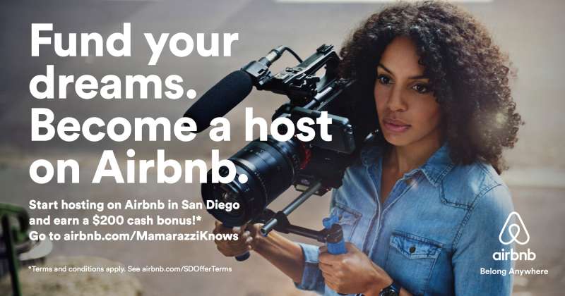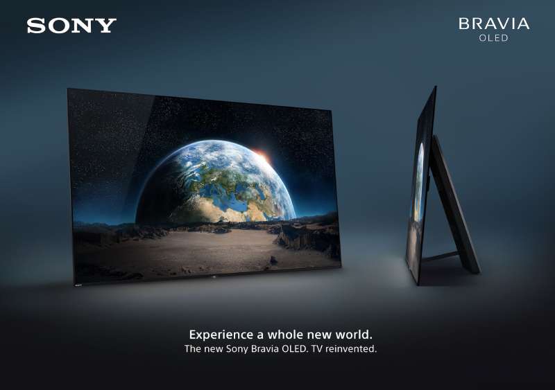
Most enterprise software advertising disappears the second you turn the page. Oracle ads did not, mainly because Oracle kept picking fights in print.
From the Unbreakable campaign of 2001 to the Exadata pages regulators forced off the market in 2012, the work runs on one claim, one color and almost no photography.
This page collects the campaigns with their years, agencies and markets, then reads the layout underneath each one: composition, typography, palette, logo placement.
What you get:
- 7 campaigns, from the Network Computer push to Oracle Red Bull Racing
- The design rules behind the print work
- A direct comparison with IBM advertising
Bring your own opinion about the copy. The craft is worth arguing over.
Oracle advertising spans 4 decades, 6 flagship campaigns and 3 sponsorship platforms, from the Network Computer push of 1995 to Oracle Red Bull Racing in 2026. The work runs on comparative performance claims, near-empty print layouts and borrowed sports equity.
Most of it was made in-house, which is unusual at this budget level and shows in the finished pages.
This page covers the campaigns, taglines, agencies and markets behind Oracle ads, plus the layout and typography decisions underneath each one.
Oracle Advertising at a Glance
Oracle Corporation has advertised since the early 1980s, running most creative through its own brand team rather than an agency of record. Its best-known campaigns are Unbreakable, the Exadata comparative print ads and Oracle Red Bull Racing. The visual signature combines Oracle Red, Oracle Sans and a very high copy-to-image ratio.
| Attribute | Value |
|---|---|
| First major campaign | “Unbreakable,” launched November 2001 |
| Lead agencies | In-house brand team; Zenith on media; Dalton Maag on typeface design from 2019 |
| Best-known taglines | “Can’t break it, can’t break in” (2001); “Exadata 20x Faster … Replaces IBM Again” (2012) |
| Primary media | Full-page newspaper print, cable TV, stadium signage, F1 livery, keynote stage |
| Primary markets | United States, United Kingdom, EMEA, Latin America |
| Visual signature | Oracle Red (PMS 180 C), Oracle Sans, white ground, left-aligned claim |
Which Oracle Ad Campaigns Are the Most Famous?
Seven Oracle campaigns carry recognition outside enterprise buying circles: the Network Computer push (1995-1998), Unbreakable (2001-2003), the Exadata comparative print ads (2010-2012), Oracle Cloud customer spots (2016-2020), Oracle Team USA (2000-2017), Oracle Red Bull Racing (2022 onward) and the venue naming programme (2007-2038).
Unbreakable (2001-2003)

Unbreakable launched in November 2001 across US print, trade press and TV, built internally under chief marketing officer Mark Jarvis. Its tagline, “Can’t break it, can’t break in,” claimed Oracle9i was both failure-proof and hacker-proof.
The layout is close to bare. A white field, one claim line set large and flush left, the red logotype small and low, and no product shot anywhere. Bloomberg reported in 2002 that Jarvis was deliberately chasing a stripped-down look, which puts every bit of emphasis on a single sentence.
Security researcher David Litchfield published working attacks within weeks. ZDNet ran the story in February 2002 under a headline about bugs busting the database open.
Network Computer (1995-1998)
Product: a diskless thin client pitched at roughly $500 against the Windows PC
Media: trade print, the Comdex keynote stage, an extended press tour
Outcome: the division was wound down; The Register later described it as reduced to an entry in Oracle’s trademark register
The creative sold one number, not a product. Tedium reports Oracle senior director Jim Lynch projected the market could reach 100 million units by 2000.
Exadata Comparative Print Ads (2010-2012)
The National Advertising Division ordered Oracle to withdraw comparative Exadata claims twice inside 4 months in 2012, both times after challenges from IBM.
| Claim | Placement | Outcome |
|---|---|---|
| “Exadata 20x Faster … Replaces IBM Again” | Wall Street Journal full page | Pulled, July 2012 |
| “5x Faster Than IBM Or You Win $10,000,000” | WSJ full page and oracle.com | NAD action, appealed to NARB |
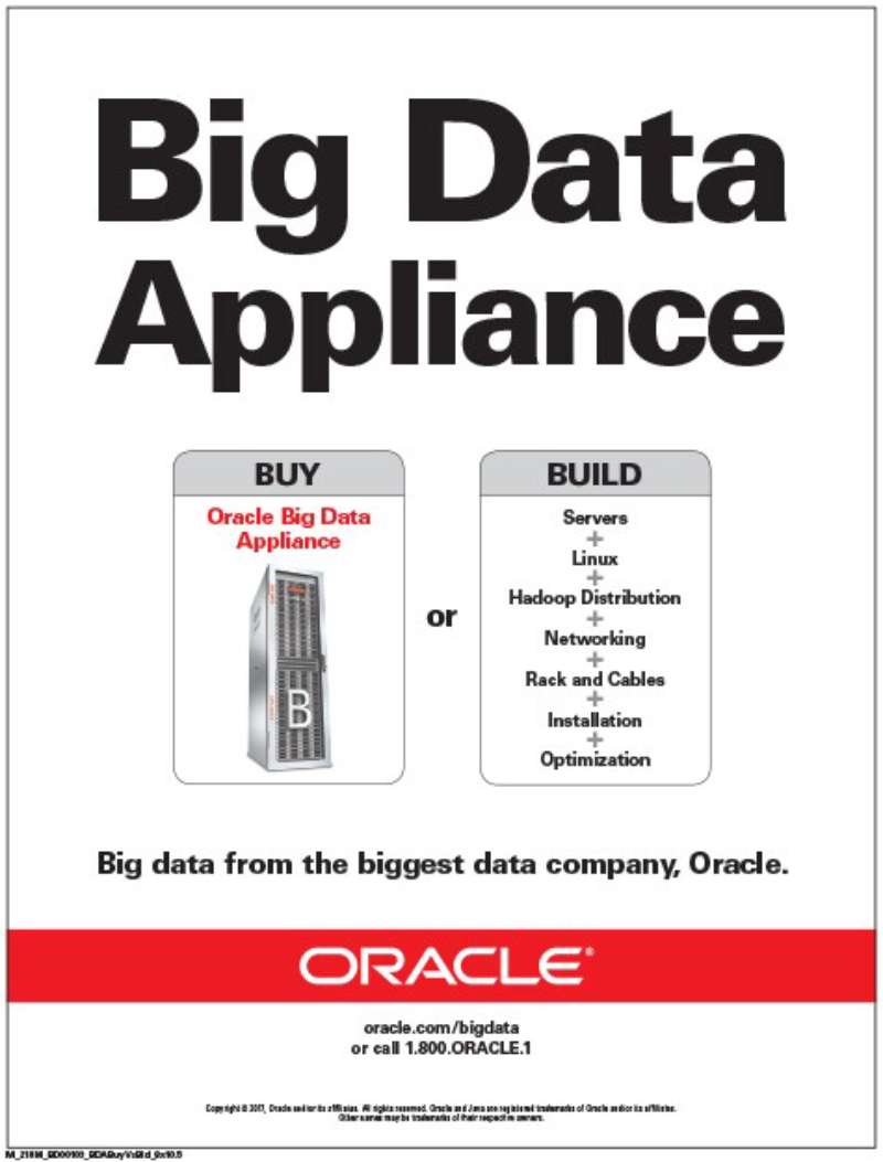
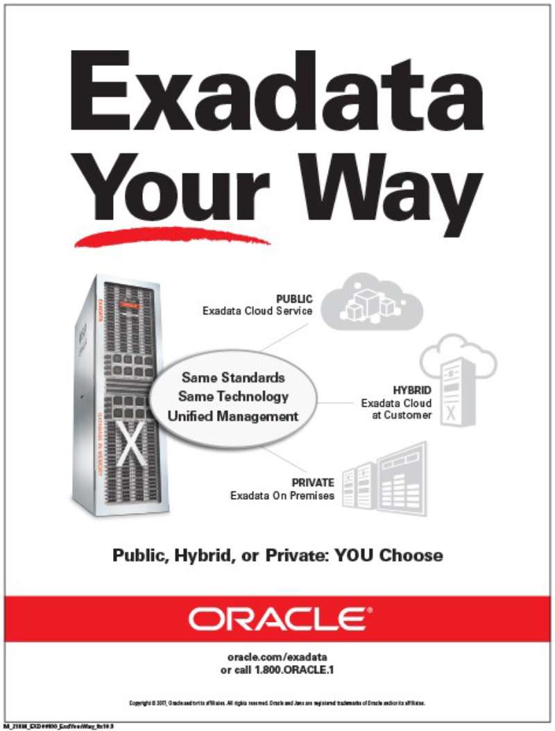
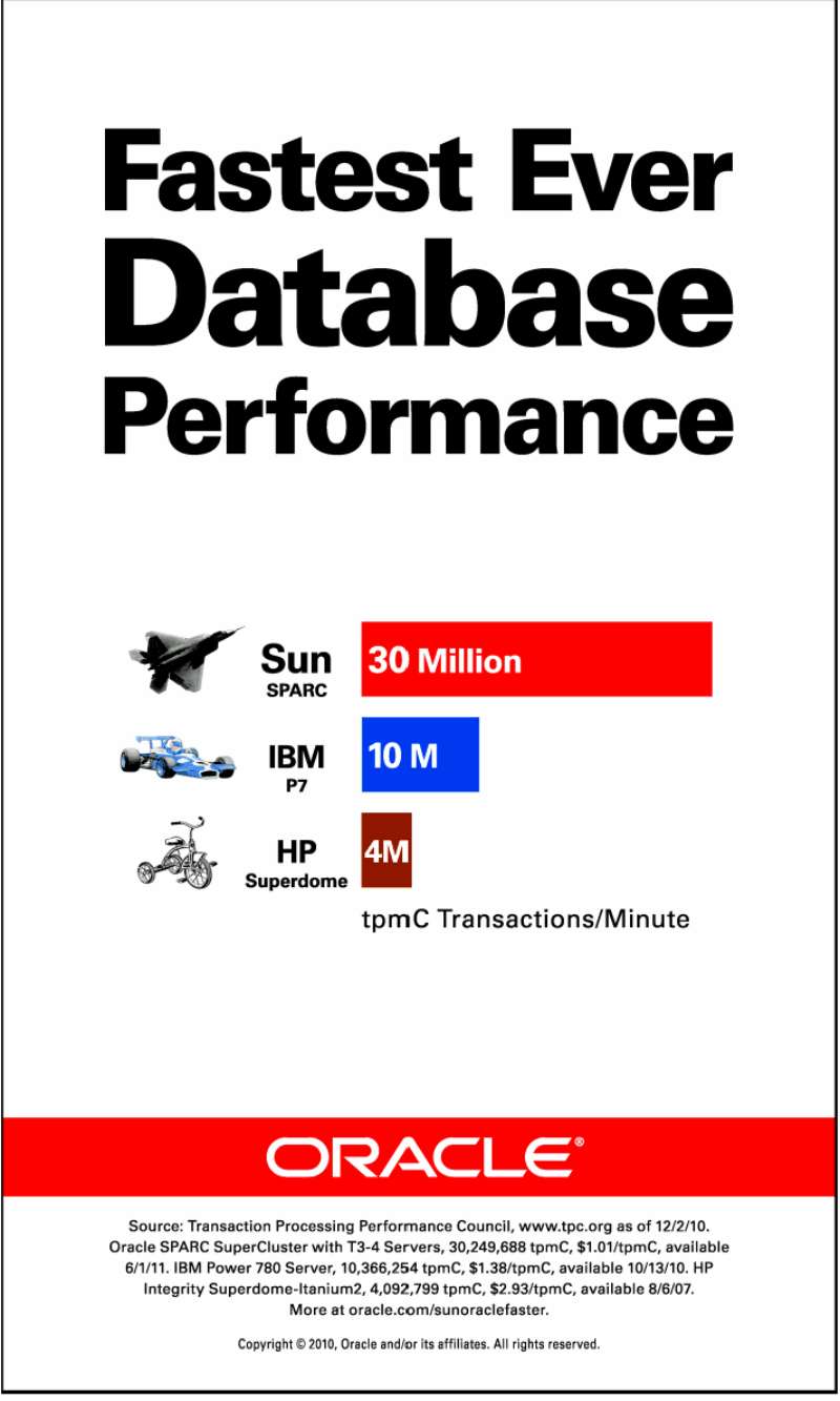
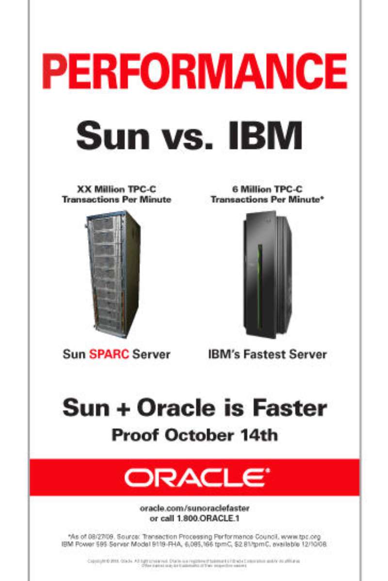
These are the loudest pages Oracle has ever printed. A condensed headline slab eats the top third, the rival’s name is set at the same size as Oracle’s own, and the typographic hierarchy collapses to two levels: the claim, then the 8pt qualifier.
Oracle Cloud Customer Spots (2016-2020)

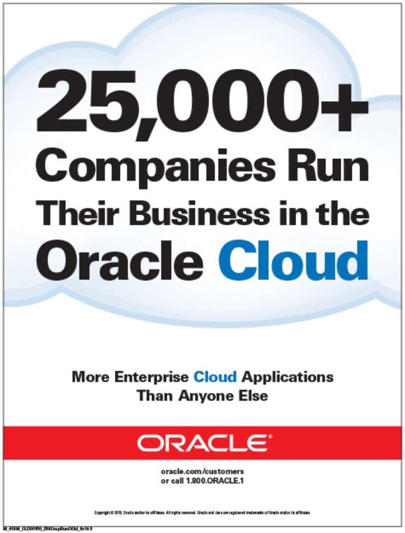
Oracle ran a long series of 30-second customer testimonial spots on US cable, with Zenith handling the media buy. Each film puts a named executive on camera describing one workload moved to Oracle Cloud.
- The GE Digital spot uses voice-over from Robert Clotworthy
- On-screen claim: more than 24,000 companies running on Oracle Cloud
- A red lower-third bar carries the logotype in every frame
Design note: no product interface appears in any of them, which is rare for enterprise software TV.
Oracle Team USA (2000-2017)

Oracle bought sailing long before it bought stadiums.
Larry Ellison founded Oracle Racing in May 2000, and the team won the 34th America’s Cup in San Francisco in September 2013 after trailing Emirates Team New Zealand 8-1. Sailing World put Ellison’s campaign spend at $170m to $200m against New Zealand’s $84m.
Hull graphics ran Oracle Red over black carbon, and the 13-story rigid wing worked as a vertical billboard readable from a helicopter camera.
Oracle Red Bull Racing (2022-Present)

Deal value: Reuters put the five-year title sponsorship near $300m; the Associated Press reported roughly $100m per season
Announced: February 9, 2022, timed to the RB18 launch
Livery: Oracle wordmark on engine cover, sidepod and rear wing endplate
Positioning: Ariel Kelman, Oracle CMO at the time, described F1 as a live demonstration surface for cloud infrastructure
The wordmark runs white on Red Bull navy rather than on Oracle Red. Handing over your own color palette to a partner is a bigger concession than most brands make.
Oracle Venue Branding (2007-2038)
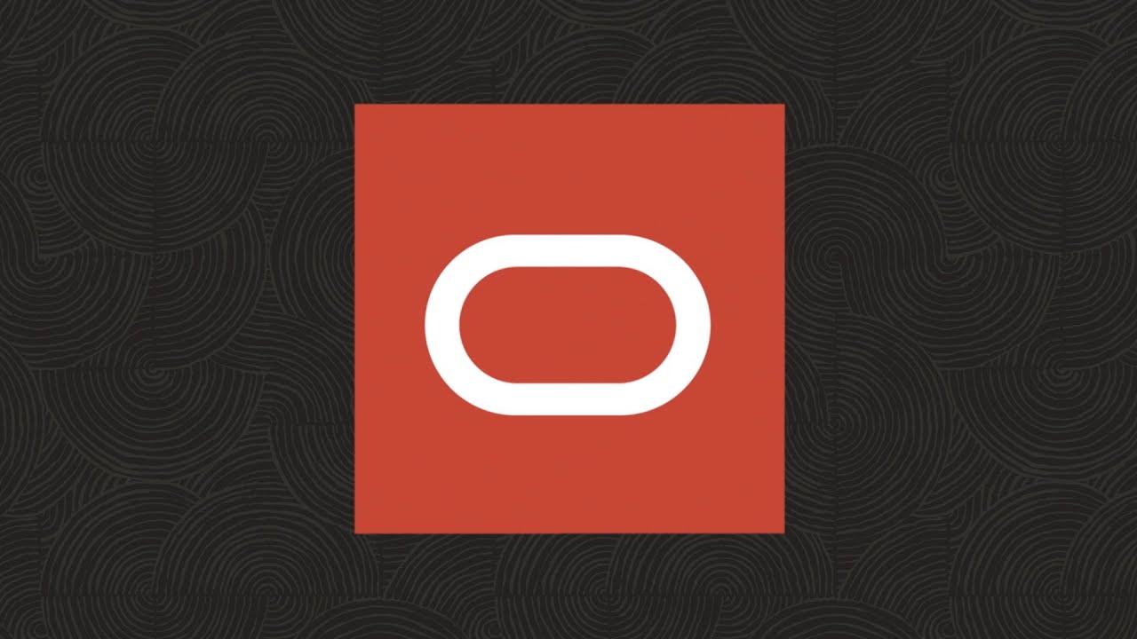
Oracle held naming rights to Oracle Arena in Oakland from 2007 until the Warriors moved to Chase Center in 2019. It signed a 20-year agreement for Oracle Park in San Francisco in January 2019, running through 2038.
Bloomberg reported the ballpark deal at over $200m. NYSportsJournalism put the figure at $350m.
Venue signage reverses the logotype out of solid red with tracking opened well past the print setting, because the reading distance is 200 metres, not 30 centimetres.
How Do Oracle Print Ads Work Visually?
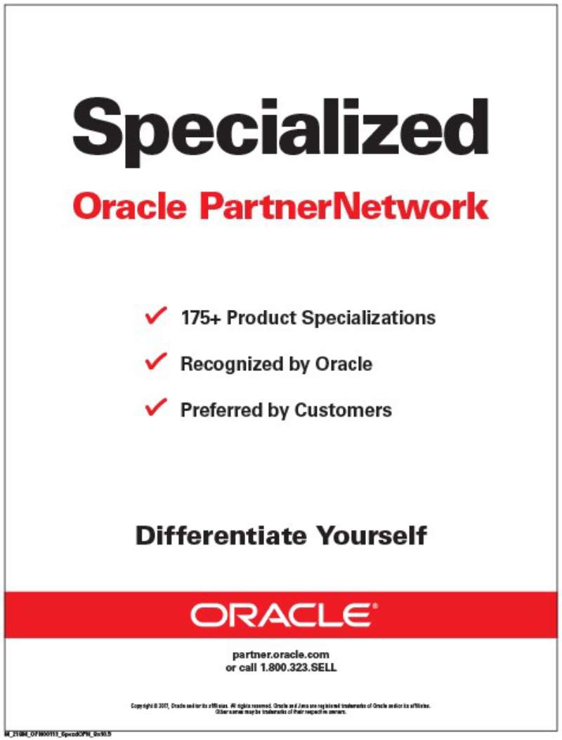
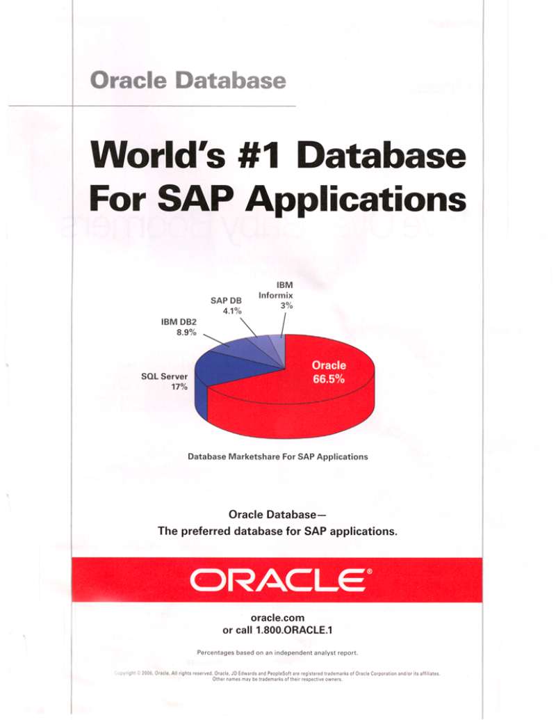
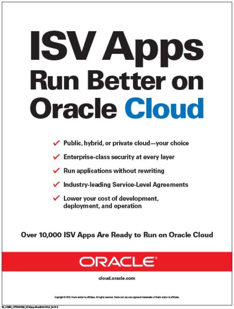
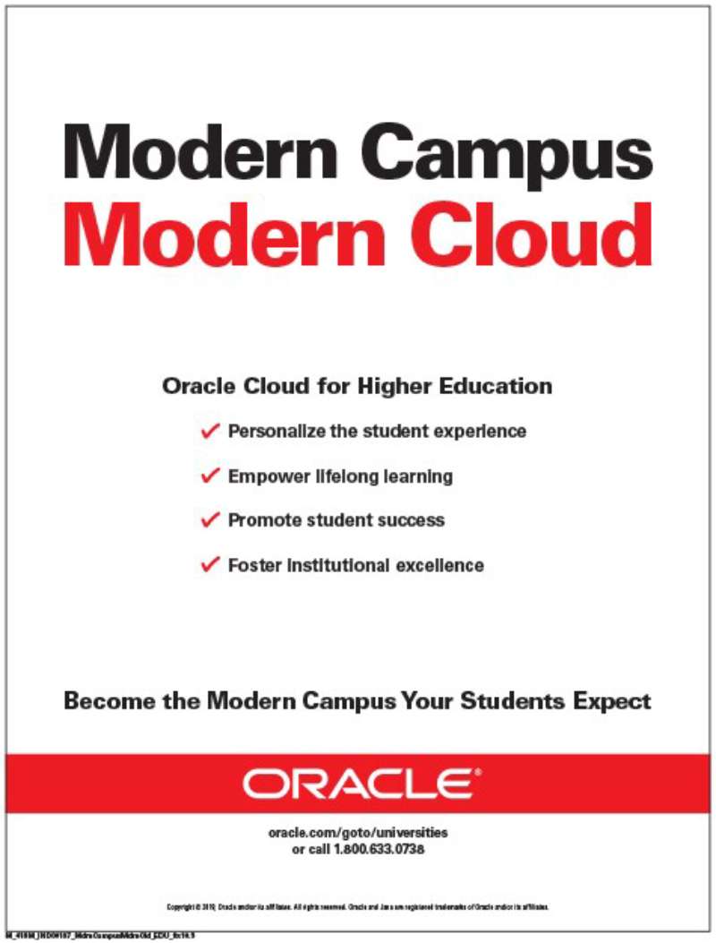
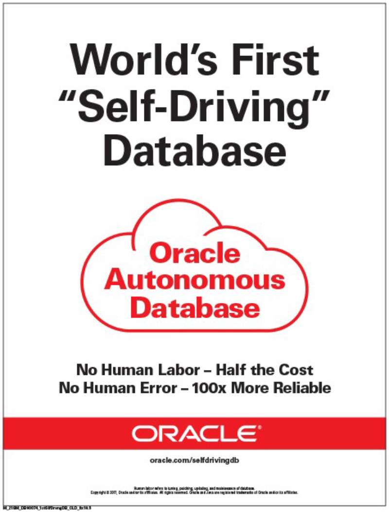
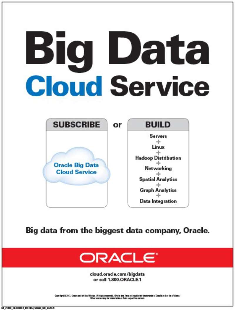
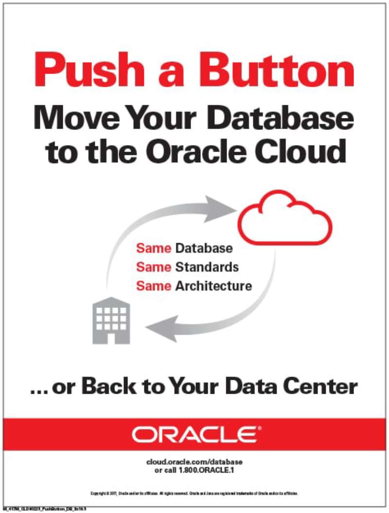
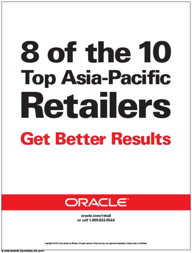
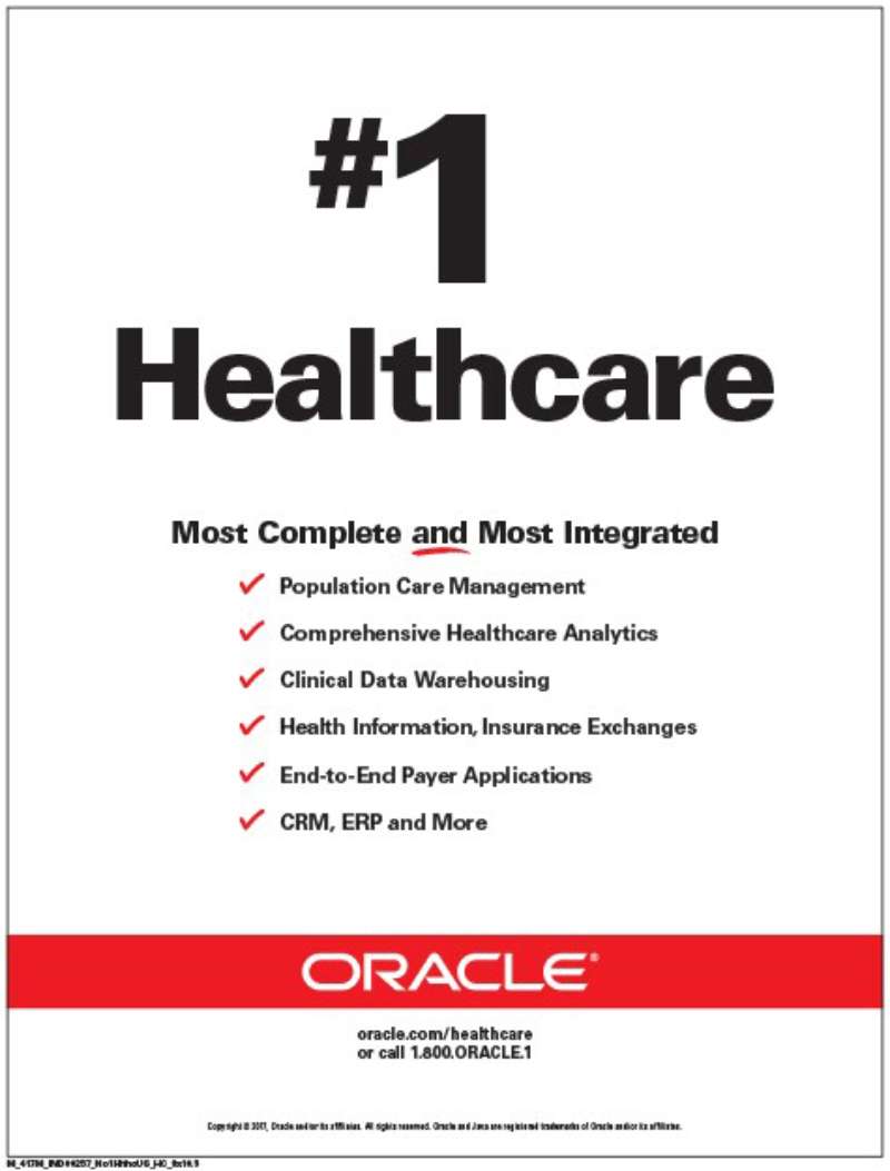
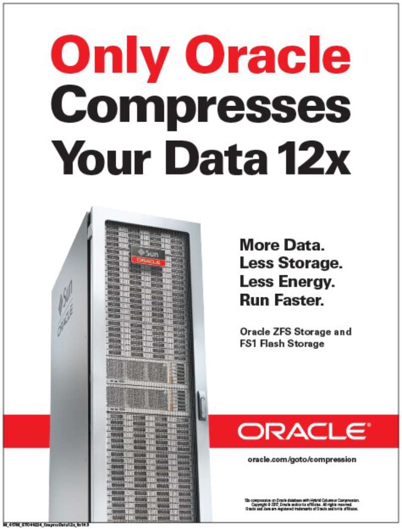
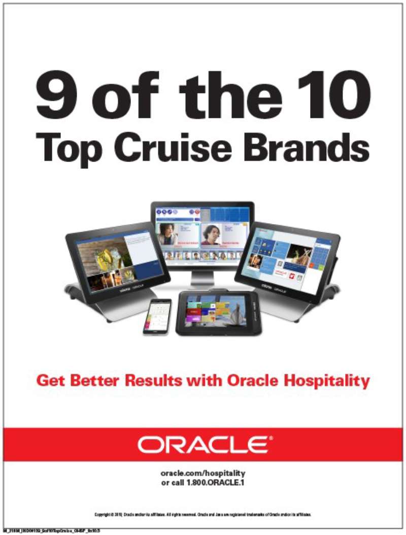
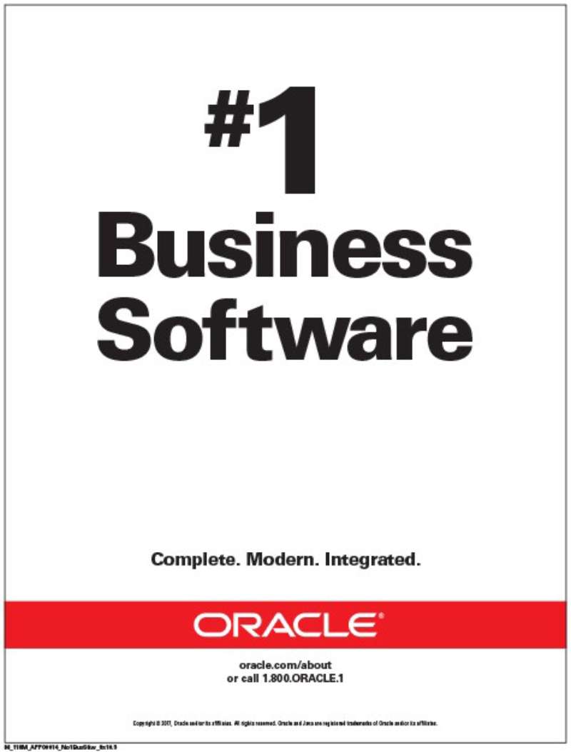
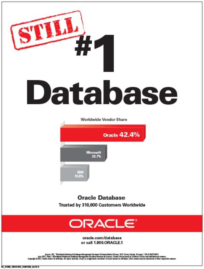
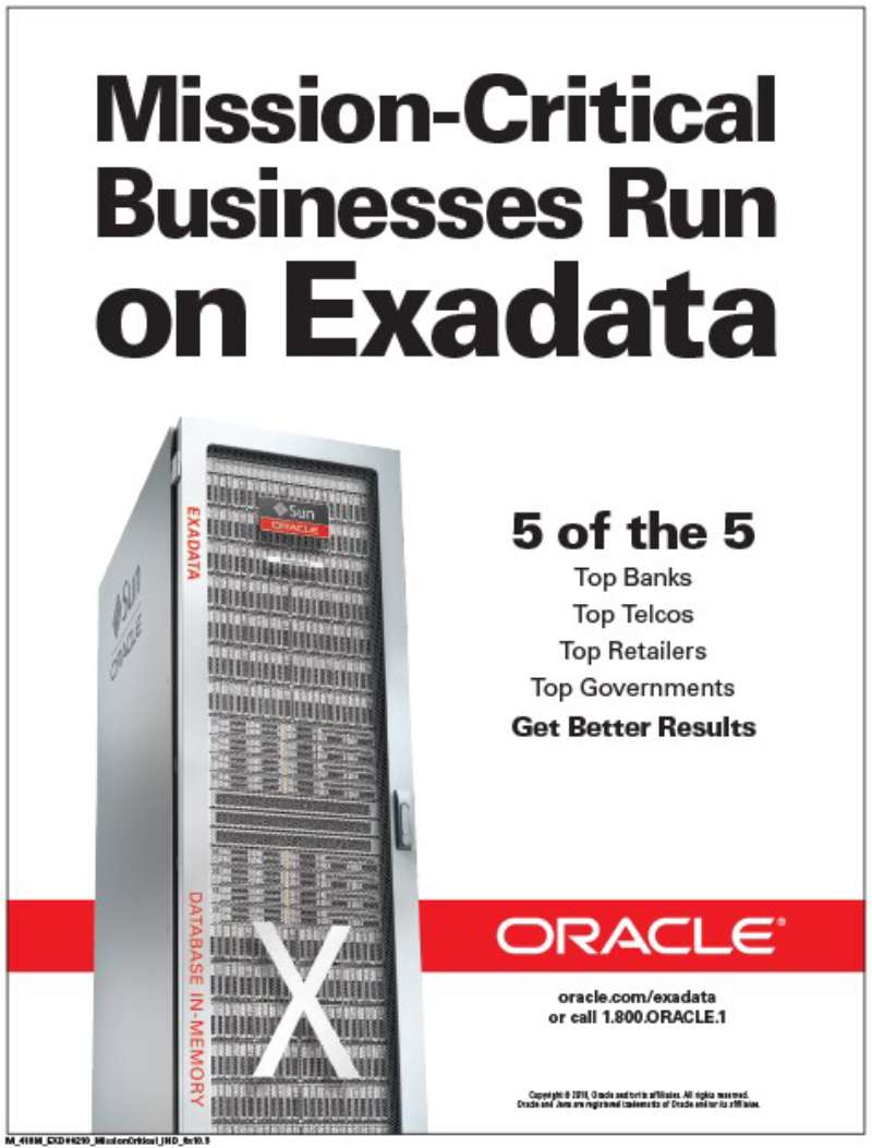
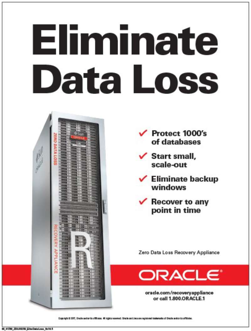
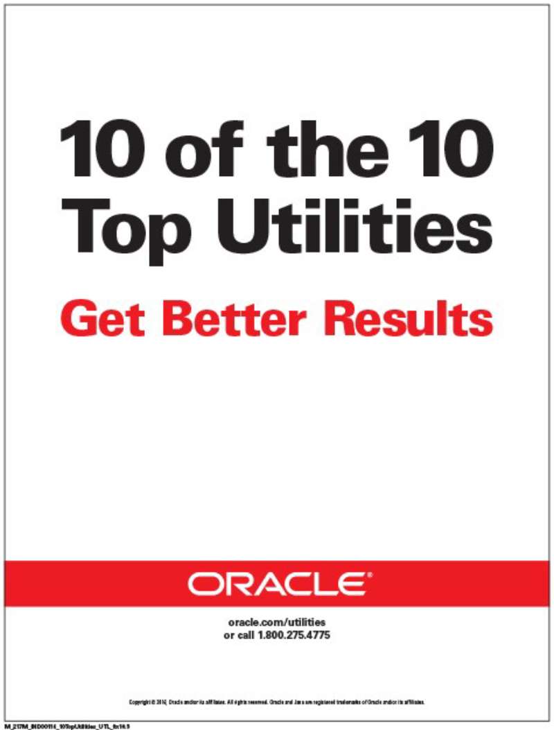
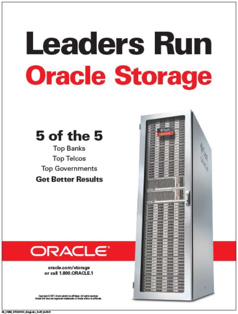
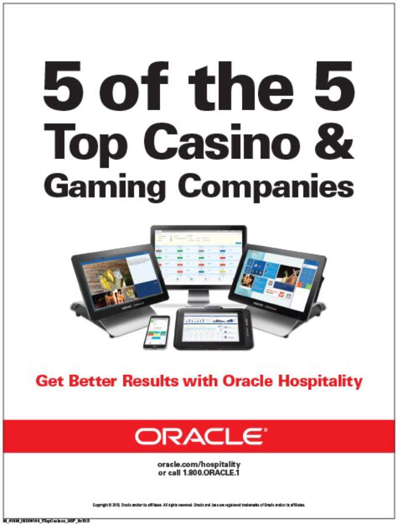
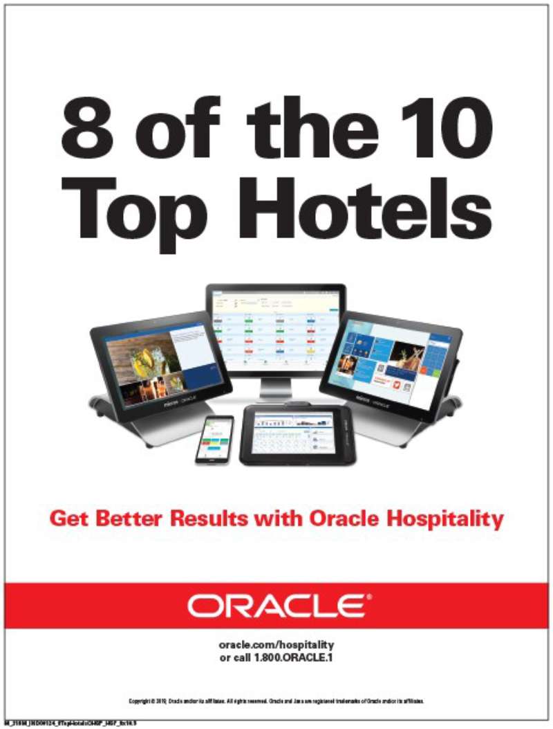
Oracle print ads use a single left-aligned claim line, a white or red ground, no photography, and the logotype parked bottom right at roughly 8 percent of page width. The visual hierarchy is two-step: claim, then legal qualifier.
The palette runs on one color. Oracle Red sits at PMS 180 C in the current Redwood system, supported by neutrals and a yellow accent, and the brand guidelines published in October 2024 instruct designers never to let red dominate a composition.
That instruction is newer than most of the famous work, which is exactly why the older Exadata pages feel so aggressive next to anything Oracle prints today.
Type since 2019 is Oracle Sans, a sans-serif font drawn by Dalton Maag with angular wedge terminals, paired with Georgia for long copy.
Layout sits on a wide single-column measure rather than a magazine grid. Compared to a Swiss-influenced multi-column system, Oracle’s approach throws away the flexibility that grid systems give you and buys back sheer legibility at speed.
The white space does the persuading. Roughly 70 percent of a typical Unbreakable page is empty, which makes the red logotype the only place the eye can land after the headline.
Where it works: a reader scanning a newspaper spread reads the claim in under a second.
Where it fails: nothing in the layout survives being shrunk to a mobile ad slot, which is part of why Oracle moved spend to sponsorship.
How Do Oracle TV Commercials Differ From Its Print Ads?
Oracle TV commercials carry a named human being; the print ads never do. Broadcast work leans on customer testimony, an on-camera executive and a spoken number, while print leans on one written claim. Both end on the same red logotype lockup.
Oracle Cloud Customers: GE Digital (2016, media by Zenith). A GE Digital finance executive explains how machine data and analytics reach customers through Oracle Cloud. Voice-over by Robert Clotworthy. Cuts stay on faces and factory floors, never on a screen.
Oracle Red Bull Racing launch film (February 2022). The RB18 reveal doubles as the sponsorship announcement, with Christian Horner tying Oracle Cloud simulations to Max Verstappen’s 2021 title. Oracle branding appears as livery, not as a card.
CloudWorld keynote openers (2023-2025). Each keynote begins with a wraparound video across the full width of the hall. This is the only place Oracle regularly commissions motion graphics at scale, and the tone is closer to a stadium intro than a software demo.
The gap between the two media is a gap in storytelling method. Print asserts. Broadcast lets a customer assert on Oracle’s behalf, which is the safer route when the National Advertising Division is reading your headlines.
How Has Oracle Advertising Evolved Since 1995?
Oracle advertising has moved through 4 phases in 30 years: product evangelism (1995-2000), security absolutism (2001-2003), comparative attack (2010-2012) and sponsored visibility (2013 onward). Media spend shifted from newspaper pages to sports rights across that arc.
| Period | Strategic shift | Representative campaign |
|---|---|---|
| 1995-2000 | Sell a category, not a product | Network Computer |
| 2001-2003 | Single absolute claim | “Unbreakable” |
| 2010-2012 | Name the rival, publish the benchmark | Exadata vs IBM Power |
| 2013-2026 | Rent attention through sport | Oracle Team USA, Oracle Red Bull Racing |
The visual identity changed once in that whole stretch. Around 2019 the brand team removed the registration mark and the red rectangle behind the logotype, making white type on a color field the default.
Kantar’s BrandZ 2025 ranking placed Oracle in the global top 10 at roughly $215bn in brand value, and Brand Finance ranked it 16th in its 2025 Global 500.
Which Agencies Created Oracle Advertising?
Oracle produces most advertising internally. Zenith bought media for the Oracle Cloud television campaign, Dalton Maag drew the Oracle Sans typeface from 2019, Newlink served as Oracle’s PR agency of record for Latin America, and Oracle Digital Experience Agency builds campaigns for Oracle customers rather than for Oracle itself.
Mark Jarvis, as chief marketing officer, devised the Unbreakable campaign in 2001. Ariel Kelman, as chief marketing officer, signed the Red Bull Racing title sponsorship in February 2022.
Dalton Maag delivered Oracle Sans as part of the Redwood design system, and the Oracle brand team paired it with Georgia. That pairing is the whole of Oracle’s brand typography stack, which is a short list for a company of this size.
A caution worth stating plainly: Oracle’s creative agency history is thinly documented compared with consumer brands, and secondary sources contradict each other. Verify any AOR claim against Adweek or Campaign archives before repeating it.
What Can Designers Learn From Oracle Ads?
Oracle print work offers 5 transferable decisions: claim placement, palette restraint, logo scale, copy hierarchy and the handling of a competitor’s name. Each one is visible in the pages themselves without any brief attached.
- Set the claim flush left at the optical upper third, not centered
- Hold the palette to one color plus black on white
- Scale the logotype down until the headline wins, then stop
- Drop the qualifier to a size that reads as legal, not as body copy
- Match a rival’s name to your own point size when you name them at all
- Reserve red for the mark, never the background of a text-heavy page
The fourth one is the trap. Oracle used scale and proportion to bury the qualifiers that carried the actual evidence, and a regulator noticed. Good advertising design makes a claim readable; it does not make the caveat unreadable.
How Do Oracle Ads Compare to IBM Ads?
Oracle and IBM spent 3 years arguing on the same newspaper pages, which makes the comparison unusually direct. Oracle names the rival and publishes a multiplier. IBM answers through institutional campaigns that rarely mention anyone by name, which is why IBM ads read as calm and Oracle’s read as combative.
The design difference follows the strategy. IBM inherited a Paul Rand identity system with a defined grid and a fixed set of marks, so its pages look composed. Oracle’s pages look typed, because the claim was written first and the layout was fitted around it afterwards.
Against silicon brands the contrast sharpens further. Intel ads sold an ingredient with a five-note sonic logo and a sticker, and Dell ads sold configuration and price to individuals. Oracle never had a consumer product to photograph, so it printed sentences.
That absence explains the sponsorship pivot better than any strategy deck. When you cannot show the product, you buy a car that goes 200mph and put your name on it.
What Makes Oracle Advertising Work?
Oracle advertising works when it commits to one claim and hands that claim the entire page.
The stripped layout is not minimalist design chosen for taste. A single sentence on white with a small red mark is the cheapest available way to make an argument legible to somebody who was not looking for it.
Where the work fails, it fails on evidence rather than craft. The comparative pages were set with real skill and were legally indefensible, and the layout took the blame for a copy decision.
The sponsorship era sidesteps that problem by moving the argument out of type altogether. A name on a car makes no claim anyone can challenge, and the contrast between that and a 20x performance headline is the whole story of this brand’s advertising.
Oracle Ads Examples

FAQ on Oracle Ads
What is Oracle’s best-known tagline?
“Can’t break it, can’t break in” carried the Unbreakable campaign from November 2001. Oracle has not run a comparable consumer-facing slogan since, leaning instead on product names and performance numbers as the headline itself.
Why is the Oracle logo red?
Oracle has never published a reason. Secondary sources attribute the choice to energy and authority, which is standard color psychology reasoning applied after the fact rather than documented intent.
Which typeface appears in current Oracle ads?
Oracle Sans, drawn by Dalton Maag from 2019, paired with Georgia for running copy. Earlier material used Helvetica Neue through the Alta interface theme, so pre-2019 ads look noticeably more generic.
What is the Redwood design system?
Redwood is Oracle’s cross-product design system covering typography, color and interface patterns. The October 2024 brand style guide defines Oracle Red at PMS 180 C and instructs designers never to let red dominate a layout.
Has Oracle ever won a Cannes Lions?
No public record shows one. Oracle Digital Experience Agency reports more than 60 awards in recent years, but those went to client campaigns for brands like The Vitamin Shoppe and Xfinity, not to Oracle’s own advertising.
Do Oracle ads use photography?
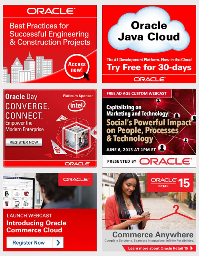
Rarely. Print work runs type on flat color with no product shot, and the television spots use documentary-style customer footage instead of art-directed imagery. The print design approach has stayed image-free for two decades.
What role does Larry Ellison play in Oracle advertising?
Ellison generates the sponsorship side personally. He founded Oracle Racing in May 2000, co-founded SailGP with Russell Coutts, and his America’s Cup campaigns put the wordmark on hulls long before Oracle bought stadium naming rights.
Does Oracle advertise outside the United States?
Yes. Oracle has run full-page ads in the European edition of the Wall Street Journal, and Newlink has served as its agency of record for Latin America. Formula One coverage handles global reach cheaply.
Can designers reuse Oracle ads in a portfolio?
Reproducing campaign imagery for commentary and study is common practice, though the layouts and the wordmark remain protected. Credit the year and the campaign, and check with a lawyer before commercial reuse. Not legal advice.
Where does Oracle spend its advertising money now?
Sport, mostly. Red Bull Racing livery, Oracle Park signage and SailGP carry more visibility than print, supported by CloudWorld keynote production and a thin layer of cable television. The corporate identity does the rest.
Conclusion
Oracle ads reward a second look, mostly because so little is happening on the surface.
A benchmark claim, a wordmark, a field of white.
That combination held from the trade press of the 1990s through the comparative advertising of 2012 and into motorsport branding today.
The lesson for designers is not the restraint. Plenty of brands strip a layout back to nothing.
The lesson is what restraint costs you when the claim sitting underneath it cannot be defended.
Oracle spent four decades proving a page can be beautifully set and still collapse under scrutiny. Then it moved the whole argument onto race liveries and stadium signage, where nobody audits a headline.
Study the layouts. Argue with the copy.

Renowned for his expertise in logo design and visual branding, Bogdan has developed a multitude of logos for various clients.
His skills extend to creating posters, vector illustrations, business cards, and brochures. Additionally, Bogdan's UI kits were featured on marketplaces like Visual Hierarchy and UI8.
He also wrote in the past years on sites like Design Your Way, WebDesignerDepot, WPDean, Designmodo, Speckyboy, Slider Revolution, and more.
- The Windsurf Logo History, Colors, Font, And Meaning - 10 October 2026
- How to Remove Background From Product Photos (No Photoshop) - 10 October 2026
- How Designers can Build a Stronger Online Creative Identity - 9 October 2026

Bogdan Sandu is a seasoned designer who has been designing websites since 2008. Renowned for his expertise in logo design and visual branding, Bogdan has developed a multitude of logos for various clients. His skills extend to creating posters, vector illustrations, business cards, and brochures. Additionally, Bogdan's UI kits were featured on marketplaces like Visual Hierarchy and UI8. He also wrote in the past years on sites like Design Your Way, WebDesignerDepot, WPDean, Designmodo, Speckyboy, Slider Revolution, and more.
You Might Also Like