A hobo in a bowler hat sold the world its first mass-market computer. IBM ads have run on that logic ever since: one idea, one image, almost nothing else on the page.
Ogilvy held the account for 32 years and built Solutions for a Small Planet, e-business and Smarter Planet out of that single rule.
This page catalogues the campaigns with the agency, year and market behind each one, then takes apart the layout decisions underneath them.
What you get:
- Six flagship campaigns, dated and credited
- The typography, palette and grid logic Paul Rand set in motion
- What the 8-bar logo does that most corporate marks cannot
- Four rules you can apply to your own layouts
IBM advertising spans 45 years of named campaign platforms, 3 agency eras and 6 flagship ideas, from the Little Tramp launch of the IBM PC in 1981 to “Let’s create smarter business” in 2025. The work runs on restraint. One idea, one image, one line, surrounded by a lot of empty paper.
This page covers the campaigns by name, with the agency, year and market behind each one, plus the layout, typeface and color decisions that hold them together.
IBM Advertising at a Glance
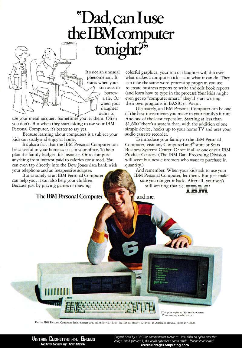
IBM has run branded advertising since the 1920s, working with Lord, Geller, Federico, Einstein on the PC account and with Ogilvy on everything else from 1994 to 2026. Its best-known campaigns are Little Tramp, e-business and Smarter Planet. The visual signature combines the 8-bar logo, IBM Blue and wide white margins.
| Attribute | Value |
|---|---|
| First major campaign | Little Tramp, 1981, for the IBM PC 5150 |
| Lead agencies | Lord, Geller, Federico, Einstein (1981-1987); Ogilvy (1994-2026); Code and Theory with Anomaly, Stagwell (2026-) |
| Best-known taglines | “THINK” (1911), “Solutions for a Small Planet” (1995), “e-business” (1997), “Let’s Build a Smarter Planet” (2008), “Let’s Create” (2022) |
| Primary media | Newspaper, business magazine, TV, out-of-home, digital |
| Awards | Cannes Lions Outdoor Grand Prix 2013, Gold Global Effie 2010, 5 for 50 Effie 2019, Advertising Hall of Fame 2022 |
| Visual signature | 8-bar logo, IBM Blue (Pantone 2718C), IBM Plex, generous white margins |
Which IBM Ad Campaigns Are the Most Famous?
The 6 most famous IBM ad campaigns are Little Tramp (1981-1987), Solutions for a Small Planet (1995-2000), e-business (1997-2003), Let’s Build a Smarter Planet (2008-2015), Era of Cognitive Business with Watson (2015-2018) and Let’s Create (2022-2025). Five of the six came from Ogilvy.
Little Tramp (1981-1987)

Lord, Geller, Federico, Einstein launched the IBM PC 5150 in August 1981 using a Charlie Chaplin lookalike under the line “a tool for modern times.” The agency auditioned more than 30 Chaplin impersonators before casting Billy Scudder, according to Ad Age.
The print layouts sit the Tramp against flat backdrops with a single prop, usually a rose or a bowler hat, and let the empty area around the figure carry the mood. Body copy drops to a narrow column at the base. The logo sits small, bottom right.
Industry insiders put the spend at $36 million, one of the largest personal computer campaigns mounted at the time (Time, 1984).
Solutions for a Small Planet (1995-2000)

The brief: reposition IBM from a box maker into a services company after the 1993 collapse.
The agency: Ogilvy & Mather, first major work on the newly consolidated account.
The format: 30-second vignettes set in Prague, Italy, Paris and rural France, with subtitles and a different musical world per spot.
The campaign broke on New Year’s Day 1995 (Encyclopedia.com). Its narrative approach put ordinary people in frame and kept the product off screen for most of the running time.
e-business (1997-2003)

IBM spent roughly $500 million on the e-business platform and another $28.5 million on online ads in 1998 alone, per IBM’s own company history.
The campaign opened on 7 October 1997 with an eight-page manifesto inserted into the Wall Street Journal. Ogilvy built the TV work as black-and-white office dramas, so the red lowercase “e” with its curling tail was the only color on screen.
- Monochrome film, single spot color in the endframe
- Headline-only print, sometimes 4 words on a full page
- Tonal separation doing the work a product shot usually does
By 1999 IBM served e-business to over 10,000 clients, and unaided association between the term and the brand ran 7 times higher than its nearest rival.
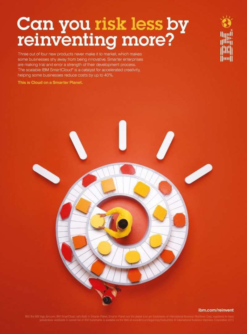
Let’s Build a Smarter Planet (2008-2015)

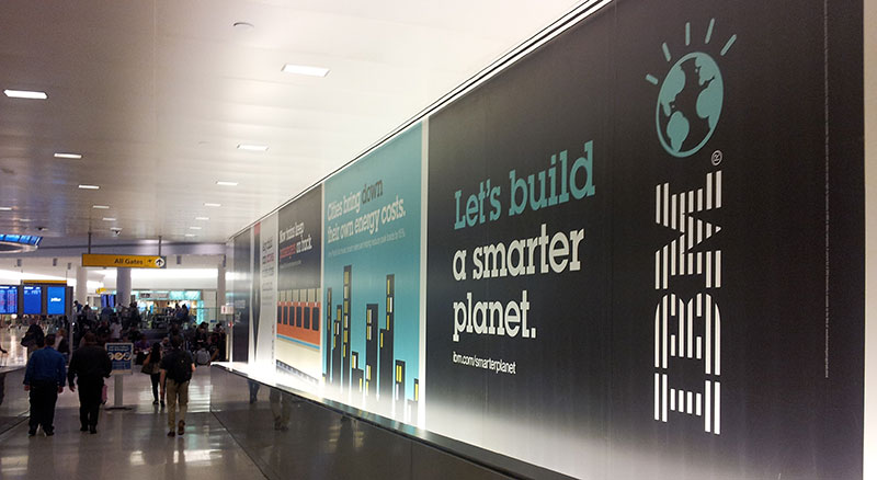
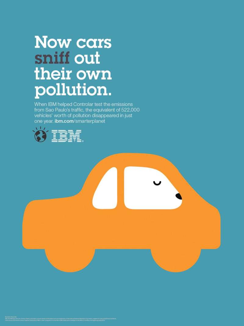
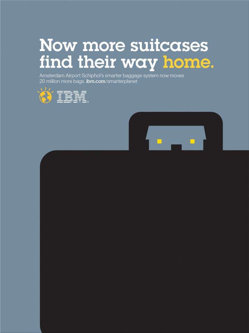
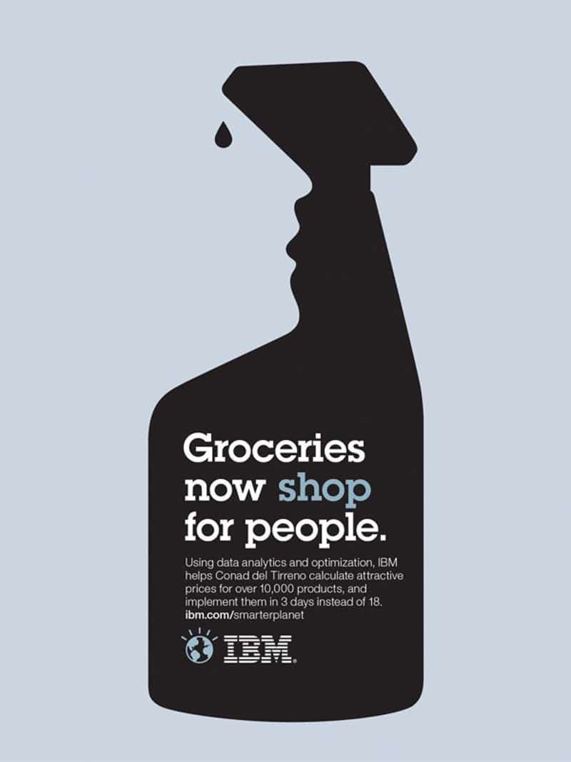
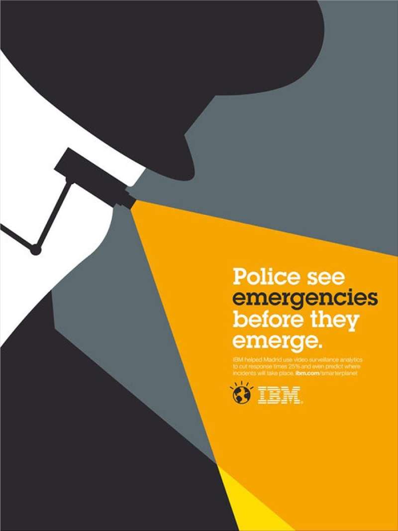
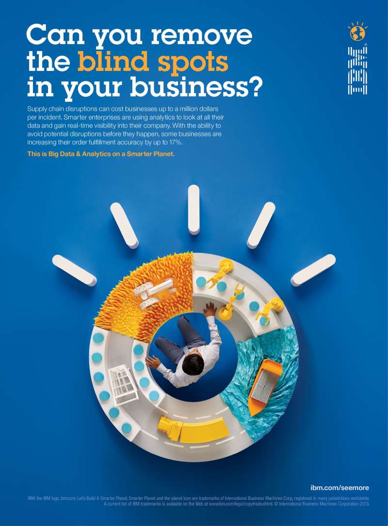
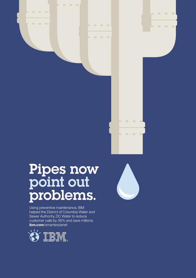
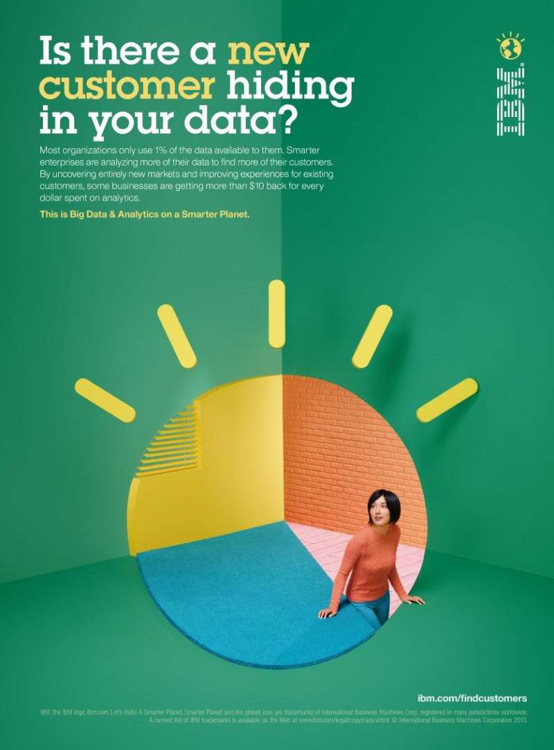
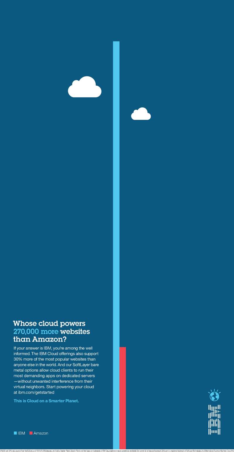
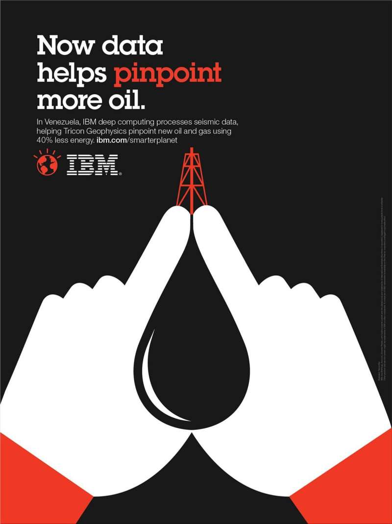
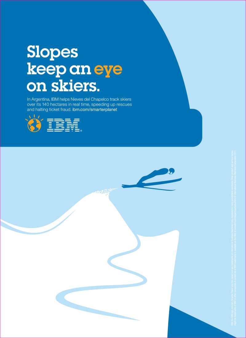
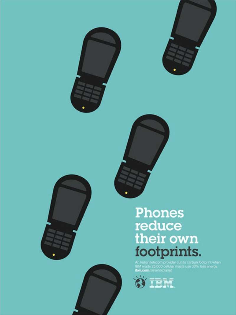
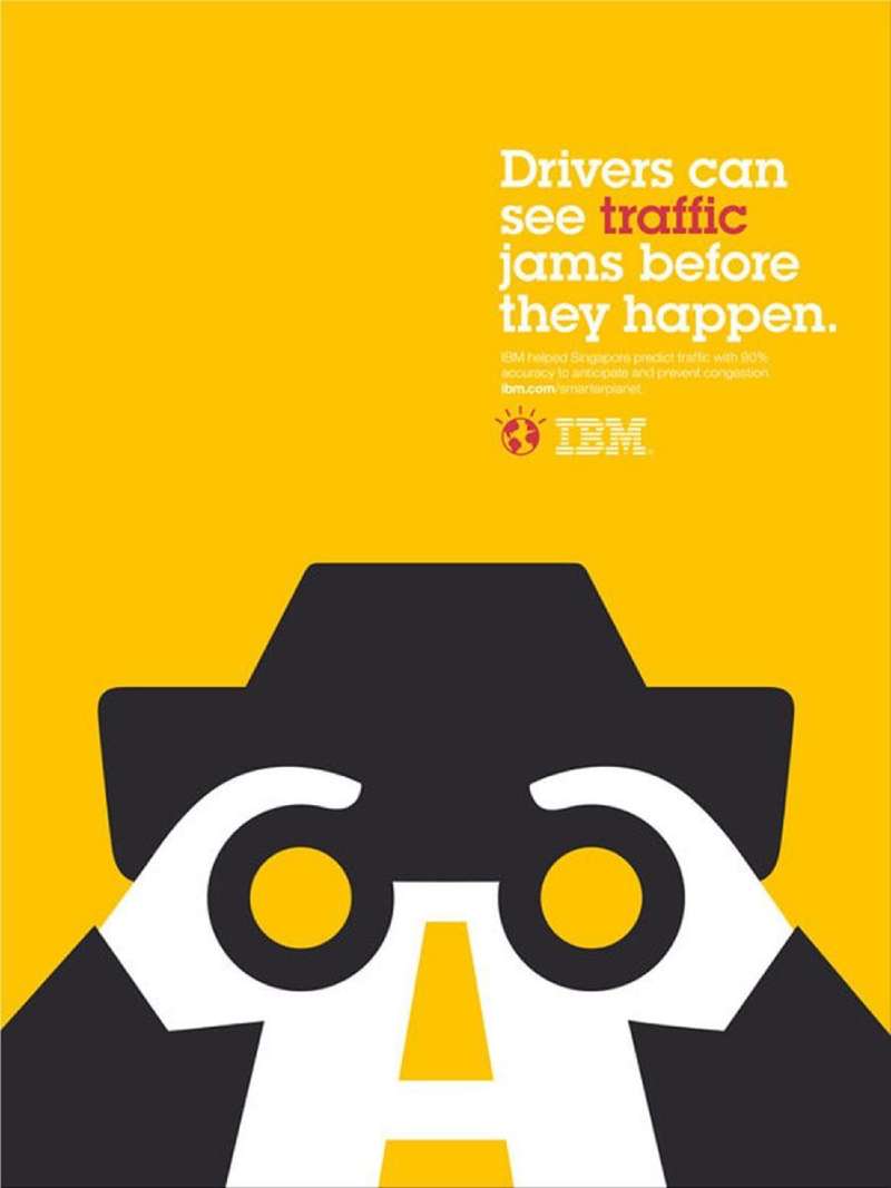
Ogilvy New York ran the launch as “op-ads,” full-page newspaper units built like opinion columns: a provocative headline, one flat icon, and 300 words of IBM viewpoint. The visual language came from design studio Office, working from Paul Rand’s stripe logic.
The icons sit on a strict modular layout system that scales from a New York Times page to a 48-sheet poster without redraw.
| Result | Figure | Source |
|---|---|---|
| Revenue attributed | $3 billion | Office |
| Client engagements | 6,000+ | Office |
| Brand value lift | 20%, or $11.3 billion | BrandZ Top 100 |
Ogilvy France extended the platform into “People for Smarter Cities,” billboards folded into benches, ramps and shelters. It took the Outdoor Grand Prix at Cannes Lions 2013, ahead of 5,610 entries.
Era of Cognitive Business (2015-2018)
Watson talks. That is the whole idea.
Ogilvy shot 30-second conversations between the system and a named guest: Bob Dylan, Serena Williams, Stephen King, Ken Jennings. IBM data scientists ran 5 Watson services across 320 Dylan songs to produce the lines the machine speaks in the spot (Adweek).
The sets are dark, near-empty rooms with one light source, which is reduction taken to its limit: a voice, a face, and a small pulsing square of light standing in for the computer.
The 2017 follow-up, “Watson at Work,” ran 8 new TV spots across energy, aviation, insurance and winemaking.
Let’s Create (2022-2025)
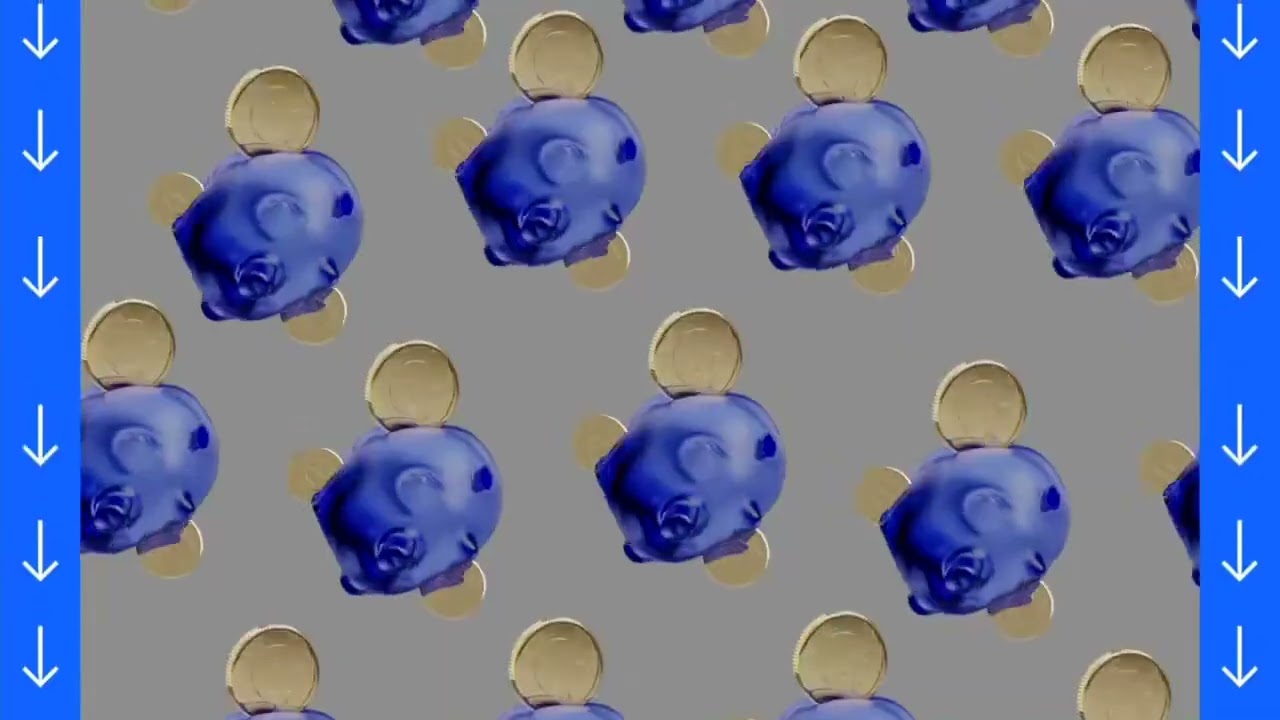
IBM launched “Let’s create” in February 2022, its largest brand initiative in over a decade, following the Kyndryl spin-off. Ogilvy built it in three chapters, and the initial work broke from IBM’s trademark blue letterforms.
The 2023 chapter, “What if?”, was directed by Ian Pons Jewell with Oscar Isaac on voiceover. The 2025 evolution, “Let’s create smarter business,” launched 3 September during the US Open with Lewis Hamilton narrating three broadcast films.
The current work uses a warmer, higher-saturation set of brand colors than any IBM campaign since the 1980s.
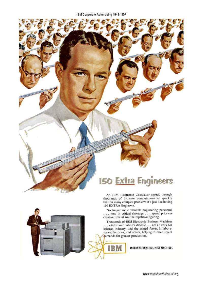
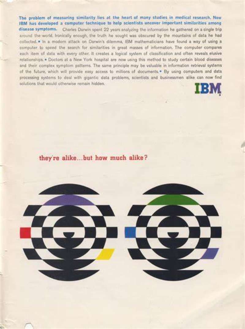
IBM Print Ads From the Mainframe Era (1956-1979)
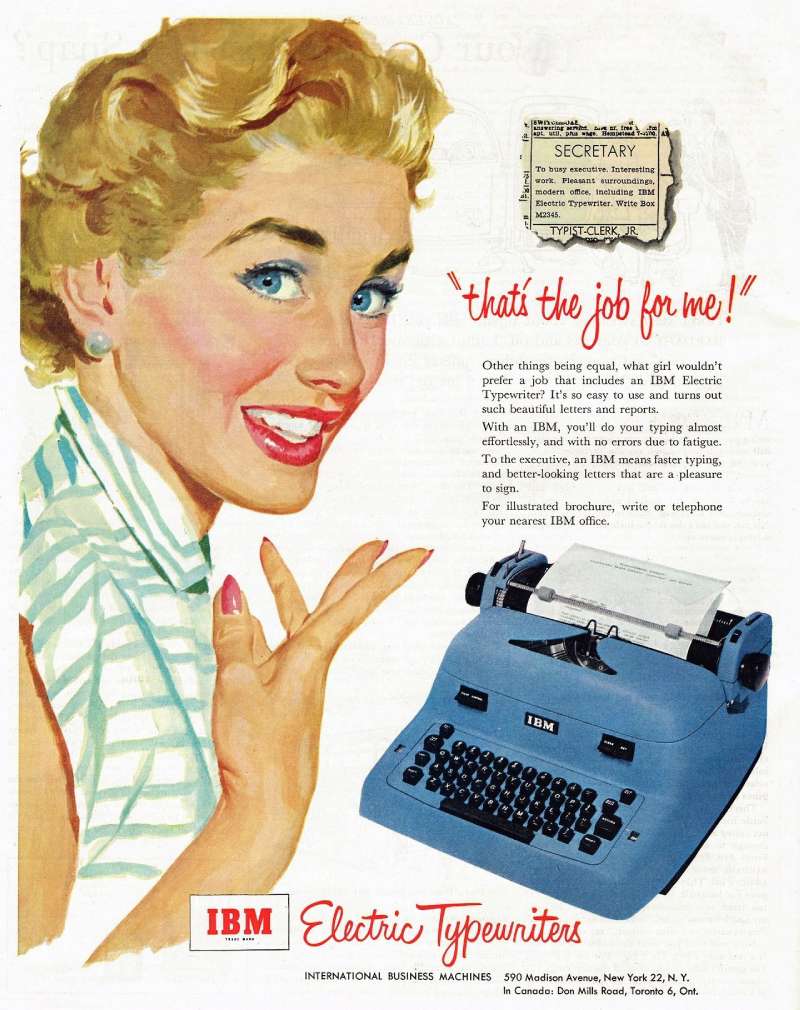
Format: single-page and double-page spreads in Fortune, Scientific American and Business Week.
Art direction: Paul Rand and the design program Eliot Noyes established in 1956, IBM’s first consultant director of design.
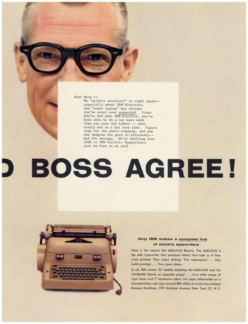
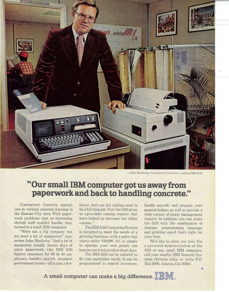
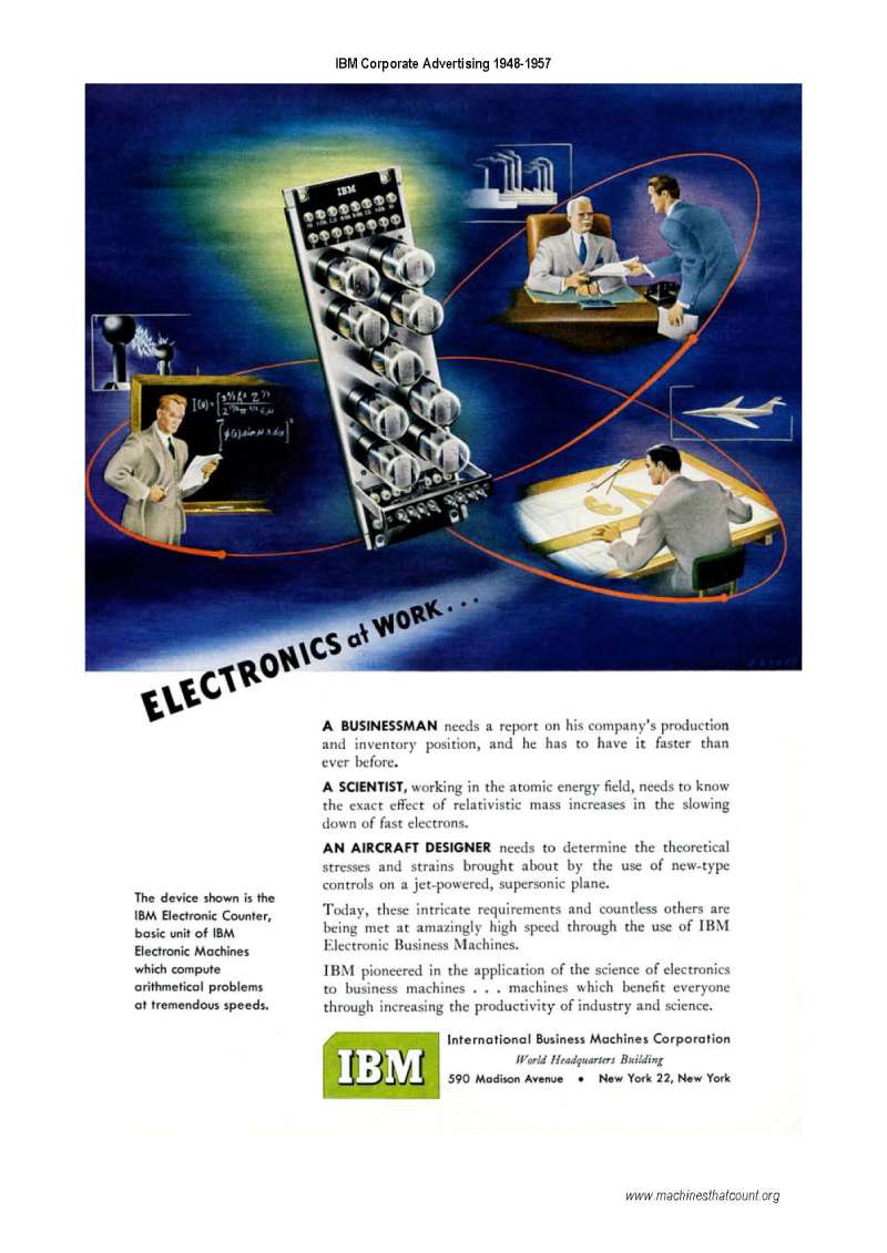
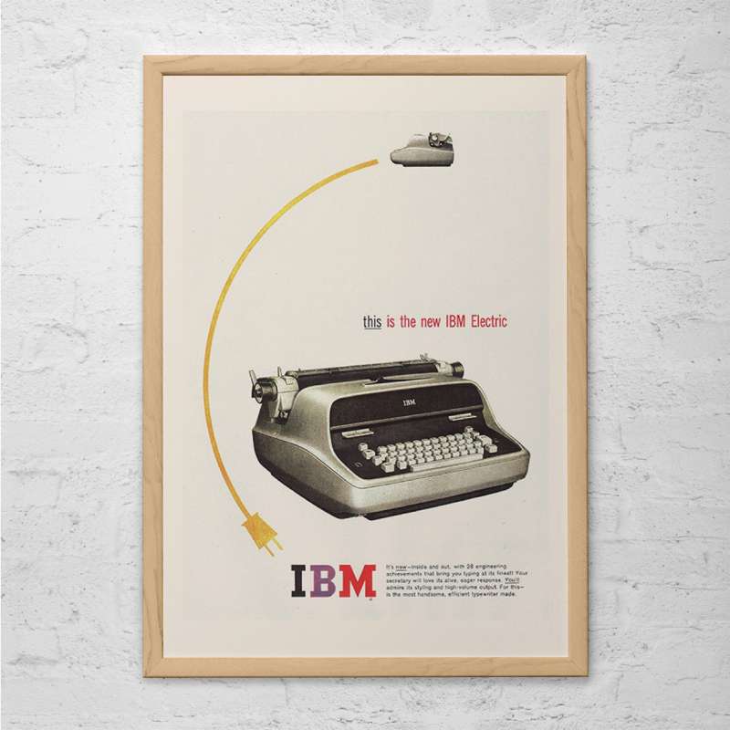
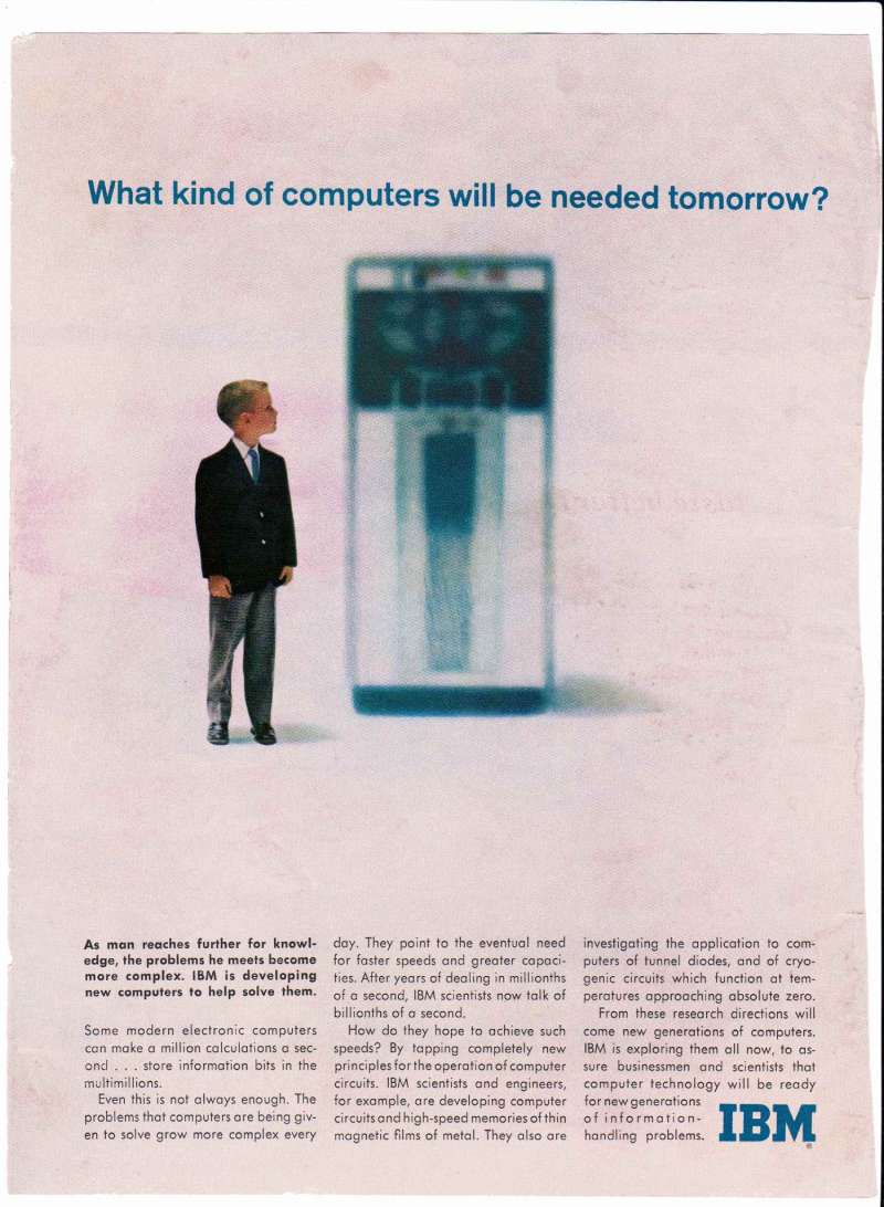
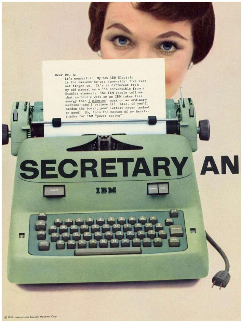
Layout logic: a photograph of the machine, one headline, a block of set copy at the foot of the page.
These pages are the clearest application of the International Typographic Style by an American corporation, and they set the visual grammar every later IBM campaign works against.
How Do IBM Print Ads Work Visually?
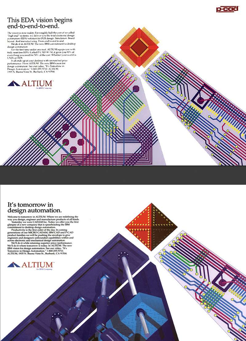
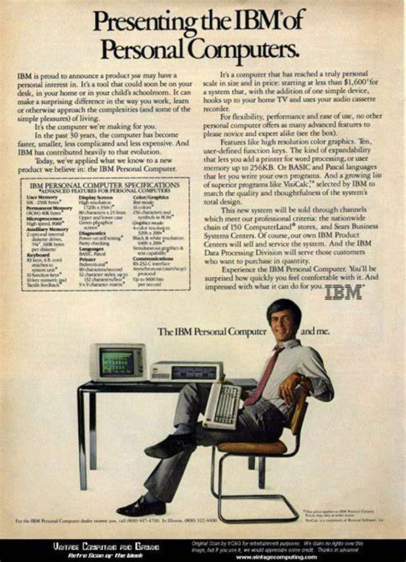
IBM print ads use a 3-part structure: one dominant image, one short headline set flush left, and a small logo anchored bottom right. Color is limited to IBM Blue plus black. Copy blocks sit below the optical center, never above it.
Typography
Helvetica served as the corporate face for over 50 years before IBM Plex replaced it in 2017. Plex was conceived by Mike Abbink with Dutch foundry Bold Monday, released under the SIL Open Font License, and shipped in 8 weights across 100+ languages.
Eight weights is not a coincidence. It mirrors the 8 bars of the logo.
The logotype itself derives from City Medium, a geometric slab cut by Georg Trump in 1930, which Rand modified rather than copied.
Color
IBM Blue is specified as Pantone 2718C. Black, gray and white are the only other approved logo colors.
Campaign palettes stay narrow. The e-business work ran monochrome with one red accent, and the Smarter Planet icons used flat fills with zero gradient.
Hierarchy and space
The reading order in an IBM page almost never changes: image, headline, copy, mark.
Margins run wider than the trade standard, often 15 to 20 percent of page width. Rand argued a distinctive logotype plus disciplined type treatment was the only workable framework for a company operating in dozens of countries.
His 1981 Eye-Bee-M rebus poster, built for the THINK motto, proved how far the mark could stretch without breaking.
How Do IBM TV Commercials Differ From Its Print Ads?
IBM TV commercials carry dialogue and character; the print ads carry proposition and proof. Broadcast work casts a human or a celebrity as the audience surrogate. Print work states the argument directly and gives the reader 300 words of it.
The Little Tramp spots (1981-1987)
Eight commercials in the Paley Center collection show the Chaplin lookalike struggling with paperwork, then solving it with a 5150. No voiceover explains the product until the final 5 seconds.
Solutions for a Small Planet (1995-2000)
Foreign-language dialogue with English subtitles, filmed in single locations, running 30 seconds. The joke lands before the logo appears.
Watson spots (2015-2016)
Two-shot conversations, static camera, minimal lighting. Watson’s line to Dylan, that it reads 800 million pages per second, does the entire product demonstration in one sentence.
Let’s create smarter business (2025)
Three broadcast films voiced by Lewis Hamilton, debuting during the US Open and running across broadcast, digital, print and social through 2025.
How Has IBM Advertising Evolved Since 1981?
IBM advertising has moved through 5 strategic phases: humanizing the PC, unifying a fractured global message, defining an industry category, selling a business platform, then selling applied AI. Each phase came with a new tagline and a tighter visual system.
| Decade | Strategic shift | Representative campaign |
|---|---|---|
| 1980s | Make the computer unthreatening to consumers | Little Tramp |
| 1990s | One voice after 40+ agencies | Solutions for a Small Planet |
| Late 1990s | Name and own a category | e-business |
| 2008-2015 | Sell a worldview, not a product | Let’s Build a Smarter Planet |
| 2022-2025 | Move enterprise AI from pilot to deployment | Let’s create smarter business |
The one constant across all 5 phases is the 8-bar mark, unchanged since 1972.
Which Agencies Created IBM Advertising?
Three agency structures have produced IBM advertising. Lord, Geller, Federico, Einstein created the Little Tramp campaign in 1981. Ogilvy held the global creative account from 1994 to 2026. Stagwell agencies Code and Theory and Anomaly won the account in June 2026.
The 1994 consolidation
Lou Gerstner moved IBM’s estimated $500 million global account from more than 40 agencies to Ogilvy & Mather on 5 May 1994, the largest consolidation of its kind at that point.
Lisa Baird, then VP of worldwide advertising, told B to B the company had been running different logo presentations country by country. A single agency fixed that, and the identity rules tightened alongside it.
What Ogilvy produced in 32 years
Ogilvy created Solutions for a Small Planet, e-business, Smarter Planet, the Watson work, Think and Let’s Create. Ogilvy France created People for Smarter Cities.
Client and agency won 31 Effie awards in the first 16 years of the relationship, plus the 5 for 50 Effie in 2019.
The 2026 handover
Ogilvy declined to take part in IBM’s creative review, and the relationship ended after 32 years. Reporting attributes the decision to balance-of-trade friction between WPP and IBM rather than to the creative work.
IBM appointed Stagwell on 30 June 2026, with Code and Theory and Anomaly operating as one team, and named Omnicom Media on global media the day before. First work is expected in August 2026.
Designers behind the identity
Eliot Noyes built the corporate design program from 1956. Paul Rand designed the 1956 lettermark, the 1972 8-bar version and the 1981 Eye-Bee-M poster, which is why he shows up on every list of the field’s most influential practitioners.
What Can Designers Learn From IBM Ads?
IBM ads offer 6 transferable rules: constrain the palette, keep the mark small, let one image carry the page, set the headline short and flush left, sink the copy below the optical center, and design the system before the execution.
- Limit the palette to one brand color plus black
- Size the logo down until it stops competing with the image
- Write the headline at 6 words or fewer, then cut two
- Build the icon set on one geometric rule and never break it mid-campaign
- Test every layout at thumbnail size before approving it at full page
- Apply the core layout fundamentals to the system, not to the individual ad
Rand’s own argument holds up: for a company operating across dozens of markets, flexibility and adaptability matter more than any single beautiful execution.
The relationship between element sizes is where most IBM imitations fail. Copying the white margins is easy. Getting the logo-to-image ratio right is not.
How Do IBM Ads Compare to Oracle Ads?
IBM and Oracle sell to the same buyer and advertise nothing alike. IBM builds long-running platforms with a named idea and a decade of runway. Oracle runs shorter, more combative product messaging, often naming competitors directly in headline copy.
The visual gap is just as wide. IBM works in restraint: one image, one line, a lot of paper. Oracle advertising leans on dense claim stacks and benchmark numbers set in tight type.
Against its hardware-era rivals the contrast is different again. Intel campaigns built consumer recognition through a sonic mnemonic and a sticker on someone else’s product, while Dell advertising and HP campaigns both fought on price and configuration in the same trade pages IBM used for op-ads.
IBM was inducted into the Advertising Hall of Fame in 2022 as the first B2B corporate honoree. None of its direct rivals hold that.
What Makes IBM Advertising Work?
Discipline, applied for 45 years without interruption.
Every phase of the work follows the same rule set: one governing idea per platform, one dominant image per page, a palette narrow enough to recognize at thumbnail size, and a mark small enough to trust the reader.
The system survives changes in agency, medium, product line and CEO because it was built as a system first and a campaign second.
Most brands run the reverse order and then wonder why the ads stop resembling each other after two years. Studying long-running identity programs makes the difference obvious.
The lesson holds at any budget. Decide the rules, then make the ads.
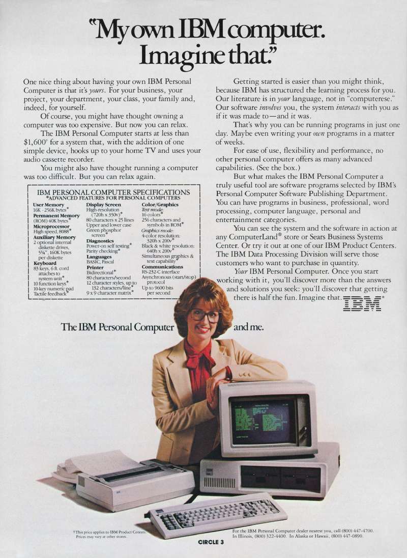
IBM Ads Examples

FAQ on IBM Ads
Who played the Charlie Chaplin character in IBM PC ads?
Actor Billy Scudder played the Little Tramp. Lord, Geller, Federico, Einstein auditioned more than 30 Chaplin impersonators before casting him, according to Ad Age. He appeared in the print and TV work from 1981 through 1987.
What is the Eye-Bee-M poster?
Paul Rand designed it in 1981 to support the THINK motto. An eye and a bee replace the I and B, with the 13-bar M anchoring the rebus to the corporate mark.
It functions as a second logo, and it is a useful case study in how far a mark can flex before it stops being recognizable.
What typeface do IBM ads use?
IBM Plex, released in 2017. Before that, Helvetica ran for over 50 years.
Plex ships in Sans, Serif, Mono and Condensed cuts, and its role in the wider identity system extends well past advertising into products and documentation.
Why did IBM move all its advertising to one agency?
Lou Gerstner inherited more than 40 agencies producing inconsistent logo presentations across 30-plus countries. Consolidating the estimated $500 million account with Ogilvy in May 1994 gave the brand a single voice and a single set of visual rules.
What was the IBM e-business manifesto?
An eight-page insert placed in the Wall Street Journal on 7 October 1997, laying out IBM’s argument for internet-based commerce. It coined the category term and anchored a campaign that ran roughly six years across print, TV and outdoor.
Which IBM campaign won a Cannes Lions Grand Prix?
People for Smarter Cities, created by Ogilvy France, took the Outdoor Grand Prix in 2013 against 5,610 entries. The billboards folded into benches, ramps and shelters, so the media placement itself performed a civic function.
Which celebrities have appeared in IBM commercials?
Bob Dylan, Serena Williams, Stephen King and Ken Jennings starred in the Watson spots. Oscar Isaac voiced the 2023 work, and Lewis Hamilton narrated the 2025 films.
Unusually for celebrity-led campaigns, none of them endorse the product directly.
What is IBM Blue?
The official logo color, specified as Pantone 2718C. IBM’s Carbon Design System references Blue 60, hex #0f62fe, for digital work. Black, gray and white are the only other approved treatments of the 8-bar mark.
How many taglines has IBM used?
At least 8 named lines since 1911: THINK, Solutions for a Small Planet, e-business, on demand business, Let’s Build a Smarter Planet, Outthink, Let’s Create, and Let’s create smarter business.
Does IBM still run consumer advertising?
No. The current work targets business decision makers, IT leaders and government buyers rather than households.
IBM became the first B2B brand inducted into the Advertising Hall of Fame as a corporate honoree in 2022.
Conclusion
IBM ads reward study because the system behind them outlived every campaign it produced.
Eliot Noyes set up the design program in 1956. Seventy years on, IBM Plex, the op-ad layouts and the Cannes-winning out-of-home work all trace back to that same governing idea.
Agencies changed. Code and Theory and Anomaly hold the global creative account now, with the first work landing under Let’s create smarter business.
The mark did not change.
For designers, the useful part sits in the constraints: Pantone 2718C, one image, one line, wide margins.
Pull up any Watson spot or an Eye-Bee-M reproduction and count the elements on the page. The number stays low.
That restraint is the entire method, and copying it into your own identity work costs nothing.

Renowned for his expertise in logo design and visual branding, Bogdan has developed a multitude of logos for various clients.
His skills extend to creating posters, vector illustrations, business cards, and brochures. Additionally, Bogdan's UI kits were featured on marketplaces like Visual Hierarchy and UI8.
He also wrote in the past years on sites like Design Your Way, WebDesignerDepot, WPDean, Designmodo, Speckyboy, Slider Revolution, and more.
- Canva vs PowerPoint: Which Is Better for Presentations? - 22 September 2026
- How to Install Fonts on Mac (Step-by-Step Guide) - 20 September 2026
- From Mockup to Code: How AI-Augmented Development Speeds Up the Design Handoff - 19 September 2026

Bogdan Sandu is a seasoned designer who has been designing websites since 2008. Renowned for his expertise in logo design and visual branding, Bogdan has developed a multitude of logos for various clients. His skills extend to creating posters, vector illustrations, business cards, and brochures. Additionally, Bogdan's UI kits were featured on marketplaces like Visual Hierarchy and UI8. He also wrote in the past years on sites like Design Your Way, WebDesignerDepot, WPDean, Designmodo, Speckyboy, Slider Revolution, and more.
You Might Also Like