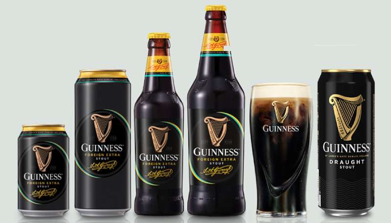
The Guinness logo is one of those rare brand marks that people recognize before they even read the name. A golden harp sitting on a dark background, paired with bold serif lettering. It’s been around in some form since 1862, which makes it older than most countries’ current flags.
The mark belongs to Guinness, the Irish stout brand founded by Arthur Guinness in 1759 at St. James’s Gate Brewery in Dublin. Now owned by Diageo, the brewery sells its beer in over 150 countries. The logo has gone through roughly six major versions across its history, but the core idea (a harp, the brand name, and a nod to 1759) has never really changed.
What’s interesting is how deeply this logo ties into Irish national identity. The harp on the Guinness label actually predates the Irish government’s own use of the symbol. When the Irish Free State formed in 1922, they had to flip their harp to face the opposite direction because Guinness already owned the trademark.
That kind of brand power doesn’t happen by accident.
What Is the Guinness Logo?

The Guinness logo is a combination mark featuring a golden harp symbol above the wordmark “GUINNESS” in uppercase serif lettering, with “Est. 1759” integrated into the design. The current version was redesigned in 2016 by Design Bridge, with illustrator Gerry Barney drawing the harp. It represents Irish heritage, craftsmanship, and the brand’s connection to the Brian Boru Harp.
Here’s what you need to know about its key attributes:
- Design Type: Combination mark (symbol plus wordmark)
- Primary Elements: The Brian Boru Harp, custom serif wordmark, founding year “1759”
- First Appearance: 1862 on Guinness bottle labels
- Trademark Registration: 1876 under the Trade Marks Registration Act
- Current Version: 2016 redesign by Design Bridge, illustrated by Gerry Barney
- Designer/Agency: Design Bridge (London), with contributions from harp makers Niebisch & Tree and letterpress studio New North Press
- Color Palette: Gold (#F0DC8D), Black (#000000), White (#FFFFFF)
- Usage Context: Beer bottles, cans, draft tap handles, pub signage, merchandise, digital platforms, and global advertising campaigns
How Has the Guinness Logo Evolved Over Time?

The Guinness logo has been redesigned about six times since 1862. Each version kept the harp as its anchor, but the level of detail, the lettering style, and the color scheme shifted with the times.
The biggest changes happened in 1955, 1968, 2005, and 2016. Most of the early adjustments focused on simplifying the harp, while the most recent redesign actually went the other direction and added detail back in.
That’s a pretty unusual move for a brand in 2016. Most companies were stripping things down to flat icons at that point.
Original Guinness Logo (1862–1955)
- Years Active: 1862–1955
- Design Description: A monochrome oval badge with a double outline. The harp sat in the upper portion, surrounded by ornate cursive lettering. The word “Trademark” appeared on the harp itself. Arthur Guinness’s signature was included in the center of the label.
- Color Scheme: Black and white (monochrome)
- Designer: Attributed to Benjamin Lee Guinness, who adopted the harp symbol
- Context: By the 1860s, Guinness stout was being exported globally. The company needed a visual mark that would clearly identify the product as Irish. The harp, already a symbol of Irish cultural pride, was the obvious pick.
- Cultural Significance: This was the version that established the harp as Guinness’s identity. It was registered as a trademark in 1876, and that registration is actually why the Irish government later had to reverse their national harp symbol.
Simplified Harp Logo (1955–1968)
- Years Active: 1955–1968
- Design Description: The logo was stripped down to just the harp on a white background. No lettering, no frame. The harp itself was drawn with fine detail, replicating the strings, curves, and shape of the original Brian Boru Harp.
- Color Scheme: Black on white
- Key Changes from Previous: Removed all text, the oval frame, and the “Trademark” label. Pure symbol.
- Context: This reflected a broader trend toward cleaner, more minimalist design in mid-century branding. The harp could now stand entirely on its own.
Modernized Guinness Logo (1968–1997)
- Years Active: 1968–1997
- Design Description: A heavily simplified harp with fewer strings (reduced to nine) and less ornamental detail. The word “GUINNESS” appeared below in bold, stencil-style capital letters. The first official typeface for the brand, called the “Hobbs” typeface, was introduced in 1963 by Bruce Hobbs at S.H. Benson Limited.
- Color Scheme: Black and white, with gold appearing on some applications
- Designer: Gerry Barney (harp illustration), Bruce Hobbs (typeface)
- Key Changes from Previous: The harp lost most of its fine detail. Strings were reduced. The wordmark was added back, and for the first time, it had a consistent font across all materials.
- Cultural Significance: This version moved Guinness from a Victorian-era look to something that could work across print, TV, and merchandise. It was a practical redesign more than an aesthetic one.
Refined Identity (1997–2005)
- Years Active: 1997–2005
- Design Description: The harp became a small golden badge. The wordmark was thinned, and the founding year was split on either side of the harp: “17” on the left, “59” on the right. The typeface was updated to “Unified Hobbsian,” where all letters were uniform except for a break in the two middle N’s, and the G sat slightly higher than the other characters.
- Color Scheme: Gold harp, white text on black background
- Key Changes from Previous: Introduction of the gold-on-black color scheme that most people associate with the brand today. The serif typeface was replaced with a semi-grotesque style.
- Context: This redesign coincided with Guinness merging with Grand Metropolitan to form Diageo in 1997. The brand needed a more premium, globally consistent identity.
Streamlined Logo (2005–2016)
- Years Active: 2005–2016
- Design Description: Design Bridge created a clean, flat version. The golden harp sat on a black background above the white wordmark in all capitals, with the first “G” slightly enlarged. “Est 1759” appeared in thin white text flanking the harp. The wordmark was redrawn as a custom piece and no longer existed as a standalone font.
- Color Scheme: Gold, black, and white
- Designer: Design Bridge
- Key Changes from Previous: Further simplification. The harp became more graphic and icon-like. The wordmark was cleaned up.
- Cultural Significance: This was the version that worked best as a digital icon. It was flat, scalable, and clean. But some designers felt the harp had lost its soul in the process.
Current Guinness Logo (2016–Present)
- Years Active: 2016–present
- Design Description: A richly detailed, three-dimensional harp with fine shading, authentic curves, and “Est. 1759” stamped directly into the instrument’s body. The wordmark uses hand-drawn typography inspired by the first Guinness print ads from the 1920s and John Gilroy’s famous poster lettering. Wavy lines referencing the River Liffey appear in the design.
- Color Scheme: Gold, black, white with metallic textures
- Designer: Design Bridge, with illustrator Gerry Barney, harp makers Niebisch & Tree, and letterpress studio New North Press
- Key Changes from Previous: The harp gained significant detail and dimension. Design Bridge actually consulted with real harp makers to make sure the shape would function musically if it were built as a physical instrument. The serif font returned with elongated, sharpened serifs.
- Cultural Significance: This redesign went against the flat design trend entirely. It was a deliberate bet on craft and heritage at a time when most brands were going simpler. Designers loved it.
What Do the Design Elements of the Guinness Logo Mean?
Every piece of the Guinness logo connects back to Ireland. The harp is modeled after the Brian Boru Harp, a 14th-century Gaelic instrument preserved at Trinity College Dublin.
It’s one of the oldest surviving harps of its kind. The harp has been a symbol of Ireland since the reign of Henry VIII, appearing on coinage and coats of arms for centuries.
The founding year “1759” reinforces the brand’s age and authority. And the hand-drawn wordmark references early 20th-century Guinness advertising, tying the current identity to the company’s history of storytelling through visual communication.
Why Did Guinness Choose These Specific Colors?

The Guinness color palette is built around three colors, and honestly, each one is doing heavy lifting.
Black (#000000) is the dominant background color. It mirrors the deep, near-black color of the stout itself. From a color psychology standpoint, black communicates strength, sophistication, and premium quality.
Gold (#F0DC8D) represents the creamy head that forms on a properly poured pint. It also carries associations with luxury, heritage, and craftsmanship. In Pantone terms, the gold falls close to a warm amber tone.
White (#FFFFFF) provides contrast and readability. It’s used for the wordmark and secondary text elements, ensuring the logo works across both dark and light applications.
The combination of black and gold specifically is what makes the Guinness logo feel premium compared to other beer logos. Most breweries lean on reds, blues, or greens. Guinness went dark and rich. That choice alone separates it from competitors.
What Typography Style Is Used in the Guinness Logo?
The current wordmark is a custom hand-drawn piece, not a commercially available font. It draws from multiple sources in Guinness’s own history.
The closest match you’ll find commercially is Agenda URW Light, though it’s not exact. The lettering combines details from old letterpress type with elements borrowed from John Gilroy’s poster work from the mid-20th century.
Earlier versions used the “Hobbs” typeface (1963), then “Design Group Hobbs” (1991), then “Unified Hobbsian” (1997). Each was a serif-influenced design, keeping the brand rooted in tradition.
The 2005 version dropped the font entirely in favor of a custom wordmark, and the 2016 redesign continued that approach. The current letters have elongated, sharpened serifs that feel both old-fashioned and sharp at the same time. It works really well at large scales, like on pub signage and packaging.
What Are the Hidden Meanings in the Guinness Logo?
The harp faces to the right, with the soundboard on the left. The Irish government’s harp is mirrored, facing the opposite direction. This wasn’t a random choice. Guinness trademarked the harp first, so the government had to reverse theirs.
In the 2016 version, “Est. 1759” is stamped into the harp itself, inspired by metal lettering on the ironwork at the Guinness Storehouse in Dublin. There are also wavy lines referencing the River Liffey, which runs near St. James’s Gate Brewery.
Design Bridge collaborated with actual harp makers to make sure the instrument’s proportions would technically work as a real, playable harp. That’s a level of detail most people never notice, but it adds authenticity that you can feel even if you can’t explain it.
How Does the Guinness Logo Compare to Competitor Logos?
Most beer brand logos fall into a few categories: crests, wordmarks, or mascots. Guinness doesn’t really fit any of them cleanly. It sits somewhere between an emblem and a combination mark, which gives it a unique position in the market.
Compare it to the Heineken logo, which uses a red star on green. Or Budweiser, which relies on its bowtie shape and Americana red and white. Carlsberg leans on a hop leaf. Corona uses a crown. Stella Artois keeps a classic crest.
Guinness stands out because its symbol isn’t generic to the beer industry. A harp has nothing to do with brewing. It’s about national identity and cultural heritage, which gives the brand a completely different kind of emotional connection.
The black and gold color scheme also reads more like a luxury brand than a beer company. That’s intentional. While brands like Pabst Blue Ribbon or Miller Lite position themselves as everyday beers, Guinness has always aimed for something more premium.
What Are the Technical Specifications of the Guinness Logo?
Official Color Codes
- Primary Color: Gold
- Hex: #F0DC8D
- RGB: (240, 220, 141)
- CMYK: (0, 8, 41, 6)
- Secondary Color: Black
- Hex: #000000
- RGB: (0, 0, 0)
- CMYK: (0, 0, 0, 100)
- Accent Color: White
- Hex: #FFFFFF
- RGB: (255, 255, 255)
- CMYK: (0, 0, 0, 0)
Dimensions and Proportions
The harp is scaled significantly larger than the wordmark in the current version, which was a deliberate shift from the 2005 design where both elements were more equally weighted.
The logo should always maintain clear space around it equal to at least the height of the “G” in the wordmark. The harp must remain intact and unmodified. The aspect ratio of the full lockup (harp plus wordmark) is roughly 1:1.5 vertical.
For digital use, the logo works as a vector graphic in SVG format, which keeps it crisp at any size. For print applications, high-resolution files at 300 DPI or above are standard. The detailed harp illustration requires higher resolution rendering than the previous flat version, which is one trade-off of the 2016 redesign.
What Cultural Impact Has the Guinness Logo Had?

The Guinness harp is arguably more recognizable globally than Ireland’s own national emblem. That’s a strange thing to say about a beer company, but it’s true.
The logo appears on merchandise, pub signs, and branded glassware across over 150 countries. It’s become shorthand for “Irish pub culture” in places where most people have never been to Dublin.
The harp’s influence extends beyond Guinness itself. When the Irish Free State was established in 1922, the government had to design their national harp facing the opposite direction because Guinness already held the trademark. That’s a case where a corporate brand directly shaped a national symbol.
Guinness’s advertising history also plays into this. The John Gilroy toucan and zoo animal posters from the 1930s and 1940s are collected as art pieces today. The brand’s “Made of More” campaign further positioned the logo as a mark of depth and character. Few brewery brands have that kind of cultural footprint.
How Does the Guinness Logo Fit Into the Overall Brand Identity?
The logo doesn’t work in isolation. It sits at the center of a larger system that includes packaging, advertising, bar merchandise, and the Guinness Storehouse experience in Dublin.
The brand guidelines define how the harp, wordmark, and color scheme appear across every touchpoint. The black and gold palette extends to Guinness Draught cans, tap handles, and even the interior design of Guinness-branded bars worldwide.
Arthur Guinness’s signature, which appeared on the original 1862 trademark label, still shows up on certain products and marketing materials. It’s a third brand element alongside the harp and wordmark that adds a personal, human dimension.
The whole system works together because of repetition and consistency. Whether you see the logo on a pint glass in Tokyo, a billboard in Lagos, or a gift shop in Dublin, it looks and feels like the same brand. Diageo keeps tight control over this, and honestly, it shows.
How Should the Guinness Logo Be Used?
The Guinness logo is a globally registered trademark owned by Diageo. Unauthorized commercial use will land you in legal trouble, and they do enforce it.
Here are the basics:
- Do not modify, distort, recolor, or separate the harp from the wordmark in ways not specified in the brand guidelines
- Do not use the logo on any product or material that suggests endorsement without written permission from Diageo
- Do not recreate the harp illustration with alternate styling or simplification
- Official assets are typically available through Diageo’s brand portal for licensed partners and distributors
- Personal use (fan art, editorial) exists in a gray area, but commercial applications always require licensing
If you’re a pub or retailer carrying Guinness products, official signage and branded materials are usually provided through your Diageo distributor. The company is pretty generous with point-of-sale materials for trade partners.
For digital use on websites and apps, always use the approved vector files rather than pulling low-resolution images from search results. The 2016 harp has too much fine detail to survive JPEG compression at small sizes.
FAQ on The Guinness Logo
What Does the Harp on the Guinness Logo Represent?
The harp is based on the Brian Boru Harp, a 14th-century Gaelic instrument housed at Trinity College Dublin. It’s a symbol of Irish heritage and national pride.
Guinness adopted it in 1862 to mark the beer as distinctly Irish for export markets across the British Empire.
Why Is the Guinness Harp Facing the Opposite Direction From Ireland’s National Emblem?
Guinness trademarked the harp in 1876. When the Irish Free State formed in 1922, the government had to reverse their version to avoid a trademark conflict.
So the Guinness harp has its soundboard on the left. The state emblem has it on the right.
Who Designed the Current Guinness Logo?
Design Bridge handled the 2016 redesign. Illustrator Gerry Barney drew the harp, collaborating with harp makers Niebisch & Tree to get the proportions right.
New North Press added letterpress techniques for the final tactile impression of the mark.
What Are the Official Colors of the Guinness Logo?
Gold (#F0DC8D), black (#000000), and white (#FFFFFF). The black mirrors the stout’s deep color. Gold reflects the creamy head on a poured pint.
This monochrome base with gold accents gives it a premium feel uncommon among brewery brands.
What Font Does Guinness Use in Its Logo?
The current wordmark is a custom hand-drawn design, not a commercial typeface. It borrows from John Gilroy’s poster lettering and early 1920s Guinness print ads.
The closest available match is Agenda URW Light, though it’s not identical.
How Many Times Has the Guinness Logo Been Redesigned?
About six major versions since 1862. The biggest shifts happened in 1955, 1968, 1997, 2005, and 2016.
Each version kept the harp. The wordmark and detail level changed. The core identity stayed consistent across every redesign.
Is the Guinness Logo Trademarked?
Yes. Diageo, the parent company, holds global trademark rights. The harp was first registered in 1876 under the Trade Marks Registration Act.
Unauthorized commercial use is enforced. Licensed partners get official assets through Diageo’s brand portal.
What Makes the Guinness Logo Different From Other Beer Logos?
Most brewery marks use hops, crowns, or crests. Guinness uses a national symbol with no direct connection to brewing.
The black and gold scheme reads more like a luxury brand than a fast food or casual drink company. That separation is intentional.
Does the Guinness Logo Have Hidden Details?
The 2016 version includes wavy lines referencing the River Liffey near St. James’s Gate Brewery. “Est. 1759” is stamped directly into the harp body, inspired by ironwork at the Guinness Storehouse.
Design Bridge even made the harp’s shape musically functional if it were built as a real instrument.
Can I Use the Guinness Logo for Personal or Commercial Projects?
Commercial use requires licensing from Diageo. Personal or editorial use falls in a gray area, but selling anything with the Guinness mark without permission is a legal risk.
For trade partners, branded signage and materials are supplied through authorized distributors.
Conclusion
The Guinness logo has survived over 160 years of redesigns without ever losing what makes it work. That’s rare for any brand, let alone one in the crowded global beer market.
The Brian Boru Harp gives it cultural weight that competitors can’t replicate. Black and gold give it shelf presence that reads as premium from any distance.
Design Bridge’s 2016 update proved that adding detail can be just as effective as stripping it away. The hand-drawn wordmark and crafted harp brought back character that the flat 2005 version had lost.
Whether on a pint glass in a Dublin pub or a poster in Tokyo, the Guinness visual identity holds up. It’s a lesson in logo design that most brands could learn from.

Renowned for his expertise in logo design and visual branding, Bogdan has developed a multitude of logos for various clients.
His skills extend to creating posters, vector illustrations, business cards, and brochures. Additionally, Bogdan's UI kits were featured on marketplaces like Visual Hierarchy and UI8.
He also wrote in the past years on sites like Design Your Way, WebDesignerDepot, WPDean, Designmodo, Speckyboy, Slider Revolution, and more.
- How photo recovery software works and when to use it - 7 October 2026
- Top Source Sans Pro Font Pairing for Clean UIs - 6 October 2026
- Best Email Design System Examples From Leading Brands - 5 October 2026

Bogdan Sandu is a seasoned designer who has been designing websites since 2008. Renowned for his expertise in logo design and visual branding, Bogdan has developed a multitude of logos for various clients. His skills extend to creating posters, vector illustrations, business cards, and brochures. Additionally, Bogdan's UI kits were featured on marketplaces like Visual Hierarchy and UI8. He also wrote in the past years on sites like Design Your Way, WebDesignerDepot, WPDean, Designmodo, Speckyboy, Slider Revolution, and more.
You Might Also Like