

The Budweiser Logo History, Colors, Font, And Meaning

Imagine a single image summoning the essence of crisp, cool refreshment. The Budweiser logo does just that: an icon that’s become synonymous with America’s storied beer culture.
Nestled within its folds are tales of tradition, a lineage of branding ingenuity, and a testament to the power of visual identity.
This article will decode the rich tapestry woven by the fiery reds and regal golds adorning Budweiser’s bottles and cans.
We’ll venture beyond the emblem, exploring how a bowtie silhouette evolved to be much more than a mere label—it’s a symbol etched into the very fabric of the beer industry.
By the close, expect a deeper appreciation of the logo’s journey, from its origins to its standing as a beacon of the American-style lager.
Delve into the interplay of graphic design, marketing lore, and the subtle dance between continuity and innovation that shapes a brand’s face to the world.
Discover the key elements—that iconic red bowtie, the regal Clydesdales, the trademarked colors—that coalesce to form the visual anthem known as the Budweiser logo.
The Meaning Behind the Budweiser Logo
![]()
When we take a gander at the Budweiser logo, what vibes does it send your way? It’s not just any logo – it’s a symbol. And behind that symbol lies a whole world of meaning.
A Taste of Americana
Budweiser, often nicknamed The King of Beers, embodies American spirit. And that crown? Well, it’s no accident. This regal touch anchors its top-tier position in the world of brews. It’s the crowning touch, pun absolutely intended.
The Eagle’s Flight
Flying high and proud in the logo is the eagle, an emblem of freedom and strength. It’s not just for show. It mirrors Budweiser’s soaring reputation and its free spirit in the brewing industry. When you see that eagle, think big. Think bold.
The History of the Budweiser Logo
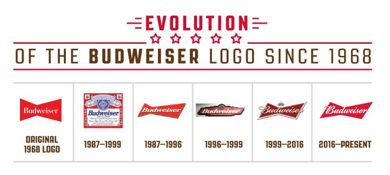
Let’s rewind and travel back in time. Budweiser’s journey has been long and frothy, and its logo has had its fair share of tweaks and turns.
Vintage Charm
In the beginning, the logo was simpler. No fancy jazz. But over time, it evolved, incorporating more elements, each echoing the brand’s journey and the times it sailed through.
Contemporary Touches
With the changing landscape of branding, Budweiser made sure it wasn’t left in the dust. Modernizing while keeping its core intact, the logo has seen some facelifts that scream the 21st century, but with a nostalgic nod to its roots.
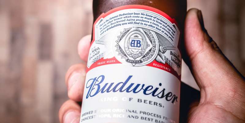
The Colors of the Budweiser Logo
The official colors of the Budweiser logo are red and white. The red color represents enjoyment, passion, energy, and strength, while the white color symbolizes simplicity.
The Budweiser color palette has been the same since 2016 and can be used for design projects and purposes.
The color codes for Budweiser are RGB: (221, 23, 49), HEX: #DD1731, CMYK: (7, 100, 88, 1) for red, and RGB: (255, 255, 255), HEX: #FFFFFF, CMYK: (0, 0, 0, 0) for white.
The Font Used in the Budweiser Logo
Ah, typography, the unsung hero of many a design. And Budweiser’s font? It’s a story in itself.
Classic Yet Contemporary
The font screams tradition but with a modern twist. It’s sturdy, confident, and straight-up iconic.
Standing Out in a Crowd
In a world bombarded by brands, Budweiser’s typeface ensures it’s not lost in the noise. It’s all about making a statement, and boy, does it make one!
Iconic Symbols in the Logo
Ever noticed the little details? Let’s dive deeper.
The “A” with the Eagle
That’s not just any “A”. With the eagle nestled within, it symbolizes the brand’s American heritage, a nod to its roots.
Barley & Hops
Sprinkled subtly are these ingredients, highlighting the brew’s authenticity and commitment to quality.
Evolving Yet Timeless
Budweiser’s brand personality is a blend of the old and new. Here’s how.
Adapting to Times
Though rooted in tradition, Budweiser isn’t afraid to adapt, ensuring it remains relevant in the ever-changing world of brands.
The Nostalgic Appeal
For many, Budweiser is a trip down memory lane, a connection to good old times. Its logo serves as a bridge between the past and the present.
FAQ On The Budweiser Logo
What is the significance of the Budweiser logo?
Within the strokes of the Budweiser emblem lies a legacy of American brew craft. This icon, deftly symbolizing quality and tradition, has become a beacon for beer aficionados. Its visual impact stands as a testament to Budweiser’s place within the pantheon of global beer brands.
How has the Budweiser logo evolved over time?
The evolution of the logo mirrors a journey, with pivotal changes reflecting shifts in design trends and marketing strategies.
From subtle tweaks to notable transformations, each iteration has strengthened the logo’s recognition, building on the familiar red bowtie and expanding the brand’s storied identity.
What do the colors in the Budweiser logo represent?
Red and gold dominate the palette of the Budweiser brand. Red screams of passion and vitality, while gold underscores a commitment to quality.
Together, they forge an inimitable brand identity design that catches eyes and signals the unmistakable presence of a Budweiser.
Why is the Clydesdale horse featured in Budweiser branding?
The Clydesdale, Budweiser’s distinguished brand mascot, encapsulates strength and tradition, resonating deeply with the company’s values.
These majestic creatures have become almost synonymous with the brand, reflecting its longstanding heritage and reinforcing the logo’s weight in the visual branding landscape.
Are there any legal issues regarding the Budweiser logo?
Navigating the tricky tides of alcohol advertising regulations, the Budweiser logo has remained a beacon of stability.
Though it has faced challenges and undergone refinements, the logo stands resilient, duly protected under branding and trademark laws that shield its unique and historic identity.
How does the Budweiser logo influence its marketing campaigns?
A cornerstone of Budweiser’s marketing campaigns, the logo acts as both spearhead and anchor, ensuring instant brand recognition.
It’s leveraged from Super Bowl commercials to packaging graphics, consistently invigorating the brand’s image and crafting an alluring visual narrative for consumers.
What differentiates the Budweiser logo from other beer brand logos?
The Budweiser logo distinguishes itself with timeless elegance—its trademark colors and iconography breathe life into the brand story.
Amidst a sea of beer brand logos, it stands apart, delivering an enduring visual branding that resonates with beer consumers’ collective consciousness.
How important is the logo to Budweiser’s overall brand identity?
As the visual keystone to Budweiser’s brand identity, the logo is paramount. Its consistent application across bottles, advertisements, and merchandising fortifies a cohesive brand image, a red and gold tapestry that’s unmistakable and vital to the brand’s enduring legacy.
What was the initial inspiration behind the Budweiser logo design?
Rooted in a desire to epitomize quality and heritage, the original Budweiser logo design sought to harness the panache of the Anheuser-Busch ethos.
It was envisioned as a mark destined to resonate across generations, a beacon of tradition and craftsmanship in the brewing world.
How do logo redesigns reflect changing marketing strategies for Budweiser?
Every tweak and turn of the Budweiser logo reflects a strategic pivot—a dance with the times while preserving the core essence.
Redesigns have aligned with contemporary aesthetics, ensuring the brand stays relevant and compelling in an ever-shifting landscape dominated by visual identity and digital marketing.
Conclusion
In the realm of branding, the Budweiser logo stands as more than just art; it’s a cultural icon, weaving history with modernity. As we’ve journeyed through the evolution of this emblematic symbol, it’s evident that every curve, hue, and font choice matters. The logo’s dance between tradition and innovation has become as intricate as the lace of foam atop a freshly poured beer.
Wrapping up, our exploration reinforces that logos are potent conveyors of identity—Budweiser’s is no exception. From its regal Clydesdales to the commanding presence of the bowtie, the design radiates the brand’s standing within the tapestry of the beer industry. It’s a visual serenade to loyalists while beckoning newcomers with open arms.
The takeaway here: a logo can distill a company’s essence, project its values, and resonate through time. Budweiser’s masterful blend of marketing, design, and history stands testament to this truth—a brand identity design par excellence.
If you enjoyed reading this article about the Budweiser logo, you should read these as well:
- Budweiser Ads: King of Beers, Celebrate the Great Moments
- Stella Artois Ads: Elevate Your Drinking Experience
- Coors Light Ads: Refreshing Moments, Crisp Taste
Bogdan Sandu, a seasoned designer with 15 years of diverse experience, has been designing websites since 2008.
Renowned for his expertise in logo design and visual branding, Bogdan has developed a multitude of logos for various clients.
His skills extend to creating posters, vector illustrations, business cards, and brochures. Additionally, Bogdan's UI kits were featured on marketplaces like Visual Hierarchy and UI8.
Latest posts by Bogdan Sandu (see all)
- Bright Color Palettes for Eye-Catching Designs - 18 May 2024
- Venmo’s Visual Voice: What Font Does Venmo Use? - 18 May 2024
- The Hoegaarden Logo History, Colors, Font, And Meaning - 17 May 2024