

Feast Your Eyes: Delicious Food Color Palettes
Imagine a feast not just for the palate but the eyes too. Nestled on plates, an edible canvas awaits—a tableau where food color palettes play the leading role in a culinary performance.
It’s here, at the intersection of flavor and hue, that we craft a sensory harmony, elevating the ordinary to a realm of visceral vibrancy.
In the culinary world, the visual appeal of a dish can make as vibrant a statement as its taste. As artists brandishing spatulas instead of sponges, we understand the power of color theory in cooking.
We harness the allure of complementary food colors and the subtleties of seasonal color trends to orchestrate a symphony of sight before the first bite is even taken.
Delving into this article, expect a treasure trove of insight—how a chef’s color choices and gastronomic visuals shape the dining experience, and how culinary aesthetics can be strategically wielded to tantalize and entice.
Here’s to crafting plates that whisper stories as rich and intricate as their flavors.
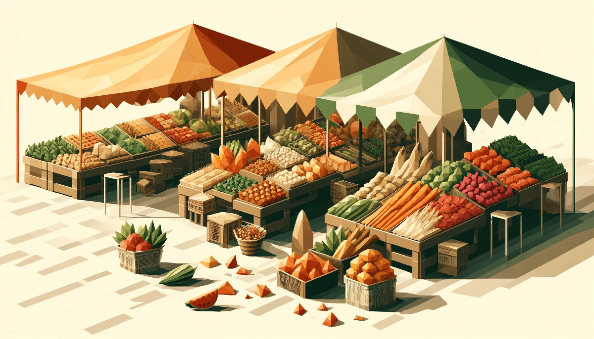
Examples of Food Color Palettes
| #F7F6BB | #FCDC2A | #87A922 | #114232 |
| #F2C18D | #F6F193 | #C5EBAA | #A5DD9B |
| #FFF2E1 | #EAD8C0 | #D1BB9E | #A79277 |
| #E5C287 | #898121 | #E8751A | #FDA403 |
| #F1F5A8 | #E5E483 | #D2D180 | #B2B377 |
| #416D19 | #9BCF53 | #BFEA7C | #FFF67E |
| #9CAFAA | #D6DAC8 | #FBF3D5 | #EFBC9B |
| #AFD198 | #E8EFCF | #ECCA9C | #DBA979 |
| #A1C398 | #C6EBC5 | #FEFDED | #FA7070 |
| #90D26D | #2C7865 | #FF9800 | #D9EDBF |
| #C6DCBA | #E4DEBE | #FFFFEC | #D7E4C0 |
| #D24545 | #EEE | #E8D8C4 | #597E52 |
| #BBC3A4 | #9B4444 | #CAA6A6 | #F9EFDB |
| #A3C9AA | #E6BAA3 | #43766C | #FBFADA |
| #638889 | #B19470 | #C68484 | #739072 |
| #FFE7E7 | #944E63 | #9DBC98 | #B3A398 |
| #EBD9B4 | #B47B84 | #4F6F52 | #12372A |
| #F8FAE5 | #C6A969 | #A94438 | #6D2932 |
| #86A789 | #76453B | #561C24 | #ADBC9F |
| #F1E4C3 | #C7B7A3 | #436850 | #D2E3C8 |
| #5F8670 | #DBCC95 | #EEE7DA | #527853 |
| #9A031E | #F2F1EB | #FBF6EE | #88AB8E |
| #AFC8AD | #EE7214 | #B99470 | #9FBB73 |
| #FF9130 | #A9B388 | #E36414 | #557C55 |
| #820300 | #A6CF98 | #B80000 | #FEFAE0 |
| #CD8D7A | #FB8B24 | #5F0F40 | #65B741 |
| #FF9800 | #C1F2B0 | #F7B787 | #5F6F52 |
| #C3E2C2 | #EAECCC | #F3B664 | #FA7070 |
| #F1EB90 | #FF5B22 | #FECDA6 | #F2FFE9 |
| #EC8F5E | #A9A9A9 | #FFB534 | #F9E8D9 |
| #B2533E | #739072 | #FAF8ED | #D6D46D |
| #D0E7D2 | #EBEF95 | #9A4444 | #618264 |
| #FFB000 | #ED7D31 | #A73121 | #3A4D39 |
| #FFEEF4 | #E4E4D0 | #ECE3CE | #94A684 |
| #F2E8C6 | #B5CB99 | #6C5F5B | #004225 |
| #79AC78 | #DED4B5 | #EF9595 | #FCE09B |
| #4F6F52 | #748E63 | #99B080 | #B0D9B1 |
| #EFD595 | #952323 | #DE8F5F | #186F65 |
| #4F4A45 | #F5F5DC | #EFB495 | #F9B572 |
| #FFCF9D | #F4DFB6 | #F6F1EE | #AEC3AE |
FAQ on Food Color Palettes
Why are food color palettes important in meal presentation?
Color is the silent ambassador of flavor. It speaks to our senses before we take the first bite. Food color palettes influence appetite and perception, turning a meal into a visual journey, promising delights that await the taste buds, enhancing the overall dining experience ambiance.
How do chefs decide on the right colors for a dish?
It’s an art form akin to painting. Chefs consider the color harmony and how each hue complements or contrasts, creating a visually appealing plate. Flavor color coordination often mirrors nature’s own palettes, ensuring the dish is as beautiful as it is delectable.
What role do food color palettes play in food branding?
Brands wield color to whisper stories of taste and tradition. A thoughtful food branding colors strategy can transform consumer perception, creating a lasting imprint of a brand’s identity.
Think of the warmth of a hearty stew or the fresh zest of lime – both beckon through color.
Can food color palettes affect the taste of food?
Indeed, it’s a curious dance between the eyes and palate. Vibrant food styling hues can enhance perceived freshness and intensify flavor expectations.
Subtle shades, meanwhile, might underscore a delicate taste profile, steering the sensory experience even before the food graces one’s lips.
Are there tools to help create food color palettes?
Certainly. Platforms like Pantone® and Adobe Color are indispensable in selecting the perfect spectrums. These tools help in exploring and pairing hues, ensuring the culinary aesthetics aren’t left to chance, and every shade on the plate serves a purpose.
What’s the significance of natural food pigments?
Natural pigments boast more than just hue; they carry with them the promise of health and vitality. Weaving natural food pigments into our creations means infusing dishes with authenticity and nutritional richness – a feast for both the body and soul.
How can food color palettes enhance food photography?
Photography immortalizes the ephemeral artistry of food. Thoughtfully curated food color palettes lead to visually striking images that can captivate and entice an audience instantly.
It’s the colorful whisper that turns a casual viewer into a ravenous reader, eager to devour the story behind the dish.
Do seasonal ingredients affect color palette choices?
Seasons are nature’s own palette, and they indeed dictate shades on plates. Chefs curate seasonal ingredients that encapsulate the essence of the time of year. Edible colors echo the surrounding environment, crafting a cyclical tale of time, taste, and tint.
How important are food color palettes in plating techniques?
Colorful plating weaves the first thread of a diner’s experience. It’s the skillful application of plate composition that suggests a feast is more than just sustenance; it’s an art form. Food presentation isn’t just crucial, it’s the chef’s signature.
What is the impact of cultural influences on food color palettes?
Cultural hues spill onto plates, storytelling through a spectrum of tradition. Each cuisine carries with it a legacy of colors that pioneered palates and defined regions.
A mere glance at the vibrant dish visuals can transport one to a distant land or a treasured memory.
Conclusion
As we draw the curtain on this chromatic journey, let it be said: food color palettes are not mere accents; they are the essence of culinary storytelling.
- With every hue chosen,
- with each shade that graces a plate, a silent narrative unfolds, beckoning diners to a feast that is relished not just with the palate but with the soul.
In the alchemy of food styling hues and culinary aesthetics, there is much to consider—natural food pigments, the swirling moods of seasons, and the whispers of culture that echo in every tint. Embrace the artistry, the strategic choices of complementary food colors, and the powerful gastronomic visuals that stir emotions even before the fragrance hits the senses.
Let’s keep crafting these silent symphonies, with vibrant dish visuals as our muse and the plate our canvas, for in the world of flavors, color is king. The final brushstroke is yours to cast; create boldly.
Bogdan Sandu, a seasoned designer with 15 years of diverse experience, has been designing websites since 2008.
Renowned for his expertise in logo design and visual branding, Bogdan has developed a multitude of logos for various clients.
His skills extend to creating posters, vector illustrations, business cards, and brochures. Additionally, Bogdan's UI kits were featured on marketplaces like Visual Hierarchy and UI8.
Latest posts by Bogdan Sandu (see all)
- Bright Color Palettes for Eye-Catching Designs - 18 May 2024
- Venmo’s Visual Voice: What Font Does Venmo Use? - 18 May 2024
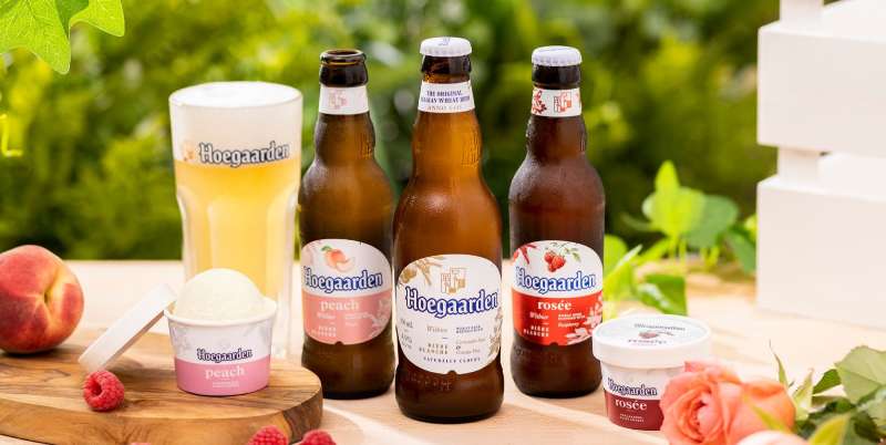
- The Hoegaarden Logo History, Colors, Font, And Meaning - 17 May 2024