A beer brand spent 20 years engineering ink that turns blue. That is the level of commitment sitting behind Coors Light ads.
Since 1978, the brand has run its whole advertising strategy on one idea: cold, made visible. Silver cans, Rocky Mountain silhouettes, copy short enough to read from a moving car.
This page covers the campaigns by name, with the agency, year and market behind each one:
- Closest to Cold, Made to Chill, Chillboards, Lights Out, Case of the Mondays
- The design analysis: composition, palette, typography, logo placement
- How the print work differs from the Super Bowl commercials
By the end you will know why the blue mountains outlasted six agencies.
Coors Light advertising spans 48 years, 8 lead agencies and 6 flagship campaigns, from the brand’s 1978 launch as Coors Brewing Company’s first light lager to the sloth-filled Super Bowl LIX spot in February 2025. The work runs on a single promise repeated in different formats: cold, made visible.
This page covers the campaigns by name, with the agency, year and market behind each one, plus the composition, palette and type decisions that hold them together across print, out-of-home, packaging and TV.
Coors Light Advertising at a Glance
Coors Light has advertised since 1978 and works with a rotating roster that includes VCCP, Leo Burnett, Droga5, DDB and Mischief @ No Fixed Address. Its best-known campaigns are Closest to Cold, Made to Chill and Case of the Mondays. The visual signature combines silver, ice blue and a Rocky Mountain silhouette.
| Attribute | Value |
|---|---|
| First major campaign | Silver Bullet positioning, in commerce from February 1986 (USPTO filing 74255228) |
| Lead agencies | Foote, Cone & Belding, VCCP, 72andSunny, Leo Burnett, DDB Chicago, Droga5, Rethink, Mischief @ No Fixed Address |
| Best-known taglines | “Tap the Rockies,” “The World’s Most Refreshing Beer,” “Made to Chill” (2019), “Choose Chill” (2024) |
| Primary media | TV, print, out-of-home, cold-activated packaging, YouTube, streaming |
| Awards | Clio Grand Award 2024 (“Lights Out”), Clio Gold and D&AD Wood Pencil 2023, ADC Gold Cube, Cannes Lions 2022 Titanium shortlist (“Chillboards”) |
| Visual signature | Silver can, red Coors script, custom cut-edge sans for LIGHT, two-triangle mountain mark |
Which Coors Light Ad Campaigns Are the Most Famous?
Six campaigns carry the brand’s reputation: Closest to Cold (2011 to 2015, UK), Made to Chill (2019), Chillboards (2022), Lights Out (2023), the Chill Train revival (2024) and Case of the Mondays (2025). Each one takes cold as the message and changes only the delivery system.
Closest to Cold (2011 to 2015)
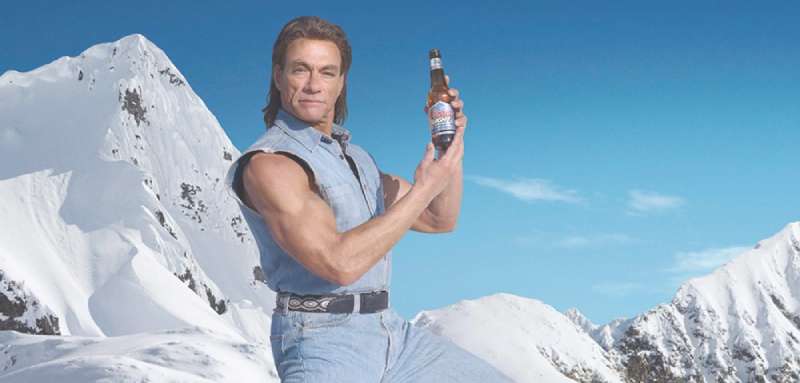
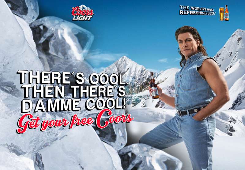
Closest to Cold ran across the UK from June 2011, created by VCCP and VCCP Blue, starring Jean-Claude Van Damme in the Rockies in head-to-toe distressed denim.
The films used wide, cold-cast landscape framing with the actor placed small inside it, so the mountain reads first and the product lands last. Molson Coors put GBP 9m through the line behind it, the biggest ad spend in Coors Light’s UK history at that point (SLR).
Campaign reported a follow-up push of GBP 2.5m in 2013 for the “Imprints” spot, in which Van Damme makes snow angels to “Take My Breath Away.”
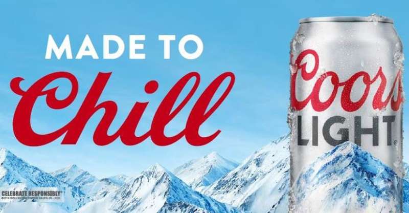
Made to Chill (2019 to 2023)

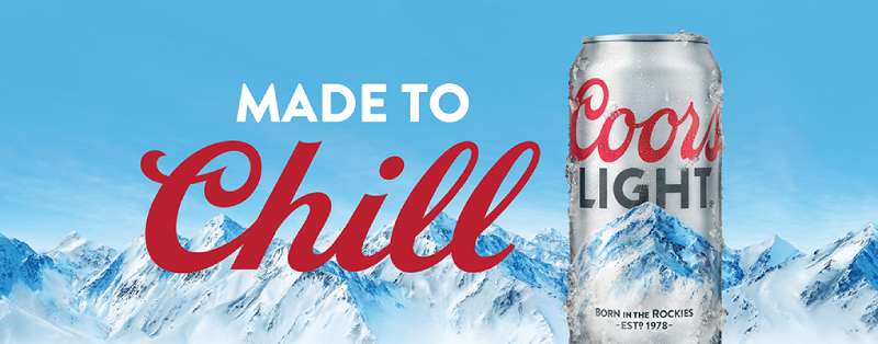
Strategic reset: Leo Burnett won the account in May 2019 from 72andSunny and dropped the mountaintop adventure imagery entirely.
Media plan: the launch reached 90% of 21-to-34-year-olds an average of nine times during August 2019, backed by more than 500 out-of-home displays (PR Newswire).
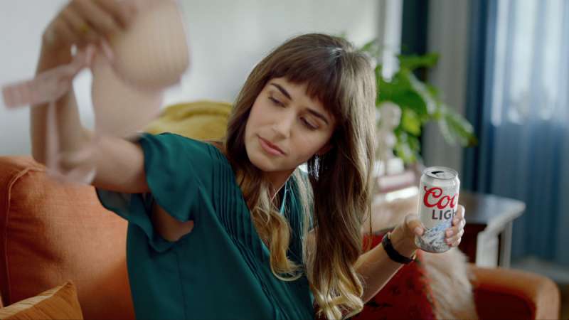
Creative device: ordinary domestic moments, including a shower beer and the “official beer of being done wearing a bra” spot.
Coors Light was down 4.6% in case volume year to date when the platform launched, per Molson Coors. By late 2021 the brand had grown its total US beer share for the first time in five years, according to IRI data cited by the company.
Chillboards (2022)
DDB Chicago, adam&eveDDB London and Nord DDB Copenhagen replaced rented billboard space with painted rooftops in Miami, using a reflective white coating that bounces back 85% of sunlight (Adweek).
The painted area covered the equivalent of 160 average-sized billboards, and a custom dynamic typeface was drawn to stretch across each individual roof, filling 96% of the available surface (D&AD).
Chillboards made the Cannes Lions 2022 Titanium Grand Prix shortlist and took Clio Gold in 2023.
Lights Out (2023)

Shohei Ohtani hit a foul ball into a Coors Light digital board and killed a square of LEDs directly on the can.
Rethink replicated the dead pixels as a real can design within 48 hours, then added the same black square to wildpostings and out-of-home across Anaheim and every screen inside Angel Stadium.
- Cans priced at USD 17 sold out in under 24 hours
- The damaged billboard panel later auctioned for more than USD 7,000
- Clio Grand Award winner, 2024
The Chill Train (2005, revived 2024)

The train started life in 2005 as the Silver Bullet Express and sat unused for roughly 12 years before Droga5 brought it back for Super Bowl LVIII in February 2024.
LL Cool J drives it, Lainey Wilson appears mid-route, and The O’Jays’ “Love Train” closes the 30-second cut. Molson Coors reported double-digit growth in volume sales and velocities over the following four-week period, plus a 12% lift in display inventory worth about 160,000 extra units on retail floors.
Case of the Mondays (2025)

On 13 January 2025, Coors Light released print and out-of-home ads reading “Mountain Cold Refershment.” The typo was deliberate.
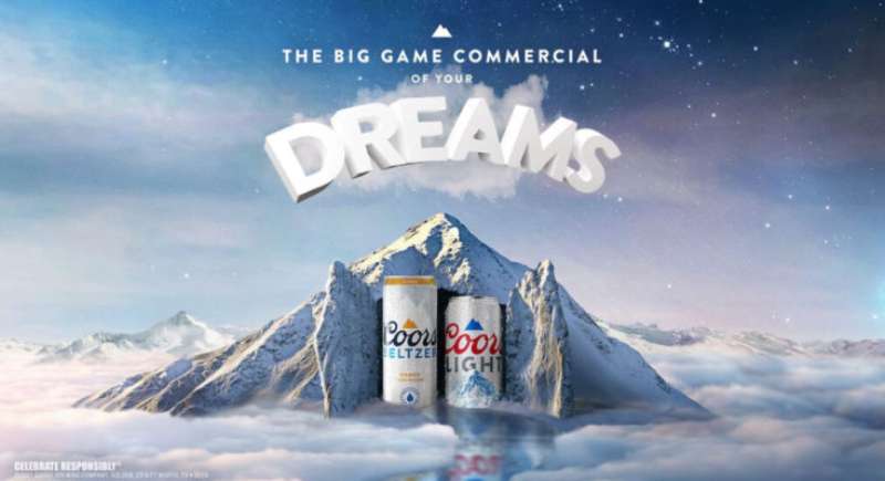
It ran in Times Square, as a full-page New York Times placement, and on billboards in Montreal and Toronto. Mischief @ No Fixed Address then shipped 1.8 million rebranded Mondays Light 12-packs (Ad Age) before the sloth-led Super Bowl LIX spot aired on 9 February.
Talker Research found 60% of Americans and Canadians report a case of the Mondays after the game. Ad Age scored the commercial 4.5 out of 5, the highest of any beer brand in 2025.
Coors Light Print Ads for Cold-Activated Packaging
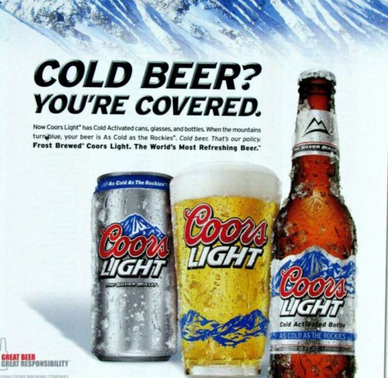
The cold-activated bottle launched in 2007 with thermochromic ink from LCR Hallcrest, printed on paper labels by Inland Label & Marketing Services (Packaging World).
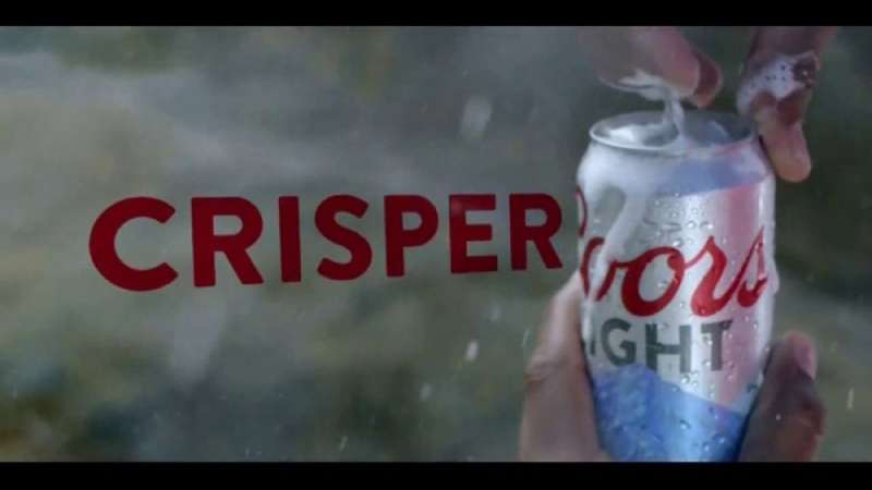
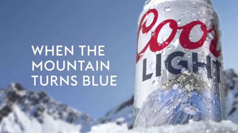
Cans followed: UK in 2007, Canada in 2008, the US in 2009, with mountains turning blue at approximately 46 degrees Fahrenheit. Chromatic Technologies founder Lyle Small first pitched the idea in 2002.
Print work from this period does one job. Show the can. Show the mountains blue. The packaging itself carries the design argument, and the layout stays out of its way.
How Do Coors Light Print Ads Work Visually?
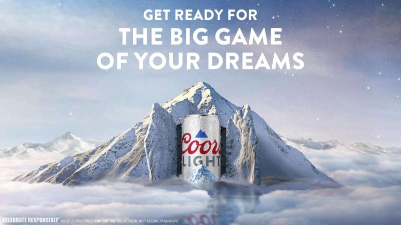
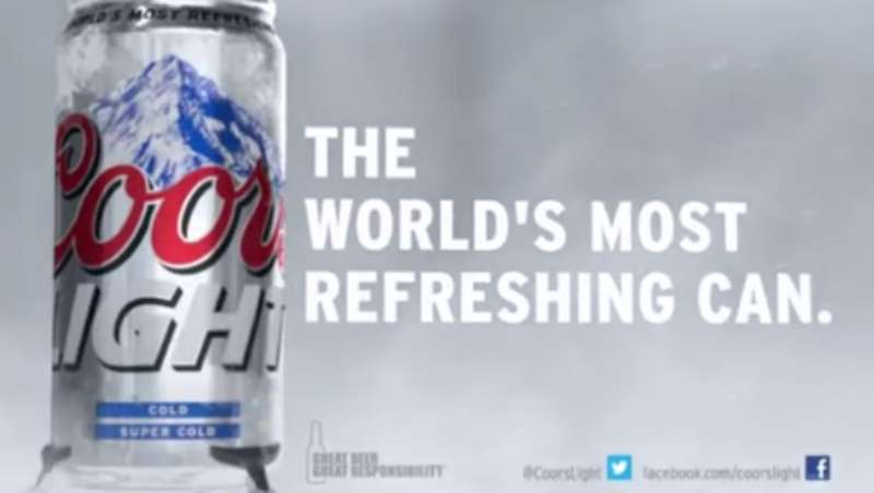
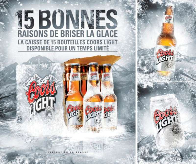
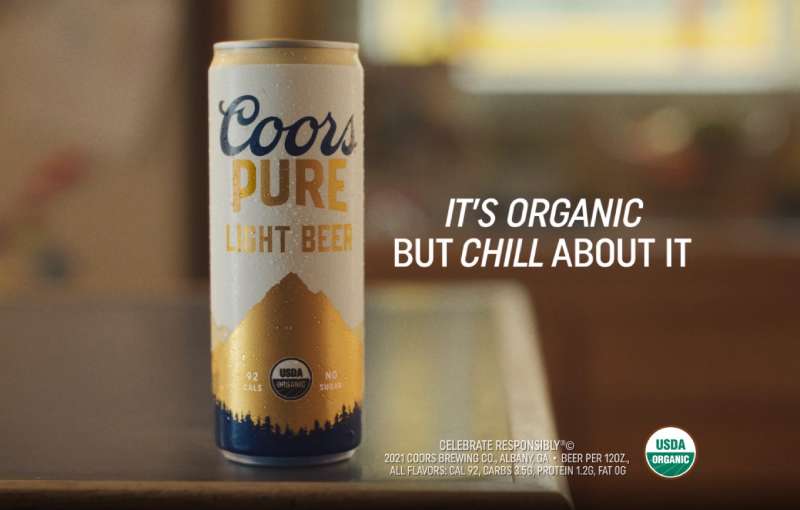
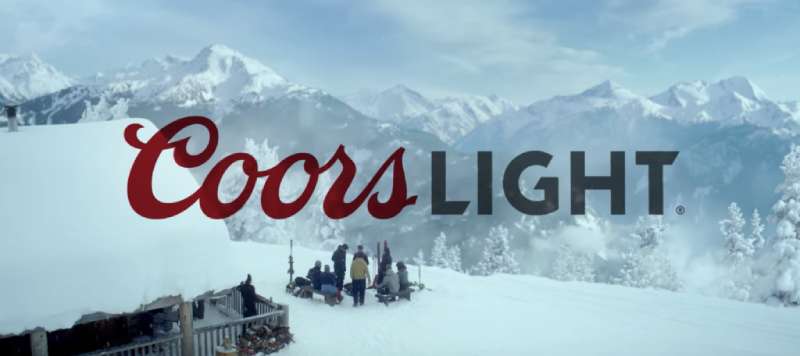
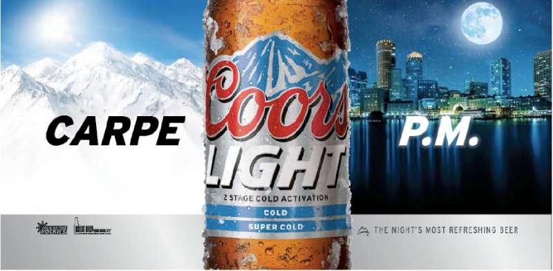
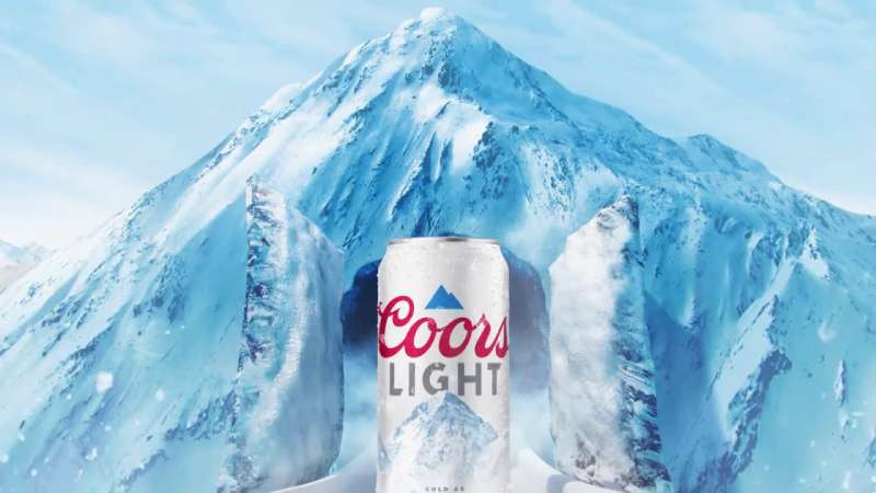
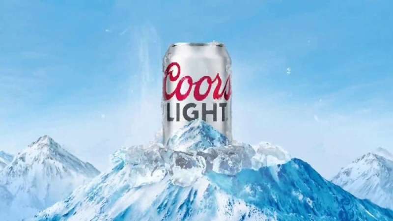
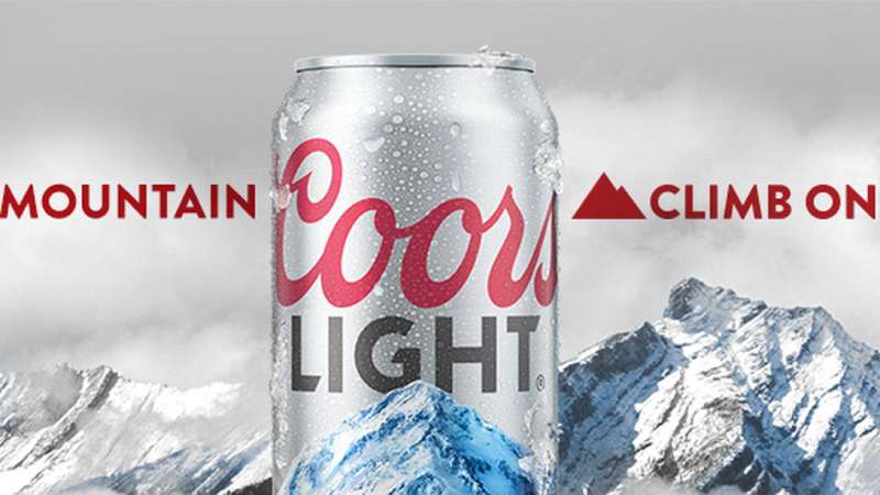
Coors Light print ads use a three-element system: silver can, blue mountain mark, one short line of copy. Backgrounds run cold (white, ice blue, gunmetal), the can sits near the optical center, and the logo lockup anchors the lower third. Copy rarely exceeds five words.
The palette is close to a single-hue build: silver, white and one saturated blue, with the red Coors script as the only warm accent. That restraint is why the red reads as loudly as it does.
Type: “Coors” is a proprietary cursive script inherited from the parent brewery. “LIGHT” sits in a custom sans-serif with cut ends on the L, G and T, which nothing in a standard font library replicates.
Hierarchy: the can is the first thing your eye lands on, the tagline second, the logo third. Nothing competes for that first position.
Space: the ads are generous with empty area around the product, which is what makes a 12-ounce can read at 48 sheets.
Blue does most of the emotional work here. Cool hues signal temperature drop faster than any headline, which is why the brand spent 20 years engineering ink that turns blue rather than writing better cold copy.
Out-of-home versions push the type weight up and the word count down. Anyone building comparable work should look at typefaces that survive at highway distance before choosing a layout, and the same discipline applies if you are laying out a beer poster from scratch.
How Do Coors Light TV Commercials Differ From Its Print Ads?
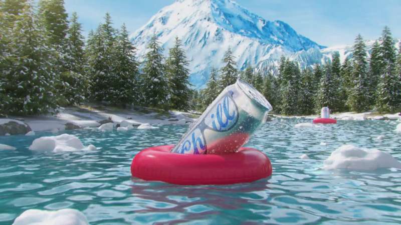
TV adds narrative, celebrity and music that print cannot carry. Where a print ad states cold, a commercial dramatizes it: a train made of beer cans, a man freezing in the Alps, a room full of sloths. The can appears late, usually in the final 5 seconds.
The Return of the Coors Light Chill Train (2024, Droga5)
A silver locomotive with can-shaped cars leaves the Rockies at a claimed 900 mph, freezing everything it passes, including a beach scene widely read as a shot at Corona. LL Cool J is revealed as the conductor in the final beat.
Slow Monday (2025, Mischief @ No Fixed Address)
Thirty seconds of sloths performing office tasks, bagging groceries and outrunning police at a crawl, cut to a cover of The Mamas & the Papas’ “Monday, Monday.” Kevin Mulroy served as ECD.
Closest to Cold: I’m Annoyed (2011, VCCP)
Van Damme fails to survive three days in Alpine snow. The spot launched on Facebook and YouTube in October rather than TV first, which was unusual for a beer brand at the time.
The through-line across all three is a narrative structure that delays the product. Print cannot delay anything, so it compensates with scale and contrast instead.
Celebrity casting is the other split. LL Cool J, Lainey Wilson and Van Damme all function as recognizable faces attached to a brand promise, and none of them appear in the print work at all.
How Has Coors Light Advertising Evolved Since 1978?
Coors Light advertising moved through four strategic phases: Western heritage (1978 to 1999), music-and-humor targeting of young men (2000 to 2010), technology-led cold proof (2007 to 2018), and emotional chill positioning (2019 to present). The Rocky Mountain asset survives all four.
| Decade | Strategic shift | Representative work |
|---|---|---|
| 1980s | Silver Bullet nickname established | Silver Bullet trademark, in commerce from 1986 |
| 2000s | Humor plus music for men in their twenties | “And Twins” (2001, Foote, Cone & Belding) |
| 2010s | Product technology as the message | Cold-activated cans, Closest to Cold |
| 2020s | Chill as a cultural stance | “Made to Chill,” “Choose Chill,” “Case of the Mondays” |
The 2001 “And Twins” spots came from Aaron Evanson and John Godsey at Foote, Cone & Belding, built on a rewritten version of Tom T. Hall’s “I Love.”
Design followed strategy. Turner Duckworth rebuilt the brand’s identity system in 2015, replacing the detailed mountain illustration with two abstract gray triangles and introducing a matte can finish intended to make the beer look colder.
A further refresh in 2020 added the blue mountain icon into the logo lockup itself. Coors Light posted 6.8% off-premise case volume growth that year and its highest ever share of the premium lights segment, per Nielsen data cited by Molson Coors.
Collectors chasing older print work from this era will notice how much warmer the 1980s and 1990s layouts were, with photographic mountain backdrops instead of flat vector shapes.
Which Agencies Created Coors Light Advertising?
Eight agencies built the modern Coors Light body of work. Foote, Cone & Belding created “And Twins” in 2001. VCCP created Closest to Cold in 2011. Leo Burnett created Made to Chill in 2019. Mischief @ No Fixed Address created Case of the Mondays in 2025.
| Agency | Campaign | Year |
|---|---|---|
| VCCP / VCCP Blue | “Closest to Cold” (UK) | 2011 to 2015 |
| Cavalry, Chicago | “Reach For The Cold” | 2013 |
| Leo Burnett | “Made to Chill” | 2019 |
| DDB Chicago, adam&eveDDB, Nord DDB | “Chillboards” | 2022 |
| Rethink | “Lights Out” | 2023 |
| Droga5 | “Chill Train revival” | 2024 |
Turner Duckworth sits outside the advertising roster and handles design. The San Francisco studio produced the 2015 identity overhaul after working through Molson Coors company archives.
Marcelo Pascoa, VP of marketing for the Coors family of brands, has fronted the Chill Train, Lights Out and Case of the Mondays work publicly. Sofia Colucci serves as Molson Coors chief marketing officer.
What Can Designers Learn From Coors Light Ads?
Five practices transfer directly from Coors Light’s advertising to any product-led campaign. All of them come from a brand with one message and 48 years of repetition behind it.
- Build the entire palette around one temperature, then break it with a single warm accent
- Give the product silhouette the top position in the reading order, never the logo
- Move the proof into the packaging when the copy stops being believed
- Keep out-of-home copy under five words and let scale carry the rest
- Document the asset so it survives agency changes, which is exactly what a written set of brand rules exists to do
The blue mountains outlasted VCCP, Leo Burnett, Droga5, Rethink and DDB. That is the actual lesson.
How Do Coors Light Ads Compare to Bud Light Ads?
Bud Light advertising leans on character comedy and celebrity ensembles. Coors Light leans on a physical property of the product. That difference shows up in the layouts: Bud Light print work carries more people, more copy and a warmer blue-and-white palette, while Coors Light print work is closer to a product catalog page with a tagline attached.
The rivalry is direct. Molson Coors returned to in-game Super Bowl advertising in 2023 after Anheuser-Busch InBev gave up the beer-category exclusivity it had held since 1989.
Against Budweiser’s heritage-led campaigns, Coors Light looks colder and less sentimental. Against Corona’s beach-and-horizon compositions, it looks tighter and more product-forward, which the 2024 Chill Train spot mocked openly by burying a beach couple in snow.
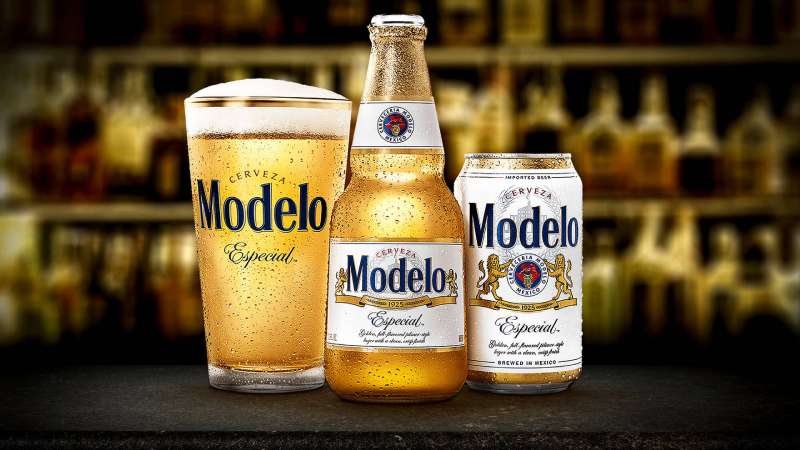
Modelo’s advertising takes a third route entirely, built on fighting-spirit narrative rather than temperature or place. Three brands, three contrasting visual strategies, one shelf.
What Makes Coors Light Advertising Work?
One product truth, restated for 48 years. Cold.
Every campaign that worked pushed temperature into a new format: thermochromic ink on the can, a train made of silver cars, painted rooftops in Miami, an infrared camera. Every campaign that stalled, including Climb On, drifted toward lifestyle imagery and left the temperature behind.
The design system holds because it barely moves. A tightly restricted set of colors, one mountain silhouette, one red script, and copy short enough to read at 70 mph.
Repeating the same visual signal across agencies, decades and markets is unglamorous work in commercial design. It also outlasted six agencies.
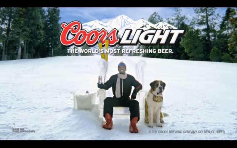
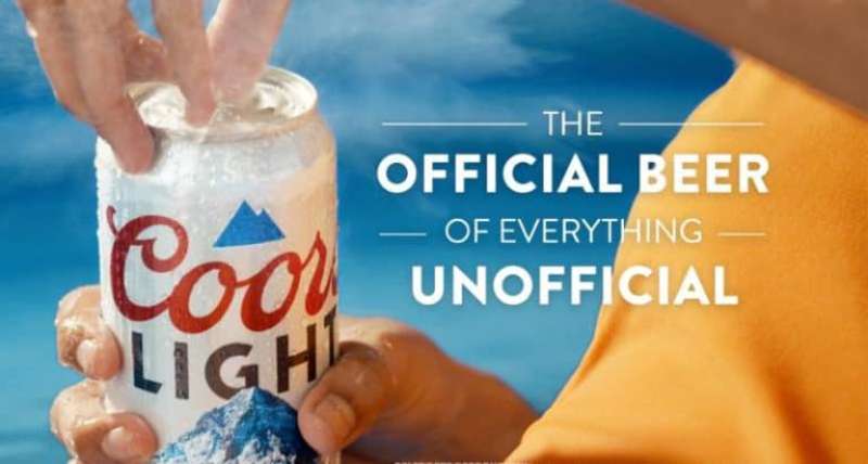
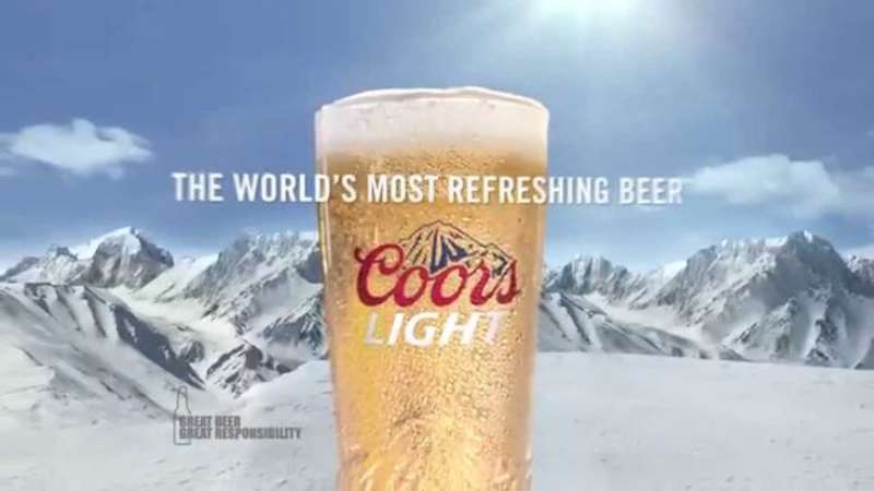
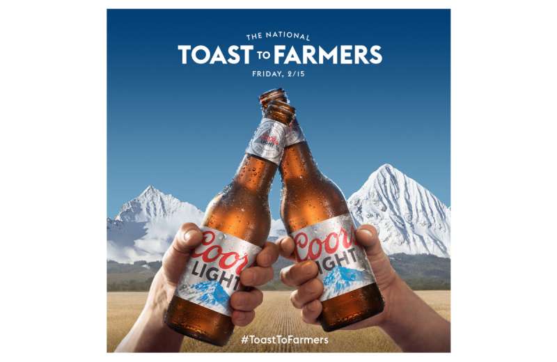
Coors Light Ads Examples

FAQ on Coors Light Ads
What is the Coors Light slogan?
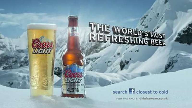
The brand has cycled through several. Made to Chill arrived in 2019, Choose Chill followed in 2024, and “The World’s Most Refreshing Beer” ran from 2007. Tap the Rockies and Born in the Rockies are the older ones.
Why do the mountains on a Coors Light can turn blue?
Thermochromic ink. The mountains shift from white to blue at roughly 46 degrees Fahrenheit, signalling the beer is cold. Chromatic Technologies developed the aluminum-safe version after LCR Hallcrest supplied the earlier paper label ink.
Who stars in Coors Light Super Bowl commercials?
LL Cool J conducted the Chill Train in the 2024 spot, with a Lainey Wilson cameo. The 2025 Super Bowl LIX ad used animated sloths instead of celebrities, plus a Timothy Simons teaser beforehand.
What was the Coors Light typo ad?
On 13 January 2025, ads reading “Mountain Cold Refershment” ran in Times Square, The New York Times and on billboards in Montreal and Toronto. The misspelling was deliberate, kicking off Case of the Mondays.
What is the Coors Light Chill Train?
A silver locomotive built from beer cans that delivers cold across America. It debuted in 2005 as the Silver Bullet Express, disappeared for over a decade, then returned for Super Bowl LVIII in February 2024.
Which agency makes Coors Light ads?
Several, by market and year. Rethink handles the current work, Mischief @ No Fixed Address made Case of the Mondays, Droga5 made the Chill Train, and Leo Burnett built Made to Chill.
Why is Coors Light called the Silver Bullet?
The nickname comes from the unpainted silver can, and it entered commerce as a trademarked phrase in February 1986. It remains the brand’s longest-running piece of advertising shorthand, older than any current tagline.
Did Coors Light really paint rooftops as billboards?
Yes. The 2022 Chillboards project covered Miami roofs in reflective white paint that bounces back 85% of sunlight, lowering indoor temperatures. Painted area equalled roughly 160 standard billboards, with a custom typeface drawn per roof.
What happened with the Shohei Ohtani Coors Light billboard?
A foul ball killed a square of LEDs directly on the can graphic. Rethink turned the dead pixels into a real can design within 48 hours, and the limited run sold out in under a day.
Is Coors Light the official beer of the NFL?
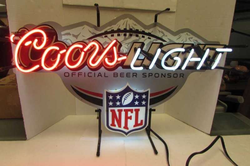
Not anymore. Coors Light held the NFL sponsorship from 2002 until Bud Light took it in 2011. Molson Coors shifted spend toward the NHL and, later, college football through ESPN’s College GameDay.
Conclusion
Coors Light ads work because the brand refuses to argue about anything except temperature.
Forty-eight years of print advertising, out-of-home boards and TV spots keep circling one claim, with the cold-activated can doing the proving whenever copy alone stops landing.
The design lesson travels well beyond the beer aisle. A restricted palette, one dominant product silhouette, and real negative space outperform clever headlines in every format the brand has tested.
Award juries noticed. Chillboards and Lights Out picked up Cannes Lions shortlisting, Clio metal and D&AD pencils with no celebrity anywhere in the work.
Line the campaign layouts up side by side and the pattern is obvious. Change the agency, the medium, the decade. Keep the mountain.

Renowned for his expertise in logo design and visual branding, Bogdan has developed a multitude of logos for various clients.
His skills extend to creating posters, vector illustrations, business cards, and brochures. Additionally, Bogdan's UI kits were featured on marketplaces like Visual Hierarchy and UI8.
He also wrote in the past years on sites like Design Your Way, WebDesignerDepot, WPDean, Designmodo, Speckyboy, Slider Revolution, and more.
- The Windsurf Logo History, Colors, Font, And Meaning - 10 October 2026
- How to Remove Background From Product Photos (No Photoshop) - 10 October 2026
- How Designers can Build a Stronger Online Creative Identity - 9 October 2026

Bogdan Sandu is a seasoned designer who has been designing websites since 2008. Renowned for his expertise in logo design and visual branding, Bogdan has developed a multitude of logos for various clients. His skills extend to creating posters, vector illustrations, business cards, and brochures. Additionally, Bogdan's UI kits were featured on marketplaces like Visual Hierarchy and UI8. He also wrote in the past years on sites like Design Your Way, WebDesignerDepot, WPDean, Designmodo, Speckyboy, Slider Revolution, and more.
You Might Also Like