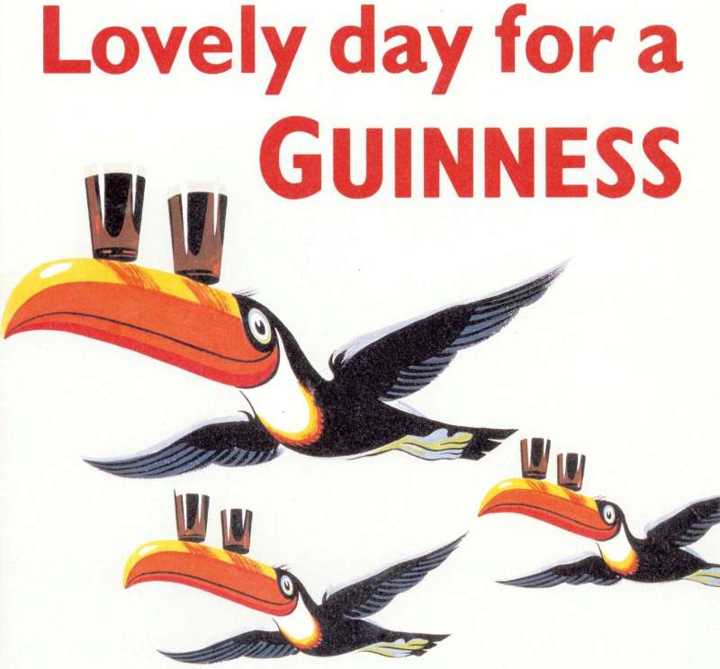
A toucan balancing two pints on its beak did more for the brand than any health claim ever managed.
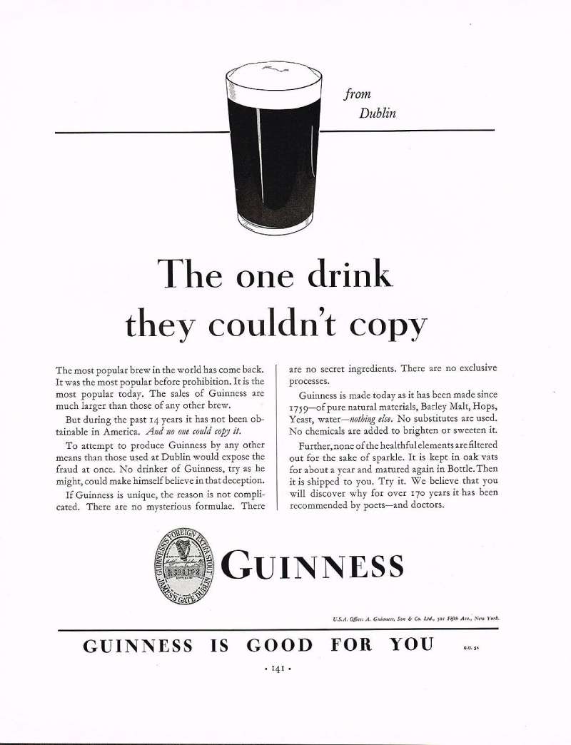
Guinness ads have run for 97 years, from the 1929 press campaign to the Premier League films of 2025. Six agencies, one visual system, almost no drift.
The posters circulate constantly. The design decisions behind them rarely get explained.
You will get every campaign with its agency, year and market, plus the layout, palette and typography that made the work hold up.
What follows covers:
- Gilroy’s zoo posters and the S.H. Benson years
- The 119.5-second pour turned into a proposition
- Surfer, noitulovE, Tipping Point and Sapeurs
- What designers can lift from all of it
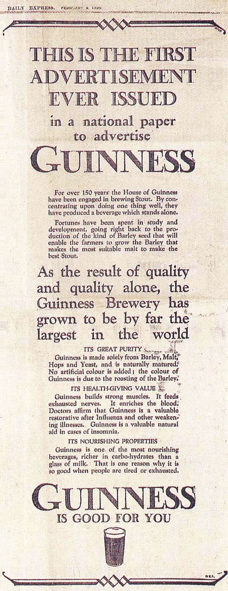
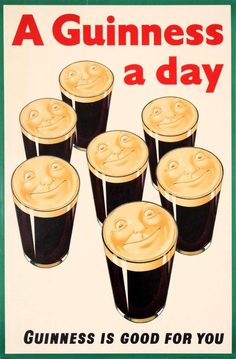
Guinness advertising spans 97 years, 6 lead agencies and 8 flagship campaigns, from the first “Guinness is good for you” press ad in 1929 to “Lovely Day for a Guinness” in 2025. The work runs on one device: never sell the stout, sell the wait for it.
Print carried the idea first through lithograph posters, then cinema, television and stadium sponsorship picked it up.
This page covers the campaigns by name, with the agency, year and market behind each one, plus the composition, palette and typography choices that make the posters and commercials hold up decades later.
Guinness Advertising at a Glance
Guinness has advertised since 1929, working primarily with S.H. Benson, Ogilvy & Mather and AMV BBDO. Its best-known campaigns are “My Goodness, My Guinness,” “Good Things Come to Those Who Wait” and “Made of More.” The visual signature combines a black-and-white palette, the gold Brian Boru harp and animals drawn by John Gilroy.
| Attribute | Value |
|---|---|
| First major campaign | “Guinness is good for you” press advertising, 1929 |
| Lead agencies | S.H. Benson (1928 to 1971), Ogilvy & Mather (1971 to 1998), AMV BBDO (1998 to present) |
| Best-known taglines | “Guinness for Strength” (1934), “My Goodness, My Guinness” (1935), “Good Things Come to Those Who Wait” (1998), “Made of More” (2012) |
| Primary media | Press, lithograph poster, out-of-home, cinema, television, digital, stadium |
| Awards | Cannes Lions Gold for “Surfer” (1999), Clio Advertiser of the Year (2001), D&AD Pencils for “Sapeurs” (2015) |
| Visual signature | Cream ground with red lettering in print, monochrome in film, harp lockup, animal or product as focal point |
Which Guinness Ad Campaigns Are the Most Famous?
The 5 most famous Guinness ad campaigns are “My Goodness, My Guinness” (1935 to the 1960s), “Guinness Time” (late 1980s to 1994), “Good Things Come to Those Who Wait” (1998 to 2007), “Michael Power” in Africa (1999 to 2006) and “Made of More” (2012 to 2019).
My Goodness, My Guinness (1935 to the 1960s)

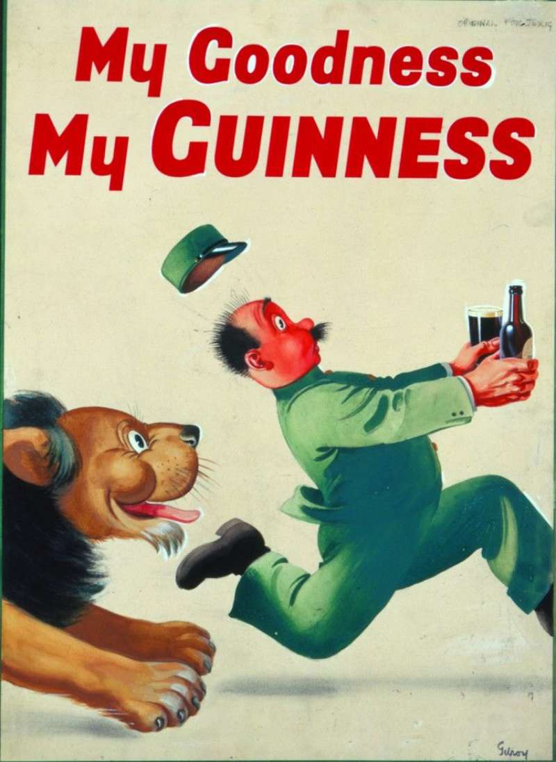
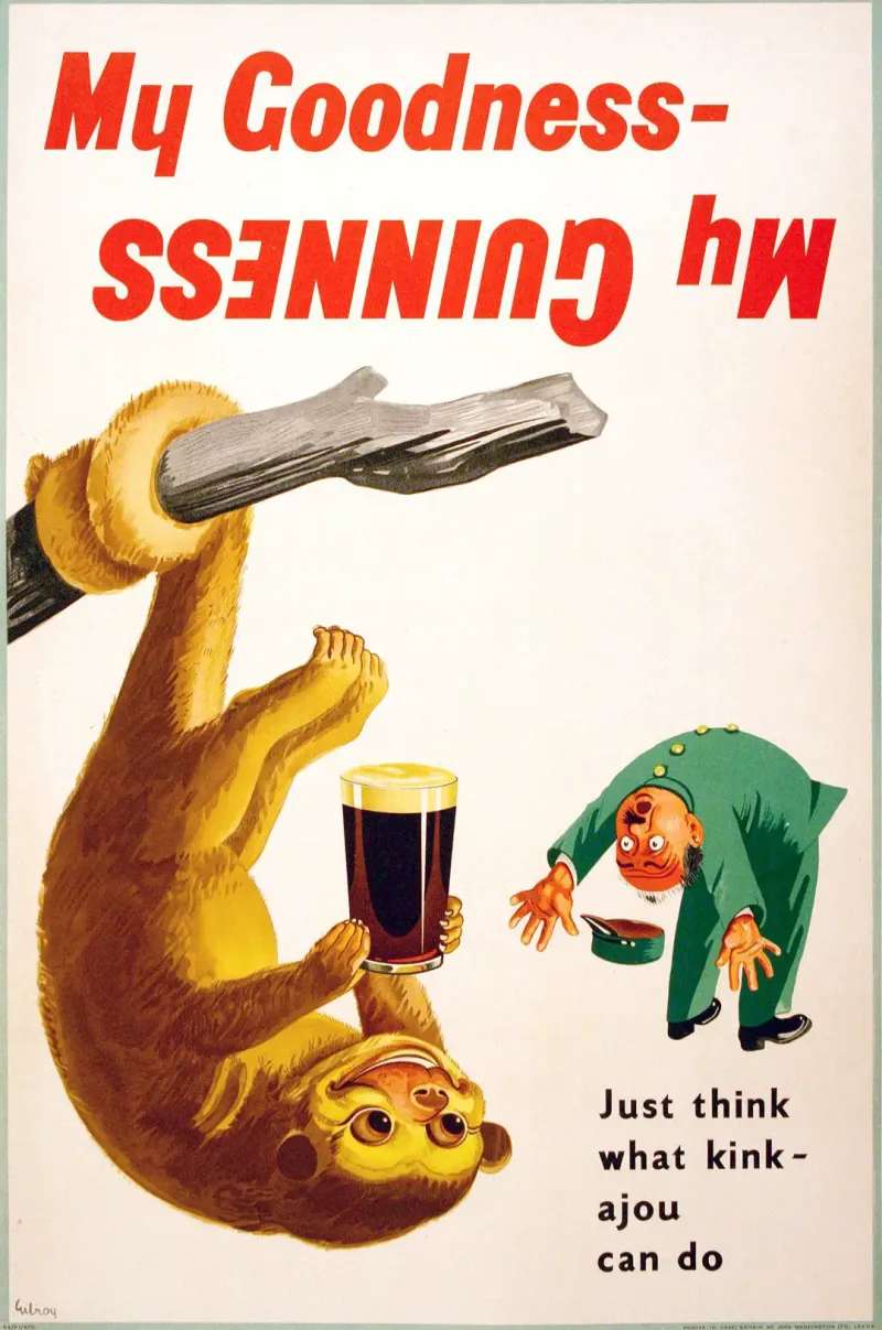
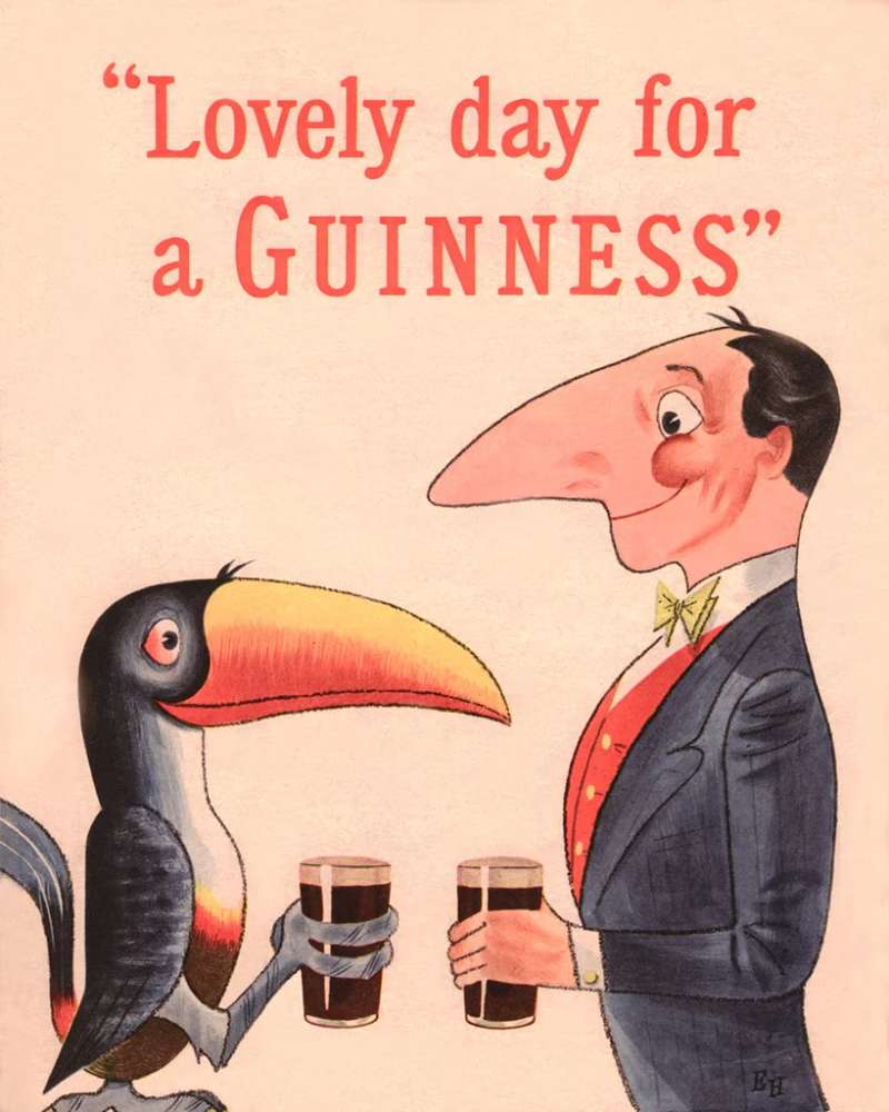
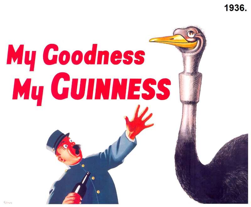
“My Goodness, My Guinness” ran across Britain and Ireland from 1935, created by S.H. Benson. The campaign showed a beleaguered zookeeper chasing animals that had stolen his pint, and Gilroy drew the zookeeper as a caricature of himself.
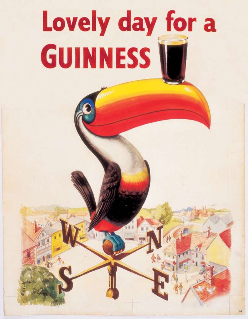
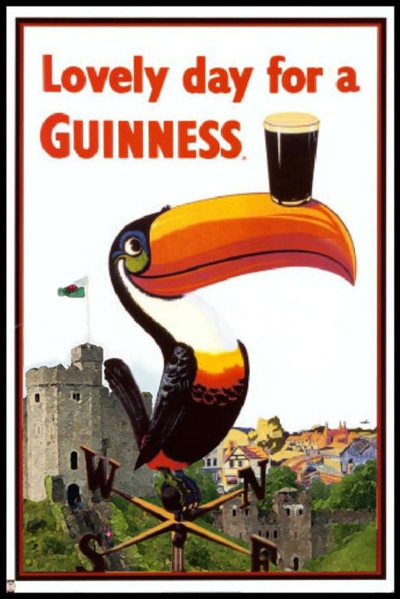
Gilroy produced roughly 50 poster designs and close to 100 press advertisements over 35 years, most built on a flat colour field with the animal as the single focal point and the copy line dropped underneath at one weight.
Recurring cast: toucan, sea lion, ostrich, kangaroo, lion, pelican.
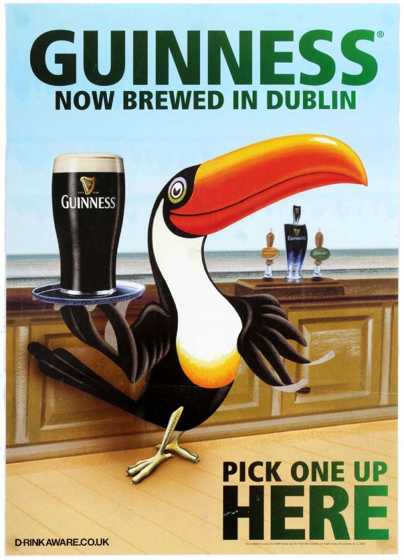
The toucan debuted in autumn 1935 after crime writer Dorothy L. Sayers wrote the accompanying verse, and returned on new posters in 1953 and again in 1980s television spots (Guinness Storehouse).
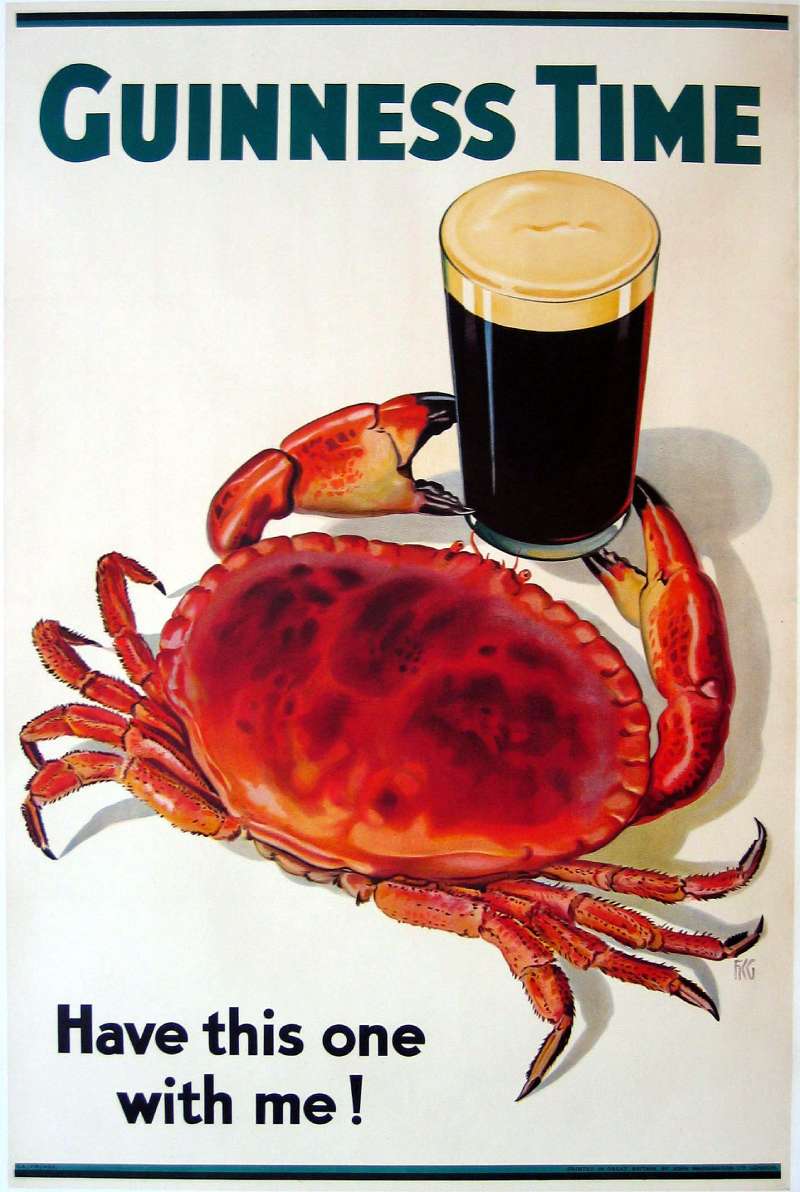
Guinness Time and Anticipation (late 1980s to 1994)

Agency: Arks Ltd, Dublin.
Market: Ireland first, then the UK in 1995.
Device: the settling pint as an on-screen timer.
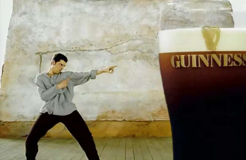
“Anticipation” put actor Joe McKinney through a jump-cut dance around a settling pint, shot at Ardmore Studios in Wicklow on a small budget and directed by Richie Smyth.
The soundtrack, Perez Prado’s “Guaglione,” went to number 1 in Ireland and number 2 in the UK Top 40 off the back of the spot.
Good Things Come to Those Who Wait (1998 to 2007)

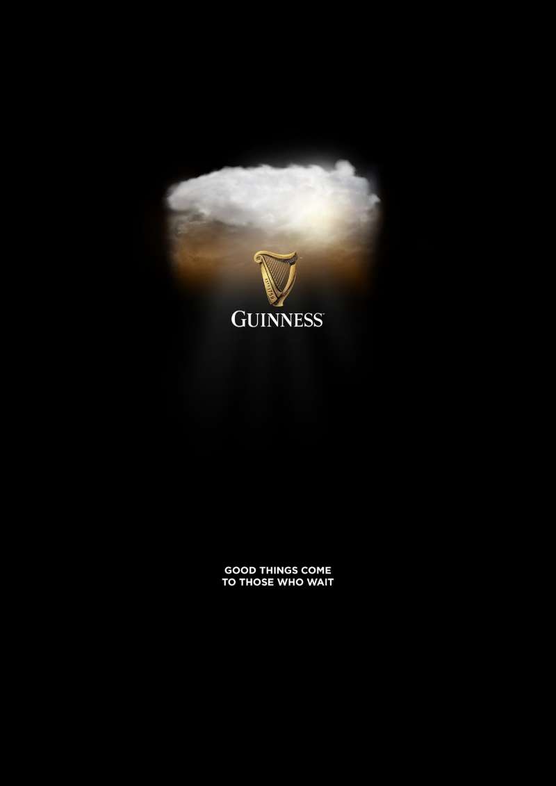
AMV BBDO won the account in 1998 by pitching a product truth: the 119.5-second two-part pour. The platform turned a service delay into the brand’s core proposition across TV, cinema and press in the UK and Ireland.
| Spot | Year | Director | Hook |
|---|---|---|---|
| Swimblack | 1998 | Jonathan Glazer | Swimmer crosses a bay in 119.5 seconds |
| Surfer | 1999 | Jonathan Glazer | Wave crest becomes white horses |
| noitulovE | 2005 | Daniel Kleinman | Evolution played in reverse |
| Tipping Point | 2007 | Nicolai Fuglsig | Domino chain through an Argentine village |
Michael Power (1999 to 2006)

Saatchi & Saatchi built the campaign to double Guinness sales in Africa by 2005, casting Cleveland Mitchell as an action hero across radio and television.
Spots ran 3 to 5 minutes, long enough that cash-strapped African stations sometimes scheduled them as free programming (Ad Age).
The campaign closed with a 2004 feature film, “Critical Assignment,” shot across Cameroon, Ghana, Kenya and Nigeria.
Made of More (2012 to 2019)
AMV BBDO replaced the pour-based platform with character-based documentary storytelling. Films profiled real people rather than staging metaphors.
- Sapeurs (2014): Congolese dressers in Brazzaville, shot as a 90-second spot plus a 5-minute documentary
- Wheelchair Basketball (2013): friends playing so one of them is not alone
- Compton Cowboys (2018): horse rescue in South Los Angeles
“Sapeurs” returned 19.90 pounds of revenue for every 1 pound spent, and the platform as a whole delivered a profit ROI of 3.88 pounds per pound, close to double the category norm (Thinkbox).
Guinness Print Ads From the Alice in Wonderland Series (1929 to the 1930s)
Gilroy’s earliest Guinness work parodied Lewis Carroll.
The Guinness Online Archive dates “The Walrus and the Carpenter” to the 21 September 1929 issue of Bystander magazine, printed in black and white with hand-set verse running beneath the illustration.
These pages read as editorial rather than advertising design, which is exactly why they worked in magazines that readers were paying to keep.
How Do Guinness Print Ads Work Visually?
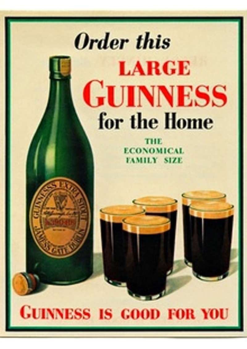
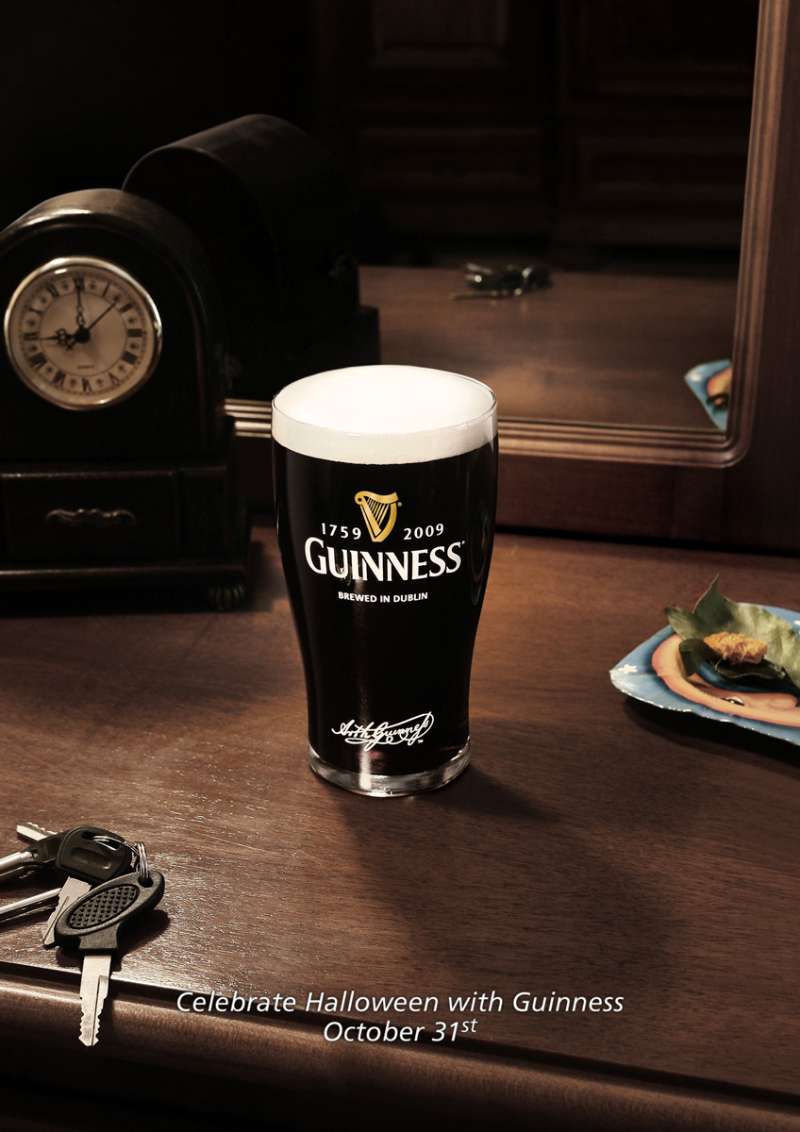
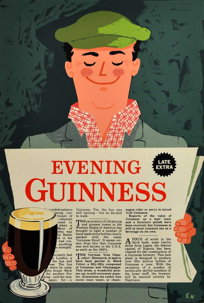
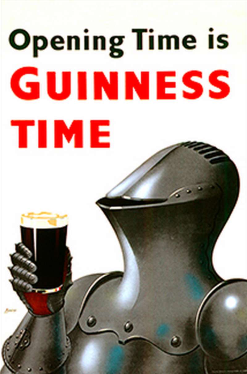
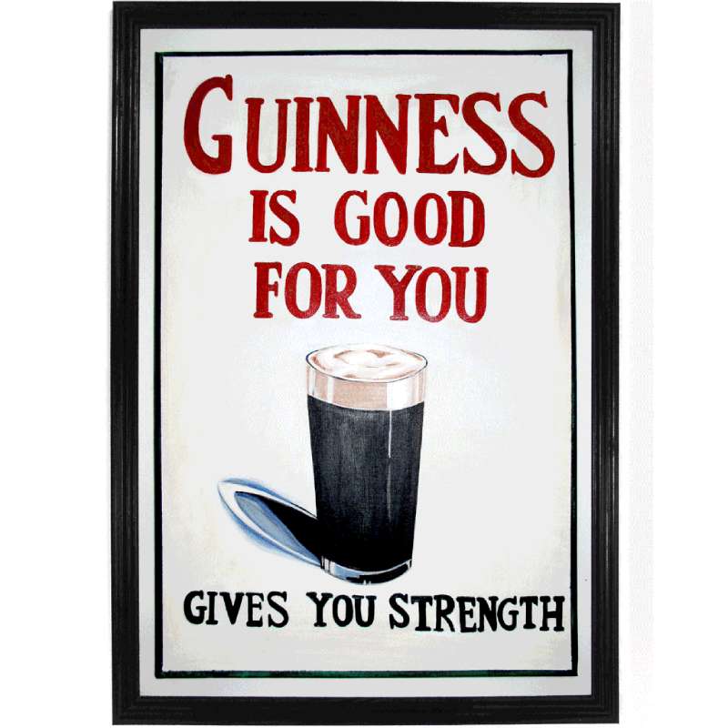
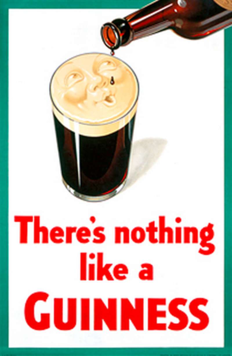
Guinness print ads use a fixed formula: one illustrated subject on a flat cream or coloured ground, a single line of red or black display lettering, and the harp lockup pushed to a corner. Image occupies roughly 70 percent of the page. Copy never competes with the drawing.
The palette does the heavy lifting. Gilroy worked in solid, unmodelled colour with no gradient and almost no texture, which made the posters survive four-colour lithography at billboard scale.
Black stout against a cream ground produces the sharpest contrast available in print, and it is the same relationship the brand still uses in film. Later television work stripped the monochrome colors down further to pure black and white.
Type comes second on every layout. Bruce Hobbs designed the first official Guinness typeface at S.H. Benson in 1963, a serif font set in red on cream, and it locked the brand typography for two decades.
The visual hierarchy reads illustration, then tagline, then harp. Never the reverse.
Generous white space around the animal is what keeps a 1935 toucan poster legible on a phone screen in 2026. The 1930s work also picked up the geometric flatness of Art Deco without the ornament.
How Do Guinness TV Commercials Differ From Its Print Ads?
Guinness television commercials replace the joke with duration. Print posters land a gag in one frame. TV spots use 60 to 100 seconds to dramatise waiting, which means cinematography, music and edit rhythm carry the message instead of composition and lettering.
Surfer (1999)

Directed by Jonathan Glazer for AMV BBDO, shot in Hawaii over 9 days, scored with Leftfield’s “Phat Planet.” Surfers wait for a wave whose crest breaks into white horses, a direct lift from Walter Crane’s 1893 painting “Neptune’s Horses.”
It won a Gold Lion at Cannes in 1999 and was voted best ad of all time in a Channel 4 and Sunday Times poll.
noitulovE (2005)

Daniel Kleinman directed this 60-second reverse-evolution spot on a 1.3 million pound production budget inside a 15 million pound campaign. Three drinkers run backwards through evolution to mudskippers, then return to a London pub.
Tipping Point (2007)

Nicolai Fuglsig filmed a 10 million pound domino chain in an Argentine village, with post-production by The Mill. It was the most expensive Guinness commercial made at that point.
Sapeurs (2014)

AMV BBDO sent a crew to Brazzaville to film the Society of Elegant Persons. The film abandons the black-and-white house style entirely and runs on saturated suiting colour, which is the point of the contrast.
How Has Guinness Advertising Evolved Since 1929?
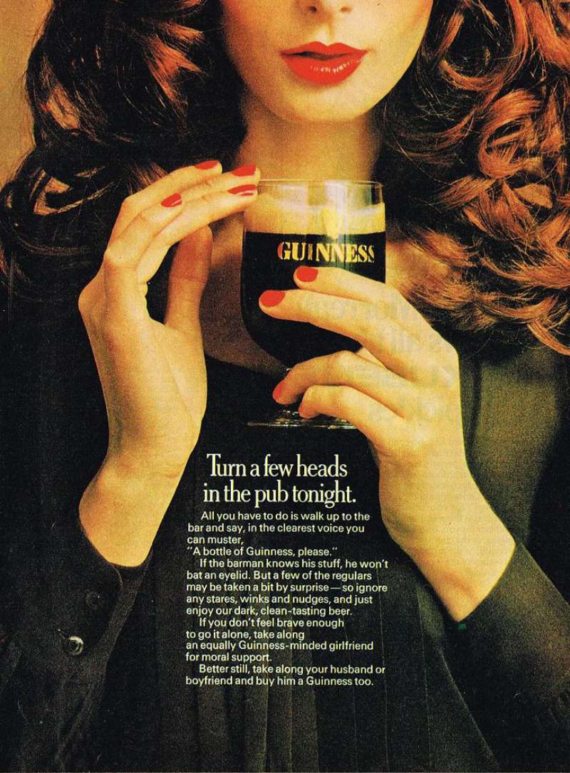
Guinness advertising has moved through 4 strategic phases: health claims (1929 to 1950s), humour and mascots (1935 to 1980s), product truth around the pour (1988 to 2007), and human character stories (2012 to present).
| Decade | Strategic shift | Representative campaign |
|---|---|---|
| 1930s | Health and strength claims | “Guinness for Strength” (1934) |
| 1950s to 1960s | Mascot humour at poster scale | “My Goodness, My Guinness” |
| 1980s to early 1990s | Cult personality and enigma | Rutger Hauer, “Pure Genius” |
| 1998 to 2007 | The 119.5-second pour as proposition | “Good Things Come to Those Who Wait” |
| 2012 to today | Real people and sponsorship | “Made of More,” Premier League work |
Rutger Hauer appeared in more than 20 Ogilvy & Mather spots before that campaign ended in 1994 with “Chain.”
The current phase is commercially the strongest. Guinness posted double-digit growth in fiscal 2025 against Diageo’s 1.7 percent organic net sales increase, and added more than 3.8 million new drinkers since 2019 (Diageo annual report).
Which Agencies Created Guinness Advertising?
S.H. Benson created Guinness advertising from 1928, Ogilvy & Mather absorbed Benson in 1971 and held the account until 1998, and AMV BBDO has run it since. Saatchi & Saatchi handled Africa from 1999, Arks handled Ireland in the early 1990s, and Uncommon Creative Studio made the 2025 US work.
S.H. Benson hired John Gilroy in 1928 and employed Dorothy L. Sayers as a copywriter, and Bruce Hobbs designed the brand typeface there in 1963.
AMV BBDO won the Guinness account from Ogilvy & Mather in 1998 with the pour insight, and creative directors Nicholas Hulley and Nadja Lossgott led the Sapeurs work in 2014.
Saatchi & Saatchi Cape Town developed Michael Power through writer Steven Shore, who scripted the series across its full 7-year run.
Gilroy is one of the few famous graphic designers whose commercial output is now collected at auction, with individual Guinness lithographs estimated at 700 to 1,000 dollars by Swann Galleries in 2021.
What Can Designers Learn From Guinness Ads?
Guinness work rewards study for 5 reasons: it commits to one product truth, it protects a fixed palette, it keeps type subordinate to image, it uses humour without breaking the brand, and it holds a device across decades instead of restarting every 3 years.
- Build the campaign on a product constraint, not a benefit
- Limit the palette to two values plus one accent, and keep it for 40 years
- Set the tagline in a single weight below the optical centre
- Draw the subject flat so it survives lithography, silkscreen and a phone screen
- Place the harp lockup as a signature, never as the hero
- Write copy short enough to read at 70 miles per hour on a billboard
The same discipline governs strong poster design outside drinks work, and it is the reason Guinness sheets still hang in pubs 90 years after printing. Anyone documenting a system this long-lived ends up writing brand guidelines whether they mean to or not.
How Do Guinness Ads Compare to Stella Artois and Budweiser Ads?
Guinness sells patience. Its rivals sell reassurance and scale.
Stella Artois ads ran on European provenance and price positioning, with the “Reassuringly Expensive” line doing the work Guinness gives to the pour. The visual language is warmer, more gold, more period detail.
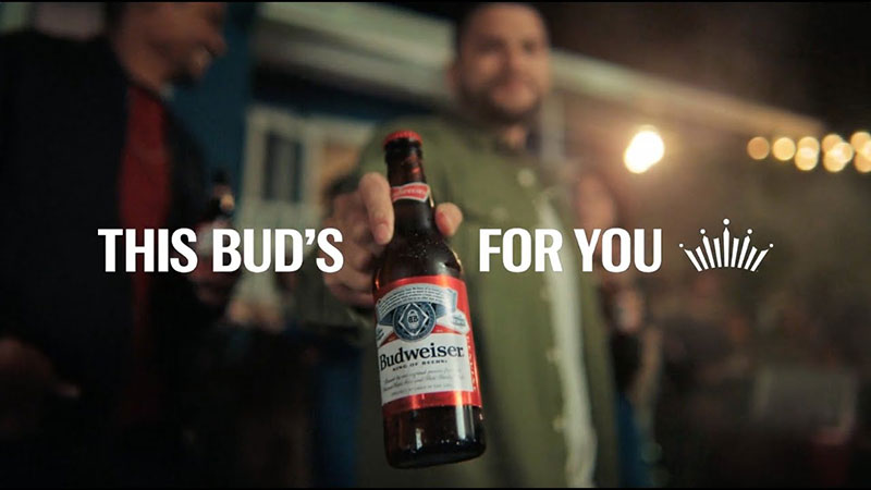
Budweiser ads operate on American mass reach, Super Bowl scale and recurring characters, which is closer to Michael Power than to Surfer. Corona ads take the opposite route again and sell a place rather than a process, with a fixed beach frame and almost no copy.
The structural difference is palette discipline. Guinness locked black, cream and gold before the Second World War and has never traded them. Budweiser has changed its red-and-white treatment repeatedly, and Coors Light ads have shifted between silver, blue and mountain imagery depending on the decade.
Guinness also leans harder on print design heritage than any of them, because it has 50 Gilroy posters to draw on and the others do not.
What Makes Guinness Advertising Work?
Consistency of constraint. Every era of the work picks one restriction and refuses to design around it.
The 1930s posters accepted flat lithographic colour and turned it into a house style. The 1990s spots accepted a slow pour and turned it into the proposition. The 2010s films accepted documentary footage and turned it into character.
None of those decisions came from wanting a prettier layout. They came from a locked color palette, a fixed lockup and a refusal to explain the joke.
That discipline is transferable. Pick the awkward truth about the product, build the composition around it, then hold the treatment long enough that people recognise it without reading the name.
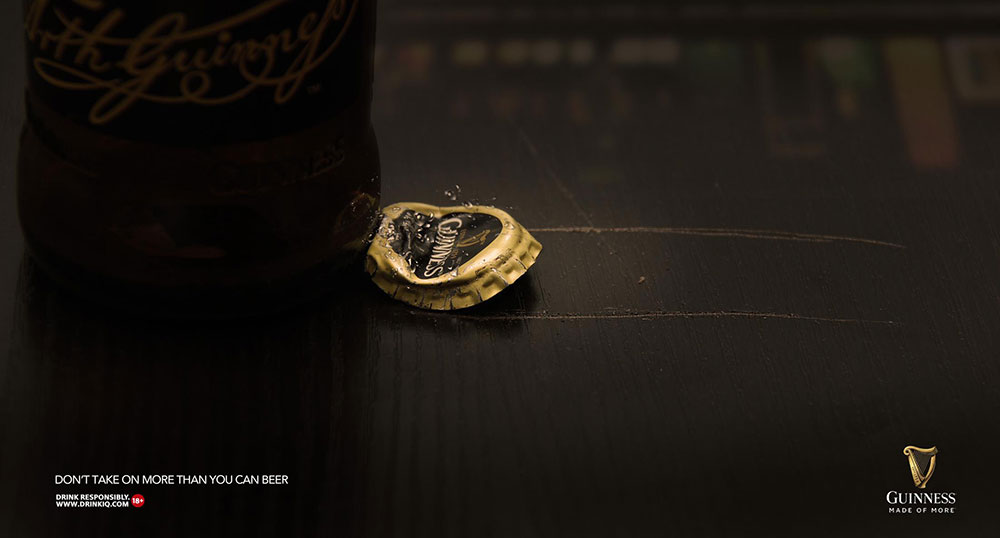
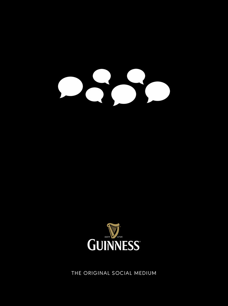
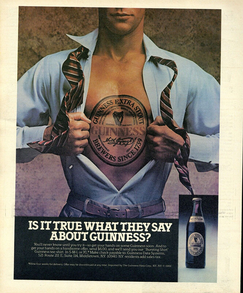
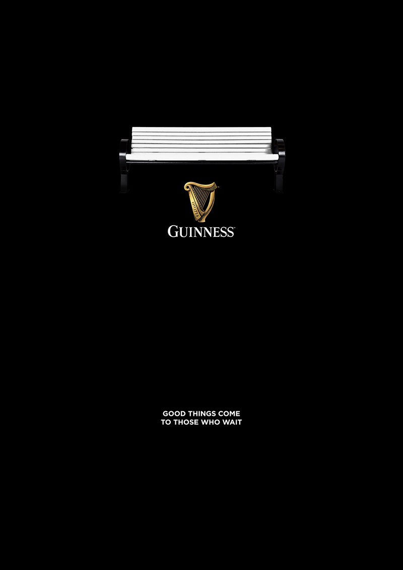
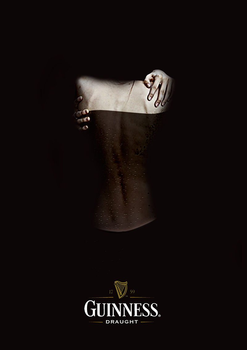
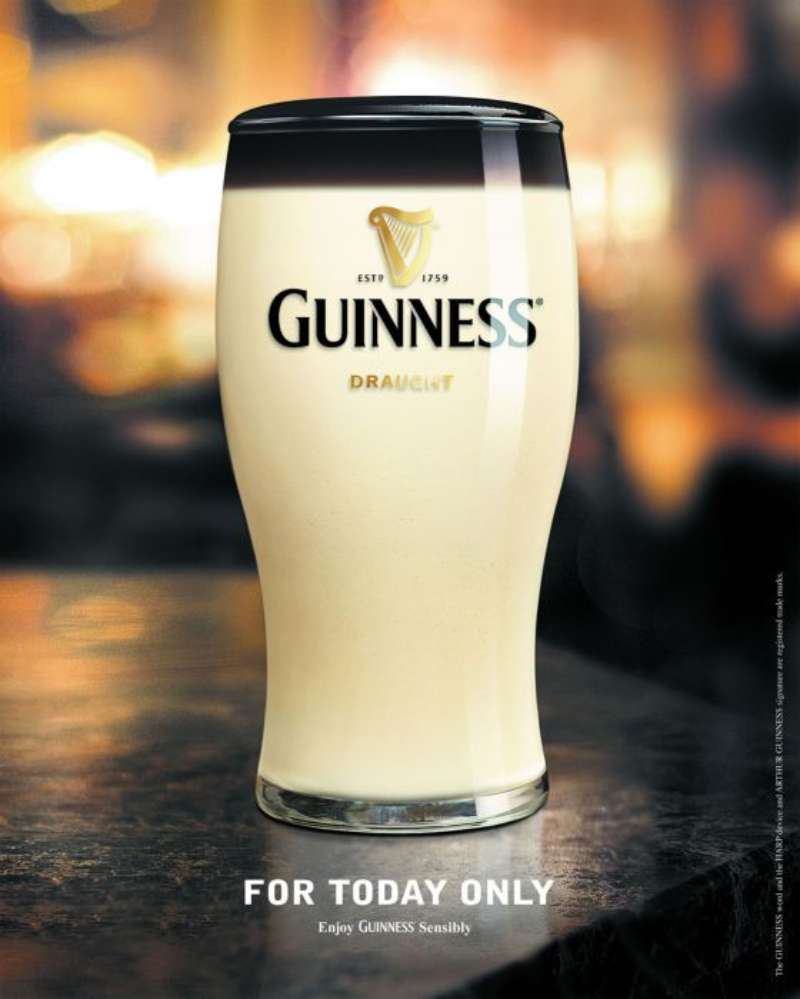
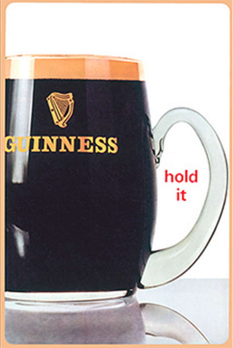
Guinness Ads Examples
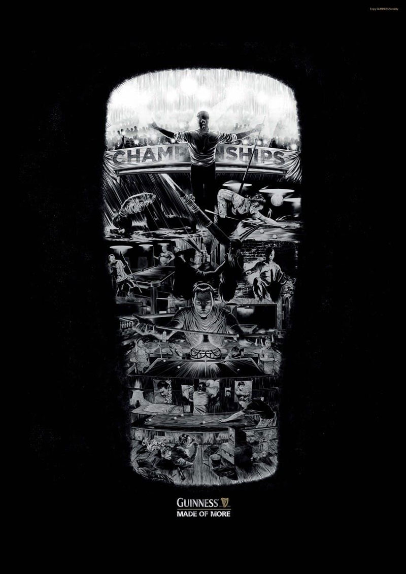
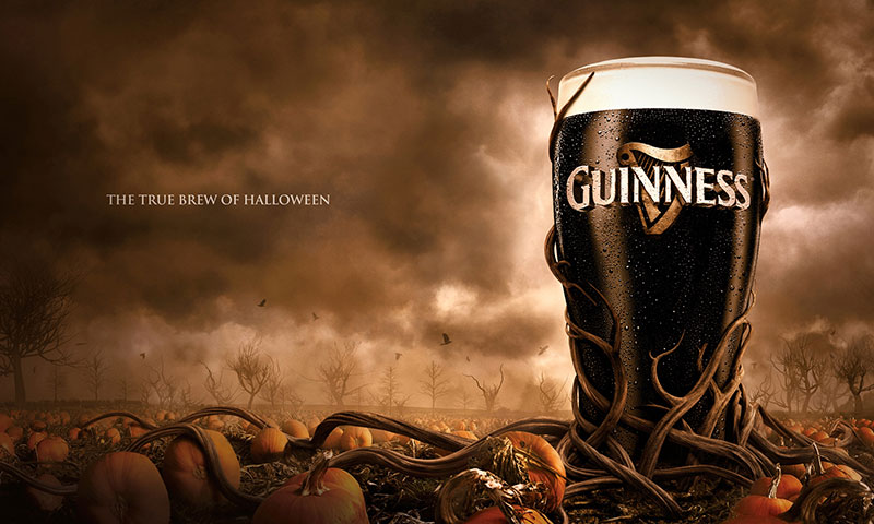
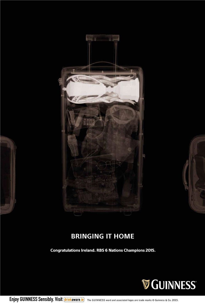
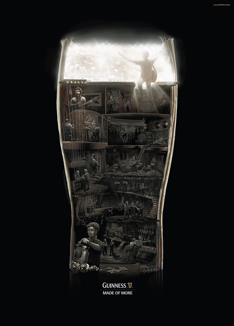
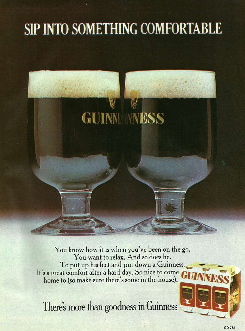
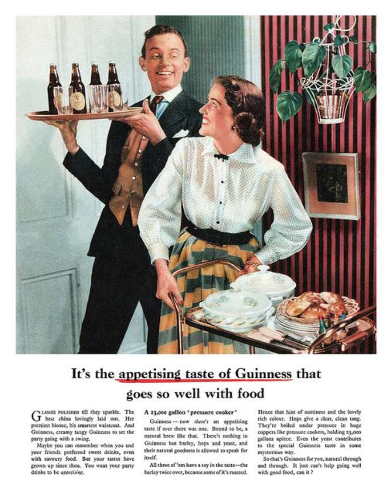
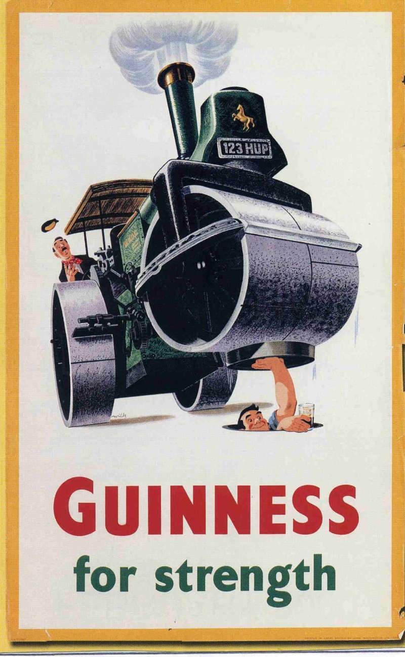
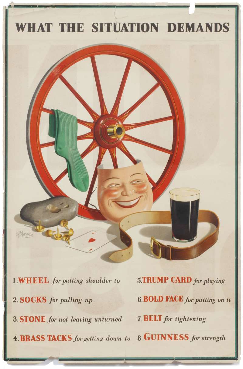


FAQ on Guinness Ads
Why is the toucan the Guinness mascot?
Gilroy needed a bird with a beak wide enough to hold two glasses. The toucan debuted in autumn 1935 with verse by Dorothy L. Sayers, and its beak solved a composition problem nothing else could.
Who was the zookeeper in the Guinness posters?
Gilroy drew himself. The harassed keeper chasing animals through the “My Goodness, My Guinness” series is a self-caricature, which is why the same face appears across roughly 50 poster designs.
What does the harp on Guinness advertising mean?
The mark copies the 14th-century Brian Boru harp held at Trinity College Dublin. Benjamin Lee Guinness adopted it in 1862 and it was registered as a trademark in 1876, turned to face left so it differs from the state emblem.
Did Guinness ever get sued over an ad?
Yes. Director Mehdi Norowzian sued in 1998, claiming the 1994 “Anticipation” spot lifted the jump-cut style of his 1992 short film “Joy”. The action failed.
Why are Guinness TV ads black and white?
The palette copies the product. A monochrome frame reproduces the stout and its creamy head directly, which is why the 1999 “Surfer” spot was graded that way and print kept the same contrast on a cream ground.
What was the most expensive Guinness commercial?
“Tipping Point”, filmed in Argentina in 2007 by Nicolai Fuglsig for AMV BBDO. The 10 million pound domino chain made it the costliest piece of Guinness advertising produced at that point.
Which Guinness ad won the most awards?
“Surfer” took a Gold Lion at Cannes in 1999 plus Clio and D&AD honours, and collected more accolades than any other commercial that year. Channel 4 and The Sunday Times later voted it the best ad of all time.
Are Guinness ads different in Africa?
Very. Saatchi & Saatchi built the Michael Power series as 3 to 5 minute action films from 1999 to 2006, and the market ran its own slogan, “Guinness For Power”, rather than the European taglines.
Did Dorothy L. Sayers really write Guinness copy?
She did. The crime novelist worked as a copywriter at S.H. Benson alongside Gilroy in the early 1930s and supplied the animal verses that fixed the tone of the poster campaign.
Why does Guinness sponsor rugby and football?
Both sports match the pub occasion the brand sells. Guinness signed a four-year Premier League deal as official beer, replacing Budweiser, and its rugby work profiled Gareth Thomas, Shane Williams and Jonny Wilkinson.
Conclusion
Guinness ads reward slow reading. Pull any lithograph poster from the St James’s Gate archive and the same three decisions surface: one subject, one line of copy, one signature.
The brand identity carried the weight long before Diageo existed. A harp, a black field, a cream ground.
Later work under AMV BBDO changed the medium, not the method. Cinema spots and out-of-home posters used the restraint the press pages had already proved.
Three things worth stealing:
- Trust negative space more than decoration
- Keep the typographic hierarchy to image, line, mark
- Hold a copy device for decades, not campaigns
Then go and see the originals. Reproductions flatten the colour and lose the paper entirely.

Renowned for his expertise in logo design and visual branding, Bogdan has developed a multitude of logos for various clients.
His skills extend to creating posters, vector illustrations, business cards, and brochures. Additionally, Bogdan's UI kits were featured on marketplaces like Visual Hierarchy and UI8.
He also wrote in the past years on sites like Design Your Way, WebDesignerDepot, WPDean, Designmodo, Speckyboy, Slider Revolution, and more.
- How to Install Fonts on Mac (Step-by-Step Guide) - 20 September 2026
- From Mockup to Code: How AI-Augmented Development Speeds Up the Design Handoff - 19 September 2026
- The Beehiiv Logo History, Colors, Font, And Meaning - 18 September 2026

Bogdan Sandu is a seasoned designer who has been designing websites since 2008. Renowned for his expertise in logo design and visual branding, Bogdan has developed a multitude of logos for various clients. His skills extend to creating posters, vector illustrations, business cards, and brochures. Additionally, Bogdan's UI kits were featured on marketplaces like Visual Hierarchy and UI8. He also wrote in the past years on sites like Design Your Way, WebDesignerDepot, WPDean, Designmodo, Speckyboy, Slider Revolution, and more.
You Might Also Like