A lager brand once built 25 years of work on admitting it cost too much.
Stella Artois ads turned that admission into “Reassuringly Expensive,” then into wordless French cinema pastiches that took Cannes Lions and changed what a beer commercial could look like.
This page collects the campaigns and pulls apart the design decisions behind them.
- Every major campaign from 1982 to the 2026 World Cup work, with agency, year and market
- The layout, palette and typography rules holding the print ads together
- How the TV commercials differ from the posters, and why
- What Lowe London, Mother and GUT each brought to the account
Stella Artois advertising spans 5 decades, 7 lead agencies and 9 flagship campaigns, from the 1970s print line “My shout, he whispered” to the 2025 Super Bowl spot “David and Dave.”
The work runs on one repeated move: take a liability (price, age, a famous face) and flip it into proof of quality.
This page covers the campaigns by era, with the agency, year and market behind each one, plus the layout, palette and typography decisions underneath them.
- The 26-year Lowe London relationship and the French cinema pastiches
- The Water.org years, built around a limited edition chalice
- The data-led revival that took a Cannes Grand Prix in 2023
Stella Artois Advertising at a Glance
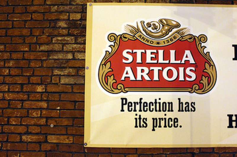
Stella Artois has run UK campaigns since the 1970s, working primarily with Lowe London and Mother. Its best known campaigns are Reassuringly Expensive, Buy a Lady a Drink and The Artois Probability. The visual signature combines the Den Hoorn horn, a red and gold cartouche, and sepia period imagery.
| Attribute | Value |
|---|---|
| First major campaign | “Reassuringly Expensive,” launched 1982 by Lowe Howard-Spink |
| Lead agencies | Lowe London (1982-2007), Mother (2015-2019), GUT (2023-2024), Artists Equity (2025) |
| Best-known taglines | “Reassuringly Expensive” (1982-2007), “A Taste Worth More” (2024), “For Moments Worth More” (2025) |
| Primary media | Cinema, TV, large-format print, out-of-home, Super Bowl |
| Awards | Cannes Creative Data Grand Prix 2023, Cannes Gold Lion 2002, Gold Epica 2002, D&AD Pencil 2024, Clio Gold 2024 |
| Visual signature | Red and gold cartouche, horn and eight-pointed star, black-and-white film grain |
Which Stella Artois Ad Campaigns Are the Most Famous?
5 campaigns define the brand: Reassuringly Expensive (1982-2007), the Jean de Florette film series (1991-2007), Buy a Lady a Drink (2015-2021), The Artois Probability (2023) and For Moments Worth More (2025). Lowe London made the first two.
Reassuringly Expensive (1982-2007)

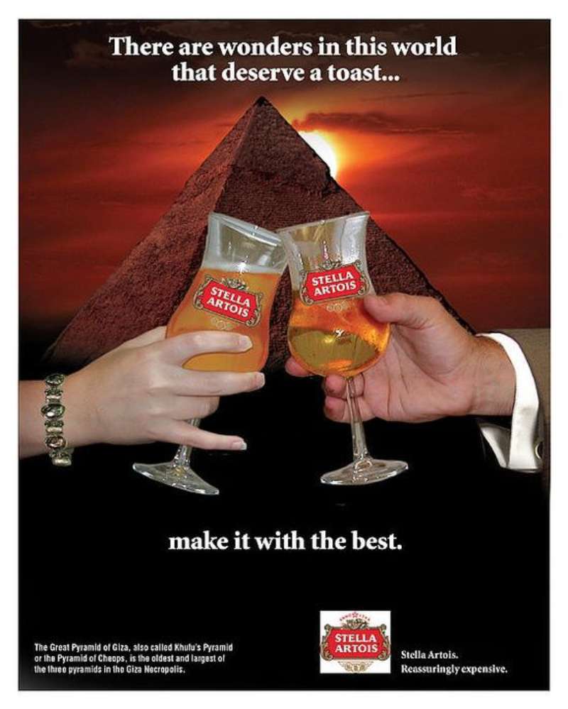
Reassuringly Expensive ran for 25 years in the UK, created by Lowe Howard-Spink. The line answers a pricing objection with a status claim. Copywriter Geoff Seymour wrote it in 1981 as body copy, not as a strapline.
Frank Lowe spotted the phrase buried in a longer ad and promoted it to endline. The early executions are almost all print: a large product shot, a short headline set in a serif face, and the strapline in small type at the base.
The Drum reports the campaign carried every UK communication from 1982 onward, turning a duty-driven price gap into the brand’s whole argument.
The Jean de Florette Film Series (1991-2007)

A chance viewing of the 1986 Claude Berri film gave a Lowe creative director the format: rural France, period costume, no dialogue, punchline at the end.
Jacques de Florette (1991): the first spot, built on a Marcel Pagnol setting and a leitmotif borrowed from Verdi’s La forza del destino.
Good Doctor (2002): 100 seconds in cinema, 60 seconds on TV, directed by Ivan Zacharias through Stink, scored by Anne Dudley.
Devil’s Island (2003): directed by Jonathan Glazer through Academy Films, written by Vince Squibb, shot in Buenos Aires with Ron Perlman.
Good Doctor was the world’s most awarded campaign of 2002, taking a Cannes Gold Lion, a Gold Epica and a Silver D&AD.
Ice Skating Priests (2005)

Filmed in Poland in black and white, this two-minute spot is the visual peak of the Lowe era.
Vince Squibb wrote and art directed it. Jonathan Glazer directed through Academy Films, with Dan Landin shooting and Polish actor Zbigniew Zamachowski in the lead.
The grade did the heavy lifting. Mark Gethin at The Moving Picture Company pushed the footage toward a 1920s newsreel look, so the beer label reads as the only modern object in frame.
Postkiwi records a Cannes Gold Lion for the spot.
Buy a Lady a Drink (2015-2021)

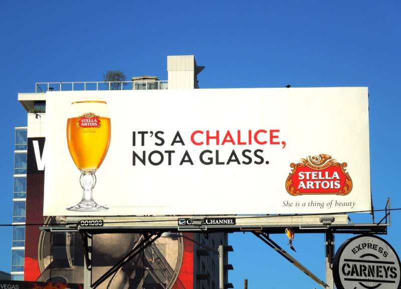
Stella Artois sold more than 225,000 limited edition chalices and donated $3m to Water.org in the campaign’s first three years, at $6.25 per chalice (Marketing Week, 2017).
The campaign debuted at the 2015 Sundance Film Festival with short films about women affected by the water crisis. Matt Damon fronted it as a Water.org co-founder.
- Taps (2018): made by Mother, the brand’s first Super Bowl spot since 2011
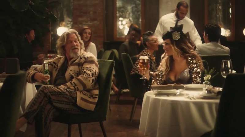
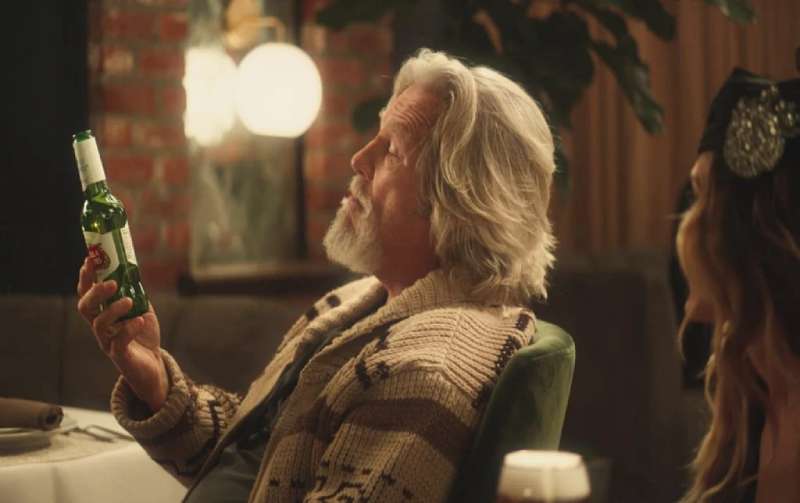
- Change Up the Usual (2019): Mother New York, with Sarah Jessica Parker as Carrie Bradshaw and Jeff Bridges as The Dude
Each chalice funded five years of clean water for one person, with designs commissioned from artists in Mexico, India and the Philippines.
The Artois Probability (2023)

An algorithm scored old paintings on the odds that the beer in them was Stella Artois.
GUT Buenos Aires launched the print and outdoor campaign in April 2023 and ran it for one month. Bruegel’s The Peasant Wedding carries a caption reading 78% probability.
Inputs to the score: year painted, geographic location, glass shape, liquid hue, and distance from Leuven.
Contagious reports over 140% reach against target and a 306-fold rise in the partner museum’s visibility. The work won the Creative Data Grand Prix plus Golds in Print & Publishing and Outdoor at Cannes Lions 2023.
A Taste Worth More and For Moments Worth More (2024-2025)

2024, GUT Miami: David Beckham orders a pint, a crowd surges toward the bar, and none of them are there for him. Ryan Booth directed.
2025, Artists Equity: “David and Dave” gives Beckham a long-lost twin played by Matt Damon. Ben Affleck directed the 60-second Super Bowl LIX launch film.
Both spots invert the usual celebrity contract. The beer outranks the brand ambassadors carrying it.
“The codes of premium have changed,” said Tim Ovadia, global VP of marketing at AB InBev, when the 2024 platform launched.
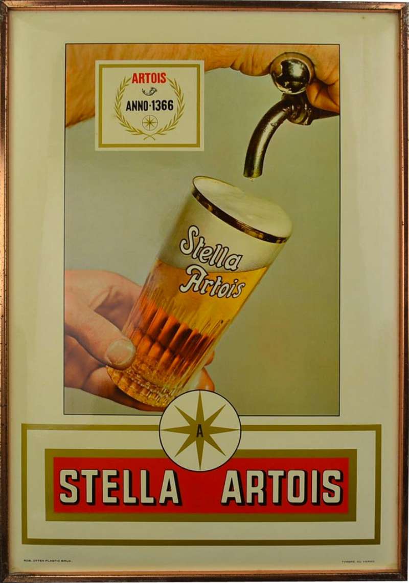
Stella Artois Print Ads From the Lowe Era
The print work sits in the same universe as the films, minus the plot.
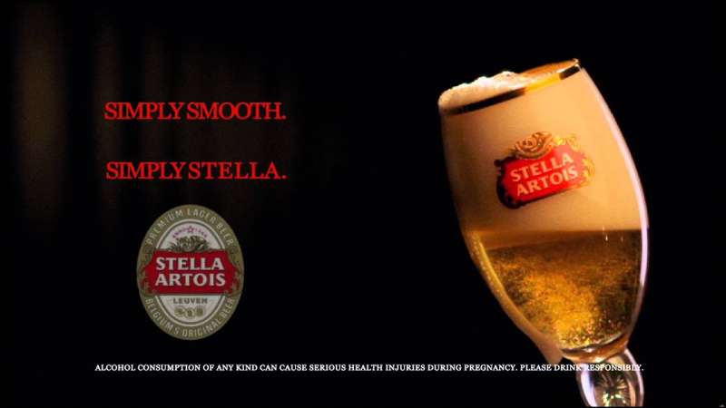
- Bottle or chalice photographed against a flat, unbroken ground
- Headline of 3 to 8 words, no body copy in later executions
- Strapline locked bottom right at roughly 30% of headline size
- Horn and cartouche reproduced small, never enlarged for emphasis
Frank Lowe also arranged the Queen’s Club Championships sponsorship in 1979, and the tournament carried the Stella Artois name for close to 30 years.
How Do Stella Artois Print Ads Work Visually?
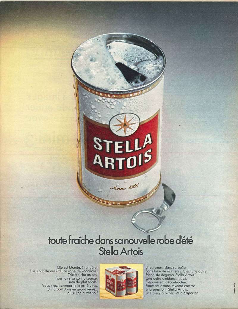
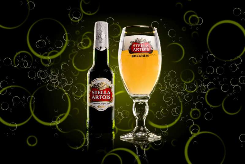
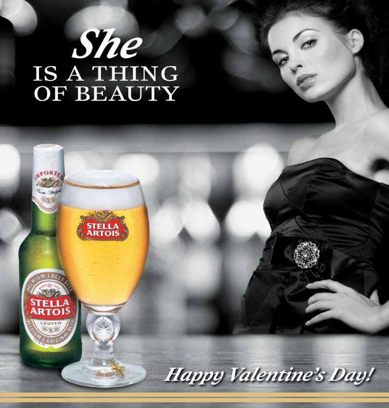
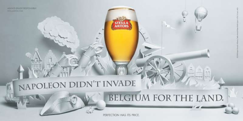
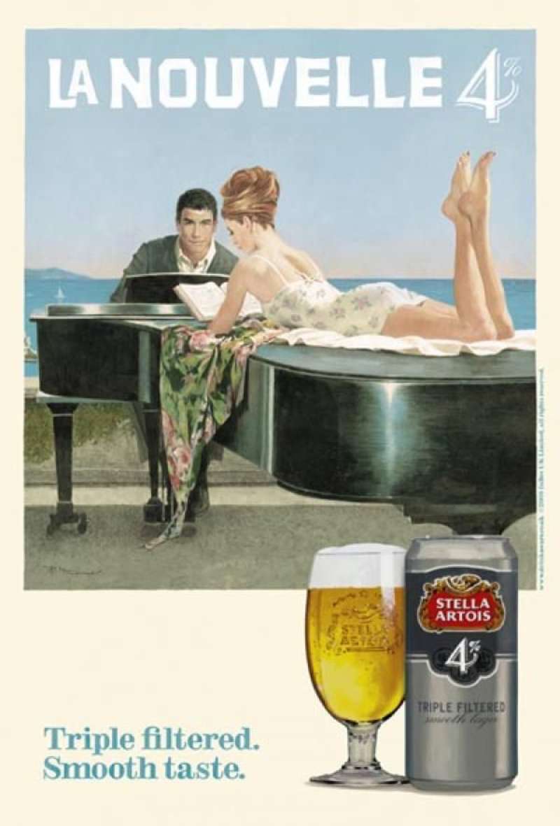
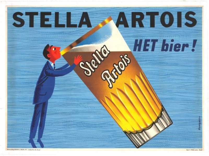
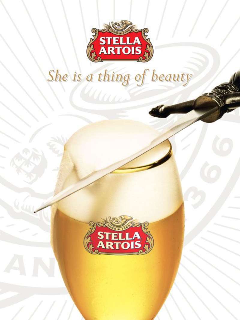
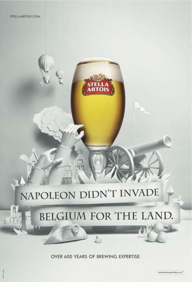
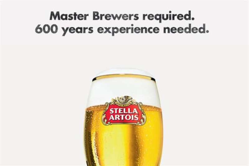
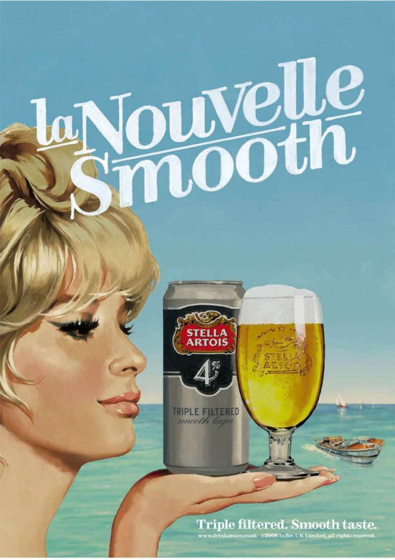
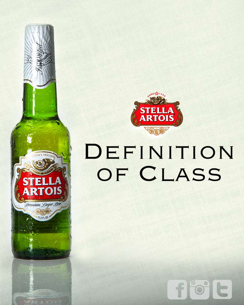
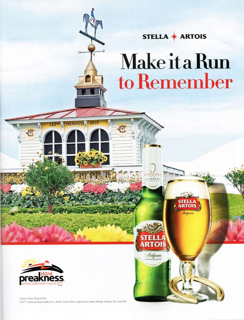
Stella Artois print ads run on a single product silhouette, a two-color ground, and a headline set well above the optical center. Copy volume drops decade by decade. The logo stays small, because scale in this system signals cheapness rather than confidence.
The layouts lean on generous empty margins more than on decoration. Nothing competes with the glass.
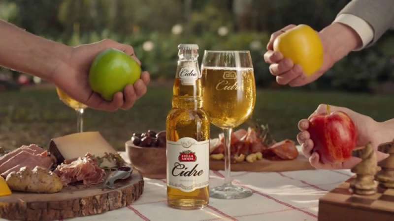
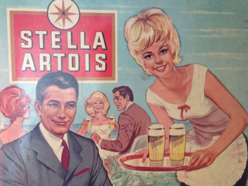
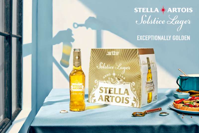
Palette is narrow and repeated: Stella Red, a metallic gold, black and white. Color associations do the premium signalling here, since gold reads as expense without anyone having to say so.
Typography follows a strict three-level system. Headline, product name, endline. That ranking of type sizes never varies across the Lowe posters, which is why the campaign held together over 25 years of different photographers.
The 2023 identity overhaul by Jones Knowles Ritchie tightened this further. Alec Tear redrew the cartouche and star, and Pangram Pangram cut two custom faces, Isabella Serif and Sebastian Sans, taking layout cues from fashion magazines.
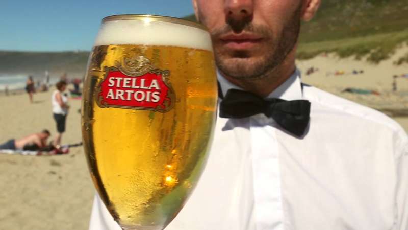
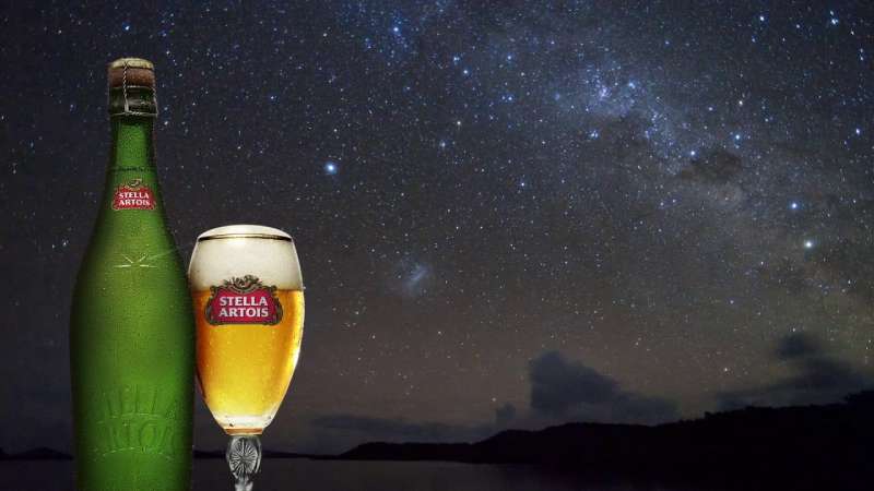
The chalice was also pulled into the pack design as a background element. Designalytics found it became the second most liked element after the logo, with the highest average resonance of any distinctive asset in the redesign.
For anyone studying large-format layout, the Artois Probability sheets are the cleanest lesson: a borrowed painting, one percentage figure, one logo. Nothing else on the page.
How Do Stella Artois TV Commercials Differ From Its Print Ads?
The films add narrative and remove copy. Print carries a headline; the Lowe-era spots carry no dialogue, a period setting, and a single sight gag resolved in the last 5 seconds. Running times stretch to 100 and 120 seconds, far beyond the standard 30.
Good Doctor (2002, Lowe Lintas, dir. Ivan Zacharias). A doctor treats cholera victims in a French village and gets nothing in return until a priest demands he be handed a Stella Artois. The Moving Picture Company graded three separate copies of the film stock to build the grain.
Devil’s Island (2003, Lowe, dir. Jonathan Glazer). Convicts sail to a penal colony in the 1930s. The weaker man finds a bottle and gets himself locked in solitary so he can drink it alone. Shot in Buenos Aires, the most expensive Stella film to that point.
Ice Skating Priests (2005, Lowe London, dir. Jonathan Glazer). Priests skate on a frozen pond, a novice falls through the ice with the crate, and the brothers dive for the beer rather than the boy.
A 120-second wartime epic (2004, Lowe, dir. Ivan Zacharias). Shot in black and white over ten days in the Czech Republic, with a dogfight between replica biplanes. Campaign reported it screened in full at more than 70 art-house cinemas, with a 70-second cut for the major chains.
David and Dave (2025, Artists Equity, dir. Ben Affleck). Beckham meets his fictional twin, played by Matt Damon, over beers and wings. Dialogue returns, the period setting goes, and the running time drops to 60 seconds.
The through line across all of them is narrative structure rather than product demonstration. The label appears once, late, and usually smaller than you expect.
How Has Stella Artois Advertising Evolved Since 1982?
The brand has made 4 strategic turns in 43 years: price as proof (1982), cinema pastiche (1991), cause partnership (2015), and celebrity self-mockery (2024). Each turn kept the premium claim and changed the evidence used to support it.
| Decade | Strategic shift | Representative campaign |
|---|---|---|
| 1980s | Price reframed as quality guarantee | “Reassuringly Expensive” print |
| 1990s | Long-form cinema storytelling | “Jacques de Florette” and successors |
| 2000s | Feature-film budgets, then retreat | “Devil’s Island,” “Ice Skating Priests” |
| 2010s | Cause marketing and US expansion | “Buy a Lady a Drink” |
| 2020s | Heritage as data, celebrity as punchline | “The Artois Probability,” “David and Dave” |
The strapline was retired in 2007 after the lager picked up a reputation for association with binge drinking in the UK, and the word Stella was avoided in advertising for a stretch afterward.
The mark itself has barely moved across that entire period. The horn dates to the Den Hoorn brewery recorded in Leuven tax rolls in 1366, and the eight-pointed star arrived in 1926 with the original Christmas beer.
The 2023 refresh returned red, gold and white to the brand system after a period of stripped-back white packaging, and added a horizontal logo lockup for digital placements.
Which Agencies Created Stella Artois Advertising?
6 agencies have led the account since the 1970s. Collett Dickenson Pearce ran it first, Lowe held it for 26 years, and the work has since moved between London, New York, Buenos Aires, Miami and Los Angeles.
| Agency | Years | Signature work |
|---|---|---|
| Collett Dickenson Pearce | 1970s | “My shout, he whispered” print |
| Lowe Howard-Spink / Lowe London | 1982-2007 | “Reassuringly Expensive,” the film series |
| Mother (London and New York) | 2015-2019 | Taps, “Change Up the Usual” |
| GUT (Buenos Aires and Miami) | 2023-2024 | “The Artois Probability,” “A Taste Worth More” |
| Artists Equity | 2025 | “David and Dave” |
Frank Lowe took the Stella Artois account out of Collett Dickenson Pearce in 1981 and opened Lowe Howard-Spink with it. Geoff Seymour wrote the strapline. Paul Weinberger ran creative on Devil’s Island, and Vince Squibb wrote both Good Doctor and Ice Skating Priests.
Jonathan Glazer directed three Stella Artois spots for Lowe London through Academy Films. Ivan Zacharias directed the Stink-produced films. Ryan Booth shot the 2024 Beckham spot for GUT Miami, and Ben Affleck directed the 2025 Super Bowl film for Artists Equity.
This is the part of commercial creative work that rarely makes it into case studies: the campaign survived four decades because the same two or three people kept writing it.
What Can Designers Learn From Stella Artois Ads?
The transferable lessons are structural, not stylistic. 6 of them hold up across print, film and packaging.
- Invert the objection. Name the thing buyers complain about and argue it is the reason to buy.
- Keep the endline for 20 years, not 20 months. Recognition compounds; novelty does not.
- Grade the image before adding type. The film stock treatment carried more brand meaning than any headline in the Lowe era.
- Shrink the logo. A small mark on a clean field reads as confidence.
- Limit the palette to red, gold and black, then hold it across every touchpoint including glassware.
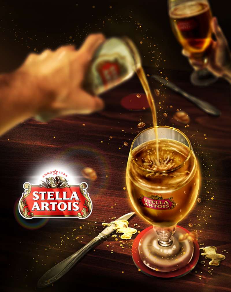
- Build one ownable object. The chalice works as packaging, prop, charity product and pack illustration.
The last one matters most. A physical asset gives a campaign somewhere to live between flights, which is why the chalice outlasted three separate strategic platforms.
How Do Stella Artois Ads Compare to Guinness Ads?
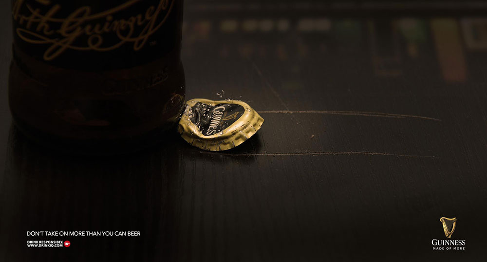
Both brands hired the same director and reached opposite conclusions. Jonathan Glazer made Surfer for Guinness and Devil’s Island for Stella Artois within a few years of each other.
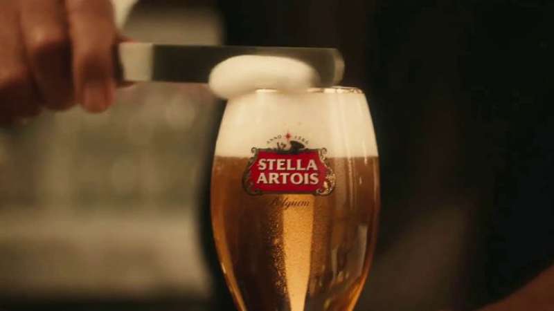
Guinness advertising builds around the pour itself, using black, cream and the 119.5-second settling time as raw material. Stella Artois never shows process. It shows a scene from a film that does not exist, then puts a bottle in it.
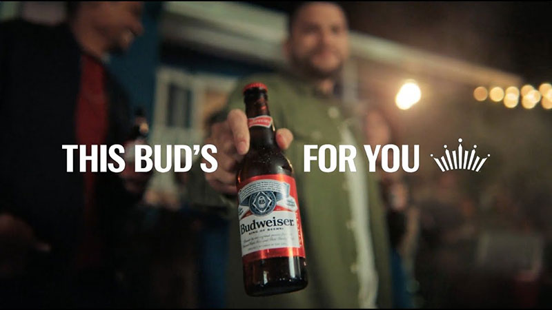
The American mass brands work differently again. Budweiser campaigns lean on Americana and animals, Corona’s print work reduces everything to a beach horizon and a lime, and Coors Light ads sell temperature through cold-activated ink and blue mountains.
Stella Artois is the only one of the four that built its case on price. That decision shaped every layout choice downstream, from the small logo to the absence of a product-in-use shot.
What Makes Stella Artois Advertising Work?
The answer sits in restraint rather than invention.
One argument (this beer costs more, and that is the point) held for 25 years without being restated in new words every season. The visual system stayed just as tight: a narrow palette, a small mark, a single object in frame, and film grain doing the work that copy usually does.
The modern work borrows the same discipline for different ends. A percentage on a painting and a footballer being ignored at a bar are both jokes built on the brand’s own self-image.
The lesson for designers is patience. A consistent brand story beats a clever one, provided you leave it alone long enough for people to learn it.
Stella Artois Ads Examples

FAQ on Stella Artois Ads
What is the most famous Stella Artois ad?
Most critics name Devil’s Island (2003) or Ice Skating Priests (2005), both directed by Jonathan Glazer for Lowe London. Good Doctor, released in 2002, was the world’s most awarded campaign that year.
What was the Stella Artois slogan?
“Reassuringly Expensive” ran in the UK from 1982 to 2007. Copywriter Geoff Seymour wrote the line in 1981, buried inside the body copy of a print ad before Frank Lowe promoted it to endline.
Why did Stella Artois drop the Reassuringly Expensive slogan?
The lager had picked up an association with binge drinking in Britain. The strapline was retired in 2007, and advertising avoided the word Stella for a period afterward.
Who directed the classic Stella Artois commercials?
Jonathan Glazer directed three spots through Academy Films, including Devil’s Island and the frozen pond film. Ivan Zacharias directed Good Doctor and the 120-second wartime epic through Stink.
What song plays in the Stella Artois advert?
The recurring theme comes from Verdi’s overture to La forza del destino, adapted by Jean-Claude Petit for Jean de Florette in 1986. Anne Dudley scored Good Doctor separately.
Has Stella Artois run a Super Bowl ad?
Yes, four times. Taps aired in 2018 with Matt Damon, Change Up the Usual followed in 2019, and David and Dave ran at Super Bowl LIX in 2025.
Which celebrities appear in Stella Artois ads?
Matt Damon, David Beckham, Sarah Jessica Parker as Carrie Bradshaw and Jeff Bridges as The Dude. Ron Perlman appeared in Devil’s Island, and Zbigniew Zamachowski led the Polish-shot priest film.
Why are the old Stella Artois commercials set in rural France?
A Lowe creative director watched Claude Berri’s Jean de Florette in 1990 and wrote a script in the same register. The period pastiche then ran as a house style for 15 years.
What is The Artois Probability campaign?
GUT Buenos Aires ran an algorithm across historical paintings, scoring the odds that the beer shown was Stella Artois. Bruegel’s The Peasant Wedding scored 78%. It won the Creative Data Grand Prix at Cannes in 2023.
Where can I watch old Stella Artois adverts?
YouTube carries most of the films. The Campaign archive, Ads of the World and the D&AD awards database hold fuller credits, including directors, production companies and creative teams.
Conclusion
Stella Artois ads reward slow reading. The Den Hoorn horn, the eight-pointed star and the chalice carried this brand long before anyone wrote an endline for it.
What changed across four decades was the evidence, never the claim.
Lowe London argued quality through sepia film grain and silence. GUT argued it with an algorithm and a Bruegel painting. Mother argued it with a Water.org donation attached to every pour.
The posters held the same footing throughout: a stripped-back layout, a two-color ground, and a wordmark small enough to look certain of itself.
Study the Cannes-winning work if you want the theory. Study the 1980s press ads if you want the discipline.

Renowned for his expertise in logo design and visual branding, Bogdan has developed a multitude of logos for various clients.
His skills extend to creating posters, vector illustrations, business cards, and brochures. Additionally, Bogdan's UI kits were featured on marketplaces like Visual Hierarchy and UI8.
He also wrote in the past years on sites like Design Your Way, WebDesignerDepot, WPDean, Designmodo, Speckyboy, Slider Revolution, and more.
- The Windsurf Logo History, Colors, Font, And Meaning - 10 October 2026
- How to Remove Background From Product Photos (No Photoshop) - 10 October 2026
- How Designers can Build a Stronger Online Creative Identity - 9 October 2026

Bogdan Sandu is a seasoned designer who has been designing websites since 2008. Renowned for his expertise in logo design and visual branding, Bogdan has developed a multitude of logos for various clients. His skills extend to creating posters, vector illustrations, business cards, and brochures. Additionally, Bogdan's UI kits were featured on marketplaces like Visual Hierarchy and UI8. He also wrote in the past years on sites like Design Your Way, WebDesignerDepot, WPDean, Designmodo, Speckyboy, Slider Revolution, and more.
You Might Also Like