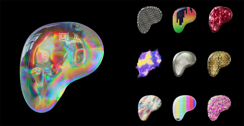
Patreon changed its logo in October 2023, and the new mark is stranger than most rebrands. Instead of a fixed symbol, it is a shape-shifting 3D P that Patreon says has no single definitive form.
What Is the New Patreon Logo?

The new Patreon logo is an abstracted 3D P shape: a rounded, textured blob that changes color and surface depending on where it appears. Patreon announced it on October 4, 2023, with a custom variable wordmark by Dinamo and 3D work by artist David McLeod and Patreon’s in-house team. Patreon says it has no exact canonical form.
New Patreon logo at a glance
| Symbol | Abstracted 3D P shape with no fixed form |
| Designer/agency | David McLeod and Patreon in-house team (3D mark); Dinamo Type Foundry (wordmark); Wolff Olins (strategy) |
| Current version since | October 2023 |
| Colors (hex) | No single brand color; gradient palettes, with no hex codes published |
| Typeface | Custom variable wordmark by Dinamo, thin to heavy |
| Previous major version | 2017 P-based mark, preceded by a 2013 version |
How Has the Patreon Logo Evolved Over Time?
Patreon’s marks from 2013 and 2017 were both built around the letter P, and each moved further from a traditional letterform, according to coverage of the rebrand. The 2023 version keeps the P but turns it into a three-dimensional, shifting object. Patreon describes it as a dynamic object in constant motion.
Previous Patreon Logos (2013 and 2017)
Public descriptions of the older logos are thin, and I could not confirm their exact shapes or colors from a primary source, so this article does not describe them.
New Patreon Logo (October 2023 to present)
The new mark was designed to feel unfinished and in progress, a reflection of how creators work, according to the Wolff Olins case study. It acts as a container that can be filled with different textures and colors, and Patreon pairs it with a wordmark whose weight changes from very thin, which keeps the focus on the creator, to heavier, which puts Patreon forward.
What Do the Design Elements of the New Patreon Logo Mean?
The shape comes from the letter P, but it is deliberately imperfect. Patreon argues that the usual brand rules, a static logo and one or two key colors, come from 20th-century retail, and that a fluid, screen-native identity makes room for animation and interaction.
What Colors Does the Patreon Logo Use?
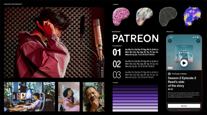
Patreon no longer builds the look around one brand color. The mark takes on gradients and textures, and the brand board below shows a purple scale, while other brand layouts use teals, blues and bold yellow. Patreon has not published hex codes in the sources I could open.
What Font Does the Patreon Logo Use?
The wordmark and typeface were created by Dinamo Type Foundry. Patreon describes a contemporary core typeface with classic geometry and a full variable weight range, plus secondary typefaces for flexibility. The wordmark itself is white sans-serif lettering on dark backgrounds, and no public font name matches it exactly.
How Does the Patreon Logo Work Across Platforms?
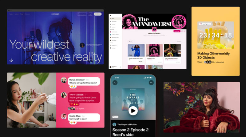
The identity was launched with a redesigned app, community chat and new creator features. The same system covers the website, creator pages and photography, so the logo can be recolored for each context instead of being replaced by a flat icon.
Can Creators Customize the Patreon Logo?
At the October 2023 launch Patreon said it was working on a logo creation tool that would let creators build their own version of the mark from colors, textures and motion taken from their work. Whether that tool is live is something to check with Patreon. Creators who use the existing marks follow Patreon’s brand page, which allows digital use to show a Patreon presence and asks creators not to alter the logo, use it inside a word or put it on merchandise without written approval.
How Was the New Patreon Logo Received?
Reactions were mixed. Commentators compared the shape to the Eraserhead baby and a liver, according to It’s Nice That. The identity also collected recognition: Wolff Olins reports a Branding win at Fast Company’s 2024 Innovation by Design Awards and Gold in the Logo category at the Graphis Design Awards 2026.
FAQ on the New Patreon Logo
Why did Patreon change its logo?
Patreon said the new brand was built for a digital-first world and meant to reflect the creator community better. The company wanted an identity that moves and adapts instead of one fixed logo, color and layout.
When did Patreon launch the new logo?
Patreon announced the new logo and wordmark on October 4, 2023, together with a redesigned app and new creator features.
Who designed the new Patreon logo?
The 3D mark was made by artist David McLeod with Patreon’s in-house team. Dinamo Type Foundry created the wordmark and typeface, Wolff Olins worked on strategy, and Active Theory handled digital and motion work.
What does the new Patreon logo look like?
It is an abstracted 3D P shape, a rounded blob with irregular textures and colors that changes with its surroundings. Patreon says there is no single definitive version of it.
What did the old Patreon logo look like?
Earlier Patreon marks from 2013 and 2017 were also built around the letter P, and each moved further from a traditional letterform. I could not confirm detailed descriptions of those older logos from a primary source.
What font does the new Patreon logo use?
Dinamo Type Foundry drew a custom variable wordmark that runs from a very thin weight to a heavier one. Patreon has not published a typeface name for public use.
What colors does the new Patreon logo use?
Patreon moved away from a single brand color toward gradient-rich palettes. The brand board in this article shows a purple scale, and other layouts use teals, blues and bold yellow.
Can creators customize the Patreon logo?
In October 2023 Patreon said it was working on a logo creation tool so creators could build their own version of the mark from colors, textures and motion. Check Patreon’s brand page for the current status, because creators who use the marks must follow its guidelines.
Why was the new Patreon logo controversial?
Critics compared the blobby mark to the Eraserhead baby and a liver, according to It’s Nice That. Patreon’s reasoning was that a fixed logo is a 20th-century retail idea.
Has the new Patreon logo won any awards?
Wolff Olins reports that the Patreon identity won the Branding category at Fast Company’s 2024 Innovation by Design Awards and Gold in the Logo category at the Graphis Design Awards 2026.
Conclusion
The new Patreon logo trades a fixed symbol for a 3D P that changes with each use, backed by a variable wordmark from Dinamo. It is a bet that creators will relate more to an unfinished, flexible identity than to a single polished icon, and the reaction shows how divisive that bet was.
Sources
- Patreon, Patreon, redesigned – a new brand identity built for, and with, creators – https://news.patreon.com/articles/patreon-redesigned
- Wolff Olins, Patreon case study – https://wolffolins.com/work/patreon
- It’s Nice That, Patreon rebrand – https://www.itsnicethat.com/news/patreon-rebrand-graphic-design-121023
- TechCrunch, Patreon launches new features, a redesigned app and a new look – https://techcrunch.com/2023/10/04/patreon-launches-new-features-a-redesigned-app-and-a-new-look
- Patreon, Brand guidelines for creators – https://www.patreon.com/brand

Renowned for his expertise in logo design and visual branding, Bogdan has developed a multitude of logos for various clients.
His skills extend to creating posters, vector illustrations, business cards, and brochures. Additionally, Bogdan's UI kits were featured on marketplaces like Visual Hierarchy and UI8.
He also wrote in the past years on sites like Design Your Way, WebDesignerDepot, WPDean, Designmodo, Speckyboy, Slider Revolution, and more.
- How to Design T-Shirt Art That Actually Prints Well - 19 November 2026
- How to Get Canva Pro for Free (Legit Ways) - 18 November 2026
- Why Website, SEO, and Advertising Work Better as One Growth System - 18 November 2026

Bogdan Sandu is a seasoned designer who has been designing websites since 2008. Renowned for his expertise in logo design and visual branding, Bogdan has developed a multitude of logos for various clients. His skills extend to creating posters, vector illustrations, business cards, and brochures. Additionally, Bogdan's UI kits were featured on marketplaces like Visual Hierarchy and UI8. He also wrote in the past years on sites like Design Your Way, WebDesignerDepot, WPDean, Designmodo, Speckyboy, Slider Revolution, and more.
You Might Also Like