

The Oracle Logo History, Colors, Font, and Meaning
Imagine this: You’re browsing through the myriad of tech giants, and there it is—the Oracle logo. Instant recognition.
There’s a story woven into its fibers, a message in its hues. It’s not just a logo; it’s a testament to Oracle Corporation’s prowess in the unforgiving world of tech.
Context? Look around. Every digital nook echoes the influence of Oracle’s database, cloud services, even Java—it’s something you interact with, knowingly or not. And here’s the kicker: It all starts with that symbol.
Now, Why stick around? Because behind that sleek design is a saga—of strategy, evolution, and the raw power of branding. There’s a goldmine of ingenuity for any web designer lurking in its redwood roots.
Together, we’ll unpack the Oracle emblem’s secrets. You’re in for the essence of visual identity, a sprinkle of Oracle branding guidelines, and hey, even some Intel on Oracle NetSuite.
By the final punctuation mark, you’ll grasp the emblem’s blueprint, its role in Oracle’s brand recognition, and maybe, just maybe, a spark of inspiration for your next design exploit.
The Meaning Behind the Oracle Logo
Simplicity, Trust, Power
Just a glance at the Oracle logo and you can sense it – a mix of simplicity, trust, and power. The minimalist design doesn’t just look good on a website or a business card, it carries weight, it carries a promise.
This logo is a visual representative of Oracle Corporation, one of the giants in the tech industry, and it does so with absolute authority. But how does it convey all that with such a simple design? Let’s dive deeper into the elements and find out.
Ellipse: Unity and Continuity
The most prominent feature of the Oracle logo is the ellipse that encompasses the company’s name. In design lingo, the ellipse symbolizes unity, continuity, and the infinite. It’s like saying Oracle is an integral part of this endlessly evolving tech universe, committed to providing consistent and infinite value.
Company Name: Confidence and Assurance
Then there’s the company’s name, sitting bold and confident in the middle of the ellipse. It’s in uppercase, an intentional design choice that speaks of Oracle’s confidence and assures clients of its reliability and commitment.
The History of the Oracle Logo
Born of a Revolution
In the early ’80s, when the digital revolution was taking its baby steps, Oracle emerged, introducing its logo to the world. The first Oracle logo was as robust as the current one, proudly flaunting the company’s name, a testament to Oracle’s early understanding of the power of branding and visual representation.
Minimalist and Timeless
Through the decades, while the tech world experienced seismic shifts, the Oracle logo remained pretty much consistent, its minimalist design proving to be timeless. It stood as a beacon, embodying the Oracle Corporation’s enduring resilience and adaptability amidst change and evolution.
The Colors of the Oracle Logo

Vibrant Red: Energy, Passion, and Innovation
The Oracle logo proudly displays a striking shade of red, a color that evokes energy, passion, and innovation. It embodies the drive and ambition of a company that stands at the forefront of the technology and software realm.
Boldness and Leadership
Red, in the world of logos, often indicates boldness, leadership, and a forward-thinking approach. Oracle’s use of this color is a testament to its vision, trailblazing initiatives, and the revolutionary solutions it brings to the table.
The Font Used in the Oracle Logo
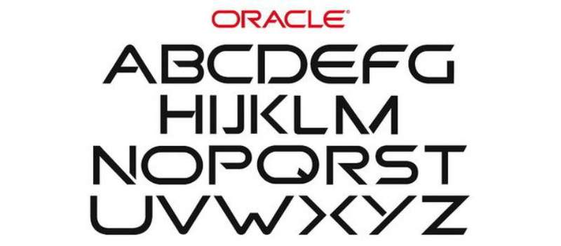
Sans Serif: Modern and Clean
Oracle uses a sans serif typeface for its logo, giving it a modern, clean, and uncluttered look. Sans serif fonts are often used by tech companies to symbolize innovation and forward-thinking. They’re perfect for digital screens, easy to read, and deliver a swift punch of information, just like Oracle’s solutions.
Oracle Logo: Impact on Corporate Identity
Logo as a Brand Ambassador
A logo isn’t just a pretty design. It’s a brand ambassador, speaking volumes about a company and its values.
The Oracle logo, with its uncluttered design and strategic color scheme, aligns perfectly with the corporation’s identity. It showcases Oracle as a powerful, trustworthy, and innovative tech leader.
Influence on Client Perception
Client perception is another crucial aspect influenced by a company’s logo. Oracle, through its logo, successfully projects an image of being a secure, reliable, and authoritative solution provider in the tech industry, thereby shaping positive client perceptions and reinforcing their trust.
Influence of Oracle Logo on Design Trends
Minimalist Inspiration
The Oracle logo is a great example of how simplicity can make a strong impact. This approach has inspired many other brands to adopt minimalist logo designs, preferring to convey their message with less noise and more clarity. The principle “less is more” clearly reflected here continues to steer current design trends.
Font Choices: The Sans Serif Wave
Oracle’s choice of using a sans-serif font has not only helped establish its identity but has also reinforced the idea that typography matters in logo design. Its logo has contributed to the “Sans Serif wave”, influencing many other tech companies to opt for similar font styles that evoke modernity and accessibility.
The Adaptability of Oracle Logo Across Various Mediums
Digital to Print: Versatile Transition

One of the strongest aspects of the Oracle logo is its high adaptability. It works equally well on a website, a mobile app, a t-shirt, or a billboard. The versatile transition from digital to print and its visibility in both small and large formats are testimony to the logo’s well-thought-out design.
The Power of Black and White
Another notable attribute of the Oracle logo is its design integrity in black and white versions. Whether it’s for a monochromatic ad or simply a fax copy, the logo retains its impactful, recognizable nature, a sign of a truly effective logo design.
FAQ On The Oracle Logo
Who Designed the Oracle Logo?
It’s a slice of history, that. The Oracle logo, known for its simplicity and striking red color, was designed to capture the essence of the company’s innovation and technological prowess. Credit goes to the internal team who set out to brand Oracle as a leader in the tech space.
What’s the Meaning Behind the Oracle Logo?
Look at it and feel the power. The Oracle logo, flaunting a distinctive red hue, symbolizes energy, passion, and action in the tech world. That swoosh? Imagine an abstract ‘O’—the gateway to database management systems and cloud solutions.
What are the Official Colors of the Oracle Logo?
When you say Oracle, think red. Specifically, Pantone 485 for print, and RGB 186 for screens. It’s loud, bold—like their enterprise software. It’s the kind of red that stays with you, a color that spells dominance in the industry.
Has the Oracle Logo Ever Changed?
Sure, it evolved. But subtly. Once upon a time, it was more detailed, featuring ‘Oracle Systems Corporation’. Today, it’s just the name and that iconic splash of red—the minimalist brand identity for a digital era.
Can I Use the Oracle Logo for My Project?
Tread carefully. The Oracle logo? It’s trademarked—protected. You’re staring at the intellectual property rights of a tech titan. Always, always seek permission and follow Oracle’s logo usage guidelines. It’s not just a logo—it’s a brand equity statement.
What’s the Font Used in the Oracle Logo?
It’s bespoke, not your typical off-the-shelf typeface. Oracle’s branding team whipped up a custom font that’s as unique as their CRM solutions. No exact replicas out there. Unique, like the software solutions they create.
Is the Oracle Logo Available in Vector Format?
Absolutely. Crisp lines and scalability, that’s what vectors are for. Need to slap that Oracle brand recognition onto something huge or something small? Get yourself the vector file, and you’re all set, no pixelation in sight.
How Does the Oracle Logo Reflect the Company’s Values?
Oracle’s logo cuts straight to the chase—much like their approach to business. It embodies precision, forward-thinking, and leadership in the tech industry—from their roots in database systems to the ever-expanding cloud services. It’s not just art, it’s a statement.
Are There Different Versions of the Oracle Logo for Various Products?
For sure. Oracle’s got an entire family of services. Each has its identity—but all hail the parent brand. Think Oracle Cloud with its sky-high promises, or Oracle NetSuite with tailored solutions. Subtlety is key; it’s brand cohesion at its best.
What Does the Future Hold for the Oracle Logo?
It’s Oracle, expect evolution. As they dive deeper into integrated cloud applications, the logo will keep pace, reflecting the ever-changing landscape of tech, while still standing as a beacon of software innovation. It’s the Oracle way.
Conclusion
In the dance of pixels and vectors, the Oracle logo stands as a beacon of modernity, a symbol that’s both guardian and storyteller of a tech empire. It’s wrapped in Oracle branding guidelines, dipped in the hues of ambition, and etched with the promise of digital transformation.
- We’ve unraveled the threads of its creation.
- We’ve soaked in the meaning behind those arresting colors.
- We’ve respected the sanctity of trademark laws, knowing well this is no mere image but a visual identity system, a crown jewel in Oracle Corporation’s vast kingdom.
And there, in the integrated cloud applications and promise of enterprise solutions, we find more than a design—we discover a legacy. As you step back into the digital wilds, carry this snapshot of branding finesse. May the Oracle emblem’s tale of strategic evolution ignite a spark in your next design endeavor.
If you liked this article about the Oracle logo, you should check out this article about the eBay logo.
There are also similar articles discussing the LG logo, the HP logo, the Adobe logo, and the Intel logo.
And let’s not forget about articles on the Dell logo, the Sony logo, the Cisco logo, and the NVIDIA logo.
Bogdan Sandu, a seasoned designer with 15 years of diverse experience, has been designing websites since 2008.
Renowned for his expertise in logo design and visual branding, Bogdan has developed a multitude of logos for various clients.
His skills extend to creating posters, vector illustrations, business cards, and brochures. Additionally, Bogdan's UI kits were featured on marketplaces like Visual Hierarchy and UI8.
Latest posts by Bogdan Sandu (see all)
- Think Pink: Soft and Strong Pink Color Palettes - 14 May 2024
- Fashion Typography: What Font Does Vogue Use? - 14 May 2024
- The Kirin Logo History, Colors, Font, And Meaning - 13 May 2024