

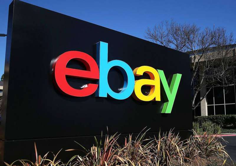
The eBay logo is one of the most recognized symbols in online commerce. It has gone through multiple redesigns since 1995, but the core idea has stayed the same: colorful lowercase letters that signal a marketplace built on community and variety.
Four letters. Four colors. That’s all it takes for millions of people to instantly think about buying and selling online.
eBay Inc., founded by Pierre Omidyar in San Jose, California, started as AuctionWeb before becoming the brand we know today. The current version of the logo was introduced in October 2012, designed by branding agency Lippincott. It’s the fourth major iteration of the mark, and it replaced a beloved (if slightly chaotic) version that had been around for over a decade.
What Is the eBay Logo?
The eBay logo is a lowercase wordmark featuring four colored letters, each in red, blue, yellow, and green. It was officially introduced on October 10, 2012, and was designed by the branding firm Lippincott. The design represents diversity, community, and the wide range of products available on the platform.
Design Attributes
Design Type: Wordmark. No icon, no emblem, no mascot. Just the company name styled in a specific way. Clean and direct.
Primary Elements: Four lowercase letters (“e,” “b,” “a,” “y”), each set in a different color. The letters sit close together, touching but not overlapping. That detail matters. It signals connection without chaos.
Official Introduction Date: September 13, 2012 (unveiled), October 10, 2012 (officially rolled out).
Designer/Agency: Lippincott, a New York-based brand strategy and design firm. The previous colorful version from 1999 was designed by Elissa Davis at CKS Partners in California.
Trademark Status: Registered with the USPTO under Registration Number 4408423, filed September 12, 2012, and registered September 24, 2013. The mark claims red, blue, yellow, and green as features. eBay’s name and logo are protected by intellectual property laws in the U.S. and internationally.
Color Palette:
- Red (“e”): #E53238
- Blue (“b”): #0064D2
- Yellow (“a”): #F5AF02
- Green (“y”): #86B817
Usage Context: The logo appears across eBay’s website, mobile app, marketing materials, packaging, seller tools, and advertising. eBay maintains strict brand guidelines for how it should be displayed.
How Has the eBay Logo Evolved Over Time?

The eBay logo has been redesigned four times since the company’s founding in 1995. It started as a pixelated black-and-white rectangle for AuctionWeb, shifted to a serif-based wordmark in 1997, exploded into colorful overlapping letters in 1999, and was refined into its current clean form in 2012.
Each version tells you something about where the company was at the time.
Some changes were subtle. Others were complete overhauls.
Original AuctionWeb Logo (1995-1997)
Years Active: 1995 to 1997
Design Description: A horizontal rectangle split into two halves. The left side was white with black text reading “Auction,” and the right side was black with white text reading “Web.” The lettering had a pixelated, almost bitmap-like quality to it.
Color Scheme: Black and white only. No frills.
Designer: Created in-house, likely by Omidyar himself or close collaborators. There’s no official credit on record.
Context: Pierre Omidyar launched AuctionWeb as a side project from his personal website. He wasn’t thinking about brand identity at that point. He was thinking about whether his idea would even work. The first item ever sold on the platform was a broken laser pointer for $14.83.
Cultural Significance: This logo captures the raw, unpolished energy of the early internet. It looks like something made in MS Paint, and honestly, that’s kind of the charm. It was a product of its time, when websites looked homemade because they were.
First eBay Wordmark (1997-1999)
Years Active: 1997 to 1999
Design Description: The company rebranded from AuctionWeb to eBay. The new logo was just the word “EBAY” in black capital letters on a white background, with the “B” noticeably larger than the other letters.
Color Scheme: Black text on white. Still monochrome.
Designer: Not officially credited. The typeface used was Times New Roman, which is about as basic as it gets.
Context: The name change happened because Omidyar originally wanted the domain “EchoBay.com” for his consulting work, but it was taken. He shortened it to eBay. By 1997, the auction platform had grown way beyond a hobby project, so a proper identity was needed.
Key Changes from Previous: Dropped the split-rectangle format. Removed the pixelated styling. Went with a clean serif font. The oversized “B” was the only real design flourish.
Cultural Significance: This was eBay’s first attempt at looking like a real company. But the logo felt corporate and cold. It didn’t match the playful, anything-goes spirit of the platform.
The Colorful Overlapping Logo (1999-2012)
Years Active: 1999 to 2012 (roughly 13 years, the longest-running version)
Design Description: Lowercase letters with a capitalized “Y,” each in a different color: red, blue, yellow, and green. The letters were different sizes and widths, placed at varying heights, and they overlapped each other with semi-transparency. The whole thing bounced across the page like it couldn’t sit still.
Color Scheme: Red, blue, yellow, green. The colors were slightly transparent to create blending effects where letters overlapped.
Designer: Elissa Davis at CKS Partners in California. It was actually her first project at the agency. She later said she drew inspiration from the Apple logo’s color palette and the playful movement of the game Twister.
Context: eBay brought in CKS Partners to boost visitor traffic and refresh the brand image. The result was a complete visual transformation. The logo was built using various weights and widths of the Univers font family.
Key Changes from Previous: Everything changed. Color replaced monochrome. Uppercase became mostly lowercase. Static letters became bouncing, overlapping characters. The personality went from “corporate memo” to “garage sale you’d actually want to visit.”
Cultural Significance: This became THE eBay logo in most people’s minds. It lasted 13 years. It captured the messy, fun, democratic feeling of a marketplace where you could buy a vintage watch right next to someone selling a broken laser pointer. The overlapping glyphs were meant to represent the sense of community on the platform.
Current eBay Logo (2012-Present)
Years Active: October 2012 to present
Design Description: All four letters are lowercase, evenly sized, and lined up on the same baseline. Same four colors, but no overlapping. The letters touch each other but don’t crowd. Set in Univers 53 Extended.
Color Scheme: Red (#E53238), Blue (#0064D2), Yellow (#F5AF02), Green (#86B817).
Designer: Lippincott, a well-known brand consultancy based in New York.
Context: By 2012, the tech industry was moving toward cleaner, more minimalist design. Apple, Google, and Microsoft had all simplified their logos. eBay followed suit. Company President Devin Wenig said the update balanced eBay’s colorful history with a vision for something more contemporary and consistent.
Key Changes from Previous: Letters no longer overlap. They’re the same height and width. The capital “Y” became lowercase. The transparency effects disappeared. The typeface shifted from bold Univers weights to the thinner Univers 53 Extended. Way more structured, way less chaotic.
Cultural Significance: Some people thought the redesign was too safe. Others appreciated the grown-up look. Either way, it reflected eBay’s shift from scrappy auction site to professional global marketplace. The connected letters still hint at community, just in a quieter way.
What Do the Design Elements of the eBay Logo Mean?

Every part of the eBay logo carries specific meaning. The four distinct colors represent diversity and the wide range of products on the platform.
The connected, touching letters symbolize the buyer-seller community.
And the lowercase lettering creates a friendly, approachable tone that keeps the brand from feeling stiff or corporate.
Why Did eBay Choose These Specific Colors?

The four-color scheme isn’t random. Each color was chosen with intent, and the combination works together to create an energetic, trustworthy impression. Understanding color psychology helps explain why these particular choices make sense.
Red (“e”): Hex #E53238 / Pantone PMS 1795 C. Red signals energy, urgency, and excitement. For a marketplace where bidding wars happen in real time, it sets the right mood. You see red used heavily across other well-known brand marks for exactly this reason.
Blue (“b”): Hex #0064D2 / Pantone PMS 2726 C. Blue is the trust color. Banks use it. Tech companies use it. It tells buyers the platform is reliable and safe. For an online marketplace where strangers trade with strangers, trust is everything.
Yellow (“a”): Hex #F5AF02 / Pantone PMS 124 C. Yellow represents optimism and warmth. It’s friendly. It’s the color of finding a good deal and feeling great about it. Brands that use yellow in their marks tend to project cheerfulness and accessibility.
Green (“y”): Hex #86B817 / Pantone PMS not officially published but closely matches PMS 376 C. Green signals growth and prosperity. It suggests financial gain for sellers and good outcomes for buyers. You’ll spot green across many brand identities tied to growth or success.
Together, the four colors create something that feels like a complete system. They don’t clash, but they don’t blend either. Each letter stands on its own while contributing to the whole. That’s color theory put to work in a very practical way.
What Typography Style Is Used in the eBay Logo?

The current eBay logo uses Univers 53 Extended, a sans-serif font designed by Adrian Frutiger in 1957.
It’s a neo-grotesque typeface known for clean geometry and even proportions. The “53” in the name refers to its weight and width in Frutiger’s numbering system.
The previous colorful logo (1999-2012) also used Univers, but in bolder, varied weights, which is why the two versions look so different even though they share the same typographic DNA.
The choice of an extended width gives the logo a horizontal stretch that feels stable and grounded. The kerning is tight, with letters touching. That’s intentional. It creates visual unity and makes the wordmark feel like a single object rather than four separate characters.
What Are the Hidden Meanings in the eBay Logo?
Look, there’s no arrow hidden in the negative space like FedEx. But the eBay logo does carry subtle design intent that’s easy to miss at first glance.
The touching letters represent community. Buyers and sellers on the platform are connected, and the logo reflects that. The earlier overlapping version made this point more dramatically, but the current version still carries it through.
The four different colors on four letters also signal variety and inclusiveness, matching a platform where you can buy literally anything from anyone, anywhere. And the lowercase lettering? That’s a deliberate move to feel casual and approachable rather than authoritative.
How Does the eBay Logo Compare to Competitor Logos?
eBay’s multi-color approach sets it apart from nearly every competitor in the ecommerce space. Amazon uses a single orange arrow on black text. Etsy uses solid orange. Most online marketplaces lean toward one or two colors at most.
The closest comparison is actually Google, which also uses red, blue, yellow, and green. Both companies landed on these colors around the same time in the late 1990s, and both used them to represent breadth and diversity.
Where eBay’s logo truly differs is in its wordmark-only format. Amazon has the smile arrow. Facebook has the “f” icon. eBay relies entirely on its colored text, with no standalone symbol or icon (aside from a simplified app icon). That’s a bold choice. It means the type has to do all the heavy lifting.
Compared to the more minimal Stripe logo or the Salesforce logo, eBay’s design leans playful. It doesn’t try to look corporate. It doesn’t try to look luxurious. It just tries to look… approachable. And that matches what the platform actually is.
What Are the Technical Specifications of the eBay Logo?
Official Color Codes
Red (“e”):
Blue (“b”):
- Hex: #0064D2
- RGB: (0, 100, 210)
- CMYK: (85, 63, 0, 0)
- Pantone: PMS 2726 C
Yellow (“a”):
- Hex: #F5AF02
- RGB: (245, 175, 2)
- CMYK: (3, 34, 100, 0)
- Pantone: PMS 124 C
Green (“y”):
- Hex: #86B817
- RGB: (134, 184, 23)
- CMYK: (47, 6, 100, 0)
- Pantone: PMS 376 C (approximate)
Dimensions and Proportions
eBay maintains specific rules about how the logo should appear. According to their official playbook, the four-color logo should only be used on white, black, and neutral backgrounds. On photography, the logo always appears in white.
Clear space around the logo must be maintained at all times to keep it readable. eBay doesn’t publicly list an exact pixel-level minimum size, but their guidelines stress that the mark should never be displayed at a size where the individual letters become illegible.
The aspect ratio is roughly 3.5:1 (width to height), consistent with most horizontal wordmarks. The logo should never be stretched, rotated, recolored, or modified in any way. eBay provides official logo asset packs for approved use cases.
What Cultural Impact Has the eBay Logo Had?

The eBay logo helped define what ecommerce brands look like. When it introduced those overlapping, bouncing colored letters in 1999, it made online shopping feel fun and informal during a time when many people were still nervous about buying things on the internet.
That color palette became almost as recognizable as Google’s.
The 2012 redesign sparked a mixed reaction. Some felt it stripped away the personality. Others saw it as a necessary step toward maturity. Either way, the move influenced how other marketplace brands thought about their own visual updates.
What’s interesting is that the logo never uses a symbol or icon. It’s just text. And yet it’s instantly recognizable worldwide. That says something about how powerful contrast and color can be when applied consistently over decades.
How Does the eBay Logo Fit Into the Overall Brand Identity?
The logo is the centerpiece of eBay’s entire visual system. Everything else grows from those four colors: the website layout, the app design, marketing materials, and seller tools.
eBay’s brand style guide outlines 17 color families with 8 shades each, totaling 136 colors. But the four logo colors, red, blue, yellow, and green, are the “core colors” that everything else is built around.
The brand uses a tone-on-tone strategy for backgrounds and text pairing, always making sure there’s enough visual separation for accessibility. Photography gets white logo overlays. Color backgrounds get matching foreground tones.
The Univers typeface from the logo carries through to other branded communications, keeping everything connected. It’s a visual hierarchy that starts with those four simple letters and radiates outward into every touchpoint.
How Should the eBay Logo Be Used?
Official Usage Rules
eBay is pretty strict about this. You can mention the company by name on your website (like “I sell on eBay”), but you need a written trademark license agreement to use the actual logo. No exceptions.
Here’s what you can’t do:
- Use the logo on business cards
- Use the logo or name as a link (unless it’s an approved “Right Now on eBay” button)
- Imply that eBay sponsors, endorses, or is affiliated with your business
- Register, own, or sell domain names containing “eBay”
- Alter the logo’s colors, proportions, or arrangement in any way
Where to Access Official Logos
eBay provides official logo asset packs through their brand playbook at playbook.ebay.com. For specific permissions, you need to go through the eBay Intellectual Property Permission Center at brandpermission.ebay.com.
Licensing and Trademark Protection
The eBay logo is a registered trademark (USPTO Registration #4408423). It’s protected in the U.S. and internationally. Any unauthorized use can lead to legal action under the Anticybersquatting Consumer Protection Act of 1999 and related trademark laws.
For use in film, television, commercials, merchandise, press releases, or advertising, you must complete a request form through eBay’s IP Center. Educational and non-profit uses of unaltered screenshots don’t require permission, but the logo itself still does.
The spelling matters too. It’s always “eBay” with a lowercase “e” and uppercase “B.” Never “Ebay,” “e-Bay,” or “ebay.” Getting that wrong is a fast way to get a cease-and-desist letter.
FAQ on The eBay Logo
What font does eBay use in its logo?
eBay uses Univers 53 Extended, a sans-serif typeface designed by Adrian Frutiger in 1957. It’s a neo-grotesque font known for clean geometry and even proportions.
The previous 1999 version also used Univers, just in bolder, varied weights. Same font family, completely different feel.
What do the colors in the eBay logo mean?
Red stands for energy. Blue signals trust. Yellow brings optimism. Green represents growth.
Each letter gets its own color, creating a tetradic color scheme that reflects the diversity of products and sellers on the platform. The combination works because the colors balance each other without competing.
Who designed the current eBay logo?
Lippincott, a New York-based brand strategy firm, designed the current version in 2012. The previous colorful logo from 1999 was created by Elissa Davis at CKS Partners in California.
Davis drew inspiration from the Apple logo’s palette and the game Twister. Her first project at the agency, and it lasted 13 years.
When did eBay last change its logo?
The most recent redesign was unveiled on September 13, 2012, and went live on October 10 that same year. It replaced the playful overlapping version that had been around since 1999.
That’s over a decade with the same mark now. No changes since.
Can I use the eBay logo on my website or business card?
No. The eBay logo is a registered trademark protected by intellectual property laws in the U.S. and internationally. You need a written license agreement from eBay Inc. to use it.
You can mention the name “eBay” in text. But displaying the actual logo requires permission through their IP Center.
What is the history of the eBay logo?
It started in 1995 as a pixelated black-and-white rectangle for AuctionWeb. Pierre Omidyar founded the site as a hobby project in San Jose, California.
A plain serif wordmark came in 1997. The famous colorful version arrived in 1999. Then Lippincott cleaned it all up in 2012.
What file formats is the eBay logo available in?
eBay provides official assets through their brand playbook. Common formats include PNG for web use and vector graphics formats for print applications.
You’ll need to request access through brandpermission.ebay.com for any official use.
Why did eBay simplify its logo in 2012?
The tech industry was shifting toward cleaner design principles. Apple, Google, and Microsoft had all gone minimal. eBay followed the trend.
The overlapping letters felt dated. The new version kept the same four colors but aligned everything on a single baseline with uniform sizing. More professional, less chaotic.
How does the eBay logo compare to the Google logo?
Both use red, blue, yellow, and green. Both adopted these colors in the late 1990s. The similarity isn’t a coincidence. Both brands wanted to represent breadth and variety.
But Google uses a custom display font while eBay sticks with Univers. Different execution, similar intent.
What makes the eBay logo so recognizable?
Four letters, four colors. That’s it. The simplicity is exactly why it works. Strong repetition across every touchpoint over decades built instant recognition.
No icon. No mascot. Just a colorful wordmark that millions associate with online shopping. Consistency did the heavy lifting here.
Conclusion
The eBay logo is proof that a wordmark doesn’t need complexity to stick in people’s minds. Four letters, four colors, one clean typeface. That’s the whole formula.
From AuctionWeb’s pixelated rectangle to Lippincott’s refined 2012 redesign, every version reflected where the company was headed. The brand identity grew up alongside the platform itself.
What keeps it working is consistency. The same red, blue, yellow, and green complementary color scheme has held steady for over two decades. The Univers typeface grounds it. And the logo design principles behind it, simplicity, readability, and strong color use, are worth studying if you’re building any brand from scratch.

Renowned for his expertise in logo design and visual branding, Bogdan has developed a multitude of logos for various clients.
His skills extend to creating posters, vector illustrations, business cards, and brochures. Additionally, Bogdan's UI kits were featured on marketplaces like Visual Hierarchy and UI8.
He also wrote in the past years on sites like Design Your Way, WebDesignerDepot, WPDean, Designmodo, Speckyboy, Slider Revolution, and more.
- The Windsurf Logo History, Colors, Font, And Meaning - 10 October 2026
- How to Remove Background From Product Photos (No Photoshop) - 10 October 2026
- How Designers can Build a Stronger Online Creative Identity - 9 October 2026

Bogdan Sandu is a seasoned designer who has been designing websites since 2008. Renowned for his expertise in logo design and visual branding, Bogdan has developed a multitude of logos for various clients. His skills extend to creating posters, vector illustrations, business cards, and brochures. Additionally, Bogdan's UI kits were featured on marketplaces like Visual Hierarchy and UI8. He also wrote in the past years on sites like Design Your Way, WebDesignerDepot, WPDean, Designmodo, Speckyboy, Slider Revolution, and more.
You Might Also Like


