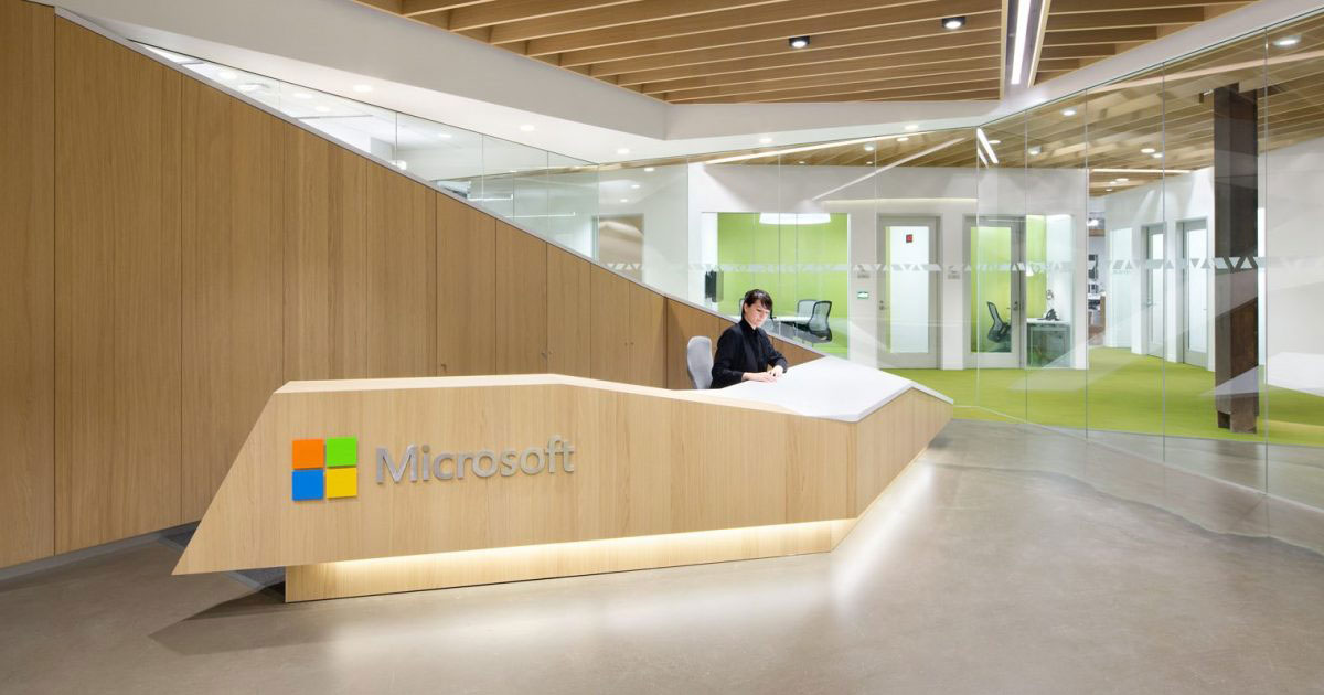
The Microsoft logo is one of the most recognized corporate symbols on the planet. Billions of people see it daily, on everything from laptop boot screens to cloud service dashboards to gaming consoles.
It sits alongside marks from Apple, Google, and Amazon as a defining visual of the modern tech industry. But unlike those brands, Microsoft’s current mark only arrived in 2012, after nearly four decades of identity shifts that tracked the company’s growth from a two-person startup to a trillion-dollar giant.
The current version pairs a four-colored square symbol with a clean gray wordmark set in Segoe. It was the first Microsoft logo to include both an icon and text together. And it was introduced at a turning point, right as the company was repositioning itself around devices and services under CEO Steve Ballmer.
Microsoft Corporation was founded on April 4, 1975, by Bill Gates and Paul Allen. Since then, the company has used at least six distinct logo versions, each reflecting a different stage of growth and market position.
What Is the Microsoft Logo?
The Microsoft logo is a combination mark featuring four colored squares arranged in a grid pattern alongside the company name in Segoe UI Semibold. It was officially introduced on August 23, 2012, and designed by Jason Wells. The symbol references the Windows interface and represents the diversity of Microsoft’s product lineup.
- Design Type: Combination mark (symbol plus wordmark)
- Primary Elements: Four-square geometric symbol in orange-red, green, blue, and yellow, paired with “Microsoft” wordmark in gray
- Official Introduction Date: August 23, 2012
- Designer: Jason Wells (with involvement from Pentagram)
- Trademark Status: Registered and renewed. The word mark “MICROSOFT” was filed on October 22, 1979, under serial number 73236080, and registered on July 6, 1982, under registration number 1200236. The trademark is actively maintained.
- Color Palette: Orange-Red (#F25022), Green (#7FBA00), Blue (#00A4EF), Yellow (#FFB900), Gray (#737373)
- Usage Context: Applied across all Microsoft products, software interfaces, marketing materials, digital platforms, packaging, retail stores, corporate communications, and merchandise
How Has the Microsoft Logo Evolved Over Time?
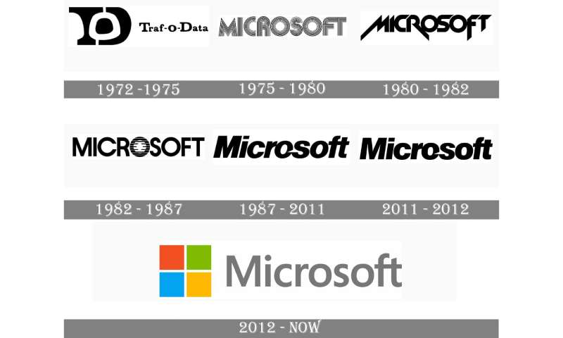
The Microsoft logo has gone through six main versions since the company’s founding in 1975.
Each redesign reflected a shift in business direction, from early software startup to global technology platform.
The progression moved from decorative 1970s lettering to the clean, multicolored mark used today.
Original Microsoft Logo (1975-1980)
- Years Active: 1975-1980
- Design Description: An all-caps wordmark formed from thick letters made of multiple parallel lines. The text was stacked, with “MICRO” on top and “SOFT” below, reflecting the company’s original hyphenated name.
- Color Scheme: Monochrome (black and white)
- Designer: Created by co-founders Bill Gates and Paul Allen, with design attributed to Simon Daniels
- Context: The company had just been founded and was developing BASIC interpreters for the Altair 8800 microcomputer. The logo needed to look current for the mid-1970s.
- Key Changes from Previous: This was the first official Microsoft logo. A prior logo for Traf-O-Data (1972), the company’s predecessor, used a completely different monogram style.
- Cultural Significance: The concentric-line lettering captured the disco-era aesthetic of the time. It was very much a product of the 1970s and feels unmistakably retro today.
Heavy Metal Microsoft Logo (1980-1982)
- Years Active: 1980-1982
- Design Description: A bold, angular wordmark using the New Zelek font. Sharp edges and diagonal cuts on letters like M, R, and F gave it an aggressive, futuristic look.
- Color Scheme: Monochrome (black and white)
- Designer: Simon Daniels
- Context: Microsoft launched Xenix (a UNIX operating system variant) in 1980 and was growing fast. The logo aimed to project technological ambition.
- Key Changes from Previous: Dropped the multi-line lettering for solid, sharp-edged characters. The feel shifted from disco to something closer to heavy metal album art.
- Cultural Significance: This was the shortest-lived Microsoft logo and is often compared to heavy metal band logos of the early 1980s. It was a curious design choice for a software company, and Microsoft moved away from it quickly.
The Blibbet Logo (1982-1987)
- Years Active: 1982-1987
- Design Description: A clean sans-serif wordmark with one distinctive feature: the letter “O” was filled with horizontal parallel lines, splitting the word visually into “Micro” and “soft.”
- Color Scheme: Monochrome (black and white)
- Designer: Simon Daniels
- Context: Microsoft was maturing as a company and needed a more professional appearance. The previous logo’s aggressive styling didn’t match the direction the brand was heading.
- Key Changes from Previous: Replaced the angular, heavy lettering with a geometric sans-serif face. The striped “O” became the logo’s signature element.
- Cultural Significance: Employees nicknamed the striped “O” the “Blibbet.” When this logo was retired in 1987, some Microsoft staff actually petitioned to bring it back. The Blibbet became a small but beloved piece of Microsoft history.
The Pac-Man Logo (1987-2012)
- Years Active: 1987-2012 (with a minor update in 2011)
- Design Description: A bold, italicized wordmark using Helvetica Black Italic. The most notable feature was a diagonal slash cut into the letter “O,” which visually separated “Micro” from “soft.”
- Color Scheme: Monochrome (black and white)
- Designer: Scott Baker
- Context: Introduced alongside the launch of OS/2, this logo arrived as Microsoft was becoming a dominant force in personal computing. It needed to look confident and forward-moving.
- Key Changes from Previous: Switched to Helvetica Black Italic. The parallel-line “O” was replaced by a clean letter with a triangular notch. The entire wordmark was italicized for the first time.
- Cultural Significance: This became the most enduring Microsoft logo, lasting 25 years. Employees called it the “Pac-Man logo” because the notch in the “O” looked like the classic arcade character. It accompanied Windows 95, Windows XP, Office, Xbox, and basically everything that made Microsoft a household name. A small update in 2011 slightly opened up the negative spaces in the “M” and reduced the overall size of the lettering, but most people never noticed the difference.
The Current Microsoft Logo (2012-Present)
- Years Active: 2012-present
- Design Description: A combination mark with a four-colored square symbol (two-by-two grid) placed to the left of the “Microsoft” wordmark in Segoe UI Semibold. The symbol uses flat, solid colors with no gradients or shadows.
- Color Scheme: Orange-Red, Green, Blue, Yellow (symbol), Gray (wordmark)
- Designer: Jason Wells
- Context: Microsoft was launching Windows 8 and its Metro (now Fluent) design language. The entire company was being reorganized around a devices-and-services strategy. The fragmented brand needed unification.
- Key Changes from Previous: First logo to use color. First to include a separate symbol alongside the wordmark. Dropped Helvetica for Segoe. Removed the italic styling entirely. Went from a standalone wordmark to a true combination mark.
- Cultural Significance: This logo aligned Microsoft’s corporate identity with the flat, tile-based interface of Windows 8. The four squares reference the Windows logo directly, connecting the parent brand to its flagship product. It represented the most dramatic visual change in the company’s history and signaled a shift toward the minimalist design language that now dominates the tech industry.
What Do the Design Elements of the Microsoft Logo Mean?
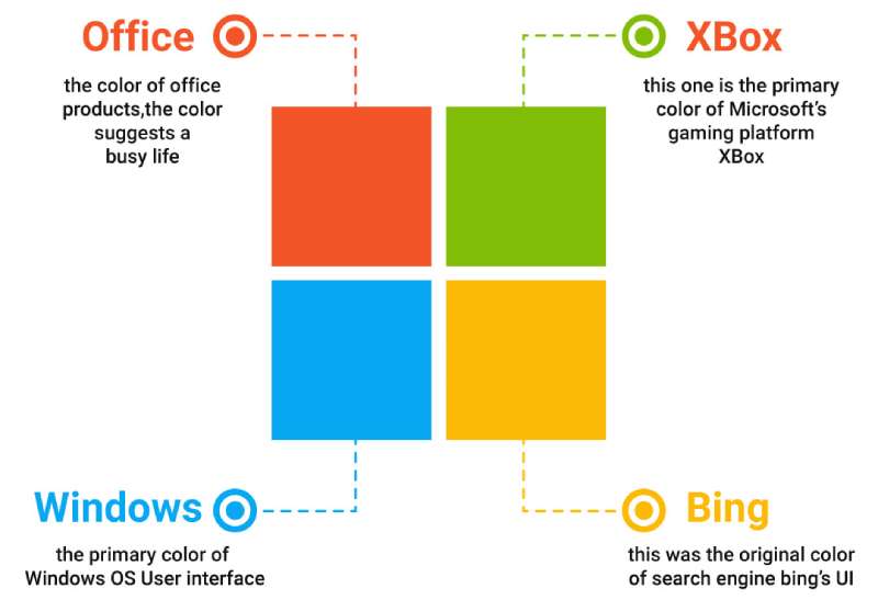
The four-square symbol is the most meaningful element. Each colored square represents a different Microsoft product line or value.
Together, the squares form a window shape, directly referencing the Windows operating system that built the company.
The wordmark in Segoe signals accessibility and modern simplicity, dropping decades of bold, aggressive type choices.
Why Did Microsoft Choose These Specific Colors?
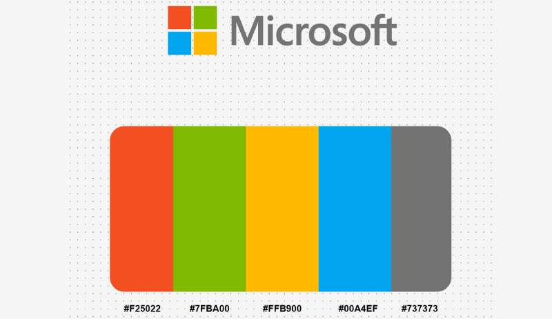
The current logo uses four colors, and each one carries both symbolic weight and a connection to specific product lines. Understanding color theory helps explain the logic behind the choices.
- Orange-Red (Hex: #F25022, RGB: 242, 80, 34, CMYK: 0, 84, 98, 0, Pantone: PMS 1665 C): Represents Microsoft Office and PowerPoint. Red tones suggest energy, action, and productivity. It ties to the passion behind creation tools.
- Green (Hex: #7FBA00, RGB: 127, 186, 0, CMYK: 56, 4, 100, 0, Pantone: PMS 376 C): Connected to Xbox and Excel. Green signals growth, fun, and financial applications. It brings a sense of liveliness to the logo.
- Blue (Hex: #00A4EF, RGB: 0, 164, 239, CMYK: 71, 22, 0, 0, Pantone: PMS 2925 C): Tied to Windows itself. Blue communicates trust, reliability, and calm. It is the color most often associated with the Microsoft brand overall.
- Yellow (Hex: #FFB900, RGB: 255, 185, 0, CMYK: 0, 30, 100, 0, Pantone: PMS 1235 C): Associated with Bing and optimism. Yellow brings warmth and creativity to the palette.
- Gray (Hex: #737373, RGB: 115, 115, 115, CMYK: 56, 47, 47, 13, Pantone: PMS 424 C): Used for the wordmark. Gray keeps the text understated, letting the colorful symbol take focus while still reading as professional and modern.
The way these four hues sit together creates something close to a tetradic color arrangement, pulling from different parts of the spectrum for maximum visual variety.
That kind of color palette choice is deliberate. It makes the logo stand out at any size, on any background.
What Typography Style Is Used in the Microsoft Logo?
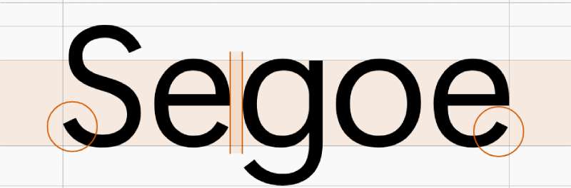
The current wordmark uses Segoe UI Semibold, a proprietary sans-serif typeface owned by Microsoft.
Segoe has clean, rounded letterforms with open counters that make it extremely readable at small sizes. That matters when your logo appears on everything from browser tabs to building signs.
Before 2012, Microsoft used Helvetica Black Italic for 25 years. The switch to Segoe was a big deal. It dropped the italic slant, the heavy weight, and the aggressive feel entirely.
The result is a wordmark that feels neutral and approachable. Good typography in a logo should not compete with the symbol, and Segoe does exactly that here.
What Are the Hidden Meanings in the Microsoft Logo?
The four-square symbol is a direct callback to the Windows logo, tying the company’s identity to its most well-known product.
Each square is exactly the same size, which suggests equality across Microsoft’s business divisions. No single product dominates the visual.
The thin gap between the four squares creates a plus-sign shape in the negative space. Some designers read this as a subtle nod to addition, growth, or interconnection between services.
Jason Wells has stated that the design was intentionally “authentically digital,” meaning it avoids skeuomorphic effects like gradients, shadows, or textures. That was a direct response to the glossy, beveled logo trends of the 2000s.
How Does the Microsoft Logo Compare to Competitor Logos?
Among major tech company logos, Microsoft’s current mark sits in interesting territory.
Apple uses a single monochrome symbol with no wordmark at all. Google uses a multicolored wordmark with no standalone icon (aside from the “G” favicon). Amazon pairs a wordmark with a subtle arrow-smile.
Microsoft is the only one among the big four that uses both a multicolored symbol and a separate wordmark together as its primary mark. That makes it more complex but also more flexible across different contexts.
Companies like Salesforce and Atlassian also use multicolored symbols, but theirs lean more abstract. Microsoft’s four-square grid is geometric and precise, which fits the structured, productivity-focused nature of its products.
Where IBM leans on blue as a single brand color and Adobe relies on red, Microsoft’s multi-color approach signals breadth. It says, “We do a lot of different things.” Whether that comes through clearly or just reads as busy depends on who you ask.
Compared to Intel, Cisco, and Oracle, Microsoft’s logo is warmer and more approachable. Those brands use cooler tones and more corporate-feeling type treatments. Microsoft deliberately went the other direction in 2012.
What Are the Technical Specifications of the Microsoft Logo?
Official Color Codes
- Orange-Red: Hex #F25022 | RGB (242, 80, 34) | CMYK (0, 84, 98, 0) | Pantone PMS 1665 C
- Green: Hex #7FBA00 | RGB (127, 186, 0) | CMYK (56, 4, 100, 0) | Pantone PMS 376 C
- Blue: Hex #00A4EF | RGB (0, 164, 239) | CMYK (71, 22, 0, 0) | Pantone PMS 2925 C
- Yellow: Hex #FFB900 | RGB (255, 185, 0) | CMYK (0, 30, 100, 0) | Pantone PMS 1235 C
- Gray (Wordmark): Hex #737373 | RGB (115, 115, 115) | CMYK (56, 47, 47, 13) | Pantone PMS 424 C
Dimensions and Proportions
- Aspect Ratio: The full logo (symbol plus wordmark) maintains a horizontal orientation. The symbol itself is a perfect square divided into four equal quadrants.
- Minimum Size Requirements: On screen, the Microsoft logo should never be smaller than 72 pixels wide. In print, it must appear at least 1 inch (25.4 mm) wide. The symbol alone should not be smaller than 20 pixels tall on screen or 0.28 inches (7.12 mm) tall in print.
- Clear Space: A minimum area of empty space must surround the logo, equivalent to the height of the four-square symbol. No other design elements, text, photography, or borders should enter this zone.
- Official Usage Guidelines: Only two approved versions exist: one for light backgrounds and one for dark backgrounds. The logo cannot be altered in proportions, colors, elements, or orientation. It must not be animated, rotated, or combined with other symbols.
What Cultural Impact Has the Microsoft Logo Had?
The Microsoft logo is one of those marks that has become part of daily life for billions of people without most of them ever thinking twice about it.
It shows up on operating system boot screens, Office applications, Surface hardware, Xbox consoles, and LinkedIn. For many people, particularly those who grew up in the 1990s and 2000s, the older Pac-Man-style logo triggers strong nostalgia.
The 2012 redesign signaled something bigger than just a new look. It marked the moment when flat, white space-heavy design became the industry standard.
Microsoft was one of the first major tech brands to ditch glossy, 3D-style graphics in favor of flat geometry. Apple, Google, and others followed within a year or two. In that sense, the current Microsoft logo helped push a broader design movement forward.
How Does the Microsoft Logo Fit Into the Overall Brand Identity?
The logo is the anchor of a much larger system. Microsoft uses the four-square symbol as a foundation, then adapts it across sub-brands like Windows, Office, Azure, and Xbox.
Each product has its own icon, but they all share design principles with the parent mark: flat colors, geometric shapes, and the Segoe typeface family.
This connects back to Microsoft’s Fluent Design System, which governs how all visual elements look and behave across software, hardware, and marketing. The brand guidelines are strict, and every use of the logo must follow documented rules about sizing, spacing, and color.
The result is a level of unity across a huge product portfolio. When you see an Azure dashboard, an Xbox splash screen, or a Teams notification, they all feel like they belong together. That kind of consistency takes a lot of work to maintain, and the logo sits right at the center of it.
How Should the Microsoft Logo Be Used?
Official Usage Rules
Microsoft has detailed brand style guide documentation covering every scenario where the logo might appear. The basics are straightforward but strictly enforced:
- Do: Use only official logo files provided by Microsoft. Maintain the required clear space around the logo. Use the correct version for your background (light or dark). Include proper trademark attribution when required.
- Don’t: Alter the logo colors, proportions, or arrangement. Place the logo on busy or cluttered backgrounds. Use the logo to suggest Microsoft endorsement or sponsorship without a license. Incorporate the logo into your own branding, product names, or domain names. Use screenshots of the logo in third-party product interfaces.
Where to Access Official Logo Files
Microsoft provides approved brand assets through its official trademark and brand guidelines page at microsoft.com. Partners with active agreements can access additional logo files through the Microsoft Partner Network. For press and editorial use, the Microsoft News Center Image Gallery offers approved images.
Licensing and Trademark Protection
The Microsoft name and logo are registered trademarks. Any commercial use of the logo requires a formal license from Microsoft. Resellers and authorized distributors may use the logo under specific conditions outlined in their agreements. Unauthorized use, including on merchandise, social media account names, or third-party packaging, can result in legal action. Microsoft actively monitors and protects its brand assets globally.
FAQ on The Microsoft Logo
What Do the Four Colors in the Microsoft Logo Represent?
Each square in the Microsoft symbol carries meaning. Red stands for Office, green for Xbox, blue for Windows, and yellow for Bing.
These four colors also reflect broader brand values like energy, growth, trust, and creativity within Microsoft’s product ecosystem.
Who Designed the Current Microsoft Logo?
Jason Wells designed the 2012 logo. The project involved collaboration with Pentagram.
It replaced the Scott Baker wordmark that had been in use since 1987. The redesign introduced color and a standalone symbol for the first time in the company’s history.
When Was the Microsoft Logo Last Changed?
The most recent full redesign happened on August 23, 2012. That version is still active today.
Before that, the Pac-Man-style logo ran for 25 years with only a minor spacing tweak in 2011. Microsoft’s visual identity has stayed stable since the 2012 rebrand.
What Font Does the Microsoft Logo Use?
The wordmark uses Segoe UI Semibold, a proprietary sans-serif typeface owned by Microsoft Corporation.
It replaced Helvetica Black Italic, which had defined the brand’s look for decades. Segoe is clean, rounded, and built for readability across digital platforms and print materials.
What Are the Official Microsoft Logo Color Hex Codes?
Orange-Red is #F25022. Green is #7FBA00. Blue is #00A4EF. Yellow is #FFB900.
The gray wordmark uses #737373. These codes have remained consistent since the 2012 corporate identity update and apply across all Microsoft branding.
Can I Use the Microsoft Logo for My Business or Website?
Not without permission. The Microsoft trademark is a protected brand asset.
Commercial use requires a formal license. Resellers and authorized partners follow specific brand guidelines. Unauthorized use on products, social media, or packaging can lead to legal action from Microsoft.
How Many Logos Has Microsoft Had?
Microsoft has used six primary logo versions since Bill Gates and Paul Allen founded the company in 1975.
The progression went from the 1975 disco-era lettering to the 1980 heavy metal look, then the Blibbet, the Pac-Man wordmark, and finally the current four-square combination mark.
What Is the Meaning Behind the Microsoft Logo Shape?
The four-square grid is a direct reference to the Windows logo. It represents a window, connecting the corporate brand to its flagship operating system.
Equal-sized squares suggest balance across business divisions. The negative space between them forms a subtle plus sign, hinting at connection and growth.
What File Formats Are Available for the Microsoft Logo?
Microsoft provides official logo assets in formats suited for both digital and print use. Vector files work best for scaling without quality loss.
Approved assets can be accessed through the Microsoft trademark page and partner portals. Raster formats like PNG are available for standard web and screen use.
Why Did Microsoft Add a Symbol to Its Logo in 2012?
Before 2012, every Microsoft logo was a standalone wordmark. The company had grown into a multi-product giant covering software, hardware, gaming, and cloud services.
Adding the four-colored symbol gave the brand a flexible icon that works at any size, from a browser favicon to a building sign. It unified a fragmented brand identity.
Conclusion
The Microsoft logo is a case study in how corporate identity should evolve alongside a business. Six versions across five decades, each one answering a different strategic need.
From Bill Gates and Paul Allen’s 1975 disco-era lettering to Jason Wells’ four-colored square, every redesign tracked a real shift in what Microsoft Corporation was becoming.
The current mark works because it is simple, scalable, and tied directly to the Windows operating system that built the company. Its flat geometry and Segoe typeface set the tone for modern tech company branding before most competitors caught on.
Good logo modernization is not about chasing trends. It is about making sure your visual identity still tells the truth about who you are.

Renowned for his expertise in logo design and visual branding, Bogdan has developed a multitude of logos for various clients.
His skills extend to creating posters, vector illustrations, business cards, and brochures. Additionally, Bogdan's UI kits were featured on marketplaces like Visual Hierarchy and UI8.
He also wrote in the past years on sites like Design Your Way, WebDesignerDepot, WPDean, Designmodo, Speckyboy, Slider Revolution, and more.
- Versatile Work Sans Font Pairing for Every Project - 16 September 2026
- Organize Digital Files Like a Pro Before Your Next Client Handoff - 16 September 2026
- How to Set Up a Digital Menu Board: Hardware to Layout - 15 September 2026

Bogdan Sandu is a seasoned designer who has been designing websites since 2008. Renowned for his expertise in logo design and visual branding, Bogdan has developed a multitude of logos for various clients. His skills extend to creating posters, vector illustrations, business cards, and brochures. Additionally, Bogdan's UI kits were featured on marketplaces like Visual Hierarchy and UI8. He also wrote in the past years on sites like Design Your Way, WebDesignerDepot, WPDean, Designmodo, Speckyboy, Slider Revolution, and more.
You Might Also Like