The Manhattan Associates logo represents one of the most recognizable symbols in supply chain management software. This corporate identity belongs to a company that’s been shaping warehouse and logistics technology since 1990, based out of Atlanta.
Manhattan Associates operates in the enterprise software space, specifically focusing on omnichannel commerce and supply chain solutions. The company’s visual identity has evolved alongside its transformation from a traditional software provider to a cloud-based platform leader.
The current logo iteration launched in 2018 features a modern wordmark design. Manhattan Associates has refined its brand identity three times throughout its corporate history, with each version reflecting shifts in technology and market positioning.
What is the Manhattan Associates Logo?
The Manhattan Associates logo is a clean wordmark featuring the company name in a custom sans-serif typeface with distinctive letter spacing. Introduced in 2018, the design was developed by an internal branding team in collaboration with external consultants. The mark emphasizes simplicity and technological sophistication through geometric letterforms and balanced proportions.
Design Type: Wordmark (logotype)
Primary Elements:
- Company name in uppercase and lowercase combination
- Custom-modified sans-serif font
- Horizontal orientation with consistent letter spacing
- No accompanying symbol or icon
Official Introduction Date: 2018
Designer/Agency: Internal brand team with external design consultants
Trademark Status: Registered trademark with the USPTO, active protection across multiple international jurisdictions
Color Palette:
- Primary: Deep Blue (#003B5C)
- Secondary: Bright Orange (#FF6600)
- Neutral: Dark Gray (#333333)
Usage Context: Software platforms, marketing collateral, trade show materials, partner portals, client presentations, digital platforms, and corporate communications
How Has the Manhattan Associates Logo Evolved Over Time?
The Manhattan Associates logo has undergone three major redesigns since the company’s founding in 1990. Each iteration reflected changing technology trends and the company’s strategic repositioning within the supply chain software market.
The evolution moved from complex emblematic designs to streamlined wordmarks. This progression mirrors broader industry trends toward digital-first branding and scalable visual identities.
Original Manhattan Associates Logo (1990-2005)
Years Active: 1990-2005
Design Description: The original design featured a geometric symbol resembling interconnected pathways or a simplified city grid, accompanied by the company name in a traditional serif typeface. The mark included both horizontal and stacked variations.
Color Scheme: Navy blue and forest green with gold accents
Designer: Regional Atlanta design firm (name not publicly documented)
Context: Launched during the company’s founding phase when Manhattan Associates focused primarily on warehouse management systems for retail distribution centers. The design reflected the era’s preference for symbolic corporate logos.
Key Changes from Previous: Initial design, no predecessor
Cultural Significance: Represented the early enterprise software aesthetic of the 1990s, emphasizing structure and connectivity through geometric patterns
Second Manhattan Associates Logo (2005-2018)
Years Active: 2005-2018
Design Description: A transitional design that simplified the symbolic element into an abstract swoosh or wave form, paired with a modernized sans-serif wordmark. The symbol suggested movement and flow, aligning with supply chain concepts.
Color Scheme: Bright blue and orange combination
Designer: Corporate rebranding team with external consultants
Context: Introduced as Manhattan Associates expanded beyond warehouse management into broader supply chain execution and omnichannel retail solutions. This period marked the company’s public listing and aggressive market expansion.
Key Changes from Previous: Eliminated the grid-like symbol, introduced orange as a secondary color, shifted to sans-serif typography, created a more dynamic visual impression
Cultural Significance: Aligned with mid-2000s corporate design trends emphasizing motion, energy, and forward momentum
Current Manhattan Associates Logo (2018-Present)
Years Active: 2018-Present
Design Description: A pure wordmark solution featuring the company name in a custom-modified geometric sans-serif. The design eliminates all symbolic elements in favor of typographic clarity and modern simplicity.
Color Scheme: Deep blue primary with bright orange accent
Designer: Internal brand team with external design consultants
Context: Launched alongside Manhattan Associates’ shift to cloud-native solutions and subscription-based business models. The rebrand coincided with major platform releases and market repositioning as a unified commerce leader.
Key Changes from Previous: Removed the swoosh symbol entirely, refined typography with custom letterforms, increased spacing between letters, established stricter usage guidelines, optimized for digital platforms and mobile applications
Cultural Significance: Reflects contemporary minimalist design philosophy and the tech industry’s movement toward minimalist design approaches prioritizing clarity over decoration
What Do the Design Elements of the Manhattan Associates Logo Mean?

The Manhattan Associates logo communicates technological precision through geometric letterforms and balanced spacing. The wordmark’s clean lines suggest reliability and systematic thinking, qualities valued in supply chain management.
The design deliberately avoids illustrative elements. This choice positions the company as a mature enterprise platform rather than a startup, emphasizing substance over stylistic flourishes.
What Is the Symbolic Meaning Behind the Manhattan Associates Logo?
The logo’s primary symbolism lies in its typographic treatment rather than iconography. The geometric letterforms suggest data structures, systematic processes, and algorithmic precision.
The spacing between letters creates a sense of order and organization. This reflects the company’s core business of organizing complex supply chain operations.
The horizontal orientation conveys stability and forward movement. These attributes align with concepts of supply chain flow and continuous operations.
What Historical Context Influenced the Manhattan Associates Logo Design?
The 2018 redesign emerged during a period when enterprise software companies were shedding complex visual identities. Companies like Salesforce, Workday, and SAP had already moved toward simplified wordmarks.
Manhattan Associates’ timing reflected its transition from on-premise software to cloud-based platforms. The clean design worked better across digital interfaces and mobile applications.
The shift away from symbolic elements also reflected changing B2B marketing approaches. Enterprise buyers increasingly valued clarity and directness over abstract corporate symbolism.
What Cultural References Does the Manhattan Associates Logo Include?
The company name itself references Manhattan’s grid system, one of the world’s most famous examples of urban planning and organization. This connection reinforces themes of structure and systematic thinking.
The typography draws from Swiss design traditions emphasizing clarity and function. This design movement has long influenced corporate identity work in technology sectors.
The color choices avoid overtly playful or consumer-oriented aesthetics. The deep blue suggests corporate professionalism, while orange provides energy without appearing frivolous.
How Does the Logo Connect to Manhattan Associates’ Industry Values?
Supply chain management requires precision, reliability, and systematic thinking. The logo’s geometric construction and balanced proportions visually communicate these operational values.
The elimination of decorative elements mirrors the industry’s focus on efficiency. Just as supply chains remove waste and redundancy, the logo removes unnecessary visual complexity.
The scalability of the wordmark design reflects cloud computing’s promise of flexible, scalable infrastructure. The mark works equally well on warehouse terminals and mobile devices.
Why Did Manhattan Associates Choose These Specific Colors?
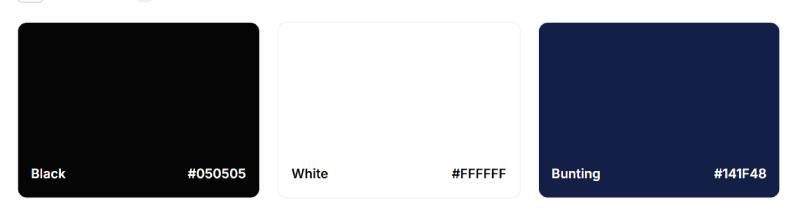
Deep Blue (#003B5C)
- Symbolic Meaning: Trust, stability, professionalism, depth
- Psychological Impact: Creates feelings of security and dependability, critical for enterprise software positioning
- Industry Connection: Commonly used in B2B technology and financial services to convey reliability
Bright Orange (#FF6600)
- Symbolic Meaning: Energy, innovation, forward-thinking, accessibility
- Psychological Impact: Draws attention and creates visual interest without overwhelming the primary brand color
- Industry Connection: Differentiates Manhattan Associates from competitors using exclusively blue color schemes
Dark Gray (#333333)
- Symbolic Meaning: Neutrality, balance, sophistication
- Psychological Impact: Provides contrast and readability in body text and secondary applications
- Industry Connection: Standard neutral for enterprise software interfaces and documentation
The blue-orange combination creates strong visual contrast while avoiding complementary color relationships that might appear too vibrant. This pairing has become increasingly common in technology branding, though Manhattan Associates adopted it earlier than many competitors.
What Typography Style Is Used in the Manhattan Associates Logo?
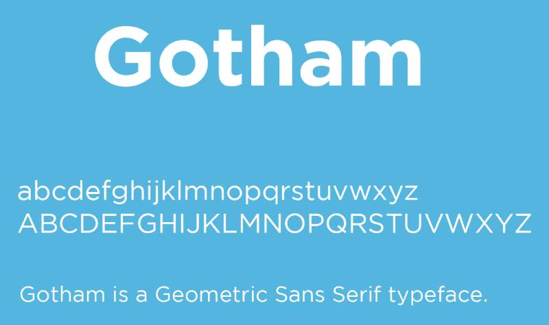
The logo employs a custom-modified geometric sans-serif typeface with distinct characteristics. The letterforms feature consistent stroke weights and minimal variation between thick and thin elements.
The typeface demonstrates influences from modernist typography, particularly geometric sans-serifs like Futura and Gotham. However, specific customizations differentiate it from standard fonts.
Letter spacing (or tracking) is wider than typical body text settings. This creates breathing room and improves legibility at small sizes, particularly on digital screens.
The capital letters maintain consistent heights without dramatic variation. This uniformity reinforces themes of precision and systematic organization central to the brand message.
What Are the Hidden Meanings in the Manhattan Associates Logo?
The letter spacing in “MANHATTAN” creates subtle vertical gaps that some observers interpret as representing warehouse aisles or distribution pathways. Whether intentional or coincidental, this reading aligns with the company’s core business.
The relationship between uppercase and lowercase letters follows a specific pattern. “MANHATTAN” appears in all caps while “ASSOCIATES” uses sentence case, creating hierarchy without requiring size differences.
Designers have noted that the letterforms’ geometric precision mirrors data visualization aesthetics. The clean lines resemble the charts and dashboards common in supply chain analytics platforms.
The absence of a separate symbol or icon is itself meaningful. This choice suggests confidence in name recognition and eliminates the need for visual shortcuts or metaphors.
How Does the Manhattan Associates Logo Compare to Competitor Logos?
Manhattan Associates competes with several major supply chain software providers, each with distinct visual identities. SAP uses its iconic blue and gray wordmark, while Oracle employs a red geometric symbol alongside its name.
Blue Yonder (formerly JDA Software) recently rebranded with a teal and purple color scheme. Their logo includes a circular symbol suggesting global connectivity.
Compared to these competitors, Manhattan Associates’ approach is notably restrained. The pure wordmark strategy positions the company as established and confident rather than seeking attention through bold symbols.
The orange accent provides differentiation in a sea of blue enterprise logos. While Salesforce and Workday also use blue extensively, few major supply chain vendors employ orange prominently.
Typography choices vary significantly across the competitive landscape. Some competitors use custom display fonts with personality, while others choose corporate standards. Manhattan Associates’ geometric approach falls in the middle, balancing distinctiveness with professional restraint.
What Are the Technical Specifications of the Manhattan Associates Logo?

Official Color Codes:
Primary Color: Deep Blue
- Hex: #003B5C
- RGB: (0, 59, 92)
- CMYK: (100, 36, 0, 64)
- Pantone: 302 C
Secondary Color: Bright Orange
- Hex: #FF6600
- RGB: (255, 102, 0)
- CMYK: (0, 60, 100, 0)
- Pantone: 1655 C
Neutral Color: Dark Gray
- Hex: #333333
- RGB: (51, 51, 51)
- CMYK: (0, 0, 0, 80)
- Pantone: Process Black C
Dimensions and Proportions:
Aspect Ratio: Approximately 5:1 (width to height)
Minimum Size Requirements:
- Print: 0.5 inches wide
- Digital: 100 pixels wide
- Smaller sizes should use the simplified icon version when available
Clear Space Specifications:
- Minimum clear space equals the height of the letter “A” in “MANHATTAN”
- This space must remain free of text, graphics, or other visual elements
- Applies to all sides of the logo
Official Usage Guidelines:
- Logo must not be redrawn, recreated, or modified
- Color variations limited to full color, white, and black
- Background colors must provide sufficient contrast
- Rotation or distortion strictly prohibited
- Effects like shadows, outlines, or gradients not permitted
What Cultural Impact Has the Manhattan Associates Logo Had?
Within the supply chain industry, the Manhattan Associates logo represents decades of technology evolution. Logistics professionals immediately recognize the mark at trade shows and in software demonstrations.
The 2018 rebrand signaled Manhattan Associates’ transformation to cloud-based platforms. Industry analysts interpreted the simplified design as reflecting the company’s modernization efforts and competitive repositioning.
The logo appears prominently in warehouse operations worldwide. Distribution center workers interact with Manhattan’s systems daily, making the mark familiar across retail, manufacturing, and third-party logistics operations.
Among enterprise software brands, Manhattan Associates exemplifies the shift away from symbolic logos. The wordmark-only approach influenced smaller supply chain technology companies seeking to appear equally established.
How Does the Manhattan Associates Logo Fit Into the Overall Brand Identity?

The logo serves as the foundation for Manhattan Associates’ complete visual system. Supporting elements include a defined color palette, typography standards, iconography sets, and photographic guidelines.
Marketing materials extend the logo’s geometric precision through grid systems and structured layouts. The same attention to organization and clarity that defines the logo characterizes all brand touchpoints.
Digital platforms translate the brand identity through consistent UI patterns. The deep blue and orange colors appear throughout software interfaces, creating recognition even without the logo present.
The brand voice mirrors the visual identity’s directness. Marketing copy emphasizes concrete results and technical capabilities rather than abstract promises or emotional appeals.
How Should the Manhattan Associates Logo Be Used?
Official Usage Do’s:
- Use only approved logo files from official brand resources
- Maintain specified clear space around all logo instances
- Apply approved color variations (full color, white, black only)
- Ensure sufficient contrast between logo and background
- Scale proportionally without distorting aspect ratio
- Use high-resolution files appropriate for output method
Official Usage Don’ts:
- Never recreate or redraw the logo
- Never apply unauthorized colors or gradients
- Never rotate, skew, or distort the logo
- Never add effects like shadows, glows, or outlines
- Never place on busy backgrounds that reduce legibility
- Never alter spacing, proportions, or individual letterforms
Where to Access Official Logos:
- Manhattan Associates partner portal (for authorized partners)
- Corporate communications team (for employees)
- Press kit resources (for media and analysts)
- Files typically provided in vector formats (AI, EPS, SVG) and raster formats (PNG, JPG)
Licensing Information:
- Logo usage requires authorization from Manhattan Associates
- Partners receive specific usage rights through partnership agreements
- Customers may use logo in approved contexts (case studies, testimonials)
- Unauthorized commercial use is prohibited
Trademark Protection Details:
- Manhattan Associates® is a registered trademark
- Logo protected under trademark and copyright law
- Company actively enforces trademark rights
- Proper trademark attribution required in formal publications
FAQ on The Manhattan Associates Logo
Where Can I Download the Official Manhattan Associates Logo?
Access official logo files through the Manhattan Associates partner portal if you’re an authorized partner.
Employees can request files from the corporate communications team. Media professionals and analysts can obtain logos from the company’s press kit resources, which include vector formats like SVG and EPS.
What File Formats Are Available for the Manhattan Associates Logo?
The logo comes in both vector graphics and raster formats.
Vector files include AI, EPS, and SVG for scalable applications. Raster formats like PNG and JPEG are provided for specific digital uses requiring fixed dimensions and DPI specifications.
Can I Use the Manhattan Associates Logo on My Website?
You need authorization from Manhattan Associates before displaying their logo.
Partners receive usage rights through partnership agreements. Customers may use the mark in approved contexts like case studies or testimonials, but unauthorized commercial use violates trademark protection.
What Colors Should I Never Use With the Manhattan Associates Logo?
Only approved color variations are permitted: full color, white, or black versions.
Never apply unauthorized colors, gradients, or effects. The official color palette includes deep blue (#003B5C), bright orange (#FF6600), and dark gray (#333333) only.
How Small Can the Manhattan Associates Logo Appear?
Minimum size requirements ensure legibility across different media.
For print applications, maintain at least 0.5 inches width. Digital displays require a minimum of 100 pixels wide. Smaller sizes compromise readability and violate brand guidelines.
Who Designed the Current Manhattan Associates Logo?
The 2018 logo resulted from collaboration between Manhattan Associates’ internal brand team and external design consultants.
Specific agency names haven’t been publicly disclosed. The design process aligned with the company’s transition to cloud-native supply chain solutions and subscription-based business models.
What Font Does the Manhattan Associates Logo Use?
The logo employs a custom-modified geometric sans-serif font with consistent stroke weights.
It’s not a standard typeface available commercially. The letterforms show influences from modernist fonts like Futura and Gotham but feature proprietary modifications for brand differentiation.
Has the Manhattan Associates Logo Always Looked the Same?
The company has refined its visual identity three times since 1990.
The original design featured geometric symbols and serif typography. The 2005 version introduced a swoosh element and sans-serif wordmark. The current 2018 iteration eliminated all symbols for pure typographic simplicity.
What Does the Manhattan in Manhattan Associates Represent?
The name references Manhattan’s famous grid system, exemplifying urban planning and organizational structure.
This connection reinforces the company’s focus on warehouse management systems and supply chain optimization. The geometric city layout metaphorically aligns with systematic logistics operations and distribution management.
Can I Modify the Manhattan Associates Logo for My Presentation?
Never recreate, redraw, or modify the logo in any way.
Prohibited alterations include rotation, distortion, color changes, added effects, or adjusted spacing. Use only approved logo files from official brand resources to maintain trademark integrity and brand guidelines compliance.
Conclusion
The Manhattan Associates logo represents more than corporate branding for a warehouse management system provider.
It reflects the company’s evolution from traditional enterprise software to cloud-based supply chain solutions. The 2018 redesign eliminated symbolic elements in favor of clean typography, aligning with modern logo design principles.
The deep blue and bright orange color palette creates visual differentiation within the logistics technology sector.
Understanding proper logo usage ensures brand guidelines compliance and maintains the mark’s integrity across digital platforms and marketing materials. The wordmark’s geometric precision communicates the systematic thinking that defines supply chain optimization.

Renowned for his expertise in logo design and visual branding, Bogdan has developed a multitude of logos for various clients.
His skills extend to creating posters, vector illustrations, business cards, and brochures. Additionally, Bogdan's UI kits were featured on marketplaces like Visual Hierarchy and UI8.
He also wrote in the past years on sites like Design Your Way, WebDesignerDepot, WPDean, Designmodo, Speckyboy, Slider Revolution, and more.
- The Windsurf Logo History, Colors, Font, And Meaning - 10 October 2026
- How to Remove Background From Product Photos (No Photoshop) - 10 October 2026
- How Designers can Build a Stronger Online Creative Identity - 9 October 2026

Bogdan Sandu is a seasoned designer who has been designing websites since 2008. Renowned for his expertise in logo design and visual branding, Bogdan has developed a multitude of logos for various clients. His skills extend to creating posters, vector illustrations, business cards, and brochures. Additionally, Bogdan's UI kits were featured on marketplaces like Visual Hierarchy and UI8. He also wrote in the past years on sites like Design Your Way, WebDesignerDepot, WPDean, Designmodo, Speckyboy, Slider Revolution, and more.
You Might Also Like