

The Bolt logo is the visual identity mark for Bolt, a one-click checkout platform co-founded in 2014 by Ryan Breslow and Eric Feldman. The current version, introduced in January 2023 and designed by London-based agency Koto, features a bold wordmark with a lightning bolt hidden in the negative space between the “l” and “t.”
As a logo, it sits at the center of Bolt’s entire brand system, appearing across product interfaces, merchant integrations, and marketing materials globally.
The checkout technology space has historically leaned on safe, trust-signaling blue palettes. Bolt’s 2023 rebrand broke from that pattern deliberately, choosing a high-voltage yellow to stand apart. It earned Fast Company’s recognition as one of the best brandings of 2023.
The current logo is a combination mark: a custom-drawn wordmark paired with a lightning bolt embedded through negative space. It was introduced in January 2023. Koto’s creative director Arthur Foliard led the project. Bolt itself was co-founded in 2014 by Ryan Breslow and Eric Feldman. The brand has gone through three main logo iterations since launch.
What Is the Bolt Logo?
The Bolt logo is a bold wordmark in “Lightning Yellow” (#E1FF00) featuring a lightning bolt hidden in negative space between the final two characters, created by Koto in January 2023. It replaced a blue sans-serif wordmark and is built around the idea of lightning-speed checkout.
- Design Type: Combination mark (wordmark + embedded icon via negative space)
- Primary Elements: Custom geometric sans-serif wordmark, negative-space lightning bolt between “l” and “t,” scalable icon variant
- Official Introduction Date: January 2023
- Designer/Agency: Koto (creative director: Arthur Foliard), with bespoke typeface by PangramPangram Foundry
- Trademark Status: The Bolt name and logo are trademarks of Bolt Financial Inc. (the US checkout platform), headquartered in San Francisco, CA. Note: Bolt Technology OÜ is a separate Estonian mobility company and is not affiliated with this checkout platform.
- Color Palette: Lightning Yellow (#E1FF00), Bolt Black (#11190C), White (#FFFFFF), and a warm gray (#CAC4B8) for secondary applications
- Usage Context: Checkout product interfaces, merchant co-branding, marketing campaigns, app icons, social media, and physical signage
How Has the Bolt Logo Evolved Over Time?
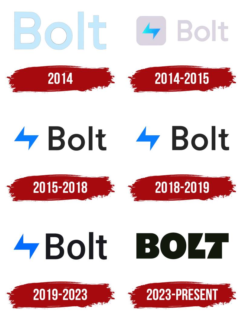
Bolt has gone through three distinct logo phases since 2014: an early functional wordmark, a blue sans-serif update that aligned with fintech norms, and the 2023 rebrand by Koto that broke category conventions entirely with yellow and embedded lightning bolt symbolism.
Original Bolt Logo (2014-2018)
- Years Active: 2014-2018
- Design Description: A clean, minimal wordmark with a standalone lightning bolt icon placed before the brand name. Simple and functional.
- Color Scheme: Dark blue and white
- Designer: In-house; specific designer not publicly documented
- Context: Bolt was co-founded in 2014 by Ryan Breslow and Eric Feldman as a checkout speed solution during a period of rapid growth in e-commerce. The logo prioritized clarity and instant category recognition.
- Key Changes from Previous: N/A (founding logo)
- Cultural Significance: Reflected the cautious, trust-first approach common to early fintech branding. Nothing unexpected, which was probably the point at the time.
Second Bolt Logo (2018-2022)
- Years Active: 2018-2022
- Design Description: A refined sans-serif wordmark, still in blue tones, with cleaner proportions. The standalone bolt icon was simplified further.
- Color Scheme: Blue and white
- Designer: In-house creative team
- Context: As Bolt grew its merchant network and moved into larger retail partnerships, the brand needed more polish and consistency across digital surfaces.
- Key Changes from Previous: Tighter letterforms, more consistent weight, slightly refined icon
- Cultural Significance: Solidly in the “trusted fintech blue” category. Functional, forgettable, safe. The company later addressed the need to stand out more effectively.
Current Bolt Logo (2023-Present)
- Years Active: 2023-present
- Design Description: Bold geometric wordmark set in a bespoke PangramPangram typeface. A lightning bolt sits in the negative space between “l” and “t.” The brand also includes 15 custom electrified glyphs, including slanted currency symbols and punctuation.
- Color Scheme: Lightning Yellow (#E1FF00), Bolt Black (#11190C), White, and warm gray accent
- Designer: Koto (Arthur Foliard, creative director)
- Context: Bolt needed to signal a new chapter after leadership changes and increased competition in the checkout space. The brief was “shockingly simple.”
- Key Changes from Previous: Dropped blue entirely. Replaced the separate bolt icon with one embedded in the wordmark via negative space. Introduced a fully custom typeface. Added an expressive illustration style called “Electric Dynamism.”
- Cultural Significance: Won Fast Company best branding of 2023. Generated significant design community debate about negative-space lightning bolt tropes, with comparisons to Virgin Media’s Volt and the sports app Buzzer.
What Do the Design Elements of the Bolt Logo Mean?
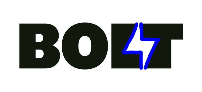
The Bolt logo uses a lightning bolt, embedded through negative space in the wordmark, to communicate the brand’s core promise: one-click checkout that moves at speed. Every element, from the heavy letterforms to the electric yellow, reinforces that single idea without decoration.
The negative space technique means most people see the wordmark first and notice the bolt later. That second-look moment is deliberate. It creates a small reward for the attentive viewer, building the kind of brand recall that flat wordmarks rarely achieve on their own.
Why Did Bolt Choose These Specific Colors?
Koto looked at the full competitive set and found blue was everywhere. PayPal, Stripe, early Bolt: almost every checkout brand defaulted to it. Moving to yellow was a specific strategic rejection of that sameness. The team explored both orange/red and yellow/lime before landing on Lightning Yellow. The lightning connection made it feel inevitable.
- Lightning Yellow (#E1FF00): Primary brand color. High-energy, attention-grabbing, directly tied to lightning imagery. Psychologically signals speed, optimism, and visibility. Stands alone in the checkout technology category.
- Bolt Black (#11190C): Not a pure black. Has a subtle green cast, which gives it warmth while maintaining authority. Used for the wordmark on light backgrounds and as the primary brand mode for merchant “ingredient brand” contexts.
- White (#FFFFFF): Clean base for digital and print applications. Provides breathing room against the high-saturation yellow.
- Warm Gray (#CAC4B8): Accent for supporting contexts. Prevents the palette from feeling too aggressive when yellow needs to step back.
Understanding color psychology matters here: yellow commands attention in ways blue simply does not. That was Foliard’s stated reasoning, and looking at the category, it is hard to argue.
What Typography Style Is Used in the Bolt Logo?
Koto commissioned a bespoke typeface from PangramPangram Foundry specifically for this identity. The result is a geometric sans-serif with extra-bold weight and distinctive angled cuts on certain terminals. It is not a standard off-the-shelf font.
PangramPangram built 15 custom “electrified” glyphs: characters users encounter frequently, like the @ symbol, currency signs, and exclamation points, each given subtle angular spikes that reference lightning. The typeface carries the energy of the brand even at the character level, which is rare.
For readability, the heavy weight means it holds up at small sizes. The angled cuts add personality without compromising legibility. Most display-weight custom fonts sacrifice one for the other.
Earlier Bolt versions used more generic sans-serif choices. The shift to a fully custom typeface marks the brand’s maturation from startup wordmark to a real brand system with proprietary assets.
What Are the Hidden Meanings in the Bolt Logo?
The most talked-about element is the lightning bolt in negative space between the “l” and “t.” Koto’s Arthur Foliard was explicit: it references Bolt’s original lightning bolt badge while unifying the icon and wordmark into a single mark.
The secondary layer is in the custom glyphs. Most people never notice the spiky @ sign or the angled currency symbols. But they add up subliminally, reinforcing the electric identity across every surface where the brand appears in body copy, not just headline usage.
There is also a structural meaning in the heaviness of the letterforms. Extra-bold weight in a sans-serif font reads as confident and direct. For a checkout platform, that maps neatly onto the brand promise: no complexity, no hesitation.
The one criticism the design community raised was similarity to other negative-space lightning bolt logos, specifically Virgin Media’s Volt and sports app Buzzer. Foliard acknowledged the proximity but defended the execution as distinctly more legible and ownable in context.
How Does the Bolt Logo Compare to Competitor Logos?
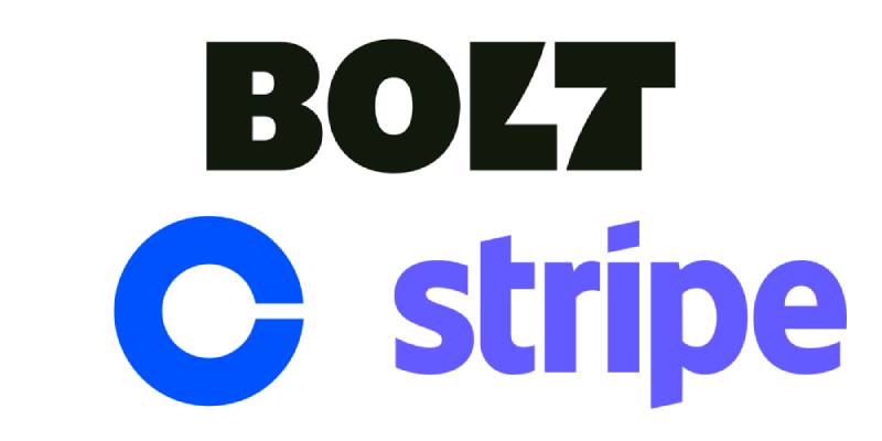
Checkout and payment technology brands have almost universally defaulted to blue palettes and clean sans-serif wordmarks. The Bolt rebrand directly addressed this. Koto’s team surveyed the space and found, in Foliard’s words, “a sea of sameness.”
Look at the Stripe logo: purple-leaning blue, clean wordmark, minimal. Professional but unremarkable in terms of energy.
The Coinbase logo follows a similar logic: blue, clean, safe. Communicates trust through category conformity rather than distinctive design choices.
Bolt’s Lightning Yellow sits in a completely different category territory. The only comparable yellow in tech at this scale would be Snapchat, and that is a consumer social app, not a B2B checkout tool. That gap is exactly why the color works for Bolt: it signals the brand before anyone reads the wordmark.
The negative-space lightning bolt technique is where the comparisons get uncomfortable. Virgin Media’s Volt, sports app Buzzer, and a handful of other brands use similar executions. But in direct comparison, the Bolt mark is generally considered the most legible and intentional version of the idea.
Against fintech peers like the Robinhood logo or the DocuSign logo, Bolt’s identity reads as considerably more confident and personality-forward.
What Are the Technical Specifications of the Bolt Logo?
Official Color Codes
- Lightning Yellow (Primary): Hex #E1FF00, RGB (225, 255, 0), CMYK (12, 0, 100, 0)
- Bolt Black (Secondary): Hex #11190C, RGB (17, 25, 12), CMYK (32, 0, 52, 90)
- White (Base): Hex #FFFFFF, RGB (255, 255, 255), CMYK (0, 0, 0, 0)
- Warm Gray (Accent): Hex #CAC4B8, RGB (202, 196, 184), CMYK (0, 3, 9, 21)
No official Pantone codes are publicly documented in Bolt’s brand guidelines.
Dimensions and Proportions
- Aspect Ratio: Not publicly specified. The wordmark is wide-format by nature of the heavy letterforms and bolt negative space.
- Minimum Size: Not published in public guidelines. Standard practice for this type of wordmark suggests no smaller than 80px wide in digital contexts to preserve the negative-space bolt legibility.
- Clear Space: Bolt’s official guidelines specify clear space requirements but do not publish exact measurements publicly. The icon variant exists specifically for contexts where the wordmark’s clear space requirements cannot be met.
- File Formats: SVG and PNG are available through Bolt’s official press resources at bolt.com. Usage requires written permission from Bolt per their brand guidelines.
- Logo Variants: Full wordmark (Lightning Yellow on Bolt Black), inverted wordmark (Bolt Black on white/yellow), icon-only variant for compact contexts, and a restrained “ingredient brand” version in Bolt Black for merchant co-branding.
What Cultural Impact Has the Bolt Logo Had?
The January 2023 launch of the new Bolt identity immediately triggered debate across the design community. Fast Company named it one of the best brandings of 2023.
The negative-space lightning bolt became a flashpoint in a broader conversation about originality in logo design. When Koto posted the work, Greg Quinton from Superunion publicly pointed to Virgin Media’s Volt identity, which used a nearly identical technique. Sports app Buzzer joined the comparison thread.
Fast Company’s defense of the logo argued that design tropes are not inherently problems. Lightning bolt symbolism has a centuries-long history of representing speed and energy. What matters is execution, and in this case the execution was considered strong enough to own the idea in the checkout category.
The brand also influenced how other fintech and checkout platforms started thinking about color. Blue had been unquestioned for years. Bolt’s yellow raised the question of whether security and trust actually require blue, or whether that association is just habit.
Among designers, the bespoke PangramPangram typeface attracted separate attention. Custom type at this level is a real investment, and it signaled that Bolt was serious about owning its visual identity long-term.
How Does the Bolt Logo Fit Into the Overall Brand Identity?
The logo is described internally as the “cornerstone” of the rebrand, and every other element of the brand system connects back to it. The lightning bolt that lives in the wordmark reappears throughout the system in electrified glyphs, angled currency signs, illustration line work, and motion design that references electrical discharge.
Koto and Bolt’s joint positioning statement, “Shockingly Simple,” ties directly to the lightning imagery.
The illustration style, called “Electric Dynamism,” uses dramatic wide-angle perspective and energetic movement to extend the bolt idea into photography and illustration without literally repeating the icon everywhere.
The brand guidelines cover everything from the logo to a new sonic identity. Bolt’s multimedia team analyzed city sounds to find the average musical key of urban environments and built an in-app sound library called “Qui” from that starting point. That level of systemic thinking is unusual and reflects a brand that treats the logo as one node in a larger connected identity.
The brand style guide also handles the dual-mode behavior of the mark: expressive Lightning Yellow when Bolt stands alone, and restrained Bolt Black when acting as an ingredient brand within a merchant’s checkout flow.
Compared to simpler single-mode identities like the Linear logo or the Retool logo, Bolt’s system is significantly more expressive while still maintaining operational consistency.
How Should the Bolt Logo Be Used?
Official Bolt checkout platform brand resources are available through bolt.com’s press resources. The guidelines are strict.
What you can do:
- Reference the Bolt name and logo in editorial or journalistic contexts where coverage of the company is the clear purpose
- Use official press kit assets downloaded from Bolt’s approved media pages
- Include the required trademark attribution line: “The Bolt name and logo are trademarks of Bolt Financial Inc. or its affiliates. All rights reserved.”
What you cannot do:
- Register, copy, or alter the Bolt logo in any form
- Combine Bolt branding with other visual elements or trademarks, including your own brand marks
- Use the logo in ways that suggest endorsement or partnership without written authorization
- Publish any media assets without written permission from Bolt
- Use the logo commercially without a licensing agreement
Where to access official files: Bolt’s press resources are available through bolt.com. SVG and PNG formats are provided for approved use cases. Any usage outside editorial coverage requires written approval from Bolt’s brand team.
Trademark protection: The Bolt logo is a registered trademark of Bolt Financial Inc. Any goodwill arising from use of the mark belongs to Bolt, not to third parties using it under permission.
FAQ on The Bolt Logo
What does the Bolt logo look like?
The Bolt logo is a bold wordmark in Lightning Yellow with a lightning bolt hidden in negative space between the “l” and “t.” The typeface is a custom geometric sans-serif built by PangramPangram Foundry. Clean, heavy, and immediately recognizable.
Who designed the current Bolt logo?
London-based agency Koto designed it, led by creative director Arthur Foliard. The bespoke typeface came from PangramPangram Foundry. The rebrand launched in January 2023 and won Fast Company’s best branding of that year.
What color is the Bolt logo?
The primary color is Lightning Yellow, hex #E1FF00. Secondary colors include Bolt Black (#11190C), white (#FFFFFF), and a warm gray accent (#CAC4B8). The yellow was chosen specifically to break from the blue-dominated color palette used by most checkout competitors. Note: if you are looking at a green Bolt logo, you may be looking at Bolt Technology OÜ, the unrelated Estonian mobility company at bolt.eu.
What is the hidden symbol in the Bolt logo?
A lightning bolt sits in the negative space between the “l” and “t” in the wordmark. Most people notice the wordmark first and the bolt second. That delayed recognition is intentional.
Has the Bolt logo always looked like this?
No. Bolt used a blue sans-serif wordmark with a separate bolt icon for most of its history since 2014. The 2023 rebrand dropped blue entirely, merged the bolt into the wordmark via negative space design, and introduced a fully custom typeface. Three main logo iterations total.
What font does the Bolt logo use?
It uses a bespoke typeface commissioned from PangramPangram Foundry. The custom font includes 15 electrified glyphs: characters like @, currency signs, and punctuation given subtle angular cuts that reference lightning.
Why did Bolt change its logo?
The old blue wordmark blended in with every other checkout and fintech brand. Bolt needed something ownable and scalable across a growing product range. The brief was clear: stand apart. Koto’s answer was Lightning Yellow and a bolt embedded directly in the typography.
Is the Bolt logo trademarked?
Yes. The Bolt logo and wordmark are trademarks of Bolt Financial Inc., the US-based checkout platform. You cannot copy, alter, or register the mark. Any use requires written permission. Note: Bolt Technology OÜ is a separate Estonian company with its own unrelated trademarks.
How does the Bolt logo compare to other payment platform logos?
Most payment and checkout logos rely on blue and clean sans-serif wordmarks. The Stripe logo and similar marks prioritize safety over personality. Bolt’s Lightning Yellow and embedded bolt symbol put it in a completely different visual category, which was the entire point of the 2023 rebrand.
Where can I download the official Bolt logo?
Official Bolt logo assets in SVG and PNG formats are available through Bolt’s press resources at bolt.com. Written permission from Bolt is required before publishing any assets. Commercial use without a licensing agreement is not permitted under their brand guidelines.
Conclusion
The Bolt logo is one of the more deliberate rebrands in checkout technology history. Koto took a forgettable blue wordmark and replaced it with something the industry had never seen: Lightning, heavy custom type, and a bolt hidden in negative space.
The bolt logo color hex codes, the PangramPangram typeface, the 15 electrified glyphs – none of it happened by accident.
Every technical specification ties back to a single brand idea: lightning-speed checkout. That kind of systemic thinking is what separates a good logo from a complete visual identity.

Renowned for his expertise in logo design and visual branding, Bogdan has developed a multitude of logos for various clients.
His skills extend to creating posters, vector illustrations, business cards, and brochures. Additionally, Bogdan's UI kits were featured on marketplaces like Visual Hierarchy and UI8.
He also wrote in the past years on sites like Design Your Way, WebDesignerDepot, WPDean, Designmodo, Speckyboy, Slider Revolution, and more.
- Refined Baskerville Font Pairing for Editorial Design - 18 October 2026
- How to Design an Album Cover That Still Works as a Tiny Thumbnail - 18 October 2026
- Why Final Rendering Becomes a Bottleneck in 3D Design Projects - 17 October 2026

Bogdan Sandu is a seasoned designer who has been designing websites since 2008. Renowned for his expertise in logo design and visual branding, Bogdan has developed a multitude of logos for various clients. His skills extend to creating posters, vector illustrations, business cards, and brochures. Additionally, Bogdan's UI kits were featured on marketplaces like Visual Hierarchy and UI8. He also wrote in the past years on sites like Design Your Way, WebDesignerDepot, WPDean, Designmodo, Speckyboy, Slider Revolution, and more.
You Might Also Like


