


The Robinhood logo is the official visual mark of Robinhood Markets, Inc., the commission-free investing platform founded in 2013. It combines a wordmark with a distinctive feather icon, representing the brand’s core promise of democratizing finance for everyday people. Within fintech branding history, Robinhood sits at an interesting intersection: a challenger brand that had to look credible enough for financial services while staying approachable for first-time investors. The logo has gone through meaningful changes since launch, with the current iteration introduced in 2021 as part of a broader visual rebrand ahead of the company’s IPO.
What Is the Robinhood Logo?
The Robinhood logo is a combination mark featuring a custom green wordmark paired with a stylized feather symbol. Introduced in its current form in 2021, it was developed in-house alongside agency partners as part of a full brand overhaul. The feather references the folkloric Robin Hood character and signals the brand’s accessibility-first mission.
- Design Type: Combination mark (wordmark + icon)
- Primary Elements: Stylized feather icon, custom sans-serif wordmark
- Official Introduction Date: 2021 (current version); original logo launched 2013
- Designer/Agency: Developed internally with external creative partners
- Trademark Status: Registered trademark of Robinhood Markets, Inc.
- Color Palette:
- Robinhood Green: #00C805
- Black: #000000
- White: #FFFFFF
- Usage Context: Mobile app, website, marketing materials, investor relations, merchandise, digital platforms
How Has the Robinhood Logo Evolved Over Time?

The Robinhood logo has gone through two distinct phases since 2013. The original version leaned into a literal feather-and-arrow concept, while the 2021 redesign stripped things back significantly, moving toward a cleaner, more confident mark suited for a publicly traded company.
Original Robinhood Logo (2013-2021)
- Years Active: 2013-2021
- Design Description: A more literal feather quill icon paired with a green wordmark set in a rounded, approachable typeface. The overall look was friendlier but felt less premium.
- Color Scheme: Green and white, with some darker accent tones
- Designer: Early branding developed by the founding team
- Context: Launched as a startup trying to appeal to millennials who were skeptical of traditional brokerages
- Key Changes from Previous: N/A (first version)
- Cultural Significance: Positioned Robinhood as a disruptor, the “people’s brokerage” at a time when most financial apps looked either stiff or overcomplicated
Redesigned Robinhood Logo (2021-Present)
- Years Active: 2021 to present
- Design Description: A refined feather icon with cleaner geometry, paired with a custom bold wordmark. The mark is more structured, scalable across digital and print, and has a noticeably more mature feel.
- Color Scheme: Signature Robinhood Green (#00C805), black, and white
- Designer: Internal brand team with external creative collaboration
- Context: Rolled out ahead of Robinhood’s Nasdaq IPO in July 2021. The company needed a brand that could hold up in a very different context than a scrappy startup.
- Key Changes from Previous: Simplified icon geometry, more custom typography, bolder overall presence
- Cultural Significance: Marked a turning point. Robinhood was no longer just a disruptor. It was trying to be an institution, and the logo had to reflect that.
What Do the Design Elements of the Robinhood Logo Mean?

Every element in the Robinhood logo connects back to the brand’s core idea: that investing shouldn’t be reserved for the wealthy. The feather, the green, the clean type – none of it is accidental. Each piece carries symbolic weight that reinforces what the company stands for.
What Does the Feather Symbol Represent?
The feather is a direct reference to Robin Hood, the folkloric English outlaw who stole from the rich to give to the poor.
It’s a clever choice because it carries instant cultural recognition without needing explanation.
In the context of a logo, the feather also signals lightness, accessibility, and movement – all relevant to what the app promises. It’s not a heavy, imposing mark like you’d see from a traditional bank. That contrast is very much the point.
Why Did Robinhood Choose These Specific Colors?

- Robinhood Green (#00C805)
- Color name: Robinhood Green
- Hex: #00C805
- Symbolic meaning: Growth, money, optimism
- Psychological impact: Green signals financial gain and forward momentum. It’s also associated with nature and balance, which softens the intensity of financial risk.
- Brand/industry connection: Green is strongly tied to color psychology in finance – think stock tickers, profit indicators, and “go” signals. Robinhood pushed it brighter and more electric than legacy banks would dare.
- Black (#000000)
- Color name: Black
- Hex: #000000
- Symbolic meaning: Authority, clarity, sophistication
- Psychological impact: Grounds the brightness of the green. Prevents the brand from feeling too casual or playful for a financial platform.
- Brand/industry connection: Used in the wordmark to signal credibility alongside the bolder green accent
- White (#FFFFFF)
- Color name: White
- Hex: #FFFFFF
- Symbolic meaning: Simplicity, transparency, openness
- Psychological impact: Creates breathing room in the overall color palette, keeping the brand feel clean and modern
- Brand/industry connection: Common in fintech and green logos across the finance sector, especially for apps targeting younger demographics
What Typography Style Is Used in the Robinhood Logo?
The wordmark uses a custom sans-serif typeface developed specifically for the brand.
It’s bold, geometric, and has tight kerning that gives the name a compact, confident presence.
The letterforms are clean without being cold – there’s a subtle warmth to the curves that keeps it from feeling purely corporate. Earlier versions used a rounder, softer type treatment. The 2021 update pushed toward something more structured, which matches the maturity the company was aiming for heading into its IPO.
From a readability standpoint, the sans-serif choice works well at small sizes, which matters a lot when your primary surface is a mobile app icon.
What Are the Hidden Meanings in the Robinhood Logo?
The most intentional “hidden” element is how the feather doubles as both a literal quill and an abstract upward arrow shape.
Depending on how you look at it, the feather’s tip points upward – a subtle nod to rising markets and financial growth.
That said, the design team has kept messaging around the logo fairly straightforward. There’s no confirmed FedEx-arrow level of hidden detail, but the arrow read is widely noted by designers who study the mark. Whether deliberate or not, it works. It adds a layer of meaning that makes the logo more interesting under scrutiny, which is exactly what good logo design principles aim for.
How Does the Robinhood Logo Compare to Competitor Logos?

Robinhood’s logo sits in a distinct position within fintech branding. Where legacy brokerages lean on dark blues, crests, and serif type to signal trust, Robinhood went the opposite direction – bright green, minimal, mobile-first. That contrast is exactly the point.
Compared to similar platforms, here’s how the visual identities stack up:
- Robinhood vs. Coinbase: Both target younger investors, but Coinbase uses a deeper blue and a more abstract geometric mark. Robinhood’s green and feather feel warmer and more narrative-driven.
- Robinhood vs. Stripe: Stripe is almost aggressively minimal – purple wordmark, no symbol. Robinhood has a stronger visual identity because the feather icon gives it a recognizable shorthand that works at app-icon size.
- Robinhood vs. Fidelity/Charles Schwab: Legacy brokerages use conservative color schemes and institutional typography. Next to those, Robinhood reads as genuinely different – which is a competitive advantage when you’re targeting people who distrust those institutions.
- Robinhood vs. Webull: Webull uses a bull icon and red/black palette, leaning harder into trading culture. Robinhood’s imagery is softer and more inclusive by comparison.
The key differentiator is emphasis. Most financial brands emphasize stability. Robinhood emphasizes access. The logo communicates that clearly.
What Are the Technical Specifications of the Robinhood Logo?
Official Color Codes
- Primary Color: Robinhood Green
- Hex: #00C805
- RGB: (0, 200, 5)
- CMYK: (100, 0, 97, 22)
- Pantone: PMS 7739 C (approximate)
- Secondary Color: Black
- Hex: #000000
- RGB: (0, 0, 0)
- CMYK: (0, 0, 0, 100)
- Pantone: Process Black C
- Accent Color: White
- Hex: #FFFFFF
- RGB: (255, 255, 255)
- CMYK: (0, 0, 0, 0)
- Pantone: N/A
Dimensions and Proportions
- Aspect ratio: Horizontal lockup is approximately 4:1 (width to height); icon-only version is roughly 1:1
- Minimum size requirements: The feather icon should not be reproduced smaller than 16px in digital contexts; the full wordmark minimum is approximately 80px wide
- Clear space specifications: A minimum clear space equal to the height of the “R” in the wordmark should be maintained on all sides
- Official usage guidelines: Available through Robinhood’s press kit and brand assets page; vector graphics formats (SVG, EPS) are preferred for all scalable applications. For raster use, high-DPI PNG files are recommended to avoid quality loss.
What Cultural Impact Has the Robinhood Logo Had?
Few fintech logos have become as culturally loaded as Robinhood’s in such a short time.
The green feather became a flashpoint during the January 2021 GameStop trading frenzy. When Robinhood restricted buying on certain stocks, the logo appeared in news coverage, protest graphics, and social media criticism in ways the brand team almost certainly didn’t plan for.
That’s the thing about a strong visual identity – it takes on meaning beyond what the company controls.
Before that, the feather had been largely positive in public perception: a scrappy challenger brand making markets accessible to regular people. Post-2021, the logo carries more complicated associations for some users. That tension hasn’t gone away entirely, though the 2021 rebrand did help reframe the visual identity in a more mature, less startup-ish direction.
The logo also contributed to a broader shift in how fintech companies approach branding. Bright, bold, icon-forward identities became more common after Robinhood proved the format worked at scale. You can see that influence in how newer tech company logos approach color and symbol design.
How Does the Robinhood Logo Fit Into the Overall Brand Identity?
The logo doesn’t exist in isolation. It’s the anchor for a broader visual system that includes the app UI, marketing materials, and the brand’s voice.
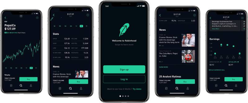
Robinhood’s overall brand guidelines tie the logo’s green tightly to a color system used throughout the app – green for gains, which is both a functional UI choice and a brand reinforcement. Every time a user sees a positive return highlighted in that specific green, it connects back to the logo.
The feather icon works independently as an app icon, which is important for mobile-first brands.
The brand style guide also governs how the logo interacts with photography, illustration, and the brand’s custom typeface across different platforms. The system is cohesive without being rigid – there’s flexibility built in for different contexts, from app store listings to billboard advertising.
Compared to something like the Coinbase logo or the Stripe logo, Robinhood’s identity has more narrative warmth. The folkloric reference gives the brand story something to build on.
How Should the Robinhood Logo Be Used?
Official Usage Guidelines
- Do: Use the logo in its approved color variations (green on white, white on dark backgrounds, black on light backgrounds)
- Do: Maintain required clear space around the logo at all times
- Do: Download assets directly from Robinhood’s official press kit or newsroom
- Don’t: Alter the logo colors, proportions, or typeface
- Don’t: Place the logo on busy backgrounds that reduce legibility
- Don’t: Use the logo in ways that imply endorsement, partnership, or affiliation without written permission from Robinhood Markets, Inc.
- Don’t: Recreate the logo from scratch or use unofficial versions found on third-party sites
Where to Access Official Logos
- Robinhood’s official press kit: newsroom.robinhood.com
- Available formats typically include SVG, PNG (transparent background), and EPS
Licensing and Trademark Protection
- The Robinhood name, feather icon, and wordmark are registered trademarks of Robinhood Markets, Inc.
- Unauthorized commercial use, modification, or reproduction is prohibited
- Editorial and journalistic use is generally permitted under fair use principles, but commercial applications require explicit approval
- Developers building integrations with Robinhood’s API should follow the brand usage guidelines published alongside the developer documentation
FAQ on The Robinhood Logo
What does the Robinhood logo look like?
The Robinhood logo is a combination mark: a stylized green feather icon paired with a bold, custom wordmark.
The feather sits to the left of the text. The overall look is clean, minimal, and unmistakably modern for a commission-free trading platform.
What color is the Robinhood logo?
The primary color is Robinhood Green, hex #00C805. It’s a bright, electric green – nothing like the muted tones traditional brokerages use.
Black and white round out the palette depending on background and usage context.
What font does the Robinhood logo use?
The wordmark uses a custom sans-serif typeface. It’s geometric, bold, and tightly spaced.
Robinhood didn’t use an off-the-shelf typeface – the letterforms were refined specifically for the brand to work well at small mobile sizes.
What does the feather in the Robinhood logo mean?
It references Robin Hood, the English folk hero who took from the rich to give to the poor. That’s the brand’s whole positioning in one symbol.
The feather also reads as a subtle upward arrow – a nod to market growth and financial access.
When did Robinhood redesign its logo?
The most recent redesign happened in 2021, timed around the company’s Nasdaq IPO.
The updated Robinhood brand identity simplified the feather geometry and introduced a more structured wordmark, replacing the softer, rounder original version from 2013.
Is the Robinhood logo trademarked?
Yes. The feather icon, wordmark, and the Robinhood name are all registered trademarks of Robinhood Markets, Inc.
Unauthorized commercial use is prohibited. Editorial use is generally fine, but anything beyond that needs written approval from the company.
Where can I download the official Robinhood logo?
Officially through Robinhood’s press newsroom at newsroom.robinhood.com. They provide PNG and SVG files for press and editorial use.
Avoid pulling the Robinhood logo PNG from random third-party sites – unofficial versions are often wrong in color or proportion.
How does the Robinhood logo compare to other fintech logos?
Most competing bank logos and brokerage marks lean on deep blues and conservative type. Robinhood went the opposite direction.
The bright green and feather symbol make it one of the more distinctive investing app branding choices in the space.
Has the Robinhood logo changed since the company launched?
Twice, in meaningful ways. The 2013 launch version had a softer, more literal feather illustration.
The current version, part of the 2021 Robinhood visual rebrand, is sharper and more scalable – built for a company that had grown well beyond its scrappy startup origins.
What design principles guided the Robinhood logo?
Minimalist design thinking shaped most of the decisions: reduce to essentials, make it work at any size, keep the symbolism clear.
The feather needed to function as a standalone app icon and alongside the wordmark without losing meaning in either context.
Conclusion
The Robinhood logo is more than a pretty mark – it’s a deliberate piece of brand communication that has held up through IPOs, controversies, and a full visual rebrand.
The feather icon, the electric green, the custom wordmark – each decision connects back to the platform’s core promise of democratizing investing.
For a fintech brand targeting first-time investors, that kind of clarity in visual identity matters more than most companies realize.
The Robinhood corporate identity proves that strong font choices, a focused color theory approach, and a symbol with genuine narrative weight can carry a brand far beyond its startup origins.

Renowned for his expertise in logo design and visual branding, Bogdan has developed a multitude of logos for various clients.
His skills extend to creating posters, vector illustrations, business cards, and brochures. Additionally, Bogdan's UI kits were featured on marketplaces like Visual Hierarchy and UI8.
He also wrote in the past years on sites like Design Your Way, WebDesignerDepot, WPDean, Designmodo, Speckyboy, Slider Revolution, and more.
- Canva vs PowerPoint: Which Is Better for Presentations? - 22 September 2026
- How to Install Fonts on Mac (Step-by-Step Guide) - 20 September 2026
- From Mockup to Code: How AI-Augmented Development Speeds Up the Design Handoff - 19 September 2026

Bogdan Sandu is a seasoned designer who has been designing websites since 2008. Renowned for his expertise in logo design and visual branding, Bogdan has developed a multitude of logos for various clients. His skills extend to creating posters, vector illustrations, business cards, and brochures. Additionally, Bogdan's UI kits were featured on marketplaces like Visual Hierarchy and UI8. He also wrote in the past years on sites like Design Your Way, WebDesignerDepot, WPDean, Designmodo, Speckyboy, Slider Revolution, and more.
You Might Also Like


