The Cohere logo represents one of the most distinctive visual identities in the enterprise AI space. Designed by Pentagram in 2023, this mark captures the essence of natural language processing through organic, cell-like forms.
Cohere Inc. was founded in 2019 by Aidan Gomez, Ivan Zhang, and Nick Frosst in Toronto, Canada. The current logo version launched in April 2023 and represents the company’s second major visual identity. Pentagram partners Jody Hudson-Powell and Luke Powell led the rebrand project over nearly a year of development.
The mark has undergone one significant iteration since the company’s founding. Its design draws from biological patterns found in nature, specifically Voronoi diagrams that appear in everything from giraffe coats to honeycomb structures.
What is the Cohere Logo?
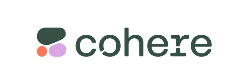
The Cohere logo is a combination mark featuring an abstract symbol of three organic cells forming a stylized “C” alongside a custom wordmark. Pentagram designed it in 2023 using Voronoi pattern mathematics. The design represents the fusion of natural forms with computational precision, symbolizing how language AI bridges human and machine communication.
Design attributes:
- Design Type: Combination mark (symbol + wordmark)
- Primary Elements: Three cell-like shapes forming an abstract “C,” custom wordmark with cell-like openings in characters
- Official Introduction Date: April 2023
- Designer/Agency: Pentagram London (Jody Hudson-Powell and Luke Powell)
- Trademark Status: Registered trademark of Cohere Inc.
- Color Palette: Mine Shaft (#212121), Alabaster (#FAFAFA), Bittersweet (#FF7759), plus secondary pinks, purples, and gradient variations
- Usage Context: API platform, website, developer dashboard, playground environment, marketing materials, enterprise communications
How Has the Cohere Logo Evolved Over Time?
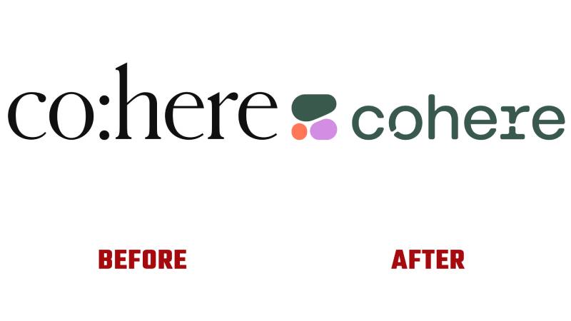
The Cohere logo has gone through two distinct phases since the company’s founding in 2019.
The original mark was simple. It featured a text-based approach with an internal colon element.
The 2023 rebrand brought a complete transformation. Pentagram introduced the cell-based visual language that defines the brand today.
Original Cohere Logo (2019-2023)
- Years Active: 2019-2023
- Design Description: Text-based wordmark with an internal colon punctuation element referencing the language and code theme
- Color Scheme: Simple, likely monochromatic presentation
- Designer: Unknown (likely in-house or early-stage design)
- Context: Created during the company’s startup phase when Cohere was establishing itself as an NLP provider
- Key Changes from Previous: First logo, no predecessor
- Cultural Significance: Represented the technical, code-centric nature of the platform’s early positioning
Current Cohere Logo (2023-Present)
- Years Active: 2023-present
- Design Description: Abstract three-cell symbol forming a “C” paired with custom wordmark featuring Voronoi-inspired openings in letterforms
- Color Scheme: Deep charcoal, clean white, vibrant coral-orange, with gradient variations in pinks and purples
- Designer: Pentagram London (Jody Hudson-Powell and Luke Powell)
- Context: Introduced as AI became mainstream news, positioning Cohere as an accessible enterprise solution rather than experimental tech
- Key Changes from Previous: Complete departure from text-only approach, introduction of symbolic element, custom typeface family, expanded color palette, comprehensive visual system
- Cultural Significance: Represents the “new nature” concept that merges organic forms with computational precision
What Do the Design Elements of the Cohere Logo Mean?

The Cohere logo uses biological cell imagery combined with mathematical Voronoi patterns.
This represents the platform’s core function. It bridges human language and machine understanding.
The three cells in the symbol show different stages of expansion. They come together to build something new, just like how the AI models process and generate language.
Why Did Cohere Choose These Specific Colors?
The primary dark gray (Mine Shaft, #212121) provides a foundation of stability and intelligence.
It grounds the identity without the coldness of pure black.
Alabaster (#FAFAFA) creates clean contrast. It references the clarity that AI brings to complex information processing.
Bittersweet (#FF7759) adds human warmth and energy. This coral-orange accent prevents the brand from feeling too clinical or robotic.
The secondary palette includes pinks, purples, and neon-tinged oranges. These colors feel synthetic yet organic, matching the “new nature” concept at the brand’s core. Understanding color psychology shows why this combination works for enterprise AI positioning.
What Typography Style Is Used in the Cohere Logo?
Pentagram created a complete custom typeface family for Cohere.
The wordmark uses Cohere Text, which has a faux-mono style. It comes in three weights (bold, regular, light) plus italics.
Cohere Headline features automatic Voronoi cell cuts dispersed through characters as you type. There’s a variable version for precise control over weight and cut placement.
Cohere Outline was built specifically for Cohere For AI initiatives. Cohere Mono handles code environments and technical snippets. This approach to typography creates consistency across all brand touchpoints.
What Are the Hidden Meanings in the Cohere Logo?
The three cells represent different stages of growth and expansion. They mirror how language models learn and evolve.
Voronoi patterns weren’t chosen randomly. They appear throughout nature in giraffe coats, dragonfly wings, and honeycomb structures.
The openings in the letterforms create cell-like components. Each character becomes a microcosm of the platform’s interconnected nature.
Pentagram stated this represents the relationship between humans and machines learning in tandem. The pebble-like shapes carry a calming quality, though this spa-like feel may not have been entirely intentional.
How Does the Cohere Logo Compare to Competitor Logos?
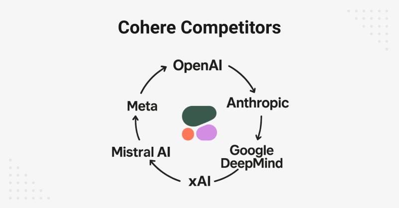
Most AI company logos lean into predictable tropes. Think silvery metallics, futuristic purples, and geometric abstraction.
Cohere breaks from this pattern completely. The organic shapes and warm color accents create immediate differentiation.
The Anthropic logo takes a different approach with geometric simplicity.
The DeepMind logo uses abstract neural network imagery.
The Mistral AI logo employs wind-inspired symbolism.
Cohere stands out among tech company logos by avoiding Corporate Memphis aesthetics and sci-fi cliches. The identity feels more mature and business-focused while remaining visually engaging. Where competitors often feel cold or abstract, Cohere’s cell-based approach adds approachability without sacrificing sophistication.
What Are the Technical Specifications of the Cohere Logo?
Official Color Codes
Primary Dark (Mine Shaft):
Primary Light (Alabaster):
- Hex: #FAFAFA
- RGB: (250, 250, 250)
- CMYK: (0, 0, 0, 2)
Accent (Bittersweet):
- Hex: #FF7759
- RGB: (255, 119, 89)
- CMYK: (0, 53, 65, 0)
Dimensions and Proportions
- Aspect Ratio: The symbol maintains a roughly square proportion, with the full lockup following standard horizontal wordmark ratios
- Minimum Size Requirements: Should maintain legibility of cell openings in wordmark characters
- Clear Space Specifications: Defined by the height of the symbol cell elements
- File Formats: Available in vector graphics (SVG), PNG with transparency, and other standard formats
- Official Usage Guidelines: Comprehensive brand guidelines provided by Pentagram, including Figma plugins and Cinema 4D tools for creating compliant brand assets
What Cultural Impact Has the Cohere Logo Had?
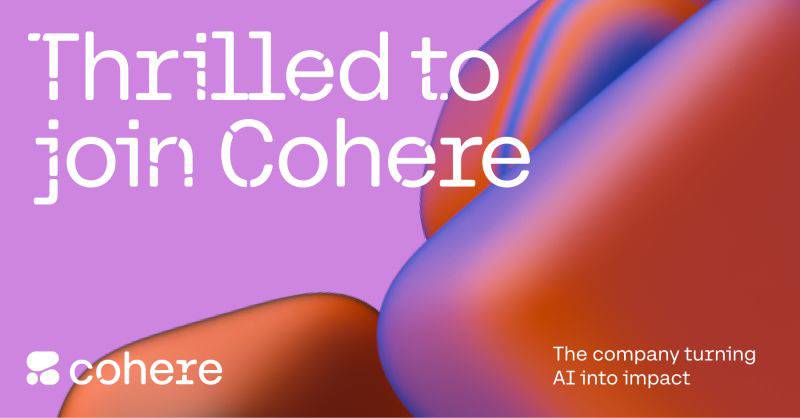
The Cohere rebrand arrived at a turning point for AI public perception. ChatGPT had just exploded into mainstream consciousness.
Every AI company was scrambling for visual differentiation.
Pentagram’s work showed that enterprise AI branding could be warm and approachable without losing credibility.
The “new nature” concept influenced how other AI startups think about positioning. It proved that biological imagery and organic forms could represent artificial intelligence just as effectively as circuits and neural network diagrams.
How Does the Cohere Logo Fit Into the Overall Brand Identity?

The logo sits at the center of a complete visual system. Every element connects back to the cell-based language.
Icons use monolinear lines with Voronoi-inspired shapes. Endpoint pictograms act as visual shorthand for different API functions.
The website, dashboard, and playground environment all share this visual DNA. Users encounter the same cell patterns whether they’re reading marketing materials or writing code in the platform.
Pentagram delivered custom design tools to maintain consistency. These include Figma plugins for creating Voronoi patterns and Cinema 4D tools for 3D applications. This comprehensive brand style guide approach ensures the identity can grow with the company.
How Should the Cohere Logo Be Used?

Official Usage Guidelines
Do:
- Use official logo files from Cohere’s brand resources
- Maintain proper clear space around the mark
- Apply the logo on backgrounds that provide sufficient contrast
- Use approved color variations for different contexts
Don’t:
- Modify the cell shapes or their arrangement
- Change the proportions between symbol and wordmark
- Apply unauthorized colors or gradients
- Recreate the logo using standard fonts
Access and Licensing
Official logo files are available through Cohere’s press and media resources. The trademark is registered and protected for commercial use.
Partners and integrators should reference Cohere’s brand guidelines for proper attribution requirements. The custom typeface is proprietary and not available for general licensing.
FAQ on The Cohere Logo
Who Designed the Cohere Logo?
Pentagram London designed the Cohere logo in 2023. Partners Jody Hudson-Powell and Luke Powell led the project.
The rebrand took nearly a year from concept to final delivery. Pentagram created the visual identity, website, and custom digital tools for the enterprise AI company.
What Does the Cohere Logo Symbol Represent?
The symbol features three organic cells forming an abstract “C.” Each cell shows a different stage of expansion.
This represents how Cohere’s large language models grow and learn. The psychology of shapes here suggests growth, connection, and continuous innovation in natural language processing.
When Was the Current Cohere Logo Introduced?
Cohere launched its current logo in April 2023. Pentagram began the project in 2021.
The timing aligned with AI becoming mainstream news. This gave the Toronto-based company a fresh identity just as enterprise AI demand surged.
What Are the Official Cohere Brand Colors?
The primary palette includes Mine Shaft (#212121), Alabaster (#FAFAFA), and Bittersweet (#FF7759).
Secondary colors feature pinks, purples, and neon oranges. This mix of natural and synthetic hues reflects the “new nature” brand concept.
What Font Does Cohere Use in Its Logo?
Cohere uses a custom font family created by Pentagram. The wordmark uses Cohere Text with cell-like openings in each character.
Additional versions include Cohere Headline, Cohere Outline, and Cohere Mono for code environments. These are proprietary and not publicly available.
Where Can I Download the Cohere Logo?
Official logo files are available through Cohere’s press and media resources. The company provides assets for partners and media use.
Files come in standard formats including SVG and PNG with transparency. Always use official sources to ensure proper trademark compliance.
What Is the Voronoi Pattern in the Cohere Identity?
Voronoi diagrams are mathematical patterns that appear throughout nature. Think giraffe coats, dragonfly wings, and honeycomb structures.
Pentagram used this pattern as the foundation for Cohere’s visual identity. It represents the blend of organic forms with computational precision in AI technology.
Has Cohere Changed Its Logo Before?
Yes. The original 2019 logo was text-based with an internal colon element. It referenced coding and language themes.
The 2023 Pentagram rebrand was a complete transformation. The new mark introduced the cell-based symbol and custom wordmark that defines the brand today.
Who Founded Cohere and When?
Aidan Gomez, Ivan Zhang, and Nick Frosst founded Cohere in 2019 in Toronto.
Gomez co-authored the “Attention Is All You Need” paper at Google Brain. This research introduced the transformer architecture that powers modern generative AI and large language models.
How Does the Cohere Logo Compare to Other AI Company Logos?
Most AI logos use silvery metallics and geometric abstraction. Cohere breaks this pattern with organic shapes and warm accent colors.
The identity avoids sci-fi cliches common in the tech industry. It feels mature and business-focused while remaining visually distinct from competitors like OpenAI and Hugging Face.
Conclusion
The Cohere logo stands as a unique example of enterprise AI branding done right. It avoids the tired sci-fi tropes that plague most machine learning platforms.
Pentagram’s cell-based visual identity captures what the company actually does. It processes language, learns, and grows.
The combination of Voronoi patterns, custom typeface design, and warm color accents creates instant recognition. Few NLP providers have achieved this level of visual hierarchy in their brand assets.
For a company built on transformer architecture and generative AI, the mark feels appropriately forward-thinking. It works across the API dashboard, marketing materials, and developer documentation without losing impact.

Renowned for his expertise in logo design and visual branding, Bogdan has developed a multitude of logos for various clients.
His skills extend to creating posters, vector illustrations, business cards, and brochures. Additionally, Bogdan's UI kits were featured on marketplaces like Visual Hierarchy and UI8.
He also wrote in the past years on sites like Design Your Way, WebDesignerDepot, WPDean, Designmodo, Speckyboy, Slider Revolution, and more.
- The Windsurf Logo History, Colors, Font, And Meaning - 10 October 2026
- How to Remove Background From Product Photos (No Photoshop) - 10 October 2026
- How Designers can Build a Stronger Online Creative Identity - 9 October 2026

Bogdan Sandu is a seasoned designer who has been designing websites since 2008. Renowned for his expertise in logo design and visual branding, Bogdan has developed a multitude of logos for various clients. His skills extend to creating posters, vector illustrations, business cards, and brochures. Additionally, Bogdan's UI kits were featured on marketplaces like Visual Hierarchy and UI8. He also wrote in the past years on sites like Design Your Way, WebDesignerDepot, WPDean, Designmodo, Speckyboy, Slider Revolution, and more.
You Might Also Like