


The DeepMind logo represents one of the most recognized visual identities in artificial intelligence research. It serves as the primary brand mark for Google DeepMind, the London-based AI lab pursuing artificial general intelligence.
Within the broader history of tech company logos, the DeepMind mark stands apart. It evolved alongside the company’s growth from a small startup to a leading force in machine learning and neural network research.
The current version launched in 2023 after DeepMind merged with Google Brain. MultiAdaptor and Someform Studio led the rebrand. Since its founding in 2010, the logo has gone through roughly six major iterations, each reflecting shifts in company ownership and strategic direction.
What is the DeepMind Logo?

The DeepMind logo is a wordmark-based identity featuring custom typography in blue tones. The current version was introduced in April 2023 when DeepMind merged with Google’s Brain division to form Google DeepMind.
Google Brand Studio EMEA, MultiAdaptor, and Someform Studio collaborated on the design. The mark represents the company’s mission to build safe AI systems.
- Design Type: Wordmark with 3D visual system
- Primary Elements: Custom DM Sans typography, abstract 3D shapes representing AI concepts
- Official Introduction Date: April 2023 (current version)
- Designer/Agency: Google Brand Studio EMEA, MultiAdaptor, Someform Studio
- Trademark Status: Registered trademark of Google LLC
- Color Palette: Google’s signature multicolor palette with primary blue tones
- Usage Context: Research publications, website, product interfaces, corporate communications
How Has the DeepMind Logo Evolved Over Time?
The DeepMind logo went through six major redesigns between 2010 and 2023.
Each version reflected ownership changes and shifts in corporate strategy.
The journey moved from a 3D stylized loop to today’s clean wordmark paired with abstract visual elements.
Original DeepMind Logo (2010-2014)
- Years Active: 2010-2014
- Design Description: 3D loop symbol with “DeepMind” text positioned below
- Color Scheme: Blue with dimensional shading
- Designer: Unknown
- Context: Launched when Demis Hassabis, Shane Legg, and Mustafa Suleyman founded the company in London
- Typography: Gill Sans font for the wordmark
- Cultural Significance: Established DeepMind’s identity as a research-focused AI startup before widespread public awareness of machine learning
Post-Acquisition Logo (2014)
- Years Active: 2014
- Design Description: Company name moved from below the icon to the right side
- Color Scheme: Similar blue tones maintained
- Designer: Internal team
- Context: Google acquired DeepMind in January 2014 for a reported $400-650 million
- Key Changes from Previous: Horizontal layout replaced vertical stacking, Proxima Nova font replaced Gill Sans
- Cultural Significance: Signaled the start of Google’s investment in AI research
Flat Design Logo (August 2014)
- Years Active: August 2014-2015
- Design Description: Modern flat design aesthetic with simplified loop icon
- Color Scheme: Washed-out blue tones
- Designer: Internal team
- Context: Aligned with the broader flat design movement happening across tech
- Key Changes from Previous: Removed 3D effects, adopted contemporary minimalist design approach
- Cultural Significance: Reflected industry-wide shift away from skeuomorphism
Google DeepMind Logo (2015-2016)
- Years Active: 2015-November 2016
- Design Description: “Google” prefix added alongside DeepMind name
- Color Scheme: Google’s standard color palette
- Designer: Google internal team
- Context: Full integration into Google’s brand architecture
- Key Changes from Previous: Product Sans typeface replaced previous fonts to match other Google products
- Cultural Significance: Demonstrated Google’s public commitment to AI development
Standalone DeepMind Logo (2016-2019)
- Years Active: Late 2016-2019
- Design Description: “Google” prefix removed, returning to standalone DeepMind branding
- Color Scheme: Blue gradient tones
- Designer: MultiAdaptor began work on the brand during this period
- Context: DeepMind maintained distinct identity while remaining under Alphabet ownership
- Key Changes from Previous: Simplified to just “DeepMind” without parent company name
- Cultural Significance: AlphaGo victory over Lee Sedol in 2016 made this version globally recognized
All-Blue Logo (2019-2023)
- Years Active: 2019-April 2023
- Design Description: Entire logo rendered in blue with custom DM Sans typography
- Color Scheme: Primary blue (#0077C6 approximately)
- Designer: MultiAdaptor with Colophon Foundry for custom fonts
- Context: Full brand refresh establishing unique identity separate from Google visual language
- Key Changes from Previous: Custom DM Sans and DM Serif font families created specifically for DeepMind
- Cultural Significance: Became associated with major breakthroughs including AlphaFold
Current Google DeepMind Logo (2023-Present)
- Years Active: April 2023-present
- Design Description: Clean wordmark with Google-aligned color palette and 3D visual system
- Color Scheme: Google’s multicolor palette, adaptable to content and context
- Designer: Google Brand Studio EMEA, MultiAdaptor, Someform Studio
- Context: Merger of DeepMind with Google Brain division
- Key Changes from Previous: Return of “Google” prefix, new 3D shape language representing AGI concepts
- Cultural Significance: Represents unified Google AI efforts and launch of Gemini
What Do the Design Elements of the DeepMind Logo Mean?

The DeepMind logo communicates scientific rigor through clean lines and measured proportions.
The current identity balances accessibility with technical credibility.
Abstract 3D shapes in the broader visual system represent neural networks, AI agents, and the connections between them.
Why Did DeepMind Choose These Specific Colors?
Blue dominates the DeepMind color history. It signals trust, intelligence, and stability.
The current palette uses Google’s signature colors, allowing flexibility across different contexts.
Primary blue (approximately #0077C6, Pantone 3005 C in earlier versions) anchors the identity.
Based on color psychology principles, blue conveys dependability and expertise. These associations matter in AI, where public trust remains fragile.
Grey tones (#75787B in previous brand documents) provide neutral contrast for text and secondary elements.
What Typography Style Is Used in the DeepMind Logo?
The current logo uses DM Sans for the wordmark. Colophon Foundry created this font specifically for DeepMind with creative direction from MultiAdaptor.
DM Sans derives from Poppins, giving it geometric proportions with low contrast.
The brand system also includes DM Serif for headlines, which comes from Source Serif Pro.
Earlier versions used Gill Sans (original), Proxima Nova (post-acquisition), and Product Sans (Google period).
The typography feels modern and accessible while maintaining scientific credibility. It avoids the decorative excess you sometimes see in consumer tech brands.
What Are the Hidden Meanings in the DeepMind Logo?
The original loop symbol suggested depth and infinite recursion. It hinted at the “deep” in deep learning.
Someform Studio designed the current 3D visual elements as metaphors for AGI concepts.
Different shapes represent neural networks, AI agents, and safety mechanisms. When these shapes overlap, they reveal new imagery, symbolizing how unexpected collaborations drive scientific breakthroughs.
The wordmark itself carries no hidden symbols. It relies on clean presentation rather than clever visual tricks.
How Does the DeepMind Logo Compare to Competitor Logos?
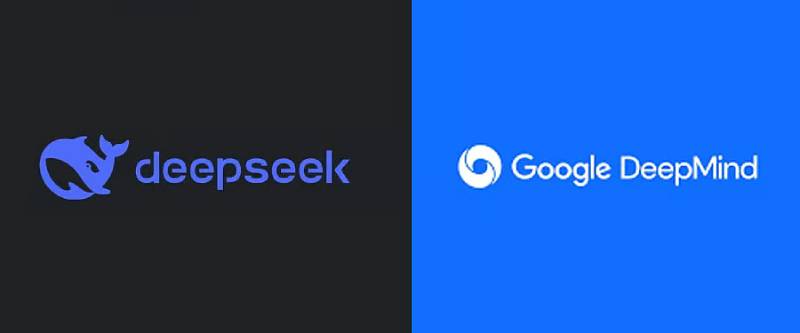
AI company branding has become remarkably similar.
Hexagons, swirls, gradients, and sans-serif wordmarks dominate the space.
DeepMind takes a different path by keeping its primary mark simple while building richness through a complementary 3D visual system.
OpenAI uses a geometric “blossom” symbol. The Anthropic logo features a pure typographic mark with a distinctive slash. DeepSeek’s logo shows a literal whale, direct and unsubtle.
Where many AI startups chase the same visual language hoping to signal credibility, DeepMind benefits from its position within Google. It can afford restraint because the Google name carries instant recognition.
The xAI logo and Mistral AI logo also compete in this space, each trying to differentiate while still reading as “serious AI company.”
What Are the Technical Specifications of the DeepMind Logo?
Official Color Codes (Historical – 2017 Brand Document):
- Primary Blue: Hex #0077C6, RGB (0, 120, 192), CMYK (100, 45, 0, 0), Pantone 3005 C
- Font Grey: Hex #75787B, RGB (117, 120, 123), Pantone Cool Grey 9 C
- Gradient Variations: 75%, 60%, 45%, 30% tints of primary blue
Current Version: Uses Google’s brand color system, which adapts to content and context.
Dimensions and Proportions:
- Aspect Ratio: Horizontal wordmark configuration
- Minimum Size: Varies by application, official brand guidelines specify requirements
- Clear Space: Defined padding requirements around the logo
- File Formats: Available in vector graphics (SVG, AI) and raster formats (PNG)
What Cultural Impact Has the DeepMind Logo Had?
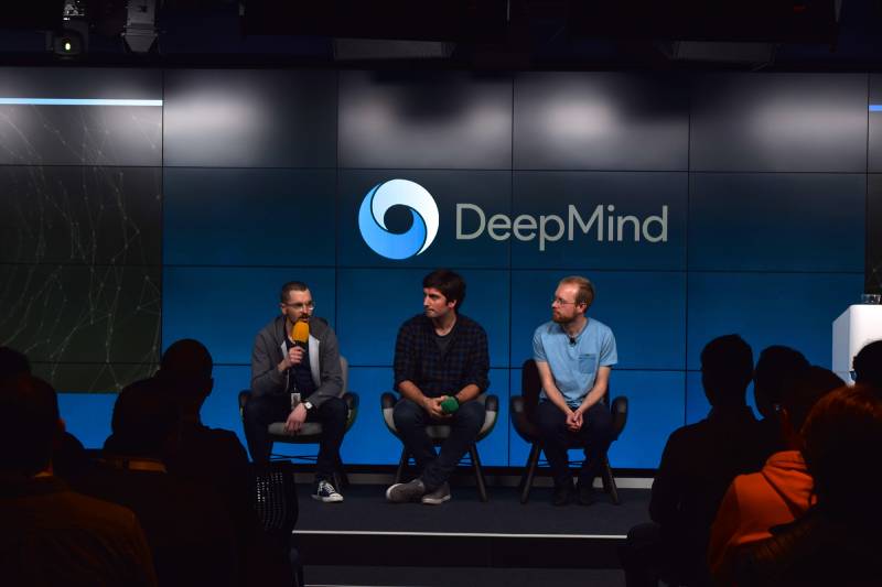
The DeepMind logo became globally recognized after AlphaGo defeated world champion Lee Sedol in 2016.
News coverage of that event, and later the AlphaFold protein structure breakthrough, spread the visual identity worldwide.
Unlike flashy consumer brands, DeepMind’s understated approach positioned it as a serious research institution.
The logo appears in Nature journal publications, academic conferences, and mainstream news. That range of contexts shaped public perception of AI research itself.
How Does the DeepMind Logo Fit Into the Overall Brand Identity?
The logo sits at the center of a broader visual system.
Custom fonts (DM Sans, DM Serif, DM Mono) extend the brand into all written communications.
The 3D visual language created by Someform Studio provides flexible imagery for different contexts. These abstract shapes, representing AI concepts, can be combined in countless configurations.
Google’s overarching brand architecture now frames DeepMind alongside other products. The Google logo connection adds institutional weight.
Photography by Ben Peter Catchpole captures the collaborative culture. This reportage style complements the abstract 3D work, grounding the brand in human reality.
How Should the DeepMind Logo Be Used?
Official Usage Guidelines:
- Maintain original proportions; never stretch or distort
- Use appropriate background colors that provide sufficient contrast
- Respect clear space requirements around the logo
- Do not modify colors or add effects
- Follow Google’s broader brand standards for co-branding situations
Where to Access Official Logos:
- Google DeepMind press resources
- Official brand asset repositories
- Authorized media kits
Licensing Information:
- The DeepMind logo is a registered trademark of Google LLC
- Usage requires appropriate permissions for commercial contexts
- Editorial and news usage generally permitted with proper attribution
Trademark Protection:
- Registered in multiple jurisdictions
- Protected under Google’s intellectual property portfolio
- Unauthorized commercial use prohibited
FAQ on The DeepMind Logo
What Does the DeepMind Logo Look Like?
The current Google DeepMind logo is a clean wordmark rendered in blue tones.
It uses custom DM Sans typography alongside a 3D visual system. The abstract shapes represent artificial intelligence concepts like neural networks and AI agents.
Earlier versions featured a stylized loop symbol suggesting depth and recursion.
Who Designed the DeepMind Logo?
The 2023 rebrand was a collaboration between Google Brand Studio EMEA, MultiAdaptor, and Someform Studio.
Colophon Foundry created the custom DM font families. The original 2010 logo designer remains unknown.
MultiAdaptor has partnered with DeepMind on branding since 2018.
When Was the DeepMind Logo Created?
The first DeepMind logo appeared in 2010 when Demis Hassabis, Shane Legg, and Mustafa Suleyman founded the company in London.
Major redesigns happened in 2014 (Google acquisition), 2019 (all-blue version), and April 2023 (Google DeepMind merger).
What Do the Colors in the DeepMind Logo Mean?
Blue dominates the DeepMind brand colors. It communicates trust, intelligence, and scientific credibility.
The current version uses Google’s adaptable color system. Historical versions used primary blue (#0077C6) with grey text.
Understanding color theory helps explain why AI companies favor blue.
How Has the DeepMind Logo Changed Over Time?
The logo evolved through six major versions. It started as a 3D loop with Gill Sans text in 2010.
Google’s 2014 acquisition brought Proxima Nova, then Product Sans typography. The 2019 redesign introduced custom DM Sans.
Each iteration reflected shifts in ownership and brand identity strategy.
Where Can I Download the Official DeepMind Logo?
Official DeepMind media assets are available through Google’s press resources.
The DeepMind logo PNG and vector files appear in authorized brand repositories. Third-party sites offer downloads, but verify authenticity before commercial use.
Always check brand style guide requirements first.
What Font Is Used in the DeepMind Logo?
DM Sans is the current wordmark typeface. Colophon Foundry developed it specifically for DeepMind, deriving it from Poppins.
The brand system includes DM Serif and DM Mono for different applications. These fonts are available on Google Fonts.
Good typographic hierarchy guides their usage.
Is the DeepMind Logo Trademarked?
Yes. The DeepMind logo is a registered trademark of Google LLC under Alphabet Inc.
Unauthorized commercial use is prohibited. Editorial and news contexts generally permit usage with proper attribution.
The trademark covers both the wordmark and associated visual elements.
What Is the Difference Between DeepMind and Google DeepMind Logos?
The standalone DeepMind logo (2016-2023) showed only “DeepMind” in blue.
After the April 2023 merger with Google Brain, “Google” returned as a prefix. The current version aligns with Google’s broader visual identity system.
Both versions share the DM Sans font family.
What File Formats Is the DeepMind Logo Available In?
Official assets include vector formats like SVG and AI for scalability.
Raster formats include PNG with transparent background options. High resolution files support print and digital applications.
Vector files maintain quality at any size, which matters for everything from favicons to billboards.
Conclusion
The DeepMind logo reflects over a decade of growth from London startup to global AI leader under Alphabet Inc.
Each redesign marked a turning point. The Google acquisition. The AlphaGo victory. The AlphaFold breakthrough. The Google Brain merger.
Strong logo design principles guided every iteration. The current wordmark balances scientific credibility with approachability.
Custom DM Sans typography and abstract 3D visuals set it apart from typical blue logos in the AI space.
As Demis Hassabis and the team push toward artificial general intelligence, this visual identity will keep evolving alongside their research.

Renowned for his expertise in logo design and visual branding, Bogdan has developed a multitude of logos for various clients.
His skills extend to creating posters, vector illustrations, business cards, and brochures. Additionally, Bogdan's UI kits were featured on marketplaces like Visual Hierarchy and UI8.
He also wrote in the past years on sites like Design Your Way, WebDesignerDepot, WPDean, Designmodo, Speckyboy, Slider Revolution, and more.
- The Windsurf Logo History, Colors, Font, And Meaning - 10 October 2026
- How to Remove Background From Product Photos (No Photoshop) - 10 October 2026
- How Designers can Build a Stronger Online Creative Identity - 9 October 2026

Bogdan Sandu is a seasoned designer who has been designing websites since 2008. Renowned for his expertise in logo design and visual branding, Bogdan has developed a multitude of logos for various clients. His skills extend to creating posters, vector illustrations, business cards, and brochures. Additionally, Bogdan's UI kits were featured on marketplaces like Visual Hierarchy and UI8. He also wrote in the past years on sites like Design Your Way, WebDesignerDepot, WPDean, Designmodo, Speckyboy, Slider Revolution, and more.
You Might Also Like


