


Introduction
The AppLovin logo represents one of the most recognized marks in mobile advertising technology. This brand identity belongs to a company that’s reshaped how app developers monetize and grow their products through sophisticated ad mediation and user acquisition platforms.
Since launching in 2012, AppLovin has evolved from a small Palo Alto startup into a publicly traded powerhouse (NASDAQ: APP). The company’s visual identity has adapted alongside its business transformation, though it’s maintained a consistent modern tech aesthetic that reflects its data-driven approach to mobile marketing.
The current AppLovin logo emerged as part of the company’s shift toward becoming a full-stack advertising platform. Its clean, contemporary design speaks to both developers seeking monetization solutions and advertisers looking to reach mobile audiences efficiently.
What is the AppLovin Logo?
The AppLovin logo is a modern wordmark combining custom typography with a distinctive graphic element. Introduced as part of the company’s brand evolution in the mid-2010s, it features bold letterforms that convey technical precision and forward momentum in the mobile advertising space.
Design Type: Combination mark (wordmark with symbol element)
Primary Elements: Custom sans-serif typography with geometric characteristics, integrated graphic accent
Official Introduction Date: Refined version launched around 2015-2016 during company expansion phase
Designer/Agency: Developed in-house with potential external brand consultancy (specific agency not publicly disclosed)
Trademark Status: Registered trademark protecting the AppLovin name and visual identity in connection with advertising and software services
Color Palette: Primary navy blue (#1B2A4E or similar), white (#FFFFFF), accent colors vary by application
Usage Context: MAX mediation platform branding, corporate communications, developer documentation, SDK interfaces, conference materials, investor relations
How Has the AppLovin Logo Evolved Over Time?
AppLovin’s visual identity has undergone measured refinements rather than dramatic overhauls since the company’s 2012 founding. The logo evolution mirrors the company’s journey from scrappy startup to enterprise-grade advertising platform serving billions of daily ad requests.
Each iteration has maintained core recognition while modernizing to reflect AppLovin’s expanding capabilities.
Early AppLovin Logo (2012-2015)
Years Active: 2012-2015
Design Description: Simpler wordmark with more conventional typography, likely using a modified existing typeface rather than fully custom letterforms
Color Scheme: Navy or dark blue with minimal color variation
Designer: Internal team during startup phase
Context: Created during AppLovin’s initial focus on app discovery and recommendation technology, before pivoting to advertising infrastructure
Key Changes from Previous: Original logo representing the founding vision
Cultural Significance: Reflected the early 2010s mobile app boom when discovery was a primary challenge for developers
Modern AppLovin Logo (2015-Present)
Years Active: 2015-present
Design Description: Refined wordmark with custom geometric letterforms, tighter spacing, more distinctive character shapes particularly in the “A” and “L”
Color Scheme: Deeper navy blue as primary, white for reversed applications, occasional accent colors in product-specific contexts
Designer: Brand team during company’s growth phase
Context: Introduced as AppLovin shifted from app discovery to becoming a comprehensive advertising platform with the launch of MAX and other enterprise products
Key Changes from Previous: More sophisticated letterforms, better scalability across digital and print, stronger visual presence at small sizes (important for SDK and developer tools)
Cultural Significance: Represents AppLovin’s maturation into a multi-billion dollar public company competing with Google and Meta in mobile advertising
What Do the Design Elements of the AppLovin Logo Mean?

The AppLovin logo’s geometric letterforms reflect the company’s algorithmic approach to advertising optimization. The clean, engineered aesthetic communicates technical sophistication to developers while maintaining approachability for business stakeholders evaluating ad tech solutions.
Each design choice reinforces AppLovin’s positioning as a data-driven platform that turns complex machine learning into simple monetization results.
What Does the Wordmark Symbolize?
The name “AppLovin” itself merges “app” with “loving,” suggesting passion for mobile applications.
This dual meaning resonates with developers who genuinely care about their creations while needing sustainable revenue streams. The wordmark’s technical precision balances this emotional component with professional credibility.
Why Did AppLovin Choose These Specific Colors?
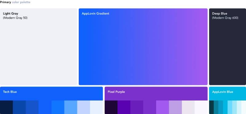
Primary Navy Blue
Approximate Hex: #1B2A4E (exact codes may vary by application)
Symbolic Meaning: Trust, stability, technical expertise
Psychological Impact: Conveys reliability crucial for platforms handling millions in ad revenue
Industry Connection: Common in enterprise software and fintech, differentiating from consumer-focused blue logos like Facebook’s brighter shade
White
Hex: #FFFFFF
Symbolic Meaning: Clarity, simplicity, modern design
Psychological Impact: Creates breathing room in dense technical interfaces
Industry Connection: Reflects minimalist design trends in SaaS platforms
What Typography Style Is Used in the AppLovin Logo?
The logo employs a custom geometric sans-serif font with consistent stroke weights and circular forms. Letterforms feature subtle customization, particularly in how the “pp” connects and the distinctive “A” construction.
This approach ensures uniqueness while maintaining excellent readability across developer documentation, conference signage, and mobile interfaces. The font spacing is tight but not cramped, projecting efficiency without sacrificing legibility.
What Are the Hidden Meanings in the AppLovin Logo?
Unlike some tech company logos with elaborate hidden symbols, AppLovin’s mark is relatively straightforward. The letterforms don’t contain secret arrows or embedded shapes.
However, the overall geometric construction suggests data structures and algorithmic precision, which aligns with the company’s machine learning-powered advertising engine. The design’s restraint itself communicates confidence, letting performance speak rather than relying on visual gimmicks to capture attention.
How Does the AppLovin Logo Compare to Competitor Logos?
AppLovin’s logo occupies a middle ground between the playful consumer-facing identities of companies like Roblox and the austere enterprise marks of traditional ad tech platforms. Compared to Unity Ads or ironSource (competitors in mobile monetization), AppLovin projects more technical seriousness.
Its navy blue palette differentiates it from Google AdMob’s multicolor approach and Meta’s brighter blues. The wordmark style resembles other B2B SaaS companies, prioritizing clarity over brand personality, which works well in developer-focused contexts where functionality trumps aesthetics.
What Are the Technical Specifications of the AppLovin Logo?

Official Color Codes:
Primary Navy Blue:
Hex: Approximately #1B2A4E (may vary by material) RGB: Approximately (27, 42, 78) CMYK: Varies based on printing process Pantone: Closest match likely in the 280-289 range
White:
Hex: #FFFFFF RGB: (255, 255, 255) CMYK: (0, 0, 0, 0)
Dimensions and Proportions:
Aspect Ratio: Approximately 4:1 (wordmark version)
Minimum Size Requirements: Likely 20-24px height for digital, 0.25 inches for print to maintain legibility
Clear Space Specifications: Minimum clear space typically equal to the height of the “A” on all sides
Official Usage Guidelines: Available through AppLovin’s brand resources for partners and developers, covering proper placement, color variations, and prohibited modifications
What Cultural Impact Has the AppLovin Logo Had?
The AppLovin logo has become deeply associated with mobile gaming monetization, appearing in countless developer dashboards and SDK implementations worldwide. For indie game developers, seeing the AppLovin mark in their analytics often represents their first significant revenue stream.
The brand’s rise coincided with the shift from paid apps to free-to-play models, making it a symbol of that business model transformation. While not achieving the mainstream recognition of consumer brands, within the mobile development community, AppLovin’s identity carries substantial weight and immediately signals programmatic advertising expertise.
How Does the AppLovin Logo Fit Into the Overall Brand Identity?

The logo anchors a broader brand system that extends to product marks like MAX, AppDiscovery, and AXON. Each product maintains visual connections to the parent brand through color palette consistency and typographic relationships.
The logo’s technical aesthetic carries through to data visualizations in the analytics dashboard, where similar geometric forms and the signature navy blue create cohesive experiences. This systematic approach helps partners recognize AppLovin technology across multiple touchpoints, from SDK documentation to conference booth displays.
How Should the AppLovin Logo Be Used?

Official Usage Do’s:
- Use approved logo files from official sources
- Maintain specified clear space around the mark
- Use approved color variations (navy on white, white on navy)
- Scale proportionally without distortion
- Ensure sufficient contrast with background colors
Official Usage Don’ts:
- Don’t recreate or redraw the logo
- Don’t apply unauthorized colors or gradients
- Don’t rotate or skew the wordmark
- Don’t place on busy backgrounds that reduce legibility
- Don’t alter spacing between letters
- Don’t combine with other brand marks without approval
Where to Access Official Logos:
AppLovin provides approved brand assets through their developer portal and partner resources. Developers integrating AppLovin SDKs typically receive guidelines as part of implementation documentation.
Licensing Information:
The AppLovin logo is a registered trademark. Use is generally permitted for factual references (such as “powered by AppLovin”) and in contexts like developer case studies with proper attribution. Commercial use beyond SDK integration requires approval.
Trademark Protection Details:
AppLovin actively protects its trademark rights to prevent confusion in the advertising technology marketplace. Partners should review brand guidelines before using the logo in marketing materials to ensure compliance with usage policies.
FAQ on The AppLovin Logo
Where Can I Download the Official AppLovin Logo?
Access official AppLovin brand assets through the developer portal and partner resource center. The company provides vector logo files in SVG and PNG formats for approved use cases.
Developers integrating the MAX mediation platform typically receive these files during SDK setup.
What File Formats Are Available for the AppLovin Logo?
AppLovin provides vector graphics in SVG format for scalable applications and high-resolution PNG files with transparent backgrounds. Some partner resources may include EPS files for print design.
Web-optimized versions ensure proper display across mobile marketing platforms and developer documentation.
Can I Use the AppLovin Logo on My App or Website?
You can display the AppLovin logo when factually indicating integration with their advertising platform or app monetization services. Proper attribution like “Powered by AppLovin” is standard.
Commercial use beyond SDK integration requires explicit approval from AppLovin Corporation.
What Colors Should I Use When Displaying the AppLovin Logo?
Use the primary navy blue version on light backgrounds or the white version on dark backgrounds. The brand color palette maintains consistency across MAX, AppDiscovery, and AXON advertising engine materials.
Never apply custom colors or gradients to the wordmark.
Has AppLovin Ever Changed Its Logo Design?
AppLovin refined its visual identity around 2015-2016 as the company expanded from app discovery to comprehensive programmatic advertising. The modern logo features more sophisticated letterforms and better scalability.
The current brand mark supports the company’s public trading status on NASDAQ.
What Does the AppLovin Name Mean?
The name combines “app” with “loving,” reflecting passion for mobile applications and developer success. This positioning resonates with mobile gaming industry professionals seeking user acquisition strategies and revenue optimization.
The wordmark balances emotional appeal with technical credibility.
How Does the AppLovin Logo Compare to Unity Ads?
AppLovin uses a professional wordmark in navy blue, while Unity Ads incorporates its parent company’s more playful cube symbol. Both serve the in-app advertising market but AppLovin projects more B2B seriousness.
The design reflects different brand positioning strategies.
What Font Does the AppLovin Logo Use?
The logo employs custom geometric sans-serif typography with consistent stroke weights. Letterforms feature subtle customization, particularly in character connections and the distinctive construction of key letters.
This ensures trademark uniqueness while maintaining readability across developer tools and analytics dashboards.
Is the AppLovin Logo Trademarked?
Yes, AppLovin maintains registered trademark protection for its logo and company name in connection with advertising technology and software services. The brand identity receives legal protection to prevent confusion in the ad tech solution marketplace.
Unauthorized commercial use violates intellectual property rights.
What Size Should the AppLovin Logo Be for Print and Digital Use?
Digital applications require minimum 20-24 pixel height to maintain legibility. Print materials need at least 0.25 inches height for the wordmark.
Always maintain the specified aspect ratio and clear space equal to the height of the first letter on all sides.
Conclusion
The AppLovin logo stands as a defining mark in the mobile advertising platform landscape, representing billions in daily ad transactions and powering monetization for thousands of developers worldwide.
Its evolution from startup identity to enterprise brand reflects the company’s transformation under CEO Adam Foroughi.
The corporate visual identity successfully bridges technical precision with approachability, making complex programmatic buying and real-time bidding feel accessible.
From SDK integration to investor relations materials, the brand mark maintains consistency across touchpoints.
Understanding proper logo usage, color specifications, and trademark guidelines ensures partners represent the AppLovin brand correctly while leveraging its advertising network capabilities.
Whether you’re implementing in-app bidding or exploring user acquisition strategies, recognizing this ad tech solution identity matters in the mobile growth platform ecosystem.

Renowned for his expertise in logo design and visual branding, Bogdan has developed a multitude of logos for various clients.
His skills extend to creating posters, vector illustrations, business cards, and brochures. Additionally, Bogdan's UI kits were featured on marketplaces like Visual Hierarchy and UI8.
He also wrote in the past years on sites like Design Your Way, WebDesignerDepot, WPDean, Designmodo, Speckyboy, Slider Revolution, and more.
- The Windsurf Logo History, Colors, Font, And Meaning - 10 October 2026
- How to Remove Background From Product Photos (No Photoshop) - 10 October 2026
- How Designers can Build a Stronger Online Creative Identity - 9 October 2026

Bogdan Sandu is a seasoned designer who has been designing websites since 2008. Renowned for his expertise in logo design and visual branding, Bogdan has developed a multitude of logos for various clients. His skills extend to creating posters, vector illustrations, business cards, and brochures. Additionally, Bogdan's UI kits were featured on marketplaces like Visual Hierarchy and UI8. He also wrote in the past years on sites like Design Your Way, WebDesignerDepot, WPDean, Designmodo, Speckyboy, Slider Revolution, and more.
You Might Also Like


