The Roblox logo is one of the most recognized marks in gaming, a bold red wordmark that millions of kids and teenagers interact with daily. It’s a logo that doesn’t try to be clever or subtle. It’s loud, confident, and built for a generation that grew up on screens. Roblox Corporation introduced the current version in 2017, moving away from earlier, clunkier treatments toward something leaner and more recognizable across digital platforms.
Within gaming brand identity history, the Roblox mark sits in an interesting spot. It competes with some of the most visually aggressive gaming company logos out there, yet it keeps things surprisingly restrained. The tilt is its whole personality. Roblox was founded in 2004, and the logo has gone through roughly five meaningful iterations since then.
What Is the Roblox Logo?
The Roblox logo is a bold red custom wordmark with a slight forward tilt, introduced in its current form in 2017. Designed in-house by Roblox Corporation, it uses a heavy sans-serif typeface with no accompanying symbol. It represents creativity, play, and a user-built world.
- Design Type: Wordmark
- Primary Elements: Custom bold sans-serif lettering, forward italic tilt, no icon or symbol
- Official Introduction Date: 2017
- Designer/Agency: Roblox Corporation (in-house)
- Trademark Status: Registered trademark, Roblox Corporation, USPTO
- Color Palette: Roblox Red (#E2231A), Black (#000000), White (#FFFFFF)
- Usage Context: App stores, game platform interface, merchandise, marketing materials, social media, sponsored events
How Has the Roblox Logo Evolved Over Time?

From a blocky early-2000s wordmark to today’s clean italic treatment, the Roblox logo has gone through five major versions. Each shift reflected where the platform was heading, not just aesthetically, but in terms of audience and ambition.
Original Roblox Logo (2004–2009)
- Years Active: 2004–2009
- Design Description: Heavy, blocky letterforms in all caps. Rigid, almost pixel-like quality that matched the platform’s early block-building aesthetic
- Color Scheme: Red and black
- Designer: David Baszucki and early Roblox team
- Context: Roblox launched as DynaBlocks before rebranding. The logo reflected the literal block-building nature of the game
- Key Changes from Previous: First official logo
- Cultural Significance: Positioned Roblox as a kids’ building game, not yet a platform
Second Roblox Logo (2009–2015)
- Years Active: 2009–2015
- Design Description: Refined letterforms with a slight shadow effect. More structured than the original but still heavy
- Color Scheme: Red, black, white
- Designer: In-house
- Context: Platform was growing fast. The logo needed to work on more surfaces, including early mobile
- Key Changes from Previous: Cleaner letterforms, shadow dropped in later revisions
- Cultural Significance: Coincided with Roblox’s expansion beyond core gaming communities
Third Roblox Logo (2015–2017)
- Years Active: 2015–2017
- Design Description: Transitional version. Letters became more uniform, red became brighter, the weight felt more modern
- Color Scheme: Bright red, black
- Designer: In-house
- Context: Roblox was pushing into mobile seriously and needed a logo that scaled better at small sizes
- Key Changes from Previous: Brighter red, more consistent letter width, less ornamentation
- Cultural Significance: Marked Roblox’s shift from “kids’ game” to “platform”
Current Roblox Logo (2017–Present)
- Years Active: 2017–present
- Design Description: Bold custom sans-serif wordmark with a deliberate forward tilt. Clean, no drop shadow, no decoration
- Color Scheme: Roblox Red (#E2231A), black, white
- Designer: Roblox Corporation in-house design team
- Context: Major brand refresh aligned with Roblox’s IPO preparation and global expansion
- Key Changes from Previous: Introduced the signature tilt, removed all shadow and texture, simplified to pure wordmark
- Cultural Significance: The version most people know. Synonymous with the platform at its peak cultural moment
What Do the Design Elements of the Roblox Logo Mean?

The Roblox logo communicates speed, energy, and forward motion through a single typographic choice: the tilt. Every element is intentional, from the weight of the letters to the specific red that Roblox uses across all touchpoints.
The emphasis in the design falls entirely on the wordmark itself. There’s no icon to distract from it. Understanding basic color theory helps explain why red works so well here. Red grabs attention faster than almost any other color in the spectrum. For a platform competing for kids’ screen time, that’s not accidental.
What Does the Roblox Logo Symbolize?
The forward tilt suggests movement and momentum. It makes a static wordmark feel like it’s going somewhere.
The heavy letterforms signal confidence and solidity. This is a platform, not just a game. The absence of an icon is a statement in itself. Roblox trusts the name alone to carry the brand.
The focal point of the entire mark is the “R,” which anchors the tilt and draws the eye left to right naturally.
Why Did Roblox Choose These Specific Colors?

Roblox Red (#E2231A)
- Color Name: Roblox Red
- Hex Code: #E2231A
- Symbolic Meaning: Energy, excitement, urgency
- Psychological Impact: Triggers alertness and stimulates engagement. Well documented in color psychology research
- Brand Connection: Red is common in gaming and entertainment branding because it commands attention. Among red logos, Roblox’s sits on the brighter, more saturated end
Black (#000000)
- Color Name: Black
- Symbolic Meaning: Authority, strength, contrast
- Psychological Impact: Grounds the red and gives the wordmark visual weight on light backgrounds
- Brand Connection: Used for the wordmark on white backgrounds and in secondary applications
The saturation level of the Roblox red is notably high. It’s not a warm, friendly red. It’s a sharp, almost aggressive red. That’s a deliberate choice for a platform fighting for attention in crowded app stores.
What Typography Style Is Used in the Roblox Logo?
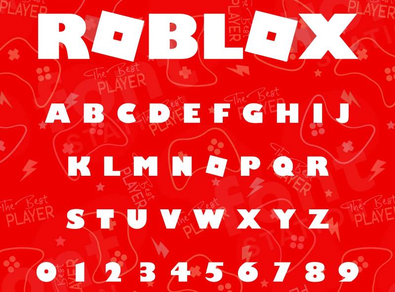
The typography is a custom sans-serif font designed specifically for Roblox. It’s not available for public use.
The letterforms are wide and heavy, with consistent stroke widths throughout. No thin strokes, no contrast between thick and thin parts of the letters. The typeface shares some DNA with geometric sans-serif styles, but the custom modifications (especially the tilt and the slightly condensed proportions) make it unmistakably its own thing.
Readability at small sizes was clearly a priority. The letters hold up well as a tiny app icon or a massive billboard. The tracking is tight, which keeps the wordmark compact and punchy rather than sprawling.
What Are the Hidden Meanings in the Roblox Logo?
The tilt is the most discussed element. Some interpret it as a reference to the block-stacking origins of the game, a stack leaning under its own weight.
Roblox has never officially confirmed a symbolic meaning behind the tilt beyond “forward momentum.” The uniform stroke weight across the letterforms subtly references the pixel-grid aesthetic of the platform’s early building blocks. It’s not screaming that reference, but it’s there if you look.
Nothing in the current logo is accidental. The decision to drop any accompanying icon or symbol tells you something about how confident Roblox is in name recognition alone.
How Does the Roblox Logo Compare to Competitor Logos?
Among major gaming platform logos, Roblox sits in an unusual position. It’s simpler than most, more typographic, and relies entirely on a wordmark where competitors often lean on icons or mascots.
The Fortnite logo goes in the opposite direction, layered, textured, stylized to the point of complexity. The Minecraft logo leans into pixelation and nostalgia, which makes sense given the audience overlap with Roblox.
The Unity Software logo is a useful comparison from the development side. Unity went clean and minimal too, but it’s aimed at developers, not kids. Roblox threads the needle between those audiences.
Compared to other video game logos more broadly, Roblox’s approach is closer to a tech company than a traditional game studio. It looks like it belongs next to the Stripe logo or the Zoom logo in terms of visual philosophy: clean, scalable, brand-first.
The League of Legends logo and the Overwatch logo both use ornate symbols alongside their wordmarks. Roblox deliberately avoids this. Whether that’s confidence or minimalism is a matter of perspective. Probably both.
What Are the Technical Specifications of the Roblox Logo?
Official Color Codes
- Primary Color: Roblox Red
- Hex: #E2231A
- RGB: (226, 35, 26)
- CMYK: (0, 85, 88, 11)
- Pantone: 485 C (approximate)
- Secondary Color: Black
- Hex: #000000
- RGB: (0, 0, 0)
- CMYK: (0, 0, 0, 100)
- Pantone: Black C
- Accent Color: White
- Hex: #FFFFFF
- RGB: (255, 255, 255)
- CMYK: (0, 0, 0, 0)
- Pantone: White
Dimensions and Proportions
- Aspect Ratio: Approximately 4:1 (width to height) for the standard horizontal wordmark
- Minimum Size Requirements: 80px wide for digital use; 0.75 inches wide for print
- Clear Space: Minimum clear space equal to the height of the “R” on all sides
- Official Usage Guidelines: Available through the Roblox Developer Hub and official brand style guide. The logo should not be rotated beyond its standard tilt, recolored, or distorted in any dimension
- File Formats Available: Vector graphics (SVG, EPS, AI), PNG with transparent background, JPEG for non-transparent use. Always use vector files for print to avoid DPI issues
What Cultural Impact Has the Roblox Logo Had?
The Roblox logo is one of those marks that kids recognize before they can fully explain what the company does. That’s rare. It’s up there with the Super Mario logo in terms of instant recognition within its target demographic.
It shows up on merchandise, YouTube thumbnails, school notebooks, bedroom walls. The 2017 redesign coincided with Roblox’s explosion in popularity, especially during 2019–2021. The clean logo scaled across all those contexts effortlessly, which is a big reason it became so embedded in youth culture.
There’s also a fan art dimension. Millions of kids have recreated, remixed, and parodied the Roblox logo across platforms like YouTube and DeviantArt. That kind of organic engagement is something brand teams dream about and rarely achieve intentionally.
The logo has also become a reference point in broader conversations about what a logo needs to accomplish at scale. It’s taught in design programs as an example of how a simple wordmark can carry enormous brand weight without relying on iconography.
How Does the Roblox Logo Fit Into the Overall Brand Identity?

The logo is the anchor of a broader system. Roblox’s brand identity connects the wordmark to its avatar characters, the Robux currency symbol, the platform’s UI color scheme, and the Roblox Developer Hub visual language. The logo holds all of that together.
The visual hierarchy across Roblox’s branding always puts the wordmark first. The avatar and character designs use a completely different visual vocabulary (blocky, colorful, playful) but the logo sits above all of it, clean and authoritative.
The color palette across the whole brand system flows from the logo’s red. It anchors everything. Product UI, loading screens, merchandise, event signage: the red is always consistent.
The graphic design principles behind the full brand system emphasize unity and repetition. The same red, the same letterforms, the same tilt angle appear consistently across every touchpoint. That kind of discipline is what makes a brand feel solid rather than scattered.
How Should the Roblox Logo Be Used?
Official Usage Guidelines
Do’s:
- Use the official logo files downloaded directly from Roblox’s brand resources page
- Maintain the required clear space on all sides
- Use only the approved color versions: full color (red on white), black on white, or white on dark/red backgrounds
- Scale proportionally, keeping the original aspect ratio
- Use vector files for any print application to maintain quality
Don’ts:
- Do not change the logo colors, including adding gradients or outlines
- Do not rotate or adjust the tilt angle
- Do not stretch, compress, or distort the wordmark
- Do not place the logo on busy backgrounds that reduce legibility
- Do not use the logo in any way that implies Roblox endorses your product or service without an official partnership
- Do not use low-resolution bitmap versions in print contexts where they’ll appear pixelated
Where to Access Official Logo Files
Official Roblox logo assets are available through the Roblox Press Kit and the Roblox Developer Hub. Both require agreeing to Roblox’s brand usage terms before downloading.
For fan projects and non-commercial use, Roblox allows limited logo use under its community guidelines. Commercial use, merchandise, and partnership branding require direct approval from Roblox Corporation.
Trademark and Licensing
The Roblox name and logo are registered trademarks of Roblox Corporation. Unauthorized commercial use is a trademark violation.
Font licensing is not applicable here since the logo uses a proprietary custom typeface that is not publicly licensed. Developers and creators working within the Roblox ecosystem should always check the current brand guidelines, as Roblox updates its usage policies periodically.
FAQ on The Roblox Logo
What font does the Roblox logo use?
The Roblox logo uses a custom proprietary typeface created in-house by Roblox Corporation.
It’s not publicly available or licensed. The letterforms are wide, heavy, and geometric, sharing some characteristics with bold sans-serif styles but modified specifically for the brand.
What color is the Roblox logo?
The primary color is Roblox Red, hex code #E2231A.
The wordmark also appears in black (#000000) on light backgrounds and white (#FFFFFF) on dark or red backgrounds. The red sits at high saturation, which is intentional for visibility across digital platforms.
When was the current Roblox logo introduced?
The current version launched in 2017 as part of a broader brand refresh.
It replaced the previous wordmark with a cleaner, tilted treatment that scaled better across mobile apps, merchandise, and marketing materials. This is the version most users recognize today.
Has the Roblox logo ever changed?
Yes. The Roblox logo has gone through roughly five major iterations since the platform launched in 2004.
Each version moved toward cleaner, more scalable design. The biggest shift came with the 2017 redesign, which introduced the signature forward tilt and removed decorative elements entirely.
What does the tilt in the Roblox logo mean?
Roblox describes the tilt as representing forward momentum and energy.
Some designers also read it as a nod to the platform’s block-stacking origins. Officially, no deeper symbolic meaning has been confirmed beyond motion and dynamism.
Who designed the Roblox logo?
The current logo was developed by Roblox Corporation’s in-house design team, not an external agency.
Earlier versions were also handled internally. Co-founders David Baszucki and Erik Cassel shaped the original visual identity when the platform launched under the DynaBlocks name in 2004.
Can I use the Roblox logo for my project?
Limited non-commercial use is allowed under Roblox’s community guidelines.
Commercial use, merchandise, and anything implying an official partnership require direct approval from Roblox Corporation. The logo is a registered trademark, so unauthorized commercial use is a legal issue, not just a policy one.
Where can I download the official Roblox logo?
Official logo files are available through the Roblox Press Kit and the Roblox Developer Hub.
Both sources provide vector formats and PNG files with transparent backgrounds. You’ll need to agree to brand usage terms before downloading. Avoid third-party sites, the files are often low resolution or outdated.
How does the Roblox logo compare to other gaming logos?
It’s notably simpler than most. Logos like Fortnite and Overwatch use heavy texture and iconography.
Roblox goes the opposite direction: pure wordmark, no symbol, minimal color. It looks closer to a tech company logo than a traditional game studio, which reflects how Roblox positions itself as a platform.
What file formats is the Roblox logo available in?
Roblox provides the logo in SVG, EPS, AI, and PNG formats through official brand resources.
For print work, always use vector formats to avoid resolution issues. PNG with a transparent background works for most digital applications. JPEG versions exist but aren’t ideal when you need a clean, background-free treatment.
Conclusion
The Roblox logo is a case study in doing more with less. A bold wordmark, a single red, a deliberate tilt, and that’s it.
No icon, no mascot, no gradient. Just a custom sans-serif typeface that millions of players recognize instantly across every platform and piece of merchandise it touches.
The 2017 brand refresh locked in a visual identity that scaled from app store thumbnails to stadium signage without breaking down.
For anyone studying gaming platform branding or logo design principles, Roblox Corporation’s approach is worth paying attention to. Simple doesn’t mean weak. Sometimes it means exactly right.

Renowned for his expertise in logo design and visual branding, Bogdan has developed a multitude of logos for various clients.
His skills extend to creating posters, vector illustrations, business cards, and brochures. Additionally, Bogdan's UI kits were featured on marketplaces like Visual Hierarchy and UI8.
He also wrote in the past years on sites like Design Your Way, WebDesignerDepot, WPDean, Designmodo, Speckyboy, Slider Revolution, and more.
- From Mockup to Code: How AI-Augmented Development Speeds Up the Design Handoff - 19 September 2026
- The Beehiiv Logo History, Colors, Font, And Meaning - 18 September 2026
- Why Small Teams Wait Too Long to Bring On Specialist Engineers - 17 September 2026

Bogdan Sandu is a seasoned designer who has been designing websites since 2008. Renowned for his expertise in logo design and visual branding, Bogdan has developed a multitude of logos for various clients. His skills extend to creating posters, vector illustrations, business cards, and brochures. Additionally, Bogdan's UI kits were featured on marketplaces like Visual Hierarchy and UI8. He also wrote in the past years on sites like Design Your Way, WebDesignerDepot, WPDean, Designmodo, Speckyboy, Slider Revolution, and more.
You Might Also Like