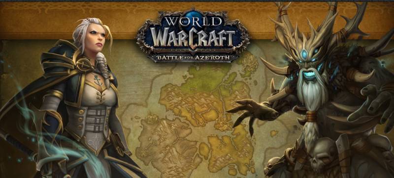
The World of Warcraft logo is one of the most recognized visual identities in gaming history. It represents Blizzard Entertainment’s flagship MMORPG, which launched in 2004 and changed online gaming permanently. The logo combines aggressive fantasy typography with a color palette built around deep blues, golds, and blacks, making it instantly recognizable across merchandise, digital platforms, and expansion packaging worldwide.
Among video game logos, WoW’s identity stands in a category of its own. It didn’t follow the clean, minimal trends that dominated tech branding during the same era. Instead, it leaned hard into ornate fantasy aesthetics and held that direction consistently for over two decades, which is honestly rare for any franchise at this scale.
The logo has gone through several refinements across each expansion, but the core identity has remained largely intact since 2004. That kind of consistency is either a sign of a strong original concept or stubbornness. In Blizzard’s case, probably both.
What Is the World of Warcraft Logo?
The World of Warcraft logo is a fantasy-styled wordmark created by Blizzard Entertainment, officially introduced in 2004. It features heavily stylized serif lettering with ornate detailing, gold and blue tones, and is built on a dark background that reinforces its epic, high-fantasy tone.
- Design Type: Wordmark with ornamental typographic treatment
- Primary Elements: Stylized letterforms, decorative serifs, metallic color effects, and a stacked two-line text layout (“World of Warcraft”)
- Official Introduction Date: 2004, alongside the game’s original release on November 23, 2004
- Designer/Agency: Blizzard Entertainment’s in-house art team
- Trademark Status: Registered trademark owned by Blizzard Entertainment (Activision Blizzard)
- Color Palette: Deep navy blue (#1A3A5C), metallic gold (#C8A951), and black (#000000) as the base
- Usage Context: Game packaging, expansion branding, in-game UI, merchandise, marketing materials, and digital storefronts
How Has the World of Warcraft Logo Evolved Over Time?

The WoW logo has stayed close to its original 2004 design through the base game and all major expansions, with each new release bringing refinements in texture, lighting effects, and color treatment rather than structural changes to the letterforms.
Original World of Warcraft Logo (2004–2007)
- Years Active: 2004–2007
- Design Description: Heavy fantasy serif wordmark with deep beveling, metallic gold letterforms, and blue atmospheric glow effects behind the text
- Color Scheme: Gold, navy blue, black
- Designer: Blizzard Entertainment in-house team
- Context: Designed to establish WoW as a high-fantasy MMORPG distinct from its Warcraft RTS predecessors
- Key Changes from Previous: First standalone logo for the MMO format, departing from the simpler Warcraft III type treatment
- Cultural Significance: Set the visual standard for fantasy MMO branding that many competitors tried to replicate
The Burning Crusade Logo (2007)
- Years Active: 2007
- Design Description: Core WoW wordmark retained, with expansion subtitle added in a complementary style using red and orange tones to signal a more aggressive, demonic theme
- Color Scheme: Gold base with added crimson and ember tones in the expansion title
- Designer: Blizzard Entertainment
- Context: First major expansion, introducing Outland and the Burning Legion as central antagonists
- Key Changes from Previous: Introduction of expansion subtitle system that would define all future WoW branding
- Cultural Significance: Established the visual pattern of pairing the core logo with thematically distinct expansion wordmarks
Wrath of the Lich King Logo (2008)
- Years Active: 2008–2010
- Design Description: Ice-blue tones dominated the expansion subtitle, with frost texture effects applied to the lettering
- Color Scheme: Ice blue, silver, dark blue
- Designer: Blizzard Entertainment
- Context: Introduction of Northrend and Arthas Menethil as the central villain
- Key Changes from Previous: Shift from warm to cold color temperature in the expansion identity
- Cultural Significance: Arguably the most beloved expansion visually, this logo became iconic alongside the game’s peak subscriber count of 12 million
Modern Era Logos (2010–Present)
- Years Active: 2010–present, covering Cataclysm through The War Within
- Design Description: Each expansion maintains the WoW master wordmark while introducing unique subtitle treatments. More recent expansions (Dragonflight, The War Within) show cleaner rendering and higher-resolution detail work
- Color Scheme: Varies by expansion theme; the master logo stays consistent in gold/navy
- Designer: Blizzard Entertainment
- Context: Adapting to higher-resolution displays, streaming platforms, and digital storefronts
- Key Changes from Previous: Improved texture rendering, cleaner edge definition, and better performance as vector graphics for scalable use
- Cultural Significance: Keeping the logo family consistent across 20 years reinforced WoW’s brand continuity even through subscription dips and competition from newer MMOs
What Do the Design Elements of the World of Warcraft Logo Mean?

Every element in the WoW logo was chosen to reinforce a sense of epic scale, ancient power, and fantasy heritage. The heavy serif letterforms suggest permanence and tradition, while the metallic gold treatment signals prestige and high stakes.
The dark background is not just aesthetic. It creates contrast that makes the gold letterforms read as luminous, almost glowing, which fits the in-game experience of encountering powerful magic and legendary loot.
What Does the Typography Symbolize in the WoW Logo?
The letterforms are built on a modified fantasy serif structure with exaggerated stroke contrast, meaning thick verticals and fine horizontals that create visual drama.
This kind of serif treatment draws from medieval manuscript traditions, connecting the game’s world to a sense of ancient history.
The stacked layout (“World of” above “Warcraft”) creates a clear visual hierarchy where “Warcraft” reads as the dominant brand name, with the game title framing it above.
It’s a smart structural choice. Most players just say “WoW” or “Warcraft” anyway, so making that word visually dominant made sense from a brand recognition standpoint.
What Is the Historical Context Behind the WoW Logo Design?
The WoW logo didn’t come from nowhere. Blizzard had already built visual language through Warcraft I, II, and III, and the MMO logo needed to feel like a natural evolution of that.
The decision to go heavier and more ornate than the RTS titles was deliberate. An MMO needed to feel like a world, not just a strategy game.
That shift in visual weight communicated something important to players in 2004: this is bigger than anything we’ve made before.
What Cultural References Are Embedded in the Logo?
The design borrows from multiple fantasy traditions. The heavy serif letterforms reference J.R.R. Tolkien-era fantasy typography that had already shaped audience expectations for the genre.
The gold-on-dark treatment echoes medieval heraldry and illuminated manuscripts, which fits Azeroth’s lore-heavy world-building approach.
There’s also a subtle connection to Art Deco sensibility in how the letters use decorative geometry without sacrificing legibility.
Why Did Blizzard Choose These Specific Colors?

- Metallic Gold (#C8A951): Signals prestige, legendary status, and reward. In WoW’s own UI, gold is the color of epic-tier loot, so the logo color and in-game color psychology reinforce each other deliberately.
- Navy Blue (#1A3A5C): Conveys depth, mystery, and arcane power. Blue is also the color of rare-quality items in the game’s loot system, creating another layer of brand-color alignment.
- Black (#000000): Used as the base to maximize contrast and make the gold letterforms appear luminous. Also grounds the design and prevents it from feeling too decorative.
The color palette works partly because it matches what players already associate with value and power inside the game itself. That kind of alignment between UI design and brand identity is harder to pull off than it looks.
What Typography Style Is Used in the World of Warcraft Logo?
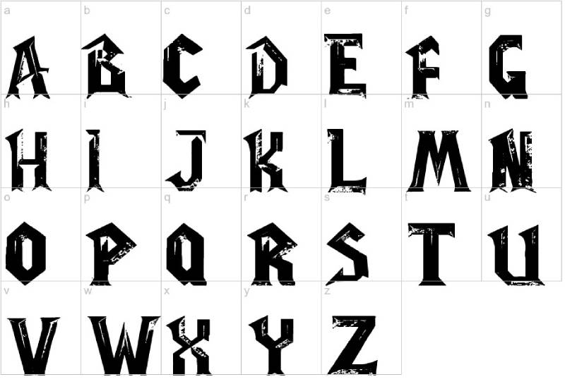
The font used in the WoW logo is a custom typeface developed by Blizzard’s art team, not available commercially. It sits in the category of a decorative display font with heavy fantasy ornamentation.
The letterforms feature high stroke contrast, prominent serifs with angled cuts, and subtle flaring at terminals that gives the text an almost hand-carved quality.
Kerning is tight throughout, which helps the letters read as a unified mass rather than individual characters. That density reinforces the “heavy and powerful” feeling the brand wants.
Over the years, the typography has been re-rendered at higher resolutions with improved texture mapping, but the actual letterform design has barely changed since 2004. That’s either excellent original work or the team being very careful not to break something that already works.
What Are the Hidden Meanings in the World of Warcraft Logo?
There’s no confirmed hidden symbolism in the WoW logo, which is actually unusual for a franchise this large. Most of what you find in design analysis is pattern recognition rather than intentional embedding.
That said, the emphasis on “Warcraft” over “World of” in the visual layout does quietly signal something: the game is primarily about conflict, not just exploration. The word that hits hardest visually is the one that means war.
The use of symmetry in the letterform construction gives the logo a sense of stability and authority, which is interesting for a game built around constant faction conflict. The design communicates permanence even when the lore is anything but stable.
How Does the World of Warcraft Logo Compare to Competitor Logos?
WoW’s logo takes a maximalist approach that most of its MMORPG competitors have moved away from. Final Fantasy XIV, Guild Wars 2, and Elder Scrolls Online all use cleaner, more restrained wordmarks, while WoW has maintained its ornate, high-detail fantasy aesthetic throughout.
Compare it to the Final Fantasy logo tradition, which tends toward elegant, minimal letterforms with strong negative space. WoW goes the opposite direction: dense, decorative, and visually loud.
The Diablo logo, also from Blizzard, shares some DNA in terms of dark backgrounds and high-drama typography, but leans into horror and gothic influences rather than high fantasy. Interesting that Blizzard uses two distinct design languages for its two biggest franchises.
The League of Legends logo is probably the closest competitor in terms of fantasy tone, but it uses a much cleaner, more modern approach with better scalability for small-format display. WoW’s logo frankly doesn’t scale down well, which has occasionally caused issues on mobile platforms and small-format assets.
Among gaming company logos broadly, Blizzard’s overall identity system is notable for using franchise-specific visual systems rather than a unified corporate aesthetic. WoW, Diablo, Overwatch, and StarCraft all look like they come from different branding universes, which is an unusual choice that somehow works.
What Are the Technical Specifications of the World of Warcraft Logo?
Official Color Codes
- Primary Color: Metallic Gold
- Hex: #C8A951
- RGB: (200, 169, 81)
- CMYK: (0, 16, 60, 22)
- Pantone: PMS 7406 C (approximate)
- Secondary Color: Deep Navy Blue
- Hex: #1A3A5C
- RGB: (26, 58, 92)
- CMYK: (72, 37, 0, 64)
- Pantone: PMS 2955 C (approximate)
- Base Color: Black
- Hex: #000000
- RGB: (0, 0, 0)
- CMYK: (0, 0, 0, 100)
- Pantone: Process Black C
Note: Blizzard does not publicly publish official brand color codes. The values above are derived from design community analysis of official assets and are widely referenced but not formally confirmed by Blizzard. For verified specifications, contact Blizzard’s licensing team directly.
Dimensions and Proportions
- Aspect Ratio: Approximately 3:1 (width to height) for the standard horizontal wordmark
- Minimum Size Requirements: Not publicly specified by Blizzard; community guidelines suggest a minimum of 200px wide for digital use to maintain legibility of decorative details
- Clear Space: Blizzard’s brand guidelines (shared with licensed partners) typically require clear space equal to the height of the capital “W” on all sides
- File Formats: Official assets are distributed as high-resolution pixel-based files and JPEG/bitmap formats for press use, alongside PNG versions with transparent backgrounds for digital placement
- DPI Requirements: Blizzard press assets are typically supplied at 300 DPI for print applications
What Cultural Impact Has the World of Warcraft Logo Had?

The WoW logo didn’t just brand a game. It became shorthand for an entire cultural moment in the mid-2000s, when MMORPGs were at peak cultural saturation and WoW was the undisputed center of that.
The logo appeared on bedroom posters, convention banners, energy drink cans, and eventually on the sides of Blizzard’s own headquarters in Irvine. That kind of physical presence turned it into something beyond a game brand.
It influenced how fantasy games branded themselves for nearly a decade afterward. The “dark background plus gold ornate text” formula got copied constantly. Some of those copies were pretty obvious.
The logo also became a cultural signal in a broader sense. Wearing WoW merchandise or displaying the logo communicated something specific about identity and community membership. That kind of logo function goes well beyond pure brand recognition into social signaling territory.
Even people who never played the game recognize the logo. That level of cultural penetration is something that very few game logos ever achieve, and it puts WoW in a short list alongside Super Mario, Minecraft, and a handful of others.
How Does the World of Warcraft Logo Fit Into the Overall Brand Identity?
The WoW logo sits at the center of a large connected brand system that includes expansion-specific logos, faction emblems (Alliance and Horde), class symbols, and Blizzard’s own corporate identity. Each layer connects back to the master wordmark visually while serving its own purpose.
The brand guidelines that Blizzard shares with licensing partners treat the WoW logo as a master mark that must remain intact, with expansion subtitles functioning as secondary identifiers. This hierarchy is consistent across physical merchandise, digital platforms, and promotional materials.
The brand style guide for WoW reportedly runs through approved color variations (full color, white knockout, black version), approved backgrounds, and clear usage restrictions. Partners who license the brand for physical merchandise go through Blizzard’s licensing team for asset access.
The logo also connects outward to Blizzard’s broader identity system, which includes the Overwatch logo and the Diablo logo as sibling franchises under the same corporate brand. Each is visually distinct, but all carry Blizzard’s stamp through shared quality standards and production values.
There’s an interesting tension in how WoW’s identity works within Blizzard’s portfolio. The game is old enough that its visual language predates modern brand thinking around scalability and digital-first design, yet Blizzard has managed to keep it relevant by investing in high-quality asset production for each expansion rather than redesigning the core mark.
How Should the World of Warcraft Logo Be Used?
Official Usage Guidelines
- Do: Use only officially supplied assets from Blizzard’s press kit or licensed media channels
- Do: Maintain the logo’s color integrity. Do not recolor or apply custom color treatments
- Do: Preserve clear space around the logo as specified in Blizzard’s licensing documentation
- Do: Use the correct file format for the intended medium (high-res PNG for digital, 300 DPI files for print)
- Don’t: Stretch, distort, or alter the logo’s proportions
- Don’t: Place the logo on backgrounds that reduce legibility or clash with the official color palette
- Don’t: Use the logo to imply official partnership or endorsement without written authorization from Blizzard
- Don’t: Apply filters, effects, or modifications to the official logo files
Where to Access Official Logo Files
Official WoW logo assets are available through Blizzard Entertainment’s press kit at press.blizzard.com. Journalists, content creators, and event organizers can access approved assets there.
Licensed merchandise partners go through Blizzard’s licensing program directly, which provides brand-approved asset packages along with usage restrictions and approval processes for final designs.
Licensing and Trademark Information
The World of Warcraft logo is a registered trademark of Blizzard Entertainment, Inc. Commercial use without a license agreement is a trademark infringement. Fan art and non-commercial community use typically fall under Blizzard’s fan content policy, which allows limited creative use with specific restrictions around monetization.
For commercial licensing inquiries, Blizzard’s licensing team handles requests through official channels listed on their corporate website. This includes merchandise, events, promotional materials, and any use that implies brand affiliation.
The trademark protections extend globally, and Blizzard actively monitors and enforces its intellectual property, particularly on platforms like Etsy, Redbubble, and similar marketplaces where unauthorized WoW merchandise is common.
FAQ on The World Of Warcraft Logo
What font is used in the World of Warcraft logo?
The WoW logo uses a custom typeface created by Blizzard Entertainment’s in-house art team.
It’s not commercially available. The letterforms are a heavily stylized fantasy serif design with exaggerated stroke contrast, ornate terminals, and a hand-carved quality that no off-the-shelf typeface replicates exactly.
What colors are in the World of Warcraft logo?
The primary colors are metallic gold (#C8A951), deep navy blue (#1A3A5C), and black (#000000).
Each expansion subtitle introduces its own color treatment. Wrath of the Lich King used ice blue, while The Burning Crusade added crimson and ember tones. The master WoW wordmark itself stays consistent across all versions.
Who designed the World of Warcraft logo?
Blizzard Entertainment’s in-house art team designed the logo, first introduced in 2004 alongside the game’s launch.
No single designer has been publicly credited. The Warcraft franchise already had established visual language from earlier RTS titles, and the MMO logo was built as a heavier, more ornate evolution of that identity.
Has the World of Warcraft logo ever changed?
The core wordmark has remained largely unchanged since 2004. Each expansion adds a distinct subtitle treatment with its own color palette and texture effects.
Later versions have been re-rendered at higher resolutions with improved detail work, but Blizzard has never fundamentally redesigned the master logo’s letterforms or structure.
What does the World of Warcraft logo symbolize?
The ornate serif letterforms reference medieval manuscript traditions, signaling ancient history and epic scale.
The gold color connects directly to WoW’s in-game color language, where gold marks legendary-quality items. The dark background makes the lettering appear luminous. Every element reinforces power, prestige, and high-fantasy identity.
Can I use the World of Warcraft logo for my project?
Not without permission. The WoW logo is a registered trademark owned by Blizzard Entertainment.
Non-commercial fan use falls under Blizzard’s fan content policy, which has specific restrictions around monetization. Commercial use requires a formal licensing agreement. Unauthorized use on merchandise platforms is actively monitored and enforced by Blizzard’s legal team.
Where can I download the official World of Warcraft logo?
Official assets are available through Blizzard’s press kit at press.blizzard.com.
Press and media can access approved PNG and high-resolution files there. Licensed partners receive brand asset packages directly through Blizzard’s licensing program. Third-party download sites are not official sources and may supply outdated or modified files.
How does the WoW logo compare to other Blizzard game logos?
The WoW logo is the most ornate in Blizzard’s portfolio. The Overwatch logo is far cleaner and more geometric, built for digital-first scalability.
The Diablo logo shares the dark background approach but leans gothic rather than high fantasy. Each Blizzard franchise uses a visually distinct identity system with no unified corporate design language linking them together.
What makes the World of Warcraft logo recognizable?
Consistency over 20 years is the main factor. The gold-on-dark fantasy wordmark has appeared across game packaging, merchandise, conventions, and digital storefronts without significant structural changes.
That kind of long-term visual repetition builds recognition faster than any single design decision. Even people who never played the game identify the logo instantly, which puts it alongside Fortnite and Minecraft in terms of cultural reach.
What file formats is the World of Warcraft logo available in?
Blizzard distributes official WoW logo assets as high-resolution PNG files with transparent backgrounds for digital use.
Print-ready files are supplied at 300 DPI for licensed partners. The logo’s intricate detail work means low-resolution versions lose significant quality, so minimum size thresholds matter more here than with simpler wordmarks.
Conclusion
The World of Warcraft logo has held its ground for over two decades without a major redesign, which says a lot about how well the original Blizzard art team understood the WoW brand identity from day one.
The Warcraft wordmark, with its gold fantasy typography and dark atmospheric base, became a blueprint that shaped MMORPG visual branding across the entire industry.
It’s more than a game logo. It’s a cultural marker tied to a specific moment in gaming history, and among game logos that have achieved that kind of reach, very few have done it with this much visual consistency.

Renowned for his expertise in logo design and visual branding, Bogdan has developed a multitude of logos for various clients.
His skills extend to creating posters, vector illustrations, business cards, and brochures. Additionally, Bogdan's UI kits were featured on marketplaces like Visual Hierarchy and UI8.
He also wrote in the past years on sites like Design Your Way, WebDesignerDepot, WPDean, Designmodo, Speckyboy, Slider Revolution, and more.
- The Cursor Logo History, Colors, Font, And Meaning - 24 September 2026
- Top 7 Web Design Subscription Services That Replace Full-Time Hires - 24 September 2026
- Canva vs PowerPoint: Which Is Better for Presentations? - 22 September 2026

Bogdan Sandu is a seasoned designer who has been designing websites since 2008. Renowned for his expertise in logo design and visual branding, Bogdan has developed a multitude of logos for various clients. His skills extend to creating posters, vector illustrations, business cards, and brochures. Additionally, Bogdan's UI kits were featured on marketplaces like Visual Hierarchy and UI8. He also wrote in the past years on sites like Design Your Way, WebDesignerDepot, WPDean, Designmodo, Speckyboy, Slider Revolution, and more.
You Might Also Like