The Final Fantasy logo is one of the most recognized title identities in gaming history. Each mainline entry in Square Enix’s RPG series carries its own unique logo, typically featuring custom lettering, a character illustration by artist Yoshitaka Amano, and a consistent serif wordmark. This approach, kept since the late 1980s, has become a branding signature across more than 16 numbered titles. The series launched in 1987, and across those decades, the visual identity has stayed immediately recognizable despite varying heavily from game to game.
What Is the Final Fantasy Logo?
The Final Fantasy logo is a series-wide branding system where each title carries unique custom artwork by Yoshitaka Amano paired with a consistent serif wordmark. First introduced in 1987 for the original NES release, the logo has no single fixed form but follows a recognizable visual template across all mainline entries.
- Design Type: Combination mark (wordmark paired with illustrative character art)
- Primary Elements: Serif logotype, Yoshitaka Amano character/concept illustration, title numeral
- Official Introduction Date: 1987 (original Famicom/NES release)
- Designer/Agency: Yoshitaka Amano (illustration); Square Co. internal design (typography)
- Trademark Status: Registered trademark of Square Enix Holdings Co., Ltd.
- Color Palette: Varies per installment; core wordmark typically appears in white (#FFFFFF) or black (#000000) against contrasting backgrounds; gold (#C8A951) frequently used in packaging and promotional materials
- Usage Context: Game packaging, title screens, promotional materials, merchandise, digital storefronts
How Has the Final Fantasy Logo Evolved Over Time?

The logo system has run since 1987 across 16+ numbered titles, each with its own distinct artwork. The wordmark typography has stayed largely consistent while the illustrative component shifted with each release, reflecting the tone and themes of that specific game.
Original Final Fantasy Logo (1987)
- Years Active: 1987
- Design Description: Simple serif wordmark with basic character art; comparatively minimal due to the hardware and printing limitations of the era
- Color Scheme: Limited color, primarily based on cartridge label constraints
- Designer: Square Co. internal team; Yoshitaka Amano illustration
- Context: Hironobu Sakaguchi’s last-attempt RPG project for a struggling Square Co.
- Key Changes from Previous: N/A, first entry
- Cultural Significance: Established the template of pairing a consistent serif wordmark with unique per-game artwork
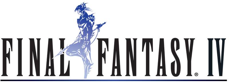
Final Fantasy IV to VI Era (1991–1994)
- Years Active: 1991–1994
- Design Description: More detailed Amano illustrations; the wordmark grew more refined; SNES hardware allowed richer color reproduction on packaging
- Color Scheme: Richer, multi-color artwork; gold and blue tones prominent
- Designer: Yoshitaka Amano
- Context: Series transition to SNES, expanding audience in Japan and growing Western fanbase
- Key Changes from Previous: Significantly more detailed character illustration; stronger use of color
- Cultural Significance: This era established Amano’s ethereal, watercolor-influenced style as the series visual standard
Final Fantasy VII Logo (1997)
- Years Active: 1997–present (still widely used in remasters and merchandise)
- Design Description: Meteor symbol above the wordmark; Amano illustration stepped back in favor of a cleaner, more graphic emblem suited to the game’s cyberpunk tone
- Color Scheme: Black background, white wordmark, stylized red-and-black meteor graphic
- Designer: Square Co. internal design; Amano involvement reduced for this entry
- Context: PlayStation debut, shift to 3D, massive global marketing push
- Key Changes from Previous: Dropped the character portrait format; introduced a standalone symbol icon
- Cultural Significance: Probably the most globally recognized logo in the series; synonymous with the franchise’s mainstream breakthrough
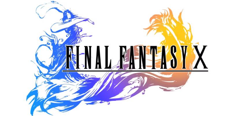
Final Fantasy X to XVI Era (2001–2023)
- Years Active: 2001–2023
- Design Description: Each title returned to Amano-style illustrations with varying degrees of abstraction; FFXVI (2023) uses a stark, graphic phoenix-and-Ifrit emblem with a bold sans-influenced wordmark variant
- Color Scheme: Varies per title; FFXVI uses black, white, and red (#C0392B range) prominently
- Designer: Yoshitaka Amano (select titles); Square Enix internal design
- Context: PlayStation 2 through PlayStation 5 hardware generations
- Key Changes from Previous: Growing graphic boldness; some entries moved toward cleaner, more modern mark styles
- Cultural Significance: Demonstrated the logo system’s flexibility: same wordmark template, totally different visual tone per game
What Do the Design Elements of the Final Fantasy Logo Mean?

The logo system works because it splits identity into two layers: a stable wordmark that signals the franchise, and per-game artwork that signals the tone of that specific title. Each element carries its own meaning, and together they communicate both continuity and variety.
What Does the Amano Artwork Represent?
Yoshitaka Amano’s illustrations function as a visual shorthand for the game’s central conflict or protagonist.
His style, rooted in Japanese ink painting and European Art Nouveau, deliberately avoids realism.
That abstraction is intentional. It lets players project emotion onto the characters rather than receiving a fixed interpretation.
The artwork essentially acts as the focal point of each logo, drawing the eye before the wordmark is even read.
Why Did Final Fantasy Choose These Specific Colors?
- White (#FFFFFF)
- Symbolic Meaning: Purity, the blank slate of a new adventure
- Psychological Impact: Clean, readable against dark backgrounds; projects a premium feel
- Brand Connection: Works across merchandise, screens, and print without degradation
- Black (#000000)
- Symbolic Meaning: Drama, weight, the unknown
- Psychological Impact: Creates strong contrast that makes the wordmark legible at small sizes
- Brand Connection: Used consistently across box art backgrounds and title screens
- Gold (#C8A951)
- Symbolic Meaning: Legacy, prestige, the epic scale of the series
- Psychological Impact: Signals collector and anniversary editions; elevates perceived value
- Brand Connection: Appears on limited editions, orchestral concert branding, and premium merchandise
What Typography Style Is Used in the Final Fantasy Logo?

The wordmark uses a custom serif typeface with high-contrast strokes, tall letterforms, and subtle decorative details at the terminals.
It sits somewhere between a classical Roman typeface and a display serif font, weighted toward elegance over legibility at small sizes.
The letterforms have stayed largely consistent since the early 1990s, which is unusual for a franchise that otherwise changes its visuals aggressively per entry.
That typographic consistency is actually doing a lot of work. It’s the thread that connects FFVII’s meteor logo to FFXVI’s phoenix emblem as parts of the same series.
What Are the Hidden Meanings in the Final Fantasy Logo?
The name itself is the most discussed piece of symbolism. Hironobu Sakaguchi named the game “Final Fantasy” because he believed Square was on the verge of bankruptcy and this would be his final project.
It wasn’t. And the name stuck as an odd, slightly melancholic brand identity for one of gaming’s biggest franchises.
Some entries embed additional symbolism in the illustration. The FFVII meteor represents both destruction and the game’s central antagonist Sephiroth’s goal. The FFXIV logo (post-relaunch) features a phoenix specifically referencing the game’s own near-cancellation and revival.
Accidental meaning, but it’s there if you look.
How Does the Final Fantasy Logo Compare to Competitor Logos?
Among major JRPG franchises, Final Fantasy’s per-entry logo system is unique. Most competitors use a single fixed mark. That flexibility, combined with a consistent wordmark, gives it an unusual position in video game logos history.
The Legend of Zelda logo uses a fixed gold-on-black wordmark that changes minimally across entries. Strong brand coherence, but less personality per game.
The World of Warcraft logo stays consistent across expansions at the base brand level, with expansion-specific sub-branding layered on top. Different approach, similar challenge.
The Dark Souls logo keeps a fixed emblem across the trilogy, reinforcing series identity but offering no per-game distinction.
The Diablo logo uses a consistent gothic wordmark with the iconic rune symbol, staying visually stable but with color and texture variations across entries.
Final Fantasy’s system solves a branding problem most franchises avoid: how to make each entry feel like its own product while still signaling series membership. The per-game artwork handles differentiation; the wordmark handles continuity. It’s a cleaner solution than most.
Worth noting: the approach only works because Amano’s illustration style is so distinctive. A generic illustrator wouldn’t give the system the coherence it needs.
What Are the Technical Specifications of the Final Fantasy Logo?
Official Color Codes
Primary Color: White (Standard Wordmark)
- Hex: #FFFFFF
- RGB: (255, 255, 255)
- CMYK: (0, 0, 0, 0)
- Pantone: White
Secondary Color: Black (Background/Alternate Wordmark)
- Hex: #000000
- RGB: (0, 0, 0)
- CMYK: (0, 0, 0, 100)
- Pantone: Black C
Accent Color: Gold (Premium/Anniversary Usage)
- Hex: #C8A951
- RGB: (200, 169, 81)
- CMYK: (0, 15, 59, 22)
- Pantone: 124 C (approximate)
Dimensions and Proportions
- Aspect Ratio: Varies per entry; the wordmark alone runs approximately 4:1 width-to-height
- Minimum Size Requirements: Square Enix brand guidelines (not publicly released in full) recommend no reproduction below 100px width for digital; print minimum approximately 25mm width
- Clear Space: Standard practice is a minimum clear space equal to the cap height of the wordmark on all sides
- Official Usage Guidelines: Governed by Square Enix’s trademark and brand protection policies; not publicly available as an open style guide
- File Formats Available (officially): Press assets typically distributed as vector graphics (EPS/SVG) and high-resolution PNG with transparency
- Resolution for Print: Minimum 300 DPI for physical reproduction
What Cultural Impact Has the Final Fantasy Logo Had?
Few game franchises have a visual identity with this level of cultural reach. The Final Fantasy wordmark appears on concert hall programs for orchestral tours, on fashion collaborations, on physical statues, and in museum game history exhibits.
The FFVII logo specifically became shorthand for an entire era of gaming. See that meteor symbol and most players aged 30+ immediately know exactly what it is and what year it takes them back to.
The per-entry logo system also influenced how other franchises approach sequel branding. The idea that a sequel can have its own distinct visual identity while remaining part of a parent brand is now common in gaming, but Final Fantasy was doing it in the early 1990s.
Yoshitaka Amano’s involvement gave the logos a fine art credibility that most game branding lacks. His work has been exhibited in galleries. That crossover between commercial game branding and fine art illustration is genuinely unusual and accounts for a lot of the cultural respect the logos carry.
The franchise also has one of the most active fan art communities built specifically around logo and title card recreations. People make custom Final Fantasy-style logos for their own projects constantly. That’s a sign the visual system is well-understood and genuinely admired as a design language, not just recognized as a brand mark.
How Does the Final Fantasy Logo Fit Into the Overall Brand Identity?

The logo is the entry point to a much larger brand system. Square Enix manages Final Fantasy as both a game franchise and a media property, and the logo anchors every extension of it.
The wordmark connects the mainline games, the spin-offs (Crisis Core, Stranger of Paradise, Tactics), the films (Advent Children), the mobile titles, and the merchandise lines into a single recognizable family.
The brand guidelines extend to how the logo sits on packaging, how it appears in trailers, and how it’s licensed for third-party merchandise. The consistency of the wordmark across all those touchpoints is what holds the brand together despite enormous visual variation in the per-game artwork.
Square Enix also uses the logo to signal quality tier. A product carrying the main Final Fantasy wordmark is positioned differently from a mobile spin-off or a crossover appearance in another game. The logo carries weight, and Square Enix manages that weight deliberately.
Related brand entities connected to the logo system include: Yoshitaka Amano (artist), Square Enix (publisher), the Crystal Chronicles sub-brand, the Final Fantasy XIV online service brand, and the Compilation of FFVII sub-series. Each has its own visual treatment that extends from, rather than replaces, the core logo identity.
How Should the Final Fantasy Logo Be Used?
Official Usage Guidelines
- Do: Use official press kit assets downloaded from Square Enix’s press portal for editorial, review, and journalistic coverage
- Do: Credit Square Enix as the trademark owner when reproducing the logo in print or digital editorial contexts
- Do: Maintain proportions when scaling; never stretch or distort the wordmark
- Don’t: Use the logo on merchandise, products, or commercial materials without explicit licensing from Square Enix
- Don’t: Modify, recolor, or recreate the wordmark for commercial purposes
- Don’t: Use the logo to imply sponsorship, partnership, or endorsement by Square Enix without written agreement
Where to Access Official Logos
- Square Enix Press Center (press.na.square-enix.com) for North American press assets
- Direct media request to Square Enix PR for high-resolution or vector formats
- Official game pages on Steam, PlayStation Store, and Nintendo eShop contain logo assets within press kits
Licensing and Trademark Protection
- Final Fantasy is a registered trademark of Square Enix Holdings Co., Ltd.
- Commercial use requires a formal licensing agreement with Square Enix
- Fan art and non-commercial creative work exists in a tolerated but technically unlicensed space; Square Enix has historically not pursued individual fan creators, but this is not an official permission
- Font licensing for the custom wordmark typeface is not available publicly; the letterforms are proprietary to Square Enix
FAQ on The Final Fantasy Logo
What font is used in the Final Fantasy logo?
The wordmark uses a custom serif typeface developed internally by Square Co.
It’s not publicly available or licensed. The tall letterforms and high-contrast strokes give it a distinctly classical, almost engraved quality that no standard typeface quite replicates.
Who designed the Final Fantasy logo artwork?
Yoshitaka Amano created the illustration component for most mainline entries.
His background in anime character design and Japanese ink painting gives each logo its distinctive, ethereal quality. Final Fantasy VII was a notable exception, using a graphic emblem instead of his portrait-style artwork.
Has the Final Fantasy logo changed over the years?
Yes, but in a specific way. The wordmark typography has stayed largely consistent since the early 1990s.
What changes with every entry is the illustrative component. Each game gets unique artwork, a different color scheme, and its own visual tone while the series name lettering remains stable.
What do the colors in the Final Fantasy logo mean?
There’s no single color scheme. Each entry uses its own color palette tied to that game’s themes.
The wordmark itself defaults to white or black depending on the background. Gold appears frequently on anniversary editions and premium merchandise, signaling prestige rather than narrative meaning.
Why does every Final Fantasy game have a different logo?
Square Enix treats each numbered entry as a standalone title, not just a sequel.
The per-game logo system reflects that. Unique artwork signals a fresh story and setting, while the consistent serif wordmark keeps franchise recognition intact. It’s a smart solution to a real branding challenge.
What is the crystal symbol in some Final Fantasy logos?
Crystals are a recurring motif across the series, central to many games’ storylines.
Several logos incorporate crystal imagery as part of the emphasis on the game’s core theme. It’s less a fixed brand symbol and more a thematic reference that appears when the narrative calls for it.
Where can I download the official Final Fantasy logo?
Official press assets are available through Square Enix’s press portal for editorial and journalistic use.
These are typically distributed as high-resolution PNG files with transparent backgrounds. Vector format files are available on request for media outlets but are not publicly downloadable for general use.
Is the Final Fantasy logo trademarked?
Yes. Final Fantasy is a registered trademark of Square Enix Holdings Co., Ltd.
Using the logo commercially without a licensing agreement is an infringement. Fan art for non-commercial use exists in a tolerated grey area, but Square Enix has never issued a formal public permission for it.
How does the Final Fantasy logo compare to other JRPG logos?
Most competing franchises use a single fixed mark across all entries.
Final Fantasy’s per-entry system is unusual in the genre. Compared to something like the game logo conventions of Dragon Quest or Persona, the Amano-illustration approach gives each title a fine art quality that most game branding doesn’t attempt.
What makes the Final Fantasy logo design so recognizable?
Two things working together: the stable wordmark and Amano’s unmistakable illustration style.
Neither element alone would be enough. The visual hierarchy places the illustration as the emotional hook and the wordmark as the brand anchor. That split function is what makes the logo system work across 35+ years and 16+ titles.
Conclusion
The Final Fantasy logo system is genuinely unlike most franchise branding in gaming, built on a per-entry illustration approach that keeps Square Enix’s RPG series visually fresh across every title while the consistent serif wordmark holds the whole thing together.
Yoshitaka Amano’s involvement gives it a fine art credibility that goes well beyond standard gaming company logos.
The logo design evolution across 35+ years shows how a franchise can change completely in tone and still feel like one coherent brand identity.
That balance between variety and consistency is what makes it worth studying.

Renowned for his expertise in logo design and visual branding, Bogdan has developed a multitude of logos for various clients.
His skills extend to creating posters, vector illustrations, business cards, and brochures. Additionally, Bogdan's UI kits were featured on marketplaces like Visual Hierarchy and UI8.
He also wrote in the past years on sites like Design Your Way, WebDesignerDepot, WPDean, Designmodo, Speckyboy, Slider Revolution, and more.
- The Windsurf Logo History, Colors, Font, And Meaning - 10 October 2026
- How to Remove Background From Product Photos (No Photoshop) - 10 October 2026
- How Designers can Build a Stronger Online Creative Identity - 9 October 2026

Bogdan Sandu is a seasoned designer who has been designing websites since 2008. Renowned for his expertise in logo design and visual branding, Bogdan has developed a multitude of logos for various clients. His skills extend to creating posters, vector illustrations, business cards, and brochures. Additionally, Bogdan's UI kits were featured on marketplaces like Visual Hierarchy and UI8. He also wrote in the past years on sites like Design Your Way, WebDesignerDepot, WPDean, Designmodo, Speckyboy, Slider Revolution, and more.
You Might Also Like