


The Legend of Zelda logo is one of gaming’s most recognized visual identities, built around the iconic Triforce symbol and a distinctive gold wordmark that has represented Nintendo’s flagship action-adventure franchise since 1986. It sits alongside titles like the Super Mario logo as one of Nintendo’s most enduring brand marks. The logo has gone through meaningful changes across nearly four decades, but its core visual language has stayed remarkably consistent. Few video game logos carry this level of cultural weight.
What Is the Legend of Zelda Logo?
The Legend of Zelda logo is a combination mark featuring the franchise’s stylized wordmark in an ornate serif typeface, accompanied by the Triforce symbol, rendered primarily in gold tones. First introduced in 1986 with the original NES release, the logo was developed internally by Nintendo and has been updated across each major title while retaining its medieval fantasy character.
- Design Type: Combination mark (wordmark + emblem)
- Primary Elements: Triforce symbol, stylized serif wordmark, ornamental decorative framing on select versions
- Official Introduction Date: 1986 (original NES release)
- Designer/Agency: Nintendo internal design team
- Trademark Status: Registered trademark of Nintendo Co., Ltd.
- Color Palette: Gold (#C9A84C), Deep Navy (#1A1A2E), Black (#000000), White (#FFFFFF) for alternate versions
- Usage Context: Game packaging, title screens, merchandise, marketing materials, digital platforms, promotional media
How Has the Legend of Zelda Logo Evolved Over Time?

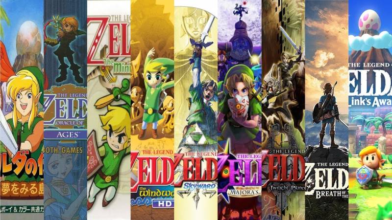
The logo has gone through roughly a dozen distinct versions since 1986, each tied to a specific game release. The core elements – gold lettering, the Triforce, and a fantasy serif style – have persisted throughout, but the level of ornamentation, color depth, and typographic detail has shifted considerably across generations.
Original Legend of Zelda Logo (1986–1987)
- Years Active: 1986–1987
- Design Description: Simple gold wordmark on a dark background, minimal ornamentation, blocky serif letterforms
- Color Scheme: Gold on black/dark blue
- Designer: Nintendo internal team
- Context: Designed for the original NES Famicom Disk System release in Japan, then adapted for North American cartridge release
- Key Changes from Previous: N/A (first version)
- Cultural Significance: Established the gold-on-dark visual language that defined the series for decades
A Link to the Past Logo (1991–1992)
- Years Active: 1991–1992
- Design Description: More refined wordmark with added decorative flourishes, Triforce symbol more prominent
- Color Scheme: Richer gold tones, deeper background contrast
- Designer: Nintendo internal team
- Context: SNES release brought more graphical capability, allowing for a more detailed logo treatment
- Key Changes from Previous: Increased visual complexity, more polished letterforms
- Cultural Significance: Set the visual tone for the SNES era of the franchise
Ocarina of Time Logo (1998–2000)
- Years Active: 1998–2000
- Design Description: 3D-influenced gold lettering with beveled edges, ocarina motif integrated into some versions, highly ornate framing
- Color Scheme: Multi-tonal gold with shadow and highlight gradients
- Designer: Nintendo internal team
- Context: First 3D Zelda game; the logo reflected the jump to polygon-era graphics and epic scope
- Key Changes from Previous: Significant dimensional quality added, subtitle treatment introduced as a distinct design layer
- Cultural Significance: Widely considered the most iconic Zelda logo iteration; tied to what many call the greatest game ever made
Breath of the Wild Logo (2017–present)
- Years Active: 2017–present
- Design Description: Cleaner, more open wordmark with reduced ornamentation, the subtitle in a contrasting lighter sans-adjacent typeface
- Color Scheme: Gold wordmark, sky-blue and earthy tones in background treatments
- Designer: Nintendo EPD
- Context: Open-world reboot of the franchise required a logo that felt expansive rather than enclosed
- Key Changes from Previous: Less decorative framing, more breathing room, subtitle given visual weight equal to the main title
- Cultural Significance: Marked a new era for the franchise and became one of the most downloaded and recreated logos in gaming fan communities
What Do the Design Elements of the Legend of Zelda Logo Mean?

Every element in the logo connects directly to the game’s lore, world, and themes. The Triforce isn’t decorative. It’s the central artifact of the entire franchise mythology, representing Power, Wisdom, and Courage.
The gold color isn’t arbitrary either. It references the Triforce’s literal appearance in the games and signals something ancient, sacred, and worth protecting.
The ornate serif typography pulls from medieval manuscript traditions, which fits a franchise rooted in high fantasy, ancient kingdoms, and timeless conflict.
What Does the Triforce Symbol Represent?
The Triforce is three equilateral triangles arranged in a larger triangle formation.
In the games, each triangle represents one of the three goddesses of Hyrule: Din (Power), Nayru (Wisdom), and Farore (Courage). The three characters – Ganon, Zelda, and Link – each carry one piece.
As a logo element, it functions as an instant recognition trigger. You don’t even need the wordmark. Most fans recognize the franchise from the symbol alone.
Why Did Nintendo Choose These Specific Colors?

- Gold (#C9A84C)
- Symbolic meaning: Divinity, ancient power, the Triforce artifact
- Psychological impact: Conveys prestige, rarity, and timelessness
- Brand connection: Directly mirrors the in-game appearance of the Triforce
- Black / Deep Navy (#000000 / #1A1A2E)
- Symbolic meaning: Mystery, the unknown, darkness that the hero must face
- Psychological impact: Creates strong contrast that makes the gold pop immediately
- Brand connection: Standard dark background used across fantasy game branding to signal epic tone
- White (#FFFFFF) – alternate versions
- Symbolic meaning: Purity, clarity, the light-world settings in several games
- Psychological impact: Used for lighter-themed titles and modern digital contexts
- Brand connection: Appears in merchandise and digital marketing where dark backgrounds aren’t practical
The gold color treatment puts Zelda in a specific category of game logos that use color to signal mythology rather than energy or speed.
What Typography Style Is Used in the Legend of Zelda Logo?

The wordmark uses a custom-modified serif typeface with strong calligraphic influence.
It’s not a standard retail font. Nintendo’s designers built it with exaggerated stroke contrast, meaning the thick and thin parts of each letter differ dramatically – a quality you typically see in old-world manuscript lettering.
The serif details are ornate but not cluttered. There’s a clear typographic hierarchy between “The Legend of” (smaller, lighter) and “Zelda” (dominant, heavier weight).
Across different game entries, the font styling has been adapted slightly, but the core character has never been replaced with anything modern or geometric.
What Are the Hidden Meanings in the Legend of Zelda Logo?
The Triforce’s three-part structure mirrors storytelling structure itself: setup, conflict, resolution. Or, in Zelda terms: peace, chaos, restoration.
The choice of a serif-heavy, medieval-style wordmark quietly signals that this isn’t a fast-paced action franchise. It’s a slower, more contemplative adventure rooted in exploration and puzzle-solving.
Some fans have noted that the negative space within certain versions of the Triforce arrangement creates a fourth downward-pointing triangle – sometimes called the “Shadow Triforce” in fan lore, though Nintendo has never officially referenced this as intentional design.
How Does the Legend of Zelda Logo Compare to Competitor Logos?
Among gaming company logos and franchise marks, Zelda sits in a unique position. It’s one of very few game logos that uses a mythological in-universe symbol as its primary mark.
The Final Fantasy logo leans on illustrated characters and crystalline imagery, changing dramatically with each entry. The Dark Souls logo uses austere typography with minimal symbolism. The God of War logo went through a major rebrand that shifted it from aggressive to cinematic.
Zelda has stayed more consistent than almost any of them.
Compare it to something like the World of Warcraft logo, which uses a similarly ornate fantasy serif treatment, and you can see how that visual language signals a specific genre expectation to players.
The Witcher logo is probably the closest competitor in terms of tone – dark, medieval, symbol-forward. But Zelda’s gold palette keeps it distinct from the Witcher’s gritty silver-and-black approach.
Where most action game logos chase energy and aggression, Zelda’s logo communicates something closer to mythology. That’s a deliberate and unusual choice that has aged extremely well.
What Are the Technical Specifications of the Legend of Zelda Logo?
Official Color Codes:
- Primary Color: Gold
- Hex: #C9A84C
- RGB: (201, 168, 76)
- CMYK: (0, 16, 62, 21)
- Pantone: 124 C
- Secondary Color: Black
- Hex: #000000
- RGB: (0, 0, 0)
- CMYK: (0, 0, 0, 100)
- Pantone: Process Black C
- Accent Color: Deep Navy (dark background variant)
- Hex: #1A1A2E
- RGB: (26, 26, 46)
- CMYK: (43, 43, 0, 82)
- Pantone: 2767 C
Dimensions and Proportions:
- Aspect ratio: Varies by game title; typically wider than tall, approximately 3:1 for the standard horizontal lockup
- Minimum size requirements: Not publicly specified by Nintendo; standard brand practice recommends no smaller than 150px wide for digital use
- Clear space specifications: Not officially published; industry standard suggests clear space equal to the height of the Triforce symbol on all sides
- Official usage guidelines: Governed by Nintendo’s brand and trademark policies; official assets available only through Nintendo’s licensed partner program
For digital use, the logo is distributed as a vector graphic to maintain quality at any scale. Pixel-based formats like JPEG are used for web and social contexts, though lossless formats are preferred for merchandise and print applications. Print files require a minimum of 300 DPI for clean reproduction.
What Cultural Impact Has the Legend of Zelda Logo Had?
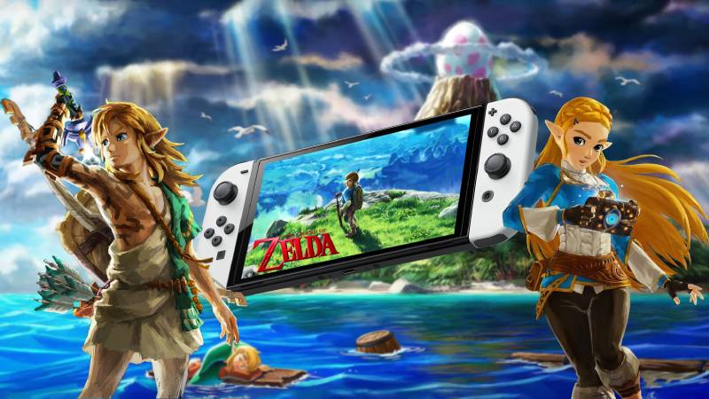
The Triforce has crossed well beyond gaming into broader popular culture. It appears as one of the most common gaming-related tattoos worldwide. It shows up on clothing, jewelry, home décor, and fan art at a scale that few video game symbols match.
The logo’s consistent gold-and-dark color treatment has influenced how other fantasy game franchises present themselves visually. You can trace its fingerprints across dozens of RPG and adventure game logos released since the early 1990s.
It also holds a specific place in the history of logo design more broadly, as an example of a brand mark that derives its power entirely from narrative meaning rather than abstract visual cleverness.
The logo’s cultural reach is comparable to other franchises with deep mythological branding, sitting alongside the Game of Thrones logo and the Skyrim logo as marks that have become shorthand for an entire genre feeling.
How Does the Legend of Zelda Logo Fit Into the Overall Brand Identity?
The logo sits at the center of a tightly connected visual system. The Triforce symbol, the gold color palette, the medieval typography, and the in-game UI design all reference each other. When you open a Zelda game, the visual language of the logo carries directly into the menus, the item screens, and the environmental design of Hyrule itself.
Nintendo treats the Zelda brand as a premium tier within its portfolio. The logo’s consistent quality signals that. It doesn’t get casual redesigns the way some Nintendo sub-brands do.
The overall brand guidelines (while not publicly released) appear to enforce strict consistency across merchandise, packaging, and promotional materials. The logo’s relationship to the storytelling function of the franchise is unusually direct – it’s basically a narrative artifact in its own right, not just a commercial mark.
Related entities in the brand ecosystem include the Hyrule royal crest, Link’s shield design, and the recurring motif of triforce-patterned borders – all of which maintain visual unity across the franchise’s massive catalog of titles and merchandise.
How Should the Legend of Zelda Logo Be Used?
- Do’s:
- Use official Nintendo-provided assets for any licensed or commercial application
- Maintain the original color relationships – do not recolor the gold wordmark to another color without Nintendo’s explicit approval
- Keep proportions intact – do not stretch or compress the mark
- Maintain clear space around the logo in all applications
- Use high-resolution vector files for print to ensure clean reproduction at any size
- Don’ts:
- Do not use the logo for commercial purposes without a valid license from Nintendo
- Do not modify, remix, or create derivative versions for monetized products
- Do not place the logo on backgrounds that reduce legibility of the gold wordmark
- Do not use low-resolution bitmap versions for large-format print applications
- Do not combine the logo with third-party branding in ways that imply Nintendo endorsement
- Where to access official logos: Nintendo’s official press kit and media resource portal (press.nintendo.com) provides approved assets for journalists and licensed partners
- Licensing information: Commercial use requires a formal licensing agreement with Nintendo Co., Ltd. Fan use for non-commercial purposes is generally tolerated but not explicitly sanctioned
- Trademark protection: The Legend of Zelda wordmark and the Triforce symbol are registered trademarks of Nintendo. Unauthorized commercial use is actively enforced by Nintendo’s legal team
FAQ on The Legend of Zelda Logo
What font is used in the Legend of Zelda logo?
Nintendo uses a custom-modified serif typeface for the Zelda wordmark. It’s not available as a retail font.
The letterforms draw from calligraphic tradition, with heavy stroke contrast and ornate detailing. Several fan-made approximations exist, with “Hylia Serif” being the closest freely available option.
What does the Triforce symbol mean?
The Triforce represents three golden triangles left behind by Hyrule’s three creator goddesses: Din, Nayru, and Farore.
Each piece corresponds to Power, Wisdom, and Courage – and to Ganon, Zelda, and Link respectively. It’s the franchise’s central artifact and most recognizable visual element.
Who designed the Legend of Zelda logo?
Nintendo’s internal design team created the original Zelda logo for the 1986 Famicom Disk System release.
No single designer has been publicly credited. Each game entry gets its own logo treatment, handled by Nintendo EPD’s art direction team rather than an outside agency.
What color is the Zelda logo?
The primary Zelda logo color is gold, with a hex value of approximately #C9A84C.
It’s typically presented on black or deep navy backgrounds. Some alternate versions use white or light backgrounds for merchandise and digital contexts where dark backgrounds aren’t practical.
Has the Legend of Zelda logo changed over the years?
Yes. The logo has gone through roughly a dozen versions since 1986, one per major title.
The Triforce symbol and gold serif wordmark have stayed constant. What changes is the level of ornamentation, the depth of the gold gradient treatment, and how much visual weight the game subtitle carries.
Can I use the Zelda logo for my project?
Not for commercial use. The Zelda wordmark and Triforce symbol are registered Nintendo trademarks.
Fan art and non-commercial creative projects generally fly under the radar, but Nintendo actively enforces its trademark rights against monetized products. Always check Nintendo’s licensing terms before using the logo anywhere publicly.
What is the Hyrule crest and how does it relate to the logo?
The Hyrule crest is a separate symbol featuring a spread-winged bird above the Triforce. It represents the Royal Family of Hyrule.
It appears alongside the main logo in certain game versions and is common on in-game shields, maps, and architecture. It’s a secondary brand element, not part of the core logo lockup.
Where can I download the official Zelda logo?
Nintendo provides official press assets at press.nintendo.com for journalists and licensed partners.
For general fans, high-resolution versions circulate widely online, but these aren’t officially sanctioned for download. Vector formats of the Zelda logo design are not publicly distributed by Nintendo outside of formal licensing arrangements.
How does the Zelda logo compare to other Nintendo franchise logos?
It’s the most ornate logo in Nintendo’s portfolio. The Super Mario logo is playful and round; Zelda’s is formal and mythological.
Where Mario uses bright primary colors, Zelda commits to gold and dark tones. That contrast reflects the different audiences and emotional registers each franchise targets.
What makes the Zelda logo design so recognizable?
Three things: the Triforce symbol, the gold color palette, and the consistent use of ornate serif typography across nearly 40 years.
Most logo designs rely on one strong element. Zelda’s works because all three elements reinforce the same idea – ancient, mythological, worth protecting. That consistency is rare in graphic design.
Conclusion
The Legend of Zelda logo is one of the rare cases where a franchise’s visual identity and its mythology are genuinely inseparable.
The Triforce symbol, the gold wordmark, the ornate Hyrule-inspired typography – none of it feels like branding for its own sake.
Across nearly 40 years and a dozen logo iterations, Nintendo has kept the Zelda visual identity remarkably stable. That kind of consistency, from the original NES release through Tears of the Kingdom, is hard to pull off.
It works because the Zelda logo design was rooted in something real from the start: the lore, the world, the emotional stakes of the franchise itself.

Renowned for his expertise in logo design and visual branding, Bogdan has developed a multitude of logos for various clients.
His skills extend to creating posters, vector illustrations, business cards, and brochures. Additionally, Bogdan's UI kits were featured on marketplaces like Visual Hierarchy and UI8.
He also wrote in the past years on sites like Design Your Way, WebDesignerDepot, WPDean, Designmodo, Speckyboy, Slider Revolution, and more.
- The Windsurf Logo History, Colors, Font, And Meaning - 10 October 2026
- How to Remove Background From Product Photos (No Photoshop) - 10 October 2026
- How Designers can Build a Stronger Online Creative Identity - 9 October 2026

Bogdan Sandu is a seasoned designer who has been designing websites since 2008. Renowned for his expertise in logo design and visual branding, Bogdan has developed a multitude of logos for various clients. His skills extend to creating posters, vector illustrations, business cards, and brochures. Additionally, Bogdan's UI kits were featured on marketplaces like Visual Hierarchy and UI8. He also wrote in the past years on sites like Design Your Way, WebDesignerDepot, WPDean, Designmodo, Speckyboy, Slider Revolution, and more.
You Might Also Like


