The Dark Souls logo is one of the most recognizable pieces of branding in gaming history. It represents FromSoftware’s punishing action RPG series, first released in 2011. The wordmark’s stark, gothic lettering communicates exactly what the game is: brutal, dark, and unforgiving. Few video game logos carry this kind of weight before you’ve even picked up a controller.
Within gaming branding history, the Dark Souls logo sits in a rare category. It didn’t follow trends. While most studios were chasing clean, minimal title treatments during the early 2010s, FromSoftware went the opposite direction entirely. The result aged better than almost anything from that era.
The current logo uses a custom serif wordmark with heavy distressing and aged texture. It was introduced alongside the original Dark Souls release in 2011, designed under the direction of FromSoftware’s internal art team. The series has gone through three mainline entries, each with logo variations that maintained the core visual language while adapting to each game’s specific tone.
FromSoftware was founded in 1986. The Dark Souls identity as we know it launched 25 years later, growing through three direct logo iterations across the mainline trilogy.
—
What Is the Dark Souls Logo?
The Dark Souls logo is a distressed serif wordmark introduced in 2011 by FromSoftware and published by Bandai Namco. It uses aged, cracked letterforms in a near-black palette to communicate danger, decay, and dark medieval fantasy.
- Design Type: Wordmark
- Primary Elements: Custom distressed serif typography, cracked texture overlay, occasional flame or sigil motifs depending on edition
- Official Introduction Date: 2011 (Dark Souls I)
- Designer/Agency: FromSoftware internal art direction; specific individual designer not publicly credited
- Trademark Status: Trademarked by FromSoftware, Inc. and Bandai Namco Entertainment
- Color Palette: Primary near-black (#1A1A1A), aged gold/amber accent (#C9A84C), off-white distressed fill (#E8E0D0)
- Usage Context: Game packaging, title screens, merchandise, marketing materials, digital storefronts, collector’s editions
How Has the Dark Souls Logo Evolved Over Time?

The Dark Souls logo has remained visually consistent across the trilogy, with each entry refining rather than replacing the core design. Dark Souls I set the template in 2011, Dark Souls II softened it slightly in 2014, and Dark Souls III pushed it toward a more dramatic, high-contrast treatment in 2016.
Original Dark Souls Logo (2011)
- Years Active: 2011-2014
- Design Description: Heavy distressed serif wordmark with cracked letterforms and flame element beneath the text. Aged, worn texture throughout.
- Color Scheme: Near-black text, amber flame accent, dark background
- Designer: FromSoftware internal team
- Context: Launched as the spiritual successor to Demon’s Souls; needed a logo that communicated hardcore difficulty and gothic atmosphere
- Key Changes from Previous: First entry in the sub-brand; no predecessor to compare against
- Cultural Significance: Established the visual DNA that would define the entire Soulsborne genre’s branding language
Dark Souls II Logo (2014)
- Years Active: 2014-2016
- Design Description: Similar serif distressed wordmark but with slightly cleaner letterforms. Less aggressive cracking, more refined texture.
- Color Scheme: Deeper blacks, reduced amber accent, cooler overall tone
- Designer: FromSoftware internal team
- Context: Different development team internally; logo shift subtly reflected the change in creative direction
- Key Changes from Previous: Reduced distressing intensity, adjusted letter spacing, flame motif less prominent
- Cultural Significance: Confirmed the wordmark as a series standard, not a one-off choice
Dark Souls III Logo (2016)
- Years Active: 2016-present
- Design Description: Most refined version of the trilogy. Higher contrast, stronger weight in the letterforms, dramatic fire imagery integrated more formally.
- Color Scheme: True black, brighter amber/orange flame, sharper white highlights
- Designer: FromSoftware internal team, with Miyazaki returning as director
- Context: Positioned as the trilogy finale; logo needed to feel conclusive and epic
- Key Changes from Previous: Increased contrast, bolder stroke weight, flame element more central and dramatic
- Cultural Significance: The version most widely recognized today; used across most retrospective marketing and merchandise
What Do the Design Elements of the Dark Souls Logo Mean?

The Dark Souls logo communicates decay, danger, and perseverance through every design choice. The distressed letterforms aren’t decorative. They’re intentional. Each crack and worn edge references the lore’s central theme: a world in slow collapse, where everything that once stood strong is crumbling.
The flame motif ties directly to the bonfire mechanic, the series’ core symbol of rest and survival.
The weight of the letterforms signals authority. This isn’t a game trying to be approachable.
What Is the Symbolic Meaning Behind the Dark Souls Logo Design?
The distressed serif [typography] references medieval stone carvings and ancient inscriptions.
It connects the logo to Lordran’s crumbling architecture and forgotten kingdoms.
The fire element is the most direct symbol in the series. Linking the focal point of the wordmark to the bonfire mechanic was a smart, coherent design decision.
The overall composition tells you the tone before you read a single word of game description.
Why Did Dark Souls Choose These Specific Colors?
- Near-Black (#1A1A1A)
- Symbolic Meaning: Darkness, death, the unknown
- Psychological Impact: Communicates threat and weight; creates immediate contrast against any background
- Brand Connection: Directly reflects the game’s title and atmosphere
- Amber/Gold (#C9A84C)
- Symbolic Meaning: Fire, the fading flame, ancient glory
- Psychological Impact: Draws the eye; creates warmth against the cold black, suggesting something worth fighting for
- Brand Connection: Tied directly to the bonfire mechanic and the Age of Fire lore
- Off-White/Aged (#E8E0D0)
- Symbolic Meaning: Decay, age, the passage of time
- Psychological Impact: Avoids sterile brightness; keeps the palette feeling worn and historical
- Brand Connection: Mirrors the game’s aesthetic of ancient, crumbling civilizations
What Typography Style Is Used in the Dark Souls Logo?
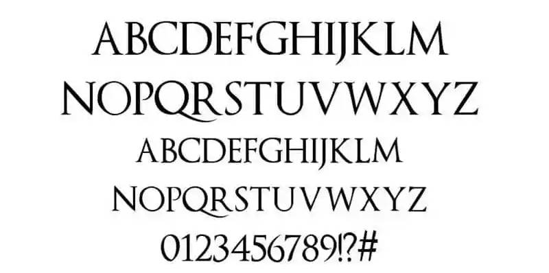
The logo uses a custom display serif with heavy distressing applied over the base letterforms.
It’s not a stock serif font pulled from a library. The letterforms were modified specifically for this identity, with cracking textures and uneven edges built into the design.
The display font approach makes sense here. This logo wasn’t designed for body text or UI. It lives on title screens, box art, and posters.
Readability takes a secondary role to atmosphere, which is actually the right call for this type of game branding. Across the trilogy, the typeface became heavier and more refined without losing its core damaged quality.
What Are the Hidden Meanings in the Dark Souls Logo?
The cracked texture isn’t purely decorative. It mirrors the Undead Curse, the in-game condition where characters slowly lose their humanity.
The aged quality of the letterforms suggests these words have been carved into stone for centuries. Like the world of Lordran itself.
The fire element positioned beneath or within the wordmark subtly frames “DARK SOULS” as something being consumed by flame, which is exactly what the game’s lore is about. The cycle of fire fading and being rekindled.
Whether intentional or not, the slight instability of the letterforms makes the logo feel like it could collapse. Which, honestly, fits.
How Does the Dark Souls Logo Compare to Competitor Logos?
Among dark fantasy action RPG logos, Dark Souls stands apart through deliberate restraint. It uses no illustration, no character art, no emblem. Just distressed type. Most competitors lean on iconography. Dark Souls trusted the words alone to carry the weight.
Compare it to the Diablo logo, which uses a prominent rune drop and stylized letterforms with a more overtly supernatural feel.
The Witcher logo takes a different route entirely, using a clean medallion mark paired with strong serif typography. More polished. Less raw.
The God of War logo uses bold, angular sans-serif letterforms, which communicates aggression through geometry rather than decay.
The Final Fantasy logo goes for elegance, thin serifs, clean lines, a crystal motif. Almost the opposite direction from Dark Souls.
What makes the Dark Souls wordmark work against all of these is specificity. It doesn’t try to look like a general “dark game.” It looks exactly like this game. That clarity is rare.
What Are the Technical Specifications of the Dark Souls Logo?
Official Color Codes:
- Primary Color: Near-Black
- Hex: #1A1A1A
- RGB: (26, 26, 26)
- CMYK: (0, 0, 0, 90)
- Pantone: Black 6 C (approximate)
- Secondary Color: Amber/Gold
- Hex: #C9A84C
- RGB: (201, 168, 76)
- CMYK: (0, 16, 62, 21)
- Pantone: 7562 C (approximate)
- Accent Color: Aged Off-White
- Hex: #E8E0D0
- RGB: (232, 224, 208)
- CMYK: (0, 3, 10, 9)
- Pantone: 9183 C (approximate)
Dimensions and Proportions:
- Aspect Ratio: Approximately 4:1 (horizontal wordmark)
- Minimum Size Requirements: Not officially published; standard practice suggests no smaller than 100px wide for digital use
- Clear Space: Minimum clear space equal to the cap-height of the wordmark on all sides
- Official Usage Guidelines: Governed by Bandai Namco and FromSoftware trademark terms; no official public brand guidelines document released
What Cultural Impact Has the Dark Souls Logo Had?

The Dark Souls logo became shorthand for an entire design philosophy in gaming. Distressed gothic typography is now immediately associated with “Soulslike” as a genre label, not just a game series.
Fan recreations, parody versions, and tribute designs appear constantly across the internet. The “YOU DIED” screen shares the same visual DNA as the logo, and both became genuine cultural phenomena.
Merchandise featuring the wordmark sells consistently years after release. That kind of staying power isn’t accidental.
The logo influenced how smaller indie studios approached dark fantasy branding. You can see its fingerprints on a generation of games that followed. It gave “dark and worn” a specific grammar that didn’t exist in quite the same way before 2011.
How Does the Dark Souls Logo Fit Into the Overall Brand Identity?
The logo isn’t isolated from the rest of the Dark Souls visual system. It connects directly to the UI design, the item description typography, the loading screen layouts, and the overall art direction of the games themselves.
The same distressed, aged quality found in the wordmark runs through environmental design, item icons, and menu systems.
This coherence is what makes the brand identity actually work. The logo isn’t sitting on top of the game’s visual identity. It’s part of the same continuous design language.
FromSoftware extended this approach into related titles. The game logos for Bloodborne and Elden Ring share clear DNA with Dark Souls, using similar distressed serif approaches while adapting to each game’s specific world and tone. Even the gaming company logos in the Soulsborne space have been influenced by this visual framework.
The brand guidelines may not be publicly available, but the consistency across every touchpoint suggests they’re taken seriously internally.
How Should the Dark Souls Logo Be Used?
Official Usage Do’s:
- Use only officially licensed assets obtained through Bandai Namco’s press kit or media resources
- Maintain original proportions; never stretch or distort the wordmark
- Use on dark backgrounds where possible to preserve the intended contrast
- Keep adequate clear space around the logo in all applications
Official Usage Don’ts:
- Don’t recreate the logo using substitute fonts and claim it as official
- Don’t use the logo on commercial products without proper licensing from Bandai Namco
- Don’t alter colors, add effects, or combine the wordmark with other brand marks
- Don’t use low-resolution versions on large-format print applications
Where to Access Official Logos: Bandai Namco’s official press portal provides authorized assets for media use. Fan and non-commercial use falls under separate considerations outlined in FromSoftware’s IP guidelines.
Licensing and Trademark: The Dark Souls logo is a registered trademark of FromSoftware, Inc. Commercial use requires explicit written permission from Bandai Namco Entertainment. Unauthorized commercial reproduction constitutes trademark infringement.
FAQ on The Dark Souls Logo
What font is used in the Dark Souls logo?
The Dark Souls logo uses a custom-modified serif display typeface with heavy distressing applied over the base letterforms.
It’s not available as a commercial font. FromSoftware’s internal art team modified existing gothic serif forms, adding cracked textures and uneven edges specific to this identity.
Who designed the Dark Souls logo?
No individual designer has been publicly credited. The logo came from FromSoftware’s internal art team under the creative direction of the studio.
Hidetaka Miyazaki, as director, shaped the overall visual tone, but specific design attribution remains undisclosed.
What do the colors in the Dark Souls logo mean?
The near-black base communicates death and darkness. The amber gold accent ties directly to fire, specifically the bonfire mechanic and the Age of Fire lore central to the series.
The aged off-white texture suggests decay. Together, the color palette tells the game’s entire story at a glance.
Has the Dark Souls logo changed between games?
Yes, but subtly. Each entry in the trilogy refined the wordmark rather than redesigning it.
Dark Souls III features the most polished version, with stronger contrast and bolder letterforms compared to the original 2011 design.
Can I download the Dark Souls logo for free?
Official assets are available through Bandai Namco’s press portal for media use. Fan and personal use exists in a gray area.
Commercial use without licensing is a trademark infringement. Font licensing rules apply separately if you’re recreating the lettering style.
What design style is the Dark Souls logo?
It’s a distressed gothic wordmark. The design pulls from medieval stone carving traditions and Grunge design principles, applying decay and wear to communicate the game’s core themes directly through its title treatment.
How does the Dark Souls logo compare to other FromSoftware titles?
Bloodborne and Elden Ring share clear visual DNA with the Dark Souls wordmark. All three use distressed serif lettering with aged textures.
The Skyrim logo takes a similar dark fantasy approach but leans on angular dragon iconography rather than pure typographic distressing.
Is the Dark Souls logo trademarked?
Yes. The Dark Souls logo and wordmark are registered trademarks of FromSoftware, Inc., with Bandai Namco Entertainment holding publishing rights.
Unauthorized commercial reproduction is infringement. This applies to merchandise, print, and digital use alike.
What makes the Dark Souls logo so recognizable?
Specificity. The distressed gothic serif treatment is distinct enough that it reads as Dark Souls instantly, even without the flame motif.
Strong visual hierarchy between the heavy letterforms and dark background makes it work at any size, from box art to a small game icon.
What file formats is the Dark Souls logo available in?
Official press assets typically include PNG with transparent backgrounds and high-resolution JPEG versions.
Vector graphics versions aren’t publicly distributed, though fan-made SVG recreations exist. For print use, always source files with sufficient DPI from official Bandai Namco press materials.
Conclusion
The Dark Souls logo isn’t just a title treatment. It’s a precise visual argument for what the game is, built from distressed gothic serif letterforms, a near-black palette, and amber fire accents that reference the bonfire mechanic directly.
FromSoftware’s internal art direction produced something that influenced an entire genre’s branding language without ever releasing official brand style guide documentation.
The wordmark’s visual identity held across three mainline entries, each refinement strengthening rather than diluting the original design.
That kind of consistency, across a full trilogy and years of merchandise, is what separates a good logo from a genuinely iconic one.

Renowned for his expertise in logo design and visual branding, Bogdan has developed a multitude of logos for various clients.
His skills extend to creating posters, vector illustrations, business cards, and brochures. Additionally, Bogdan's UI kits were featured on marketplaces like Visual Hierarchy and UI8.
He also wrote in the past years on sites like Design Your Way, WebDesignerDepot, WPDean, Designmodo, Speckyboy, Slider Revolution, and more.
- The Windsurf Logo History, Colors, Font, And Meaning - 10 October 2026
- How to Remove Background From Product Photos (No Photoshop) - 10 October 2026
- How Designers can Build a Stronger Online Creative Identity - 9 October 2026

Bogdan Sandu is a seasoned designer who has been designing websites since 2008. Renowned for his expertise in logo design and visual branding, Bogdan has developed a multitude of logos for various clients. His skills extend to creating posters, vector illustrations, business cards, and brochures. Additionally, Bogdan's UI kits were featured on marketplaces like Visual Hierarchy and UI8. He also wrote in the past years on sites like Design Your Way, WebDesignerDepot, WPDean, Designmodo, Speckyboy, Slider Revolution, and more.
You Might Also Like