Few symbols in gaming carry as much weight as the Nintendo logo. It’s been around in some form since the late 1800s, which is wild when you think about it. Most people associate it with the red and white wordmark on their Switch console or a Game Boy cartridge from 1992. But the full story goes back way further than video games.
Nintendo Co., Ltd. was founded in 1889 in Kyoto, Japan, by Fusajiro Yamauchi. The company started as a playing card manufacturer, specifically Hanafuda cards. The logo has gone through roughly a dozen significant changes since then, reflecting the company’s shift from traditional Japanese card games to becoming one of the most recognized names in entertainment.
The current version, a rounded red rectangle with “Nintendo” in white custom lettering, has been in use since around 2006. It replaced the slightly more elongated “racetrack” oval that became a staple in the early 2000s. The designer of the original iteration is not publicly documented, though the modern wordmark’s refinements are attributed to Nintendo’s internal corporate design team.
What Is the Nintendo Logo?
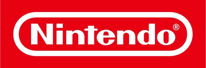
The Nintendo logo is a custom wordmark set inside a rounded red rectangle, officially introduced in its current form around 2006. It features clean, geometric sans-serif lettering in white against Nintendo Red. The design represents approachability, fun, and global brand consistency across all Nintendo products and platforms.
Here’s a breakdown of the key attributes:
- Design Type: Wordmark inside a contained shape (combination mark)
- Primary Elements: Custom sans-serif lettering, rounded rectangular border, solid color fill
- Official Introduction Date: The current refined version dates to approximately 2006, though the “racetrack” wordmark concept originated in 1975
- Designer/Agency: Nintendo’s in-house design team. No single credited designer for the modern wordmark
- Trademark Status: Registered trademark of Nintendo Co., Ltd. globally. Protected across multiple classes including entertainment, electronics, and toys
- Color Palette: Nintendo Red (#E60012) on a white background, or white text on Nintendo Red. Black and white variations exist for specific applications
- Usage Context: Console hardware, game cartridges, packaging, retail signage, digital storefronts, marketing materials, and merchandise worldwide
How Has the Nintendo Logo Evolved Over Time?
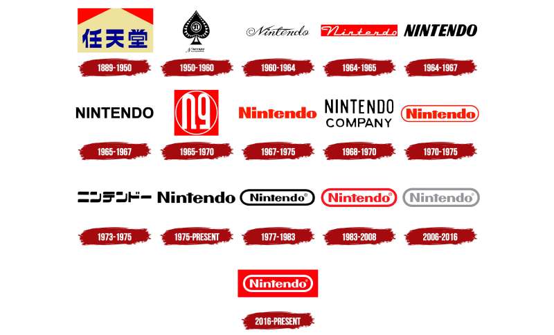
Nintendo’s visual identity has shifted dramatically across more than 130 years. The earliest marks were Japanese calligraphy for the playing card business.
By the mid-20th century, the company experimented with Western-style lettering. The 1960s and 70s brought several rapid changes as Nintendo moved into toys and eventually video games.
The modern era solidified around a clean wordmark in the 1970s, and it’s been refinement after refinement since then. Probably around 12 significant versions total, depending on how you count minor tweaks.
Original Nintendo Logo (1889–1950s)
- Years Active: 1889 to roughly the 1950s
- Design Description: Traditional Japanese kanji characters (任天堂) rendered in brush-style calligraphy, sometimes enclosed in decorative borders typical of the Meiji era
- Color Scheme: Black ink on natural paper tones, occasionally red accents for card packaging
- Designer: Unknown, likely Fusajiro Yamauchi or a local Kyoto calligrapher
- Context: Nintendo was exclusively a Hanafuda and Western playing card company. The name “Nintendo” roughly translates to “leave luck to heaven,” and the mark reflected traditional Japanese commercial identity
- Key Changes from Previous: This was the original. No predecessor
- Cultural Significance: Represented Nintendo’s roots as a Kyoto-based artisan business, grounded in Japanese craftsmanship and card-playing culture
Transitional Western Lettering Logo (1960s)
- Years Active: Early 1960s to around 1967
- Design Description: The company began using romanized “Nintendo” lettering as it expanded into toys, games, and other ventures beyond playing cards. Multiple variations existed simultaneously
- Color Scheme: Varied. Some used dark blue or black lettering
- Designer: Unattributed
- Context: Under Hiroshi Yamauchi’s leadership, Nintendo was diversifying rapidly. Taxis, hotels, instant rice. Seriously. The branding was inconsistent because the company itself was figuring out what it wanted to be
- Key Changes from Previous: Shift from kanji-only marks to romanized text, signaling international ambitions
- Cultural Significance: Marked Nintendo’s first steps toward becoming a global brand rather than a regional Japanese business
The “Rounded” Nintendo Logo (1968–1975)
- Years Active: Approximately 1968 to 1975
- Design Description: A more structured, rounded sans-serif wordmark. Cleaner than the 1960s versions but still somewhat playful
- Color Scheme: Red and white combinations appeared here, though not yet standardized
- Designer: Unattributed, internal
- Context: Nintendo was entering the toy market more aggressively. Products like the Ultra Hand were gaining attention in Japan. The branding needed to feel approachable and fun
- Key Changes from Previous: Consistent use of a single romanized wordmark instead of multiple coexisting versions. The red hue started becoming part of the identity
- Cultural Significance: Laid the groundwork for what would become the “racetrack” logo. This was the period where Nintendo started looking like… well, Nintendo
The Racetrack Logo (1975–2006)
- Years Active: 1975 to approximately 2006
- Design Description: The famous “racetrack” or oval-shaped border surrounding “Nintendo” in a custom sans-serif font. The border was slightly elongated, with rounded ends that gave it the racetrack nickname
- Color Scheme: Primarily red border and lettering on white, or white on red. The red (#E60012) became the official brand color during this era
- Designer: Internal Nintendo design team
- Context: Introduced as Nintendo was entering the arcade and home console market. This logo appeared on the NES, Super Nintendo, Game Boy, Nintendo 64, and GameCube. It’s the version most people over 30 grew up with
- Key Changes from Previous: The contained border was the big move. It gave the wordmark a badge-like quality, something you could stamp onto hardware and it would immediately register
- Cultural Significance: This became one of the most recognized video game logos on Earth. It rode the entire golden age of gaming. The NES, the Game Boy, the N64. All of it. For a whole generation, this logo meant Saturday mornings and birthday presents
Modern Refined Nintendo Logo (2006–Present)
- Years Active: 2006 to present
- Design Description: A subtly refined version of the racetrack mark. The corners of the rounded rectangle are slightly softer, the lettering spacing is adjusted, and the overall proportions feel more balanced. It reads as the same logo, but if you put them side by side, the differences are there
- Color Scheme: Nintendo Red (#E60012) remains primary. White lettering on red, or red on white depending on context. Grayscale and black variants for specific applications
- Designer: Nintendo internal design team
- Context: Introduced around the Wii era, aligning with Nintendo’s push toward a broader, more casual audience. The refinement made the logo feel more approachable and modern without losing recognition
- Key Changes from Previous: Subtle proportion adjustments, slightly refined letter spacing and corner radius. Not a redesign so much as a polish. Took me a while to even spot the differences, honestly
- Cultural Significance: This version has carried Nintendo through the Wii, Wii U, 3DS, and Switch eras. It’s the mark on the most successful console of the 2020s
What Do the Design Elements of the Nintendo Logo Mean?
The Nintendo logo works because every part of it serves a purpose. The rounded rectangular border acts as a container, a badge that says “this is official Nintendo.”
The custom lettering is geometric but not cold. There’s a deliberate friendliness baked into the letter shapes.
The whole thing reads as trustworthy and playful at the same time, which is exactly the brand position Nintendo has held for decades. It’s a logo that works equally well on a kid’s lunchbox and a shareholder report.
Why Did Nintendo Choose These Specific Colors?
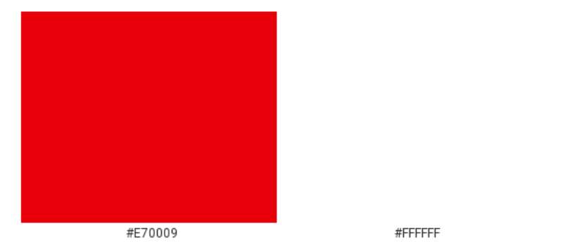
Nintendo Red (#E60012) is the backbone of the entire visual identity. It’s a high-saturation, slightly warm red that grabs attention without feeling aggressive.
In color psychology, red signals energy, excitement, and passion. For a company selling fun, that’s a straightforward choice.
White provides the contrast. It keeps the logo clean and legible at any size. The pairing of red and white is also culturally significant, echoing the Japanese flag and reinforcing the company’s heritage.
You won’t find a color palette much simpler than this. And that simplicity is the whole point. No gradients, no secondary accent colors in the core mark. Just red and white. It prints well, it scales well, it shows up on a screen from across the room.
What Typography Style Is Used in the Nintendo Logo?
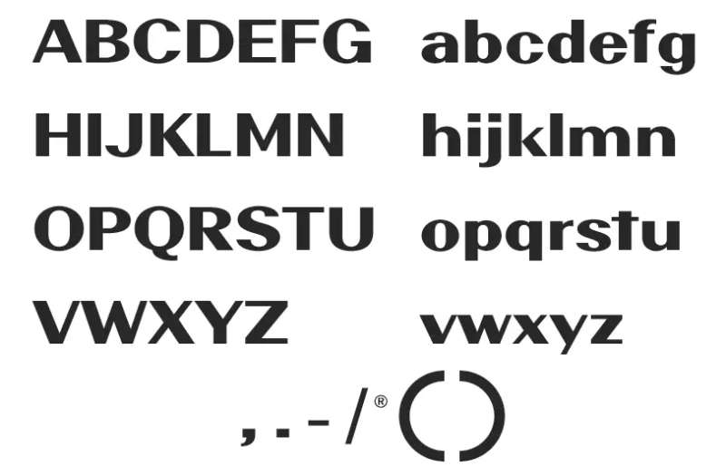
The typography is a custom sans-serif typeface designed specifically for Nintendo. You won’t find it in any font library.
The letterforms are geometric with slightly rounded terminals, giving them a friendly, approachable quality. The kerning is tight but not cramped, and the x-height is generous, which helps with legibility at small sizes.
Compared to something like the Sega logo, which uses italicized, speed-suggesting lettering, Nintendo’s type feels stable and grounded. It doesn’t shout. It just sits there confidently.
What Are the Hidden Meanings in the Nintendo Logo?
The name itself carries meaning that most Western audiences miss. “Nintendo” (任天堂) translates roughly to “leave luck to heaven” or “the temple of free hanafuda.”
The rounded rectangular border subtly echoes the shape of a playing card, which ties back to the company’s origins in 1889.
Some have pointed out that the contained wordmark resembles a game cartridge label, though Nintendo has never confirmed this was intentional. The designer’s stated approach was always clarity and recognition over hidden symbolism. But sometimes those connections happen on their own. The psychology of shapes suggests that rounded rectangles convey safety and reliability, which fits Nintendo’s family-friendly positioning perfectly.
How Does the Nintendo Logo Compare to Competitor Logos?
Put the Nintendo logo next to Sony PlayStation, Microsoft Xbox, and Sega. They all take completely different approaches to branding in the same industry.
PlayStation uses a stylized “PS” monogram with a 3D illusion. Xbox relies on a green sphere with an abstract “X.” Sega goes with italicized blue lettering that screams speed.
Nintendo’s wordmark is the most conservative of the bunch. And that’s deliberate. While competitors chase modern, edgy aesthetics, Nintendo leans into timelessness. The logo has barely changed in 50 years because it doesn’t need to.
Compare it to other gaming company logos like the EA logo or the Epic Games logo, and you’ll notice Nintendo avoids abstract symbols entirely. No swooshes, no icons, no pictorial marks. Just the name. That takes confidence.
The Capcom logo and Square Enix logo share some DNA with Nintendo’s approach. They’re both wordmark-forward. But neither has the same level of instant, global recognition.
Among red logos across all industries, Nintendo’s sits in rare company. The red-on-white scheme is shared by Coca-Cola, Netflix, and YouTube. That’s good company to be in for brand recall.
What Are the Technical Specifications of the Nintendo Logo?
Official Color Codes
- Primary Color: Nintendo Red
- Hex: #E60012
- RGB: (230, 0, 18)
- CMYK: (0, 100, 92, 10)
- Pantone: 485 C (closest match)
- Secondary Color: White
- Hex: #FFFFFF
- RGB: (255, 255, 255)
- CMYK: (0, 0, 0, 0)
- Tertiary Variant: Black (for monochrome applications)
- Hex: #000000
- RGB: (0, 0, 0)
- CMYK: (0, 0, 0, 100)
Dimensions and Proportions
- Aspect Ratio: Approximately 5:1 (width to height) for the full wordmark with border
- Minimum Size: Nintendo’s brand guidelines specify that the logo should not be reproduced smaller than 25mm in width for print applications
- Clear Space: A minimum clear zone equal to the height of the letter “N” in the wordmark must surround the logo on all sides
- File Formats: Official assets are distributed as vector graphics (AI, EPS, SVG) and high-resolution pixel-based formats (PNG at 300+ DPI)
- Usage Restrictions: The logo must not be rotated, stretched, recolored outside approved variants, or placed on visually busy backgrounds that reduce legibility
What Cultural Impact Has the Nintendo Logo Had?
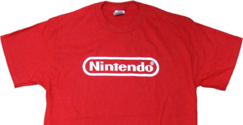
The Nintendo logo belongs to a very small group of marks that transcend their industry. People who have never played a video game recognize it. Parents, grandparents, kids. It doesn’t matter.
During the late 1980s and early 1990s, “Nintendo” became a generic term for video games in many households. “Stop playing Nintendo” could mean any console, any game. That kind of cultural saturation is something most brands spend billions trying to achieve and never get close to.
The logo appears in pop culture constantly. T-shirts, street art, memes, retro-themed cafes. It’s become a shorthand for nostalgia itself. You see that red and white mark and your brain goes straight to childhood, to a specific feeling. That’s not just branding. That’s cultural artifact territory.
The Super Mario logo and the Legend of Zelda logo are massive in their own right, but they exist under the Nintendo umbrella. The corporate mark is what ties the whole ecosystem together.
How Does the Nintendo Logo Fit Into the Overall Brand Identity?
Nintendo runs a multi-layered brand architecture. The corporate logo sits at the top, functioning as an endorsement mark that appears on every product, every console, every game published by Nintendo.
Below that, individual franchise logos carry their own identities. Mario, Zelda, Pokémon, Animal Crossing, Metroid. Each has a distinct visual language.
The corporate mark acts as a seal of quality, similar to how the “Nintendo Seal of Quality” sticker worked on NES cartridges in the 1980s. It tells consumers: this is a Nintendo product, and it meets a certain standard. That trust was built over decades, and the logo carries all of it.
The brand style guide ensures consistency across regions. Nintendo of America, Nintendo of Europe, and the Japan headquarters all use the same mark, same colors, same specifications. No regional variations. That global unity is part of why the logo works so well internationally.
The visual hierarchy in Nintendo’s branding is clear. Corporate logo first, console branding second (like the Switch logo), franchise branding third. Everything has its place, and nothing competes for attention.
How Should the Nintendo Logo Be Used?
Nintendo is famously protective of its intellectual property. The logo falls under strict trademark guidelines, and unauthorized use will get you a cease and desist faster than you’d expect.
Official usage rules include:
- Never alter the logo’s colors outside of the approved red, white, and black variants
- Never stretch, compress, rotate, or apply effects like drop shadows or outlines
- Always maintain the required clear space around the mark
- Never place the logo on a patterned or photographic background without sufficient contrast
- The logo must always appear in its complete form. Don’t crop or partial-display it
Where to access official logos: Nintendo provides brand assets to authorized partners through its official partner portal. Public access to high-resolution logos is restricted. Press and media can request assets through Nintendo’s media relations pages for specific regions.
Licensing: Use of the Nintendo logo in any commercial context requires explicit written permission from Nintendo Co., Ltd. This includes merchandise, events, publications, and digital content. Fan art exists in a gray area, and Nintendo has historically been more aggressive than most tech companies about enforcing trademark rights.
Trademark protection: The Nintendo wordmark and logo are registered in virtually every major market worldwide. The trademark covers entertainment software, hardware, toys, clothing, and numerous other product categories. Infringement cases are handled through Nintendo’s legal teams in Kyoto, Redmond (Washington), and Frankfurt.
FAQ on The Nintendo Logo
What does the Nintendo logo look like?
It’s a white custom wordmark inside a rounded red rectangle. The lettering is a geometric sans-serif designed specifically for Nintendo. Clean, simple, instantly recognizable.
The red-and-white scheme has been consistent since the 1970s. No extra symbols or mascots in the corporate mark.
When was the Nintendo logo first created?
Nintendo’s first logo dates back to 1889 when Fusajiro Yamauchi founded the company in Kyoto, Japan. That original mark used Japanese kanji characters for the Hanafuda card business.
The modern wordmark concept started around 1975. The current refined version appeared in 2006.
Why is the Nintendo logo red?
Red signals energy and excitement. For a company built on fun, it’s a direct choice that works across every culture and age group.
The specific shade, Nintendo Red (#E60012), also echoes the Japanese flag. That cultural connection to the company’s heritage isn’t accidental.
Who designed the Nintendo logo?
No single designer is publicly credited. Nintendo’s in-house corporate design team developed and refined the wordmark over decades.
Unlike some famous graphic designers who are tied to specific brand marks, the Nintendo logo evolved internally through multiple iterations without a named creator.
Has the Nintendo logo changed over the years?
Yes. Roughly a dozen times. It started as kanji calligraphy, moved through various Western lettering experiments in the 1960s, and landed on the “racetrack” oval wordmark in 1975.
The shift from the elongated oval to today’s softer rounded rectangle happened around 2006. Subtle, but it’s there.
What font is used in the Nintendo logo?
It’s a custom typeface. You won’t find it available for download anywhere. The letterforms are geometric with slightly rounded terminals, giving the text a friendly feel.
Some people compare it to fonts like Pretendo or other fan recreations, but the official version is proprietary to Nintendo Co., Ltd.
What does the word “Nintendo” mean?
The kanji 任天堂 translates roughly to “leave luck to heaven.” Some interpret it as “the temple of free hanafuda.”
Either way, the name reflects the company’s origins in the playing card business. It carries a philosophical weight that most people never think about when they see it on a Switch box.
Can I use the Nintendo logo for my own project?
Not without permission. Nintendo is one of the most aggressive companies when it comes to trademark protection. Any commercial use requires explicit written approval.
Even fan projects get takedown notices. If you need official assets, go through Nintendo’s partner portal or media relations team.
How does the Nintendo logo compare to other gaming logos?
It’s the most understated of the major console brands. PlayStation uses a stylized monogram. Xbox has the green sphere. The Ubisoft logo went abstract.
Nintendo just uses its name. No icon, no symbol. That minimalist approach stands out precisely because everyone else is doing more.
Where can I download the official Nintendo logo?
You can’t, at least not through public channels. Nintendo restricts access to high-resolution brand assets to authorized partners and press contacts.
Low-resolution versions appear across the web, but for anything commercial or professional, you’ll need to go through official licensing. Nintendo doesn’t mess around with this stuff.
Conclusion
The Nintendo logo has done something most brand marks never pull off. It survived the jump from Hanafuda playing cards to the Nintendo Switch without losing an ounce of recognition.
That red wordmark works on a Game Boy cartridge from 1989 and a digital storefront in 2025. Same impact.
From Fusajiro Yamauchi’s Kyoto workshop to a global gaming icon, the logo’s evolution mirrors the company itself. Steady, deliberate, never chasing trends.
Whether stamped on a Nintendo 64 box or a Joy-Con controller, the mark carries decades of trust. Few game logos come close to that kind of staying power.

Renowned for his expertise in logo design and visual branding, Bogdan has developed a multitude of logos for various clients.
His skills extend to creating posters, vector illustrations, business cards, and brochures. Additionally, Bogdan's UI kits were featured on marketplaces like Visual Hierarchy and UI8.
He also wrote in the past years on sites like Design Your Way, WebDesignerDepot, WPDean, Designmodo, Speckyboy, Slider Revolution, and more.
- Canva vs PowerPoint: Which Is Better for Presentations? - 22 September 2026
- How to Install Fonts on Mac (Step-by-Step Guide) - 20 September 2026
- From Mockup to Code: How AI-Augmented Development Speeds Up the Design Handoff - 19 September 2026

Bogdan Sandu is a seasoned designer who has been designing websites since 2008. Renowned for his expertise in logo design and visual branding, Bogdan has developed a multitude of logos for various clients. His skills extend to creating posters, vector illustrations, business cards, and brochures. Additionally, Bogdan's UI kits were featured on marketplaces like Visual Hierarchy and UI8. He also wrote in the past years on sites like Design Your Way, WebDesignerDepot, WPDean, Designmodo, Speckyboy, Slider Revolution, and more.
You Might Also Like