

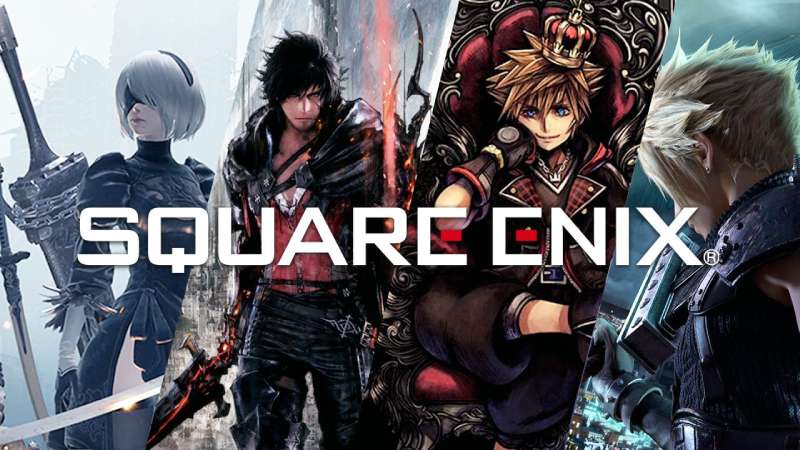
The Square Enix logo is one of the most recognized marks in gaming. It represents a company born from the 2003 merger of two Japanese publishers, Square (commonly known as Squaresoft) and Enix Corporation. The result was a single brand identity that had to carry the weight of franchises like Final Fantasy, Dragon Quest, and Kingdom Hearts.
That red-and-black wordmark you see on game boxes and loading screens? It didn’t come out of nowhere. The design pulls directly from Squaresoft’s visual DNA, specifically the red triangle that sat inside the “A” of the old Squaresoft logo. When the two companies merged, the branding team kept that red accent as a through line. It’s a small detail, but it connects everything back to 1986 when Square first became an independent company.
Within the broader history of gaming company logos, Square Enix sits in a specific spot. It’s not flashy. It’s not a mascot-based mark. It’s a geometric wordmark with one color trick that makes it stick. The current version has been in use since April 2003, and it’s been through zero major redesigns. Just a few tweaks for different media formats.
What Is the Square Enix Logo?

The Square Enix logo is a geometric sans-serif wordmark rendered in black uppercase lettering, with the horizontal bars of both “E” letters replaced by red rectangles. It was introduced on April 1, 2003, when SquareSoft merged with Enix Corporation. The design is credited to Square Enix’s in-house team.
- Design Type: Wordmark (also called a logotype). There’s no icon, mascot, or emblem sitting next to it. Just the company name, styled with intent.
- Primary Elements: Black uppercase lettering with two red rectangular accents inside the “E” characters. The company also uses an “SE” monogram version for smaller applications, keeping the same red rectangle detail on the “E.”
- Official Introduction Date: April 1, 2003, the day the merger between Square and Enix became official.
- Designer/Agency: Created by Square Enix’s internal design team. No external agency has been publicly credited with the logo’s creation.
- Trademark Status: Registered trademark of Square Enix Holdings Co., Ltd. The SQUARE ENIX name and logo are protected across multiple international jurisdictions covering video games, software, entertainment, merchandise, and publications.
- Color Palette: The official palette uses two primary colors. Red (#E20A16) for the “E” accents and Black (#000000) for the main lettering. The logo is often displayed on a white background, though an inverted white-on-black version exists for dark applications.
- Usage Context: The logo appears on game packaging, title screens, digital storefronts, press kits, marketing materials, merchandise, manga publications, and corporate communications. It also shows up in animated form at the start of most Square Enix game titles, usually accompanied by a piano note and a whispered voiceover in Japanese.
How Has the Square Enix Logo Evolved Over Time?

The Square Enix logo itself hasn’t gone through dramatic visual changes since 2003. But the story behind it starts much earlier, with two separate companies that each had their own branding before the merger brought everything together under one mark.
The real evolution happened across three distinct phases: the original Enix Corporation branding (1975 to 2003), the Squaresoft branding (1983 to 2003), and the merged Square Enix identity (2003 to present).
The Enix Corporation Logo (1975–2003)
Years Active: 1975 to 2003
Enix Corporation was founded on September 22, 1975, by Yasuhiro Fukushima as Eidansha Boshu Service Center. The company’s final logo before the merger featured a large green swirl shaped to resemble a lowercase “e.”
Below that swirl sat the Enix wordmark in a decorative font with bold strokes distributed through each letter. The green hue and organic swirl shape gave it a completely different feel from what Square was doing at the time.
When the merger happened, basically none of the Enix visual identity survived. The green was gone. The swirl was gone. Square’s design language won out entirely.
The Squaresoft Logo (1983–2003)
Years Active: 1983 to 2003
Square Co., Ltd. started in 1983 as a division of Den-Yu-Sha, a power line construction company. It became independent in September 1986 under founder Masafumi Miyamoto.
The Squaresoft logo used a black, italicized sans-serif typeface with one standout feature: a red scalene triangle placed inside the “A,” replacing the horizontal crossbar. That red triangle became the visual signature of the brand.
This is the logo that shipped with Final Fantasy VII, Chrono Trigger, Xenogears, and dozens of other titles that defined RPG gaming in the 1990s. It carries a lot of nostalgia for people who grew up during that era.
The color choices here, black text with a red geometric accent, directly inspired the Square Enix logo that replaced it.
The Merged Square Enix Logo (2003–Present)
Years Active: 2003 to present
When the merger was announced on November 26, 2002, and completed on April 1, 2003, the new company needed a single visual identity. The resulting logo kept Square’s approach almost entirely.
The italic styling was dropped. The typeface shifted to a more geometric, upright format with squared-off contours. And the red triangle in the “A” became red rectangles in both “E” letters.
There’s been no major redesign since. The logo has appeared in black, white, gold (for Kingdom Hearts cinematics), blue (for Dragon Quest Builders), and grayscale versions depending on the context. But the core design stays locked in.
What Do the Design Elements of the Square Enix Logo Mean?
Every piece of the Square Enix logo serves a purpose. The geometric letterforms, the red accents, the uppercase structure. None of it is accidental.
The red rectangles inside the “E” letters are the most talked-about detail. They’re a direct callback to Squaresoft’s red triangle, which itself was a bold move in logo design: replacing part of a letter with a shape in a different color.
Why Did Square Enix Choose These Specific Colors?

The color palette is stripped down to two colors. That’s it.
Red (#E20A16): A bright, high-saturation red. In color theory, red signals energy, passion, and urgency. For a gaming brand, it also connects to Japan’s cultural identity (think the Japanese flag). The RGB values are (226, 10, 22) and the CMYK equivalent is roughly (0, 96, 90, 11).
Black (#000000): Standard black for the main lettering. It gives the logo weight, authority, and strong contrast against light backgrounds. Black logos tend to project stability and professionalism, which matters for a company that’s also a publicly traded holding corporation on the Tokyo Stock Exchange.
The red-on-black combination came straight from Squaresoft. The Enix green was completely abandoned. That says a lot about which company’s identity carried more visual strength into the merger.
What Typography Style Is Used in the Square Enix Logo?
The typeface is custom, but it looks very close to Bank Gothic Light. Every letter is uppercase, geometric, and squared off at the edges. No curves where a straight line will do.
The letter spacing is tight but readable, and the overall weight feels medium. Not too heavy, not too thin. It reads cleanly at small sizes, which matters when your logo needs to fit on everything from a phone screen to a Blu-ray box.
The “E” modification is the only playful part. Those red rectangles break what would otherwise be a pretty standard corporate wordmark. It’s a small rebellion inside a structured design.
What Are the Hidden Meanings in the Square Enix Logo?
There’s no complex iconography buried in the logo. Look, some logos have arrows in negative space or clever shape combinations. This one doesn’t really play that game.
But the red rectangles do carry meaning beyond decoration. They visually link back to Squaresoft’s identity, keeping a piece of the legacy brand alive inside the new one. It’s a nod to the history without being heavy-handed about it.
Some fans have noted that the two red bars (one in each “E”) could represent the two companies that merged. That’s probably a coincidence. But it works as an interpretation.
How Does the Square Enix Logo Compare to Competitor Logos?
Most gaming publishers use either bold wordmarks or icon-based logos. Square Enix falls into the wordmark category, which puts it alongside companies like EA and Ubisoft.
But here’s where it gets interesting.
Nintendo uses a rounded, friendly wordmark inside an oval, projecting accessibility and fun. Capcom leans into a blocky, angular type treatment that screams arcade energy. Rockstar Games has that five-pointed star with an “R,” immediately recognizable and edgy.
Bethesda keeps things corporate-clean with a simple, restrained wordmark. Sega goes the opposite direction with a bold blue italic treatment that still carries 1990s energy.
Square Enix sits somewhere between minimalist corporate branding and gaming-specific visual identity. The red accent is the one thing that pulls it toward the entertainment side. Without it, this could be any tech holding company’s logo. With it, gamers instantly recognize it.
Compared to Epic Games (which recently simplified to a stark monochrome logo) or Valve (which has stuck with its unsettling human-head-valve concept), Square Enix’s approach feels restrained but effective. It doesn’t try to be clever. It just is.
What Are the Technical Specifications of the Square Enix Logo?
Official Color Codes
- Primary Color: Red
- Hex: #E20A16
- RGB: (226, 10, 22)
- CMYK: (0, 96, 90, 11)
- Secondary Color: Black
- Hex: #000000
- RGB: (0, 0, 0)
- CMYK: (0, 0, 0, 100)
- Background Color: White
- Hex: #FFFFFF
- RGB: (255, 255, 255)
- CMYK: (0, 0, 0, 0)
Dimensions and Proportions
The logo is a horizontal wordmark with an aspect ratio of approximately 5:1 (width to height). When used in stacked format, the ratio shifts closer to 2:1.
Square Enix maintains strict brand guidelines for logo usage. Clear space around the logo must equal at least the height of the capital “S” on all sides. The logo should never be stretched, rotated, or recolored outside of the approved variants (standard, inverted, and monochrome).
For digital use, the minimum width is typically around 120 pixels to keep the red rectangles visible. For print, minimum size depends on DPI settings, but anything below 25mm width starts losing the accent detail.
The logo is available as vector files (SVG, AI, EPS) through official press kit channels, which means it scales to any size without losing quality.
What Cultural Impact Has the Square Enix Logo Had?

The logo has become shorthand for a specific type of gaming experience. When you see it on a loading screen, you expect story-driven RPGs with cinematic production values. That association didn’t happen overnight.
It built up across two decades of Final Fantasy releases, Kingdom Hearts crossovers, Dragon Quest entries, and acquisitions that brought Western franchises like Tomb Raider into the fold.
The mark appears on merchandise worldwide, from t-shirts to collector’s editions to arcade cabinets in Japan. It’s been featured in film (the 2018 Tomb Raider movie prominently displayed it) and in gaming culture broadly.
Among fans, the Squaresoft logo still holds a special place. There’s genuine nostalgia for that red triangle in the “A.” But the Square Enix wordmark has earned its own recognition. These days, most gamers under 25 have only ever known this version.
How Does the Square Enix Logo Fit Into the Overall Brand Identity?

The logo is an umbrella mark. It sits above a massive portfolio of sub-brands that each have their own visual identities. The Final Fantasy logo, for instance, always features Yoshitaka Amano’s artwork and a distinct wordmark specific to each numbered entry.
Dragon Quest has its own chunky, colorful lettering. Kingdom Hearts uses a heart-shaped key iconography. Each franchise maintains its own personality.
The Square Enix logo functions as the corporate seal on top. It tells you who made it and who’s behind it, without interfering with the individual game’s branding.
The company’s style guide ensures the logo is applied consistently across all touchpoints, from the corporate website to game packaging to financial reports filed with the Tokyo Stock Exchange. That kind of discipline is what keeps a tech and entertainment brand recognizable across wildly different contexts.
How Should the Square Enix Logo Be Used?
Square Enix is protective of its branding. The logo is a registered trademark of Square Enix Holdings Co., Ltd., and using it without permission is a legal risk.
Here’s the practical breakdown:
- Official assets can be accessed through the Square Enix press hub (press.na.square-enix.com) for accredited media outlets. General public access to high-resolution logo files requires approval.
- Fan use is permitted under specific conditions. Square Enix allows non-commercial use for community purposes (fan sites, blogs, event coverage), but you need to include proper trademark attribution. Something like: “SQUARE ENIX and the SQUARE ENIX logo are registered trademarks of Square Enix Holdings Co., Ltd.”
- Commercial use without a licensing agreement is not allowed. If you’re selling anything with the logo on it, you need written permission from the company.
- Modifications to the logo are off-limits. Don’t change the colors, stretch it, add effects, or combine it with other marks. The brand guidelines are strict about maintaining the logo’s integrity.
If you’re a content creator or journalist covering Square Enix games, the safest route is to download assets directly from their press portal and follow the attribution requirements they list there. Most coverage falls under fair use, but proper credit keeps things clean.
FAQ on The Square Enix Logo
What does the Square Enix logo look like?
It’s a black uppercase wordmark with red rectangles replacing the middle bars of both “E” letters. The typeface is geometric and close to Bank Gothic Light. Clean, blocky, and instantly recognizable on any game box or title screen.
When was the Square Enix logo created?
The logo debuted on April 1, 2003, the day the merger between Squaresoft and Enix Corporation became official.
It was designed by the company’s internal team in Tokyo. No external agency has been publicly credited.
What do the red rectangles in the Square Enix logo mean?
They’re a direct reference to the Squaresoft logo, which had a red triangle inside the “A.” The red accents carried over as a visual link between the old brand and the new Square Enix brand identity.
Some fans read them as representing two companies merging into one.
What font does the Square Enix logo use?
The logo uses a custom font similar to Bank Gothic Light. Every character is uppercase with squared-off edges and tight spacing.
It’s been customized specifically for the brand, so you won’t find the exact match in any font library.
What are the official Square Enix logo colors?
Two colors. Red (#E20A16) for the accents and black (#000000) for the lettering. The color palette was inherited from Squaresoft’s visual identity. Enix’s green branding was dropped entirely after the merger.
Has the Square Enix logo changed since 2003?
Not really. The core design has stayed the same for over two decades.
There are format variations (stacked, monogram, inverted) and color variants like gold for Kingdom Hearts cinematics. But the actual logo structure? Untouched.
How does the Square Enix logo compare to other gaming company logos?
It’s more restrained than most. Riot Games uses a bold fist icon. Konami leans into a red swoosh. Square Enix sticks with a minimal wordmark approach, closer to a corporate holding company than a game studio.
Can I use the Square Enix logo on my website or content?
For non-commercial fan use, yes, with proper trademark attribution. You need to credit Square Enix Holdings Co., Ltd. as the owner.
Commercial use requires a licensing agreement. Modifications to the logo are not permitted under the brand guidelines.
What happened to the old Squaresoft logo?
It was retired after the 2003 merger. The last game to feature it was the Japanese release of Final Fantasy X-2 on March 13, 2003.
The red triangle from the Squaresoft “A” lives on as the red rectangles in the Square Enix “E” letters. That’s the connection most people miss.
Where can I download the official Square Enix logo?
The official press hub at press.na.square-enix.com has logo assets for accredited media. Vector formats like SVG and AI are available through press kits. General public access to high-resolution files requires direct approval from the company.
Conclusion
The Square Enix logo has done its job for over twenty years without a single major redesign. That’s rare in the gaming industry, where rebrands happen constantly.
Two colors, a geometric wordmark, and a pair of red rectangles. That’s all it took to build one of the most recognized marks in the RPG publisher space.
The design carries the legacy of Squaresoft’s visual identity forward while giving the merged company its own distinct presence across game packaging, digital storefronts, and merchandise worldwide.
Sometimes the best design work is the kind that doesn’t need fixing.

Renowned for his expertise in logo design and visual branding, Bogdan has developed a multitude of logos for various clients.
His skills extend to creating posters, vector illustrations, business cards, and brochures. Additionally, Bogdan's UI kits were featured on marketplaces like Visual Hierarchy and UI8.
He also wrote in the past years on sites like Design Your Way, WebDesignerDepot, WPDean, Designmodo, Speckyboy, Slider Revolution, and more.
- The Windsurf Logo History, Colors, Font, And Meaning - 10 October 2026
- How to Remove Background From Product Photos (No Photoshop) - 10 October 2026
- How Designers can Build a Stronger Online Creative Identity - 9 October 2026

Bogdan Sandu is a seasoned designer who has been designing websites since 2008. Renowned for his expertise in logo design and visual branding, Bogdan has developed a multitude of logos for various clients. His skills extend to creating posters, vector illustrations, business cards, and brochures. Additionally, Bogdan's UI kits were featured on marketplaces like Visual Hierarchy and UI8. He also wrote in the past years on sites like Design Your Way, WebDesignerDepot, WPDean, Designmodo, Speckyboy, Slider Revolution, and more.
You Might Also Like


