The Sega Logo History, Colors, Font, And Meaning
Whisking through the annals of gaming lore, the Sega logo emerges—a beacon to generations of gamers. Its radiant blue hue and unassuming typography beckon a trip down memory lane, threading the fabric of electronic fantasies with reality.
Captivating visuals. Instant recognition. The mark of a titan in pixelated adventures, and I’m here to unravel its enigma.
Each curve and color swatch of this emblem carries tales of innovation, competition, and nostalgia—tales that any enthusiast or professional must grasp to truly appreciate the art and strategy of video game branding.
By article’s end, a richer palette of understanding awaits: the logo’s evolution, echoing louder than Sonic’s dash; the ingenious synthesis of corporate identity and gamer culture within gaming industry branding; and the intellectual intricacy woven by game developers and designers.
As we dissect, we uncover significance beyond mere visuals—the logo as a cornerstone of Sega’s storied legacy.
Prepare to decode a symbol that transcended its console realm to become a cultural icon.
The Meaning Behind the Sega Logo
Feeling the Vibe
The Sega logo is more than just letters; it’s an embodiment of the company’s spirit and ethos. Those bold letters tell a story of innovation, excitement, and cutting-edge entertainment.
Connecting with Gamers
Every time a gamer sees the Sega logo, there’s an instant spark, a connection. That’s because it encapsulates hours of adventures, challenges, and achievements.
A Symbol of Trust
In the gaming industry, trust is everything. The Sega logo stands tall as a beacon, signaling quality and reliability. It’s not just about entertainment; it’s a promise of an unmatched experience.
The History of the Sega Logo
Humble Beginnings
Sega’s logo has come a long way. From its inception in the ’60s to its iconic blue background today, the journey has been epic.
Evolving Through Time
As Sega evolved, so did its logo. It matured, and changed shapes, and styles, reflecting the company’s growth and evolution in the gaming arena.
Memories in Pixels
Every tweak, and every redesign has a story. From the early arcade games to the legendary home consoles, the logo has seen it all, etching memories in pixels and hearts alike.
The Colors of the Sega Logo

Blue: The Dominant Hue
Blue, ah! It’s not just a color. It’s Sega’s identity. Representing trust, depth, and stability, this shade is synonymous with Sega’s commitment to quality gaming.
Contrast & Vibrancy
The stark white letters against the blue scream attention. It’s vibrant, lively, and perfectly encapsulates the essence of the brand.
The Font Used in the Sega Logo
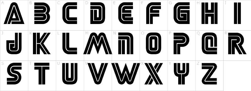
Bold and Beautiful
That font isn’t just any typeface. It’s a statement. Bold, assertive, and confident – it mirrors the brand’s ethos.
Uniqueness in Simplicity
In the world of fonts, Sega’s choice is simplistic yet distinctive. It doesn’t scream for attention; it subtly demands it.
Iconic Sound Associated with the Sega Logo
The Classic Jingle
You know that jingle that plays every time you start a Sega game? It’s as iconic as the logo itself. A melody that every gamer has etched in their memory.
Emotion in Audio
That short jingle is packed with nostalgia. It’s not just a sound; it’s an emotion, transporting gamers back to their favorite Sega moments.
Impact on Pop Culture
Beyond Gaming
The Sega logo hasn’t just influenced gamers. Its impact is seen across pop culture, from movies to music videos and merchandise. It’s more than a brand; it’s a cultural icon.
Merch and More
Ever seen those cool t-shirts with the Sega logo? Or maybe that uber-cool backpack? The logo has inspired a plethora of merchandise, making its mark in the world of fashion too.
Sega in Media
Countless references, nods, and mentions in movies, TV shows, and songs show how deeply embedded the Sega logo is in global pop culture. It’s not just gamers; the world loves Sega!
Legacy and Future
Pioneering Gaming
Sega has been a trailblazer in the gaming world, and the logo represents this legacy of pioneering achievements in interactive entertainment.
What Lies Ahead
As Sega ventures into new realms, its logo remains a constant. It will continue to evolve, but its essence will remain, guiding the brand into the future.
FAQ On The Sega Logo
Who designed the Sega logo?
The history of the Sega logo is shrouded in a bit of mystery; there isn’t a singularly accredited designer.
What is well-documented, though, is that it epitomizes 90s console branding, a symbol of the era when Sega was a colossus striding the gaming landscape, its bright blue emblematic of boundless skies in digital realms.
What does “SEGA” stand for?
SEGA is an abbreviation; it condenses “Service Games,” harkening back to its origins—a company that supplied coin-operated amusement machines.
Its logo morphed over time, crystallizing into the iconic lettering that became synonymous with video game industry revolution.
When was the Sega logo first introduced?
This insignia made its debut in the 1950s; though not immediately in the form familiar to contemporary audiences, it has, since inception, been a flag for Sega Corporation, a herald of gaming’s golden age.
Why is the Sega logo blue?
Blue, an echo of vastness and imagination, paralleled Sega’s vision of unbounded play. It wasn’t simply a choice of aesthetic—the emblem’s hue was a strategic selection that reflected the innovation and creativity inherent within the gaming brand logos of the era.
Has the Sega logo changed over the years?
Certainly, the logo’s metamorphosis is undeniably a reflection of logo evolution in sync with the company’s pivotal shifts.
It has donned various forms, eventually resting on the renowned blue insignia that now serves as a beacon for the classic Sega insignia beloved by many.
Which Sega console featured the logo most prominently?
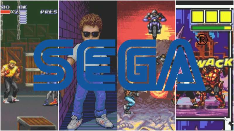
The Sega Genesis acutely featured the emblem, etched into its startup screen and its hardware. The sight of the glowing logo promised a dive into extraordinary worlds, setting the stage for the adventures that lay in the heart of the cartridge chamber.
Is the Sega logo trademarked?
Unequivocally, yes. Like many trademarked game logos serving as legal armor, the Sega logo is safeguarded to protect its identity and branding, preventing misuse or misrepresentation within the teeming gaming cosmos.
What was the importance of the Sega logo in marketing?
In the cacophony of the marketplace, the Sega logo was a clarion call. It wasn’t merely a matter of recognition; it was corporate identity in gaming—a visual shout that promised the thrill of new frontiers, proprietary technology, and, of course, exclusive gaming experiences.
Which is the most iconic Sega logo variation?
Popularity waves a flag for the classic 90s iteration. Imprinted in the minds of those who grew up with it, it represents more than a video game company logo—it’s a nostalgia-laden symbol for an era when gaming leaped forward, with Sega at the vanguard.
How does the Sega logo compare to other gaming logos?
Indeed, each gaming brand logo carries its weight in recognition and emotion.
Sega’s, however, stands out for its sheer succinctness—a bold, blue charm that encapsulates both its heraldic role in console branding and its undeniable imprint on pop culture and gaming history.
Conclusion
Encapsulating the spirit of a brand in a simple graphic is the magic of design—the Sega logo stands testament to that wizardry. A distillation of nostalgia, branding prowess, and bold ambition, its very mention evokes pixelated memories and the pulse of an 8-bit heart.
Through our journey, we’ve peeled back layers, revealing more than a symbol. We’ve unveiled a story woven into the tapestry of gaming history itself—a legacy etched into the minds of those who wielded the controller and dreamt in vivid Sega blue.
- A reflection of innovation,
- An emblem of joy,
- A harbinger of technological leaps,
- The Sega logo is all these and more.
In parting, let this be an ode to the emblem that danced across screens worldwide, reminding us that great design does more than captivate the eye—it captures an era, defines a culture, and inspires the imagination. And as the sun sets on this narrative, the glowing blue continues to light the way for designers and dreamers alike.
If you enjoyed reading this article about the Sega logo, you should read these as well:
- Download The Runescape Font Or Some Of Its Alternatives
- Cool video game fonts to use for designing game-related projects
- Steve Madden Ads: Elevate Your Shoe Game, Own the Trend
Bogdan Sandu, a seasoned designer with 15 years of diverse experience, has been designing websites since 2008.
Renowned for his expertise in logo design and visual branding, Bogdan has developed a multitude of logos for various clients.
His skills extend to creating posters, vector illustrations, business cards, and brochures. Additionally, Bogdan's UI kits were featured on marketplaces like Visual Hierarchy and UI8.
Latest posts by Bogdan Sandu (see all)