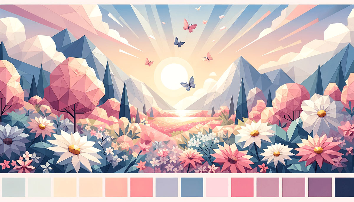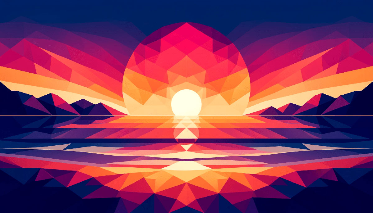
The sky catches fire every evening, painting clouds in shades most designers spend hours trying to replicate.
Sunset color palettes capture this natural phenomenon in formats you can actually use for branding, web design, and creative projects. These aren’t random combinations thrown together by algorithms.
Each palette in this collection comes with hex codes, specific use cases, and proven applications across different design contexts. You’ll see how golden hour transitions work in digital interfaces, which combinations suit luxury brands versus playful startups, and why certain purple-orange pairings outperform standard color theory predictions.
The palettes below range from vibrant city sunsets to muted twilight tones, each solving specific design problems.
Sunset Color Palettes
Classic Golden Hour
| #F2C447 | #F76218 | #FF1D68 | #B10065 | #740580 |
Color Codes
Bright yellow (#F2C447) transitions through vibrant orange (#F76218) into deep magenta (#FF1D68), finishing with rich purple tones (#B10065, #740580). The gradient spans warm to cool across five distinct hues.
Best Use Cases
Perfect for food packaging, beverage branding, and high-energy product launches. Works exceptionally well in poster design and festival marketing materials. Also strong for fitness apps, summer campaigns, and entertainment brands seeking bold visual identity.
Mood & Atmosphere
Radiates warmth, excitement, and optimism. Captures the exact moment when the sun dips below the horizon and the sky explodes with color psychology impact.
Design Applications
Use the yellow as primary accents, orange for call-to-action buttons, magenta for secondary highlights. Reserve purple tones for backgrounds or contrast elements. Maintains strong readability when paired with charcoal or deep navy text.
Color Relationships
Built on analogous colors with high saturation levels. The warm-to-cool transition creates natural visual hierarchy without additional design work.
Desert Dusk
| #FFC345 | #FF9E4A | #FF785E | #614E72 | #214675 |
Color Codes
Golden amber (#FFC345) flows through peachy orange (#FF9E4A, #FF785E) into dusty purple (#614E72) and deep navy (#214675). Mimics arid landscapes at twilight with softer hue transitions than classic golden hour.
Best Use Cases
Ideal for travel brands, desert tourism, wellness retreats, and meditation apps. Strong choice for packaging design targeting natural or organic products. Resonates with audiences seeking calm, grounded experiences.
Mood & Atmosphere
Evokes tranquility, warmth, and natural beauty. Less aggressive than vibrant sunset palettes while maintaining emotional depth through the purple-to-navy shift.
Design Applications
Navy works brilliantly for text and headers with strong contrast against lighter tones. Use orange shades for focal point elements and CTAs. The dusty purple bridges warm and cool zones, perfect for mid-tier information hierarchy.
Color Relationships
Combines warm color palettes with cool accents. The complementary color scheme between orange and navy creates built-in contrast without clashing.
Ocean Sunset
| #FF775A | #FD9248 | #00A7B7 | #228C85 | #10555B |
Color Codes
Fiery coral (#FF775A) and orange (#FD9248) contrast sharply with teal (#00A7B7) and deep ocean greens (#228C85, #10555B). The split creates dynamic tension through temperature contrast rather than gradual transition.
Best Use Cases
Perfect for coastal brands, marine conservation, surf companies, and beach resorts. Works in tech startups wanting energy without typical blue-only palettes. Strong for web design needing both warmth and professionalism.
Mood & Atmosphere
Balances energy with calm through warm-cool interplay. Suggests adventure, freedom, and natural beauty with more complexity than single-temperature palettes.
Design Applications
Use teal for primary buttons and interactive elements, coral for accents and highlights. Dark ocean tones anchor layouts with strong baseline stability. Requires careful balance to prevent color clashing.
Color Relationships
Relies on complementary color scheme fundamentals. Orange and teal sit opposite on the color wheel, creating maximum visual impact with strong semantic meaning.
Purple Twilight
| #5A38D7 | #7C4BE5 | #FDBAE7 | #A93EB9 | #45046B |
Color Codes
Deep purple (#5A38D7) through vibrant violet (#7C4BE5) with soft pink highlights (#FDBAE7). Magenta (#A93EB9) bridges to nearly-black purple (#45046B). Rare sunset palette focusing entirely on cool spectrum.
Best Use Cases
Exceptional for beauty brands, luxury cosmetics, creative agencies, and entertainment. Works in motion graphics and music industry branding. Appeals to younger demographics seeking contemporary, bold aesthetics.
Mood & Atmosphere
Mysterious, sophisticated, and enchanting. Evokes cooler climates and late-evening skies rather than traditional warm sunset moments.
Design Applications
Light pink works for backgrounds in minimalist design contexts. Use deep purples for primary elements with magenta as accent color. Creates strong emphasis when combined with white or cream neutrals.
Color Relationships
Monochrome colors with tonal variation. The pink breaks pure monochromatic structure while maintaining color theory harmony through shared undertones.
Coastal Sunset
| #4F4D9D | #5C5BA5 | #917AD3 | #AB85DC | #DF8ADD |
Color Codes
Deep indigo (#4F4D9D, #5C5BA5) transitions through lavender (#917AD3, #AB85DC) to soft magenta (#DF8ADD). Inspired by beach sunsets where water reflects sky colors with purple dominance.
Best Use Cases
Strong for wellness apps, spiritual brands, beachwear, and resort marketing. Works in book cover design for romance, fantasy, and self-help genres. Particularly effective in digital interfaces requiring calming atmospheres.
Mood & Atmosphere
Serene, peaceful, and contemplative. Less energetic than warm sunset palettes while maintaining visual interest through saturation shifts.
Design Applications
Use indigo for headers and navigation elements. Lavender works well for content backgrounds with magenta reserved for CTAs and key highlights. Pairs beautifully with sandy beige or cream tones as neutrals.
Color Relationships
Similar to purple color palettes but with cooler temperature. The analogous colors create smooth transitions ideal for gradient applications.
Romantic Wedding Sunset
| #870D38 | #B04F70 | #D891A8 | #E6AFAA | #F3CCAC |
Color Codes
Deep wine red (#870D38) softens through rose (#B04F70, #D891A8) into blush pink (#E6AFAA) and peachy cream (#F3CCAC). Captures the romantic, intimate quality of sunset during wedding color palettes planning.
Best Use Cases
Perfect for wedding invitations, event planning, romance brands, and feminine product lines. Strong in boutique fashion, jewelry, and gift packaging. Also works for upscale restaurants and hospitality brands targeting couples.
Mood & Atmosphere
Elegant, romantic, and tender. Softer than typical red color palettes while maintaining emotional warmth through wine undertones.
Design Applications
Use cream tones for backgrounds, blush for secondary elements, deep wine for typography and borders. The middle rose tones work perfectly for decorative elements and patterns. Requires careful alignment to maintain sophistication over saccharine appearance.
Color Relationships
Builds on pink color palettes with extended range. The monochromatic structure with hue shift toward orange creates warmth without abandoning pink identity.
Vibrant City Sunset
| #EEAF61 | #FB9062 | #EE5D6C | #CE4993 | #6A0D83 |
Color Codes
Golden peach (#EEAF61) through coral (#FB9062) into bright rose (#EE5D6C), vibrant magenta (#CE4993), and deep plum (#6A0D83). Urban sunset reflecting off glass buildings with heightened saturation and energy.
Best Use Cases
Exceptional for tech startups, creative agencies, music festivals, and youth-oriented brands. Works in app design, gaming color palettes, and entertainment marketing. Appeals to audiences seeking bold, contemporary visual language.
Mood & Atmosphere
Energetic, playful, and modern. Captures urban excitement with more sophistication than neon color palettes while maintaining similar intensity.
Design Applications
Use plum for backgrounds and large blocks, magenta for interactive elements, coral for highlights. Peach works as transition color or accent in illustrations. Requires strong white space to prevent overwhelming viewers.
Color Relationships
Similar to bright color palettes with warm-to-cool progression. The triadic color scheme foundation provides balanced visual interest across all five tones.
Sunset Tones
| #08183A | #152852 | #4B3D60 | #FD5E53 | #FC9C54 | #FFE373 |
Color Codes
Deep navy (#08183A, #152852) and purple (#4B3D60) anchor bright red (#FD5E53), warm orange (#FC9C54), and golden yellow (#FFE373). Six-color palette offering both dramatic darks and brilliant warm tones.
Best Use Cases
Perfect for editorial design, magazine layouts, dashboard interfaces, and data visualization. The extended range supports complex visual hierarchy needs. Works brilliantly in print design requiring both impact and readability.
Mood & Atmosphere
Dramatic, sophisticated, and versatile. The contrast between dark and light creates tension similar to actual sunset light transitions.
Design Applications
Navy tones for backgrounds and text, warm tones for data points, CTAs, and highlights. The purple bridges the temperature gap and works for mid-level information. Strong proximity between elements maintains cohesion despite color intensity range.
Color Relationships
Combines dark color palettes with vivid color palettes. The split-complementary color scheme between navy and warm tones creates dynamic tension with professional polish.
Saturated Sunset
| #240002 | #6F0100 | #A53005 | #D97D0C | #FEC135 |
Color Codes
Near-black maroon (#240002) intensifies through burgundy (#6F0100) and burnt orange (#A53005) to golden amber (#D97D0C, #FEC135). Captures the most intense moment when the sun creates maximum color saturation against darkening sky.
Best Use Cases
Ideal for automotive brands, sports teams, energy drinks, and action-oriented products. Strong in logo design principles requiring bold recognition. Works in gaming interfaces and high-impact advertising campaigns.
Mood & Atmosphere
Intense, powerful, and dramatic. More aggressive than typical sunset palettes with stronger color psychology associations to heat and energy.
Design Applications
Use the darkest tones for backgrounds and large blocks, golden yellow for key highlights and CTAs. The middle orange tones create strong movement when used strategically. Requires careful scale and proportion to avoid overwhelming designs.
Color Relationships
Built on saturated color palettes fundamentals. The progression from cool-dark to warm-light creates natural depth perception similar to gradient color palettes.
Violet Sunset
| #231A39 | #9D7381 | #D0978E | #FAAC7B | #FDD8A4 |
Color Codes
Deep indigo (#231A39) transitions through dusty rose (#9D7381) and muted peach (#D0978E) to warm apricot (#FAAC7B, #FDD8A4). Soft, muted palette with lower saturation than most sunset schemes.
Best Use Cases
Perfect for lifestyle blogs, wellness products, artisan goods, and boutique brands. Works exceptionally in vintage color palettes contexts and handmade product marketing. Appeals to audiences seeking understated elegance over bold statements.
Mood & Atmosphere
Calm, refined, and sophisticated. The muted tones evoke early morning or late evening rather than peak sunset intensity.
Design Applications
Use indigo for text and headers, peachy tones for backgrounds and content areas. Dusty rose works beautifully for borders and decorative elements. Pairs well with cream color palettes and natural textures in layouts.
Color Relationships
Similar to muted color palettes with warm bias. The color palette relies on tonal variation rather than saturation for visual interest.
Warm Orange Sunset
| #E56A45 | #E09971 | #B66E41 | #FAA775 | #39242A |
Color Codes
Vibrant coral (#E56A45) blends with soft peach (#E09971), earthy brown (#B66E41), light apricot (#FAA775), and deep chocolate (#39242A). Unique sunset palette incorporating earth tones alongside warm oranges.
Best Use Cases
Exceptional for food brands, coffee shops, autumn campaigns, and organic products. Strong in packaging design for natural or artisanal goods. Works well in restaurant branding and cookbook design.
Mood & Atmosphere
Warm, comforting, and grounded. The brown tones add stability and earthiness missing from purely orange-based palettes.
Design Applications
Use chocolate for backgrounds and text, coral for primary accents, peach tones for content areas. The earthy brown bridges warm and neutral zones effectively. Creates strong unity when combined with natural imagery and textures.
Color Relationships
Combines orange color palettes with brown color palettes. Similar to earth color palettes but with higher warmth and saturation in key tones.
Pastel Sky
| #495692 | #E3B6D0 | #8583B7 | #DA8EA3 | #2A5480 |
Color Codes
Muted blue (#495692, #2A5480) combines with soft pink (#E3B6D0, #DA8EA3) and gentle periwinkle (#8583B7). Dreamy pastel interpretation of post-sunset twilight colors.
Best Use Cases
Perfect for baby products, children’s brands, dreamy illustrations, and fantasy content. Strong in book cover design for young adult and romance genres. Appeals to audiences seeking soft, approachable aesthetics.
Mood & Atmosphere
Gentle, peaceful, and whimsical. Less intense than typical sunset schemes while maintaining recognizable sky-inspired origins.
Design Applications
Use pink tones for backgrounds, blue for text and structural elements, periwinkle for mid-level information. The palette naturally creates rhythm through alternating warm-cool placement. Works beautifully in web design requiring soft, non-aggressive interfaces.
Color Relationships
Based on pastel color palettes with sky color palettes inspiration. The complementary color scheme between pink and blue creates gentle contrast.
Peach & Purple
| #A569A0 | #794983 | #E78A85 | #6B64A7 | #5D4461 |
Color Codes
Medium orchid (#A569A0) and deep plum (#794983, #5D4461) frame soft peachy coral (#E78A85) with muted violet (#6B64A7). Cheerful palette balancing cool purples with warm peach tones.
Best Use Cases
Ideal for children’s products, playful brands, educational materials, and creative services. Works in toy packaging and kid-focused digital experiences. Strong choice for brands targeting parents with young children.
Mood & Atmosphere
Playful, optimistic, and joyful. The purple dominance adds sophistication preventing overly juvenile appearance despite cheerful nature.
Design Applications
Use peach for primary highlights and attention-drawing elements, purples for backgrounds and structural components. The palette supports strong variety without losing cohesion. Requires thoughtful repetition to maintain professional appearance.
Color Relationships
Similar to kids color palettes with increased sophistication. The split-complementary color scheme between peach and purple variants creates dynamic energy.
Elegant Sunset
| #FAA788 | #D29AA5 | #B4798B | #FC753D | #392F3C |
Color Codes
Soft salmon (#FAA788) blends with muted rose (#D29AA5, #B4798B), bright tangerine (#FC753D), and deep purple-brown (#392F3C). Sophisticated palette for luxury and hospitality applications.
Best Use Cases
Perfect for event planning, luxury hotels, upscale restaurants, and romance-focused businesses. Strong in invitation design and premium branding materials. Appeals to audiences seeking refined, elegant visual experiences.
Mood & Atmosphere
Romantic, luxurious, and intimate. The muted tones with single bright accent create understated sophistication.
Design Applications
Use dark purple-brown for backgrounds and text, salmon and rose for content areas, tangerine sparingly for CTAs. The palette supports elegant typography choices with serif font pairings. Strong alignment and grid systems enhance the refined aesthetic.
Color Relationships
Combines pink color palettes with warm color palettes. Similar to wedding color palettes but with increased color complexity and depth.
Bright Summer Sunset
| #F2480F | #E79414 | #8DF4D2 | #5781F4 | #E33900 |
Color Codes
Vibrant red-orange (#F2480F, #E33900) contrasts with golden yellow (#E79414), mint turquoise (#8DF4D2), and bright blue (#5781F4). Unusual sunset palette incorporating unexpected cool mint alongside warm tones.
Best Use Cases
Exceptional for summer campaigns, beach brands, travel agencies, and tropical products. Works in festival marketing and vacation-oriented services. Strong in digital designs requiring high energy and playfulness.
Mood & Atmosphere
Energetic, fun, and tropical. The mint-blue combination adds refreshing quality missing from traditional warm-only sunset palettes.
Design Applications
Use orange tones for primary elements and CTAs, blue for backgrounds or secondary information, mint as accent color. The high contrast requires generous white space for visual breathing room. Works brilliantly with modern color palettes in contemporary contexts.
Color Relationships
Based on triadic color scheme principles with modified saturation. Similar to summer color palettes but with sunset-specific warm dominance and temperature contrast.
FAQ on Sunset Color Palettes
What colors are typically in sunset color palettes?
Sunset palettes typically include warm oranges, golden yellows, coral pinks, deep purples, and navy blues. The hue progression moves from warm to cool, mimicking natural sky transitions during golden hour and twilight periods.
How do I choose the right sunset palette for my brand?
Match palette intensity to brand personality. Vibrant coral-orange combinations suit energetic brands, while muted peach-purple tones work for wellness or luxury. Consider your industry and target demographic when selecting saturation levels.
Can sunset palettes work in professional designs?
Yes, when applied strategically. Use deeper navy and purple tones for backgrounds and text, reserving bright oranges for accents. Muted sunset palettes with lower saturation maintain professionalism while adding color palette warmth.
What hex codes represent classic sunset colors?
Common sunset hex codes include #FF6B35 (coral), #F7931E (orange), #FDC830 (golden yellow), #8B5A9B (twilight purple), and #1C3D5A (deep navy). These create authentic evening sky gradient effects in digital designs.
How do sunset palettes affect user psychology?
Sunset colors evoke warmth, optimism, and natural beauty through color psychology. Orange stimulates energy and creativity, while purple adds sophistication. Combined, they create emotional depth that pure single-color schemes cannot achieve.
Should I use RGB or CMYK for sunset palettes?
Use RGB for digital applications and CMYK for print. Sunset oranges and purples lose vibrancy in CMYK conversion, so test printed samples before finalizing print design projects.
Can I combine sunset palettes with other color schemes?
Sunset palettes pair well with neutral grays, creams, and deep charcoals. Analogous colors within sunset ranges create harmony, while contrasting navy blues provide strong contrast for text and structural elements.
What’s the difference between sunrise and sunset palettes?
Sunrise palettes feature softer pinks, pale yellows, and lighter purples with higher brightness. Sunset palettes use deeper oranges, richer golds, and more saturated purples, reflecting the atmospheric differences between dawn and dusk lighting conditions.
How many colors should a sunset palette include?
Most functional sunset palettes contain 4-6 colors. This range provides enough variety for visual hierarchy without overwhelming designs. Include at least one dark anchor color for text and backgrounds alongside warm accent tones.
Are sunset palettes suitable for minimalist designs?
Yes, when using muted versions with reduced saturation. Select 2-3 sunset tones rather than full ranges, and pair with generous white space. Minimalist design benefits from sunset warmth without excessive color complexity.
Conclusion
Sunset color palettes deliver immediate visual impact across digital and print applications when matched correctly to project needs. The fifteen palettes above cover everything from vibrant city sunsets to muted twilight tones, each solving specific design challenges.
Start with color theory fundamentals but don’t let rules override what works visually. Test your chosen palette across different contexts before committing.
Pay attention to contrast ratios for accessibility, especially when using deep purples or navy tones for text. Convert hex codes to RGB or CMYK based on your medium.
Remember that saturation adjustments can transform energetic palettes into professional ones. The same orange-purple combination works for sports brands at high saturation and law firms at lower intensity.
Use these palettes as starting points, not rigid formulas.

Renowned for his expertise in logo design and visual branding, Bogdan has developed a multitude of logos for various clients.
His skills extend to creating posters, vector illustrations, business cards, and brochures. Additionally, Bogdan's UI kits were featured on marketplaces like Visual Hierarchy and UI8.
He also wrote in the past years on sites like Design Your Way, WebDesignerDepot, WPDean, Designmodo, Speckyboy, Slider Revolution, and more.
- The Windsurf Logo History, Colors, Font, And Meaning - 10 October 2026
- How to Remove Background From Product Photos (No Photoshop) - 10 October 2026
- How Designers can Build a Stronger Online Creative Identity - 9 October 2026

Bogdan Sandu is a seasoned designer who has been designing websites since 2008. Renowned for his expertise in logo design and visual branding, Bogdan has developed a multitude of logos for various clients. His skills extend to creating posters, vector illustrations, business cards, and brochures. Additionally, Bogdan's UI kits were featured on marketplaces like Visual Hierarchy and UI8. He also wrote in the past years on sites like Design Your Way, WebDesignerDepot, WPDean, Designmodo, Speckyboy, Slider Revolution, and more.
You Might Also Like