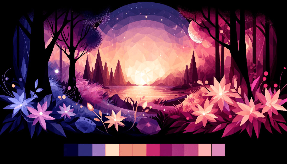
Purple sits between red‘s energy and blue‘s calm, making it tricky to use well. Too much feels heavy, too little gets lost.
But when you nail the right purple color palettes, you unlock luxury, creativity, and depth that other colors can’t match.
This guide breaks down 15 tested combinations with exact hex codes, showing you when each palette works and which pairings to avoid. You’ll see how lavender softens tech interfaces while dark purple anchors premium brands.
No theory. Just practical color palettes you can apply today.
Purple Color Palettes
Royal Elegance
| #421869 | #721CB8 | #995BD5 | #96D74C | #509724 |
What It Is
Deep violet tones balanced with vibrant lime green accents create unexpected energy. The darkest purple anchors luxury while bright green prevents it from feeling heavy.
When to Use It
Wellness brands, eco-luxury products, creative agencies wanting sophisticated edge. Works for packaging design where premium positioning meets sustainability messaging.
Best Color Pairings
Gold (#EFBF04) adds warmth. White backgrounds let purples dominate. Charcoal gray grounds the palette without competing.
Twilight Harmony
| #CFA3EA | #831DC6 | #560BAD | #3A0CA3 | #4361EE |
What It Is
Smooth transition from light purple to deep indigo, ending in electric blue.
When to Use It
Tech interfaces, app design, fintech platforms. Common in gradient backgrounds for SaaS landing pages. Meditation apps and sleep trackers use this for calming visual hierarchy.
Best Color Pairings
Silver (#C0C0C0) for UI elements. Cream backgrounds soften intensity. Avoid orange (creates clash).
Dark Luxury
| #11001C | #1A0129 | #220135 | #3A025B | #520380 |
What It Is
Near-black purples building to deep royal purple. Maximum saturation with minimal lightness.
When to Use It
High-end fashion, luxury cosmetics, premium spirits. Perfect for poster design targeting affluent demographics. Casino branding, night color palettes, exclusive membership sites.
Best Color Pairings
Gold (#D4AF37) creates opulence. Rose gold adds feminine luxury. Pure white text ensures readability.
Purple Plumes
| #2E0F38 | #1A2C54 | #8351A8 | #4D7B93 | #B45DBB |
What It Is
Classic violet meets teal and dusty blue. Analogous colors working in cool harmony.
When to Use It
Corporate branding for creative industries. Conference materials, annual reports with personality. Web design for agencies, consultancies, educational platforms.
Best Color Pairings
Warm color palettes with terracotta accents. Beige (#F5F5DC) neutralizes coolness. Avoid competing with neon color palettes.
Sunset Pier
| #01243A | #442342 | #660F53 | #E06196 | #F5A4C5 |
What It Is
Deep ocean blues transitioning through magenta to soft pink. Captures sunset color palettes with purple dominance.
When to Use It
Beauty brands, lifestyle blogs, wedding color palettes. Romance novels, spa branding, feminine products. Instagram-friendly designs where color psychology drives engagement.
Best Color Pairings
Navy blue deepens drama. Ivory text maintains elegance. Gold color palettes add warmth without clash.
Violet Droplets
| #360F2A | #68324A | #61447E | #A484C7 | #C0B1F4 |
What It Is
Monochrome colors climbing from wine to lavender. Single hue with varying lightness creates cohesion.
When to Use It
Brand guidelines requiring strict color families. Templates, presentation decks, internal communications. Works for minimalist design approaches prioritizing simplicity.
Best Color Pairings
Gray color palettes (#808080) provide neutral ground. White space prevents monotony. Skip bright color palettes entirely.
Purple Rain
| #120348 | #3A2081 | #2E2C9A | #EEC8ED | #E7E4F9 |
What It Is
Electric purples grounded by pastel color palettes finish. High contrast between darks and lights.
When to Use It
Music industry branding, entertainment venues, festival marketing. Motion graphics and video thumbnails. Gaming interfaces where visual identity needs instant recognition.
Best Color Pairings
Yellow (#FFFF00) as complementary color scheme accent. Charcoal backgrounds amplify neon effect. Avoid brown color palettes.
Magenta Geode
| #47003C | #77176E | #C83FA9 | #AA4D84 | #F3B0DC |
What It Is
Jewel-toned purples with hot pink intensity. Sparkling, gem-like quality from saturated color palettes.
When to Use It
Cosmetics packaging, fashion e-commerce, beauty tutorials. Kids color palettes for tween demographics. Party invitations, celebration graphics, fun color palettes for events.
Best Color Pairings
Silver metallics enhance sparkle. Black creates drama. Green color palettes clash badly.
Lavender Fields
| #382D72 | #5C509C | #A080E1 | #B7C2C6 | #E5CCF4 |
What It Is
Lavender shades with sage green undertones. Soft, natural progression from medium to light color palettes.
When to Use It
Spring color palettes for seasonal campaigns. Wellness centers, aromatherapy brands, organic products. Stationery design, greeting cards, nature color palettes applications.
Best Color Pairings
Olive green (#808000) adds earthiness. Cream color palettes soften edges. Avoid red color palettes (too jarring).
Purple and Orange Spark
| #3C096C | #5A189A | #9D4EDD | #FFC880 | #FF9100 |
What It Is
Deep purples clash beautifully with burnt orange warmth. Split-complementary color scheme creating visual tension.
When to Use It
Sports branding, energy drinks, fitness apps. Concert posters, gaming color palettes, streaming overlays. Creative portfolios needing bold graphic design principles.
Best Color Pairings
Black grounds intensity. White space prevents chaos. Skip pink color palettes (oversaturates).
Purple Teal Fusion
| #300049 | #4A0072 | #D5B4E7 | #00838F | #00695C |
What It Is
Dark purple meets turquoise color palettes. Teal color palettes provide cool refreshment.
When to Use It
Tech startups, SaaS platforms, cryptocurrency brands. Modern color palettes for digital products. Healthcare apps, telehealth services, mental wellness platforms.
Best Color Pairings
Light gray (#D3D3D3) balances vibrancy. Gold accents add luxury. Avoid yellow color palettes.
Purple Yellow Energy
| #4C2882 | #C86BFA | #F5F5F5 | #F0EB93 | #FBE300 |
What It Is
Triadic color scheme with purple and yellow. White mediates between extremes.
When to Use It
Children’s products, educational materials, happy color palettes for positive messaging. Food packaging for snacks, beverage labels, food color palettes applications.
Best Color Pairings
Light blue cools intensity. Gray (#808080) neutralizes. Red creates chaos.
Purple Red Passion
| #5B058A | #8207C5 | #F9626C | #F72634 | #9D0610 |
What It Is
Fuchsia intensity bleeding into crimson red. Maximum emotional impact through color psychology.
When to Use It
Valentine’s campaigns, romance brands, passion-focused messaging. Fashion week materials, haute couture branding. Nightlife venues, cocktail bars, vintage color palettes with modern twist.
Best Color Pairings
Black enhances drama. Rose gold softens aggression. Green clashes terribly.
Black Purple Mystery
| #000000 | #800061 | #C00091 | #AB00C8 | #9600FF |
What It Is
Pure black anchoring neon purple progression. Dark color palettes meeting electric vibrancy.
When to Use It
Luxury tech products, premium gaming peripherals, cyberpunk aesthetics. Album covers, music streaming interfaces. Logo design for exclusive memberships.
Best Color Pairings
Silver metallics shine. White text maintains readability. Skip beige color palettes (kills edge).
Pastel Purple Dream
| #7D71A7 | #CAADFF | #FFC2E2 | #FFADC7 | #FCF6D9 |
What It Is
Pastel pink and lilac blend with vanilla. Soft, whimsical color palette for gentle messaging.
When to Use It
Baby products, nursery decor, maternity brands. Bakery branding, cafe aesthetics, sweet shops. Instagram color palettes for lifestyle influencers.
Best Color Pairings
White color palettes maximize airiness. Mint green adds freshness. Dark blue creates harsh contrast.
FAQ on Purple Color Palettes
What colors go best with purple in a palette?
Gold adds luxury, teal creates modern contrast, white provides breathing room. Complementary color schemes using yellow work for bold designs.
Green pairs well through analogous colors. Avoid orange unless deliberately seeking high contrast.
How do I choose the right shade of purple for branding?
Dark purple signals luxury and exclusivity for premium brands. Light purple works for wellness, beauty, feminine products.
Neon purple targets youth, gaming, entertainment. Consider your industry and color psychology before committing.
What’s the difference between violet, lavender, and purple?
Violet (#7F00FF) leans blue, appearing on the color theory spectrum. Lavender (#E6E6FA) is desaturated, pastel purple.
Purple (#800080) sits balanced between red and blue. Each has different emotional associations and design applications.
Can purple work for corporate or professional designs?
Yes. Tech companies like Twitch, Yahoo, and Stripe use purple successfully in logo design.
Pair with gray, navy blue, or neutrals for professional credibility. Avoid pastel color palettes in conservative industries like finance or law.
What are the best purple palettes for web design?
Modern color palettes combining purple with turquoise color palettes perform well for tech. Purple gradients work beautifully in hero sections.
Ensure proper contrast ratios for accessibility. Use RGB values correctly across devices.
How do I convert purple hex codes to other color formats?
Hex codes like #800080 convert to RGB (128, 0, 128) for screens. CMYK values handle print design.
Pantone matching ensures brand consistency. Online converters handle this automatically, but verify results visually.
What emotions do different purple shades evoke?
Deep purples communicate luxury, sophistication, mystery. Royal purple suggests prestige and power.
Lilac and mauve feel romantic, nostalgic, feminine. Magenta purple energizes and excites. Consider color psychology for target audiences.
Are purple color palettes good for Instagram and social media?
Absolutely. Instagram color palettes featuring purple perform exceptionally well for beauty, lifestyle, wellness brands.
Gradient color palettes with purple create scroll-stopping posts. Maintain consistent color schemes across your feed for brand recognition.
How do purple palettes work in packaging design?
Packaging design uses purple for premium positioning. Cosmetics, chocolates, luxury goods favor this color.
Consider DPI requirements and CMYK conversion for accurate reproduction. Test printed samples before full production runs.
Can I mix purple with other color palette trends?
Yes. Combine with earth color palettes for grounded luxury. Purple works in retro color palettes with gold accents.
Neon color palettes incorporate electric purples effectively. Adapt based on your visual identity needs.
Conclusion
These purple color palettes give you proven combinations that work across web design, print design, and branding. From pastel color palettes to dark color palettes, each serves specific design needs.
Start with hex codes that match your visual identity. Test contrast ratios for accessibility before finalizing.
Remember that hue, saturation, and context determine success. A violet that works for motion graphics might fail in packaging design.
Use Pantone references for print consistency and RGB values for screens. Build your brand guidelines around one primary palette, then expand strategically.
Purple delivers results when applied with intention.

Renowned for his expertise in logo design and visual branding, Bogdan has developed a multitude of logos for various clients.
His skills extend to creating posters, vector illustrations, business cards, and brochures. Additionally, Bogdan's UI kits were featured on marketplaces like Visual Hierarchy and UI8.
He also wrote in the past years on sites like Design Your Way, WebDesignerDepot, WPDean, Designmodo, Speckyboy, Slider Revolution, and more.
- The Windsurf Logo History, Colors, Font, And Meaning - 10 October 2026
- How to Remove Background From Product Photos (No Photoshop) - 10 October 2026
- How Designers can Build a Stronger Online Creative Identity - 9 October 2026

Bogdan Sandu is a seasoned designer who has been designing websites since 2008. Renowned for his expertise in logo design and visual branding, Bogdan has developed a multitude of logos for various clients. His skills extend to creating posters, vector illustrations, business cards, and brochures. Additionally, Bogdan's UI kits were featured on marketplaces like Visual Hierarchy and UI8. He also wrote in the past years on sites like Design Your Way, WebDesignerDepot, WPDean, Designmodo, Speckyboy, Slider Revolution, and more.
You Might Also Like