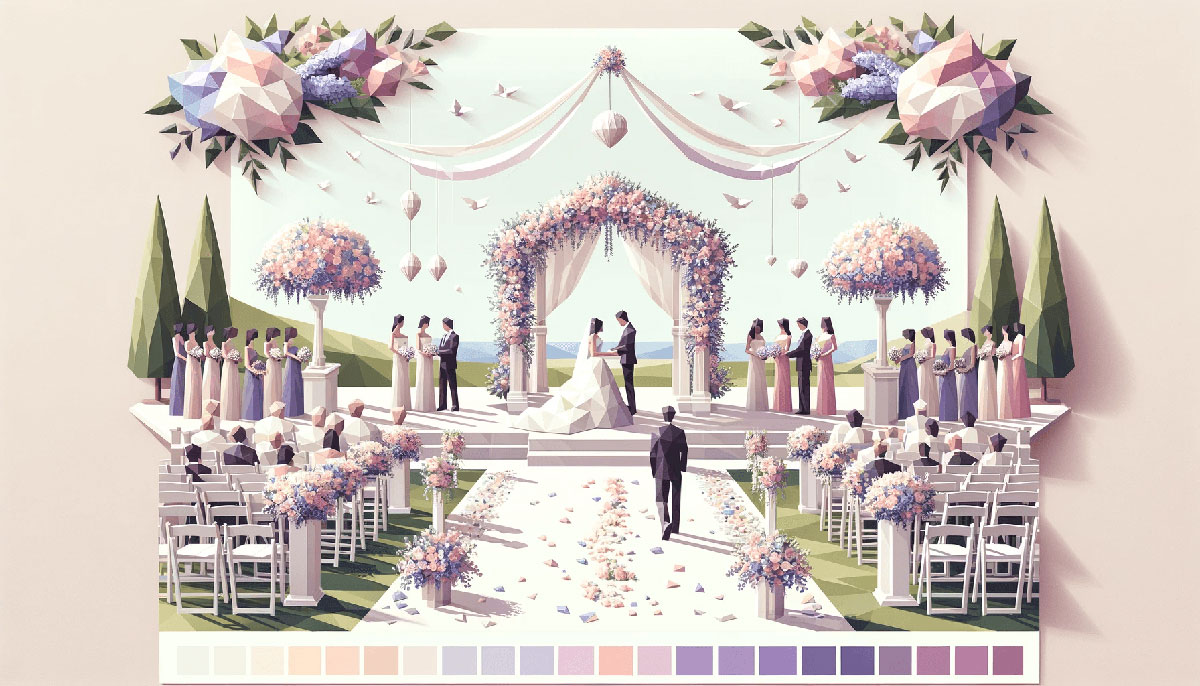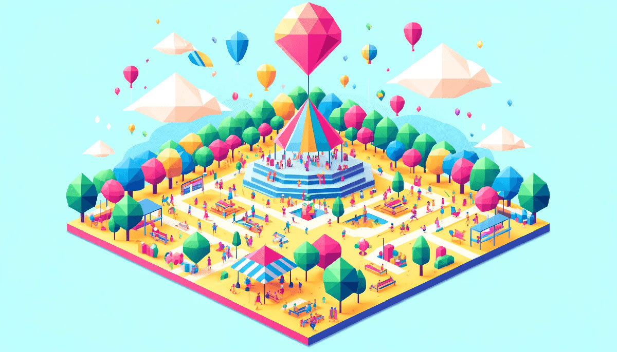
Happy color palettes transform designs from forgettable to magnetic in seconds. The right combination of cheerful hues triggers dopamine, grabs attention, and makes your brand feel approachable without trying too hard.
Most designers guess at color combinations or copy what competitors use. That’s why everything looks the same.
This guide breaks down 15 tested color schemes that actually work. You’ll learn which palettes fit specific industries, how to pair warm and cool tones without creating visual chaos, and why certain combinations trigger happiness while others just look loud.
Each palette includes hex codes, psychological triggers, and practical pairing tips you can apply immediately.
Happy Color Palettes
Cheerful Citrus
| #FFEB3B | #FF9800 | #FF5722 | #FF4081 | #F50057 |
Best Use Cases
Tech product packaging works because the vibrant orange and bold pink grab attention at point of sale. Lifestyle branding thrives with this complementary color scheme when you need to convey energy without crossing into aggressive territory.
Children’s apps and toys benefit from the playful dynamics between yellow and pink tones.
Mood & Psychology
This color palette triggers dopamine through bright yellows while the coral and hot pink add warmth. Creates feelings of joy, enthusiasm, and spontaneous energy rather than calm.
Pairing Tips
Limit the hot pink (#F50057) to call-to-action buttons or headlines. Use bright yellow (#FFEB3B) as your dominant color with orange as supporting accents.
Pair with off-white backgrounds, never pure white, because it reduces eye strain and makes the brights feel premium instead of cheap.
Happy Rainbow
| #01BEFE | #FFDD00 | #FF7D00 | #FF006D | #ADFF02 | #8F00FF |
Best Use Cases
Festival branding and event materials where maximum visual impact matters more than subtlety. Works for kids color palettes including educational apps, toy packaging, and children’s content.
Avoid corporate or professional contexts entirely.
Mood & Psychology
Six distinct hues create celebration and playfulness through chromatic diversity. This triadic color scheme variation triggers excitement but can overwhelm if not balanced with negative space.
Pairing Tips
Reserve electric violet (#8F00FF) and vivid rose (#FF006D) for small accent areas only. Let capri blue (#01BEFE) and Ukraine yellow (#FFDD00) carry most of the visual weight.
Use charcoal gray (#2D2D2D) for all text to create enough contrast against bright backgrounds.
Playful Pastels
| #FFB300 | #FFB74D | #FFD54F | #FFF176 | #DCE775 |
Best Use Cases
Spa branding and wellness products benefit from the calming yellow-green progression. Marketing campaigns targeting optimistic demographics without aggressive sales tactics.
Works for spring color palettes in seasonal retail and wedding color palettes for daytime ceremonies.
Mood & Psychology
Analogous colors in the yellow family create serene cheerfulness rather than explosive energy. The gentle green (#DCE775) adds organic freshness that color psychology links to growth and renewal.
Pairing Tips
Start with cream yellow (#FFF176) as the base, then layer in #FFB300 for highlights. The lime green works best in small doses for accent elements or icons.
Combine with cream color palettes (#FFFDD0) for backgrounds that maintain the soft, approachable vibe.
Sunshine Delight
| #FF9A55 | #FFEA6C | #54FFFB | #E7B2FF | #89FFCC |
Best Use Cases
Digital interfaces and mobile apps where screen brightness needs balancing with warm tones. Neon color palettes influence makes this perfect for youth-oriented brands and gaming interfaces.
Food and beverage packaging for tropical or citrus products.
Mood & Psychology
Warm peach (#FF9A55) and lemon (#FFEA6C) create approachability while cyan (#54FFFB) adds refreshing coolness. The lavender and mint prevent the warmth from becoming overwhelming.
Pairing Tips
Use cyan (#54FFFB) sparingly as a focal point color because it dominates despite being a cool tone. Let peach orange carry the main brand identity with lemon yellow for secondary elements.
The gradient from warm to cool creates natural visual hierarchy when used left-to-right in layouts.
Candy Land
| #FF4081 | #F50057 | #D5006D | #C51162 | #880E4F |
Best Use Cases
Creative projects like magazine layouts and artistic websites where bold statements trump conservative appeal. Fashion and beauty brands targeting confident, trend-forward audiences.
Works for magenta color palettes in cosmetics and hot pink applications in activewear.
Mood & Psychology
Monochrome colors in the pink-magenta range create sophisticated playfulness. The progression from bright to deep adds depth without introducing competing hues.
Pairing Tips
Use the darkest magenta (#880E4F) for text over lighter shades to maintain readability. Bright pink (#FF4081) works as the primary brand color with deeper tones providing emphasis.
Pair with white color palettes or very light gray to prevent visual fatigue.
Tropical Vibes
| #FF6B6B | #4ECDC4 | #FFE66D | #95E1D3 | #FFA07A |
Best Use Cases
Travel and hospitality branding where vacation energy drives conversion. Summer color palettes for seasonal campaigns and beachwear collections.
Restaurant branding for casual dining concepts and juice bars.
Mood & Psychology
Coral (#FF6B6B) and turquoise (#4ECDC4) create the classic beach palette that triggers relaxation and escape. Sunshine yellow adds optimism while mint green reinforces freshness.
Pairing Tips
Balance warm coral with cool turquoise using the 60-40 rule. Let one temperature dominate based on brand personality.
Sunshine yellow (#FFE66D) works best for small pops like buttons or icons rather than large background areas. Combine with teal color palettes for more sophisticated applications.
Summer Joy
| #87CEEB | #FFD700 | #FF7F50 | #7FFFD4 | #32CD32 |
Best Use Cases
Outdoor recreation brands and sports equipment where high energy meets natural appeal. Event marketing for summer color palettes festivals and outdoor concerts.
Works for bright color palettes in athletic apparel and fitness apps.
Mood & Psychology
Sky blue (#87CEEB) and gold yellow (#FFD700) mimic cloudless summer days. Lime green adds grass-field associations while coral provides warmth.
Pairing Tips
Gold yellow works as the hero color with sky blue providing balance. Limit lime green (#32CD32) to accent use because its intensity can overwhelm.
Pair with navy blue (#000080) for text to create enough contrast against the bright backgrounds.
Bubblegum Dreams
| #FFB6C1 | #ADD8E6 | #E6E6FA | #FFFACD | #98FB98 |
Best Use Cases
Pastel color palettes excel in baby products, nursery design, and children’s content where soft cheerfulness matters. Bakery branding and dessert packaging for premium confections.
Wedding invitations and bridal shower materials benefit from the romantic associations.
Mood & Psychology
Light pink (#FFB6C1) and baby blue (#ADD8E6) create gentle optimism without aggressive energy. The saturation levels stay low enough to maintain calming properties while the variety prevents monotony.
Pairing Tips
Use light purple (#E6E6FA) and lemon cream (#FFFACD) for backgrounds. Reserve soft pink and baby blue for foreground elements and illustrations.
Combine with beige color palettes (#F5F5DC) for text areas to maintain the gentle aesthetic while ensuring readability.
Energetic Brights
| #00BFFF | #FFFF00 | #FF6347 | #00FF00 | #FF00FF |
Best Use Cases
Gaming interfaces and esports branding where maximum intensity drives engagement. Nightclub promotions and electronic music festivals benefit from the high-energy combinations.
Works for neon color palettes in retail displays and vivid color palettes for attention-grabbing advertisements.
Mood & Psychology
Electric blue (#00BFFF) and neon yellow (#FFFF00) create adrenaline-inducing combinations. Magenta adds unexpected vibrancy while lime green reinforces the synthetic, digital feel.
Pairing Tips
Never use all five simultaneously. Pick two dominants and one accent maximum per screen or layout.
Black (#000000) backgrounds let these colors perform without visual chaos. Use charcoal (#36454F) for text to reduce eye strain against bright elements.
Sunset Happy
| #FFA500 | #FF8C69 | #FFEB9C | #FFB6D9 | #B0E0E6 |
Best Use Cases
Sunset color palettes work perfectly for lifestyle blogs and wellness content where warmth meets tranquility. Photography portfolios and creative agency branding benefit from the artistic gradient.
Restaurant interiors for casual dining concepts targeting evening crowds.
Mood & Psychology
Golden orange (#FFA500) to powder blue (#B0E0E6) mimics dusk transitions that trigger relaxation responses. The coral and pink create romantic associations without saccharine excess.
Pairing Tips
Use as a gradient color palette moving warm to cool from top to bottom in layouts. Golden orange anchors headers while powder blue handles footer areas.
Combine with cream (#FFFDD0) for body text backgrounds to maintain the soft, approachable aesthetic.
Fresh & Cheerful
| #F9E69F | #F49366 | #303C6C | #B0DEE5 | #D1FEFF |
Best Use Cases
Coastal retail and beach resort branding where vacation vibes need professional polish. Coffee shop interiors and casual dining concepts targeting morning and brunch crowds.
Works for sky color palettes in travel marketing and sea color palettes for marine-related businesses.
Mood & Psychology
Pale yellow (#F9E69F) and peach (#F49366) provide warmth while light blue tones (#B0DEE5, #D1FEFF) add refreshing coolness. Navy (#303C6C) grounds the palette and prevents it from feeling too light.
Pairing Tips
Use navy (#303C6C) for all text elements and structural components. Let the pale yellow and peach handle accent areas while blues create breathing room.
This color theory combination maintains enough contrast for accessibility while keeping the cheerful mood intact.
Joyful Jamboree
| #FFCC80 | #FFAB40 | #FF8F00 | #FF6F20 | #FF5252 |
Best Use Cases
Orange color palettes excel in food branding and restaurant design where appetite stimulation matters. Fitness and sports brands targeting motivation and energy use these warm progressions.
Autumn marketing campaigns and harvest-themed seasonal content.
Mood & Psychology
Warm orange progression from light (#FFCC80) to deep (#FF6F20) creates dynamic energy without jarring transitions. The pink accent (#FF5252) adds unexpected playfulness to the otherwise orange-focused scheme.
Pairing Tips
Use the lightest shade (#FFCC80) for backgrounds and the deepest (#FF6F20) for primary actions. Pink works as a strategic accent for secondary buttons.
Pair with dark orange or burnt orange (#CC5500) for text on light backgrounds to maintain the warm aesthetic throughout.
Cotton Candy
| #FFD1DC | #B0E0E6 | #E0BBE4 | #FFFDD0 | #F0FFF0 |
Best Use Cases
Bakery and confectionery branding where sweetness translates visually. Children’s boutiques and baby product packaging benefit from the gentle, non-threatening combinations.
Works for pastel pink applications in cosmetics and light color palettes for spa environments.
Mood & Psychology
Powder blue (#B0E0E6) and baby pink (#FFD1DC) create innocent cheerfulness. The lavender (#E0BBE4) adds sophistication while cream and mint maintain the airy feel.
Pairing Tips
Use cream (#FFFDD0) for large background areas because it’s less stark than white. Baby pink and powder blue work as alternating section backgrounds.
Combine with soft pink (#FFB6D9) for stronger accent needs while maintaining the pastel aesthetic.
Citrus Splash
| #FF9966 | #FFFF66 | #CCFF00 | #66CCFF | #FF6699 |
Best Use Cases
Food color palettes for juice bars, smoothie brands, and tropical beverage packaging. Summer festival promotions and outdoor event marketing where vibrant energy drives attendance.
Athletic apparel for running and cycling gear targeting visibility and energy.
Mood & Psychology
Tangerine (#FF9966) and lemon (#FFFF66) create citrus associations that trigger freshness and vitamin-rich perceptions. Aqua blue (#66CCFF) adds cooling refreshment while pink grapefruit (#FF6699) rounds out the fruit theme.
Pairing Tips
Lemon yellow dominates best as the hero color with tangerine providing support. Limit lime (#CCFF00) to small accent areas because its intensity overwhelms quickly.
Use white (#FFFFFF) or very light gray (#F8F8F8) for text areas to let the bright palette breathe.
Happy Meadow
| #7FFF00 | #F0E68C | #87CEFA | #FFDAB9 | #DDA0DD |
Best Use Cases
Nature color palettes for organic food brands and eco-friendly products where natural appeal builds trust. Garden centers and landscaping services benefit from the outdoor associations.
Spring marketing campaigns and Easter seasonal content use these flower-field combinations effectively.
Mood & Psychology
Grass green (#7FFF00) and buttercup yellow (#F0E68C) create outdoor freshness. Sky blue (#87CEFA) adds airiness while peach and plum (#DDA0DD) introduce floral variety.
Pairing Tips
Buttercup yellow works best as the dominant color with grass green as supporting accents. Reserve plum for small decorative elements only.
Combine with sage green (#9DC183) for text or structural elements to maintain the natural theme while ensuring readability.
FAQ on Happy Color Palettes
What colors make a happy color palette?
Bright yellows, corals, peaches, and sunny oranges create the strongest happiness response. Pair these warm color palettes with fresh cool tones like aqua, turquoise, or sky blue for balance.
Add one neutral like cream or off-white to prevent visual overwhelm.
How many colors should a happy palette include?
Three to five colors creates optimal visual interest without chaos. Use one dominant happy color, one to two supporting shades, and one neutral anchor.
This color theory approach maintains balance while delivering cheerful energy.
Can cool colors like blue be part of happy palettes?
Absolutely. Sky blue, turquoise, and mint green evoke tropical freshness many associate with happiness.
Cool colors work best when paired with warm accents like coral or peach to prevent coldness.
What’s the difference between happy and energetic color palettes?
Happy palettes balance brightness with approachability. Energetic palettes use intense saturation like electric orange and vivid magenta to stimulate action.
One calms while lifting mood, the other activates and demands attention through aggressive contrast.
Which industries benefit most from happy color palettes?
Wellness brands, children’s products, food and beverage companies, and lifestyle blogs see the strongest performance. Modern digital platforms and casual dining concepts also benefit.
Avoid for legal services, finance, or enterprise B2B where trust trumps cheerfulness.
How do I use happy colors without looking unprofessional?
Pair bright hues with sophisticated neutrals like charcoal or navy. Use white space generously and limit saturated colors to accent areas only.
Clean typography and consistent spacing make bright colors feel premium instead of cheap.
Should I use gradients with happy color palettes?
Yes, when transitioning from warm to cool tones. Gradient color palettes create natural visual flow in layouts.
Limit gradients to one area per design to maintain clarity and prevent the composition from feeling too busy or unfocused.
What background colors work best with happy palettes?
Off-white, cream, or very light gray lets brights pop without harsh contrast. Pure white creates eye strain against saturated colors.
Colored backgrounds like mint or pale yellow work when text sits on dark anchors for readability.
Can I mix pastel and bright happy colors?
Yes, but establish clear visual hierarchy. Use bright color palettes for primary actions and pastel color palettes for backgrounds.
This creates depth without competition, letting each saturation level serve a distinct purpose in the design.
How do happy color palettes perform in print versus digital?
Digital screens display brighter, more saturated colors through RGB. Print using CMYK appears slightly muted.
Always test Pantone swatches for print projects and adjust DPI to 300 for crisp, professional output.
Conclusion
Happy color palettes aren’t about throwing bright colors together and hoping they work. They require understanding color psychology, balancing warm and cool tones, and knowing when to use saturation versus softness.
The 15 palettes covered here give you tested combinations for everything from fun color palettes in gaming to modern color palettes in corporate environments.
Start with one dominant joyful shade, add supporting colors from the same temperature family, then include neutrals for breathing room. Test your choices across different contexts before committing.
Remember that proper visual hierarchy and strategic use of white space matter just as much as color selection itself. The difference between amateur and professional lies in restraint, not in how many bright hues you can cram into one design.

Renowned for his expertise in logo design and visual branding, Bogdan has developed a multitude of logos for various clients.
His skills extend to creating posters, vector illustrations, business cards, and brochures. Additionally, Bogdan's UI kits were featured on marketplaces like Visual Hierarchy and UI8.
He also wrote in the past years on sites like Design Your Way, WebDesignerDepot, WPDean, Designmodo, Speckyboy, Slider Revolution, and more.
- The Windsurf Logo History, Colors, Font, And Meaning - 10 October 2026
- How to Remove Background From Product Photos (No Photoshop) - 10 October 2026
- How Designers can Build a Stronger Online Creative Identity - 9 October 2026

Bogdan Sandu is a seasoned designer who has been designing websites since 2008. Renowned for his expertise in logo design and visual branding, Bogdan has developed a multitude of logos for various clients. His skills extend to creating posters, vector illustrations, business cards, and brochures. Additionally, Bogdan's UI kits were featured on marketplaces like Visual Hierarchy and UI8. He also wrote in the past years on sites like Design Your Way, WebDesignerDepot, WPDean, Designmodo, Speckyboy, Slider Revolution, and more.
You Might Also Like