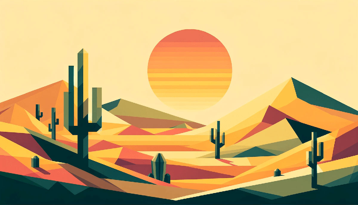
Orange dominates when brands need energy without red’s aggression or yellow’s caution. It’s the color of sunsets, citrus, autumn leaves, and every “buy now” button that actually converts.
But slap any random orange color palettes on your design and you risk looking like a 1970s kitchen or a traffic cone.
This guide breaks down 15 proven palettes with exact hex codes, use cases, and color combinations that work. You’ll learn which oranges pair with teal for cinema-grade contrast, which ones soften into pastel blends for wellness brands, and which burnt tones anchor rustic aesthetics.
From complementary schemes to gradient progressions, each palette includes RGB values and real-world applications.
Orange Color Palettes
Sunset Glow
| #FF4500 | #FF6347 | #FFD700 | #FF8C00 | #FF7F50 |
Color Codes
Five warm tones ranging from deep red-orange (#FF4500) to coral (#FF7F50). Golden yellow (#FFD700) acts as the mid-tone anchor between fiery oranges.
Best Use Cases
Works for autumn color palettes in seasonal campaigns, restaurant branding, and energetic call-to-action buttons. Perfect for sunset-themed designs, travel websites, and outdoor recreation brands.
Color Combinations
Pair with deep navy (#000080) or charcoal for high contrast. Add cream (#FFFBDC) as background to soften intensity while maintaining warmth.
Mood & Psychology
Radiates enthusiasm, creativity, and optimism through its vibrant energy. The gradient from red-orange to gold evokes natural sunsets, creating familiarity and comfort.
Citrus Burst
| #FFA500 | #FFB800 | #FF4500 | #FF6347 | #FF8C00 |
Color Codes
Standard orange (#FFA500) serves as the primary hue with four supporting variations. Yellow-orange (#FFB800) and dark orange (#FF8C00) create tonal range for depth.
Best Use Cases
Food packaging, juice brands, vitamin supplements, and health-focused product design. Great for children’s websites, educational platforms, and playful brand identities.
Color Combinations
Combine with teal color palettes (#008083) for popular complementary schemes. White backgrounds keep the palette fresh and approachable without overwhelming viewers.
Mood & Psychology
Conveys vitality, freshness, and natural energy through citrus associations. The bright saturation stimulates appetite and promotes feelings of happiness.
Burnt Orange Warmth
| #CC5500 | #D2691E | #CD853F | #B8860B | #DAA520 |
Color Codes
Deep burnt orange (#CC5500) anchors this earthy palette with chocolate and golden accents. Peru (#CD853F) and goldenrod (#DAA520) add lighter tones without losing warmth.
Best Use Cases
Interior design for cozy living spaces, coffee shops, artisan bakeries, and rustic brands. Works in vintage color palettes for retro-inspired campaigns and heritage branding.
Color Combinations
Layer with cream color palettes and taupe for sophisticated neutrals. Add forest green or olive for natural, earth color palettes combinations.
Mood & Psychology
Creates feelings of stability, comfort, and grounded warmth through terracotta associations. The muted tones suggest reliability and timelessness, ideal for established brands.
Orange & Teal Cinema
| #FD5901 | #F78104 | #FAAB36 | #249EA0 | #008083 |
Color Codes
Three warm oranges (#FD5901, #F78104, #FAAB36) paired with two cool teals for complementary contrast. Uses the classic complementary color scheme popular in film grading.
Best Use Cases
Movie posters, streaming platforms, tech startups, and modern web design projects. Common in sports branding, gaming interfaces, and dynamic marketing materials.
Color Combinations
Add charcoal (#36454F) or navy for depth without competing with primary colors. Introduce white or light gray as negative space to prevent visual fatigue.
Mood & Psychology
Creates high energy through warm-cool tension while maintaining balance. The combination signals both excitement (orange) and trustworthiness (teal), perfect for tech brands.
Coral Reef
| #FF6B6B | #FF8C94 | #FF7F50 | #FFA07A | #FF6347 |
Color Codes
Blends coral (#FF7F50) with pink color palettes for softer orange variations. Light salmon (#FFA07A) and tomato (#FF6347) provide tonal diversity within the warm spectrum.
Best Use Cases
Beauty brands, wellness products, tropical resort marketing, and feminine-leaning designs. Effective in summer color palettes for seasonal collections and beachwear campaigns.
Color Combinations
Pair with turquoise color palettes or aquamarine for tropical themes. Combine with beige color palettes and sand tones for coastal aesthetics.
Mood & Psychology
Evokes playfulness, vitality, and approachability through its vibrant yet friendly tones. The coral shades suggest organic warmth without the aggression of pure red color palettes.
Peach Sorbet
| #FFDAB9 | #FFE4B5 | #FFB6C1 | #FFC0CB | #FFCCCB |
Color Codes
Pastel color palettes featuring peach (#FFDAB9) and light pink variations. Moccasin (#FFE4B5) bridges peach and pink for smooth transitions.
Best Use Cases
Nursery designs, wedding color palettes, bakery branding, and gentle feminine products. Perfect for skincare packaging, spa materials, and calming user interfaces.
Best Use Cases
Works in spring color palettes for fresh, youthful branding approaches.
Color Combinations
Add mint green or lavender for soft, cool color palettes accents. Use ivory or off-white backgrounds to maintain the delicate aesthetic.
Mood & Psychology
Communicates gentleness, nurturing, and softness through low saturation and high brightness. The palette feels soothing and non-threatening, ideal for stress-relief products.
Autumn Harvest
| #8B4513 | #D2691E | #FF8C00 | #CD853F | #A0522D |
Color Codes
Saddle brown (#8B4513) and sienna (#A0522D) ground this palette with rich brown color palettes. Dark orange (#FF8C00) and chocolate (#D2691E) add seasonal vibrancy.
Best Use Cases
Fall marketing campaigns, pumpkin spice products, rustic packaging design, and harvest festivals. Effective for coffee color palettes in café branding and organic food labels.
Color Combinations
Mix with deep forest green or olive green for natural depth. Layer with gold color palettes accents for premium autumn aesthetics.
Mood & Psychology
Evokes abundance, tradition, and earthiness through harvest associations. The warm browns create feelings of security and connection to nature.
Tangerine Dream
| #FF9933 | #FFAA33 | #FFBB33 | #FFCC33 | #FFDD33 |
Color Codes
Progressive gradient from tangerine (#FF9933) to bright yellow (#FFDD33). Creates smooth analogous colors transitions within the warm spectrum.
Best Use Cases
Energy drink branding, sports equipment, fitness apps, and motivational content. Works in bright color palettes for attention-grabbing designs and youth marketing.
Color Combinations
Add purple color palettes or violet for unexpected triadic color scheme variations. Use gray color palettes to tone down intensity for professional applications.
Mood & Psychology
Radiates optimism, enthusiasm, and forward momentum through its sunny progression. The gradient effect suggests transformation and positive change, ideal for growth-focused brands.
Tropical Sunset
| #FF6F61 | #FF8A80 | #FFAB91 | #FFCCBC | #FFE0B2 |
Color Codes
Livingston coral (#FF6F61) transitions through progressively lighter peach tones to champagne (#FFE0B2). Creates depth through five-step tonal variation from saturated to barely-there warmth.
Best Use Cases
Travel agencies, resort branding, tropical product lines, and sunset color palettes applications. Perfect for beach-themed designs, vacation planning apps, and exotic food packaging.
Color Combinations
Pair with sea color palettes featuring deep blue-greens for oceanic contrast. Add sand neutrals and driftwood grays for complete coastal themes.
Mood & Psychology
Evokes relaxation, escape, and tropical paradise through warm gradient flows. The fading intensity suggests tranquil evenings and stress-free vacation mindsets.
Mandarin & Navy
| #FF8500 | #FFA040 | #000080 | #4169E1 | #1E3A8A |
Color Codes
Bold mandarin orange (#FF8500) contrasts with navy blue (#000080) and royal blue (#4169E1). Professional blue color palettes balance energetic orange for corporate applications.
Best Use Cases
Corporate branding, financial services, educational institutions, and professional logo design. Works for tech companies needing both trustworthiness (navy) and innovation (orange).
Color Combinations
Add crisp white for clean backgrounds that amplify both warm and cool tones. Introduce silver or light gray for modern, tech-forward aesthetics.
Mood & Psychology
Balances authority and approachability through strategic warm-cool pairing. Navy signals professionalism while orange prevents stuffiness, ideal for accessible expertise.
Pumpkin Spice
| #E67E22 | #D35400 | #CA6F1E | #BA4A00 | #A04000 |
Color Codes
Monochrome colors approach using five shades of deep pumpkin orange. Ranges from vibrant carrot (#E67E22) to rich mahogany-orange (#A04000).
Best Use Cases
Fall product launches, Halloween color palettes alternatives, seasonal café menus, and harvest branding. Effective for artisan products, craft breweries, and rustic home goods.
Color Combinations
Mix with cream or tan for softer contrast without losing seasonal impact. Add deep burgundy or maroon for richer autumn depth.
Mood & Psychology
Creates cozy nostalgia through associations with fall traditions and comfort foods. The monochromatic depth suggests sophistication within casual warmth.
Orange Sherbet
| #FF5900 | #FF8237 | #FFAA6E | #FFD3A5 | #FFFBDC |
Color Codes
Vivid bright orange (#FF5900) fades to barely-there cream (#FFFBDC) through four steps. Apricot middle tones (#FFAA6E) bridge intensity and softness.
Best Use Cases
Ice cream branding, dessert packaging, kids color palettes, and playful food design. Works for summer promotions, frozen treats, and nostalgic candy companies.
Color Combinations
Add mint blue or pastel blue for refreshing sweet-shop aesthetics. Combine with light purple or lilac for whimsical childhood themes.
Mood & Psychology
Evokes sweetness, playfulness, and carefree joy through dessert associations. The gradient suggests indulgence without guilt, perfect for treat-yourself messaging.
Terracotta Earth
| #E2725B | #C9594C | #B14D3E | #994130 | #803522 |
Color Codes
Five terracotta shades progress from clay-fired brightness to deep earthen tones. Burnt sienna influences create pottery and adobe aesthetics.
Best Use Cases
Southwest design, pottery studios, artisan ceramics, and bohemian interior schemes. Perfect for organic cosmetics, natural fiber clothing, and handcrafted product lines.
Color Combinations
Layer with sage green or moss green for garden-inspired palettes. Add ecru or raw linen neutrals for woven textile aesthetics.
Mood & Psychology
Communicates authenticity, craftsmanship, and connection to earth through clay references. The natural progression suggests handmade quality and artisanal care.
Apricot Blush
| #FBCEB1 | #FFBF9A | #FFA07A | #FF8C69 | #FF7F50 |
Color Codes
Soft apricot (#FBCEB1) deepens gradually to classic coral (#FF7F50). Light salmon (#FFA07A) serves as mid-tone between pastel orange and vibrant coral.
Best Use Cases
Makeup brands, skin color palettes for beauty tech, blush packaging, and feminine wellness. Works for romance novels, dating apps, and relationship-focused content.
Color Combinations
Pair with rose gold or champagne for luxe beauty aesthetics. Add dusty rose or mauve for vintage-inspired elegance.
Mood & Psychology
Suggests warmth, affection, and gentle femininity through blush-like progression. The peachy tones feel universally flattering and approachable without being childish.
Fire & Ice
| #FF4500 | #FF6347 | #00CED1 | #20B2AA | #008B8B |
Color Codes
Intense red-orange tones (#FF4500, #FF6347) clash with cyan and dark cyan. Maximum color theory contrast through opposing temperature extremes.
Best Use Cases
Action sports, energy drinks, extreme sports equipment, and high-impact advertising. Perfect for gaming interfaces, competitive platforms, and adrenaline-focused brands.
Color Combinations
Add charcoal or jet black to anchor the intense contrast. Use sparingly with generous white space to prevent visual overload.
Mood & Psychology
Creates maximum tension and excitement through opposing warm-cool dynamics. The dramatic split signals intensity, competition, and bold action, never subtlety.
FAQ on Orange Color Palettes
What colors go best with orange in a palette?
Teal and navy blue create cinematic contrast through complementary color schemes. Cream and beige soften intensity for vintage aesthetics.
Green works in triadic combinations, while charcoal adds sophistication. Gold amplifies warmth for autumn themes.
What is the hex code for standard orange?
Standard orange is #FFA500 in hex, which translates to RGB values of R:255, G:165, B:0.
This is the baseline hue that sits precisely between red and yellow on the color wheel. Pantone also references specific orange standards for print work.
How do I create a professional orange palette for branding?
Start with one primary orange (#FF8500 or #E67E22), add two neutrals (gray, white), and one complementary accent (blue or teal).
Test contrast ratios for accessibility. Limit orange to 20-30% of total visual hierarchy to prevent overwhelming designs.
What’s the difference between burnt orange and regular orange?
Burnt orange (#CC5500) contains more red and brown, creating deeper, earthier tones compared to standard orange (#FFA500).
Regular orange appears brighter and more saturated. Burnt orange works in vintage color palettes and rustic designs, while standard orange suits modern, energetic applications requiring higher saturation.
Can orange work in minimalist design?
Yes, when used as a single accent color against neutral backgrounds like white, light gray, or black.
Minimalist design requires restraint. Orange should occupy less than 10% of the composition, typically in call-to-action elements or focal points following Swiss design principles.
What industries use orange color palettes most effectively?
Food and beverage (citrus brands, cafés), technology (innovation signals), sports and fitness (energy), retail (warm color palettes increase urgency), and education (approachability).
Healthcare uses muted oranges for wellness without clinical coldness. Packaging design leverages orange for shelf visibility and appetite stimulation.
How do pastel orange palettes differ from vibrant ones?
Pastel orange (#FFDAB9, #FFE4B5) uses high brightness and low saturation for soft, approachable aesthetics in nurseries and beauty brands.
Vibrant oranges (#FF4500, #FF6347) maximize saturation for attention-grabbing designs. Pastel color palettes feel calming; bright color palettes demand immediate action through color psychology principles.
What are common mistakes when using orange in design?
Overusing orange without neutral balance creates visual fatigue. Pairing orange with clashing neon colors produces migraine-inducing chaos.
Ignoring contrast ratios fails accessibility standards. Using orange text on white backgrounds below 4.5:1 ratio violates WCAG guidelines, particularly for body copy requiring legibility.
How do seasonal orange palettes differ throughout the year?
Autumn color palettes feature burnt orange, brown, and gold. Summer color palettes use coral and peach with aquatic blues.
Spring incorporates light orange with fresh greens. Winter rarely features orange except in Christmas color palettes paired with evergreen.
What file formats preserve orange color accuracy best?
PNG and vector graphics (SVG, AI) maintain color fidelity across devices. JPEG compression can shift orange tones unpredictably.
For print, use CMYK color mode at 300 DPI minimum. Web designs require RGB with hex codes for consistent rendering across browsers and maintaining saturation levels.
Conclusion
These 15 orange color palettes prove that orange works across every design context when you understand color theory fundamentals and proper color combinations.
From burnt orange anchoring rustic packaging design to coral softening wellness brand guidelines, the right palette shifts perception entirely.
Use complementary schemes with teal for cinematic impact. Apply analogous colors for smooth gradient transitions.
Test every palette against contrast ratios and accessibility standards. Balance saturation levels with neutral anchors.
Start with hex codes, adapt through RGB for web design, convert to CMYK for print design. Your next project needs the energy only orange delivers.

Renowned for his expertise in logo design and visual branding, Bogdan has developed a multitude of logos for various clients.
His skills extend to creating posters, vector illustrations, business cards, and brochures. Additionally, Bogdan's UI kits were featured on marketplaces like Visual Hierarchy and UI8.
He also wrote in the past years on sites like Design Your Way, WebDesignerDepot, WPDean, Designmodo, Speckyboy, Slider Revolution, and more.
- Canva vs PowerPoint: Which Is Better for Presentations? - 22 September 2026
- How to Install Fonts on Mac (Step-by-Step Guide) - 20 September 2026
- From Mockup to Code: How AI-Augmented Development Speeds Up the Design Handoff - 19 September 2026

Bogdan Sandu is a seasoned designer who has been designing websites since 2008. Renowned for his expertise in logo design and visual branding, Bogdan has developed a multitude of logos for various clients. His skills extend to creating posters, vector illustrations, business cards, and brochures. Additionally, Bogdan's UI kits were featured on marketplaces like Visual Hierarchy and UI8. He also wrote in the past years on sites like Design Your Way, WebDesignerDepot, WPDean, Designmodo, Speckyboy, Slider Revolution, and more.
You Might Also Like