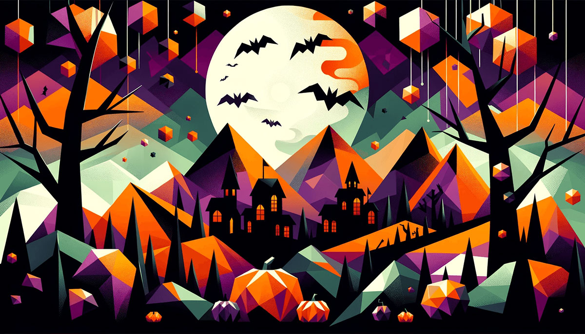
Orange and black might be the obvious choice, but Halloween color palettes stretch far beyond jack-o’-lantern basics.
From neon nightmares to pastel spooks, the right color scheme sets your entire October mood. Whether you’re designing party invitations, branding seasonal products, or decorating your space, colors create instant atmosphere.
This guide breaks down 15 distinct palettes with exact hex codes, usage tips, and psychological insights. You’ll discover which combinations evoke gothic glamour versus playful tricks, how to apply color theory principles to Halloween themes, and when to break traditional rules.
Each palette includes specific applications, mood profiles, and technical guidance for web design, print design, and physical decorations.
Halloween Color Palettes
Classic Spooky
| #FF6D01 | #000000 | #902EBB | #63C328 |
Color Codes
Pumpkin orange (#FF6D01) paired with pure black (#000000) forms the foundation. Purple (#902EBB) adds mystical depth while poison green (#63C328) brings playful spookiness.
Best Used For
Traditional Halloween decorations, party invitations, costume design. Works well for packaging design targeting families with children.
Mood & Atmosphere
Creates instant October recognition. The warm orange suggests harvest season and jack-o’-lanterns glowing at dusk. Black brings mystery and nighttime shadows. Purple hints at magic, green at bubbling cauldrons.
How to Apply It
Use black as your background or primary text color for maximum contrast. Let orange dominate visual space (60%), black grounds the design (30%), purple and green as accents (10% combined). This balance keeps the palette from overwhelming viewers.
Midnight Mystery
| #1C1C1C | #F4831B | #902EBB | #EEEB27 |
Color Codes
Blackboard (#1C1C1C) offers softer darkness than pure black. Trendy orange (#F4831B), stylish purple (#902EBB), crispy yellow (#EEEB27) complete the scheme.
Best Used For
Modern Halloween branding, social media graphics, web design projects. Strong choice for sophisticated adult Halloween parties.
Mood & Atmosphere
Less cartoonish than classic combinations. The muted black feels refined while maintaining spooky credentials. Yellow brings unexpected brightness that suggests candlelight or moon glow.
How to Apply It
Start with blackboard as your canvas. Layer orange and purple through visual hierarchy principles. Reserve yellow for small highlights, calls-to-action, or text emphasis. Too much yellow kills the moody atmosphere.
Witchy Vibes
| #5C58A4 | #110504 | #FA7602 | #40A231 |
Color Codes
Ultra violet (#5C58A4) dominates this supernatural palette. Licorice black (#110504), safety orange (#FA7602), pigment green (#40A231) support the witchcraft theme.
Best Used For
Gothic fashion brands, occult-themed products, witchcraft community events. Perfect for book cover design in paranormal romance or fantasy genres.
Mood & Atmosphere
Purple connects to magic, mystery, supernatural realms. Deep and saturated, not pastel. The near-black hue adds gravitas missing from lighter Halloween schemes.
How to Apply It
Let purple do heavy lifting in headers, hero sections, primary design elements. Green works as an accent for potion bottles, spell ingredients, mystical symbols. Apply color theory to ensure green and purple maintain proper saturation levels.
Candy Corn Dream
| #FF9A00 | #FDD001 | #FBFAF4 | #000000 |
Color Codes
Bright orange (#FF9A00) and candy yellow (#FDD001) mimic the iconic treat. Off-white (#FBFAF4) provides breathing room, black (#000000) adds definition.
Best Used For
Candy brands, children’s Halloween products, playful party supplies. Works brilliantly for retro-themed designs referencing 1950s-1970s Halloween aesthetics.
Mood & Atmosphere
Sweet, nostalgic, approachable. Zero scariness factor. Evokes childhood trick-or-treating, paper decorations, elementary school parties.
How to Apply It
Use the three warm color palettes tones in equal measure for authentic candy corn feel. Black serves as outline work, text, or borders. Consider vintage color palettes principles for maximum nostalgic impact.
Haunted Forest
| #1A824A | #E78206 | #352830 | #7059A2 |
Color Codes
Sea green (#1A824A) brings deep woodland darkness. Fulvous orange (#E78206), raisin black (#352830), ultra violet (#7059A2) complete the natural spooky scheme.
Best Used For
Outdoor Halloween events, nature-themed horror, autumn harvest festivals. Strong foundation for autumn color palettes with supernatural twist.
Mood & Atmosphere
Feels organic, earthy, grounded in actual October landscapes. The dark green suggests moss-covered tombstones, shadowy pine forests, midnight trails.
How to Apply It
Green dominates to establish the forest setting. Orange appears as dying leaves, lantern light breaking through trees. Purple adds otherworldly elements. This palette follows analogous colors principles with a twist.
Blood Moon
| #DD394C | #2A2D32 | #F8A442 | #20698A |
Color Codes
Rusty red (#DD394C) dominates like a lunar eclipse overhead. Jet black (#2A2D32), orange peel (#F8A442), cerulean blue (#20698A) provide dramatic support.
Best Used For
Horror movie promotions, vampire-themed events, gothic romance novels. Excellent for creating tension in poster design.
Mood & Atmosphere
Dangerous, urgent, cinematic. The red immediately signals blood, warning, supernatural danger. Blue adds unexpected coolness that makes red feel even more intense through contrast.
How to Apply It
Red demands attention as your focal point. Use it sparingly for maximum psychological impact. Blue works for shadows, night sky, moonlight elements. The complementary color scheme creates natural visual tension.
Pumpkin Patch
| #0F060B | #B0352D | #E38057 | #330F13 |
Color Codes
Deep black (#0F060B) and burnt brown (#330F13) create dark color palettes foundation. Dark red (#B0352D) and pumpkin orange (#E38057) bring warmth.
Best Used For
Agricultural Halloween events, farm-to-table restaurants, rustic decorations. Natural fit for autumn color palettes extending into Halloween season.
Mood & Atmosphere
Cozy yet slightly sinister. Feels like sunset over a cornfield, lanterns lighting dirt paths. The brown tones ground everything in harvest reality rather than fantasy.
How to Apply It
Layer the browns and blacks to create depth. Orange appears as highlights, candlelight, pumpkin surfaces. Red adds intensity without dominating. Think about gradient transitions between these earth tones.
Gothic Glamour
| #8A4985 | #925AA2 | #FD6924 | #CC021A |
Color Codes
Plum (#8A4985) and purpureus (#925AA2) create sophisticated purple gradient color palettes. Crayola orange (#FD6924) and fire engine red (#CC021A) add bold heat.
Best Used For
High-end Halloween galas, luxury brand seasonal campaigns, fashion editorials. Perfect when you need elegance without sacrificing seasonal recognition.
Mood & Atmosphere
Luxurious, dramatic, adult-oriented. Zero cute factor. The purple suggests velvet, wine, expensive fabrics. Red and orange keep it Halloween without being obvious.
How to Apply It
Use purple as your dominant color across large surfaces. This shows refinement. Orange and red work as accent colors in small doses. Consider color psychology when deciding placement, as red triggers urgency while purple suggests creativity.
Pastel Spook
| #EB8A41 | #9B9B9A | #C4E582 | #AE85C7 |
Color Codes
Persian orange (#EB8A41) softens traditional pumpkin brightness. Battleship gray (#9B9B9A), mindaro green (#C4E582), African violet (#AE85C7) create gentle contrast.
Best Used For
Children’s products, cute Halloween themes, nursery decorations. Strong choice for brands wanting Halloween recognition without scary elements.
Mood & Atmosphere
Whimsical, approachable, sweet. More friendly ghost than haunted house. The muted tones belong in pastel color palettes families while maintaining October identity.
How to Apply It
Distribute all four colors evenly for watercolor effect. No single color should dominate heavily. Gray serves as neutral anchor. This palette works beautifully for kids color palettes applications where you need seasonal without frightening.
Neon Nightmare
| #FF5A00 | #1A1A1F | #A6FF00 | #8A2BE2 |
Color Codes
Neon orange (#FF5A00) screams for attention against near-black (#1A1A1F). Neon green (#A6FF00) and neon purple (#8A2BE2) complete the electric scheme.
Best Used For
Nightclub Halloween events, rave parties, youth-oriented campaigns. Perfect for neon color palettes enthusiasts wanting seasonal adaptation.
Mood & Atmosphere
Energetic, modern, rebellious. Feels like blacklight posters and glow sticks. The extreme saturation levels create eye-catching designs that demand attention.
How to Apply It
Dark background is non-negotiable. Neons need darkness to glow properly. Use one neon as hero color (orange for Halloween recognition), others as accents. Consider RGB color mode for digital displays where these colors shine brightest.
Vintage Halloween
| #62632A | #7F3751 | #FDA629 | #FCC318 |
Color Codes
Dark moss green (#62632A) and quinacridone magenta (#7F3751) create aged feel. Web orange (#FDA629) and mikado yellow (#FCC318) add warmth.
Best Used For
Retro color palettes projects, antique shops, nostalgic branding. Excellent for designs referencing 1940s-1960s Halloween imagery.
Mood & Atmosphere
Faded, nostalgic, timeworn. Like vintage postcards or old paper decorations. Colors feel sun-bleached, library-dusty, attic-discovered.
How to Apply It
Avoid high contrast. Let colors blend and mute together for authentic vintage effect. Yellow and orange suggest aged paper. Consider sepia undertones when working with these hues in print design.
Moonlit Cemetery
| #389092 | #5FCFC3 | #141E28 | #F79336 |
Color Codes
Dark cyan (#389092) and Tiffany blue (#5FCFC3) create moonlight glow. Rich black (#141E28) anchors while dark orange (#F79336) adds warmth.
Best Used For
Mystery novels, ghost tour promotions, atmospheric photography. Works well for designs needing Halloween mood without traditional color expectations.
Mood & Atmosphere
Eerie, mysterious, supernatural. The blue tones suggest midnight, fog, cold moonlight. Unexpected for Halloween, which makes it memorable. Blue creates distance and coldness color psychology teaches us.
How to Apply It
Let blues dominate for otherworldly feeling. Black provides depth and shadow. Orange appears sparingly as distant lanterns or warm light sources. This creates complementary color scheme tension between cool blues and warm orange.
Silly Jacks
| #302720 | #A62B02 | #FDB400 | #EF9837 |
Color Codes
Dark brown (#302720) grounds this playful pumpkin-inspired scheme. Dark red (#A62B02), golden yellow (#FDB400), orange (#EF9837) mimic carved jack-o’-lanterns.
Best Used For
Family-friendly events, pumpkin patches, community festivals. Perfect foundation for designs celebrating carving traditions.
Mood & Atmosphere
Playful, traditional, welcoming. Zero frightening elements. The warm browns and golds suggest candlelight glowing through carved faces.
How to Apply It
Brown creates stable base. Layer the three warm tones to show dimensional carving. Yellow represents brightest candlelight, orange the pumpkin flesh, red the deeper shadows. Apply scale and proportion principles when balancing these similar hues.
Autumn Harvest
| #391F14 | #9EAE18 | #E05A06 | #DACEC4 |
Color Codes
Bistre brown (#391F14) provides rich earthy foundation. Apple green (#9EAE18), persimmon orange (#E05A06), timberwolf beige (#DACEC4) complete the harvest feel.
Best Used For
Farmers markets, organic food brands, autumn color palettes bridging into Halloween. Strong choice for earth color palettes seasonal adaptations.
Mood & Atmosphere
Natural, wholesome, grounded. More pumpkin pie than haunted house. Colors feel pulled directly from October landscapes, fallen leaves, ripening gourds.
How to Apply It
Brown and beige create neutral framework. Orange dominates as primary seasonal signal. Green adds freshness, preventing palette from feeling too heavy. Consider monochrome colors variations of orange for additional depth.
Jack-o’-Lantern Glow
| #13171A | #FF6D01 | #FF9E00 | #FDB51A |
Color Codes
Eerie black (#13171A) creates night setting for glowing pumpkins. Three orange shades: pumpkin (#FF6D01), orange peel (#FF9E00), selective yellow (#FDB51A) show dimensional carving.
Best Used For
Carving contests, pumpkin-focused products, traditional October celebrations. Captures the exact visual of lit jack-o’-lanterns on porches.
Mood & Atmosphere
Classic, dimensional, warm. The multiple orange tones create realistic glow effect. Black represents night, oranges represent flickering candlelight from inside carved pumpkins.
How to Apply It
Black background is essential. The three oranges work together showing light gradation. Brightest yellow (#FDB51A) for direct flame, mid orange for pumpkin walls, darkest orange for carved edges. This follows natural gradient lighting principles, creating depth through color palette variation alone.
FAQ on Halloween Color Palettes
What colors are traditionally used in Halloween palettes?
Orange and black form the foundation, representing harvest and darkness. Purple adds mystical elements while green suggests supernatural forces.
These four colors appear across most traditional Halloween designs, from packaging design to party decorations, creating instant October recognition.
Why is orange such a dominant Halloween color?
Orange connects directly to pumpkins, autumn leaves, and harvest season. The warm hue suggests candlelight and jack-o’-lantern glow.
From a color psychology perspective, orange creates energy and excitement without the aggression red triggers, making it perfect for festive occasions.
Can I use pastel colors for Halloween designs?
Absolutely. Pastel color palettes work brilliantly for children’s products, cute themes, or brands wanting seasonal recognition without scary elements.
Softer oranges, muted purples, and gentle greens maintain Halloween identity while feeling approachable and whimsical rather than frightening.
What hex codes should I use for classic Halloween orange?
#FF6D01 delivers traditional pumpkin orange with strong visibility. #F4831B offers slightly softer warmth while #FDA629 leans toward golden tones.
Test colors in both RGB for screens and CMYK for print to ensure consistency across applications.
How do I create contrast in Halloween color schemes?
Pair warm oranges with cool blues or use pure black against bright colors. Contrast ensures readability while creating visual interest.
Apply visual hierarchy principles by making your darkest color the text or outline and brightest color the focal point.
What’s the best background color for Halloween designs?
Black works for dramatic, spooky atmospheres. Dark grays (#1C1C1C, #2A2D32) offer sophistication while maintaining mystery.
For lighter approaches, off-white (#FBFAF4) or beige backgrounds let bold Halloween colors pop without overwhelming viewers, particularly effective for web design applications.
Should I follow color theory rules for Halloween palettes?
Understanding color theory helps, but Halloween breaks conventional rules. Orange and purple aren’t complementary colors, yet they work perfectly together.
Focus on mood over theory. If colors evoke the right Halloween atmosphere, technical color wheel relationships matter less.
How many colors should a Halloween palette include?
Three to four colors creates balance without chaos. One dominant color (usually orange or purple), one dark anchor (black or deep brown), one accent.
Adding a fourth neutral like gray or cream provides breathing room, particularly important for busy designs with multiple decorative elements.
Can I mix Halloween palettes with other seasonal themes?
Yes. Autumn color palettes naturally blend with Halloween through shared oranges and browns. Transition easily from harvest to spooky.
Avoid mixing with Christmas color palettes (red and green) unless intentionally creating quirky contrast, as these combinations confuse seasonal messaging.
What colors work best for modern minimalist Halloween designs?
Black and single bright accent (orange, purple, or green) creates clean contemporary feel. Minimalist design principles demand restraint.
Use plenty of white space, limit your palette to two colors maximum, and let simple shapes carry Halloween recognition through pumpkin or bat silhouettes.
Conclusion
The right Halloween color palettes transform ordinary designs into memorable seasonal experiences. Whether you choose classic orange and black, sophisticated gothic glamour, or playful pastel spooks, each combination carries distinct psychological weight.
Understanding color psychology helps you match palettes to specific audiences. Children respond to bright, friendly schemes while adult markets appreciate muted vintage or bold neon approaches.
Don’t ignore technical considerations. Test your chosen hex codes across RGB displays and CMYK prints to ensure consistency.
Apply graphic design principles like contrast, balance, and visual hierarchy to maximize impact. The most effective Halloween designs use three to four colors strategically rather than cramming every spooky shade into one composition.
Start with mood, choose your dominant hue, add supporting tones, then refine through testing.

Renowned for his expertise in logo design and visual branding, Bogdan has developed a multitude of logos for various clients.
His skills extend to creating posters, vector illustrations, business cards, and brochures. Additionally, Bogdan's UI kits were featured on marketplaces like Visual Hierarchy and UI8.
He also wrote in the past years on sites like Design Your Way, WebDesignerDepot, WPDean, Designmodo, Speckyboy, Slider Revolution, and more.
- The Windsurf Logo History, Colors, Font, And Meaning - 10 October 2026
- How to Remove Background From Product Photos (No Photoshop) - 10 October 2026
- How Designers can Build a Stronger Online Creative Identity - 9 October 2026

Bogdan Sandu is a seasoned designer who has been designing websites since 2008. Renowned for his expertise in logo design and visual branding, Bogdan has developed a multitude of logos for various clients. His skills extend to creating posters, vector illustrations, business cards, and brochures. Additionally, Bogdan's UI kits were featured on marketplaces like Visual Hierarchy and UI8. He also wrote in the past years on sites like Design Your Way, WebDesignerDepot, WPDean, Designmodo, Speckyboy, Slider Revolution, and more.
You Might Also Like