The Animal Crossing logo is the official wordmark for Nintendo’s life-simulation video game series, first released in Japan in 2001. It uses a custom rounded typeface paired with a green leaf motif to signal the game’s outdoor, nature-forward personality. Across six mainline entries, the logo has stayed remarkably consistent, which is actually pretty rare for a franchise that spans over two decades. It’s one of those video game logos that people recognize instantly, even outside of gaming circles.
What Is the Animal Crossing Logo?
The Animal Crossing logo is a combination mark featuring a rounded, custom wordmark in green and white tones, introduced with the franchise’s 2001 Japanese debut. It uses a leaf graphic element, soft typography, and a nature-inspired color palette to communicate the game’s relaxed, community-driven identity.
- Design Type: Combination mark (wordmark + graphic element)
- Primary Elements: Rounded custom lettering, green leaf icon, soft drop shadows
- Official Introduction Date: 2001 (Japan, as Dōbutsu no Mori); 2002 in North America
- Designer/Agency: Nintendo EAD internal design team
- Trademark Status: Registered trademark of Nintendo Co., Ltd.
- Color Palette: Leaf Green (#4CAF50 range), Warm White (#FFFFFF), soft yellow-green accents
- Usage Context: Game packaging, title screens, Nintendo Switch UI, merchandise, marketing materials, digital storefronts
How Has the Animal Crossing Logo Evolved Over Time?

The Animal Crossing logo has gone through subtle but meaningful updates across six mainline entries, each version refining the typography and color depth while keeping the leaf motif and rounded letterforms that define the brand.
Original Animal Crossing Logo (2001–2005)
- Years Active: 2001–2005
- Design Description: Simple rounded wordmark with a basic leaf graphic; relatively flat compared to later versions
- Color Scheme: Green and white with minimal shading
- Designer: Nintendo EAD
- Context: Launched alongside the GameCube release in Japan and North America; needed to communicate a casual, approachable tone that was new for Nintendo at the time
- Key Changes from Previous: N/A (first version)
- Cultural Significance: Set the visual standard for cozy, non-combat Nintendo titles
Wild World & City Folk Logo (2005–2012)
- Years Active: 2005–2012
- Design Description: Similar wordmark with slightly refined letterforms; adapted for portable display on the Nintendo DS
- Color Scheme: Brighter greens to improve legibility on smaller screens
- Designer: Nintendo EAD
- Context: Wild World was the series’ first handheld entry; the logo needed to work at smaller sizes without losing its character
- Key Changes from Previous: Slightly tighter letter spacing, crisper leaf detail
- Cultural Significance: Helped the franchise reach a much wider, younger audience through the DS platform
New Leaf Logo (2012–2017)
- Years Active: 2012–2017
- Design Description: More polished wordmark with improved depth; leaf icon became more three-dimensional
- Color Scheme: Richer greens with slight gradient depth
- Designer: Nintendo EPD
- Context: Released for Nintendo 3DS; the “New Leaf” title was reflected in a fresher, slightly updated logo treatment
- Key Changes from Previous: Added subtle shading to the leaf, more dimensional letterforms
- Cultural Significance: Became the best-selling entry in the series at the time, cementing the logo as widely recognized
New Horizons Logo (2020–Present)
- Years Active: 2020–present
- Design Description: Cleaner, modern iteration of the wordmark; the leaf icon is crisper and the overall composition is better balanced for 4K displays and digital storefronts
- Color Scheme: Lighter, more tropical greens; soft teal tones introduced in supporting materials
- Designer: Nintendo EPD
- Context: Released during the COVID-19 pandemic; the logo’s warm, welcoming look became culturally significant far beyond gaming
- Key Changes from Previous: Refined for high-resolution screens, softer color temperature, updated leaf proportions
- Cultural Significance: One of the most recognized green logos in gaming; became a symbol of escapism during global lockdowns
What Do the Design Elements of the Animal Crossing Logo Mean?
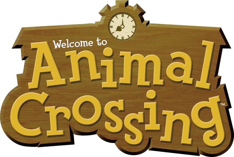
The Animal Crossing logo uses rounded forms, a leaf icon, and soft green tones to communicate safety, nature, and community. Every element is intentional: nothing in this logo feels aggressive or corporate.
What Does the Leaf Symbol Represent in the Animal Crossing Logo?
The leaf is the most loaded symbol in the logo.
In the game, leaves literally represent items and gifts. Players find items wrapped in leaves. The leaf icon in the logo directly connects to this in-game mechanic, making it one of the more specific examples of storytelling through design.
It also signals the outdoors, seasons, and growth – all themes central to the game’s daily loop.
Why Did Animal Crossing Choose These Specific Colors?
The color choices are grounded in both nature and color psychology.
- Leaf Green
- Hex: approximately #5DBB63
- Pantone: closest match Pantone 361 C
- Symbolic meaning: nature, growth, relaxation
- Psychological impact: reduces stress, signals safety
- Brand connection: directly tied to the game’s outdoor, seasonal setting
- Warm White
- Hex: #FFFFFF to #F5F5F0
- Symbolic meaning: openness, simplicity, approachability
- Psychological impact: communicates calm and friendliness
- Brand connection: makes the logo accessible across ages
The analogous color approach – staying close to the green-yellow-teal range – keeps the whole visual identity feeling cohesive and relaxed rather than bold or competitive.
What Typography Style Is Used in the Animal Crossing Logo?

The wordmark uses a custom rounded sans-serif typeface.
It’s not available for download anywhere officially. The closest public match people reference is Fink Heavy, though Nintendo’s version has noticeably different proportions.
The rounded terminals are doing a lot of work here. They soften every letterform, removing any sharpness that might read as threatening or mature. This is intentional for a game targeting all ages.
Understanding font psychology makes it obvious why Nintendo went this direction: rounded letterforms consistently test as friendlier and more trustworthy, especially with younger audiences.
What Are the Hidden Meanings in the Animal Crossing Logo?
There aren’t many hidden elements here – and that’s actually the point.
Nintendo’s design for Animal Crossing is deliberately transparent. What you see is what you get: a friendly, nature-focused game for everyone. Unlike logos with complex visual emphasis or layered symbolism, this one communicates its meaning immediately.
The one subtle detail: the leaf’s placement above or beside the wordmark creates a sense of the logo “breathing,” which aligns with the game’s slow-paced, unhurried design philosophy.
How Does the Animal Crossing Logo Compare to Competitor Logos?
Among cozy life-simulation games, Animal Crossing’s logo stands apart for its consistency and restraint. Where competitors have shifted styles dramatically, Nintendo has kept the same visual language for over two decades.
Compare it to the Stardew Valley logo, which takes a more rustic, hand-crafted approach with pixel-style lettering. Or the Sims logo, which focuses on a geometric diamond mark rather than nature imagery.
The Minecraft logo goes the opposite direction entirely – blocky, hard-edged, deliberately rough. That contrast shows how much typography direction shapes perceived tone.
Even within Nintendo’s own game logos, Animal Crossing is the softest. The Super Mario logo uses bolder, heavier letterforms with more visual energy. The Legend of Zelda logo leans into fantasy and adventure with serif-influenced styling.
Animal Crossing sits in its own lane: approachable, nature-forward, and consistent. That’s a clear positioning choice.
What Are the Technical Specifications of the Animal Crossing Logo?
Official Color Codes (New Horizons version, approximate):
- Primary Color: Leaf Green
- Hex: #5DBB63
- RGB: (93, 187, 99)
- CMYK: (50, 0, 47, 27)
- Pantone: 361 C (closest match)
- Secondary Color: Warm White
- Hex: #F5F5F0
- RGB: (245, 245, 240)
- CMYK: (0, 0, 2, 4)
- Accent Color: Teal Green
- Hex: #4AA9A0
- RGB: (74, 169, 160)
- CMYK: (56, 0, 5, 34)
Dimensions and Proportions:
- Aspect ratio: Approximately 3:1 (width to height) for the horizontal lockup
- Minimum size: Nintendo recommends no smaller than 100px wide for digital use
- Clear space: Minimum clear space equal to the height of the leaf icon on all sides
- File formats: Available in vector graphics formats (SVG, EPS) for licensed partners; JPEG and PNG for general press use
- DPI for print: Minimum 300 DPI for physical merchandise and print applications
What Cultural Impact Has the Animal Crossing Logo Had?

Few video game logos have crossed into broader cultural conversation the way Animal Crossing’s did during 2020. The logo became shorthand for a particular kind of comfort – soft, green, unhurried – during one of the most stressful periods in recent memory.
The color palette and visual tone got referenced outside gaming entirely. Fashion brands, interior designers, and social media aesthetics all borrowed the game’s visual language, with the logo itself appearing on merchandise, fan art, and even political campaigns.
That kind of cultural reach is unusual for a franchise that doesn’t feature combat, competition, or high-stakes narrative. The logo’s warmth is part of why it works at that scale.
It also stands as one of the more consistent identities in the gaming company logos space. Nintendo didn’t chase trends or redesign for hype. The logo you see today is recognizably the same one from 2001.
How Does the Animal Crossing Logo Fit Into the Overall Brand Identity?

The logo anchors a broader visual system built around nature, warmth, and seasonal change. It connects directly to the game’s character design, UI colors, packaging, and merchandise in a way that feels genuinely unified.
The rounded typography in the logo matches the rounded forms of the in-game characters. The green palette carries through into menus, loading screens, and box art. This is textbook brand guidelines work: every touchpoint reinforces the same feeling.
The leaf icon appears throughout the game’s UI as well, creating a direct link between the logo and the actual product experience. That kind of cross-system consistency is harder to pull off than it looks.
Nintendo applies the same logo across Switch packaging, Nintendo eShop listings, amiibo packaging, and all official merchandise. The brand style guide is tight, even if it’s not publicly available.
How Should the Animal Crossing Logo Be Used?
Official usage guidelines (Nintendo’s general IP policy):
- Do’s:
- Use official logo files sourced directly from Nintendo’s press kit
- Maintain clear space around the logo at all times
- Reproduce in original colors; don’t alter the hue or saturation
- Use approved file formats for appropriate contexts (vector for print, PNG for digital)
- Don’ts:
- Don’t stretch, distort, or rearrange the wordmark and leaf elements
- Don’t use the logo on merchandise without a Nintendo licensing agreement
- Don’t place the logo on busy backgrounds that reduce legibility
- Don’t modify colors, add effects, or apply unauthorized gradients
- Don’t use the logo to imply official endorsement or partnership
Where to access official assets: Nintendo’s official press site (press.nintendo.com) provides approved logo files for media use. Licensing inquiries go through Nintendo’s official licensing department.
Trademark protection: The Animal Crossing logo, name, and all associated characters are registered trademarks of Nintendo Co., Ltd. Fan projects using the logo fall under Nintendo’s fan creation policy, which is more permissive than most major publishers but still prohibits commercial use. This applies across print, web, and any other medium.
FAQ on The Animal Crossing Logo
What font is used in the Animal Crossing logo?
The wordmark uses a custom rounded sans-serif typeface created by Nintendo’s internal team.
The closest public match is Fink Heavy, but Nintendo’s version has different letter spacing and proportions. It’s not available for download anywhere officially.
What do the colors in the Animal Crossing logo mean?
The leaf green signals nature, growth, and calm – all core to the game’s identity.
Warm white keeps the logo approachable across age groups. The color palette stays within an analogous green-teal range, which reads as relaxed rather than competitive or aggressive.
Has the Animal Crossing logo ever changed?
Yes, but only subtly. Each mainline entry – from the original GameCube release through New Horizons – brought small refinements to the letterforms and leaf icon.
No major redesigns. The core visual identity has stayed consistent since 2001.
Who designed the Animal Crossing logo?
Nintendo’s internal design team, originally Nintendo EAD, created the logo for the 2001 Japanese launch.
Later versions were handled by Nintendo EPD after the studio restructuring in 2015. No individual designer has been publicly credited.
What does the leaf symbol mean in the Animal Crossing logo?
In the game, leaves represent items and gifts – players find collectibles wrapped in them.
The leaf icon in the logo directly references this mechanic. It also connects to the game’s broader themes of seasons, nature, and outdoor life.
Can I use the Animal Crossing logo for my project?
Not commercially. The Animal Crossing logo is a registered trademark of Nintendo Co., Ltd.
Fan art and non-commercial personal projects fall under Nintendo’s fan creation policy, which is more lenient than most publishers. Any merchandise or commercial use requires an official Nintendo licensing agreement.
What is the Animal Crossing logo’s official color code?
The primary green is approximately #5DBB63 in hex, with RGB values of (93, 187, 99).
The closest Pantone match is 361 C. Warm white (#F5F5F0) serves as the secondary color across most logo applications.
How does the Animal Crossing logo compare to other Nintendo game logos?
It’s the softest in Nintendo’s lineup. The Super Mario logo uses bolder, heavier forms. The Legend of Zelda logo leans into fantasy styling.
Animal Crossing sits apart – rounded, nature-forward, and consistently calm across every version.
Where can I download the official Animal Crossing logo?
Official press-use files are available through Nintendo’s press site at press.nintendo.com.
These are approved for media coverage only. Vector files in SVG and EPS formats are available to licensed partners through Nintendo’s official licensing channels.
Why is the Animal Crossing logo so recognizable?
Consistency is the main reason. Nintendo has used the same visual language – rounded type, green leaf, soft palette – across every entry since 2001.
The logo design also crossed into broader culture during 2020, when New Horizons became a symbol of comfort well beyond the gaming audience.
Conclusion
The Animal Crossing logo is one of the more quietly successful examples of Nintendo franchise branding – consistent, purposeful, and instantly readable across two decades of game releases.
The rounded wordmark and leaf icon work together to signal something specific: a cozy, nature-driven experience meant for everyone.
Nintendo EAD and later EPD never chased trends with the title design. That restraint paid off.
From the original GameCube release through New Horizons, the visual identity stayed grounded in the same color palette and typographic style, building recognition that most game series never achieve.

Renowned for his expertise in logo design and visual branding, Bogdan has developed a multitude of logos for various clients.
His skills extend to creating posters, vector illustrations, business cards, and brochures. Additionally, Bogdan's UI kits were featured on marketplaces like Visual Hierarchy and UI8.
He also wrote in the past years on sites like Design Your Way, WebDesignerDepot, WPDean, Designmodo, Speckyboy, Slider Revolution, and more.
- Best Visual Regression Testing Tools for Web and App Design in 2026 - 13 October 2026
- Jujutsu Kaisen Font Generator - 12 October 2026
- The Windsurf Logo History, Colors, Font, And Meaning - 10 October 2026

Bogdan Sandu is a seasoned designer who has been designing websites since 2008. Renowned for his expertise in logo design and visual branding, Bogdan has developed a multitude of logos for various clients. His skills extend to creating posters, vector illustrations, business cards, and brochures. Additionally, Bogdan's UI kits were featured on marketplaces like Visual Hierarchy and UI8. He also wrote in the past years on sites like Design Your Way, WebDesignerDepot, WPDean, Designmodo, Speckyboy, Slider Revolution, and more.
You Might Also Like