


The Mistral AI logo represents one of Europe’s most ambitious artificial intelligence startups. Founded in Paris in April 2023, this French company quickly became a serious competitor to American tech giants.
The company takes its name from the powerful Mediterranean wind that blows through southern France. That connection to natural force and speed carries through to the brand identity.
Mistral AI went through a significant visual transformation in early 2025. The rebrand, created by Sylvain Boyer Studio (the same designer behind the Paris 2024 Olympic Games identity), introduced a bold pixel-art aesthetic that breaks from typical AI company conventions.
The current logo iteration launched in February 2025. It’s the second major version since the company’s founding, marking a shift from gradient-heavy design to clean, modular blocks.
What is the Mistral AI Logo?

The Mistral AI logo is a pixelated letter “M” constructed from modular rectangular blocks, officially introduced in February 2025. Designed by Sylvain Boyer Studio, it features a distinctive rainbow color gradient and references early machine learning training on cat images through its subtle feline symbolism.
Design Type: Combination mark (icon plus wordmark)
Primary Elements:
- Pixelated “M” icon constructed from rectangular blocks
- Hidden cat face within the M shape (referencing “Le Chat” chatbot)
- Sans-serif wordmark in Arial
- Rainbow gradient option and solid color variants
Official Introduction Date: February 2025
Designer/Agency: Sylvain Boyer Studio, Paris
Trademark Status: Registered trademark of Mistral AI SAS
Color Palette:
- Red: RGB 225/5/0
- Orange Dark: RGB 250/80/15
- Orange: RGB 255/130/5
- Orange Light: RGB 255/175/0
- Yellow: RGB 255/216/0
- Black: RGB 0/0/0
- Beige Light: RGB 255/250/235
Usage Context: Website, mobile apps (Le Chat iOS/Android), API documentation, marketing materials, enterprise products, social media
How Has the Mistral AI Logo Evolved Over Time?

Mistral AI’s visual identity has undergone one major transformation since the company launched.
The evolution reflects both rapid company growth and a strategic repositioning in a crowded AI market.
Original Mistral AI Logo (2023-2025)
Years Active: April 2023 to February 2025
Design Description: The original logo featured a pixelated letter “M” with softer, blurred edges.
A gradient transitioned from yellow to red across the symbol.
The company name appeared with an underscore separator.
Color Scheme: Yellow to red gradient, demonstrating warmth and computational energy
Context: Created during the company’s founding phase when Mistral AI was establishing itself as a European alternative to OpenAI and Google.
The design reflected the company’s technical roots while maintaining startup energy.
Cultural Significance: Represented the ambitious spirit of three former Google DeepMind and Meta researchers returning to France to build something new.
Current Mistral AI Logo (2025-Present)
Years Active: February 2025 to present
Design Description: The current logo uses clean, modular rectangular blocks forming the letter “M.”
The pixel structure appears more defined and organized than before.
A hidden cat face references both the “Le Chat” chatbot and early AI training datasets that heavily featured cat images.
Color Scheme: Rainbow palette (red through yellow) or solid black/white variants
Designer: Sylvain Boyer Studio
Context: Launched alongside major product updates including Le Chat mobile apps and enterprise features.
The rebrand coincided with Mistral AI’s growing valuation and expansion into new markets.
Key Changes from Previous: Sharper edges replaced blurred contours. Pure colors replaced gradients. The underscore was removed from the wordmark. Arial typeface standardized across materials.
Cultural Significance: Positions Mistral AI as a playful yet serious contender, breaking from the cold, corporate aesthetic typical of AI companies.
What Do the Design Elements of the Mistral AI Logo Mean?

The logo carries multiple layers of meaning.
Each element connects to the company’s technology, mission, and cultural identity.
The modular block structure directly references computational processes and the building-block nature of language models.
Why Did Mistral AI Choose These Specific Colors?
The warm color palette deliberately contrasts with the cool blues and purples dominating AI branding.
Red (RGB 225/5/0): Conveys energy and ambition. Connects to the urgency of technological progress. Draws attention in crowded digital spaces.
Orange variants (RGB 250/80/15 through 255/175/0): Creates warmth and approachability. Bridges between the intensity of red and the optimism of yellow. Reflects the Mediterranean origin of the mistral wind.
Yellow (RGB 255/216/0): Signals optimism and innovation. Represents brightness and clarity in AI assistance. Completes the warm gradient.
Black (RGB 0/0/0): Provides contrast and professionalism. Anchors the warmer colors. Works across all applications.
Understanding color theory helps explain why this palette creates such strong brand recognition.
The psychology of color suggests warm tones build trust while signaling creativity.
What Typography Style Is Used in the Mistral AI Logo?
Mistral AI uses Arial as its primary typeface.
This choice surprised many design observers.
Arial is a sans-serif font with clean, geometric forms.
The company describes choosing Arial for its “universal appeal and captivating simplicity.”
The font choice prioritizes accessibility over distinctiveness, ensuring readability across all platforms and languages.
What Are the Hidden Meanings in the Mistral AI Logo?
The most discussed hidden element is the cat face embedded within the M shape.
This references early machine learning history when models were trained on thousands of cat photos because they were widely available online.
It also connects to “Le Chat” (French for “the cat”), Mistral’s chatbot product.
The pixel structure evokes 8-bit video games, suggesting that AI can be both powerful and playful.
The psychology of shapes in the modular blocks conveys stability, reliability, and systematic thinking.
How Does the Mistral AI Logo Compare to Competitor Logos?
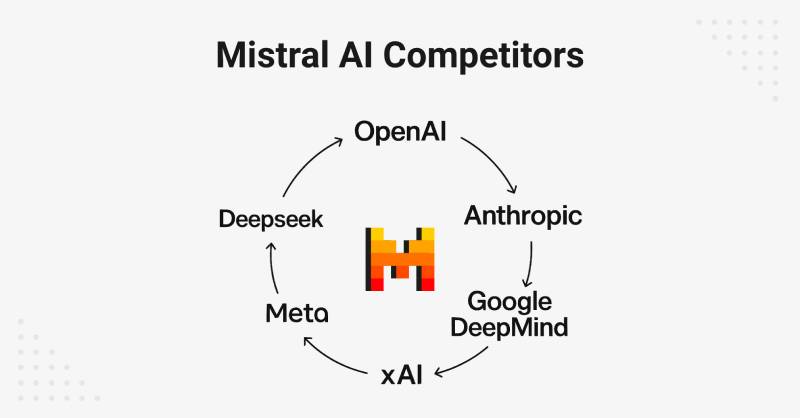
Mistral AI’s branding stands apart from the AI industry standard.
Most competitors use minimalist typography and cool color palettes.
OpenAI employs a simple black wordmark. Google DeepMind uses clean geometric forms.
Anthropic’s logo features muted tones and simple geometry.
Among tech company logos, Mistral’s pixel aesthetic creates instant differentiation.
The Cohere logo and Hugging Face logo also break from convention but in different ways.
Stability AI’s logo maintains the typical tech minimalism that Mistral actively rejects.
This positioning makes Mistral immediately recognizable but risks appearing less serious to enterprise clients.
What Are the Technical Specifications of the Mistral AI Logo?
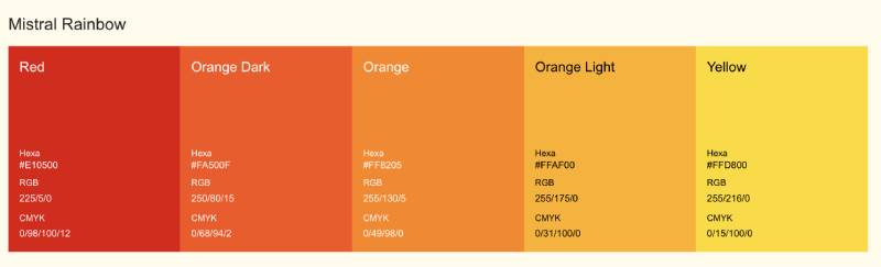
Official Color Codes
Primary Colors (Mistral Rainbow):
- Red: RGB (225/5/0), CMYK (0/98/100/12)
- Orange Dark: RGB (250/80/15), CMYK (0/68/94/2)
- Orange: RGB (255/130/5), CMYK (0/49/98/0)
- Orange Light: RGB (255/175/0), CMYK (0/31/100/0)
- Yellow: RGB (255/216/0), CMYK (0/15/100/0)
Neutral Colors:
- Black: RGB (0/0/0), CMYK (0/0/0/100)
- Black Tinted: RGB (30/30/30), CMYK (0/0/0/88)
- Beige Light: RGB (255/250/235), CMYK (0/2/8/0)
- Beige Medium: RGB (255/240/195), CMYK (0/6/24/0)
- Beige Dark: RGB (233/226/203), CMYK (0/3/13/9)
Understanding RGB values matters for digital applications.
CMYK specifications ensure accuracy in print design applications.
Dimensions and Proportions
Available Formats:
- Full logo (icon plus wordmark): Rainbow on dark, rainbow on light, monochrome variants
- Rainbow logo (icon only): Dark and light versions
- M Icon: Rainbow, black, white, and orange variants
- M Icon Boxed: Rainbow, black, and orange versions
File Formats: PNG and vector graphics (SVG) available through the official brand kit
Official Usage Guidelines: Mistral AI provides a downloadable brand kit with approved logo variations and usage instructions
What Cultural Impact Has the Mistral AI Logo Had?
The rebrand generated significant discussion in both design and tech communities.
Critics questioned whether the playful pixel aesthetic undermines credibility in enterprise markets.
Supporters praised Mistral for breaking from the cold, corporate AI look.
The design reflects broader conversations about European tech identity and the desire to compete with Silicon Valley on different terms.
How Does the Mistral AI Logo Fit Into the Overall Brand Identity?

The logo anchors a complete brand guidelines system.
Every visual element supports Mistral’s positioning as an accessible, open-source alternative.
The pixel illustrations extend the modular concept into marketing materials and product interfaces.
Model icons for products like Codestral, Pixtral, and Magistral share the same visual language.
The brand style guide maintains consistency across web, mobile, and print applications.
How Should the Mistral AI Logo Be Used?
Official Usage Guidelines:
- Download the official brand kit from mistral.ai/brand
- Use provided logo files without modification
- Maintain clear space around the logo
- Choose appropriate color variant for background context
What to Avoid:
- Do not alter logo colors or proportions
- Do not add effects, shadows, or outlines
- Do not place the logo on busy backgrounds that reduce legibility
- Do not recreate or approximate the logo
Where to Access Official Logos: The brand assets page at mistral.ai/brand offers a complete kit in ZIP format
Trademark Protection: The Mistral AI name, logos, and icons are registered trademarks. Partners and media should use assets responsibly and per official guidelines.
FAQ on The Mistral AI Logo
What Does the Mistral AI Logo Look Like?
The Mistral AI logo features a pixelated letter “M” built from modular rectangular blocks.
It uses a rainbow color scheme ranging from red through orange to yellow. The design includes a hidden cat face, referencing the Le Chat chatbot.
A clean wordmark in Arial accompanies the icon.
Who Designed the Mistral AI Logo?
Sylvain Boyer Studio created the current Mistral AI brand identity in 2025.
Boyer is a Paris-based designer also known for the Paris 2024 Olympic Games visual identity. His work follows strong logo design principles while breaking AI industry conventions.
When Did Mistral AI Update Its Logo?
The rebrand launched in February 2025.
The original logo had been in use since the company’s founding in April 2023. This update coincided with major product releases including Le Chat mobile apps for iOS and Android.
What Do the Colors in the Mistral AI Logo Mean?
The warm color palette signals energy and approachability.
Red conveys ambition. Orange creates warmth. Yellow represents optimism.
This deliberately contrasts with the cool blues dominating competitors like OpenAI. The scheme connects to orange logos and yellow logos in tech branding.
Why Is There a Cat Hidden in the Mistral AI Logo?
The cat references two things. First, early machine learning models trained on thousands of cat photos because they were widely available online.
Second, it connects to Le Chat (French for “the cat”), Mistral’s AI assistant product.
Where Can I Download the Official Mistral AI Logo?
Visit mistral.ai/brand for official brand assets.
The downloadable kit includes PNG and SVG files. You get full logo versions, rainbow icons, M icons, and boxed variants. All files maintain proper DPI for various applications.
What Font Does the Mistral AI Logo Use?
Mistral AI uses Arial for its wordmark and brand communications.
The company chose this for “universal appeal and captivating simplicity.” It prioritizes readability over distinctiveness. This decision sparked debate among design observers who expected something more custom.
Is the Mistral AI Logo Trademarked?
Yes. The name, logos, icons, and identifying assets are registered trademarks of Mistral AI SAS.
Partners must follow official usage guidelines. The company requests responsible use of brand materials and provides clear do’s and don’ts in their brand kit.
How Has the Mistral AI Logo Changed Over Time?
The original 2023 logo used a blurred pixel “M” with a gradient from yellow to red.
The 2025 version sharpened the edges into clean modular blocks. Pure colors replaced gradients. The underscore in the wordmark was removed.
What File Formats Is the Mistral AI Logo Available In?
Official assets come in PNG and SVG formats.
PNG works for web design and digital use. SVG provides scalability for any size without quality loss. The brand kit organizes files by logo type and color variant for easy access.
Conclusion
The Mistral AI logo represents a bold departure from typical AI company branding. Its pixel-art aesthetic and hidden cat symbolism create instant recognition in a crowded market.
Arthur Mensch and his co-founders built more than a large language model company. They crafted a complete visual identity system that challenges Silicon Valley conventions.
Whether the playful approach wins over enterprise clients remains to be seen.
But one thing is clear. This French AI startup refuses to blend in with competitors like xAI or Scale AI.
The open source philosophy extends to their brand transparency, with downloadable assets and clear usage guidelines available to all.

Renowned for his expertise in logo design and visual branding, Bogdan has developed a multitude of logos for various clients.
His skills extend to creating posters, vector illustrations, business cards, and brochures. Additionally, Bogdan's UI kits were featured on marketplaces like Visual Hierarchy and UI8.
He also wrote in the past years on sites like Design Your Way, WebDesignerDepot, WPDean, Designmodo, Speckyboy, Slider Revolution, and more.
- Canva vs PowerPoint: Which Is Better for Presentations? - 22 September 2026
- How to Install Fonts on Mac (Step-by-Step Guide) - 20 September 2026
- From Mockup to Code: How AI-Augmented Development Speeds Up the Design Handoff - 19 September 2026

Bogdan Sandu is a seasoned designer who has been designing websites since 2008. Renowned for his expertise in logo design and visual branding, Bogdan has developed a multitude of logos for various clients. His skills extend to creating posters, vector illustrations, business cards, and brochures. Additionally, Bogdan's UI kits were featured on marketplaces like Visual Hierarchy and UI8. He also wrote in the past years on sites like Design Your Way, WebDesignerDepot, WPDean, Designmodo, Speckyboy, Slider Revolution, and more.
You Might Also Like


