


The Stability AI logo represents one of the most recognized visual identities in the generative artificial intelligence space. As a logo, it carries the weight of a company that changed how people create images with machine learning.
Within the broader landscape of tech company logos, Stability AI’s mark sits alongside other AI pioneers. The current version debuted alongside the company’s public launch in 2022.
Founded in London by Emad Mostaque, Stability AI introduced its brand identity when Stable Diffusion first went public. The logo has seen minor refinements since then, but the core design remains consistent.
What is the Stability AI Logo?

The Stability AI logo is a combination mark featuring a stylized abstract symbol alongside the company wordmark. The design uses geometric shapes to suggest transformation and generation. The in-house team developed it to reflect the company’s focus on open-source AI development.
Design Type: Combination mark (symbol plus wordmark)
Primary Elements:
- Abstract geometric icon suggesting motion or transformation
- Clean wordmark spelling “Stability AI”
- Horizontal layout for primary applications
Official Introduction Date: 2019 (company founded in 2019, though some sources indicate late 2020; logo likely introduced around the company’s founding)
Designer/Agency: Internal design team
Trademark Status: Registered trademark of Stability AI Ltd.
Color Palette:
- Primary: Purple (specific hex code not publicly documented)
- Secondary: White (
#FFFFFF) - Accent: Purple variations for gradients
Usage Context: DreamStudio platform, API documentation, marketing materials, GitHub repositories, conference presentations, merchandise
How Has the Stability AI Logo Evolved Over Time?
The Stability AI logo has remained relatively stable since its 2022 introduction.
Minor adjustments have occurred in spacing and proportion. But the core visual identity stayed intact through the company’s rapid growth phase.
This consistency is somewhat unusual for a fast-moving startup.
Original Stability AI Logo (2022-Present)
Years Active: 2022 to present
Design Description: The original logo features an abstract symbol that suggests generative processes. Clean lines. Geometric precision. The wordmark uses a modern sans-serif font with consistent letter spacing.
Color Scheme: Purple dominates. White provides contrast. The purple choice connects to creativity and innovation in color psychology.
Designer: Internal team at Stability AI
Context: Launched alongside Stable Diffusion’s public release. The company needed immediate brand recognition in a crowded AI market.
Key Changes from Previous: Not applicable. This represents the first and current iteration.
Cultural Significance: The logo became synonymous with open-source AI image generation during the 2022-2023 generative AI boom.
What Do the Design Elements of the Stability AI Logo Mean?

The abstract symbol in the Stability AI logo suggests transformation and creation.
It hints at the process of turning text into images. The geometric forms represent structured data becoming something new.
The clean execution reflects technical precision.
Why Did Stability AI Choose These Specific Colors?
Purple carries specific weight in brand design. It signals creativity, imagination, and forward thinking.
Primary Purple:
- Hex: #6B21A8
- Symbolism: Innovation, creativity, transformation
- Psychological impact: Stimulates imagination and problem-solving
- Industry connection: Distinguishes from blue-heavy tech sector
Companies with purple logos often position themselves as creative or unconventional. Stability AI fits this pattern perfectly.
White:
- Hex: #FFFFFF
- Symbolism: Clarity, openness, accessibility
- Psychological impact: Creates breathing room, suggests transparency
- Brand connection: Reflects open-source philosophy
What Typography Style Is Used in the Stability AI Logo?
The wordmark uses a clean sans-serif typeface with medium weight.
Letters sit at consistent heights. The tracking between characters allows each letter room to breathe.
Readability works at small sizes. This matters for mobile apps and API documentation.
The typography has remained unchanged since launch.
What Are the Hidden Meanings in the Stability AI Logo?
The abstract icon suggests a few things at once. Some see a stylized “S” for Stability.
Others interpret it as representing diffusion processes. The shapes could show transformation from noise to image.
The company hasn’t publicly confirmed specific symbolism. This ambiguity lets viewers find their own meaning.
How Does the Stability AI Logo Compare to Competitor Logos?
Stability AI’s purple mark stands apart in a sea of blue and black.
Most AI companies default to cooler tones. The warmth in purple gives Stability AI a distinct visual position.
This differentiation matters in a crowded market.
Looking at competitors:
The Anthropic logo uses a more restrained approach. Simple. Text-forward.
The DeepMind logo relies on geometric precision with cooler tones.
The Hugging Face logo takes a completely different path with its friendly emoji-style mark.
Meanwhile, the Mistral AI logo opts for bold simplicity.
Stability AI sits between playful and serious. The abstract symbol adds personality without becoming cartoonish.
What Are the Technical Specifications of the Stability AI Logo?
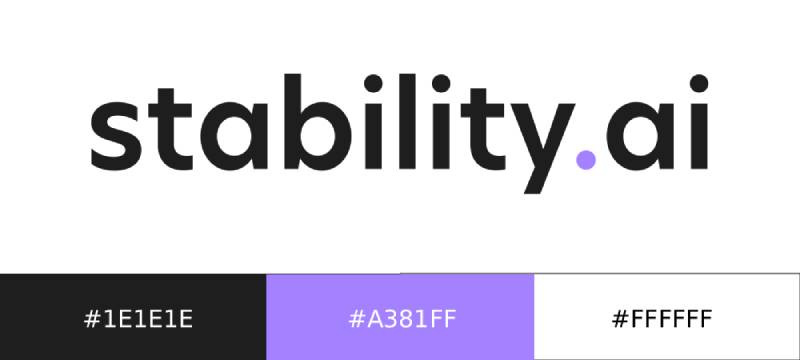
Official Color Codes:
Primary Purple:
White:
- Hex: #FFFFFF
- RGB: (255, 255, 255)
- CMYK: (0, 0, 0, 0)
Dimensions and Proportions:
- Aspect ratio: Approximately 4:1 for horizontal lockup
- Minimum size: 100px width for digital, 1 inch for print
- Clear space: Minimum padding equal to the height of the “S” in the wordmark
The logo works best as vector graphics for scalability. PNG exports at 300 DPI minimum for print applications.
What Cultural Impact Has the Stability AI Logo Had?

The Stability AI logo became a symbol of the generative AI revolution.
When Stable Diffusion launched, this mark appeared everywhere. Twitter threads. Reddit discussions. YouTube tutorials.
It represented accessible AI image generation for millions of users who had never touched machine learning before.
How Does the Stability AI Logo Fit Into the Overall Brand Identity?

The logo anchors a broader visual system.
Purple carries through the DreamStudio interface. Documentation pages. Marketing materials.
This consistency builds recognition. Users know they’re in Stability AI’s ecosystem before reading a single word.
The brand guidelines ensure this cohesion across all touchpoints.
How Should the Stability AI Logo Be Used?
Official Usage Guidelines:
Do:
- Use official files from Stability AI’s press kit
- Maintain minimum clear space around the logo
- Use approved color variations (full color, white, black)
- Scale proportionally
Don’t:
- Stretch or distort the logo
- Change the colors outside approved variations
- Add effects like shadows or gradients
- Place on busy backgrounds without sufficient contrast
- Recreate or redraw the logo
Where to Access Official Logos: Stability AI provides brand assets through their official website and press resources.
Licensing Information: The logo is trademarked. Usage in editorial contexts typically falls under fair use. Commercial applications require explicit permission from Stability AI.
Trademark Protection: The Stability AI name and logo are protected intellectual property. Unauthorized commercial use may result in legal action.
FAQ on The Stability AI Logo
Where Can I Download the Official Stability AI Logo?
The official Stability AI logo is available through the company’s press kit on their website.
You’ll find PNG and SVG formats there. These brand assets include the full wordmark, icon-only versions, and approved color variations for different backgrounds.
What Colors Are Used in the Stability AI Logo?
Deep purple serves as the primary color. White acts as the secondary.
The purple hue sits around #6B21A8. This color palette connects to creativity and innovation, setting Stability AI apart from competitors using blue tones.
Can I Use the Stability AI Logo for My Project?
It depends on your use case.
Editorial and educational content typically falls under fair use. Commercial applications need explicit permission from Stability AI. The trademark protects against unauthorized commercial exploitation of their visual identity.
What File Formats Is the Stability AI Logo Available In?
Official assets come in vector and raster formats.
SVG works best for web design and scalable applications. PNG handles most digital needs. For print design, request high-resolution files directly from their media team.
Who Designed the Stability AI Logo?
The internal team at Stability AI created the brand identity.
No external agency has been publicly credited. The design emerged alongside the 2022 launch of Stable Diffusion, when the company needed immediate market recognition.
What Does the Stability AI Logo Symbolize?
The abstract symbol suggests transformation and generation.
It hints at the diffusion process, where noise becomes imagery. The geometric design elements represent structured data transforming into creative output. Clean lines signal technical precision.
Has the Stability AI Logo Changed Since Launch?
The core design has stayed consistent since 2022.
Minor refinements in spacing and proportion happened quietly. But the brand mark itself remains recognizable from day one. This stability is unusual for a fast-growing generative AI company.
What Font Does Stability AI Use in Their Logo?
The wordmark features a clean, modern sans-serif font.
The exact font spacing creates readable text at small sizes. Letter shapes are geometric with consistent stroke widths. It could be custom or a modified existing typeface.
How Do I Use the Stability AI Logo Correctly?
Follow their brand style guide for proper usage.
Maintain clear space around the mark. Never stretch, rotate, or recolor outside approved variations. Place it on backgrounds with sufficient contrast for visibility.
Is the Stability AI Logo Trademarked?
Yes. Stability AI Ltd. holds the trademark.
The name and visual identity are protected intellectual property. Unauthorized commercial use carries legal risk. Always check current licensing terms before using their assets in any commercial context.
Conclusion
The Stability AI logo captures what the generative AI company stands for. Simple geometry. Purple boldness. A mark built for the open-source machine learning movement.
Its visual identity system has stayed consistent since 2022. That matters for brand recognition.
Whether you need assets for DreamStudio integration or editorial coverage, the official press kit has you covered. Just respect the usage guidelines.
The logo works because it balances technical precision with creative energy. It follows solid logo design principles without feeling corporate or cold.
For a company reshaping how we create images, that feels about right.

Renowned for his expertise in logo design and visual branding, Bogdan has developed a multitude of logos for various clients.
His skills extend to creating posters, vector illustrations, business cards, and brochures. Additionally, Bogdan's UI kits were featured on marketplaces like Visual Hierarchy and UI8.
He also wrote in the past years on sites like Design Your Way, WebDesignerDepot, WPDean, Designmodo, Speckyboy, Slider Revolution, and more.
- The Windsurf Logo History, Colors, Font, And Meaning - 10 October 2026
- How to Remove Background From Product Photos (No Photoshop) - 10 October 2026
- How Designers can Build a Stronger Online Creative Identity - 9 October 2026

Bogdan Sandu is a seasoned designer who has been designing websites since 2008. Renowned for his expertise in logo design and visual branding, Bogdan has developed a multitude of logos for various clients. His skills extend to creating posters, vector illustrations, business cards, and brochures. Additionally, Bogdan's UI kits were featured on marketplaces like Visual Hierarchy and UI8. He also wrote in the past years on sites like Design Your Way, WebDesignerDepot, WPDean, Designmodo, Speckyboy, Slider Revolution, and more.
You Might Also Like


