The n8n logo represents one of the most recognized symbols in the workflow automation space. It serves as the visual identity for n8n GmbH, the Berlin-based company that created the open-source automation platform.
Within tech company branding, n8n’s mark stands out for its clean, modern approach. The current version has been in use since the platform’s public launch, with minor refinements along the way.
Jan Oberhauser founded n8n in 2019. Since then, the logo has seen subtle updates while maintaining its core identity. The design reflects the platform’s focus on connecting different services and automating workflows between them.
What is the n8n Logo?
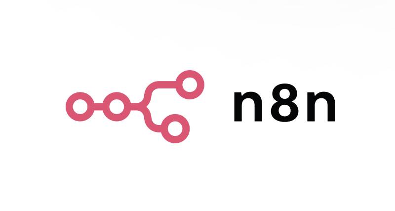
The n8n logo is a combination mark featuring stylized “n8n” typography alongside a geometric icon. Introduced in 2019 during the platform’s launch, it was designed to represent node-based workflow connections. The symbol communicates automation and integration through its interconnected visual elements.
Design Attributes:
- Design Type: Combination mark (wordmark plus icon)
- Primary Elements: Custom typography spelling “n8n” with a geometric node symbol
- Official Introduction Date: 2019
- Designer/Agency: In-house design team
- Trademark Status: Registered trademark of n8n GmbH
- Color Palette: Primary pink (#EA4B71), secondary dark gray (#1A1A1A), white (#FFFFFF)
- Usage Context: Software interface, documentation, GitHub repository, marketing materials, merchandise
How Has the n8n Logo Evolved Over Time?
The n8n logo has maintained consistency since 2019, with only minor adjustments to proportions and color values.
This stability reflects the brand’s commitment to recognition in a crowded automation market.
Most changes have focused on improving digital display quality rather than redesigning core elements.
Original n8n Logo (2019-2021)
- Years Active: 2019-2021
- Design Description: Initial version featuring the “n8n” text with a simple node icon. The “8” represented infinity and continuous automation loops.
- Color Scheme: Warm orange as the primary color with dark text
- Designer: n8n founding team
- Context: Launched alongside the platform’s open-source release on GitHub
- Cultural Significance: Established n8n’s identity in the growing no-code/low-code movement
Refined n8n Logo (2021-Present)
- Years Active: 2021-Present
- Design Description: Cleaner lines, adjusted letter spacing, and a more refined node symbol
- Color Scheme: Pink (#EA4B71) with improved contrast ratios
- Designer: n8n design team
- Context: Updated as the company grew and secured Series A funding
- Key Changes from Previous: Improved scalability for small sizes, cleaner icon geometry
- Cultural Significance: Represents n8n’s transition from startup to established automation platform
What Do the Design Elements of the n8n Logo Mean?

The n8n logo communicates connection and automation through every design choice.
The “8” in the center creates visual infinity, suggesting endless workflow possibilities.
Node-like shapes in the icon reference the platform’s drag-and-drop interface where users connect different services.
Why Did n8n Choose These Specific Colors?
The pink (#EA4B71) creates energy and approachability. It stands apart from the blues dominating enterprise software.
Understanding color psychology explains why this choice works. Pink suggests creativity, enthusiasm, and action.
The dark gray provides grounding and professionalism, balancing the vibrant primary color.
- Primary Pink(#EA4B71): Energy, creativity, accessibility. Differentiates from competitor blues.
- Dark Gray (#1A1A1A): Professionalism, stability, technical credibility.
- White (#FFFFFF): Clarity, simplicity, clean interfaces.
What Typography Style Is Used in the n8n Logo?
The n8n wordmark uses a custom sans-serif typeface with rounded terminals.
This softness makes the technical platform feel approachable to non-developers.
The lowercase letters reinforce accessibility. No capitals means no intimidation.
Letter spacing is tight but readable, even at small sizes for favicons and mobile displays.
What Are the Hidden Meanings in the n8n Logo?
The “8” works on multiple levels. Obviously, it’s part of the name. But rotate it, and you get infinity.
The node icon contains subtle connection points that mirror the platform’s actual interface.
Some users notice the letters “n” bookending the “8” create a visual pattern of nodes linked together.
The designer hasn’t confirmed all interpretations, which honestly makes it more interesting.
How Does the n8n Logo Compare to Competitor Logos?
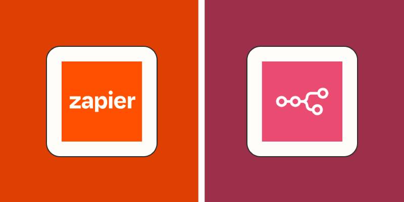
In the automation space, n8n’s pink immediately separates it from competitors.
Zapier uses orange. Make (formerly Integromat) goes with purple.
The Tines logo takes a completely different approach with its abstract mark.
Most automation platforms lean toward abstract symbols suggesting connection or flow. n8n keeps things more literal with its node-based icon. The UiPath logo similarly represents automation concepts but through different visual language.
What sets n8n apart is the playful “8” inclusion. It’s memorable. You see it once, you remember it.
What Are the Technical Specifications of the n8n Logo?
Official Color Codes:
- Primary Pink: Hex:
#EA4B71, RGB: (234, 75, 113), CMYK: (0, 68, 52, 8) - Dark: Hex:
#040506, RGB: (4, 5, 6), CMYK: (33, 17, 0, 98) - White: Hex:
#FFFFFF, RGB: (255, 255, 255), CMYK: (0, 0, 0, 0)
Dimensions and Proportions:
- Aspect Ratio: Approximately 3:1 for the full horizontal lockup
- Minimum Size: 24px height for digital, 10mm for print
- Clear Space: Minimum padding equal to the height of the “n” character on all sides
- File Formats Available: SVG (preferred), PNG with transparency, vector formats for print
What Cultural Impact Has the n8n Logo Had?
Within the open-source community, the n8n logo has become shorthand for accessible automation.
It appears across thousands of GitHub repositories, tutorial videos, and integration documentation.
The mark represents a shift toward self-hosted alternatives in the automation space.
For many developers, seeing the n8n logo signals flexibility and data ownership.
How Does the n8n Logo Fit Into the Overall Brand Identity?

The logo anchors a broader visual system built around the same pink and dark gray palette.
Documentation, the web interface, and marketing materials all extend these colors consistently.
Following solid brand guidelines, n8n maintains recognition across every touchpoint.
The node icon appears independently as an app icon and favicon, working within the larger brand style guide.
Typography choices in the product mirror the logo’s approachable, rounded aesthetic.
How Should the n8n Logo Be Used?

Official Usage Guidelines:
- Do: Use official logo files from n8n’s press kit or GitHub repository
- Do: Maintain minimum clear space around the logo
- Do: Use approved color variations (full color, white, dark)
- Don’t: Stretch, rotate, or distort the logo
- Don’t: Change the logo colors
- Don’t: Add effects like shadows, gradients, or outlines
Where to Access Official Logos:
- n8n’s official website press section
- GitHub repository assets folder
- Official documentation
Licensing Information:
The n8n logo is a trademark of n8n GmbH. Usage in editorial contexts (reviews, tutorials, comparisons) is generally permitted. Commercial usage or suggesting endorsement requires written permission from n8n.
For integration partners, n8n provides specific badge assets and co-branding guidelines through their partnership program.
FAQ on The N8N Logo
Where Can I Download the Official n8n Logo?
The official n8n logo is available through the company’s GitHub repository and press kit section on their website.
You’ll find multiple file formats there. PNG, SVG, and vector files for different use cases.
Always grab assets from official sources to ensure you’re using the current version.
What File Formats Are Available for the n8n Logo?
The n8n brand assets come in SVG for scalable web use, PNG with transparency for general digital applications, and pixel-based formats for specific sizes.
SVG works best. It scales without quality loss.
For print materials, request vector files directly from n8n GmbH.
What Colors Are in the n8n Logo?
The primary color palette features pink (#EA4B71) as the main brand color.
Dark gray (#1A1A1A) provides contrast for text elements. White backgrounds are standard.
This workflow automation branding choice sets n8n apart from competitors using typical blues.
Can I Use the n8n Logo for My Project?
Editorial use is generally fine. Writing tutorials, reviews, or comparisons about the automation platform allows logo usage.
Commercial use requires permission from n8n GmbH. Same goes for anything suggesting official endorsement.
Check their trademark guidelines before proceeding with integration badges or partner materials.
What Does the n8n Logo Symbolize?
The logo represents node-based workflow connections. The “8” suggests infinity and continuous automation loops.
Node shapes in the icon mirror the platform’s actual interface where users connect services visually.
It communicates the core product function at a glance.
Who Designed the n8n Logo?
The original n8n visual identity came from the founding team led by Jan Oberhauser in Berlin.
Later refinements were handled by n8n’s in-house design team as the company grew.
No external agency has been publicly credited for the brand development.
What Font Is Used in the n8n Wordmark?
The n8n logotype uses a custom typeface with rounded terminals. This gives it a friendly, approachable feel.
Lowercase letters throughout. No capitals.
The typography choices make the technical platform accessible to non-developers exploring automation tools.
Is the n8n Logo Trademarked?
Yes. The n8n logo is a registered trademark of n8n GmbH, the company headquartered in Berlin.
This protects the open source logo design from unauthorized commercial use.
The trademark covers both the icon and the wordmark combination.
What Size Should the n8n Logo Be Displayed At?
Minimum digital size is 24 pixels in height. For print, keep it above 10mm.
Clear space around the logo should equal the height of the “n” character on all sides.
These specs ensure the logo stays readable across applications.
Does n8n Have a Separate Icon for App Use?
Yes. The node symbol works independently as an n8n favicon and app icon.
This standalone version appears in browser tabs, mobile apps, and integration directories.
It maintains brand recognition even without the full wordmark present.
Conclusion
The n8n logo does exactly what good branding should. It communicates the product’s purpose instantly.
That mark has become synonymous with self-hosted workflow automation. Developers recognize it across GitHub repositories, Docker images, and integration directories worldwide.
The design balances technical credibility with approachability. Not an easy thing to pull off in the low-code platform space.
Whether you need the n8n logo PNG for a tutorial or the vector version for print, official brand assets are freely accessible.
Simple. Memorable. Functional. That’s solid brand design work.

Renowned for his expertise in logo design and visual branding, Bogdan has developed a multitude of logos for various clients.
His skills extend to creating posters, vector illustrations, business cards, and brochures. Additionally, Bogdan's UI kits were featured on marketplaces like Visual Hierarchy and UI8.
He also wrote in the past years on sites like Design Your Way, WebDesignerDepot, WPDean, Designmodo, Speckyboy, Slider Revolution, and more.
- The Windsurf Logo History, Colors, Font, And Meaning - 10 October 2026
- How to Remove Background From Product Photos (No Photoshop) - 10 October 2026
- How Designers can Build a Stronger Online Creative Identity - 9 October 2026

Bogdan Sandu is a seasoned designer who has been designing websites since 2008. Renowned for his expertise in logo design and visual branding, Bogdan has developed a multitude of logos for various clients. His skills extend to creating posters, vector illustrations, business cards, and brochures. Additionally, Bogdan's UI kits were featured on marketplaces like Visual Hierarchy and UI8. He also wrote in the past years on sites like Design Your Way, WebDesignerDepot, WPDean, Designmodo, Speckyboy, Slider Revolution, and more.
You Might Also Like