The Tines logo represents one of the most recognized visual identities in the security automation space. Founded in Dublin, Ireland in 2018, Tines has built a brand that reflects its no-code approach to workflow automation.
The company sits within a growing category of cybersecurity and automation platforms. Its visual identity needed to communicate both technical capability and accessibility.
The current logo version launched alongside the company’s public debut. Tines has maintained a consistent visual identity since its founding, with minor refinements rather than complete overhauls. The mark combines a custom wordmark with a distinctive symbol that references the platform’s core functionality.
What Is the Tines Logo?
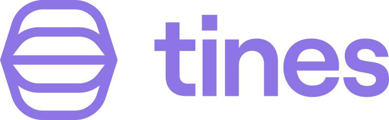
The Tines logo is a combination mark featuring a custom wordmark alongside an abstract symbol representing workflow connections. Introduced in 2018, the design emphasizes simplicity and technical precision, reflecting the platform’s mission to make security automation accessible without code.
Design Attributes
- Design Type: Combination mark (wordmark plus symbol)
- Primary Elements: Custom letterforms, abstract connecting lines symbol
- Official Introduction Date: 2018
- Designer/Agency: Internal team with refinements over time
- Trademark Status: Registered trademark
- Color Palette: Deep purple (#6B4FBB), white, with secondary blue accents
- Usage Context: Platform interface, marketing materials, partner integrations, documentation
How Has the Tines Logo Evolved Over Time?
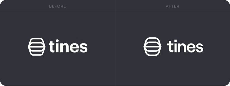
The Tines logo has remained largely consistent since the company’s 2018 founding.
Unlike many tech startups that undergo dramatic rebrands, Tines refined its original concept rather than replacing it.
The evolution focused on optimizing the mark for digital environments and scaling applications.
Original Tines Logo (2018-2021)
- Years Active: 2018-2021
- Design Description: Initial wordmark with connecting lines symbol
- Color Scheme: Purple primary with white secondary
- Context: Launched with company founding, designed to represent workflow automation visually
- Cultural Significance: Established Tines as a distinct player in the SOAR market
Refined Tines Logo (2021-Present)
- Years Active: 2021-present
- Design Description: Optimized letterforms, adjusted symbol proportions
- Color Scheme: Refined purple (#6B4FBB), expanded secondary palette
- Key Changes from Previous: Improved digital rendering, cleaner lines, better scalability
- Context: Coincided with Series B funding and market expansion
What Do the Design Elements of the Tines Logo Mean?
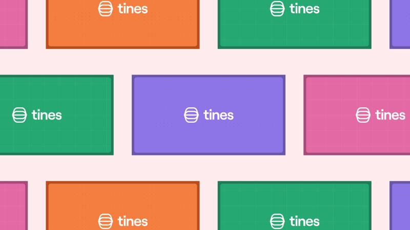
The Tines logo symbol represents workflow connections and automation pathways.
The abstract lines suggest data flowing between systems. This visual metaphor directly ties to what the platform does.
The clean geometry communicates precision and reliability. Security teams need tools they can trust.
Why Did Tines Choose These Specific Colors?
Purple dominates the Tines color palette for good reason.
The specific shade (#6B4FBB) balances professionalism with approachability. It stands apart from the blues that saturate the cybersecurity industry.
Understanding color psychology explains this choice. Purple suggests innovation and creativity while maintaining trust.
- Primary Purple (#6B4FBB): Innovation, creativity, premium positioning
- White: Clarity, simplicity, clean interfaces
- Secondary Blues: Trust, security, technical competence
What Typography Style Is Used in the Tines Logo?
The Tines wordmark uses a custom sans-serif font with geometric characteristics.
The letterforms are clean and modern. No unnecessary flourishes.
Readability works at any size, from favicon to billboard. The typography choices reflect the platform’s emphasis on clarity and usability.
What Are the Hidden Meanings in the Tines Logo?
The connecting lines in the symbol represent more than decoration.
They visualize the concept of “stories” (what Tines calls its automation workflows). Each line suggests a connection between systems.
The open-ended nature of the symbol implies infinite possibilities. Automation paths extend beyond the visible mark.
How Does the Tines Logo Compare to Competitor Logos?
Within tech company logos, particularly in security automation, Tines stands apart through color choice alone.
Most SOAR platforms default to blues and greens. Splunk uses orange. Palo Alto Networks relies on red.
Tines chose purple, claiming visual territory competitors avoided. The minimalist design approach also differentiates it from busier competitor marks.
Companies like CrowdStrike and Palo Alto Networks use more aggressive, protective imagery. Tines opts for approachability.
What Are the Technical Specifications of the Tines Logo?
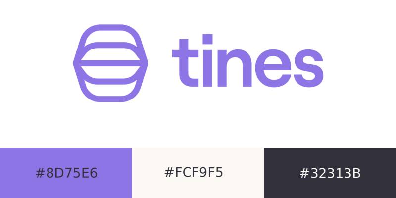
Official Color Codes
-
Primary Purple:
- Hex:
#8D75E6 - RGB: (141, 117, 230)
White Linen (Off-White):
- Hex:
#FCF9F5 - RGB: (252, 249, 245)
Dark Background (Tuna):
- Hex:
#32313B - RGB: (50, 49, 59)
- Hex:
Dimensions and Proportions
- Aspect Ratio: Approximately 3:1 for horizontal lockup
- Minimum Size: 80px width for digital, 20mm for print
- Clear Space: Minimum padding equal to the height of the “T” character
- File Formats Available: SVG, PNG (with transparency), EPS
What Cultural Impact Has the Tines Logo Had?
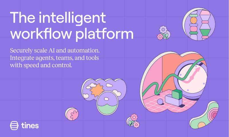
The Tines logo helped establish a new visual language for security automation tools.
It proved that cybersecurity brands could look approachable without sacrificing credibility. The purple palette influenced other startups in the space.
Within the Dublin tech scene, Tines became a recognizable success story. The logo appears frequently in Irish tech coverage and startup ecosystem materials.
How Does the Tines Logo Fit Into the Overall Brand Identity?
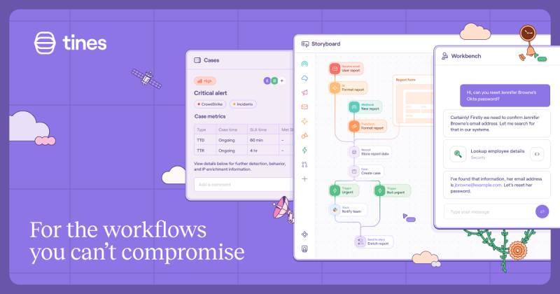
The logo anchors a broader visual system documented in Tines’ brand guidelines.
It connects to the platform interface design. The same purple appears in buttons, highlights, and navigation elements.
Marketing materials extend the connecting lines motif. Illustrations and diagrams echo the logo’s geometry. The white space principles in the logo carry through to all brand touchpoints.
How Should the Tines Logo Be Used?
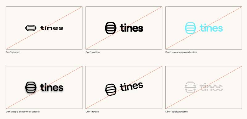
Usage Guidelines
- Do: Use official logo files from Tines media resources
- Do: Maintain minimum clear space around the mark
- Do: Use approved color variations for dark/light backgrounds
- Don’t: Stretch, rotate, or distort the logo
- Don’t: Change the logo colors outside approved palette
- Don’t: Add effects like shadows or gradients
Where to Access Official Logos
Tines provides official logo files through their press kit and media resources page. Partners and customers can request brand assets directly.
The trademark is protected. Commercial use requires explicit permission from Tines.
FAQ on The Tines Logo
Where Can I Download the Official Tines Logo?
The official Tines brand assets are available through the company’s press kit and media resources page.
You can request vector logo files directly from Tines. They provide PNG, SVG, and EPS formats for different use cases.
Partners typically get access to a dedicated brand portal.
What File Formats Are Available for the Tines Logo?
Tines offers its logo in multiple formats. SVG works best for web design applications.
PNG files with transparent backgrounds handle most digital needs.
EPS and AI files serve print design requirements. Each format maintains the logo’s visual integrity at any size.
What Colors Are Used in the Tines Logo?
The primary color is a distinctive purple (#6B4FBB). This sets Tines apart from other cybersecurity company logos that typically use blue.
White serves as the secondary color.
The palette reflects the Dublin tech company’s innovative positioning in the security automation space.
Can I Use the Tines Logo for My Project?
Usage depends on context. Editorial and informational purposes generally allow logo display.
Commercial use requires permission from Tines. The trademark is protected.
Always follow official logo usage guidelines from their brand style guide. When in doubt, reach out to their team.
What Does the Tines Logo Symbol Represent?
The abstract symbol represents workflow connections. Those lines visualize how the no-code automation platform links different systems together.
It reflects the concept of “stories” within the SOAR platform.
The open design suggests unlimited automation possibilities.
Has the Tines Logo Changed Since the Company Was Founded?
Tines has maintained consistent brand identity design since 2018. No dramatic redesigns.
The company refined proportions and optimized digital rendering around 2021.
This stability helped the Irish cybersecurity startup build strong brand recognition in the security automation market.
What Font Does the Tines Logo Use?
The Tines wordmark uses a custom geometric typeface. Clean lines. No decorative elements.
The typography elements prioritize readability across all sizes.
This approach matches the platform’s focus on clarity and usability in workflow automation tools.
Is There a Dark Mode Version of the Tines Logo?
Yes. Tines provides both light and dark background versions.
The dark mode variant uses white letterforms against dark surfaces. The Tines visual identity system accounts for various application contexts.
Both versions maintain the signature purple accent.
What Makes the Tines Logo Different from Other Security Automation Logos?
Color choice matters most. While competitors favor blues and greens, Tines claimed purple.
The logo design principles emphasize approachability over intimidation.
Most SOAR platforms look aggressive. Tines looks friendly. That distinction reflects their no-code philosophy.
Where Does the Tines Logo Appear Most Often?
The logo dominates the platform interface. You see it in product dashboards and documentation.
Marketing materials and partner integrations feature it prominently.
The Tines press kit includes assets for media coverage. Conference booths and swag also display the security automation platform’s mark consistently.
Conclusion
The Tines logo demonstrates how a security automation platform can build a distinctive visual identity without following industry conventions.
Purple instead of blue. Approachable instead of aggressive.
From its founding in Dublin to its current position as a leading SOAR platform, Tines maintained brand consistency. The combination mark works across digital platforms, marketing materials, and product interfaces.
The vector graphics format ensures the logo scales perfectly. Whether you need the Tines logo PNG for a presentation or SVG for your website, official brand assets deliver.
Smart contrast choices make the wordmark readable everywhere. That matters for enterprise software branding.

Renowned for his expertise in logo design and visual branding, Bogdan has developed a multitude of logos for various clients.
His skills extend to creating posters, vector illustrations, business cards, and brochures. Additionally, Bogdan's UI kits were featured on marketplaces like Visual Hierarchy and UI8.
He also wrote in the past years on sites like Design Your Way, WebDesignerDepot, WPDean, Designmodo, Speckyboy, Slider Revolution, and more.
- The Windsurf Logo History, Colors, Font, And Meaning - 10 October 2026
- How to Remove Background From Product Photos (No Photoshop) - 10 October 2026
- How Designers can Build a Stronger Online Creative Identity - 9 October 2026

Bogdan Sandu is a seasoned designer who has been designing websites since 2008. Renowned for his expertise in logo design and visual branding, Bogdan has developed a multitude of logos for various clients. His skills extend to creating posters, vector illustrations, business cards, and brochures. Additionally, Bogdan's UI kits were featured on marketplaces like Visual Hierarchy and UI8. He also wrote in the past years on sites like Design Your Way, WebDesignerDepot, WPDean, Designmodo, Speckyboy, Slider Revolution, and more.
You Might Also Like