The Figure AI logo stands as a striking example of modern tech branding in the robotics industry. Founded in 2022 by serial entrepreneur Brett Adcock, Figure AI has quickly become one of the most recognized names in humanoid robotics.
The company’s visual identity was crafted by Red Antler, a Brooklyn-based branding agency known for working with high-growth startups. Their approach centered on a concept called “Industrial Enlightenment,” aiming to build excitement around humanoid technology without triggering fear.
Figure AI has gone through one primary logo version since launch. The current design debuted alongside the company’s emergence from stealth mode in 2022. It features a clean geometric symbol paired with bold wordmark typography.
What is the Figure AI Logo?

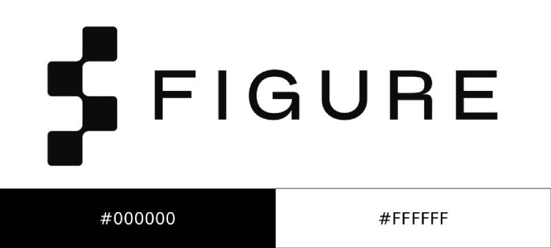
The Figure AI logo is an abstract geometric symbol resembling the letter “F,” composed of four connected squares, paired with a bold sans-serif wordmark in all capital letters. Red Antler designed the brand identity in 2022, with the symbol representing modularity, connectivity, and the intersection of AI and robotics.
Design Attributes
- Design Type: Combination mark (abstract symbol + wordmark)
- Primary Elements: Geometric “F” symbol made of connected squares, uppercase wordmark
- Official Introduction Date: 2022
- Designer/Agency: Red Antler (Brooklyn, NY)
- Trademark Status: Registered trademark of Figure AI, Inc.
- Color Palette: Monochromatic black (#000000) and white (#FFFFFF)
- Usage Context: Corporate communications, website, investor materials, product branding, humanoid robot chassis
How Has the Figure AI Logo Evolved Over Time?
Figure AI’s logo has remained largely consistent since the company’s founding. The brand launched with a fully developed visual identity system from Red Antler.
No major redesigns have occurred. This consistency reflects the startup’s focused approach to brand building.
Original Figure AI Logo (2022-Present)
- Years Active: 2022 to present
- Design Description: Abstract “F” symbol formed by four connected squares in a geometric arrangement, accompanied by “FIGURE” in bold, uppercase sans-serif typography
- Color Scheme: Primary black and white, with occasional inverse applications
- Designer: Red Antler
- Context: Introduced when Figure AI emerged from stealth mode, the logo needed to appeal to investors while laying groundwork for future consumer-facing products
- Key Changes from Previous: N/A (original design)
- Cultural Significance: Represents the company’s mission to bring commercially viable humanoid robots to market while maintaining an optimistic outlook on human-robot coexistence
What Do the Design Elements of the Figure AI Logo Mean?

The Figure AI logo communicates technological precision through geometric abstraction. Each element serves a specific purpose in conveying the brand’s values.
The connected squares suggest modularity. This reflects how robotics systems are built from interconnected components working together.
Why Did Figure AI Choose These Specific Colors?
The psychology behind colors plays a significant role in brand perception. Figure AI’s choice is deliberate and strategic.
- Black (#000000): Conveys sophistication, authority, and technological precision. Creates strong contrast and ensures maximum visibility across applications.
- White (#FFFFFF): Represents clarity, cleanliness, and the “enlightenment” aspect of the brand concept. Provides breathing room and creates negative space.
This monochromatic approach aligns well with other tech company logos and positions Figure AI as a serious player in the industry.
The stark palette also mirrors black logo design trends popular among cutting-edge technology companies.
What Typography Style Is Used in the Figure AI Logo?
The typography in the Figure AI logo uses a custom geometric sans-serif font.
All capital letters project strength and confidence. The letterforms feature clean, straight lines with consistent stroke weight.
Readability remains strong at both large and small sizes. The visual hierarchy places equal weight on symbol and text, allowing flexible usage.
What Are the Hidden Meanings in the Figure AI Logo?
The four connected squares forming the “F” carry multiple interpretations that go beyond surface-level design.
Some see neural network nodes. Others interpret robotic joints or modular building blocks. The ambiguity is intentional.
The psychology of shapes suggests squares represent stability, reliability, and structure. The connected nature implies collaboration and integration.
Red Antler’s stated intention was to create something “sleek and tech-forward without losing its touch of optimism.”
How Does the Figure AI Logo Compare to Competitor Logos?

The humanoid robotics space includes several notable competitors, each with distinct visual identities.
Boston Dynamics uses a two-tone blue color scheme with an abstract human figure. Their approach emphasizes dynamism and movement.
Tesla’s Optimus program leverages the existing Tesla wordmark. This ties the robot directly to the parent brand’s recognition.
Sanctuary AI employs an infinity-like symbol with clean sans-serif text. Their design suggests endless possibilities.
X uses minimalist line art to form their name. Unitree opts for a modified wordmark with subtle forward motion implied.
Figure AI differentiates through its geometric abstraction and strict monochromatic palette. While others incorporate color or humanoid imagery, Figure keeps things stark and modular.
This positions them alongside brands like DeepMind and SpaceX in terms of visual sophistication.
The minimalist design approach also mirrors trends seen in other AI companies like Kodiak Robotics.
What Are the Technical Specifications of the Figure AI Logo?
Official Color Codes
- Primary Color (Black)
- Hex: #000000
- RGB: (0, 0, 0)
- CMYK: (0, 0, 0, 100)
- Secondary Color (White)
- Hex: #FFFFFF
- RGB: (255, 255, 255)
- CMYK: (0, 0, 0, 0)
Dimensions and Proportions
- Aspect Ratio: The symbol maintains a square format; full lockup approximately 4:1 (horizontal)
- Minimum Size: Symbol should not appear smaller than 24px height for digital applications
- Clear Space: Maintain padding equal to the height of one square in the symbol on all sides
- File Formats: Available as vector graphics (SVG, EPS, AI) and raster formats (PNG, JPG)
What Cultural Impact Has the Figure AI Logo Had?
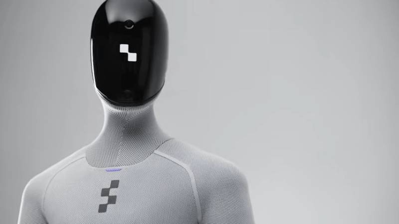
Figure AI’s logo has become synonymous with the humanoid robotics movement. When major outlets cover the industry, their branding frequently appears alongside Boston Dynamics and Tesla.
The company’s rapid rise to a $39 billion valuation has amplified brand visibility. Investors from Jeff Bezos to Microsoft have backed the company, bringing their visual identity into mainstream tech coverage.
The logo appears on Figure 01, Figure 02, and Figure 03 humanoid robots. These machines have been deployed at BMW manufacturing facilities, putting the brand in industrial settings worldwide.
Media coverage of the OpenAI partnership (and its later dissolution) frequently showcased both company logos side by side. This association elevated Figure’s brand recognition among AI enthusiasts.
How Does the Figure AI Logo Fit Into the Overall Brand Identity?

The logo serves as the anchor point for Figure AI’s complete visual system. Red Antler developed comprehensive brand guidelines covering all touchpoints.
Website design mirrors the logo’s stark aesthetic. Black backgrounds dominate, with white text and occasional accent colors.
Marketing materials maintain geometric precision throughout. Photography of the humanoid robots uses dramatic lighting that emphasizes form.
The brand style guide ensures consistency across investor decks, corporate communications, and product documentation.
Core graphic design principles like balance, alignment, and unity run through every branded asset.
The “Industrial Enlightenment” concept influences everything from color choices to imagery selection. Optimism balances technological precision.
How Should the Figure AI Logo Be Used?
Official Usage Guidelines
- Do: Maintain clear space around the logo, use approved color variations (black on white, white on black), scale proportionally
- Don’t: Stretch or distort, add effects like shadows or gradients, change colors, place on busy backgrounds, separate symbol from wordmark without approval
Accessing Official Assets
Press and partner assets may be available through Figure AI’s media relations team. Contact information is available on their official website at figure.ai.
Licensing and Trademark
The Figure AI logo and brand elements are protected intellectual property of Figure AI, Inc. Unauthorized commercial use is prohibited.
Media outlets covering the company may use the logo for editorial purposes following standard fair use guidelines.
Partnership and co-branding opportunities require direct approval from Figure AI’s brand team.
FAQ on The Figure AI Logo
Who Designed the Figure AI Logo?
Red Antler, a Brooklyn-based branding agency, designed the Figure AI logo in 2022. They developed the complete brand identity system when the humanoid robot company emerged from stealth mode.
The agency is known for working with high-growth tech startups across Silicon Valley.
What Does the Figure AI Logo Symbol Represent?
The abstract geometric symbol forms a stylized letter “F” using four connected squares. It represents modularity, connectivity, and the building blocks of robotics systems.
Some interpret it as neural network nodes or robotic joints. The ambiguity is intentional.
What Colors Are Used in the Figure AI Logo?
The logo uses a strict monochrome color palette. Primary black (#000000) and white (#FFFFFF) only.
This aligns with color theory principles that associate black with sophistication and technological precision.
What Font Does Figure AI Use in Its Logo?
Figure AI uses a custom geometric typeface in all capital letters. The letterforms feature clean lines and consistent stroke weight.
Strong typographic hierarchy allows the wordmark to stand alone or pair with the symbol.
When Was the Figure AI Logo Created?
The logo debuted in 2022 when Brett Adcock founded the company. Red Antler developed it as Figure AI prepared to announce its mission to build general purpose humanoid robots.
No major redesigns have occurred since launch.
Can I Download the Figure AI Logo?
Official logo files require permission from Figure AI’s media relations team. The company protects its trademark and brand assets.
Press outlets may use the logo for editorial coverage following standard fair use guidelines. Commercial use needs direct approval.
What Makes the Figure AI Logo Different From Competitors?
Unlike Boston Dynamics or Tesla Optimus, Figure AI avoids humanoid imagery in its mark. The geometric abstraction and white space create distinction.
Similar approaches appear in brands like Anthropic and Scale AI.
What Is the Meaning Behind Figure AI’s Brand Concept?
Red Antler built the identity around “Industrial Enlightenment.” This concept aims to generate optimism about human-robot coexistence rather than fear.
The sleek aesthetic balances tech-forward positioning with approachability for investors and future consumers.
Where Does the Figure AI Logo Appear?
The logo appears on Figure 01, Figure 02, and Figure 03 humanoid robots. It also features across corporate communications, the company website, and investor materials.
BMW manufacturing facilities display it on deployed units through their partnership.
Does Figure AI Have Brand Guidelines?
Yes. Red Antler developed comprehensive logo design principles and usage rules. These cover clear space requirements, minimum sizes, and approved color palette applications.
The guidelines ensure consistency across all touchpoints from web design to product branding.
Conclusion
The Figure AI logo represents more than just a tech startup identity. It captures the ambition of a Sunnyvale-based company pushing autonomous humanoid technology into commercial reality.
Every element works together. The geometric symbol, bold wordmark, and monochromatic scheme create instant brand recognition.
As Figure AI continues scaling production at BotQ and deploying robots alongside partners like NVIDIA and Intel, this visual identity will only grow more familiar.
For an AI robotics startup valued at $39 billion, the logo delivers exactly what it should: clarity, confidence, and a forward-looking vision for the robot manufacturer category.

Renowned for his expertise in logo design and visual branding, Bogdan has developed a multitude of logos for various clients.
His skills extend to creating posters, vector illustrations, business cards, and brochures. Additionally, Bogdan's UI kits were featured on marketplaces like Visual Hierarchy and UI8.
He also wrote in the past years on sites like Design Your Way, WebDesignerDepot, WPDean, Designmodo, Speckyboy, Slider Revolution, and more.
- The Windsurf Logo History, Colors, Font, And Meaning - 10 October 2026
- How to Remove Background From Product Photos (No Photoshop) - 10 October 2026
- How Designers can Build a Stronger Online Creative Identity - 9 October 2026

Bogdan Sandu is a seasoned designer who has been designing websites since 2008. Renowned for his expertise in logo design and visual branding, Bogdan has developed a multitude of logos for various clients. His skills extend to creating posters, vector illustrations, business cards, and brochures. Additionally, Bogdan's UI kits were featured on marketplaces like Visual Hierarchy and UI8. He also wrote in the past years on sites like Design Your Way, WebDesignerDepot, WPDean, Designmodo, Speckyboy, Slider Revolution, and more.
You Might Also Like