


The Kodiak Robotics logo represents one of the autonomous trucking industry’s most recognizable visual identities. Founded in 2018 by Don Burnette and Paz Eshel, the Mountain View, California-based company built its brand around the idea of rugged reliability meeting cutting-edge technology.
Within the broader landscape of tech company logos, Kodiak stands out for blending Americana trucking heritage with Silicon Valley aesthetics. The company underwent a significant identity refresh through its partnership with Studio Mega, evolving from its original Texas-inspired look to a more sophisticated design language.
The current version of the logo debuted alongside the company’s rebrand to Kodiak AI in September 2025. This marked the second major iteration since the company’s founding. The design features a clean wordmark with contemporary styling, moving away from the distinctly rugged Americana aesthetic of earlier versions.
What is the Kodiak Robotics Logo?
The Kodiak Robotics logo is a wordmark-style design featuring the company name in bold, contemporary typography. Introduced in its current form around 2024 through a collaboration with Studio Mega, it combines clean geometric letterforms with subtle references to the trucking industry’s visual language through color and supporting graphic elements.
Key Attributes
- Design Type: Wordmark (logotype)
- Primary Elements: Custom typography spelling “Kodiak,” supporting grid overlays, highway-inspired graphic motifs
- Official Introduction: Original logo launched 2018; refreshed brand identity circa 2024
- Designer/Agency: Studio Mega (Portland, Oregon) handled the brand refresh
- Trademark Status: Registered under Kodiak AI, Inc. (formerly Kodiak Robotics, Inc.)
- Color Palette: Orange-coral accent (approximately #E85D04), dark charcoal/black (#1A1A1A), white (#FFFFFF)
- Usage Context: Autonomous trucks, corporate communications, digital platforms, investor materials, defense applications
How Has the Kodiak Robotics Logo Evolved Over Time?
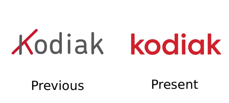
The Kodiak brand has gone through two distinct visual phases since its 2018 founding.
The original identity leaned heavily into its Texas roots with a distinctly Americana aesthetic.
Studio Mega’s collaboration brought a more minimal, tech-forward approach that better positioned Kodiak for its expansion beyond trucking into defense applications.
Original Kodiak Robotics Logo (2018-2023)
- Years Active: 2018 to approximately 2023
- Design Description: Bold wordmark with distinctly rugged, Americana-influenced styling
- Color Scheme: Orange and dark tones reflecting Texas trucking heritage
- Designer: In-house/founding team
- Context: Established during company launch when Kodiak raised $40M in initial funding to tackle long-haul trucking automation
- Cultural Significance: Represented the company’s roots in Dallas-Fort Worth operations and positioned Kodiak as a scrappy startup taking on established players
Refreshed Kodiak Logo (2024-Present)
- Years Active: 2024 to present
- Design Description: Cleaner, more geometric wordmark with contemporary typography and streamlined interface integration
- Color Scheme: Retained vibrant orange-coral accent with refined dark palette
- Designer: Studio Mega with creative partners Joe Rogers (copywriting), DeltaG and Akimbo (3D renders)
- Context: Introduced as Kodiak expanded beyond trucking into defense contracts and prepared for its SPAC merger
- Key Changes from Previous: Shifted from “rough edges” Americana to polished Silicon Valley tech aesthetic while maintaining subtle trucking references
- Cultural Significance: Represents Kodiak’s maturation from startup to publicly-traded company valued at $2.5 billion
What Do the Design Elements of the Kodiak Robotics Logo Mean?

The Kodiak logo draws its meaning from the intersection of rugged reliability and technological precision.
Studio Mega described their approach as “rough edges, smooth finish.”
This tension between grit and polish runs through every aspect of the visual identity.
Why Did Kodiak Robotics Choose These Specific Colors?
The orange-coral accent color carries significant weight in Kodiak’s visual system.
Orange traditionally signals energy, confidence, and visibility. For a company putting massive autonomous trucks on public highways, that visibility matters quite a bit.
The color also connects to safety equipment, construction zones, and the kind of high-visibility gear you see throughout the trucking industry. There’s something almost obvious about it when you think about it.
Understanding how colors affect perception helps explain why this choice works for an autonomous vehicle company trying to build public trust.
- Orange-Coral: Hex approximately #E85D04. Signals alertness, energy, and innovation. Creates strong visibility and recalls highway safety elements.
- Dark Charcoal/Black: Hex approximately #1A1A1A. Provides grounding, professionalism, and technological sophistication.
- White: Hex #FFFFFF. Creates breathing room and enables clean digital interfaces.
What Typography Style Is Used in the Kodiak Robotics Logo?
The Kodiak wordmark uses a custom sans-serif typeface with geometric characteristics.
The letterforms feature clean lines and consistent stroke widths.
This approach prioritizes readability at both large and small scales, which matters when your logo appears on everything from semi-trucks to mobile apps.
The letter spacing is carefully calibrated. Not too tight, not too loose. Just enough air between characters to maintain legibility on digital screens and printed materials alike.
What Are the Hidden Meanings in the Kodiak Robotics Logo?
The name “Kodiak” itself carries meaning most people miss on first glance.
Kodiak bears are among the largest land predators. They’re powerful, reliable, and built to endure harsh conditions. Pretty fitting for a company making trucks that drive themselves through Texas heat and Oklahoma storms.
The design system also incorporates grid overlays inspired by highway lane markings and navigation systems. These elements appear in supporting graphics and create what Studio Mega calls “highway symbolism.”
How Does the Kodiak Robotics Logo Compare to Competitor Logos?
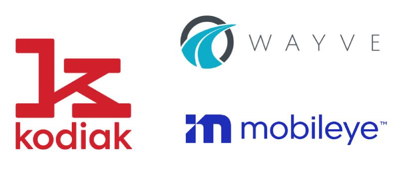
The autonomous trucking space has gotten crowded. Competitors like TORC Robotics, Gatik, Embark (now defunct), and Plus AI all fight for attention.
Most lean heavily into tech aesthetics. Blues and grays dominate. Lots of abstract symbols trying to suggest “autonomous” or “AI” through geometry.
Kodiak’s orange sets it apart immediately. The wordmark approach also differs from competitors who often rely on abstract icons or combination marks.
Companies like Wayve and Mobileye take different approaches to visualizing autonomous technology. Wayve goes minimal and abstract. Mobileye emphasizes the “eye” in its name.
Kodiak chose clarity over cleverness. You see the name. You remember the name. That simplicity actually stands out in a field full of companies trying to look futuristic.
What Are the Technical Specifications of the Kodiak Robotics Logo?
Official Color Codes
- Primary Accent (Orange-Coral): Hex: #E85D04 (approximate), RGB: (232, 93, 4), CMYK: (0, 60, 98, 9)
- Primary Dark: Hex: #1A1A1A, RGB: (26, 26, 26), CMYK: (0, 0, 0, 90)
- White: Hex: #FFFFFF, RGB: (255, 255, 255), CMYK: (0, 0, 0, 0)
Dimensions and Proportions
- Aspect Ratio: The wordmark maintains consistent proportions across applications
- Minimum Size: Digital usage typically requires minimum 24px height for legibility
- Clear Space: The brand guidelines specify minimum clear space equal to the height of the “K” character surrounding the wordmark
- File Formats: Available in SVG, PDF, AI, EPS, and PNG formats for various applications
What Cultural Impact Has the Kodiak Robotics Logo Had?
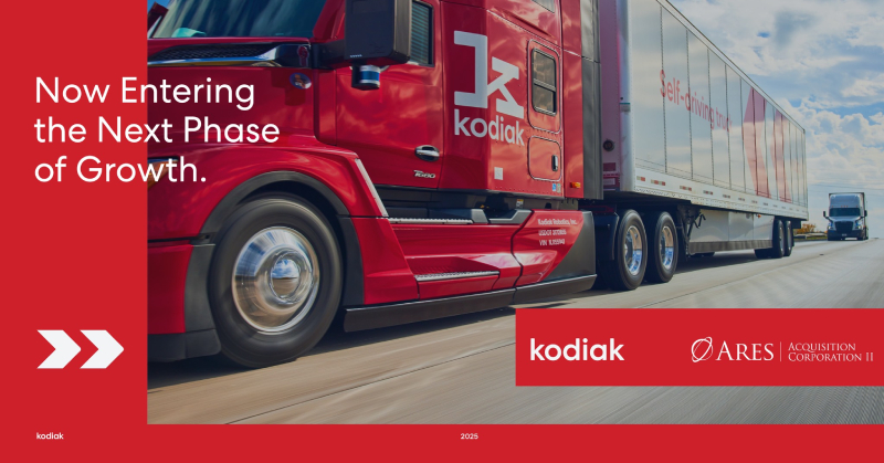
The Kodiak brand has become increasingly visible as autonomous trucking moves from science fiction to reality.
Their trucks now operate coast-to-coast across more than 18,000 miles of freight lanes.
When news coverage features autonomous trucking, Kodiak’s orange-branded trucks often appear in the footage. That repeated exposure builds recognition.
The 2024 brand refresh positioned Kodiak for broader cultural relevance as the company expanded into defense applications with a nearly $50 million Department of Defense contract.
How Does the Kodiak Robotics Logo Fit Into the Overall Brand Identity?
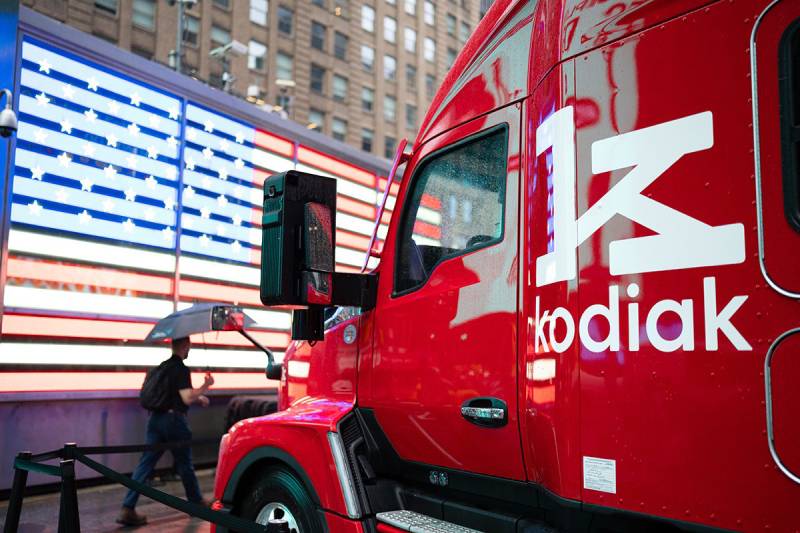
The logo serves as the anchor point for a comprehensive visual system.
Studio Mega developed supporting elements including iconography, photography direction, and digital interface design.
The style guide establishes consistent application across trucks, websites, investor presentations, and marketing materials.
Bold type treatments extend the wordmark’s personality into headlines and body copy. Grid overlays reference both highway infrastructure and the precision required for autonomous navigation.
Photography direction emphasizes what Studio Mega called “rugged photography” showing real trucks in real conditions. None of that sterile studio stuff you see from some tech companies.
How Should the Kodiak Robotics Logo Be Used?
Official Usage Guidelines
- Do: Use official logo files from authorized sources
- Do: Maintain minimum clear space around the wordmark
- Do: Apply on approved background colors (dark backgrounds with light logo, light backgrounds with dark logo)
- Don’t: Stretch, distort, or modify proportions
- Don’t: Add effects like shadows, gradients, or outlines
- Don’t: Place on busy photographic backgrounds without proper contrast
Where to Access Official Logos
Official logo files can be obtained through Kodiak AI’s corporate communications team. Media inquiries typically receive access to press kits containing approved assets.
The company’s investor relations page (investors.kodiak.ai) also provides certain branded materials following the September 2025 public listing.
Trademark Information
The Kodiak name and logo are registered trademarks of Kodiak AI, Inc. Use requires authorization. The company actively protects its intellectual property, particularly given its high-profile defense contracts and public company status.
FAQ on The Kodiak Robotics Logo
What does the Kodiak Robotics logo look like?
The Kodiak Robotics logo is a wordmark design featuring the company name in bold, geometric sans-serif letterforms.
It uses an orange-coral accent color against dark backgrounds. The design balances Silicon Valley tech aesthetics with subtle trucking industry references.
When was the Kodiak Robotics logo created?
The original logo launched in 2018 when Don Burnette and Paz Eshel founded the autonomous trucking company in Mountain View, California.
Studio Mega refreshed the brand identity around 2024. The company rebranded to Kodiak AI in September 2025.
Who designed the current Kodiak logo?
Studio Mega, a Portland-based agency, led the brand refresh. They developed new logo design principles, messaging frameworks, and visual guidelines.
Creative partners included Joe Rogers for copywriting and DeltaG for 3D renders.
What colors are used in the Kodiak Robotics logo?
The primary color palette features orange-coral (approximately #E85D04), dark charcoal (#1A1A1A), and white.
Orange signals energy and visibility. It connects to highway safety elements and high-visibility equipment common in freight transportation.
What does the Kodiak name mean?
Kodiak references the Kodiak bear, one of the largest land predators. These bears represent power, reliability, and endurance.
The name fits a self-driving truck company built to handle demanding long-haul trucking conditions across Texas and beyond.
Is the Kodiak logo a wordmark or symbol?
It’s a wordmark, also called a logotype. The design relies entirely on custom typography elements rather than icons or abstract symbols.
This approach prioritizes name recognition. You see “Kodiak” and remember it immediately.
How has the Kodiak Robotics logo changed over time?
The original 2018 version had a distinctly Americana aesthetic inspired by Texas trucking culture.
The 2024 refresh shifted toward minimalist design principles. Cleaner lines. More geometric forms. Better suited for digital platforms and investor materials.
Where can I download the official Kodiak logo?
Official assets come through Kodiak AI’s corporate communications team. Media contacts receive press kits with approved files.
The investor relations page at investors.kodiak.ai provides some branded materials. Unauthorized use violates trademark protections.
What font does the Kodiak logo use?
The wordmark uses a custom typeface with geometric characteristics. Clean strokes. Consistent weight throughout.
The spacing between letters is carefully calibrated for readability across autonomous trucks, mobile apps, and corporate documents.
How does Kodiak’s logo compare to other autonomous vehicle companies?
Most competitors like TORC Robotics and Gatik use blues and grays with abstract symbols.
Kodiak’s orange branding stands apart. The straightforward wordmark differs from companies chasing futuristic icon designs. Clarity over cleverness.
Conclusion
The Kodiak Robotics logo tells a clear story. It reflects a company that started hauling freight in Texas and grew into a publicly-traded leader in driverless ground transportation.
The wordmark design prioritizes recognition over complexity. That decision makes sense for a transportation technology brand competing against established players like TORC Robotics and Gatik.
As Kodiak AI expands its commercial freight operations and defense contracts with the U.S. Army, the visual identity will appear on more autonomous trucks crossing American highways.
Simple branding. Serious technology. The logo captures both.

Renowned for his expertise in logo design and visual branding, Bogdan has developed a multitude of logos for various clients.
His skills extend to creating posters, vector illustrations, business cards, and brochures. Additionally, Bogdan's UI kits were featured on marketplaces like Visual Hierarchy and UI8.
He also wrote in the past years on sites like Design Your Way, WebDesignerDepot, WPDean, Designmodo, Speckyboy, Slider Revolution, and more.
- Canva vs PowerPoint: Which Is Better for Presentations? - 22 September 2026
- How to Install Fonts on Mac (Step-by-Step Guide) - 20 September 2026
- From Mockup to Code: How AI-Augmented Development Speeds Up the Design Handoff - 19 September 2026

Bogdan Sandu is a seasoned designer who has been designing websites since 2008. Renowned for his expertise in logo design and visual branding, Bogdan has developed a multitude of logos for various clients. His skills extend to creating posters, vector illustrations, business cards, and brochures. Additionally, Bogdan's UI kits were featured on marketplaces like Visual Hierarchy and UI8. He also wrote in the past years on sites like Design Your Way, WebDesignerDepot, WPDean, Designmodo, Speckyboy, Slider Revolution, and more.
You Might Also Like


