The Wayve logo represents one of the most ambitious autonomous driving startups to emerge from the UK. Founded in 2017 by Alex Kendall and Amar Shah, both Cambridge University researchers, the company needed a visual identity that could communicate cutting-edge AI technology without alienating mainstream audiences.
Within the broader landscape of tech company logos, Wayve’s mark sits in interesting territory. It bridges the gap between academic credibility and commercial appeal. The current version has remained largely consistent since the company’s early funding rounds, though minor refinements have appeared over time.
The brand has gone through approximately two iterations since launch. Not dramatic overhauls, mind you. More like careful adjustments as the company scaled from research project to billion-dollar unicorn.
What Is the Wayve Logo?
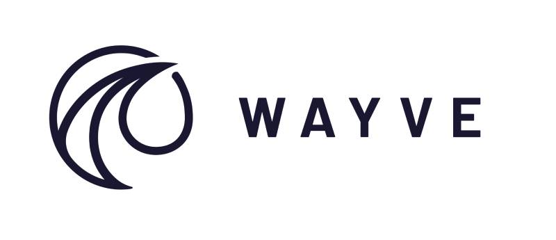
The Wayve logo is a custom wordmark featuring lowercase lettering in a geometric sans-serif style, officially introduced around 2017 when the company launched. The design communicates forward motion and technological precision through its clean letterforms and distinctive “w” construction.
Design Type: Wordmark (logotype)
Primary Elements: Custom lowercase typography spelling “wayve” with a stylized letter construction
Official Introduction Date: 2017
Designer/Agency: Not publicly disclosed
Trademark Status: Registered trademark in the UK and other jurisdictions
Color Palette: Deep navy blue (primary), white (secondary for reversed applications)
Usage Context: Corporate communications, vehicle branding, digital platforms, investor presentations, partnership announcements
How Has the Wayve Logo Evolved Over Time?
The Wayve logo has maintained remarkable consistency since the company’s founding.
Unlike many startups that rebrand after major funding rounds, Wayve stuck with its original direction.
Minor refinements to spacing and weight have occurred, but the core identity remains intact from 2017 to present.
Original Wayve Logo (2017-Present)
Years Active: 2017 to current
Design Description: Lowercase wordmark with geometric sans-serif font characteristics. The letters feature uniform stroke widths and rounded terminals that soften the technical aesthetic.
Color Scheme: Navy blue serves as the dominant brand color, projecting trust and technological competence.
Designer: Unconfirmed, likely developed in collaboration with early team members or a boutique agency.
Context: Created during the company’s spin-out from Cambridge University research. The founders needed something professional enough for academic partnerships yet modern enough for the tech world.
Key Changes from Previous: As the original version, this established the baseline. Subsequent tweaks have been subtle, mostly involving digital optimization.
Cultural Significance: The logo helped position Wayve as a serious player in autonomous vehicles during a period when the industry was dominated by American and Chinese competitors.
What Do the Design Elements of the Wayve Logo Mean?

The Wayve wordmark communicates motion, technology, and approachability through deliberate typographic choices.
The lowercase treatment feels accessible rather than imposing.
Meanwhile, the geometric construction signals precision and engineering excellence.
Why Did Wayve Choose These Specific Colors?
The deep navy blue anchors the entire brand system. According to color psychology, blue builds trust and suggests reliability.
For an autonomous driving company asking people to trust AI with their safety, that matters.
Primary Color: Navy Blue
- Hex: Approximately #1a237e to #283593 range
- Symbolic meaning: Trust, technology, depth, intelligence
- Psychological impact: Calming, professional, dependable
- Brand connection: Aligns with the serious nature of autonomous vehicle development
Secondary Color: White
- Used for reversed applications and digital interfaces
- Creates clean contrast and improves readability
The choice mirrors other blue logos in the technology sector, establishing immediate category recognition.
What Typography Style Is Used in the Wayve Logo?
The typography appears to be a custom or heavily modified geometric sans-serif.
It shares DNA with fonts like Circular or Proxima Nova but has distinct characteristics.
The letterforms prioritize legibility at small sizes, which is important for vehicle applications.
Rounded terminals give the type warmth, counterbalancing the technical subject matter.
What Are the Hidden Meanings in the Wayve Logo?
The name itself contains the primary symbolism. “Wayve” suggests both “wave” (as in signal waves, data transmission) and “way” (as in pathfinding, navigation).
The spelling modification makes it distinctive and trademarkable.
Some observers note the flowing quality of the letterforms mimics the smooth motion of autonomous driving.
Whether intentional or not, it works.
How Does the Wayve Logo Compare to Competitor Logos?

Autonomous vehicle companies tend toward two design directions: aggressive and futuristic, or calm and trustworthy.
Wayve chose the latter.
Compared to the Mobileye logo with its sharp angles, Wayve feels softer.
Against Cruise or Waymo, it reads as more European, more understated.
The Kodiak Robotics logo takes a bolder approach with its bear imagery.
Wayve opted for pure typography, letting the name carry the identity without pictorial support.
This positions the brand closer to enterprise software companies than automotive manufacturers. A deliberate choice, probably, given their B2B focus on licensing technology to carmakers rather than building consumer vehicles.
What Are the Technical Specifications of the Wayve Logo?
Official Color Codes:
Primary Color: Navy Blue
- Hex: Estimated #1a237e (exact codes not publicly released)
- RGB: Approximately (26, 35, 126)
- CMYK: Approximately (100, 95, 0, 35)
Secondary Color: White
- Hex: #FFFFFF
- RGB: (255, 255, 255)
Dimensions and Proportions:
- Aspect ratio: Horizontal orientation, approximately 4:1
- Minimum size: Likely 20mm width for print applications
- Clear space: Standard practice suggests minimum clear space equal to the height of the “w”
The logo works as a vector graphic for scalability across all applications, from app icons to vehicle wraps.
What Cultural Impact Has the Wayve Logo Had?
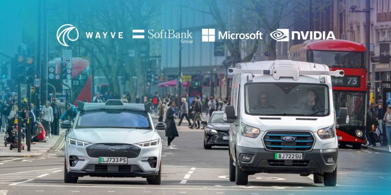
Within the UK tech ecosystem, the Wayve logo has become shorthand for British AI ambition.
When SoftBank led their massive funding round, the logo appeared across global financial press.
It represents the possibility that world-changing autonomous vehicle technology can emerge from outside Silicon Valley.
For London’s King’s Cross tech cluster, where Wayve is headquartered, the brand has become a flagship example of deep tech success.
How Does the Wayve Logo Fit Into the Overall Brand Identity?
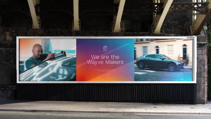
The logo anchors a broader visual system that includes photography style, illustration approach, and presentation templates.
Everything maintains that same balance of technical credibility and human accessibility.
Their brand guidelines likely specify usage across vehicle livery, corporate partnerships, and digital products.
The color palette extends into gradients and secondary colors for data visualization and UI elements.
Typography choices for body copy probably complement the logo’s geometric character without competing with it.
How Should the Wayve Logo Be Used?
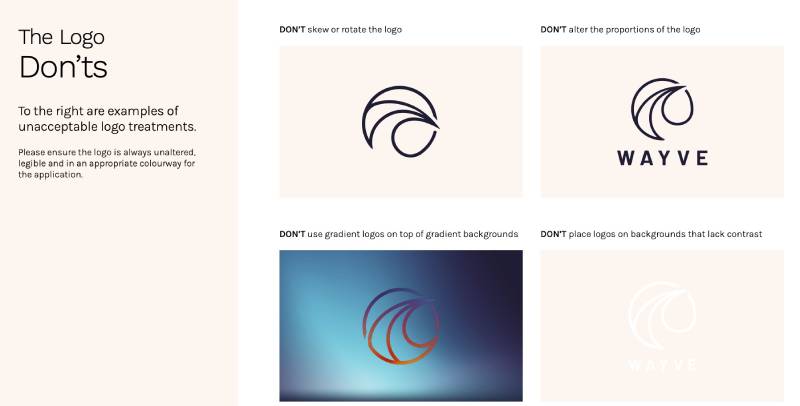
Official Usage Guidelines:
- Maintain minimum clear space around the logo
- Do not stretch, rotate, or distort the wordmark
- Use only approved color variations (full color, white, or single-color applications)
- Do not place the logo on busy backgrounds that reduce legibility
- Maintain minimum size requirements for readability
Where to Access Official Logos:
- Press kit available through Wayve’s official website
- Media inquiries can request high-resolution assets
- Partner companies receive brand assets through official channels
Licensing Information:
- The Wayve logo is a protected trademark
- Unauthorized commercial use is prohibited
- Editorial use for news coverage is generally permitted
- Partnership usage requires written approval
Trademark Protection:
- Registered in the United Kingdom and European Union
- Protected in key markets including the United States
- The company actively monitors and enforces trademark rights
FAQ on The Wayve Logo
What Does the Wayve Logo Look Like?
The Wayve wordmark features lowercase geometric lettering spelling out the company name.
Clean lines. No icon or symbol, just pure typography.
The design reflects the UK AI startup’s focus on simplicity and technological precision. It follows core logo design principles favoring clarity over complexity.
What Colors Are in the Wayve Logo?
Deep navy blue dominates the Wayve brand identity. White serves as the secondary color for reversed applications.
The hue choice projects trust and intelligence.
For an autonomous vehicle company handling safety-critical AI systems, blue communicates reliability. The saturation runs deep, giving the mark visual weight.
Who Designed the Wayve Logo?
The designer or agency behind the Wayve visual identity has not been publicly disclosed.
It likely emerged during the Cambridge robotics spinout phase in 2017.
Co-founders Alex Kendall and Amar Shah may have collaborated with a design partner, though no official credit exists in press materials or the Wayve media assets.
When Was the Wayve Logo Created?
The logo appeared in 2017 when the self-driving technology company officially launched.
It coincided with Wayve’s founding as a University of Cambridge spinout.
The mark has remained consistent through multiple funding rounds, including the SoftBank investment that valued this British AI unicorn at over one billion dollars.
What Font Is Used in the Wayve Logo?
The typeface appears custom or heavily modified. It shares characteristics with geometric sans-serifs like Circular.
Rounded terminals soften the technical feel.
The kerning is tight but readable. Proper font spacing ensures the wordmark works at small sizes on vehicles and apps.
Can I Download the Wayve Logo?
Official Wayve brand assets are available through their press kit.
Media outlets can request high-resolution files for editorial use.
The Wayve press kit typically includes formats suitable for both print design and digital applications. Commercial use requires written permission from the London AI company.
What Does the Wayve Logo Symbolize?
The name blends “wave” and “way” into something new. Signal waves. Pathfinding. Data transmission.
The flowing letterforms suggest smooth autonomous driving motion.
As an embodied AI company, Wayve needed a mark that communicated both technological depth and human accessibility. The psychology of shapes here favors curves over harsh angles.
Has the Wayve Logo Changed Over Time?
Remarkably stable. The Wayve corporate identity has seen only minor refinements since 2017.
No dramatic redesigns after Series C funding.
This unity in branding builds recognition. While competitors rebrand constantly, this mobility tech startup maintained visual consistency throughout its growth from research project to autonomous vehicle software leader.
Is the Wayve Logo Trademarked?
Yes. The Wayve trademark is registered in the United Kingdom, European Union, and United States.
Standard protection for a company of this valuation.
The intelligent driving brand actively monitors unauthorized usage. Partnership applications and co-branding require approval through official channels at Wayve headquarters London.
How Is the Wayve Logo Used on Vehicles?
The logo appears on test fleet vehicles operating in London streets. Clean placement. High contrast against vehicle paint.
Wayve fleet deployment includes branded cars for real-world driving data collection.
The wordmark scales well from small dashboard displays to full vehicle wraps, thanks to its simple geometric construction and strong visual hierarchy.
Conclusion
The Wayve logo proves that effective brand identity does not require complexity. A clean wordmark. Navy blue. Geometric letterforms. That is all.
This British tech unicorn built its visual identity on minimalist design thinking.
As Wayve expands its end-to-end autonomous driving technology and scalable autonomy platform, the logo remains a constant. It anchors the brand across partnerships with companies like Microsoft and Asda.
The mark works because it understands white space and restraint.
For a deep learning transportation company reshaping mobility from King’s Cross, the logo communicates exactly what it needs to. Nothing more.

Renowned for his expertise in logo design and visual branding, Bogdan has developed a multitude of logos for various clients.
His skills extend to creating posters, vector illustrations, business cards, and brochures. Additionally, Bogdan's UI kits were featured on marketplaces like Visual Hierarchy and UI8.
He also wrote in the past years on sites like Design Your Way, WebDesignerDepot, WPDean, Designmodo, Speckyboy, Slider Revolution, and more.
- The Windsurf Logo History, Colors, Font, And Meaning - 10 October 2026
- How to Remove Background From Product Photos (No Photoshop) - 10 October 2026
- How Designers can Build a Stronger Online Creative Identity - 9 October 2026

Bogdan Sandu is a seasoned designer who has been designing websites since 2008. Renowned for his expertise in logo design and visual branding, Bogdan has developed a multitude of logos for various clients. His skills extend to creating posters, vector illustrations, business cards, and brochures. Additionally, Bogdan's UI kits were featured on marketplaces like Visual Hierarchy and UI8. He also wrote in the past years on sites like Design Your Way, WebDesignerDepot, WPDean, Designmodo, Speckyboy, Slider Revolution, and more.
You Might Also Like