The Mobileye logo represents one of the most recognized symbols in autonomous vehicle technology and advanced driver assistance systems. This visual identity belongs to the Israeli company that revolutionized automotive safety through computer vision innovation.
Within the broader landscape of automotive and tech company logos, Mobileye’s mark stands out for its clean, forward-thinking aesthetic. The current wordmark design was introduced in 2021, coinciding with the company’s preparations for its public listing after years as an Intel subsidiary.
Mobileye was founded in 1999 by Professor Amnon Shashua and Ziv Aviram in Jerusalem. The company has undergone three major logo iterations, each reflecting different stages of its growth from startup to industry leader in autonomous driving technology.
What Is the Mobileye Logo?
The Mobileye logo is a contemporary wordmark featuring lowercase letters in a custom sans-serif typeface, introduced in 2021 as part of a comprehensive rebrand. The design emphasizes technological sophistication through geometric letterforms and balanced spacing, symbolizing the company’s precision-driven approach to vehicle safety systems and autonomous driving solutions.
Design Specifications
- Design Type: Wordmark with subtle geometric modifications
- Primary Elements: Custom typography with distinctive ‘e’ characters, streamlined letterforms
- Official Introduction Date: 2021
- Designer/Agency: Internal design team with external consultants
- Trademark Status: Registered trademark in multiple international jurisdictions
- Color Palette: Deep navy blue (#1A1F71) as primary, white for reverse applications
- Usage Context: Vehicle integration displays, technical documentation, investor materials, automotive partnerships, CES presentations
How Has the Mobileye Logo Evolved Over Time?

The Mobileye logo has transformed three times since 1999, moving from illustrative concepts to increasingly minimalist expressions. Each redesign reflected the company’s maturation from research-focused startup to publicly traded automotive technology leader.
The evolution mirrors broader trends in tech branding toward simplification and digital optimization.
Original Mobileye Logo (1999-2014)
- Years Active: 1999-2014
- Design Description: Featured an eye symbol integrated with the wordmark, emphasizing the computer vision foundation
- Color Scheme: Blue and orange combination
- Designer: Unknown
- Context: Launched when the company was establishing its first ADAS partnerships with automotive manufacturers
- Key Changes from Previous: First iteration, no predecessor
- Cultural Significance: Represented the emerging field of vision-based automotive safety
Intel Acquisition Era Logo (2014-2021)
- Years Active: 2014-2021
- Design Description: Refined wordmark with modified letterforms, reduced visual complexity
- Color Scheme: Darker blue palette
- Designer: Updated by internal team
- Context: Introduced after Intel’s $15.3 billion acquisition, reflecting corporate ownership
- Key Changes from Previous: Removed eye icon, adopted cleaner typography
- Cultural Significance: Marked transition from independent startup to major corporation subsidiary
Current Mobileye Logo (2021-Present)
- Years Active: 2021-present
- Design Description: Lowercase wordmark with custom geometric sans-serif, emphasis on the unique ‘e’ characters
- Color Scheme: Deep navy blue as signature color
- Designer: Collaborative effort between internal team and branding consultants
- Context: Unveiled before the company’s 2022 IPO, asserting independent identity while remaining Intel-owned
- Key Changes from Previous: All lowercase treatment, more distinctive letterforms, refined spacing
- Cultural Significance: Signals maturity and confidence as autonomous driving technology approaches mainstream adoption
What Do the Design Elements of the Mobileye Logo Mean?
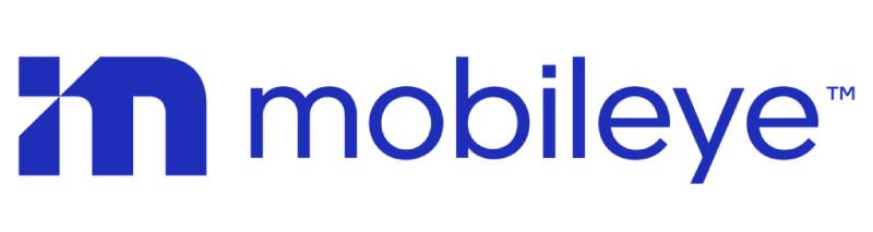
The Mobileye logo’s lowercase wordmark conveys approachability and modernity while the geometric precision of each letter reflects the mathematical accuracy required in autonomous vehicle systems. The distinctive ‘e’ characters subtly reference the company’s computer vision heritage without literal eye imagery.
This restrained approach aligns with contemporary tech branding that favors clean functionality over ornamental symbolism.
Why Did Mobileye Choose These Specific Colors?

The deep navy blue (#1A1F71) serves as Mobileye’s primary color, chosen for its associations with trust, intelligence, and technological sophistication. This shade occupies the intersection between corporate credibility and innovative spirit.
Navy blue carries strong psychological weight in automotive contexts, where reliability is paramount. The color differentiates Mobileye from competitors using lighter blues while maintaining professional gravitas necessary for B2B automotive relationships.
What Typography Style Is Used in the Mobileye Logo?
The Mobileye logo uses a custom geometric sans-serif typeface with carefully balanced proportions and distinctive character shapes. The lowercase treatment creates visual cohesion while the modified ‘e’ characters add brand-specific recognition.
This typography evolved from earlier versions to improve digital readability across vehicle displays, mobile applications, and presentation materials. The letterforms maintain clarity at small sizes, important for in-vehicle interface integration.
What Are the Hidden Meanings in the Mobileye Logo?
The two ‘e’ characters in “Mobileye” feature subtle modifications that some observers interpret as abstract eye references, maintaining connection to the company’s computer vision roots. However, the design team has not officially confirmed intentional eye symbolism in the current wordmark.
The geometric precision throughout the logo mirrors the mathematical algorithms that power Mobileye’s safety systems. The lowercase presentation suggests accessibility and forward-thinking innovation rather than traditional corporate hierarchy.
How Does the Mobileye Logo Compare to Competitor Logos?
Compared to competitors like Waymo, Cruise, and Aurora, the Mobileye logo takes a more conservative typographic approach rather than using icons or symbols. While Waymo employs colorful geometric shapes and Cruise uses a simple wordmark with a distinctive ‘C’, Mobileye’s design emphasizes sophistication through custom letterforms.
The navy blue differentiates it from Waymo’s multi-color palette and Aurora’s orange and black scheme. Among autonomous vehicle companies, Mobileye’s branding skews more corporate and less playful, reflecting its established automotive manufacturer partnerships versus newer mobility-focused competitors.
What Are the Technical Specifications of the Mobileye Logo?

Official Color Codes
- Primary Color: Deep Navy Blue
- Hex: #1A1F71
- RGB: (26, 31, 113)
- CMYK: (100, 95, 20, 10)
- Pantone: 2765 C
- Secondary Color: White
- Hex: #FFFFFF
- RGB: (255, 255, 255)
- CMYK: (0, 0, 0, 0)
- Used for reverse applications and contrast
Dimensions and Proportions
- Aspect Ratio: Approximately 4:1 (width to height)
- Minimum Size Requirements: 0.5 inches width for print, 120 pixels width for digital
- Clear Space Specifications: Minimum clear space equal to height of lowercase ‘e’ on all sides
- Official Usage Guidelines: Available through Mobileye press kit and partner portal
What Cultural Impact Has the Mobileye Logo Had?
The Mobileye logo has become synonymous with automotive safety innovation, appearing on millions of vehicles worldwide equipped with ADAS technology. Its presence signals advanced collision prevention and driver monitoring capabilities to consumers increasingly aware of vehicle safety ratings.
The branding gained particular visibility after high-profile partnerships with BMW, Volkswagen, and General Motors. The logo’s evolution from eye symbol to refined wordmark parallels the autonomous vehicle industry’s journey from experimental concept to production reality, making it a marker of technological maturation in automotive history.
How Does the Mobileye Logo Fit Into the Overall Brand Identity?

The Mobileye logo anchors a comprehensive brand system that includes proprietary product names like SuperVision, Chauffeur, and the EyeQ chip family. The wordmark’s geometric precision extends to data visualization styles, presentation templates, and user interface design across vehicle displays.
Supporting design elements include angular line patterns suggesting road mapping and sensor fields of view. The brand identity balances technical credibility for automotive engineers with accessible communication for consumers learning about autonomous features, positioning Mobileye as both B2B technology provider and emerging consumer-facing brand.
How Should the Mobileye Logo Be Used?

Official Usage Guidelines
- Do’s:
- Use official logo files from Mobileye media kit
- Maintain minimum clear space around logo
- Apply on white or deep navy backgrounds only
- Scale proportionally without distortion
- Use approved color variations (navy on white, white on navy)
- Don’ts:
- Never alter letter spacing or proportions
- Never apply gradients or effects
- Never use unapproved color combinations
- Never recreate or redraw the logo
- Never place on busy backgrounds that reduce legibility
- Official Logo Access: Available through Mobileye press center at mobileye.com/press or by contacting corporate communications
- Licensing Information: Usage requires approval for commercial applications; editorial use permitted with proper attribution
- Trademark Protection: Mobileye® is a registered trademark of Mobileye Global Inc.; unauthorized commercial use subject to legal action
FAQ on The Mobileye Logo
Who designed the current Mobileye logo?
The 2021 Mobileye logo was created through collaboration between the company’s internal design team and external branding consultants. The rebrand prepared Mobileye for its 2022 NASDAQ listing.
The design emphasizes autonomous driving technology leadership through clean geometric forms.
What does the Mobileye name mean?
Mobileye combines “mobile” and “eye,” referencing the company’s computer vision systems that enable vehicles to see and interpret road environments. Professor Amnon Shashua chose this name to reflect advanced driver assistance systems technology.
The brand identity connects directly to collision avoidance capabilities.
When did Mobileye change its logo?
Mobileye underwent major logo redesigns in 2014 and 2021. The first change followed Intel Corporation’s acquisition, while the second preceded the company’s public offering as an independent entity.
Each evolution moved toward greater visual simplicity and brand recognition.
Is the Mobileye logo trademarked?
Yes, Mobileye holds registered trademark protection in multiple jurisdictions globally. Intel subsidiary status provides additional legal resources for trademark enforcement.
Unauthorized commercial use of the corporate branding violates intellectual property rights.
What font is used in the Mobileye logo?
The logo features a custom geometric sans-serif typeface created specifically for Mobileye. The letterforms include distinctive modifications, particularly in the ‘e’ characters.
This proprietary design ensures unique brand mark differentiation from competitors like Waymo and Cruise.
Why did Mobileye remove the eye symbol from its logo?
The 2014 redesign eliminated literal eye imagery to modernize the visual identity and improve scalability across digital platforms. The refined approach aligned with vehicle safety technology maturation.
Minimalist design principles replaced illustrative elements for better automotive integration.
Can I use the Mobileye logo on my website?
Editorial use with proper attribution is generally permitted, but commercial applications require explicit approval from Mobileye corporate communications. Download official logo files from the company’s press center.
Licensing information specifies usage guidelines and trademark protection requirements.
What companies use Mobileye technology?
BMW, General Motors, Volkswagen, Ford Motor Company, Nissan, Audi, Volvo, and Geely integrate Mobileye’s EyeQ chip and sensor fusion systems. These partnerships represent millions of vehicles with driver monitoring and lane detection capabilities.
The autonomous vehicle technology appears across multiple automotive manufacturers globally.
How does the Mobileye logo appear on vehicles?
The logo typically appears on small badges near cameras or sensors, in vehicle infotainment displays during system activation, and in owner’s manuals. Placement varies by automotive supplier integration requirements.
Visibility balances brand presence with aesthetic considerations for each manufacturer.
What does the Mobileye logo color represent?
The deep navy blue conveys technological sophistication, reliability, and safety. This color palette establishes trust with automotive manufacturers while differentiating from competitors using lighter shades.
The choice reflects transportation technology standards and corporate credibility expectations.
Conclusion
The Mobileye logo represents more than corporate identity for an autonomous vehicle technology leader. It signals safety innovation across millions of vehicles worldwide.
From early eye symbolism to today’s refined wordmark, the brand evolution mirrors the journey from experimental ADAS solutions to production-ready self-driving systems. The partnership with automotive giants like Tesla, BMW, and Nissan amplified its visibility.
The deep navy palette and geometric precision communicate reliability in crash prevention and pedestrian detection. This visual language resonates with both engineers evaluating EyeQ chips and consumers learning about driver assistance features.
As mapping technology and sensor fusion advance, the logo maintains its position as a trusted symbol in transportation technology.

Renowned for his expertise in logo design and visual branding, Bogdan has developed a multitude of logos for various clients.
His skills extend to creating posters, vector illustrations, business cards, and brochures. Additionally, Bogdan's UI kits were featured on marketplaces like Visual Hierarchy and UI8.
He also wrote in the past years on sites like Design Your Way, WebDesignerDepot, WPDean, Designmodo, Speckyboy, Slider Revolution, and more.
- The Windsurf Logo History, Colors, Font, And Meaning - 10 October 2026
- How to Remove Background From Product Photos (No Photoshop) - 10 October 2026
- How Designers can Build a Stronger Online Creative Identity - 9 October 2026

Bogdan Sandu is a seasoned designer who has been designing websites since 2008. Renowned for his expertise in logo design and visual branding, Bogdan has developed a multitude of logos for various clients. His skills extend to creating posters, vector illustrations, business cards, and brochures. Additionally, Bogdan's UI kits were featured on marketplaces like Visual Hierarchy and UI8. He also wrote in the past years on sites like Design Your Way, WebDesignerDepot, WPDean, Designmodo, Speckyboy, Slider Revolution, and more.
You Might Also Like